

Benjamin Moore Province Blue vs. Benjamin Moore White Heron
The colors, each unique in their hue and saturation, embody their own individual beauty and value. It's important to note that the colors have different hues. Benjamin Moore 2135-40 leans towards blue hues, while Benjamin Moore OC-57 is yellow.
Benjamin Moore OC-57 is more saturated than Province Blue
They differ in their values, with Benjamin Moore 2135-40 being darker.
Supported paint brands for comparison: Behr, Benjamin Moore, Farrow and Ball, Dulux, Jotun, Little Greene, NCS, Ral Classic, Ral Design, Ral Effect, Sherwin Williams, Valspar, Tikkurila
First color
Second color

| Benjamin Moore Province Blue | Benjamin Moore White Heron |
|---|---|
| Shared hue scale | |
12 | |
| Hue | |
| 192°blue | 69°yellow |
| Saturation | |
| 14% | 20%more saturated |
| Lightness?Simple 0–100% measure derived from the minimum and maximum sRGB channels. Use CIE L* for perceptual lightness. | |
| 57% | 93%lighter |
| LRV?Light Reflectance Value measures the percentage of light reflected by a color, from 0 for absolute black to 100 for pure white. | |
| 31.57 | 86.69looks lighter |
| CIE L?Perceptual lightness. CIE Lab lightness ranges from 0 for black to 100 for diffuse white. | |
| 62.305 | 94.898looks lighter |
| Color difference ΔE*₀₀?CIE color difference. Smaller is closer: about 0–1 is imperceptible, 1–2 just noticeable, 2–5 a small difference, 5–10 clear, and more than 10 very different. | |
| 25.12 | |
| Temperature | |
| Cool | Warm |


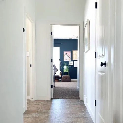
Please note that the color shown on this page is a representation and might not exactly match the real shade of the cards, fan decks, or color collections. Your monitor, browser, and screen angle can all affect how the paint looks, so it may not be the same as what you see here. All information on this page is based on RGB and HEX values provided by manufacturers.
It's important to keep in mind that the same color may appear differently on various surfaces due to the nature of those surfaces. For example, the same shade will look different on a rough wall compared to the smooth surface of cabinets.
Try before you buy

100% accurate
reusable paint samples
Peel, stick,
and repeat
Twice painted
with real paint

Next day
delivery
Color comparisons featuring Benjamin Moore Province Blue

2135-40 Province Blue vs HC-150 Yarmouth Blue


2135-40 Province Blue vs 1163 Tissue Pink

2135-40 Province Blue vs CW-575 Everard Blue

2135-40 Province Blue vs OC-37 Glacier White

2135-40 Province Blue vs SW7611 Tranquil Aqua

2135-40 Province Blue vs N470-5 Norwegian Blue

2135-40 Province Blue vs HC-50 Georgian Brick

2135-40 Province Blue vs SW2822 Downing Sand

2135-40 Province Blue vs SW7624 Slate Tile

2135-40 Province Blue vs 5001-4A Café Blue

2135-40 Province Blue vs SW2801 Rookwood Dark Red

2135-40 Province Blue vs 1632 Glass Slipper

2135-40 Province Blue vs 2062-20 Gentleman's Gray

2135-40 Province Blue vs 1671 West Coast

2135-40 Province Blue vs CW-480 Bassett Hall Green

2135-40 Province Blue vs 260 Air Force Blue

2135-40 Province Blue vs 2084-10 Brick Red

2135-40 Province Blue vs RAL 7001 Silver grey

2135-40 Province Blue vs RAL 7000 Squirrel grey

2135-40 Province Blue vs RAL 6034 Pastel turquoise

2135-40 Province Blue vs RAL 7046 Telegrey 2

2135-40 Province Blue vs RAL 5024 Pastel blue

2135-40 Province Blue vs RAL 5018 Turquoise blue

2135-40 Province Blue vs RAL 5014 Pigeon blue

2135-40 Province Blue vs RAL 5004 Black blue

2135-40 Province Blue vs SW9137 Niebla Azul

2135-40 Province Blue vs 2136-60 Harbor Haze

2135-40 Province Blue vs 1602 Gunmetal

2135-40 Province Blue vs OC-122 Cotton Balls

2135-40 Province Blue vs CSP-650 Cable Knit Sweater

2135-40 Province Blue vs 1562 Healing Aloe

2135-40 Province Blue vs SW9152 Let it Rain

2135-40 Province Blue vs 441 Alligator Alley

2135-40 Province Blue vs 2162-60 Mystic Beige

2135-40 Province Blue vs OC-13 Soft Chamois