Benjamin Moore Province Blue 2135-40
Contentsshow +hide -
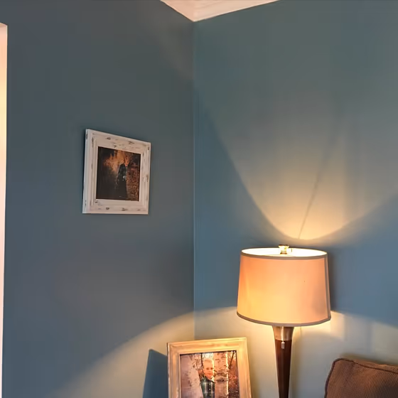
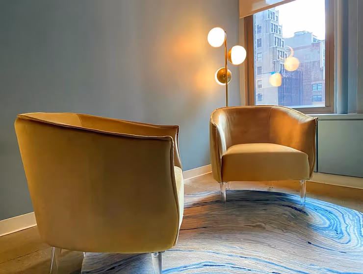
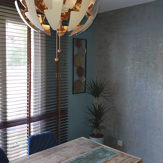
- Province Blue for living room (2 photos)
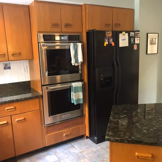
- Benjamin Moore 2135-40 on kitchen cabinets (1 photo)
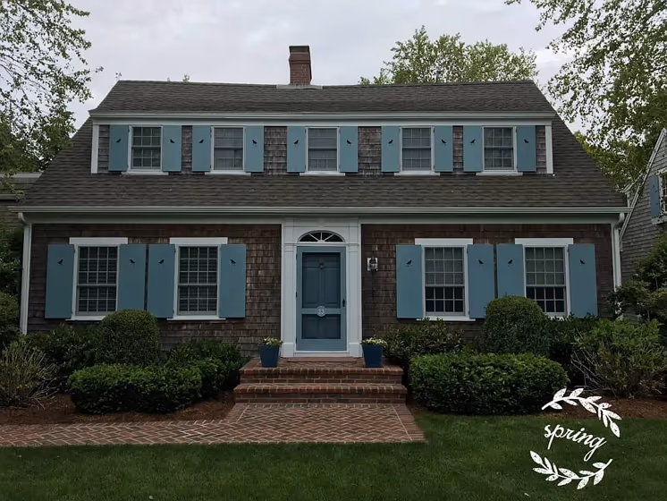
- Province Blue for exterior (1 photo)
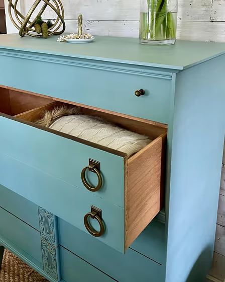
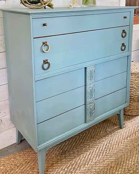
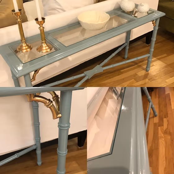
- Benjamin Moore Province Blue reviews (5 photos)
- What are Benjamin Moore Province Blue undertones?
- Is Province Blue 2135-40 cool or warm?
- How light temperature affects on Province Blue
- Monochromatic color scheme
- Complementary color scheme
- Color comparison and matching
- LRV of Province Blue 2135-40
- Color codes
- Color equivalents
| Official page: | Province Blue 2135-40 |
| Code: | 2135-40 |
| Name: | Province Blue |
| Brand: | Benjamin Moore |
What color is Benjamin Moore Province Blue?
Add a touch of sophistication to any space with Benjamin Moore 2135-40 Province Blue. This serene shade of blue effortlessly complements a variety of colors, making it a versatile choice for your interior design. Pair Province Blue with warm neutrals like beige or cream for a cozy feel, or with crisp whites for a clean, contemporary look. For a pop of contrast, try combining Province Blue with accents in rich jewel tones like emerald green or sapphire blue. Whether you're looking to create a calming retreat or a vibrant statement, Province Blue is sure to bring a sense of elegance to your home.
Loading...
LRV of Province Blue
Province Blue has an LRV of 31.57% and refers to Medium colors that reflect a lot of light. Why LRV is important?

Light Reflectance Value measures the amount of visible and usable light that reflects from a painted surface.
Simply put, the higher the LRV of a paint color, the brighter the room you will get.
The scale goes from 0% (absolute black, absorbing all light) to 100% (pure white, reflecting all light).
Act like a pro: When choosing paint with an LRV of 31.57%, pay attention to your bulbs' brightness. Light brightness is measured in lumens. The lower the paint's LRV, the higher lumen level you need. Every square foot of room needs at least 40 lumens. That means for a 200 ft2 living room you'll need about 8000 lumens of light – e.g., eight 1000 lm bulbs.
Color codes
We have collected almost every possible color code you could ever need.
Not sure what the difference between HEX and RGB is? We break down color models in plain language. Understanding color models
| Format | Code |
|---|---|
| HEX | #829BA1 |
| RGB Decimal | 130, 155, 161 |
| RGB Percent | 50.98%, 60.78%, 63.14% |
| HSV | Hue: 192° Saturation: 19.25% Value: 63.14% |
| HSL | hsl(192, 14, 57) |
| CMYK | Cyan: 19.25 Magenta: 3.73 Yellow: 0.0 Key: 36.86 |
| YIQ | Y: 148.209 I: -16.826 Q: -3.421 |
| XYZ | X: 27.358 Y: 30.761 Z: 38.205 |
| CIE Lab | L:62.305 a:-7.392 b:-6.055 |
| CIE Luv | L:62.305 u:-13.345 v:-7.704 |
| Decimal | 8559521 |
| Hunter Lab | 55.463, -9.01, -2.017 |