
Closest paint matches and alternatives to Benjamin Moore Hemlock 719
Find similar colors and alternatives to Benjamin Moore Hemlock 719 . Compare Blue Whale, Tranquil Aqua, Stone Blue and other matches by ΔE and LRV.
Select color
Select palette to match
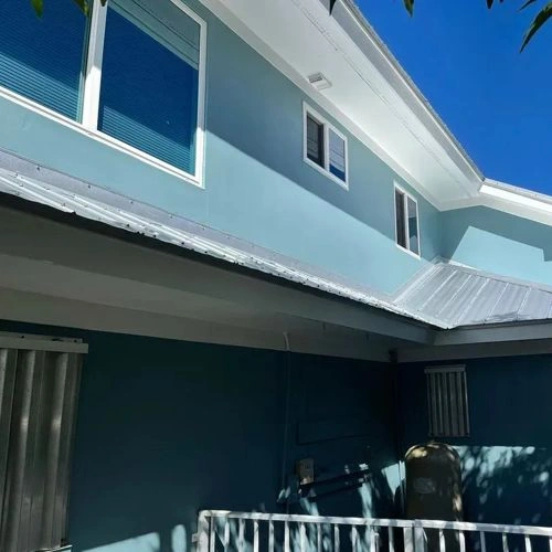
Benjamin Moore 719 Hemlock
h: 188, s: 24, v: 60
LRV: 28.89%
Jotun Blue Whale / 5517
ΔE*₀₀ = 2.00
Smaller is closer:
~0–1 (imperceptible),
1–2 (just noticeable),
2–5 (small difference),
5–10 (clear),
more than 10 (very different).
h: 192, s: 27, v: 63
LRV: 27.47%
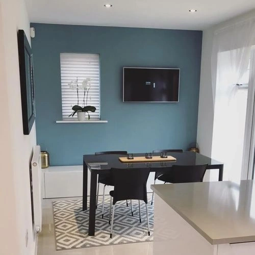
Sherwin Williams Tranquil Aqua / SW 7611
ΔE*₀₀ = 2.02
Smaller is closer:
~0–1 (imperceptible),
1–2 (just noticeable),
2–5 (small difference),
5–10 (clear),
more than 10 (very different).
h: 190, s: 22, v: 63
LRV: 30.10%
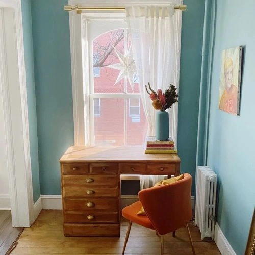
Farrow and Ball Stone Blue / 86
ΔE*₀₀ = 2.90
Smaller is closer:
~0–1 (imperceptible),
1–2 (just noticeable),
2–5 (small difference),
5–10 (clear),
more than 10 (very different).
h: 195, s: 25, v: 63
LRV: 27.72%

Sherwin Williams Moody Blue / SW 6221
ΔE*₀₀ = 2.95
Smaller is closer:
~0–1 (imperceptible),
1–2 (just noticeable),
2–5 (small difference),
5–10 (clear),
more than 10 (very different).
h: 183, s: 16, v: 57
LRV: 26.52%

Dulux Sea Urchin 2 / 90GG 28/133
ΔE*₀₀ = 3.01
Smaller is closer:
~0–1 (imperceptible),
1–2 (just noticeable),
2–5 (small difference),
5–10 (clear),
more than 10 (very different).
h: 178, s: 22, v: 58
LRV: 25.73%

Sherwin Williams Mountain Stream / SW 7612
ΔE*₀₀ = 3.03
Smaller is closer:
~0–1 (imperceptible),
1–2 (just noticeable),
2–5 (small difference),
5–10 (clear),
more than 10 (very different).
h: 190, s: 33, v: 60
LRV: 25.30%
Behr Voyage / PPU13-07
ΔE*₀₀ = 3.15
Smaller is closer:
~0–1 (imperceptible),
1–2 (just noticeable),
2–5 (small difference),
5–10 (clear),
more than 10 (very different).
h: 189, s: 31, v: 64
LRV: 28.10%
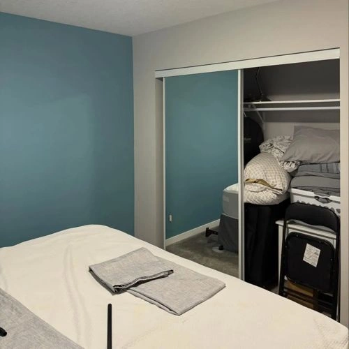
Benjamin Moore Williamsburg Wythe Blue / CW-590
ΔE*₀₀ = 3.24
Smaller is closer:
~0–1 (imperceptible),
1–2 (just noticeable),
2–5 (small difference),
5–10 (clear),
more than 10 (very different).
h: 184, s: 21, v: 63
LRV: 33.40%
Dulux Maritime Teal / 10BG 26/134
ΔE*₀₀ = 3.24
Smaller is closer:
~0–1 (imperceptible),
1–2 (just noticeable),
2–5 (small difference),
5–10 (clear),
more than 10 (very different).
h: 184, s: 29, v: 58
LRV: 23.52%

Dulux Celestial Cloud 2 / 50BG 32/114
ΔE*₀₀ = 3.35
Smaller is closer:
~0–1 (imperceptible),
1–2 (just noticeable),
2–5 (small difference),
5–10 (clear),
more than 10 (very different).
h: 193, s: 23, v: 65
Benjamin Moore Province Blue / 2135-40
ΔE*₀₀ = 3.40
Smaller is closer:
~0–1 (imperceptible),
1–2 (just noticeable),
2–5 (small difference),
5–10 (clear),
more than 10 (very different).
h: 192, s: 19, v: 63
LRV: 31.57%

Sherwin Williams Morning at Sea / SW 9634
ΔE*₀₀ = 3.56
Smaller is closer:
~0–1 (imperceptible),
1–2 (just noticeable),
2–5 (small difference),
5–10 (clear),
more than 10 (very different).
h: 190, s: 16, v: 61
LRV: 29.12%

Benjamin Moore Fort Pierce Green / 712
ΔE*₀₀ = 3.73
Smaller is closer:
~0–1 (imperceptible),
1–2 (just noticeable),
2–5 (small difference),
5–10 (clear),
more than 10 (very different).
h: 178, s: 22, v: 56
LRV: 26.39%
Sherwin Williams Peacock Plume / SW 0020
ΔE*₀₀ = 3.74
Smaller is closer:
~0–1 (imperceptible),
1–2 (just noticeable),
2–5 (small difference),
5–10 (clear),
more than 10 (very different).
h: 177, s: 23, v: 59
LRV: 27.47%

Sherwin Williams Whirlpool / SW 9135
ΔE*₀₀ = 3.79
Smaller is closer:
~0–1 (imperceptible),
1–2 (just noticeable),
2–5 (small difference),
5–10 (clear),
more than 10 (very different).
h: 194, s: 18, v: 62
LRV: 28.84%
Please note that the color shown on this page is a representation and might not exactly match the real shade of the cards, fan decks, or color collections. Your monitor, browser, and screen angle can all affect how the paint looks, so it may not be the same as what you see here. All information on this page is based on HSV, LRV, RGB and HEX values provided by manufacturers.
It's important to keep in mind that the same color may appear differently on various surfaces due to the nature of those surfaces. For example, the same shade will look different on a rough wall compared to the smooth surface of cabinets.