
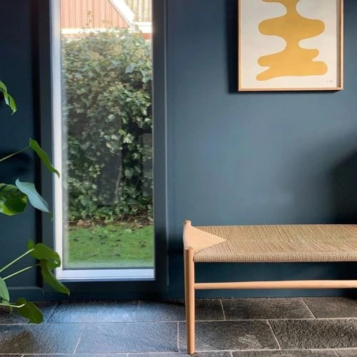
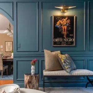
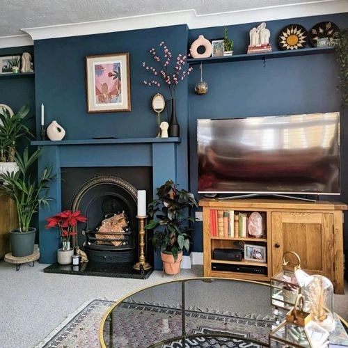
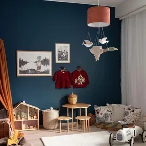
Paints matching Bunglehouse Blue by Sherwin Williams
We found 15 closest paint color matches to Bunglehouse Blue SW 0048
Select color
Select palette to match
Sherwin Williams SW 0048 Bunglehouse Blue
h: 200, s: 36, v: 44
LRV: 11.29%
Benjamin Moore Vermont Slate / 1673
ΔE*₀₀ = 1.29
Smaller is closer:
~0–1 (imperceptible),
1–2 (just noticeable),
2–5 (small difference),
5–10 (clear),
more than 10 (very different).
h: 199, s: 31, v: 43
LRV: 12.90%
Benjamin Moore Spellbound / 1659
ΔE*₀₀ = 1.72
Smaller is closer:
~0–1 (imperceptible),
1–2 (just noticeable),
2–5 (small difference),
5–10 (clear),
more than 10 (very different).
h: 200, s: 30, v: 44
LRV: 13.29%
Valspar Hobgoblin / 8004-39F
ΔE*₀₀ = 2.25
Smaller is closer:
~0–1 (imperceptible),
1–2 (just noticeable),
2–5 (small difference),
5–10 (clear),
more than 10 (very different).
h: 198, s: 44, v: 43
LRV: 10.00%
Jotun Industrial Blue / 5455
ΔE*₀₀ = 2.36
Smaller is closer:
~0–1 (imperceptible),
1–2 (just noticeable),
2–5 (small difference),
5–10 (clear),
more than 10 (very different).
h: 202, s: 28, v: 42
LRV: 11.02%
Behr Shipwreck / S470-6
ΔE*₀₀ = 2.60
Smaller is closer:
~0–1 (imperceptible),
1–2 (just noticeable),
2–5 (small difference),
5–10 (clear),
more than 10 (very different).
h: 198, s: 33, v: 46
LRV: 12.45%
Sherwin Williams Tempe Star / SW 6229
ΔE*₀₀ = 2.65
Smaller is closer:
~0–1 (imperceptible),
1–2 (just noticeable),
2–5 (small difference),
5–10 (clear),
more than 10 (very different).
h: 194, s: 33, v: 42
LRV: 11.05%
Behr Observatory / PPU13-19
ΔE*₀₀ = 2.90
Smaller is closer:
~0–1 (imperceptible),
1–2 (just noticeable),
2–5 (small difference),
5–10 (clear),
more than 10 (very different).
h: 195, s: 32, v: 40
LRV: 9.69%
Dulux Midnight Teal / 90BG 11/101
ΔE*₀₀ = 2.97
Smaller is closer:
~0–1 (imperceptible),
1–2 (just noticeable),
2–5 (small difference),
5–10 (clear),
more than 10 (very different).
h: 201, s: 33, v: 40
LRV: 9.27%
Sherwin Williams Waterloo / SW 9141
ΔE*₀₀ = 3.08
Smaller is closer:
~0–1 (imperceptible),
1–2 (just noticeable),
2–5 (small difference),
5–10 (clear),
more than 10 (very different).
h: 199, s: 27, v: 45
LRV: 12.97%

Jotun Petroli / 4625
ΔE*₀₀ = 3.11
Smaller is closer:
~0–1 (imperceptible),
1–2 (just noticeable),
2–5 (small difference),
5–10 (clear),
more than 10 (very different).
h: 206, s: 34, v: 46
LRV: 11.63%
Behr Rush Hour / MQ5-25
ΔE*₀₀ = 3.11
Smaller is closer:
~0–1 (imperceptible),
1–2 (just noticeable),
2–5 (small difference),
5–10 (clear),
more than 10 (very different).
h: 199, s: 26, v: 44
LRV: 12.39%
Tikkurila Royal / M436
ΔE*₀₀ = 3.12
Smaller is closer:
~0–1 (imperceptible),
1–2 (just noticeable),
2–5 (small difference),
5–10 (clear),
more than 10 (very different).
h: 203, s: 42, v: 42
LRV: 9.23%
Benjamin Moore Stained Glass / CSP-685
ΔE*₀₀ = 3.13
Smaller is closer:
~0–1 (imperceptible),
1–2 (just noticeable),
2–5 (small difference),
5–10 (clear),
more than 10 (very different).
h: 193, s: 38, v: 43
LRV: 13.15%
Behr Bermudan Blue / PPU13-18
ΔE*₀₀ = 3.26
Smaller is closer:
~0–1 (imperceptible),
1–2 (just noticeable),
2–5 (small difference),
5–10 (clear),
more than 10 (very different).
h: 197, s: 50, v: 44
LRV: 9.65%
Behr Midnight In The Tropics / S480-7
ΔE*₀₀ = 3.28
Smaller is closer:
~0–1 (imperceptible),
1–2 (just noticeable),
2–5 (small difference),
5–10 (clear),
more than 10 (very different).
h: 200, s: 33, v: 39
LRV: 9.04%
Please note that the color shown on this page is a representation and might not exactly match the real shade of the cards, fan decks, or color collections. Your monitor, browser, and screen angle can all affect how the paint looks, so it may not be the same as what you see here. All information on this page is based on HSV, LRV, RGB and HEX values provided by manufacturers.
It's important to keep in mind that the same color may appear differently on various surfaces due to the nature of those surfaces. For example, the same shade will look different on a rough wall compared to the smooth surface of cabinets.