Behr Observatory PPU13-19
Contentsshow +hide -
| Code: | PPU13-19 |
| Name: | Observatory |
| Brand: | Behr |
What color is Behr Observatory?
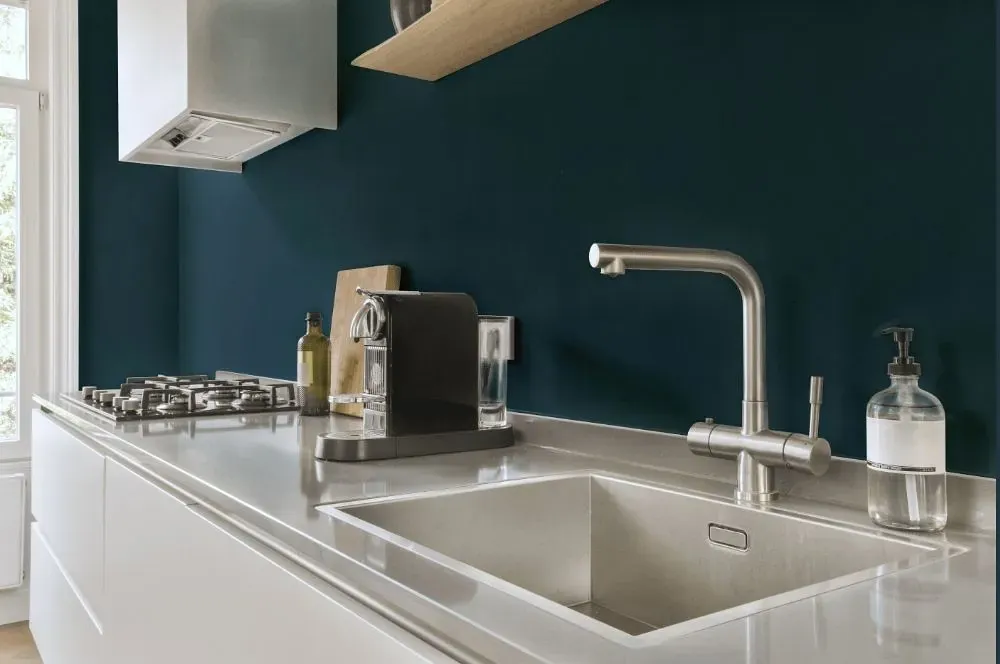
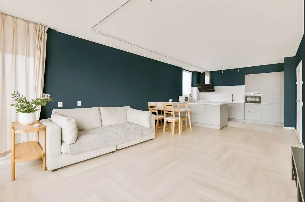
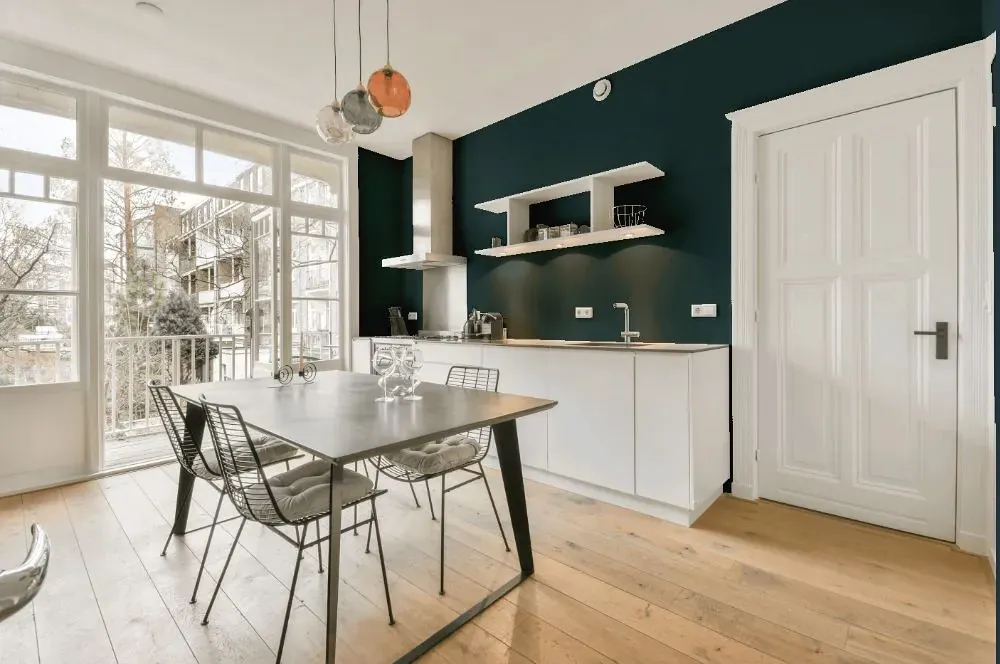
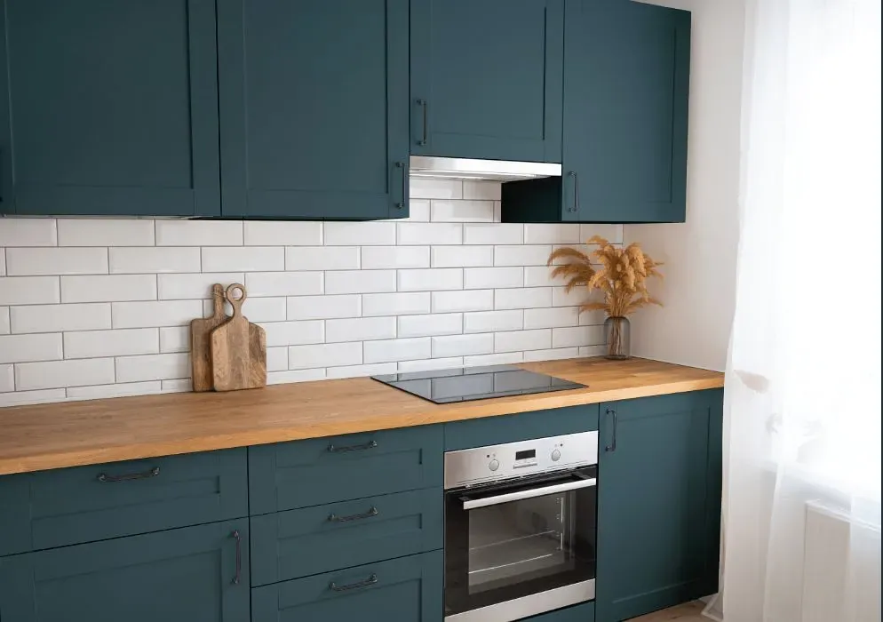
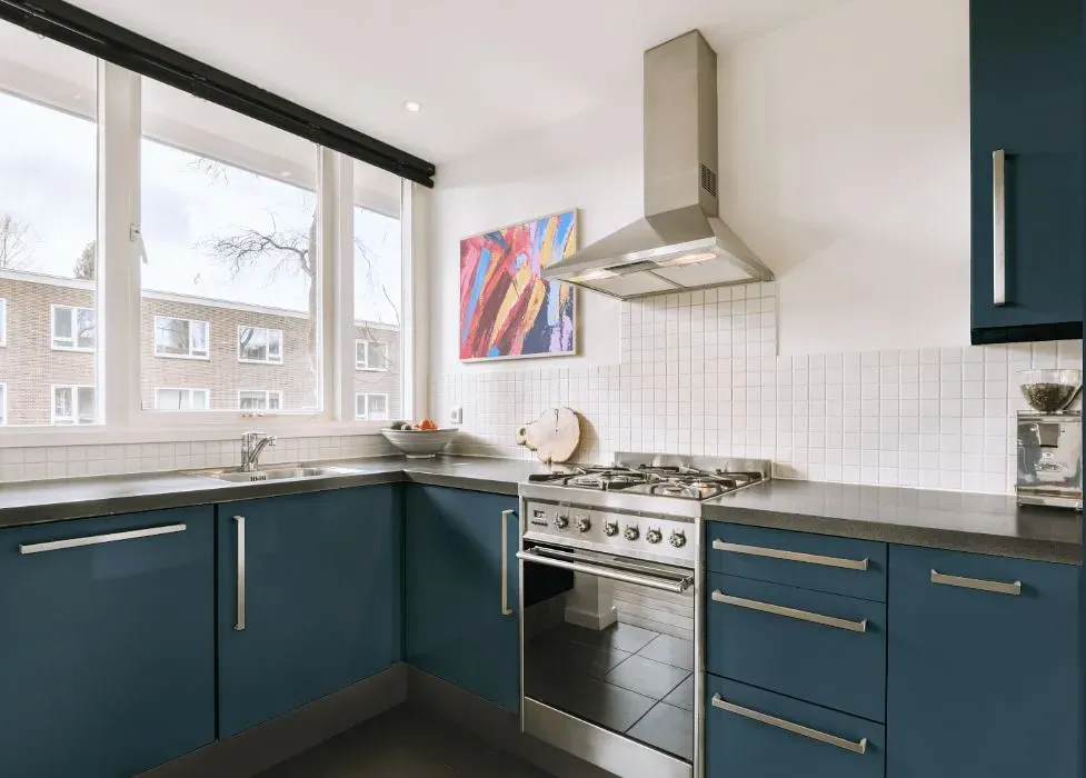
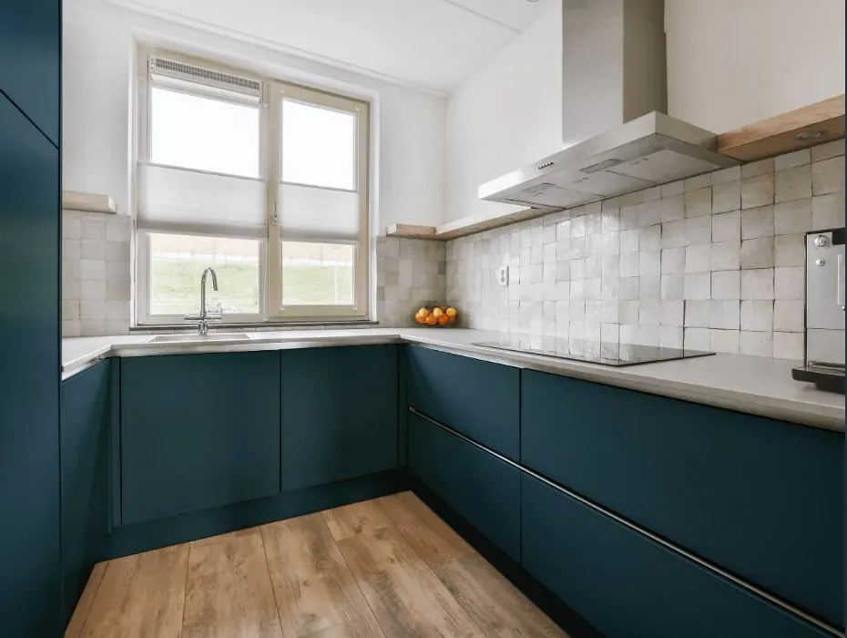
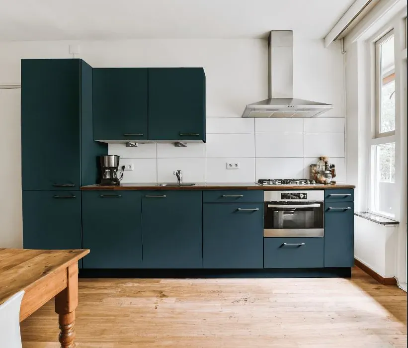
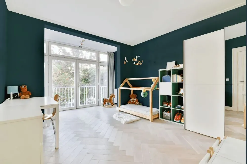
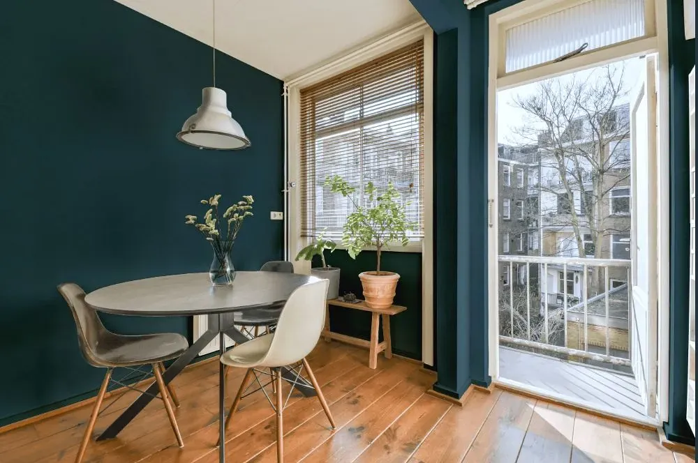
Behr [PPU13-19] Observatory is a rich and versatile hue that exudes sophistication and depth. This color brings a sense of calmness and modern elegance to any space it graces. Pairing [Observatory] with soft, muted tones like beige or taupe can create a harmonious and inviting atmosphere. For a bold contrast, consider combining it with accents in crisp white or charcoal grey for a striking visual impact. Whether used as a statement wall or a grounding base color, [Observatory] adds a timeless and refined touch to interior spaces.
Loading...
LRV of Observatory
Observatory has an LRV of 9.69% and refers to Dark colors which means that this color almost does not reflect light. Why LRV is important?

Light Reflectance Value measures the amount of visible and usable light that reflects from a painted surface.
Simply put, the higher the LRV of a paint color, the brighter the room you will get.
The scale goes from 0% (absolute black, absorbing all light) to 100% (pure white, reflecting all light).
Act like a pro: When choosing paint with an LRV of 9.69%, pay attention to your bulbs' brightness. Light brightness is measured in lumens. The lower the paint's LRV, the higher lumen level you need. Every square foot of room needs at least 40 lumens. That means for a 200 ft2 living room you'll need about 8000 lumens of light – e.g., eight 1000 lm bulbs.
Color codes
We have collected almost every possible color code you could ever need.
Not sure what the difference between HEX and RGB is? We break down color models in plain language. Understanding color models
| Format | Code |
|---|---|
| HEX | #455d65 |
| RGB Decimal | 69, 93, 101 |
| RGB Percent | 27.06%, 36.47%, 39.61% |
| HSV | Hue: 195° Saturation: 31.68% Value: 39.61% |
| HSL | hsl(195, 19, 33) |
| CMYK | Cyan: 31.68 Magenta: 7.92 Yellow: 0.0 Key: 60.39 |
| YIQ | Y: 86.736 I: -16.872 Q: -2.587 |
| XYZ | X: 8.717 Y: 10.033 Z: 13.786 |
| CIE Lab | L:37.902 a:-6.856 b:-7.494 |
| CIE Luv | L:37.902 u:-11.826 v:-8.933 |
| Decimal | 4545893 |
| Hunter Lab | 31.675, -6.31, -3.632 |