
Paints matching Constellation by Sherwin Williams
We found 15 closest paint color matches to Constellation SW 9629
Select color
Select palette to match
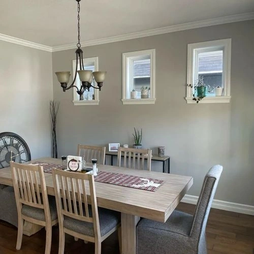
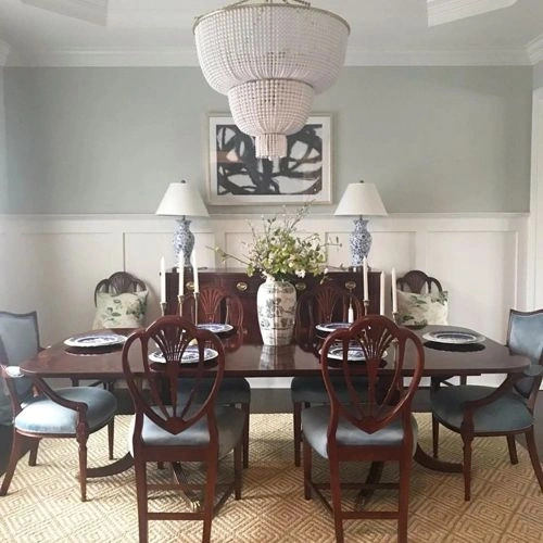
Sherwin Williams SW 9629 Constellation
h: 54, s: 5, v: 80
LRV: 60.23%
Dulux Morning Oats / 44YY 65/034
ΔE*₀₀ = 0.51
Smaller is closer:
~0–1 (imperceptible),
1–2 (just noticeable),
2–5 (small difference),
5–10 (clear),
more than 10 (very different).
h: 49, s: 5, v: 81
Behr Dolphin Fin / 790C-3
ΔE*₀₀ = 0.67
Smaller is closer:
~0–1 (imperceptible),
1–2 (just noticeable),
2–5 (small difference),
5–10 (clear),
more than 10 (very different).
h: 49, s: 5, v: 80
LRV: 58.70%
Valspar Passing Shadow / T668
ΔE*₀₀ = 0.73
Smaller is closer:
~0–1 (imperceptible),
1–2 (just noticeable),
2–5 (small difference),
5–10 (clear),
more than 10 (very different).
h: 54, s: 5, v: 82
LRV: 62.23%
Behr Whitewash Oak / PPU24-12
ΔE*₀₀ = 0.74
Smaller is closer:
~0–1 (imperceptible),
1–2 (just noticeable),
2–5 (small difference),
5–10 (clear),
more than 10 (very different).
h: 54, s: 5, v: 79
LRV: 57.86%
Sherwin Williams Lattice / SW 7654
ΔE*₀₀ = 0.75
Smaller is closer:
~0–1 (imperceptible),
1–2 (just noticeable),
2–5 (small difference),
5–10 (clear),
more than 10 (very different).
h: 60, s: 4, v: 81
LRV: 61.20%

Sherwin Williams Aloof Gray / SW 6197
ΔE*₀₀ = 0.94
Smaller is closer:
~0–1 (imperceptible),
1–2 (just noticeable),
2–5 (small difference),
5–10 (clear),
more than 10 (very different).
h: 60, s: 4, v: 79
LRV: 57.92%
Sherwin Williams Front Porch / SW 7651
ΔE*₀₀ = 0.95
Smaller is closer:
~0–1 (imperceptible),
1–2 (just noticeable),
2–5 (small difference),
5–10 (clear),
more than 10 (very different).
h: 60, s: 3, v: 80
LRV: 60.16%
Sherwin Williams Sweater Weather / SW 9548
ΔE*₀₀ = 0.95
Smaller is closer:
~0–1 (imperceptible),
1–2 (just noticeable),
2–5 (small difference),
5–10 (clear),
more than 10 (very different).
h: 60, s: 3, v: 80
LRV: 59.83%
Sherwin Williams Conservative Gray / SW 6183
ΔE*₀₀ = 1.05
Smaller is closer:
~0–1 (imperceptible),
1–2 (just noticeable),
2–5 (small difference),
5–10 (clear),
more than 10 (very different).
h: 55, s: 5, v: 82
LRV: 62.72%

Behr Silver Marlin / N360-2
ΔE*₀₀ = 1.18
Smaller is closer:
~0–1 (imperceptible),
1–2 (just noticeable),
2–5 (small difference),
5–10 (clear),
more than 10 (very different).
h: 60, s: 4, v: 78
LRV: 57.10%

Jotun Smooth White / 8470
ΔE*₀₀ = 1.18
Smaller is closer:
~0–1 (imperceptible),
1–2 (just noticeable),
2–5 (small difference),
5–10 (clear),
more than 10 (very different).
h: 47, s: 7, v: 81
LRV: 59.40%

Sherwin Williams Repose Gray / SW 7015
ΔE*₀₀ = 1.20
Smaller is closer:
~0–1 (imperceptible),
1–2 (just noticeable),
2–5 (small difference),
5–10 (clear),
more than 10 (very different).
h: 45, s: 6, v: 80
LRV: 58.22%

Benjamin Moore Rodeo / 1534
ΔE*₀₀ = 1.20
Smaller is closer:
~0–1 (imperceptible),
1–2 (just noticeable),
2–5 (small difference),
5–10 (clear),
more than 10 (very different).
h: 47, s: 7, v: 82
LRV: 59.84%
Benjamin Moore Nimbus / 1465
ΔE*₀₀ = 1.24
Smaller is closer:
~0–1 (imperceptible),
1–2 (just noticeable),
2–5 (small difference),
5–10 (clear),
more than 10 (very different).
h: 44, s: 5, v: 81
LRV: 59.40%

Valspar Notre Dame / 5006-1B
ΔE*₀₀ = 1.30
Smaller is closer:
~0–1 (imperceptible),
1–2 (just noticeable),
2–5 (small difference),
5–10 (clear),
more than 10 (very different).
h: 53, s: 4, v: 78
LRV: 56.81%
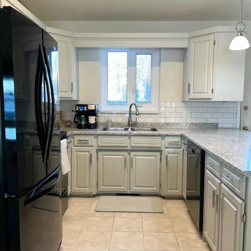
Please note that the color shown on this page is a representation and might not exactly match the real shade of the cards, fan decks, or color collections. Your monitor, browser, and screen angle can all affect how the paint looks, so it may not be the same as what you see here. All information on this page is based on HSV, LRV, RGB and HEX values provided by manufacturers.
It's important to keep in mind that the same color may appear differently on various surfaces due to the nature of those surfaces. For example, the same shade will look different on a rough wall compared to the smooth surface of cabinets.