
Closest paint matches and alternatives to Farrow and Ball De Nimes 299
Find similar colors and alternatives to Farrow and Ball De Nimes 299 . Compare S 5010-B30G, Academy Gray, Providence Blue and other matches by ΔE and LRV.
Select color
Select palette to match
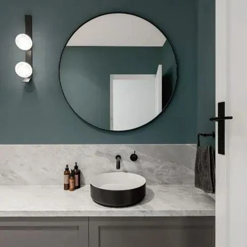
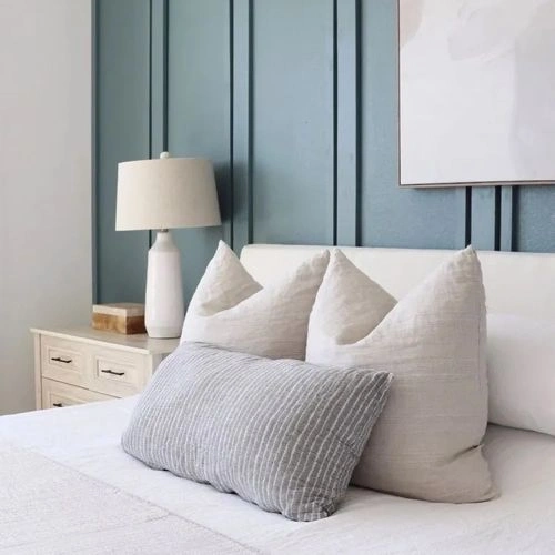
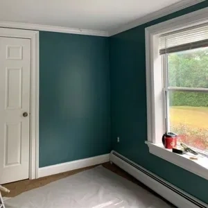
Farrow and Ball 299 De Nimes
h: 191, s: 17, v: 50
LRV: 18.64%
NCS S 5010-B30G
ΔE*₀₀ = 0.39
Smaller is closer:
~0–1 (imperceptible),
1–2 (just noticeable),
2–5 (small difference),
5–10 (clear),
more than 10 (very different).
h: 191, s: 17, v: 51
Valspar Academy Gray / 5001-2A
ΔE*₀₀ = 1.50
Smaller is closer:
~0–1 (imperceptible),
1–2 (just noticeable),
2–5 (small difference),
5–10 (clear),
more than 10 (very different).
h: 195, s: 16, v: 51
LRV: 19.34%
Benjamin Moore Providence Blue / 1636
ΔE*₀₀ = 1.57
Smaller is closer:
~0–1 (imperceptible),
1–2 (just noticeable),
2–5 (small difference),
5–10 (clear),
more than 10 (very different).
h: 194, s: 20, v: 50
LRV: 19.23%

Jotun Coastal Blue / 5504
ΔE*₀₀ = 1.68
Smaller is closer:
~0–1 (imperceptible),
1–2 (just noticeable),
2–5 (small difference),
5–10 (clear),
more than 10 (very different).
h: 196, s: 17, v: 51
LRV: 19.25%

NCS S 5010-B10G
ΔE*₀₀ = 1.83
Smaller is closer:
~0–1 (imperceptible),
1–2 (just noticeable),
2–5 (small difference),
5–10 (clear),
more than 10 (very different).
h: 197, s: 18, v: 51

Benjamin Moore Steep Cliff Gray / 2122-20
ΔE*₀₀ = 1.87
Smaller is closer:
~0–1 (imperceptible),
1–2 (just noticeable),
2–5 (small difference),
5–10 (clear),
more than 10 (very different).
h: 184, s: 12, v: 49
LRV: 20.54%

Valspar Blue Thunder / V139-5
ΔE*₀₀ = 2.01
Smaller is closer:
~0–1 (imperceptible),
1–2 (just noticeable),
2–5 (small difference),
5–10 (clear),
more than 10 (very different).
h: 192, s: 23, v: 50
LRV: 18.03%
Sherwin Williams Labradorite / SW 7619
ΔE*₀₀ = 2.11
Smaller is closer:
~0–1 (imperceptible),
1–2 (just noticeable),
2–5 (small difference),
5–10 (clear),
more than 10 (very different).
h: 196, s: 23, v: 51
LRV: 18.57%

Benjamin Moore Smokestack Gray / 2131-40
ΔE*₀₀ = 2.75
Smaller is closer:
~0–1 (imperceptible),
1–2 (just noticeable),
2–5 (small difference),
5–10 (clear),
more than 10 (very different).
h: 194, s: 16, v: 53
LRV: 22.78%

Behr Coney Island / N440-5
ΔE*₀₀ = 2.76
Smaller is closer:
~0–1 (imperceptible),
1–2 (just noticeable),
2–5 (small difference),
5–10 (clear),
more than 10 (very different).
h: 176, s: 13, v: 49
LRV: 19.22%
Valspar Risk-Reward / T692
ΔE*₀₀ = 2.82
Smaller is closer:
~0–1 (imperceptible),
1–2 (just noticeable),
2–5 (small difference),
5–10 (clear),
more than 10 (very different).
h: 197, s: 22, v: 50
LRV: 17.33%
Little Greene Etruria / 326
ΔE*₀₀ = 2.94
Smaller is closer:
~0–1 (imperceptible),
1–2 (just noticeable),
2–5 (small difference),
5–10 (clear),
more than 10 (very different).
h: 194, s: 26, v: 52
LRV: 19.00%

Sherwin Williams Mediterranean / SW 7617
ΔE*₀₀ = 2.98
Smaller is closer:
~0–1 (imperceptible),
1–2 (just noticeable),
2–5 (small difference),
5–10 (clear),
more than 10 (very different).
h: 188, s: 23, v: 49
LRV: 17.54%
Benjamin Moore Montpelier / AF-555
ΔE*₀₀ = 3.02
Smaller is closer:
~0–1 (imperceptible),
1–2 (just noticeable),
2–5 (small difference),
5–10 (clear),
more than 10 (very different).
h: 199, s: 16, v: 53
LRV: 22.36%
Behr Ocean Swell / PPU25-19
ΔE*₀₀ = 3.12
Smaller is closer:
~0–1 (imperceptible),
1–2 (just noticeable),
2–5 (small difference),
5–10 (clear),
more than 10 (very different).
h: 190, s: 10, v: 49
LRV: 19.37%
Please note that the color shown on this page is a representation and might not exactly match the real shade of the cards, fan decks, or color collections. Your monitor, browser, and screen angle can all affect how the paint looks, so it may not be the same as what you see here. All information on this page is based on HSV, LRV, RGB and HEX values provided by manufacturers.
It's important to keep in mind that the same color may appear differently on various surfaces due to the nature of those surfaces. For example, the same shade will look different on a rough wall compared to the smooth surface of cabinets.