
Paints matching Enduring Bronze by Sherwin Williams
We found 15 closest paint color matches to Enduring Bronze SW 7055
Select color
Select palette to match
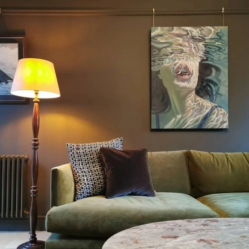
Sherwin Williams SW 7055 Enduring Bronze
h: 37, s: 27, v: 33
LRV: 7.45%
Sherwin Williams Tungsten / SW 9515
ΔE*₀₀ = 1.21
Smaller is closer:
~0–1 (imperceptible),
1–2 (just noticeable),
2–5 (small difference),
5–10 (clear),
more than 10 (very different).
h: 34, s: 26, v: 35
LRV: 7.82%
Valspar Turkish Coffee / 6003-2C
ΔE*₀₀ = 1.57
Smaller is closer:
~0–1 (imperceptible),
1–2 (just noticeable),
2–5 (small difference),
5–10 (clear),
more than 10 (very different).
h: 37, s: 22, v: 33
LRV: 7.38%
Benjamin Moore Char Brown / 2137-20
ΔE*₀₀ = 1.58
Smaller is closer:
~0–1 (imperceptible),
1–2 (just noticeable),
2–5 (small difference),
5–10 (clear),
more than 10 (very different).
h: 35, s: 29, v: 35
LRV: 9.31%
RAL Classic Brown grey / RAL 7013
ΔE*₀₀ = 1.83
Smaller is closer:
~0–1 (imperceptible),
1–2 (just noticeable),
2–5 (small difference),
5–10 (clear),
more than 10 (very different).
h: 38, s: 22, v: 34
LRV: 10.60%

Sherwin Williams Nocturne / SW 9520
ΔE*₀₀ = 1.85
Smaller is closer:
~0–1 (imperceptible),
1–2 (just noticeable),
2–5 (small difference),
5–10 (clear),
more than 10 (very different).
h: 40, s: 21, v: 33
LRV: 7.77%
Valspar Deep Desert Shadow / M331
ΔE*₀₀ = 2.05
Smaller is closer:
~0–1 (imperceptible),
1–2 (just noticeable),
2–5 (small difference),
5–10 (clear),
more than 10 (very different).
h: 42, s: 25, v: 31
LRV: 6.94%
Benjamin Moore Otter Brown / 2137-10
ΔE*₀₀ = 2.07
Smaller is closer:
~0–1 (imperceptible),
1–2 (just noticeable),
2–5 (small difference),
5–10 (clear),
more than 10 (very different).
h: 33, s: 32, v: 33
LRV: 7.68%

Sherwin Williams Muddled Basil / SW 7745
ΔE*₀₀ = 2.18
Smaller is closer:
~0–1 (imperceptible),
1–2 (just noticeable),
2–5 (small difference),
5–10 (clear),
more than 10 (very different).
h: 39, s: 26, v: 35
LRV: 8.62%

Benjamin Moore Southern Vine / 2138-10
ΔE*₀₀ = 2.22
Smaller is closer:
~0–1 (imperceptible),
1–2 (just noticeable),
2–5 (small difference),
5–10 (clear),
more than 10 (very different).
h: 42, s: 25, v: 31
LRV: 7.87%
Little Greene Attic II / 144
ΔE*₀₀ = 2.54
Smaller is closer:
~0–1 (imperceptible),
1–2 (just noticeable),
2–5 (small difference),
5–10 (clear),
more than 10 (very different).
h: 35, s: 21, v: 35
LRV: 8.93%
Benjamin Moore Café Doppio / CSP-210
ΔE*₀₀ = 2.54
Smaller is closer:
~0–1 (imperceptible),
1–2 (just noticeable),
2–5 (small difference),
5–10 (clear),
more than 10 (very different).
h: 31, s: 30, v: 33
LRV: 8.33%
Behr Potting Soil / N360-7
ΔE*₀₀ = 2.62
Smaller is closer:
~0–1 (imperceptible),
1–2 (just noticeable),
2–5 (small difference),
5–10 (clear),
more than 10 (very different).
h: 33, s: 20, v: 35
LRV: 8.75%
Benjamin Moore Green Grove / 2138-20
ΔE*₀₀ = 2.71
Smaller is closer:
~0–1 (imperceptible),
1–2 (just noticeable),
2–5 (small difference),
5–10 (clear),
more than 10 (very different).
h: 44, s: 22, v: 33
LRV: 9.72%
Valspar Roasted Sepia / 6006-2C
ΔE*₀₀ = 2.85
Smaller is closer:
~0–1 (imperceptible),
1–2 (just noticeable),
2–5 (small difference),
5–10 (clear),
more than 10 (very different).
h: 32, s: 33, v: 36
LRV: 8.12%
Sherwin Williams Best Bronze / SW 6160
ΔE*₀₀ = 2.92
Smaller is closer:
~0–1 (imperceptible),
1–2 (just noticeable),
2–5 (small difference),
5–10 (clear),
more than 10 (very different).
h: 37, s: 33, v: 36
LRV: 8.55%
Please note that the color shown on this page is a representation and might not exactly match the real shade of the cards, fan decks, or color collections. Your monitor, browser, and screen angle can all affect how the paint looks, so it may not be the same as what you see here. All information on this page is based on HSV, LRV, RGB and HEX values provided by manufacturers.
It's important to keep in mind that the same color may appear differently on various surfaces due to the nature of those surfaces. For example, the same shade will look different on a rough wall compared to the smooth surface of cabinets.