
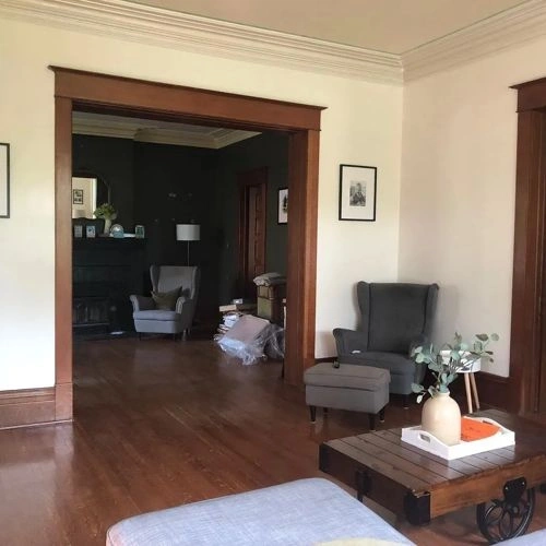
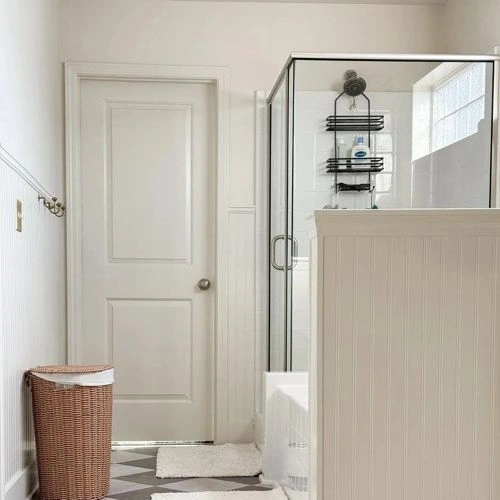
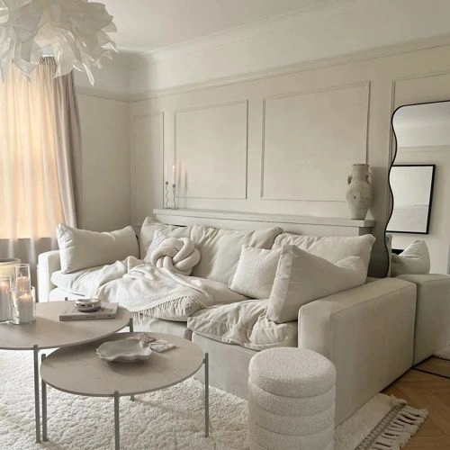
Paints matching White Duck by Sherwin Williams
We found 15 closest paint color matches to White Duck SW 7010
Select color
Select palette to match
Sherwin Williams SW 7010 White Duck
h: 41, s: 8, v: 90
LRV: 74.00%
Behr Cotton Knit / PPU7-11
ΔE*₀₀ = 0.00
Smaller is closer:
~0–1 (imperceptible),
1–2 (just noticeable),
2–5 (small difference),
5–10 (clear),
more than 10 (very different).
h: 41, s: 8, v: 90
LRV: 73.91%
Behr Sand Drift / N310-1
ΔE*₀₀ = 0.53
Smaller is closer:
~0–1 (imperceptible),
1–2 (just noticeable),
2–5 (small difference),
5–10 (clear),
more than 10 (very different).
h: 43, s: 8, v: 90
LRV: 74.44%
Behr Crisp Linen / MQ3-13
ΔE*₀₀ = 0.60
Smaller is closer:
~0–1 (imperceptible),
1–2 (just noticeable),
2–5 (small difference),
5–10 (clear),
more than 10 (very different).
h: 42, s: 9, v: 91
LRV: 75.34%
Benjamin Moore Fog Mist / OC-31
ΔE*₀₀ = 0.70
Smaller is closer:
~0–1 (imperceptible),
1–2 (just noticeable),
2–5 (small difference),
5–10 (clear),
more than 10 (very different).
h: 43, s: 8, v: 89
LRV: 70.15%

Sherwin Williams Oyster White / SW 7637
ΔE*₀₀ = 0.70
Smaller is closer:
~0–1 (imperceptible),
1–2 (just noticeable),
2–5 (small difference),
5–10 (clear),
more than 10 (very different).
h: 43, s: 8, v: 89
LRV: 72.49%

Tikkurila Merino / Y458
ΔE*₀₀ = 0.77
Smaller is closer:
~0–1 (imperceptible),
1–2 (just noticeable),
2–5 (small difference),
5–10 (clear),
more than 10 (very different).
h: 44, s: 8, v: 90
LRV: 74.35%

Sherwin Williams Nacre / SW 6154
ΔE*₀₀ = 0.78
Smaller is closer:
~0–1 (imperceptible),
1–2 (just noticeable),
2–5 (small difference),
5–10 (clear),
more than 10 (very different).
h: 42, s: 9, v: 91
LRV: 76.42%
Sherwin Williams Shoji White / SW 7042
ΔE*₀₀ = 0.78
Smaller is closer:
~0–1 (imperceptible),
1–2 (just noticeable),
2–5 (small difference),
5–10 (clear),
more than 10 (very different).
h: 38, s: 8, v: 90
LRV: 74.34%
Benjamin Moore Strand of Pearls / CSP-395
ΔE*₀₀ = 0.81
Smaller is closer:
~0–1 (imperceptible),
1–2 (just noticeable),
2–5 (small difference),
5–10 (clear),
more than 10 (very different).
h: 44, s: 8, v: 89
LRV: 72.19%

Sherwin Williams Natural Choice / SW 7011
ΔE*₀₀ = 0.81
Smaller is closer:
~0–1 (imperceptible),
1–2 (just noticeable),
2–5 (small difference),
5–10 (clear),
more than 10 (very different).
h: 44, s: 8, v: 89
LRV: 72.95%

Farrow and Ball School House White / 291
ΔE*₀₀ = 0.81
Smaller is closer:
~0–1 (imperceptible),
1–2 (just noticeable),
2–5 (small difference),
5–10 (clear),
more than 10 (very different).
h: 44, s: 8, v: 89
Benjamin Moore Etiquette / AF-50
ΔE*₀₀ = 0.88
Smaller is closer:
~0–1 (imperceptible),
1–2 (just noticeable),
2–5 (small difference),
5–10 (clear),
more than 10 (very different).
h: 41, s: 7, v: 90
LRV: 74.03%
Valspar Wispy White / 7006-1
ΔE*₀₀ = 0.88
Smaller is closer:
~0–1 (imperceptible),
1–2 (just noticeable),
2–5 (small difference),
5–10 (clear),
more than 10 (very different).
h: 41, s: 7, v: 90
LRV: 74.94%
Sherwin Williams Arrowroote / SW 9502
ΔE*₀₀ = 0.89
Smaller is closer:
~0–1 (imperceptible),
1–2 (just noticeable),
2–5 (small difference),
5–10 (clear),
more than 10 (very different).
h: 43, s: 9, v: 89
LRV: 73.49%

Behr Light Granite / N340-1
ΔE*₀₀ = 0.92
Smaller is closer:
~0–1 (imperceptible),
1–2 (just noticeable),
2–5 (small difference),
5–10 (clear),
more than 10 (very different).
h: 44, s: 8, v: 89
LRV: 72.11%
Please note that the color shown on this page is a representation and might not exactly match the real shade of the cards, fan decks, or color collections. Your monitor, browser, and screen angle can all affect how the paint looks, so it may not be the same as what you see here. All information on this page is based on HSV, LRV, RGB and HEX values provided by manufacturers.
It's important to keep in mind that the same color may appear differently on various surfaces due to the nature of those surfaces. For example, the same shade will look different on a rough wall compared to the smooth surface of cabinets.