Behr Emergency Zone P190-6
Contentsshow +hide -
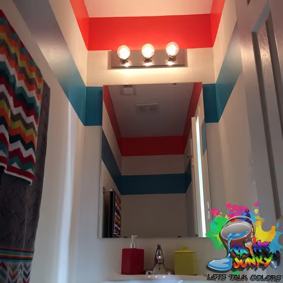
- Behr Emergency Zone reviews (3 photos)
- What are Behr Emergency Zone undertones?
- Is Emergency Zone P190-6 cool or warm?
- How light temperature affects on Emergency Zone
- Monochromatic color scheme
- Complementary color scheme
- Color comparison and matching
- LRV of Emergency Zone P190-6
- Color codes
- Color equivalents
| Code: | P190-6 |
| Name: | Emergency Zone |
| Brand: | Behr |
What color is Behr Emergency Zone?
Bring a touch of sophistication to your space with the deep hues of Behr Emergency Zone (P190-6). This rich shade adds depth and drama, creating a bold statement in any room. Pair Emergency Zone with soft neutrals like cream or gray for a balanced look, or accentuate its intensity with pops of teal or mustard yellow for a dynamic color palette. Experiment with textures like velvet or metallic finishes to enhance the luxurious feel of this stunning paint color. Embrace the allure of Emergency Zone and transform your space into a stylish sanctuary.
Loading...
LRV of Emergency Zone
Emergency Zone has an LRV of 25.12% and refers to Medium colors that reflect a lot of light. Why LRV is important?

Light Reflectance Value measures the amount of visible and usable light that reflects from a painted surface.
Simply put, the higher the LRV of a paint color, the brighter the room you will get.
The scale goes from 0% (absolute black, absorbing all light) to 100% (pure white, reflecting all light).
Act like a pro: When choosing paint with an LRV of 25.12%, pay attention to your bulbs' brightness. Light brightness is measured in lumens. The lower the paint's LRV, the higher lumen level you need. Every square foot of room needs at least 40 lumens. That means for a 200 ft2 living room you'll need about 8000 lumens of light – e.g., eight 1000 lm bulbs.
Color codes
We have collected almost every possible color code you could ever need.
Not sure what the difference between HEX and RGB is? We break down color models in plain language. Understanding color models
| Format | Code |
|---|---|
| HEX | #e36940 |
| RGB Decimal | 227, 105, 64 |
| RGB Percent | 89.02%, 41.18%, 25.10% |
| HSV | Hue: 15° Saturation: 71.81% Value: 89.02% |
| HSL | hsl(15, 74, 57) |
| CMYK | Cyan: 0.0 Magenta: 53.74 Yellow: 71.81 Key: 10.98 |
| YIQ | Y: 136.804 I: 85.875 Q: 13.048 |
| XYZ | X: 37.659 Y: 26.809 Z: 8.041 |
| CIE Lab | L:58.797 a:44.836 b:45.052 |
| CIE Luv | L:58.797 u:96.971 v:39.563 |
| Decimal | 14903616 |
| Hunter Lab | 51.777, 39.217, 27.037 |