Behr Moss Print PPU11-08
Contentsshow +hide -
| Code: | PPU11-08 |
| Name: | Moss Print |
| Brand: | Behr |
What color is Behr Moss Print?
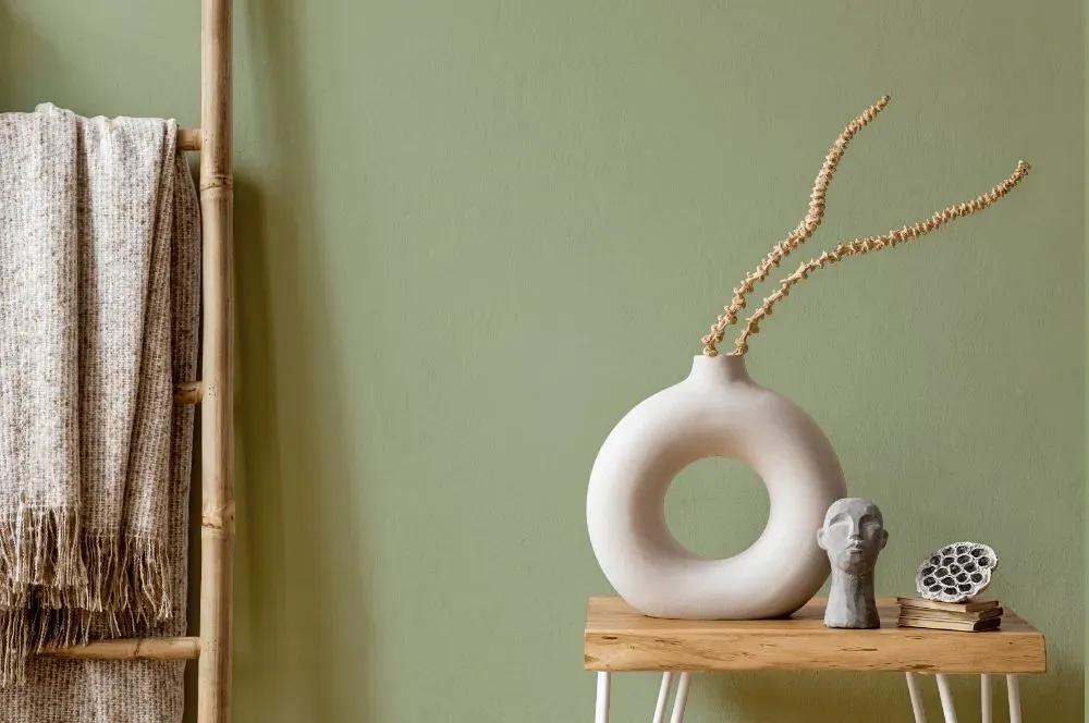
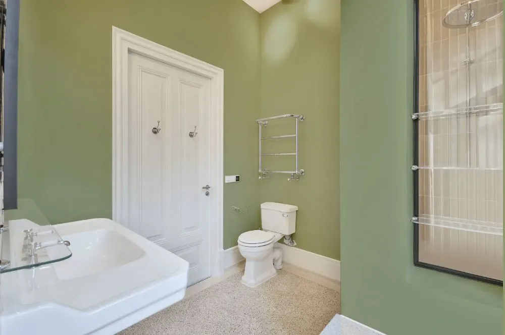
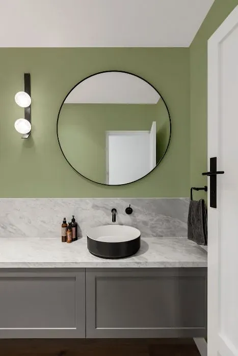
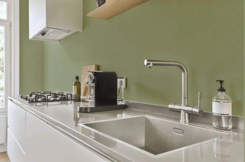
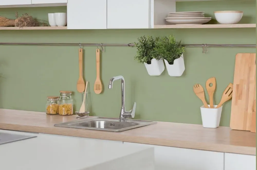
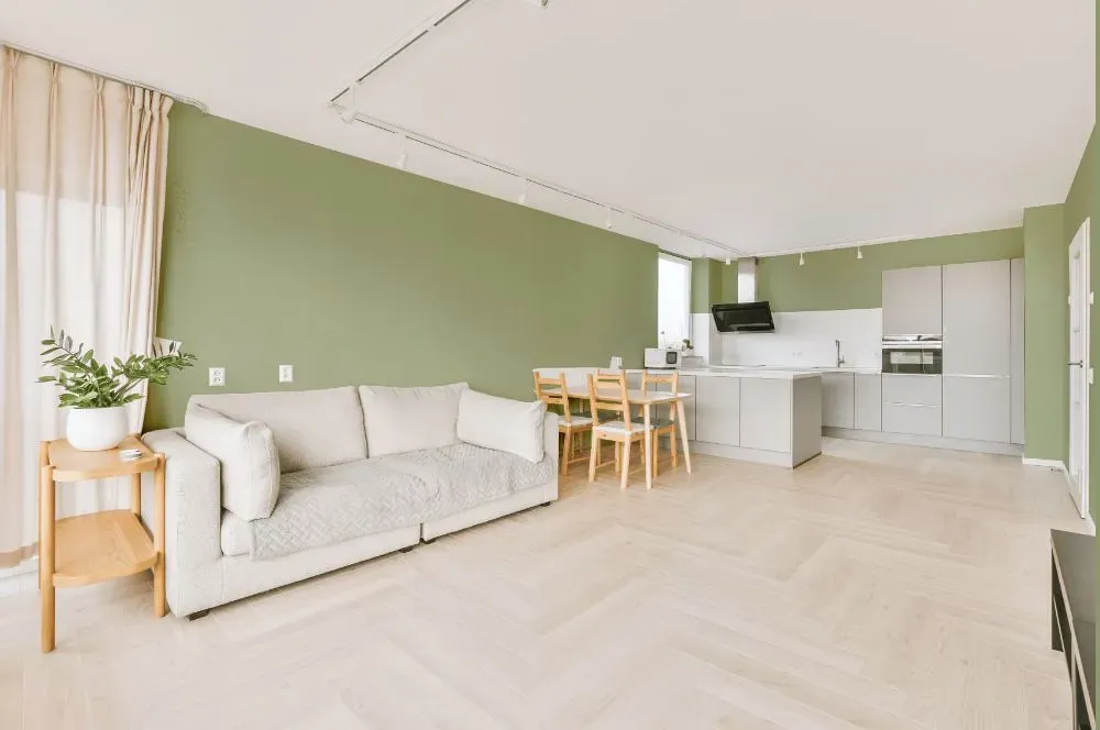
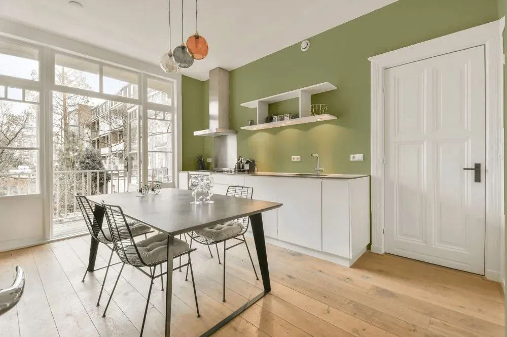
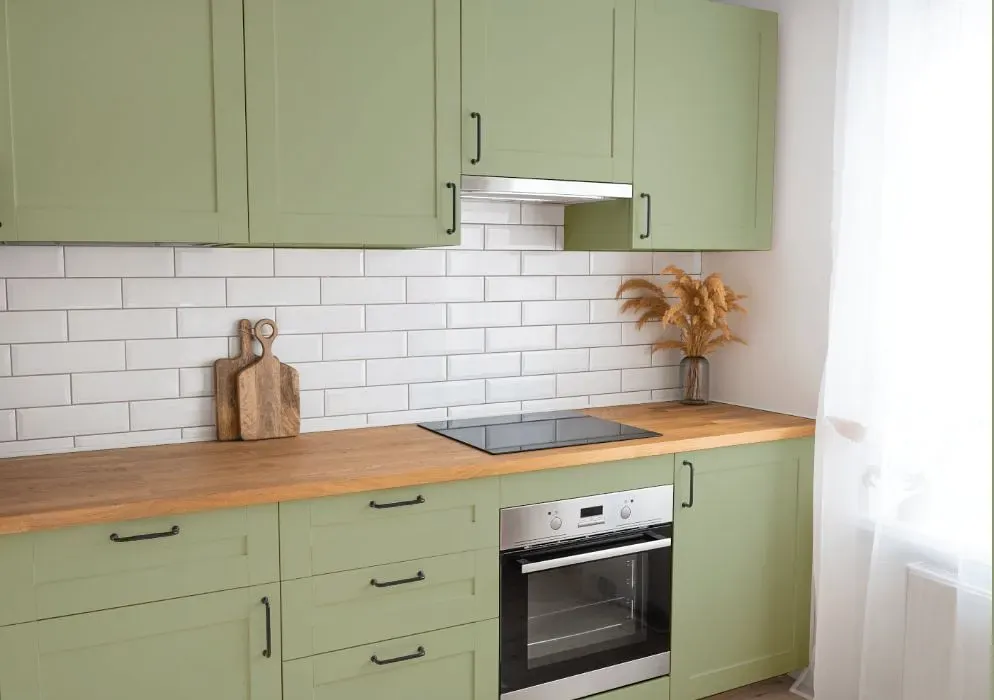
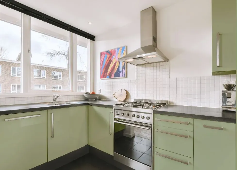
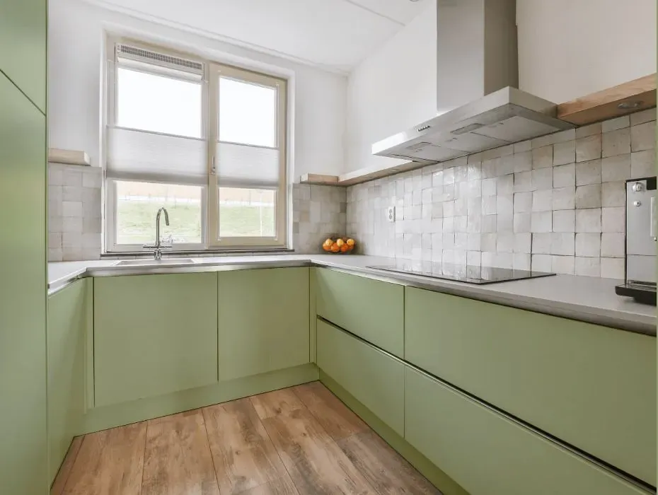
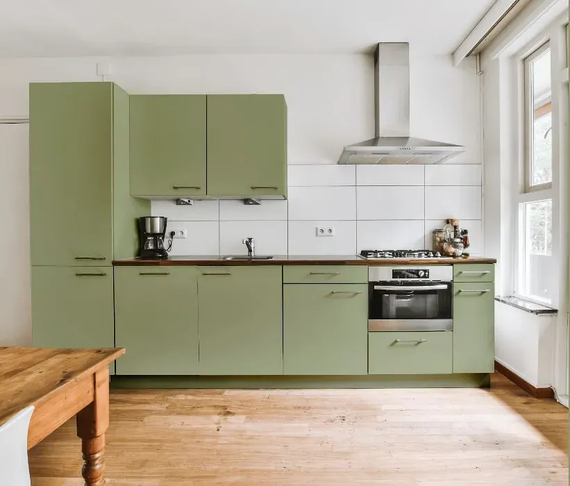
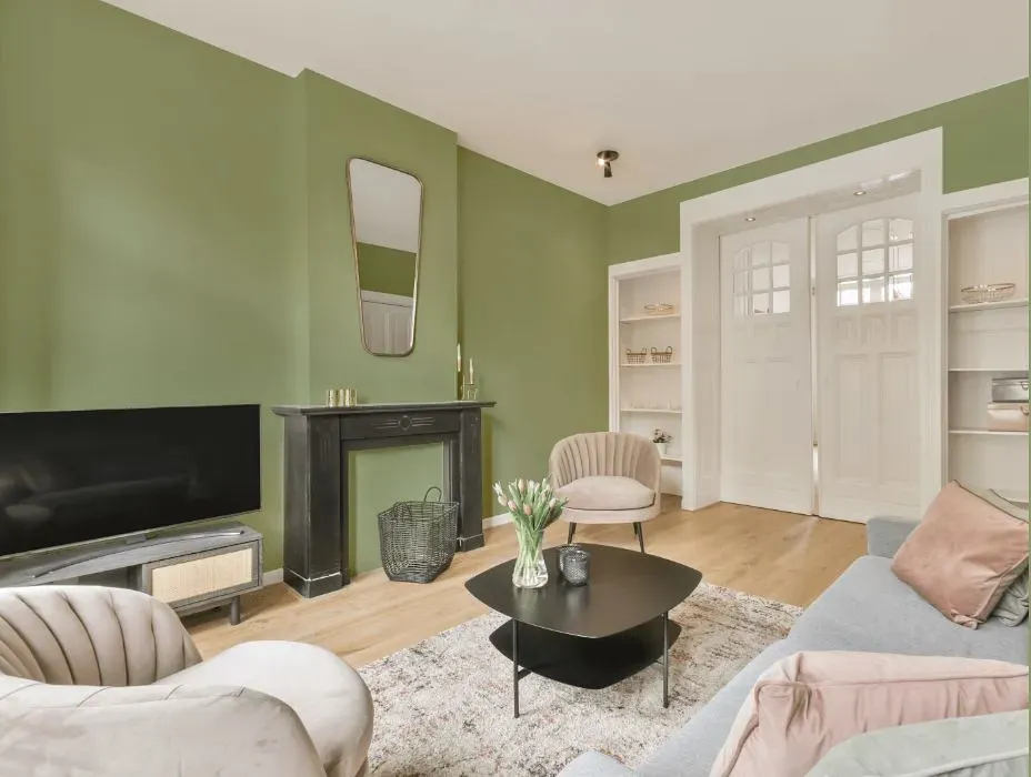
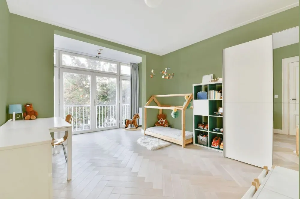
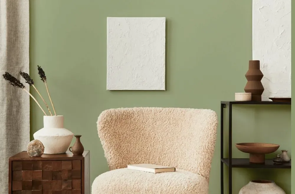
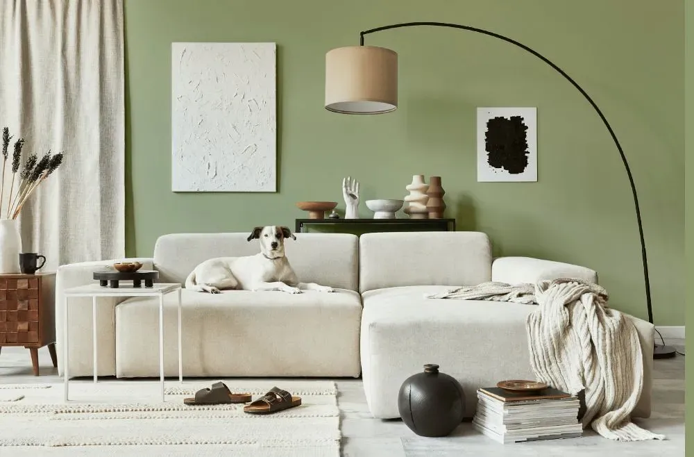
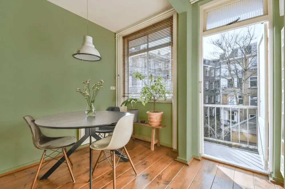
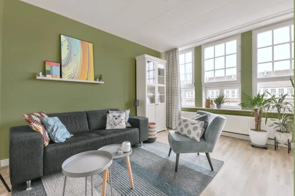
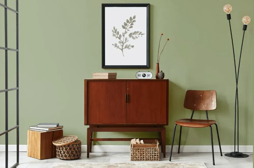
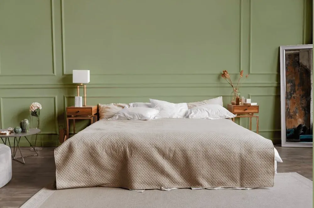
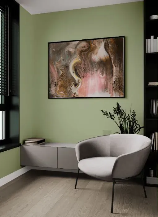
Transform your space with the serene beauty of Behr PPU11-08 Moss Print. This soothing green hue infuses a sense of nature and tranquility into any room. Pair Moss Print with warm neutrals like oatmeal and sandy beige for a harmonious and inviting look. For a pop of contrast, consider accents in deep blues or rich rust tones to elevate the palette. Whether used in a living room, bedroom, or kitchen, Moss Print adds a touch of sophistication and style to your home decor. Elevate your space with this versatile and sophisticated color choice that pairs effortlessly with a range of complementary hues.
Loading...
LRV of Moss Print
Moss Print has an LRV of 43.95% and refers to Light Medium colors that reflect half of the incident light. Why LRV is important?

Light Reflectance Value measures the amount of visible and usable light that reflects from a painted surface.
Simply put, the higher the LRV of a paint color, the brighter the room you will get.
The scale goes from 0% (absolute black, absorbing all light) to 100% (pure white, reflecting all light).
Act like a pro: When choosing paint with an LRV of 43.95%, pay attention to your bulbs' brightness. Light brightness is measured in lumens. The lower the paint's LRV, the higher lumen level you need. Every square foot of room needs at least 40 lumens. That means for a 200 ft2 living room you'll need about 8000 lumens of light – e.g., eight 1000 lm bulbs.
Color codes
We have collected almost every possible color code you could ever need.
Not sure what the difference between HEX and RGB is? We break down color models in plain language. Understanding color models
| Format | Code |
|---|---|
| HEX | #afb796 |
| RGB Decimal | 175, 183, 150 |
| RGB Percent | 68.63%, 71.76%, 58.82% |
| HSV | Hue: 75° Saturation: 18.03% Value: 71.76% |
| HSL | hsl(75, 19, 65) |
| CMYK | Cyan: 4.37 Magenta: 0.0 Yellow: 18.03 Key: 28.24 |
| YIQ | Y: 176.846 I: 5.837 Q: -11.962 |
| XYZ | X: 40.117 Y: 45.183 Z: 35.454 |
| CIE Lab | L:73.012 a:-8.615 b:15.876 |
| CIE Luv | L:73.012 u:-2.992 v:23.761 |
| Decimal | 11515798 |
| Hunter Lab | 67.218, -11.101, 15.781 |