Benjamin Moore Berry Wine 2003-30
Contentsshow +hide -
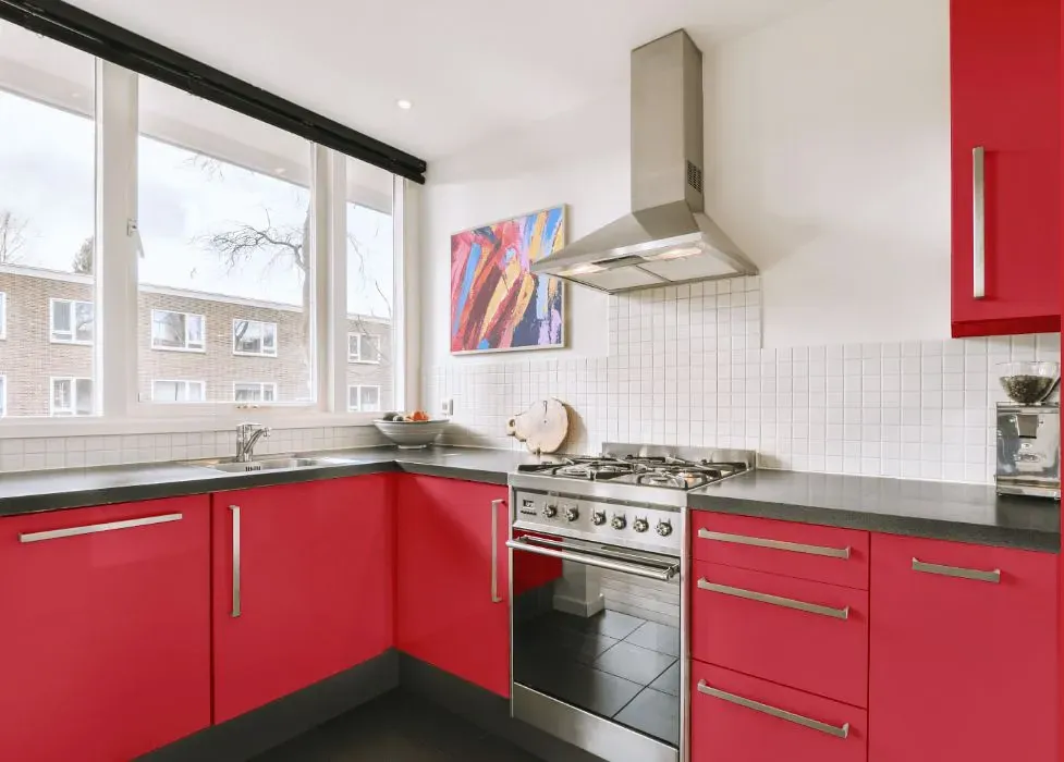
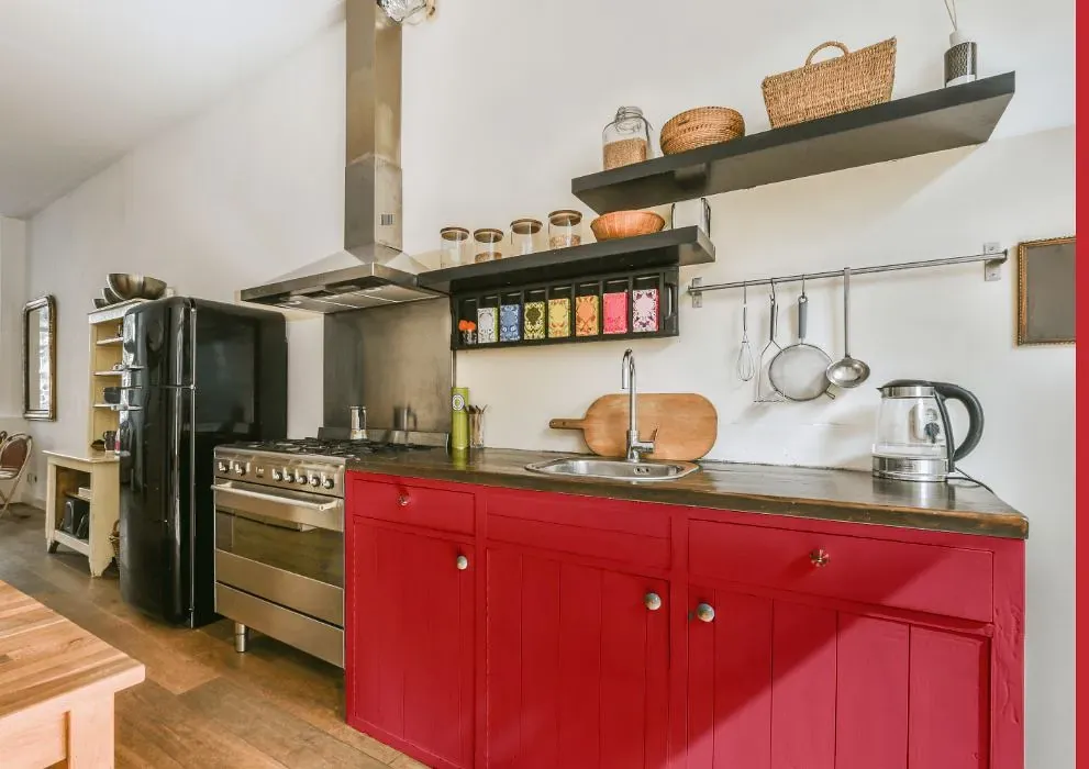
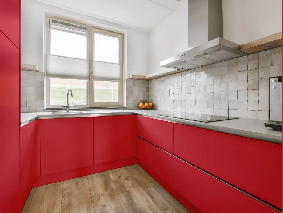
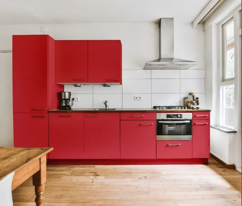
- Benjamin Moore Berry Wine reviews (23 photos)
- What are Benjamin Moore Berry Wine undertones?
- Is Berry Wine 2003-30 cool or warm?
- How light temperature affects on Berry Wine
- Monochromatic color scheme
- Complementary color scheme
- Color comparison and matching
- LRV of Berry Wine 2003-30
- Color codes
- Color equivalents
| Official page: | Berry Wine 2003-30 |
| Code: | 2003-30 |
| Name: | Berry Wine |
| Brand: | Benjamin Moore |
What color is Benjamin Moore Berry Wine?
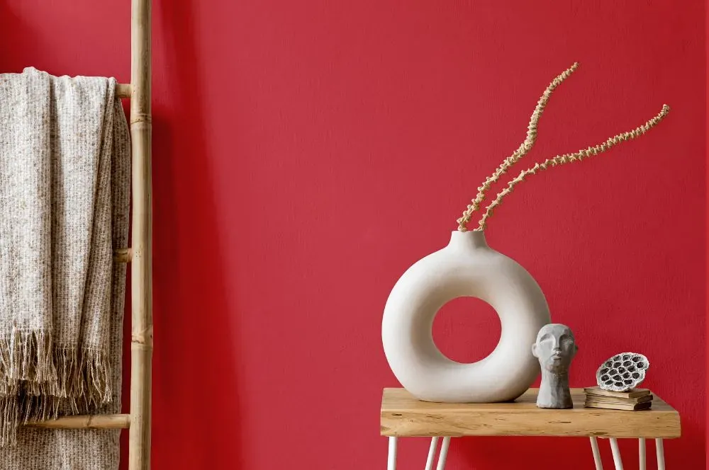
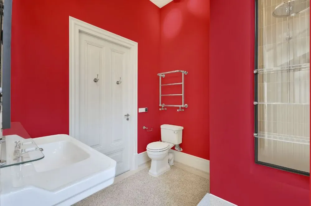
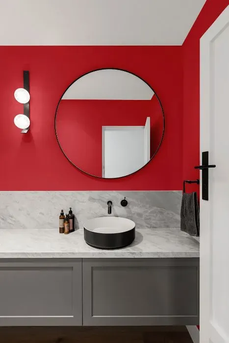
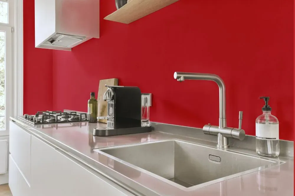
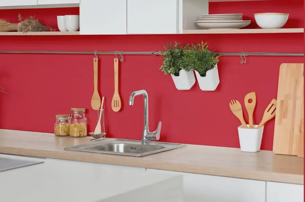
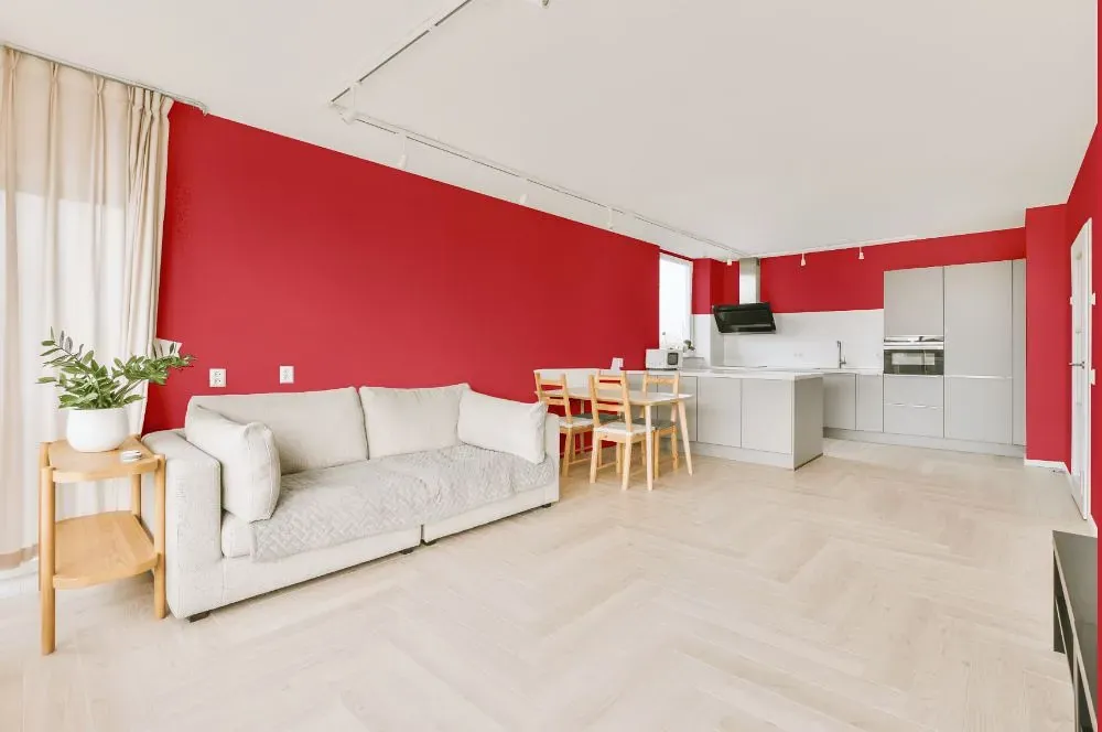
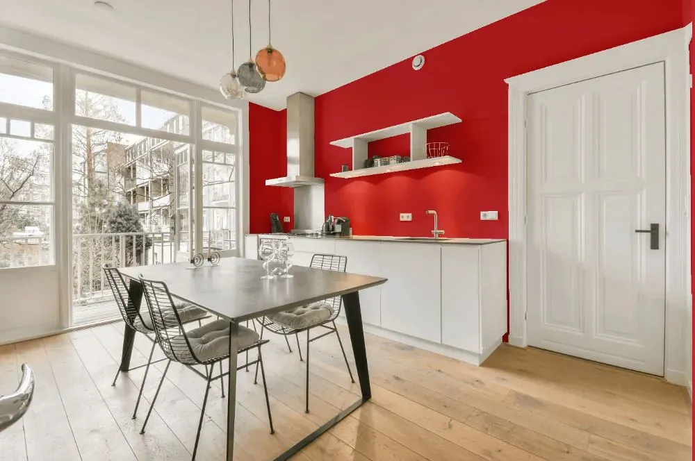
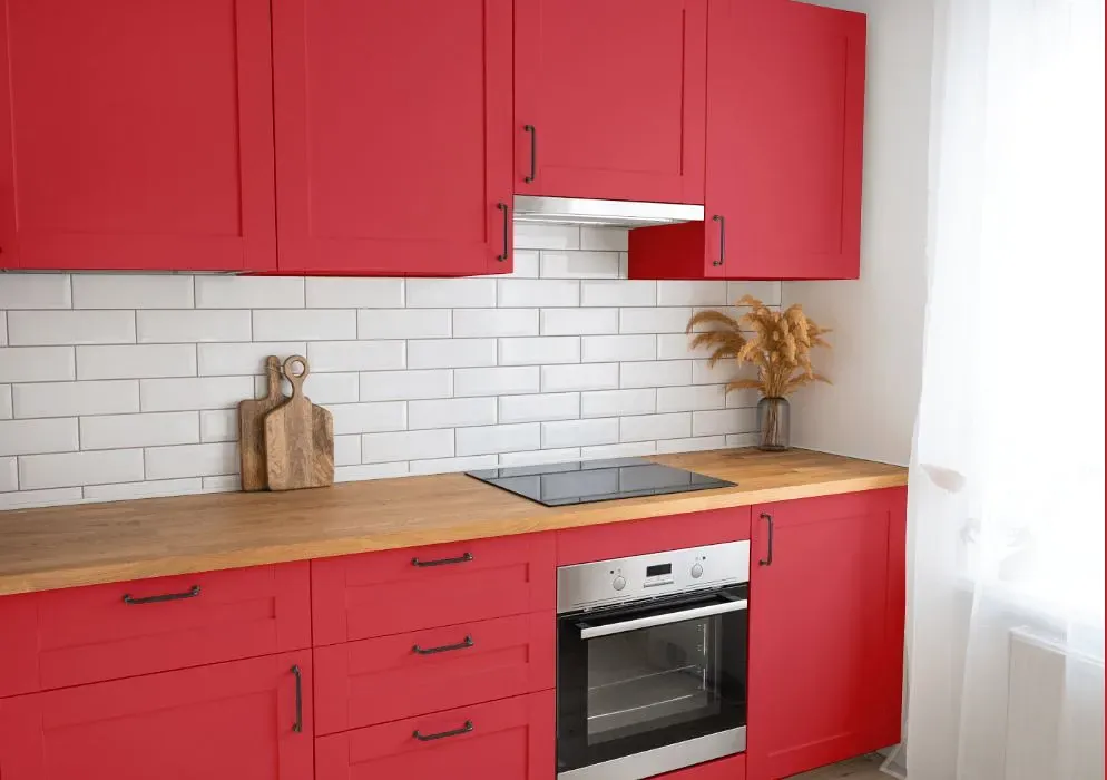
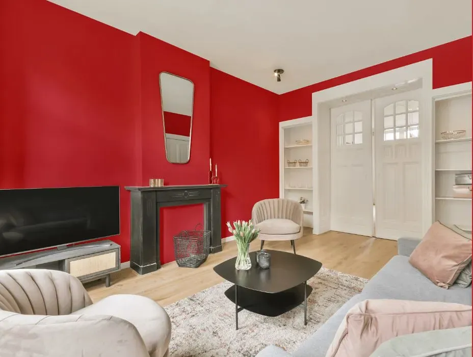
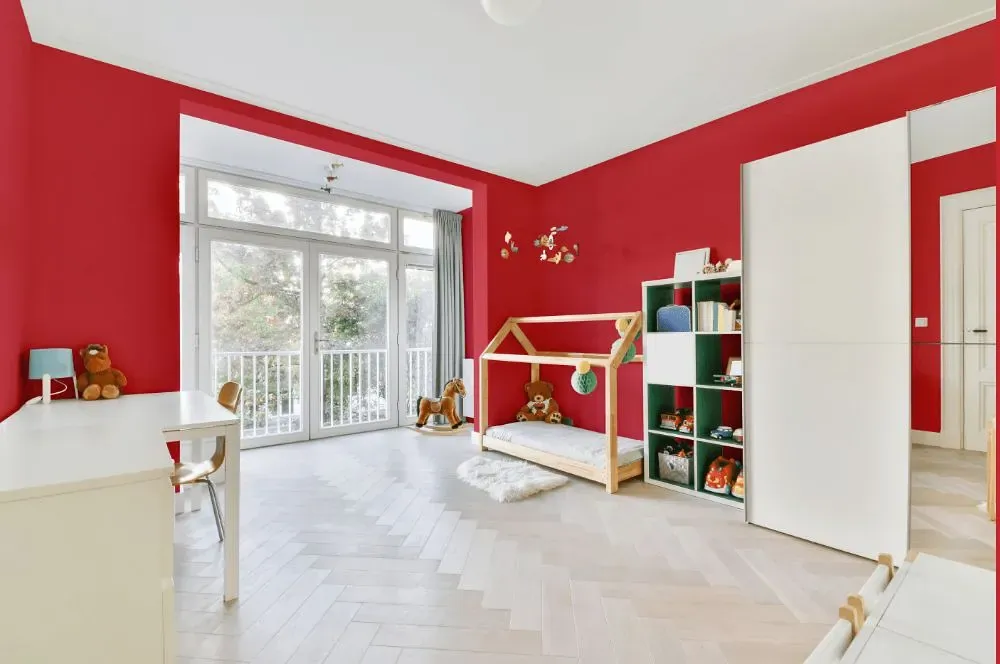
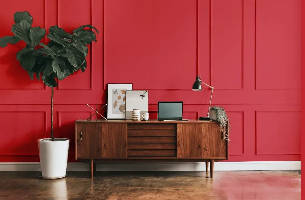
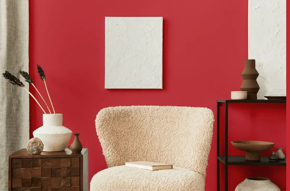
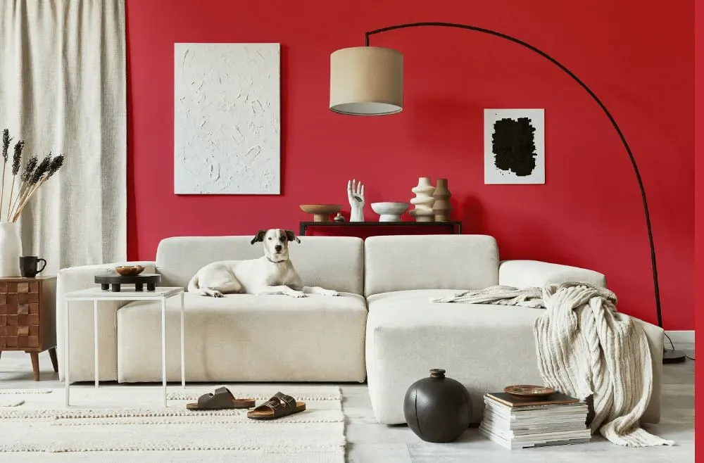
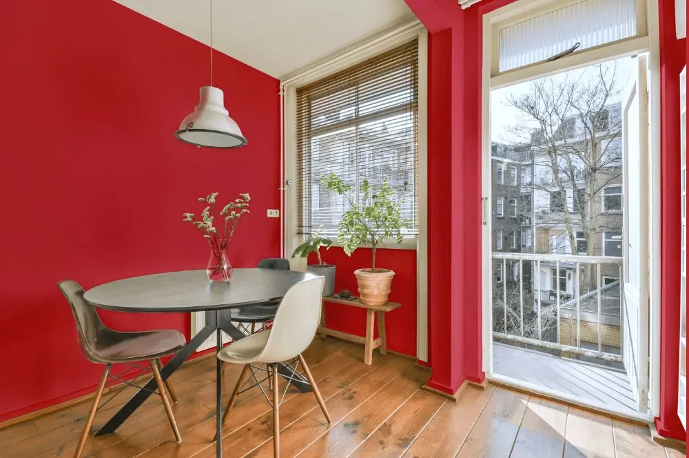
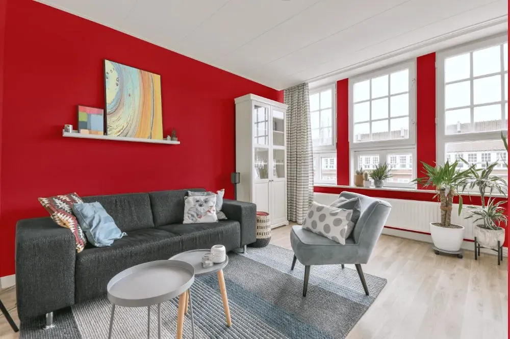
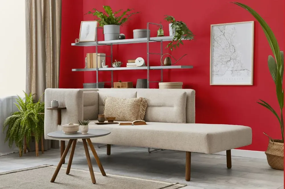
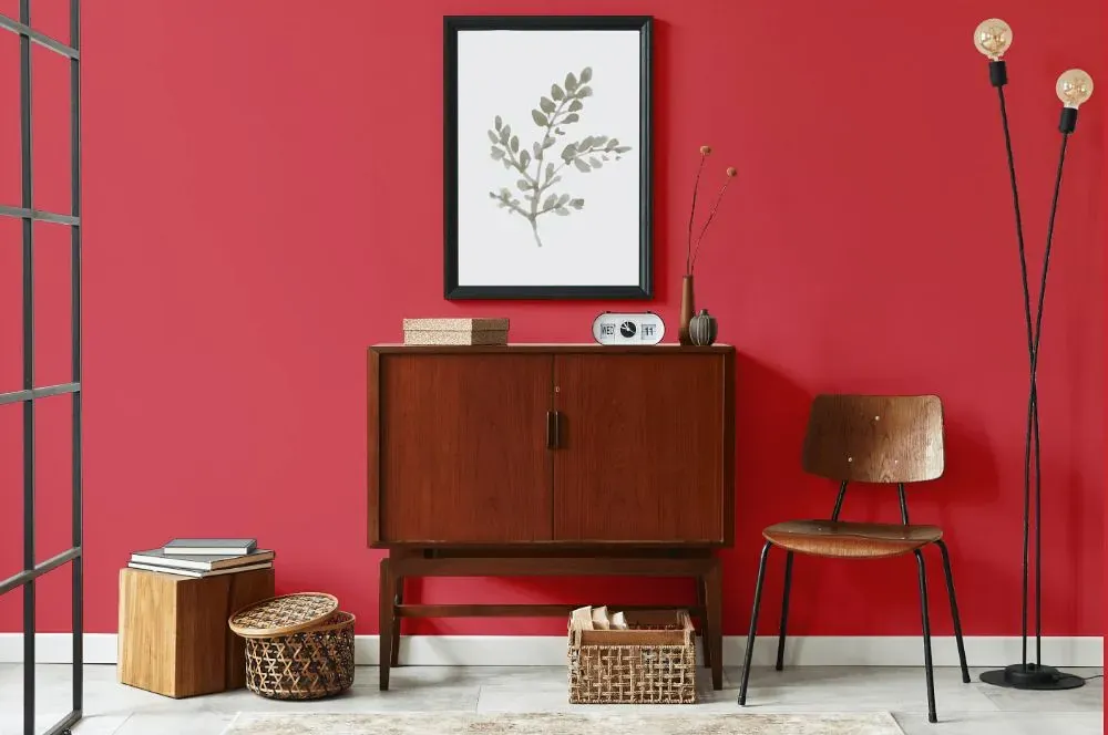
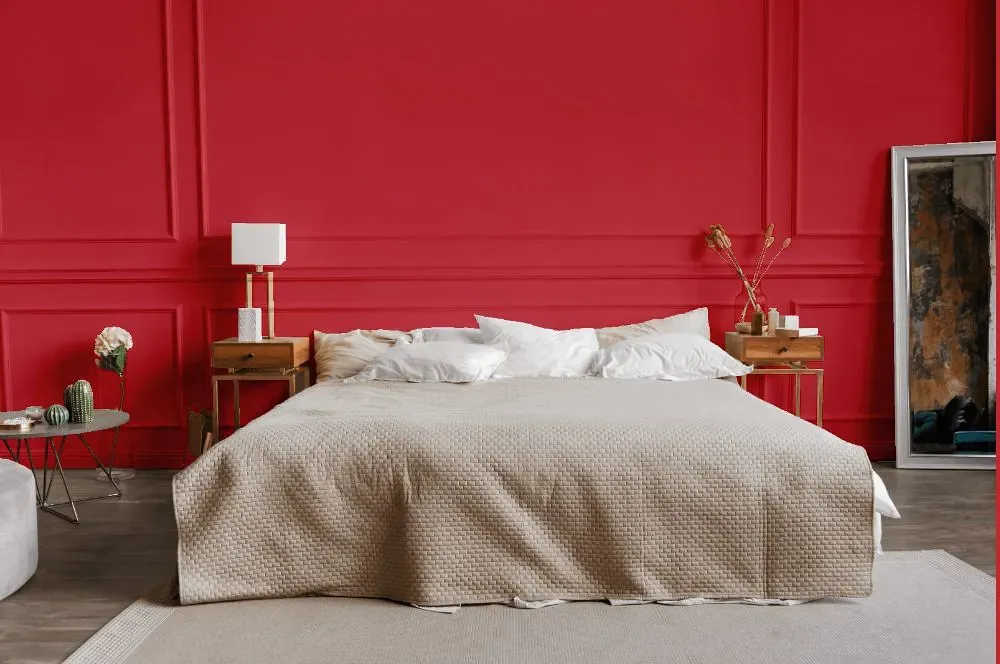
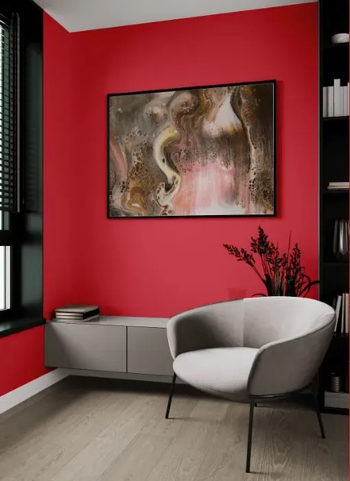
Step into a world of sophistication and elegance with Benjamin Moore's Berry Wine (2003-30). This rich and luxurious hue adds depth and warmth to any space, making it perfect for rooms where you want to create a sense of intimacy and refinement. Imagine your dining room bathed in the luscious tones of Berry Wine, inviting guests to linger over meals in a cozy and inviting atmosphere. Bring a touch of drama to your bedroom or study with this deep, moody shade, creating a retreat that feels both opulent and comforting. Embrace the richness of Berry Wine (2003-30) in spaces where you want to make a bold statement and infuse a sense of opulence and depth.
Loading...
LRV of Berry Wine
Berry Wine has an LRV of 20.56% and refers to Medium colors that reflect a lot of light. Why LRV is important?

Light Reflectance Value measures the amount of visible and usable light that reflects from a painted surface.
Simply put, the higher the LRV of a paint color, the brighter the room you will get.
The scale goes from 0% (absolute black, absorbing all light) to 100% (pure white, reflecting all light).
Act like a pro: When choosing paint with an LRV of 20.56%, pay attention to your bulbs' brightness. Light brightness is measured in lumens. The lower the paint's LRV, the higher lumen level you need. Every square foot of room needs at least 40 lumens. That means for a 200 ft2 living room you'll need about 8000 lumens of light – e.g., eight 1000 lm bulbs.
Color codes
We have collected almost every possible color code you could ever need.
Not sure what the difference between HEX and RGB is? We break down color models in plain language. Understanding color models
| Format | Code |
|---|---|
| HEX | #D44C57 |
| RGB Decimal | 212, 76, 87 |
| RGB Percent | 83.14%, 29.80%, 34.12% |
| HSV | Hue: 355° Saturation: 64.15% Value: 83.14% |
| HSL | hsl(355, 61, 56) |
| CMYK | Cyan: 0.0 Magenta: 64.15 Yellow: 58.96 Key: 16.86 |
| YIQ | Y: 117.918 I: 77.508 Q: 32.192 |
| XYZ | X: 31.459 Y: 19.858 Z: 11.191 |
| CIE Lab | L:51.676 a:54.154 b:23.0 |
| CIE Luv | L:51.676 u:100.034 v:16.221 |
| Decimal | 13913175 |
| Hunter Lab | 44.562, 48.027, 16.305 |