Benjamin Moore Neon Red 2087-10
Contentsshow +hide -
| Official page: | Neon Red 2087-10 |
| Code: | 2087-10 |
| Name: | Neon Red |
| Brand: | Benjamin Moore |
What color is Benjamin Moore Neon Red?
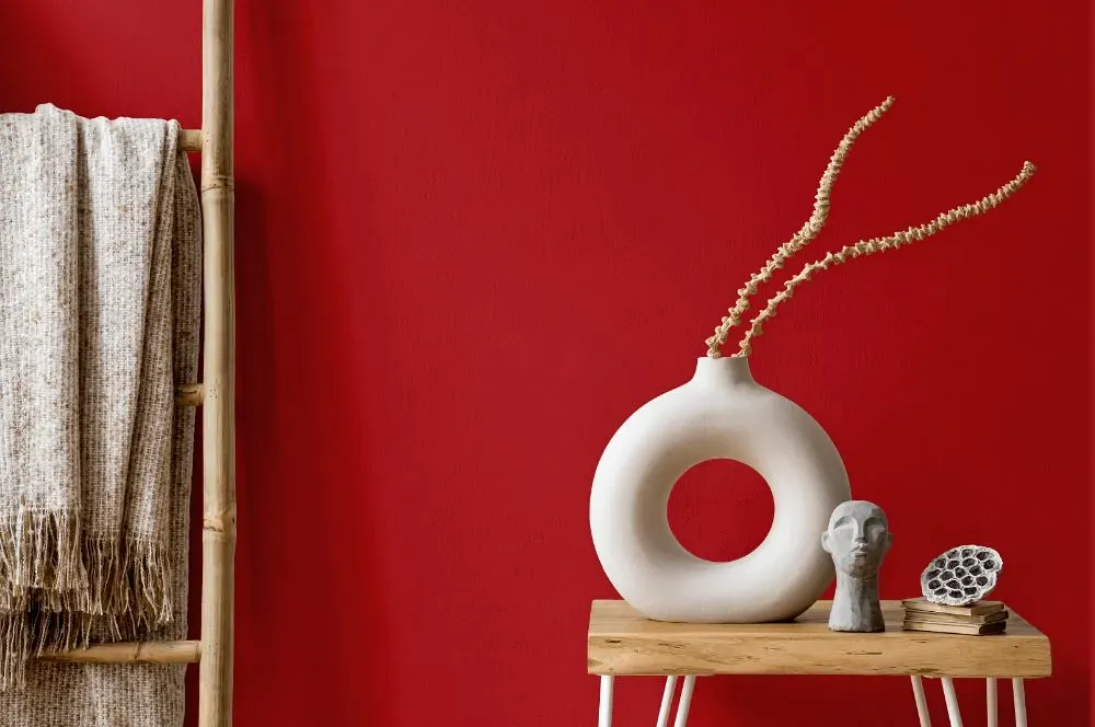
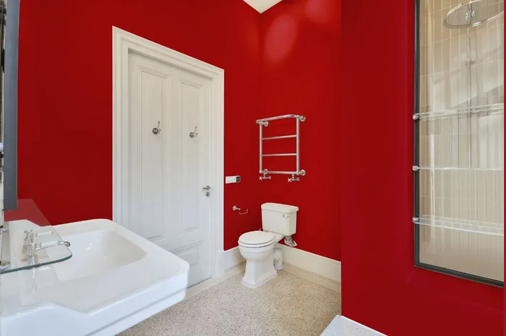
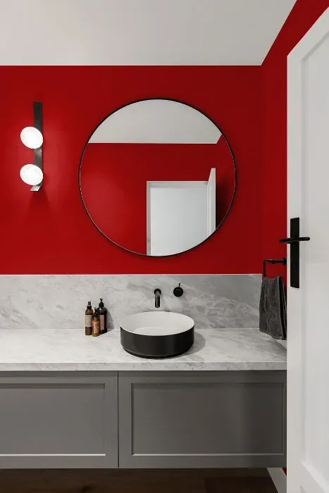
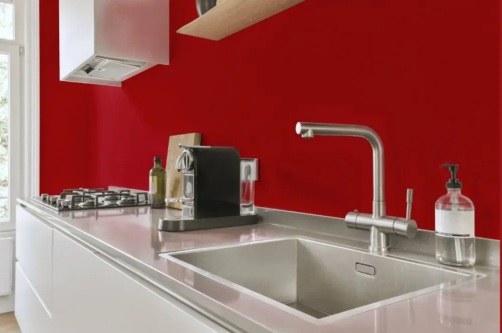
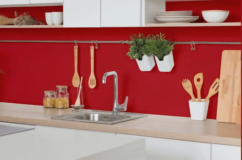
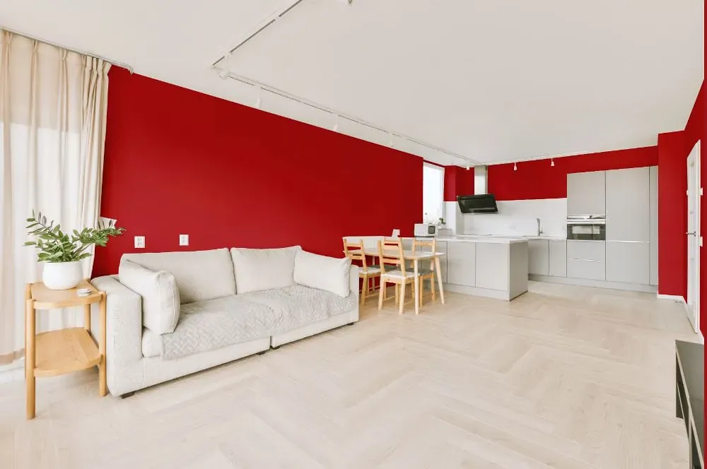
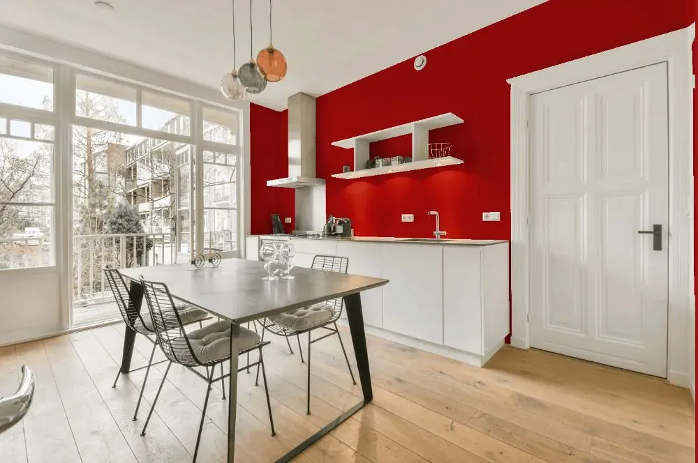
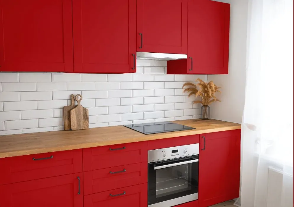
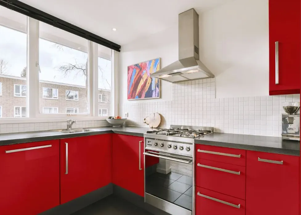
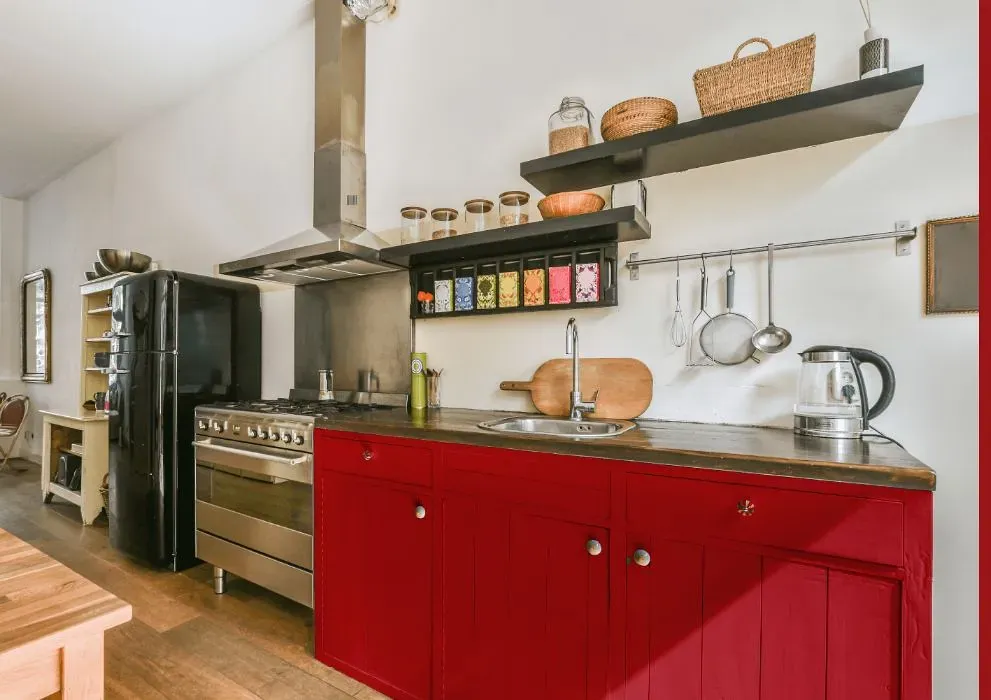
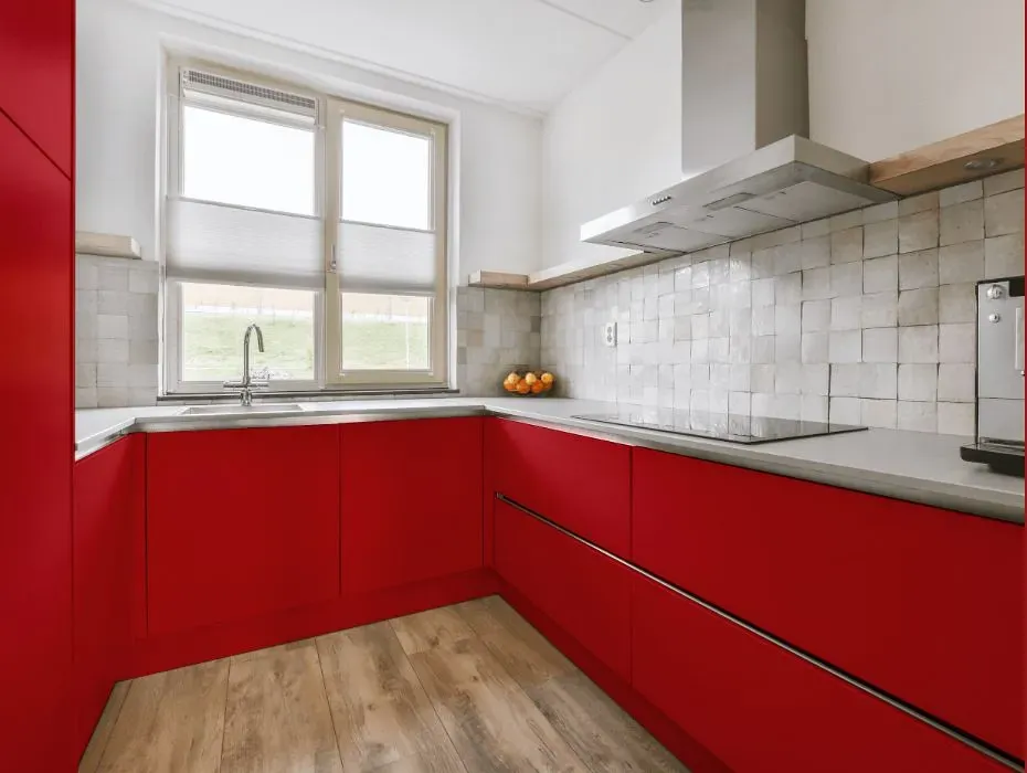
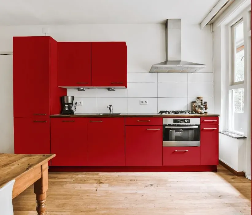
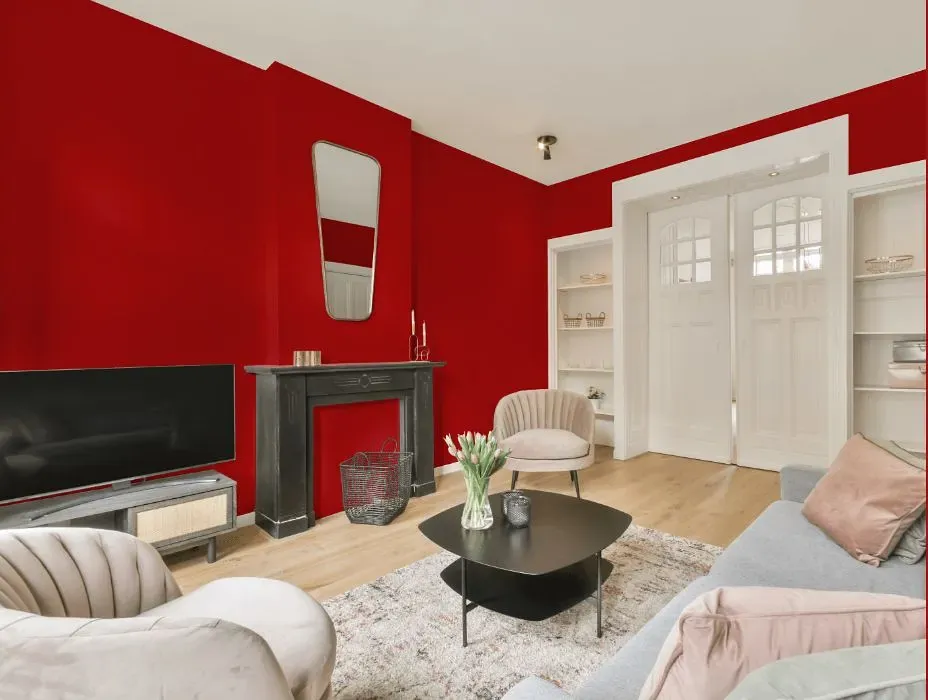
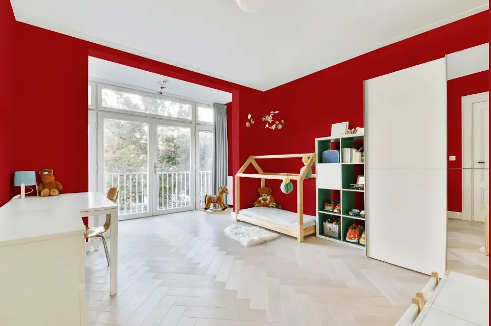
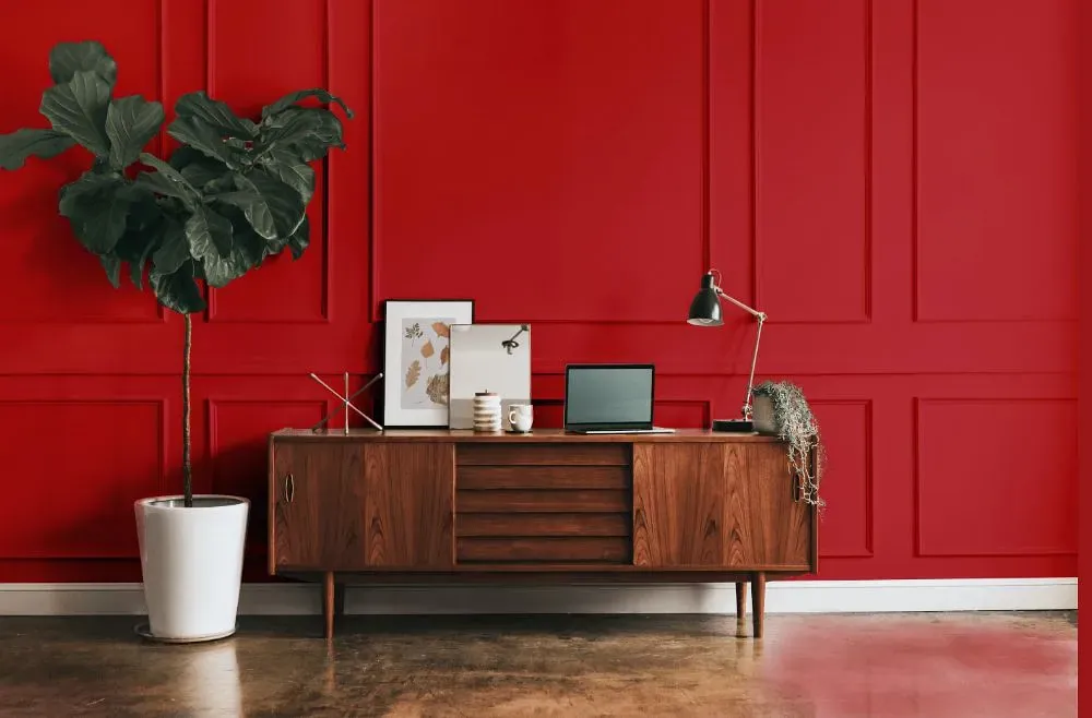
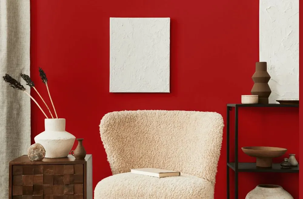
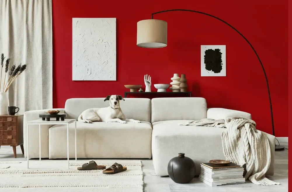
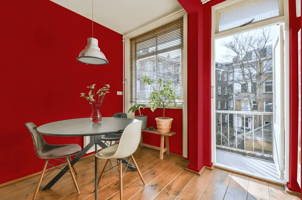
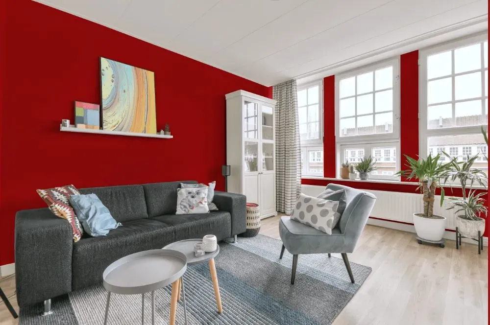
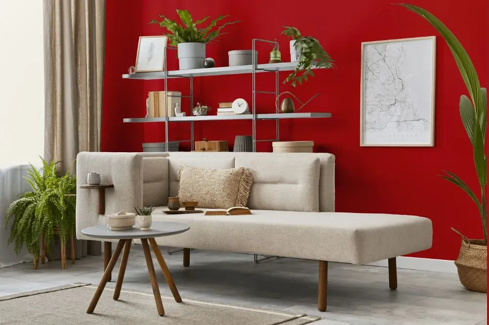
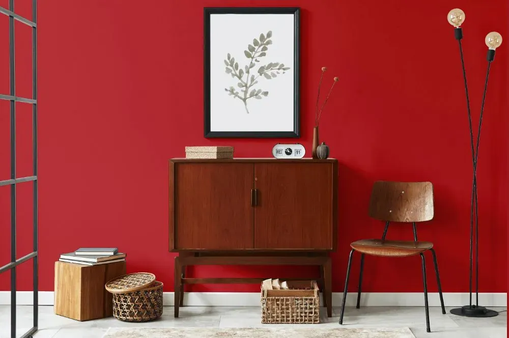
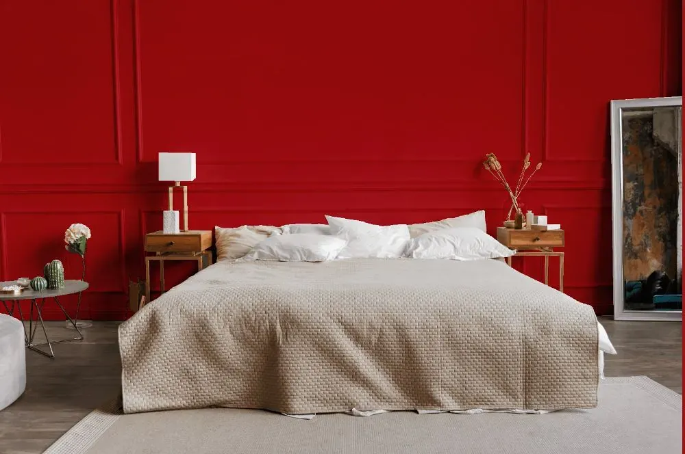
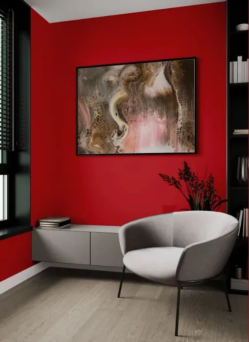
Benjamin Moore 2087-10 Neon Red is a vibrant hue that demands attention in any space. This electrifying shade injects energy and passion into a room, making it a bold statement choice for those who crave a pop of color. Pair Benjamin Moore Neon Red with neutral tones like soft beige or crisp white to create a balanced and modern look. For a more daring approach, combine it with deep navy or charcoal grey for a dramatic and edgy aesthetic. This dynamic color adds a lively touch to interiors and can be used to create a visually striking focal point.
Loading...
LRV of Neon Red
Neon Red has an LRV of 12.51% and refers to Medium Dark which means that this color reflects very little light. Why LRV is important?

Light Reflectance Value measures the amount of visible and usable light that reflects from a painted surface.
Simply put, the higher the LRV of a paint color, the brighter the room you will get.
The scale goes from 0% (absolute black, absorbing all light) to 100% (pure white, reflecting all light).
Act like a pro: When choosing paint with an LRV of 12.51%, pay attention to your bulbs' brightness. Light brightness is measured in lumens. The lower the paint's LRV, the higher lumen level you need. Every square foot of room needs at least 40 lumens. That means for a 200 ft2 living room you'll need about 8000 lumens of light – e.g., eight 1000 lm bulbs.
Color codes
We have collected almost every possible color code you could ever need.
Not sure what the difference between HEX and RGB is? We break down color models in plain language. Understanding color models
| Format | Code |
|---|---|
| HEX | #B82D33 |
| RGB Decimal | 184, 45, 51 |
| RGB Percent | 72.16%, 17.65%, 20.00% |
| HSV | Hue: 357° Saturation: 75.54% Value: 72.16% |
| HSL | hsl(357, 61, 45) |
| CMYK | Cyan: 0.0 Magenta: 75.54 Yellow: 72.28 Key: 27.84 |
| YIQ | Y: 87.245 I: 80.902 Q: 31.271 |
| XYZ | X: 21.305 Y: 12.309 Z: 4.385 |
| CIE Lab | L:41.704 a:55.007 b:30.934 |
| CIE Luv | L:41.704 u:103.615 v:20.219 |
| Decimal | 12070195 |
| Hunter Lab | 35.085, 46.997, 17.149 |