Benjamin Moore Bewitched CSP-450
Contentsshow +hide -
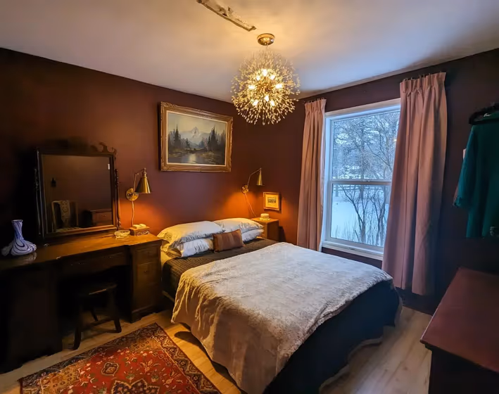
- Bewitched for bedroom (1 photo)
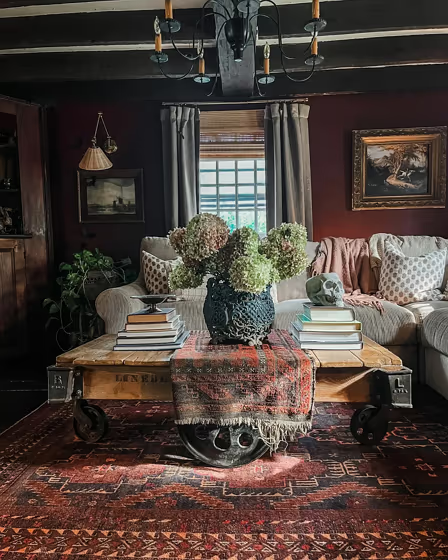
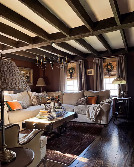
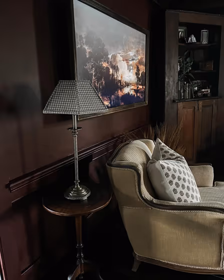
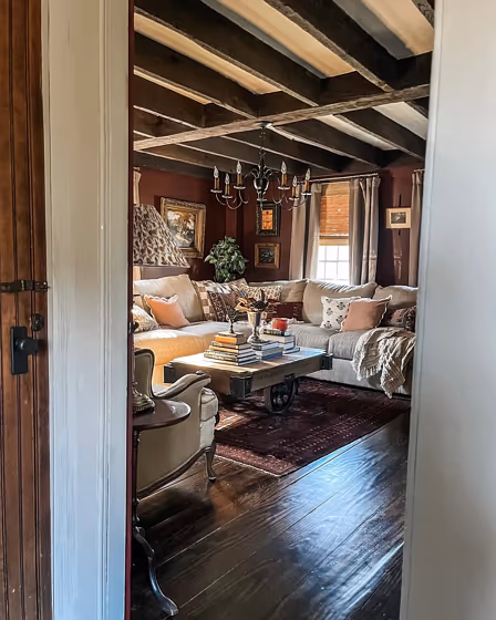
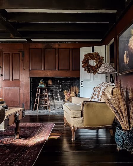
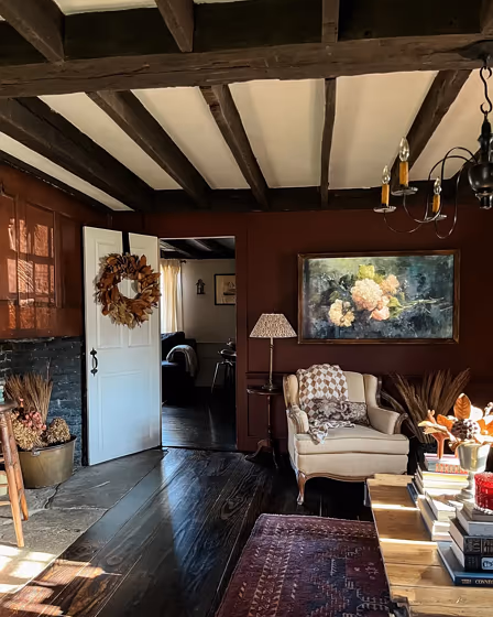
- Bewitched for living room (6 photos)
- What are Benjamin Moore Bewitched undertones?
- Is Bewitched CSP-450 cool or warm?
- How light temperature affects on Bewitched
- Monochromatic color scheme
- Complementary color scheme
- Color comparison and matching
- LRV of Bewitched CSP-450
- Color codes
- Color equivalents
| Official page: | Bewitched CSP-450 |
| Code: | CSP-450 |
| Name: | Bewitched |
| Brand: | Benjamin Moore |
What color is Benjamin Moore Bewitched?
Step into rooms painted with Benjamin Moore Bewitched (CSP-450) and feel enveloped in a cozy elegance. This rich, moody shade dances between deep charcoal and soft black, adding depth and sophistication to any space. Ideal for bedrooms, studies, and living rooms, Bewitched creates a luxurious atmosphere that invites relaxation and introspection. Pair it with warm metallic accents and plush textiles to enhance its allure. Let Bewitched be the enchanting backdrop that transforms your home into a sanctuary of refined comfort.
Loading...
LRV of Bewitched
Bewitched has an LRV of 6.37% and refers to Dark colors which means that this color almost does not reflect light. Why LRV is important?

Light Reflectance Value measures the amount of visible and usable light that reflects from a painted surface.
Simply put, the higher the LRV of a paint color, the brighter the room you will get.
The scale goes from 0% (absolute black, absorbing all light) to 100% (pure white, reflecting all light).
Act like a pro: When choosing paint with an LRV of 6.37%, pay attention to your bulbs' brightness. Light brightness is measured in lumens. The lower the paint's LRV, the higher lumen level you need. Every square foot of room needs at least 40 lumens. That means for a 200 ft2 living room you'll need about 8000 lumens of light – e.g., eight 1000 lm bulbs.
Color codes
We have collected almost every possible color code you could ever need.
Not sure what the difference between HEX and RGB is? We break down color models in plain language. Understanding color models
| Format | Code |
|---|---|
| HEX | #582F2F |
| RGB Decimal | 88, 47, 47 |
| RGB Percent | 34.51%, 18.43%, 18.43% |
| HSV | Hue: 0° Saturation: 46.59% Value: 34.51% |
| HSL | hsl(0, 30, 26) |
| CMYK | Cyan: 0.0 Magenta: 46.59 Yellow: 46.59 Key: 65.49 |
| YIQ | Y: 59.259 I: 24.432 Q: 8.673 |
| XYZ | X: 5.554 Y: 4.313 Z: 3.229 |
| CIE Lab | L:24.682 a:18.677 b:8.238 |
| CIE Luv | L:24.682 u:25.694 v:5.544 |
| Decimal | 5779247 |
| Hunter Lab | 20.769, 11.392, 5.321 |