Benjamin Moore Blush Tone 2000-50
Contentsshow +hide -
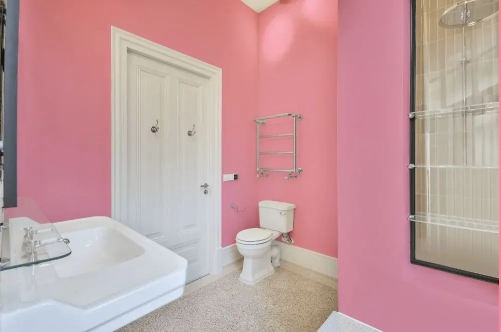
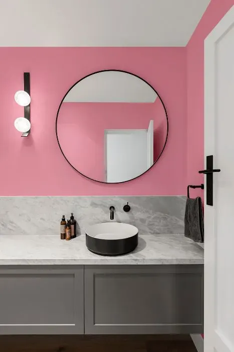
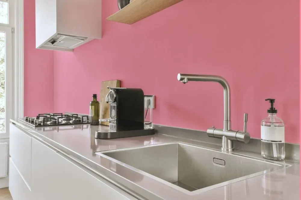
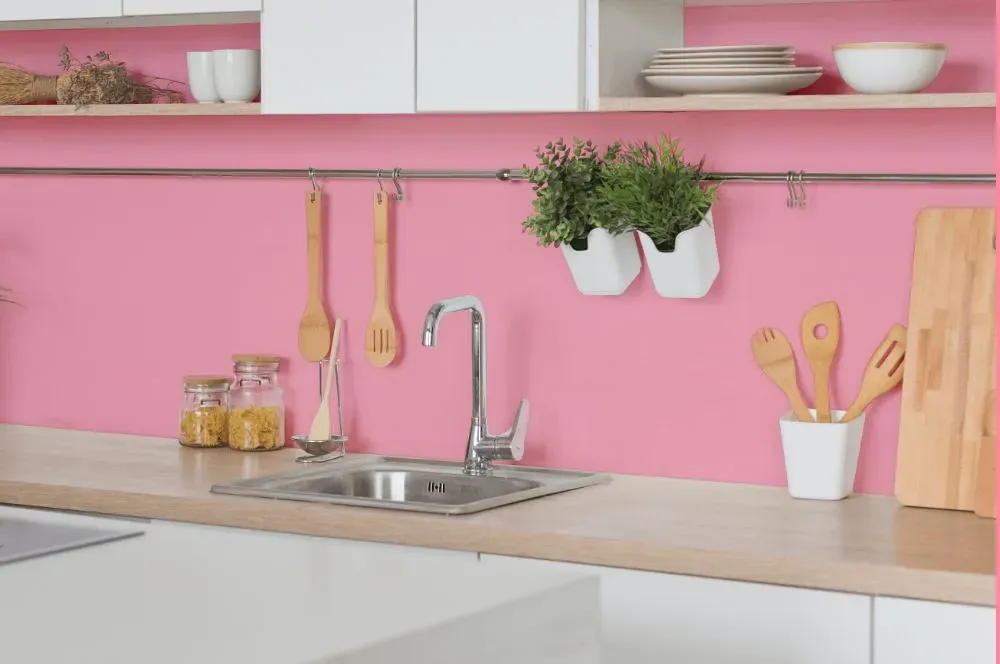
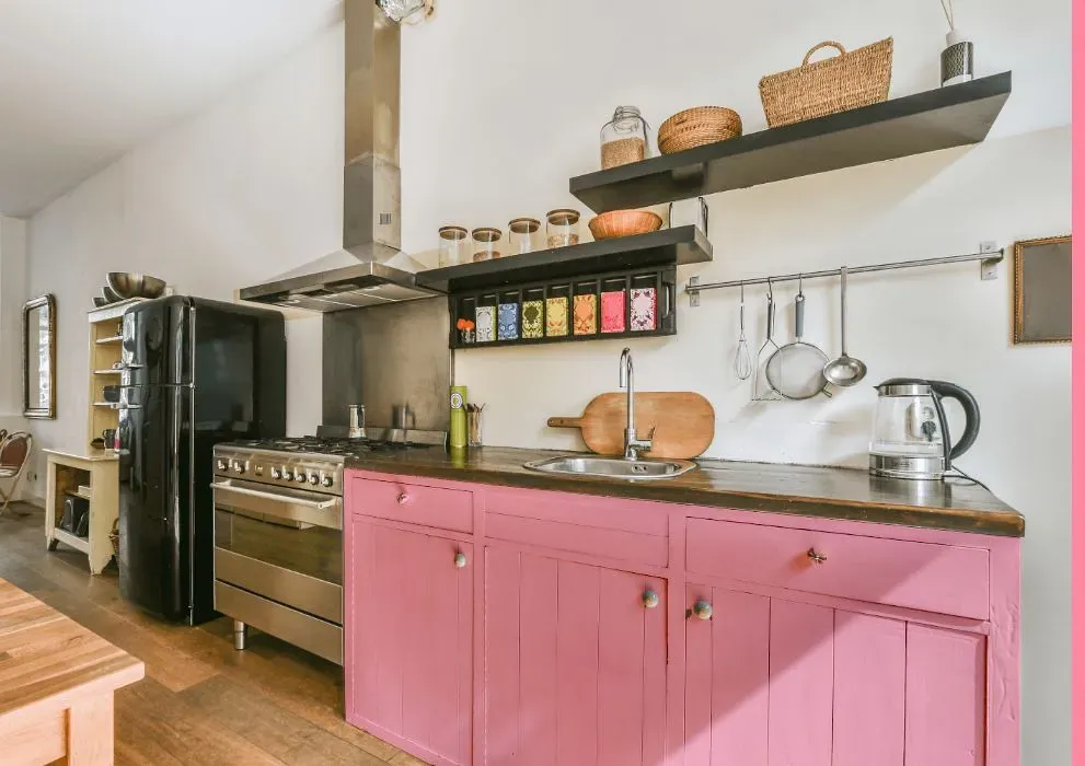
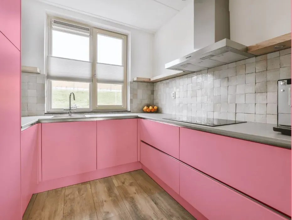
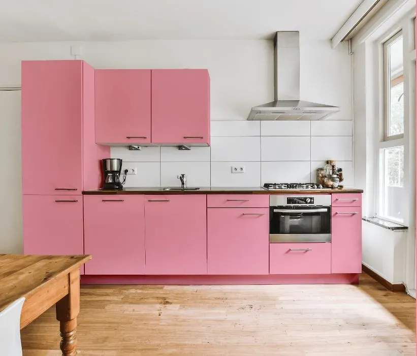
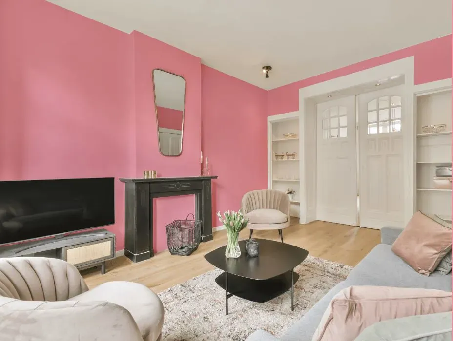
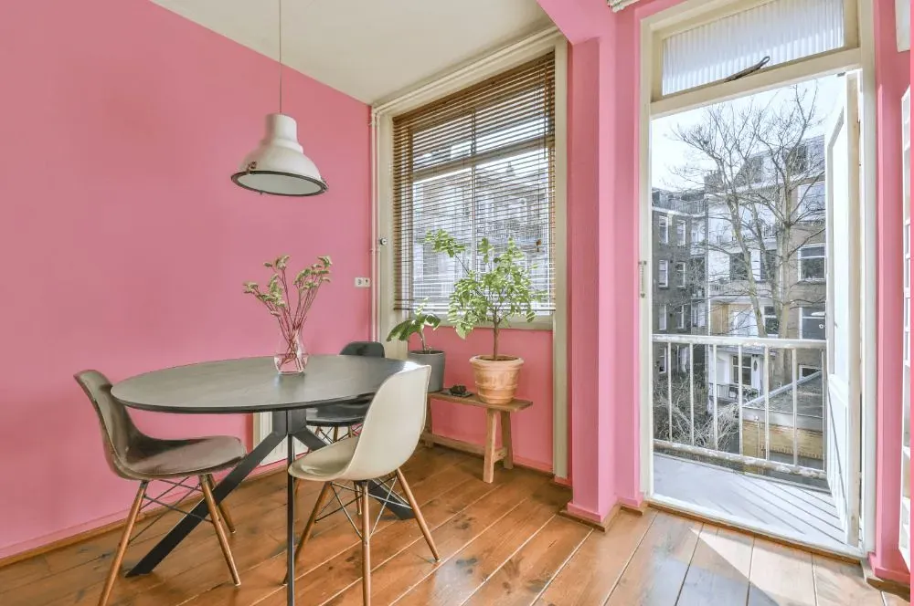
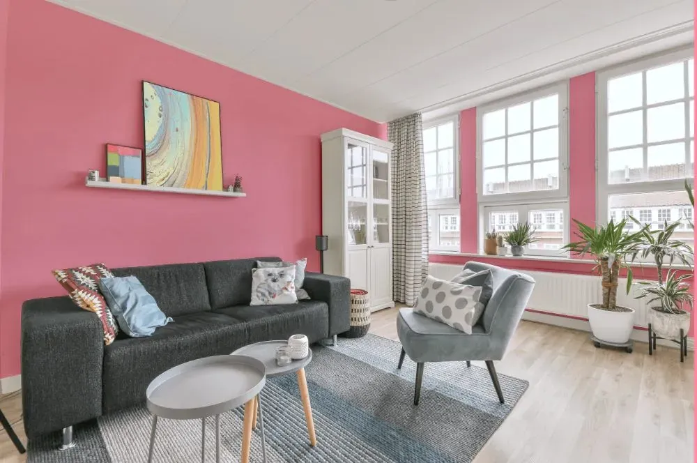
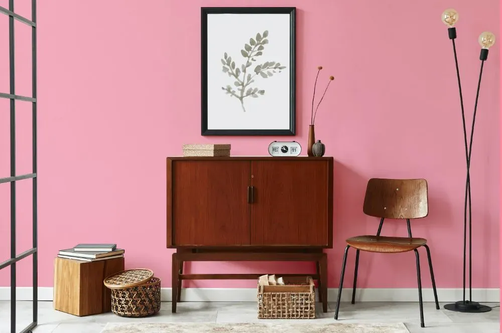
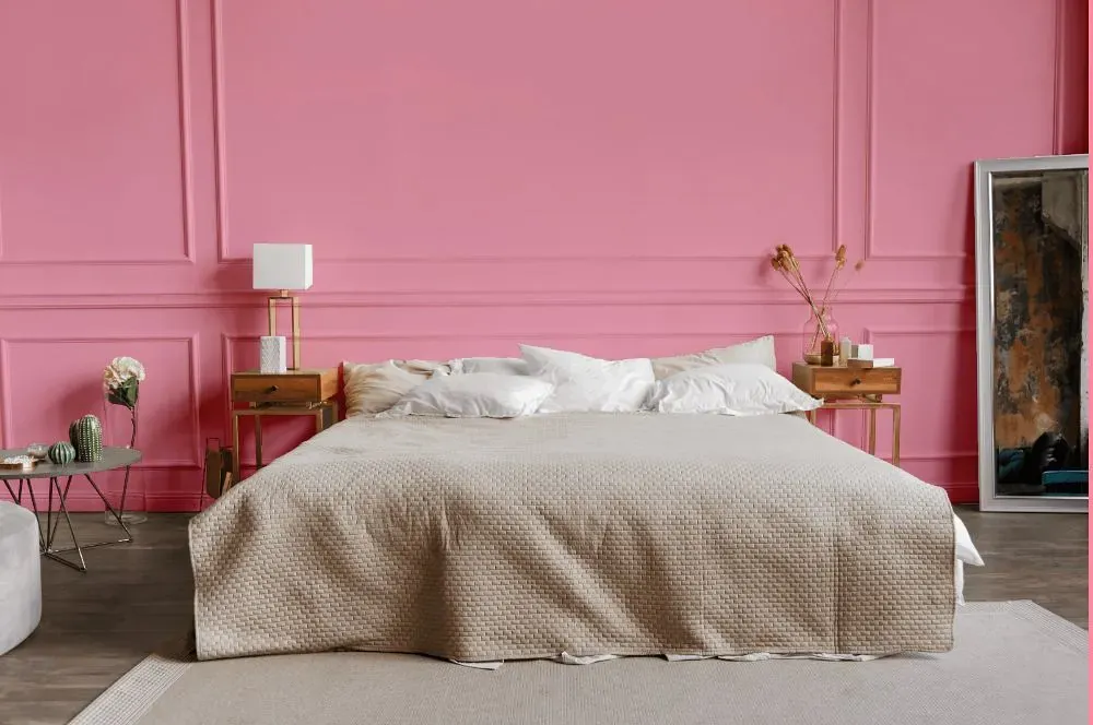
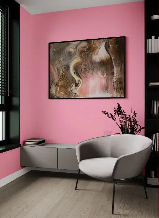
- Benjamin Moore Blush Tone reviews (23 photos)
- What are Benjamin Moore Blush Tone undertones?
- Is Blush Tone 2000-50 cool or warm?
- How light temperature affects on Blush Tone
- Monochromatic color scheme
- Complementary color scheme
- Color comparison and matching
- LRV of Blush Tone 2000-50
- Color codes
- Color equivalents
| Official page: | Blush Tone 2000-50 |
| Code: | 2000-50 |
| Name: | Blush Tone |
| Brand: | Benjamin Moore |
What color is Benjamin Moore Blush Tone?
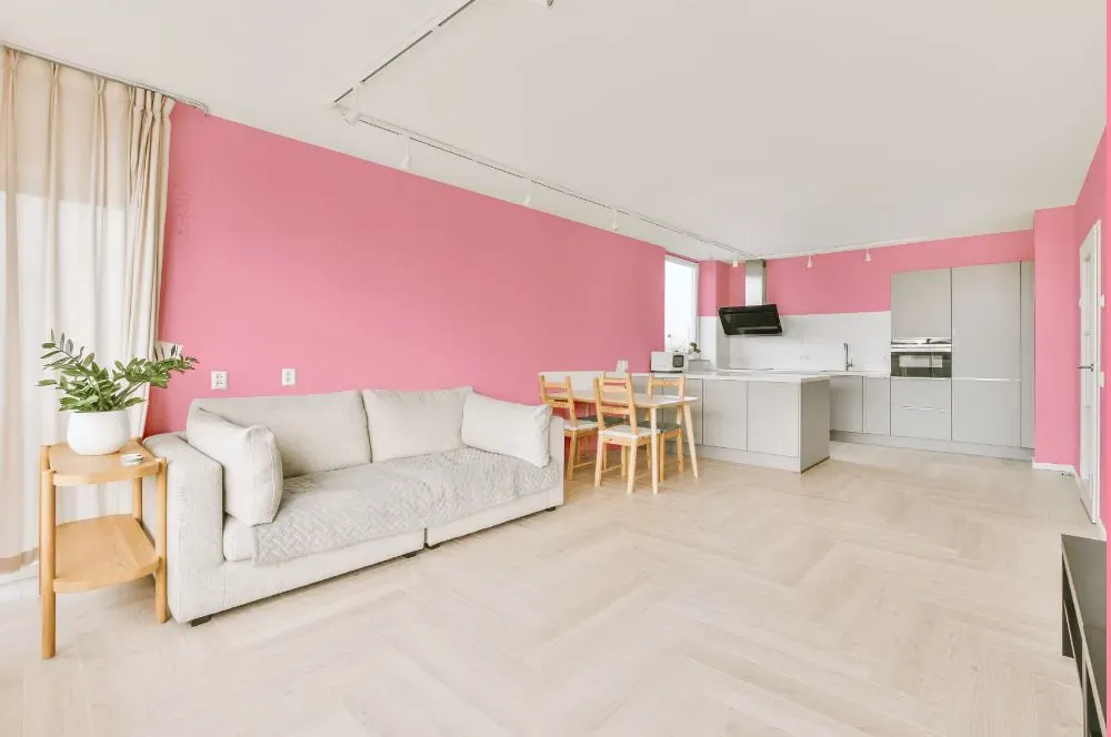
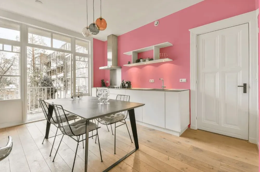
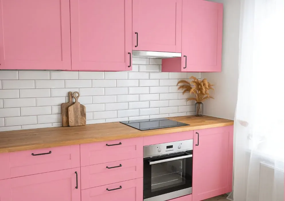
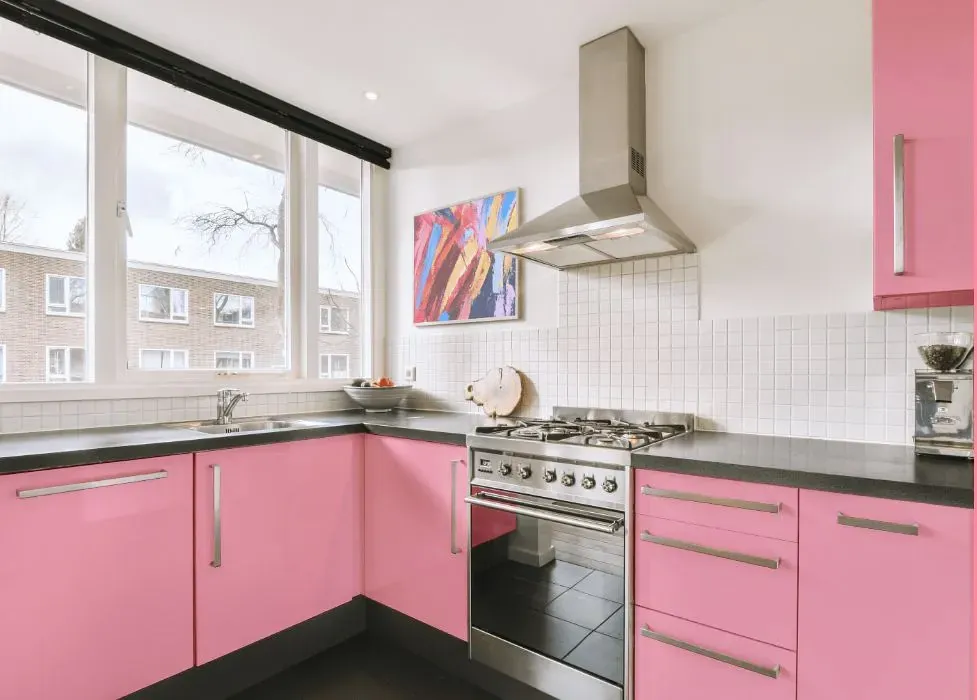
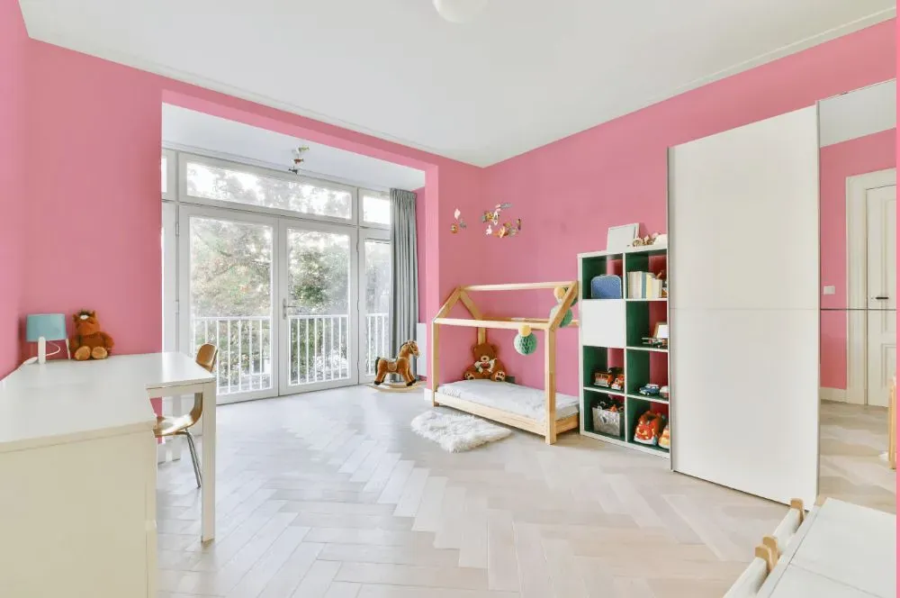
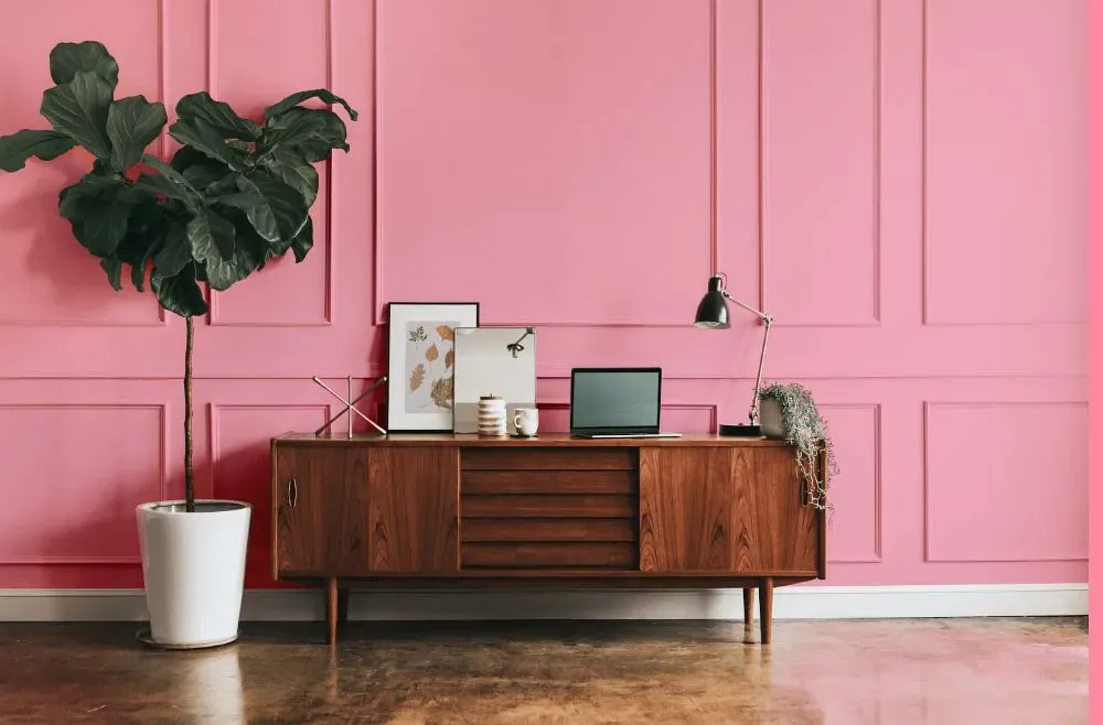
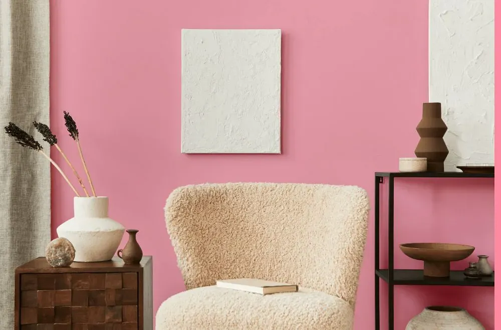
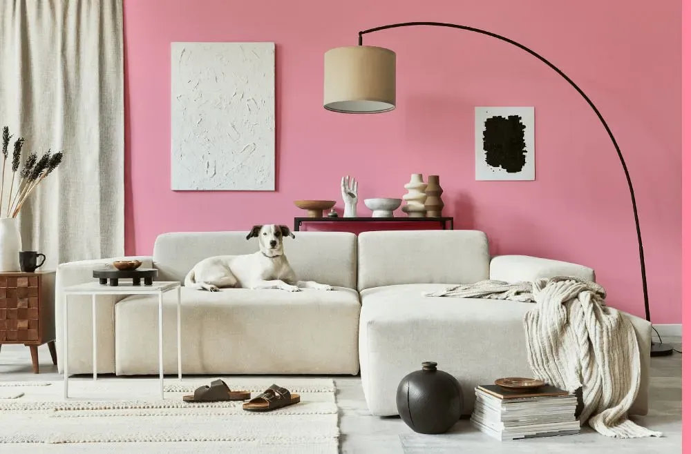
Benjamin Moore 2000-50 is a subtle and soothing shade that exudes warmth and elegance. Blush Tone works beautifully with soft neutrals like ivory and dove grey, creating a harmonious and sophisticated palette. This color pairs effortlessly with metallic accents such as brushed gold or rose gold, adding a touch of glamour to any space. Complementing Blush Tone with rich earthy tones like terracotta or deep olive can bring depth and contrast to a room, creating a truly inviting and stylish atmosphere. Whether used as a main color or an accent, Benjamin Moore 2000-50 Blush Tone adds a timeless and chic element to any interior design scheme.
Loading...
LRV of Blush Tone
Blush Tone has an LRV of 52.51% and refers to Light Medium colors that reflect half of the incident light. Why LRV is important?

Light Reflectance Value measures the amount of visible and usable light that reflects from a painted surface.
Simply put, the higher the LRV of a paint color, the brighter the room you will get.
The scale goes from 0% (absolute black, absorbing all light) to 100% (pure white, reflecting all light).
Act like a pro: When choosing paint with an LRV of 52.51%, pay attention to your bulbs' brightness. Light brightness is measured in lumens. The lower the paint's LRV, the higher lumen level you need. Every square foot of room needs at least 40 lumens. That means for a 200 ft2 living room you'll need about 8000 lumens of light – e.g., eight 1000 lm bulbs.
Color codes
We have collected almost every possible color code you could ever need.
Not sure what the difference between HEX and RGB is? We break down color models in plain language. Understanding color models
| Format | Code |
|---|---|
| HEX | #FDACBD |
| RGB Decimal | 253, 172, 189 |
| RGB Percent | 99.22%, 67.45%, 74.12% |
| HSV | Hue: 347° Saturation: 32.02% Value: 99.22% |
| HSL | hsl(347, 95, 83) |
| CMYK | Cyan: 0.0 Magenta: 32.02 Yellow: 25.3 Key: 0.78 |
| YIQ | Y: 198.157 I: 42.805 Q: 22.425 |
| XYZ | X: 64.446 Y: 54.066 Z: 55.172 |
| CIE Lab | L:78.5 a:31.934 b:3.484 |
| CIE Luv | L:78.5 u:50.827 v:-0.904 |
| Decimal | 16624829 |
| Hunter Lab | 73.529, 27.774, 6.983 |