Benjamin Moore Marshmallow Bunny 2001-70
Contentsshow +hide -
- Benjamin Moore Marshmallow Bunny reviews (23 photos)
- What are Benjamin Moore Marshmallow Bunny undertones?
- Is Marshmallow Bunny 2001-70 cool or warm?
- How light temperature affects on Marshmallow Bunny
- Monochromatic color scheme
- Complementary color scheme
- Color comparison and matching
- LRV of Marshmallow Bunny 2001-70
- Color codes
- Color equivalents
| Official page: | Marshmallow Bunny 2001-70 |
| Code: | 2001-70 |
| Name: | Marshmallow Bunny |
| Brand: | Benjamin Moore |
What color is Benjamin Moore Marshmallow Bunny?
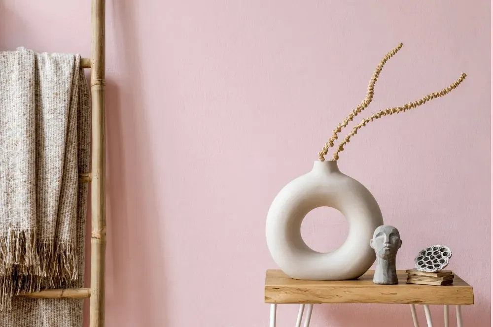
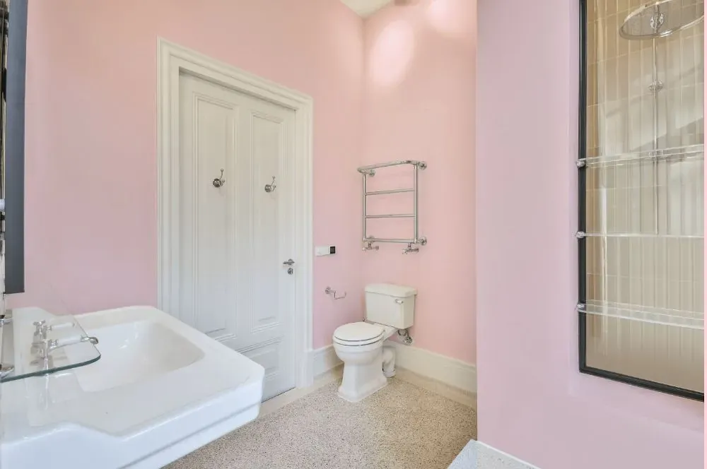
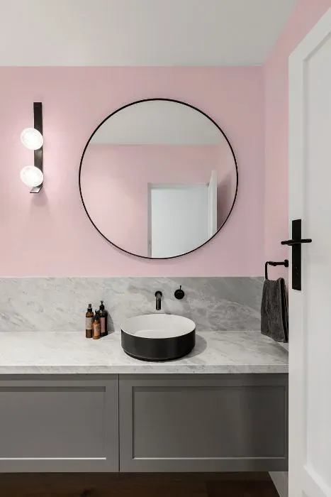
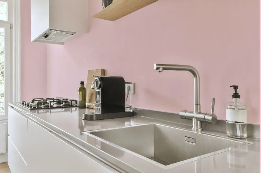
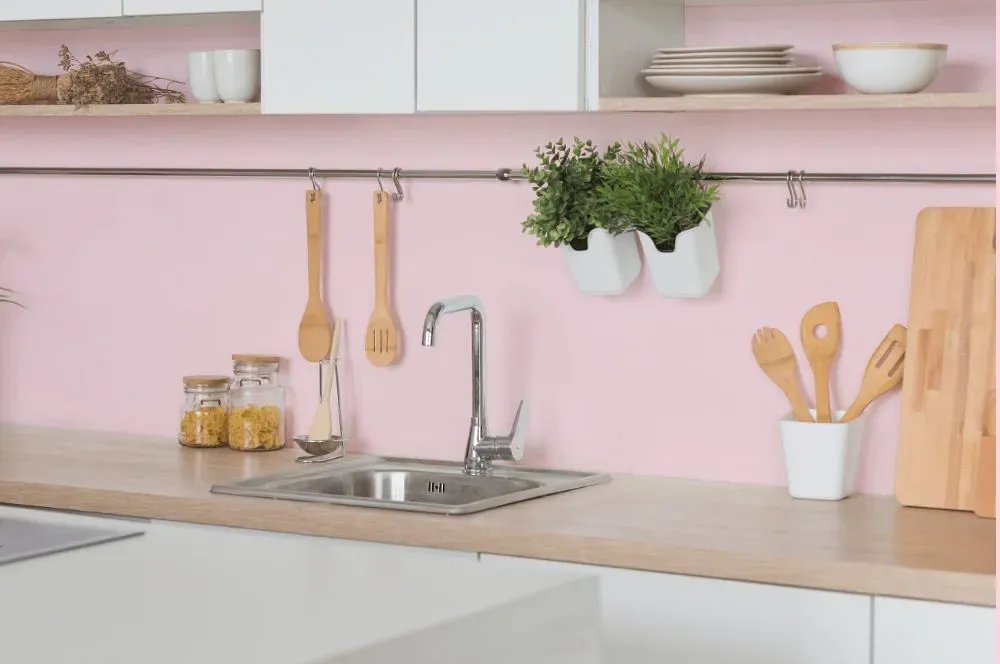
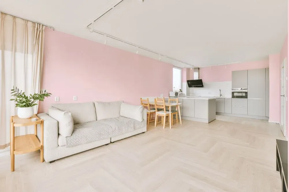
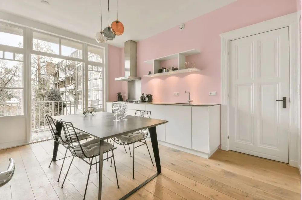
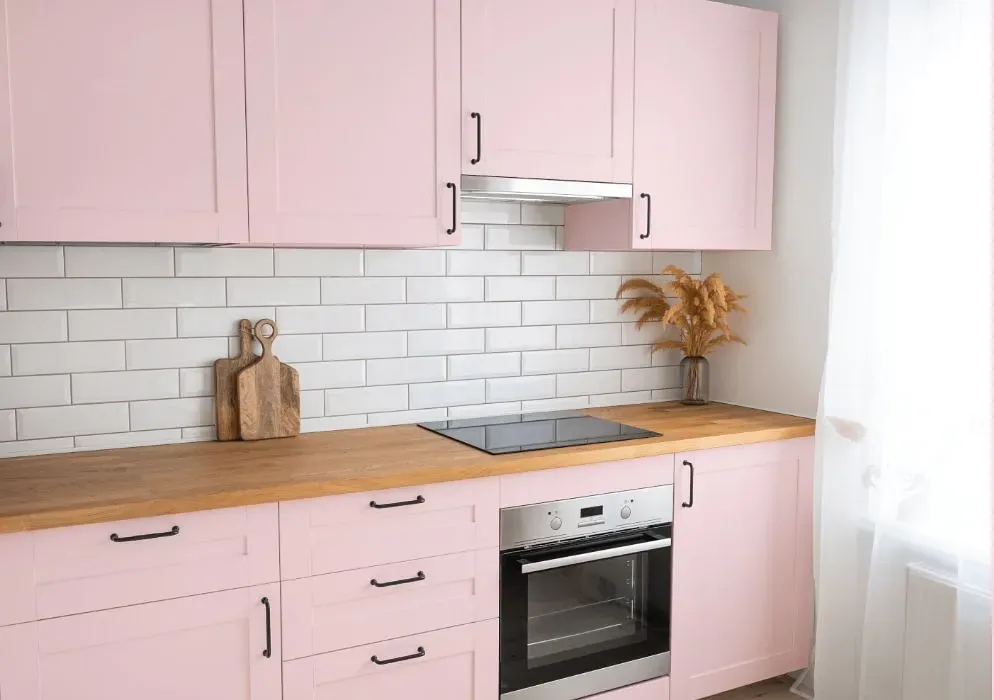
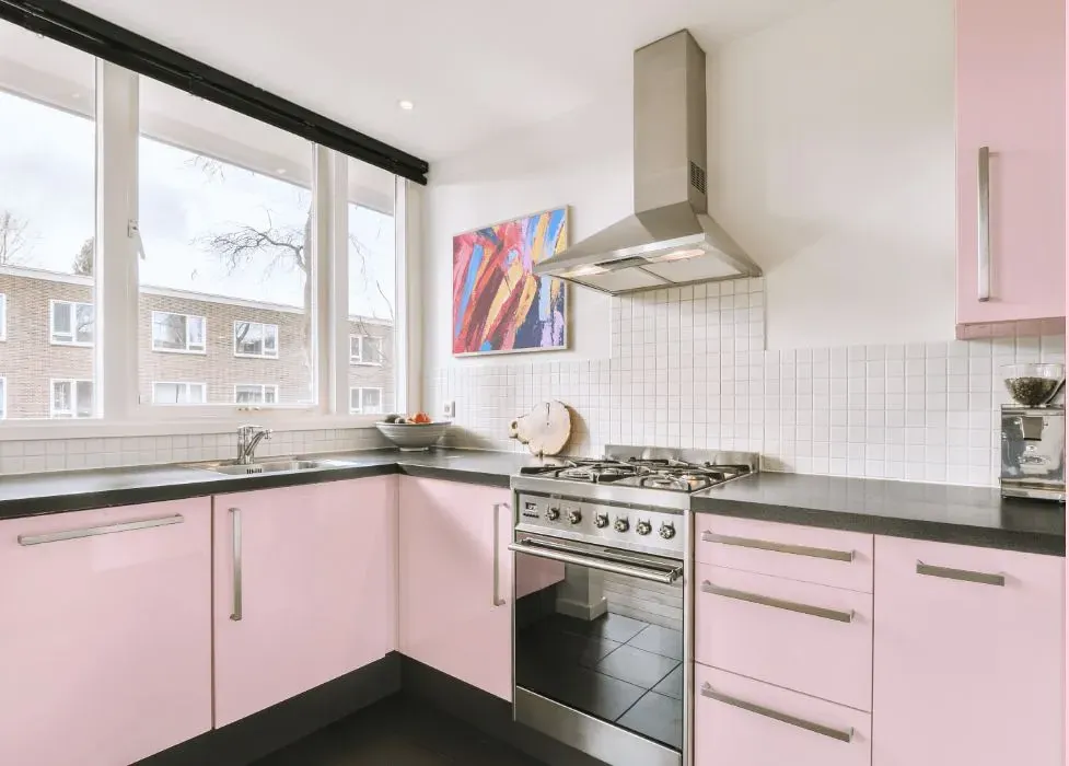
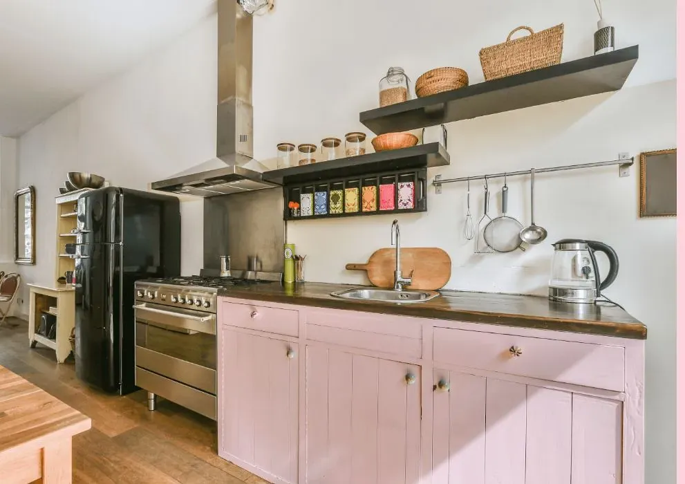
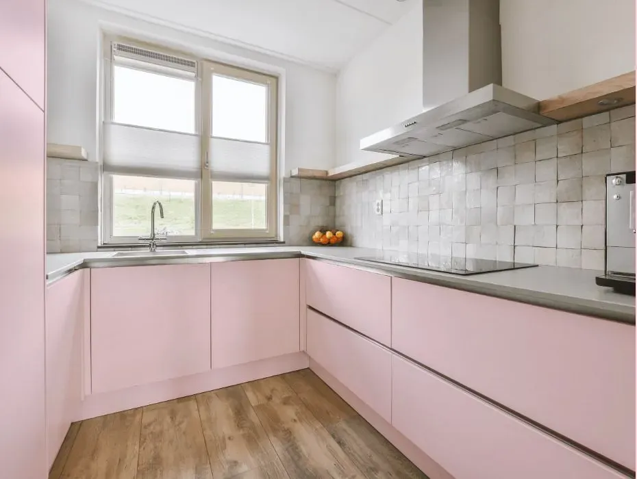
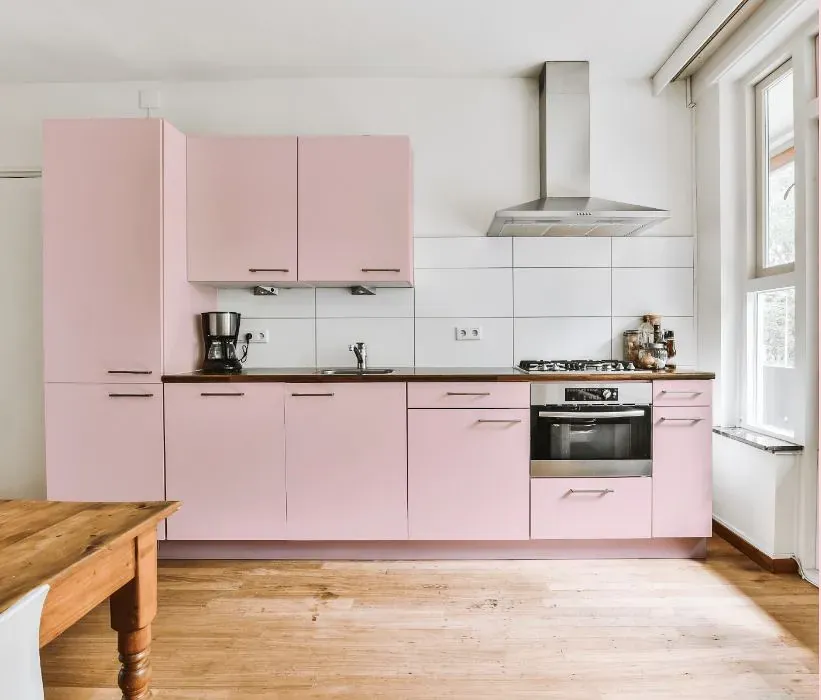
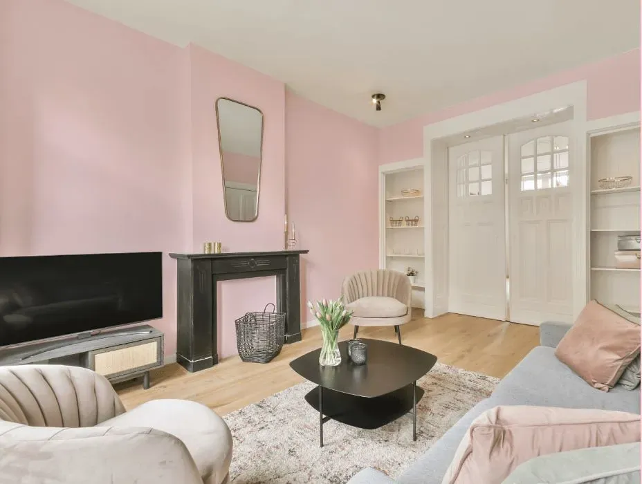
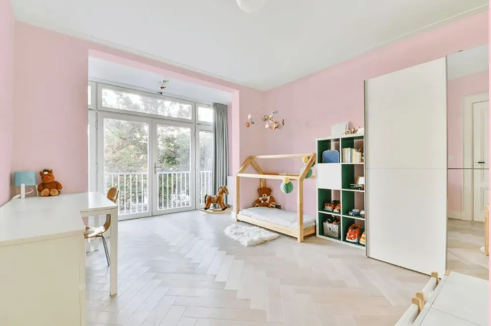
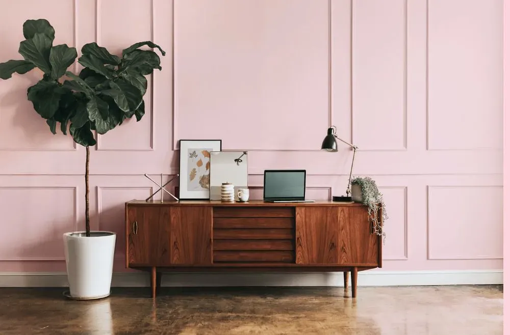
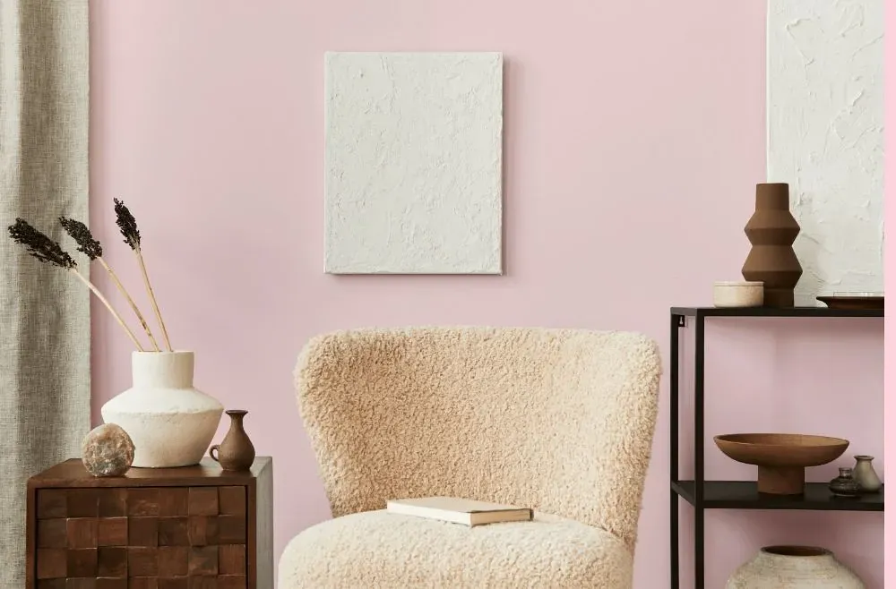
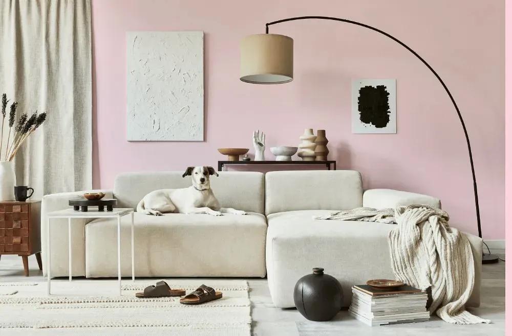
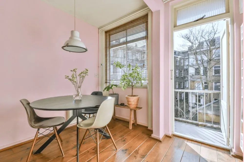
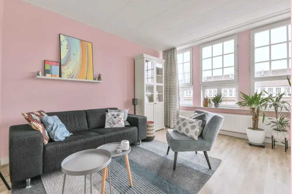
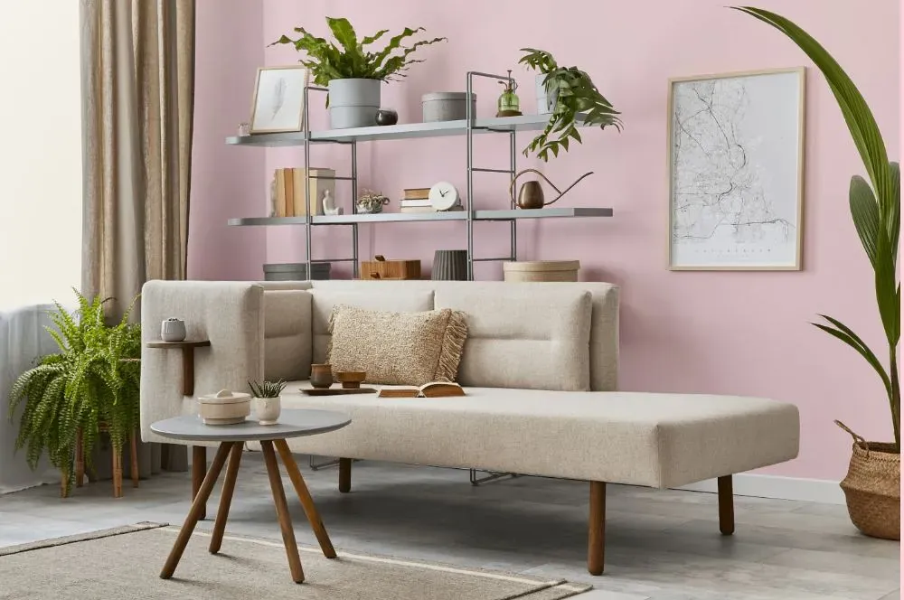
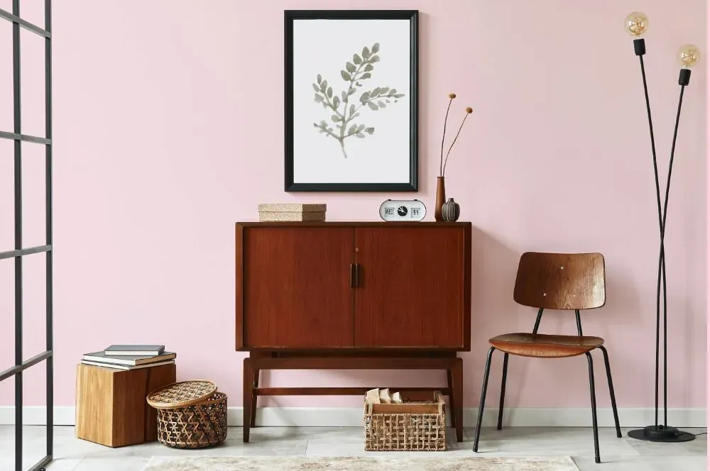
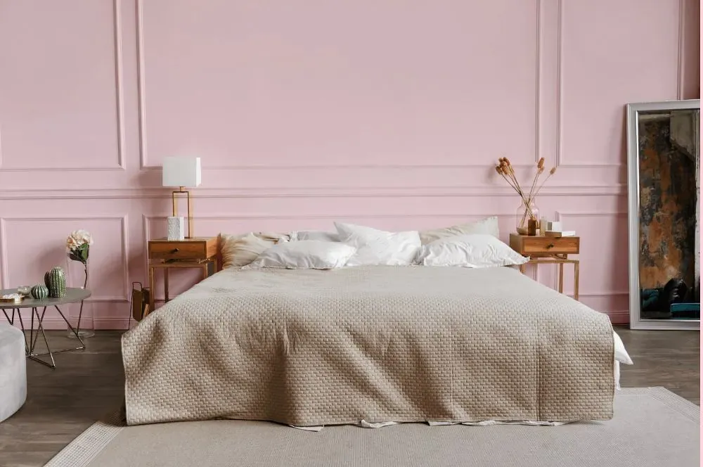
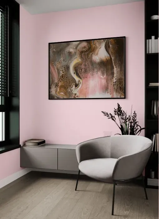
The soothing hue of Benjamin Moore 2001-70 Marshmallow Bunny evokes a sense of tranquility and warmth, making it an ideal choice for bedrooms, nurseries, and living rooms. This soft and inviting shade creates a cozy atmosphere that promotes relaxation and comfort. Whether used as an accent color or as the main wall color, Marshmallow Bunny infuses any space with a serene and elegant charm. Its subtle undertones of warmth make it perfect for creating a calming retreat in bedrooms or a welcoming ambiance in living areas. Choose Marshmallow Bunny for a timeless and sophisticated feel that will enhance the beauty of any room.
Loading...
LRV of Marshmallow Bunny
Marshmallow Bunny has an LRV of 78.34% and refers to Off‑White colors that reflect a lot of light. Why LRV is important?

Light Reflectance Value measures the amount of visible and usable light that reflects from a painted surface.
Simply put, the higher the LRV of a paint color, the brighter the room you will get.
The scale goes from 0% (absolute black, absorbing all light) to 100% (pure white, reflecting all light).
Act like a pro: When choosing paint with an LRV of 78.34%, pay attention to your bulbs' brightness. Light brightness is measured in lumens. The lower the paint's LRV, the higher lumen level you need. Every square foot of room needs at least 40 lumens. That means for a 200 ft2 living room you'll need about 8000 lumens of light – e.g., eight 1000 lm bulbs.
Color codes
We have collected almost every possible color code you could ever need.
Not sure what the difference between HEX and RGB is? We break down color models in plain language. Understanding color models
| Format | Code |
|---|---|
| HEX | #FEE2E7 |
| RGB Decimal | 254, 226, 231 |
| RGB Percent | 99.61%, 88.63%, 90.59% |
| HSV | Hue: 349° Saturation: 11.02% Value: 99.61% |
| HSL | hsl(349, 93, 94) |
| CMYK | Cyan: 0.0 Magenta: 11.02 Yellow: 9.06 Key: 0.39 |
| YIQ | Y: 234.942 I: 15.078 Q: 7.479 |
| XYZ | X: 82.491 Y: 81.235 Z: 86.914 |
| CIE Lab | L:92.236 a:10.4 b:1.087 |
| CIE Luv | L:92.236 u:16.113 v:-0.241 |
| Decimal | 16704231 |
| Hunter Lab | 90.13, 5.642, 5.917 |