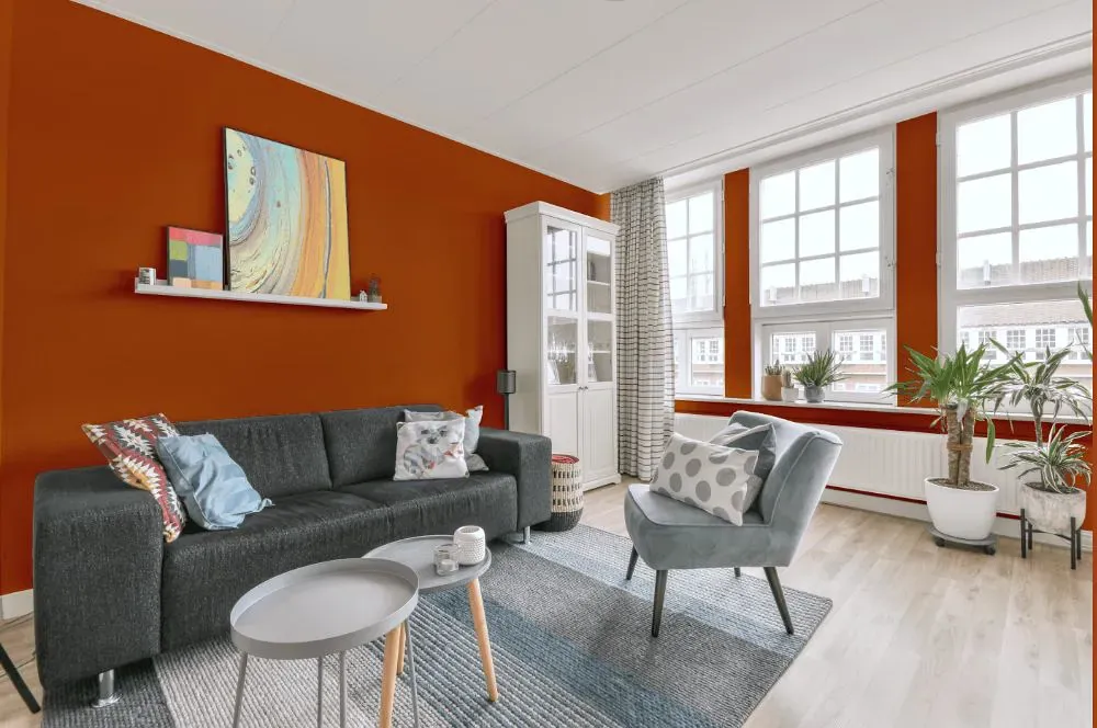
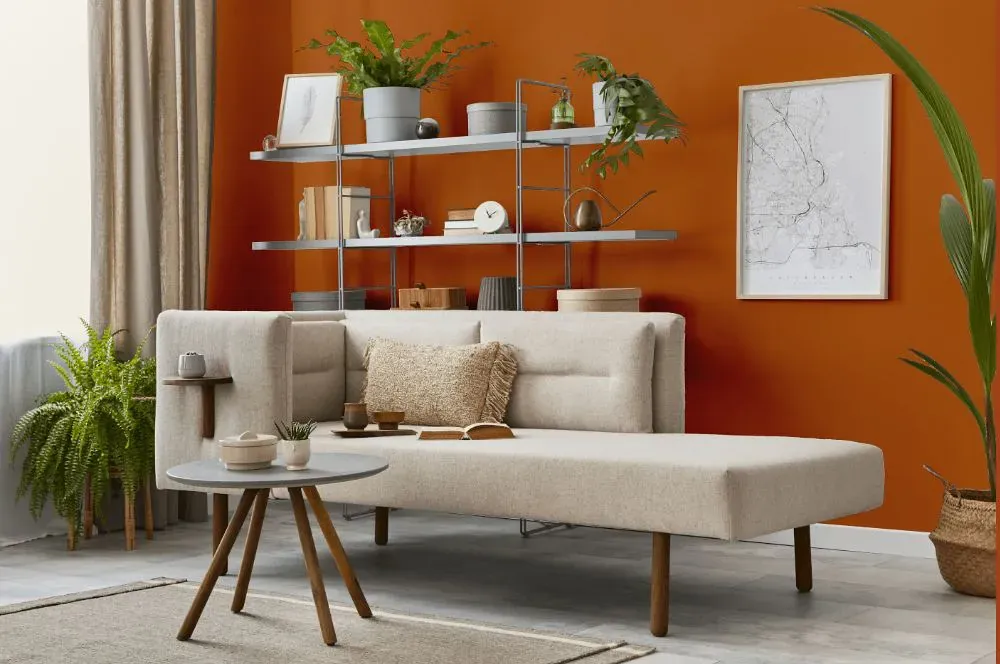
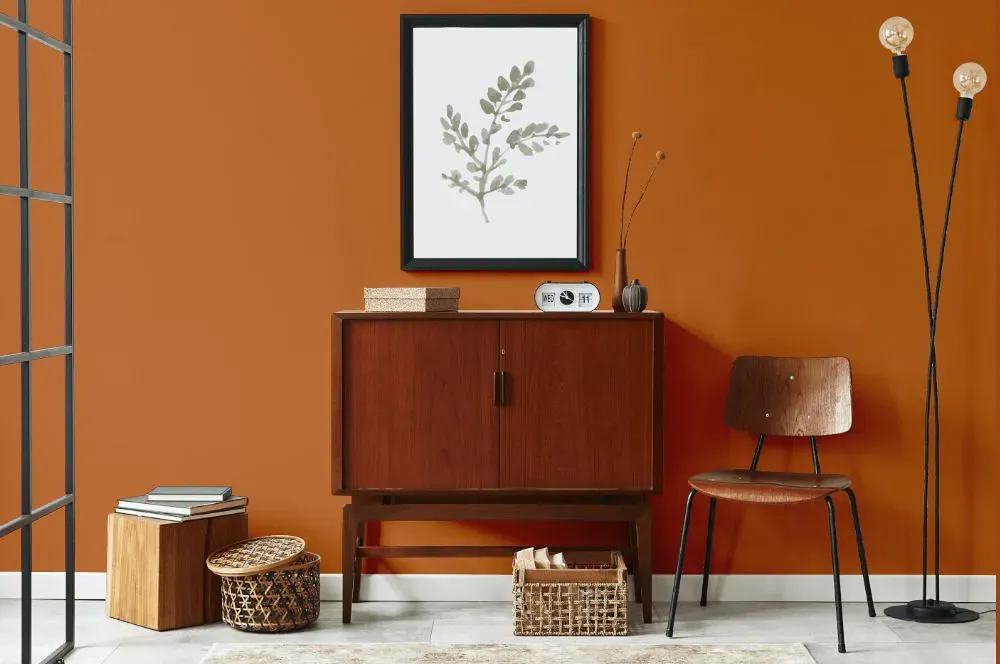
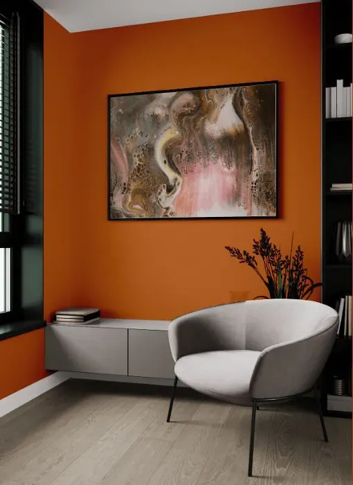
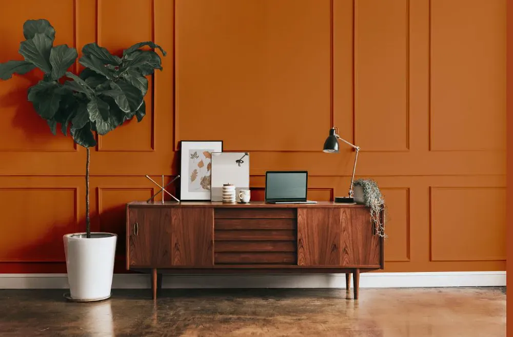
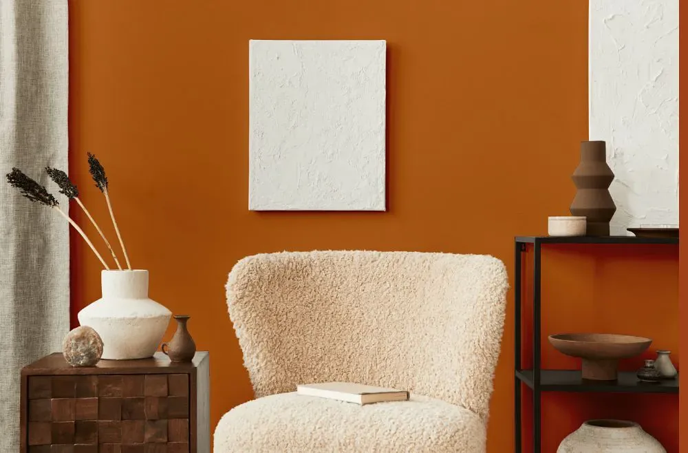
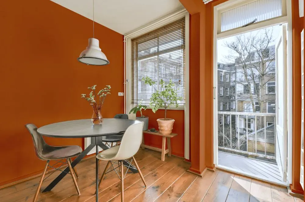
Benjamin Moore Caramel Latte 2166-20
Contentsshow +hide -
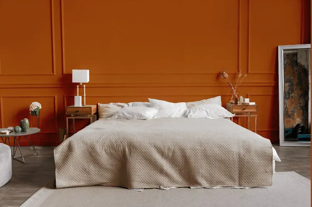
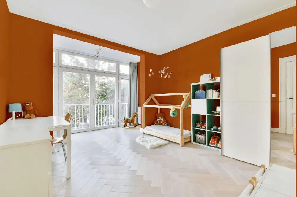
- Caramel Latte for bedroom (1 photo)
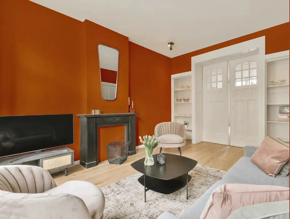
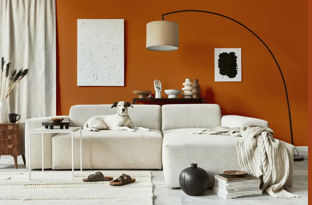
- Caramel Latte for living room (7 photos)
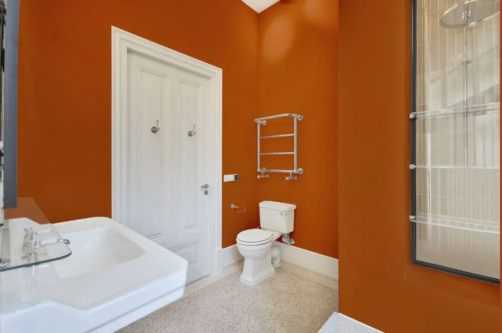
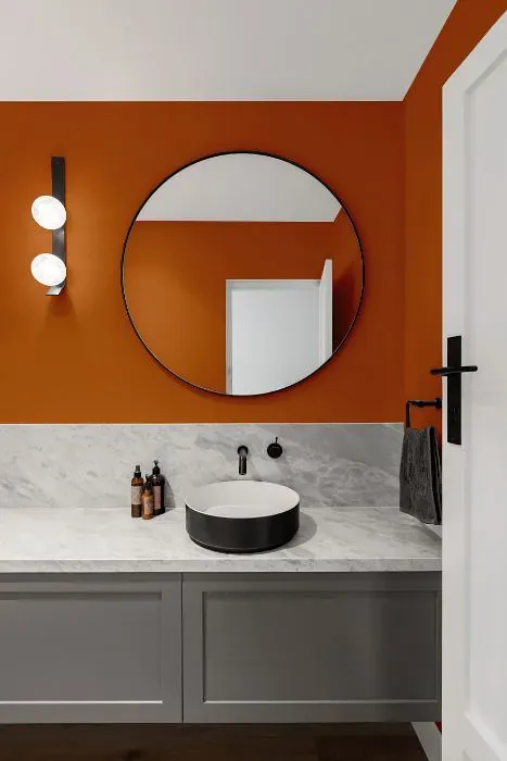
- Benjamin Moore Caramel Latte for bathroom (2 photos)
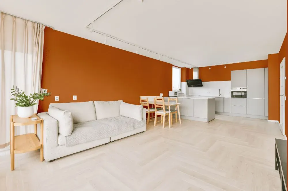
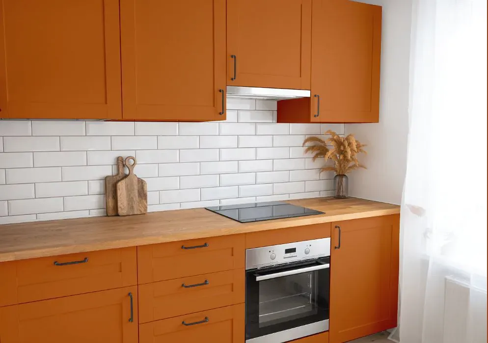
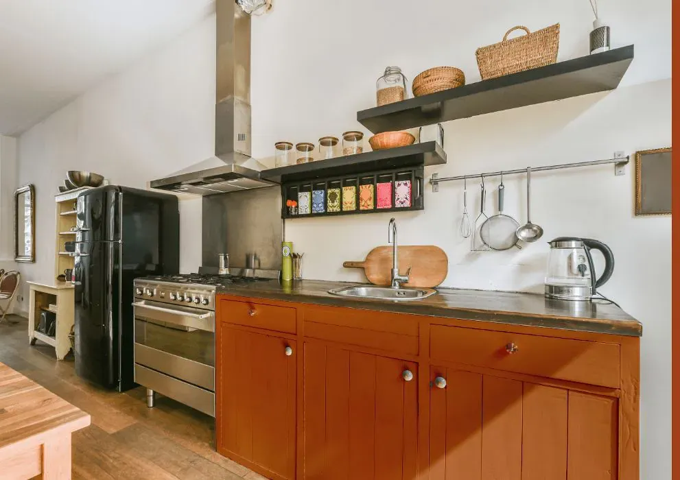
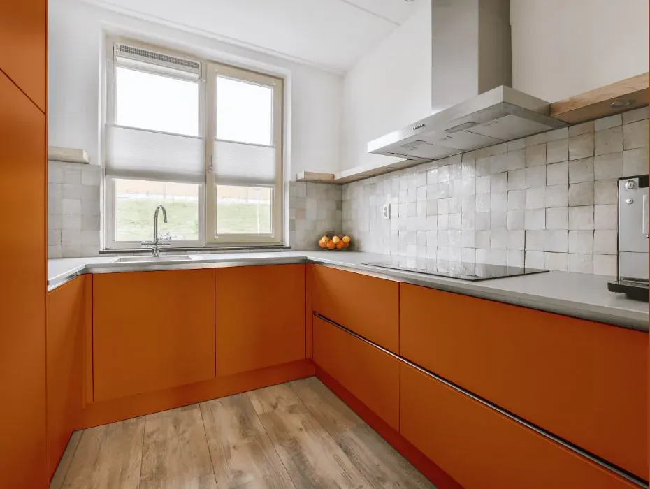
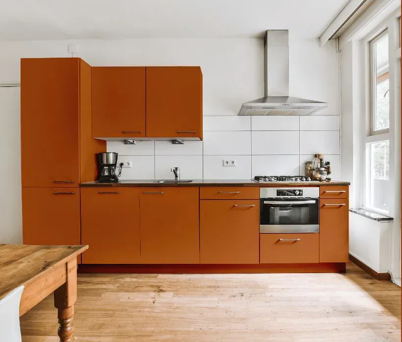
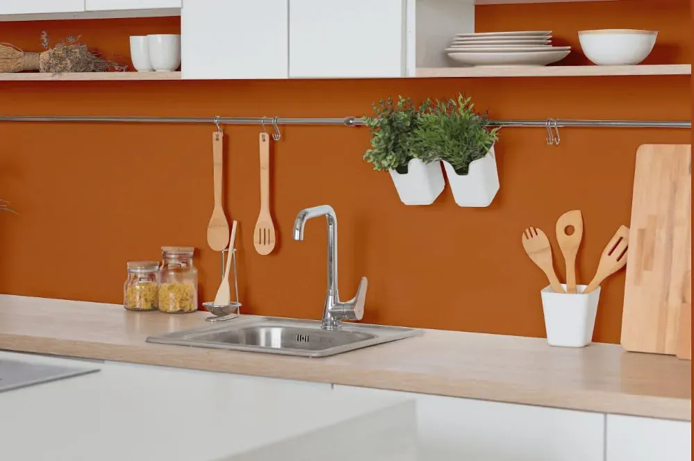
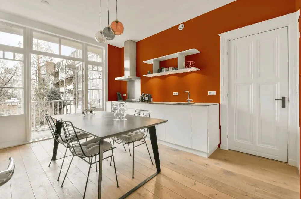
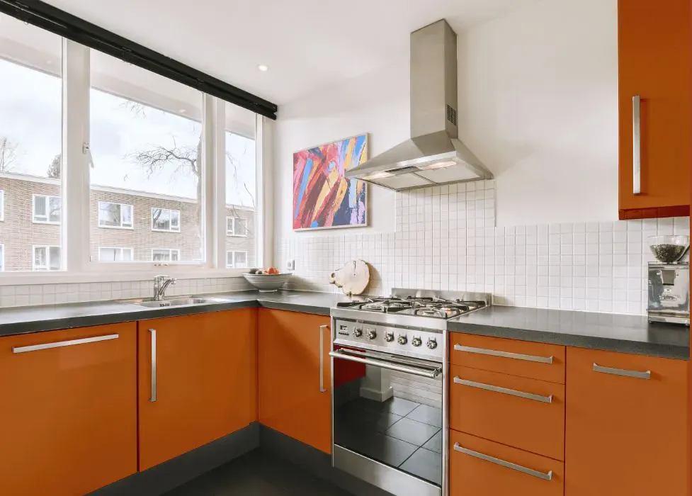
- Benjamin Moore 2166-20 on kitchen cabinets (4 photos)
- Benjamin Moore Caramel Latte reviews (9 photos)
- What are Benjamin Moore Caramel Latte undertones?
- Is Caramel Latte 2166-20 cool or warm?
- How light temperature affects on Caramel Latte
- Monochromatic color scheme
- Complementary color scheme
- Color comparison and matching
- LRV of Caramel Latte 2166-20
- Color codes
- Color equivalents
| Official page: | Caramel Latte 2166-20 |
| Code: | 2166-20 |
| Name: | Caramel Latte |
| Brand: | Benjamin Moore |
What color is Benjamin Moore Caramel Latte?
The warm and inviting tone of Benjamin Moore 2166-20 Caramel Latte adds a cozy yet sophisticated touch to any space. This rich hue pairs beautifully with soft creams and earthy tones, creating a harmonious and elegant color scheme. Combining Benjamin Moore Caramel Latte with deep navy or charcoal accents can lend a modern and refined edge to a room. For a more playful look, consider complementing this color with pops of sage green or dusty rose to add a touch of whimsy and vibrancy. Experimenting with different textures and finishes can further enhance the versatility and charm of Benjamin Moore 2166-20 Caramel Latte.
LRV of Caramel Latte
Caramel Latte has an LRV of 20.8% and refers to Medium colors that reflect a lot of light. Why LRV is important?

Light Reflectance Value measures the amount of visible and usable light that reflects from a painted surface.
Simply put, the higher the LRV of a paint color, the brighter the room you will get.
The scale goes from 0% (absolute black, absorbing all light) to 100% (pure white, reflecting all light).
Act like a pro: When choosing paint with an LRV of 20.8%, pay attention to your bulbs' brightness. Light brightness is measured in lumens. The lower the paint's LRV, the higher lumen level you need. Every square foot of room needs at least 40 lumens. That means for a 200 ft2 living room you'll need about 8000 lumens of light – e.g., eight 1000 lm bulbs.
Color codes
We have collected almost every possible color code you could ever need.
| Format | Code |
|---|---|
| HEX | #BC6B32 |
| RGB Decimal | 188, 107, 50 |
| RGB Percent | 73.73%, 41.96%, 19.61% |
| HSV | Hue: 25° Saturation: 73.4% Value: 73.73% |
| HSL | hsl(25, 58, 47) |
| CMYK | Cyan: 0.0 Magenta: 43.09 Yellow: 73.4 Key: 26.27 |
| YIQ | Y: 124.721 I: 66.585 Q: -0.604 |
| XYZ | X: 26.575 Y: 21.44 Z: 5.756 |
| CIE Lab | L:53.428 a:27.691 b:44.643 |
| CIE Luv | L:53.428 u:64.62 v:41.453 |
| Decimal | 12348210 |
| Hunter Lab | 46.303, 21.415, 25.042 |


