Benjamin Moore Coastal Paradise 655
Contentsshow +hide -
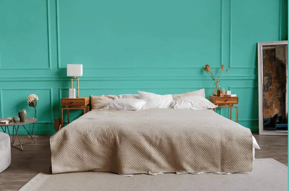
- Coastal Paradise for bedroom (1 photo)
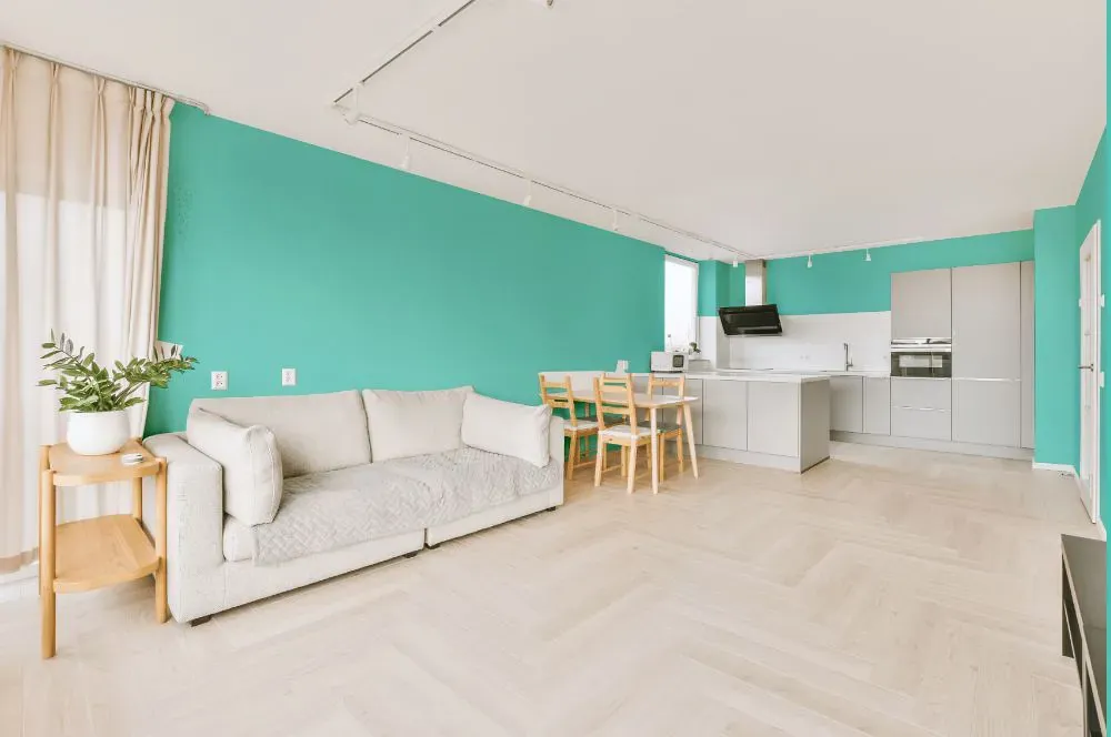
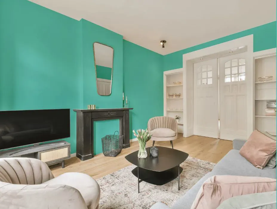
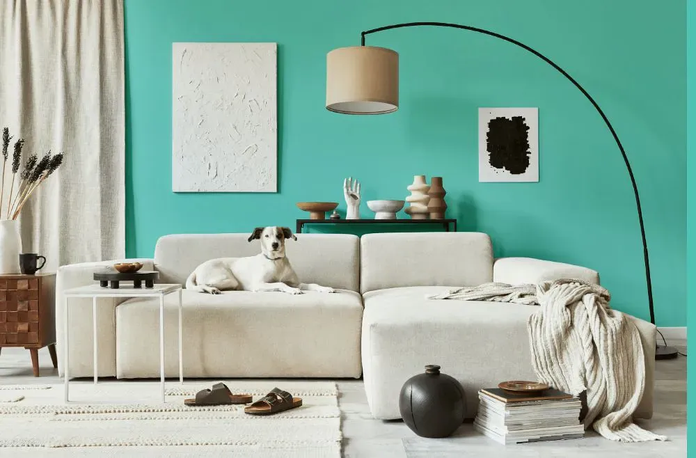
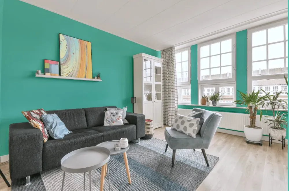
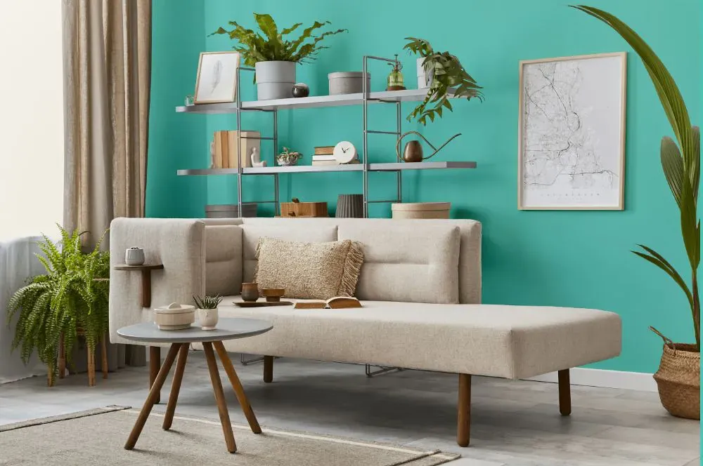
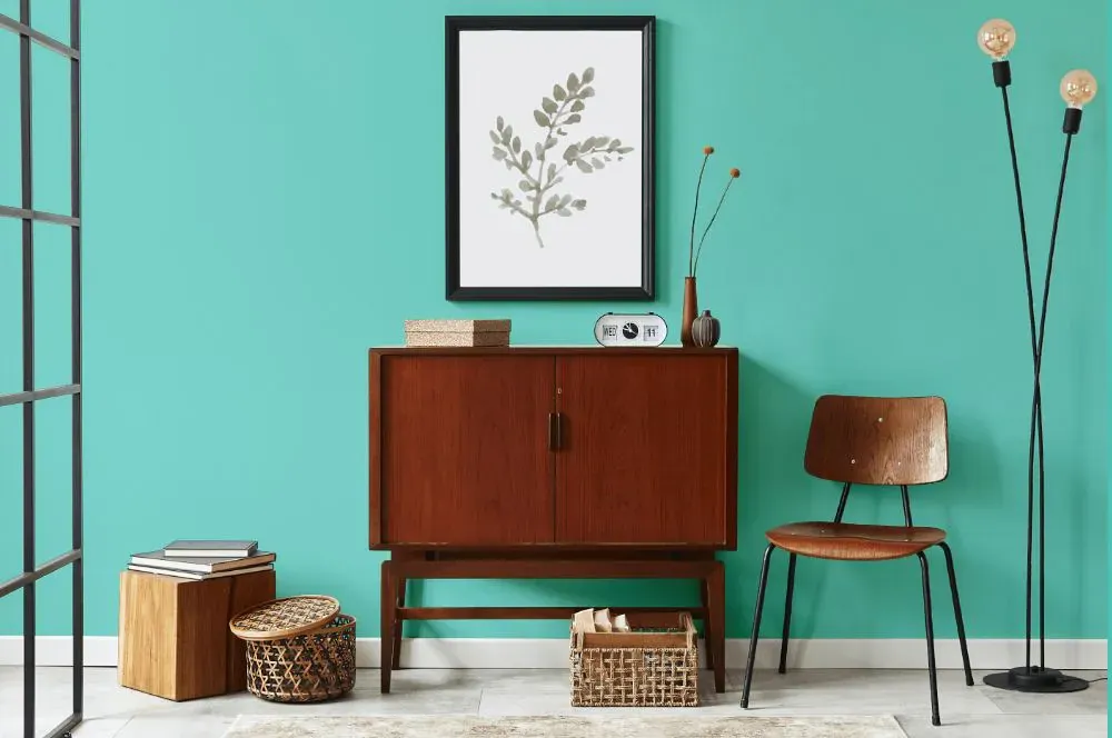
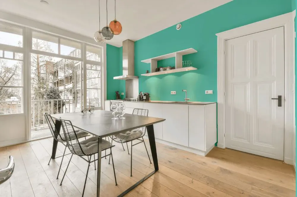
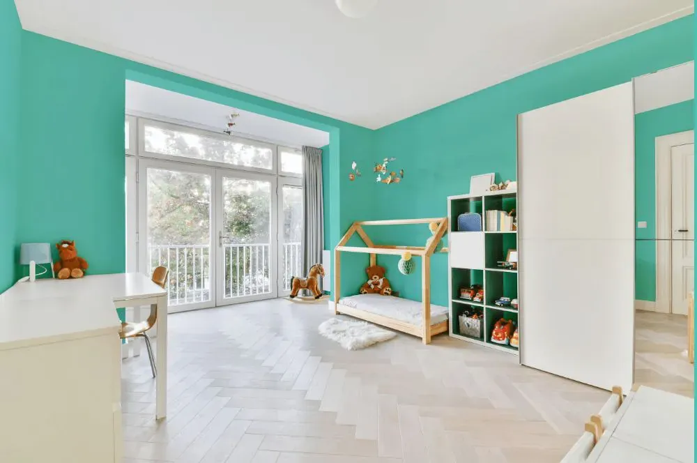
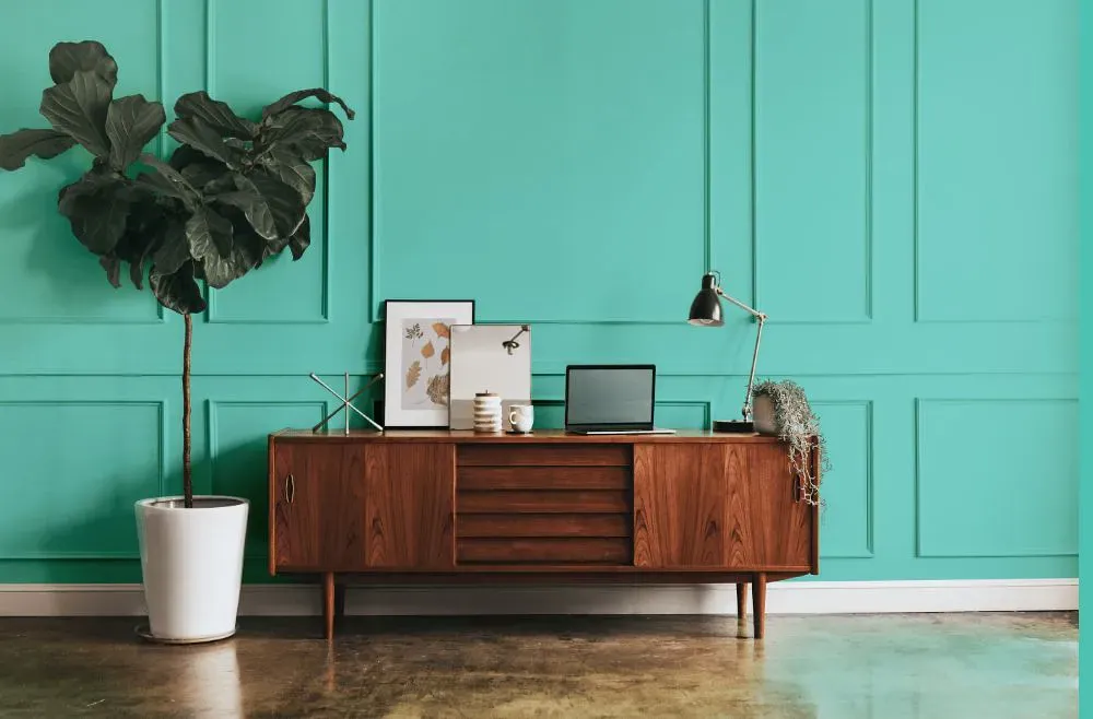
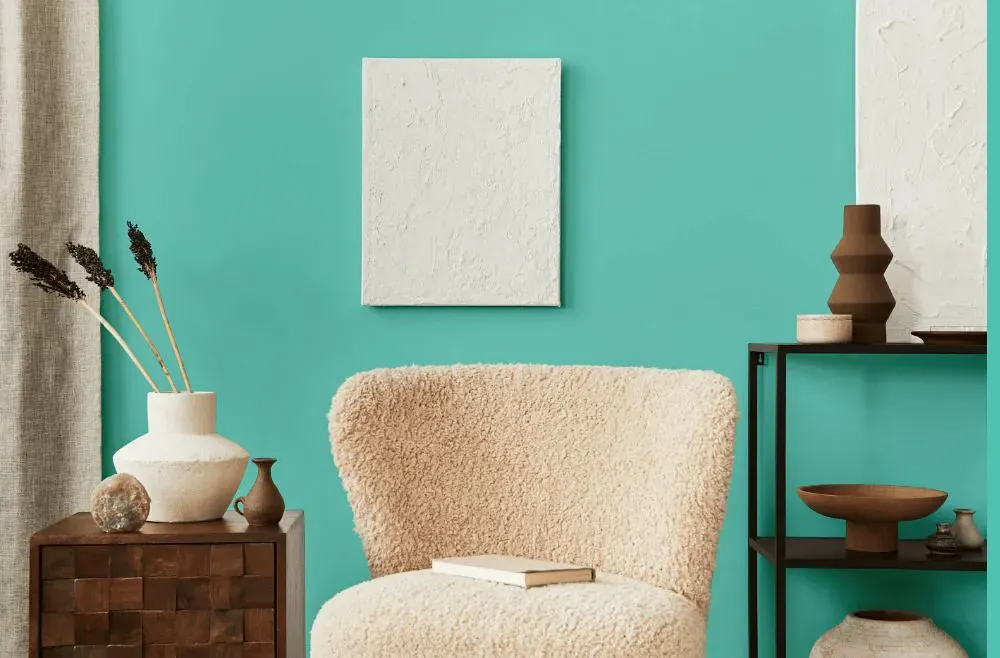
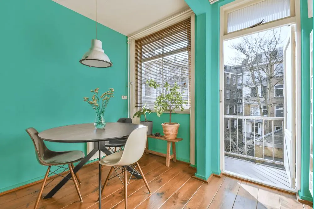
- Coastal Paradise for living room (7 photos)
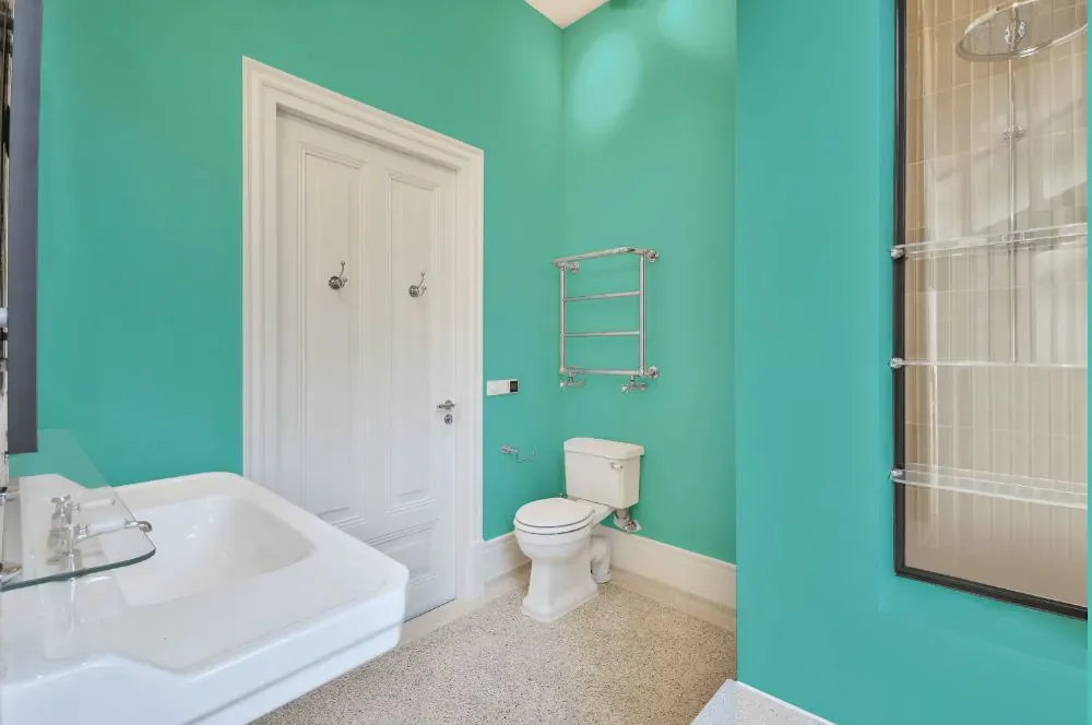
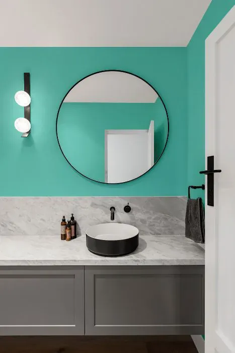
- Benjamin Moore Coastal Paradise for bathroom (2 photos)
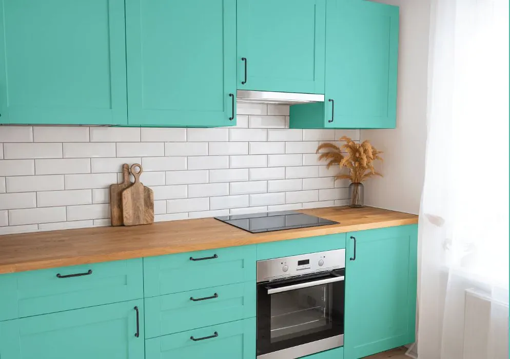
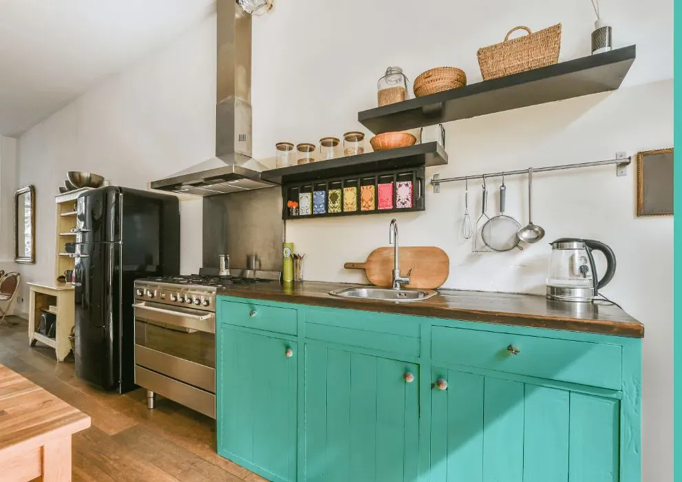
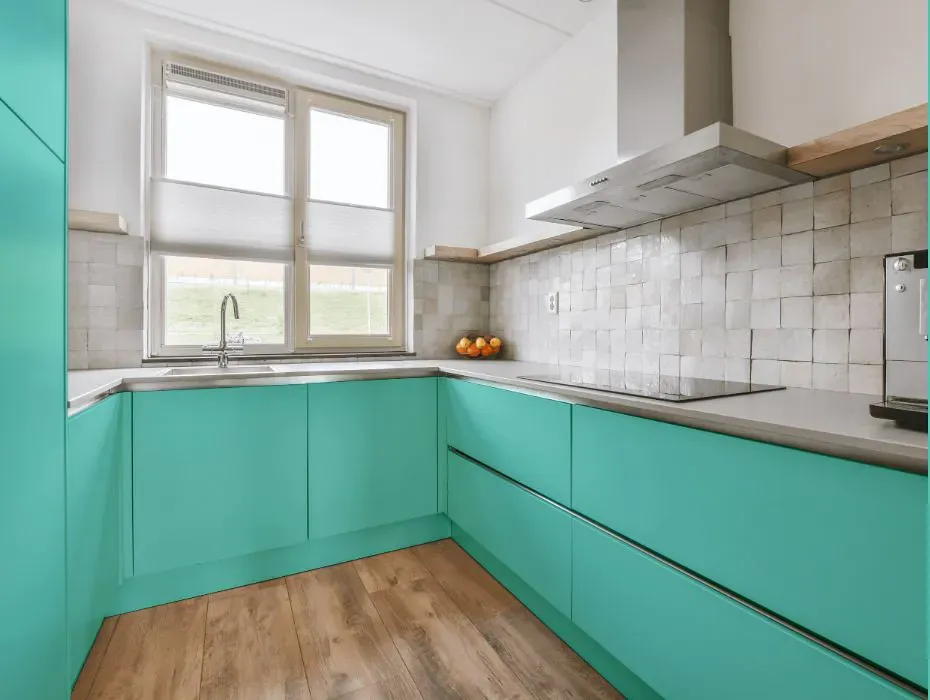
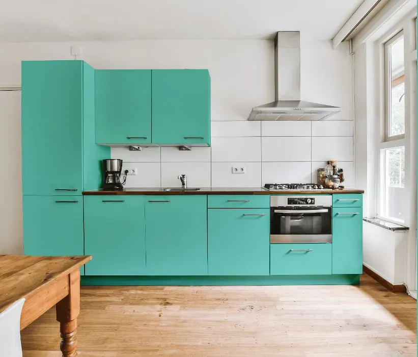
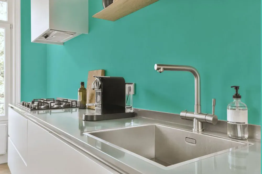
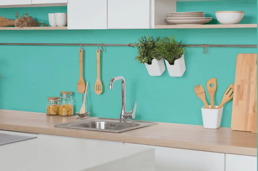
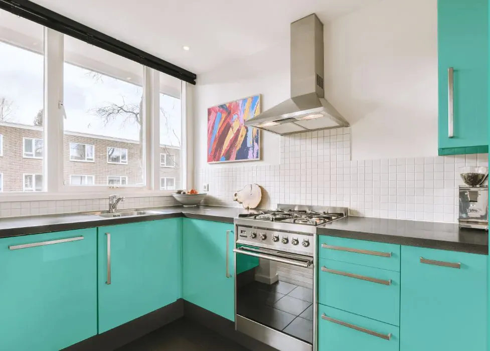
- Benjamin Moore 655 on kitchen cabinets (4 photos)
- Benjamin Moore Coastal Paradise reviews (9 photos)
- What are Benjamin Moore Coastal Paradise undertones?
- Is Coastal Paradise 655 cool or warm?
- How light temperature affects on Coastal Paradise
- Monochromatic color scheme
- Complementary color scheme
- Color comparison and matching
- LRV of Coastal Paradise 655
- Color codes
- Color equivalents
| Official page: | Coastal Paradise 655 |
| Code: | 655 |
| Name: | Coastal Paradise |
| Brand: | Benjamin Moore |
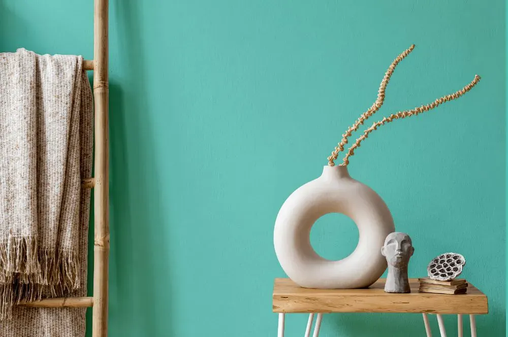
What color is Benjamin Moore Coastal Paradise?
The Benjamin Moore 655 Coastal Paradise color adds a soothing and airy feel to any space. This refreshing hue pairs beautifully with soft neutrals like warm beige and sandy taupe for a relaxed coastal vibe. Incorporating touches of cool blues or greens can further enhance the tranquil atmosphere created by the Coastal Paradise walls. Consider adding natural textures like rattan and driftwood to complement the calming essence of this color palette.
Loading...
LRV of Coastal Paradise
Coastal Paradise has an LRV of 56.73% and refers to Light colors that reflect most of the incident light. Why LRV is important?

Light Reflectance Value measures the amount of visible and usable light that reflects from a painted surface.
Simply put, the higher the LRV of a paint color, the brighter the room you will get.
The scale goes from 0% (absolute black, absorbing all light) to 100% (pure white, reflecting all light).
Act like a pro: When choosing paint with an LRV of 56.73%, pay attention to your bulbs' brightness. Light brightness is measured in lumens. The lower the paint's LRV, the higher lumen level you need. Every square foot of room needs at least 40 lumens. That means for a 200 ft2 living room you'll need about 8000 lumens of light – e.g., eight 1000 lm bulbs.
Color codes
We have collected almost every possible color code you could ever need.
Not sure what the difference between HEX and RGB is? We break down color models in plain language. Understanding color models
| Format | Code |
|---|---|
| HEX | #79D5CA |
| RGB Decimal | 121, 213, 202 |
| RGB Percent | 47.45%, 83.53%, 79.22% |
| HSV | Hue: 173° Saturation: 43.19% Value: 83.53% |
| HSL | hsl(173, 52, 65) |
| CMYK | Cyan: 43.19 Magenta: 0.0 Yellow: 5.16 Key: 16.47 |
| YIQ | Y: 184.238 I: -51.288 Q: -22.885 |
| XYZ | X: 42.335 Y: 55.915 Z: 64.423 |
| CIE Lab | L:79.565 a:-30.07 b:-3.135 |
| CIE Luv | L:79.565 u:-41.595 v:0.084 |
| Decimal | 7984586 |
| Hunter Lab | 74.776, -29.799, 1.262 |