Benjamin Moore Country Redwood HC-183
Contentsshow +hide -
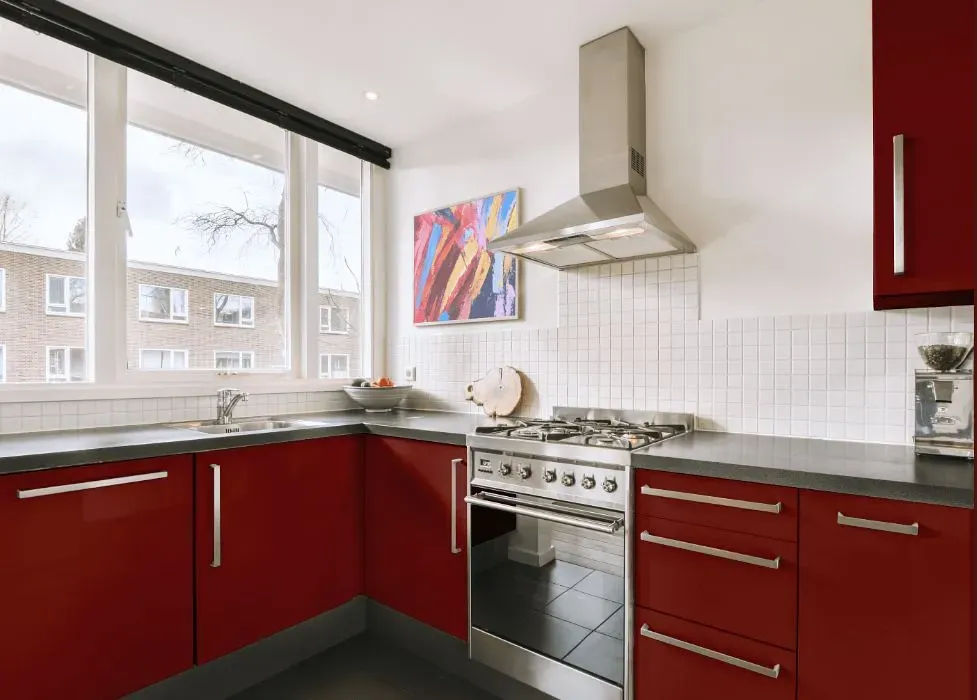
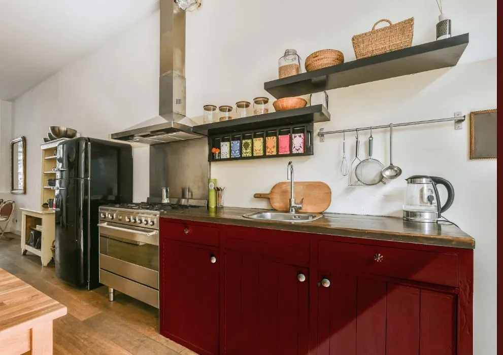
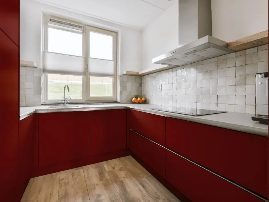
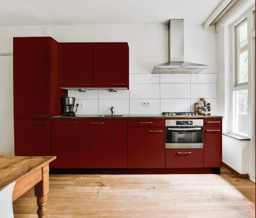
- Benjamin Moore Country Redwood reviews (23 photos)
- What are Benjamin Moore Country Redwood undertones?
- Is Country Redwood HC-183 cool or warm?
- How light temperature affects on Country Redwood
- Monochromatic color scheme
- Complementary color scheme
- Color comparison and matching
- LRV of Country Redwood HC-183
- Color codes
- Color equivalents
| Official page: | Country Redwood HC-183 |
| Code: | HC-183 |
| Name: | Country Redwood |
| Brand: | Benjamin Moore |
What color is Benjamin Moore Country Redwood?
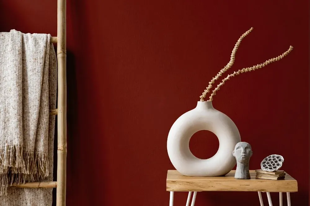
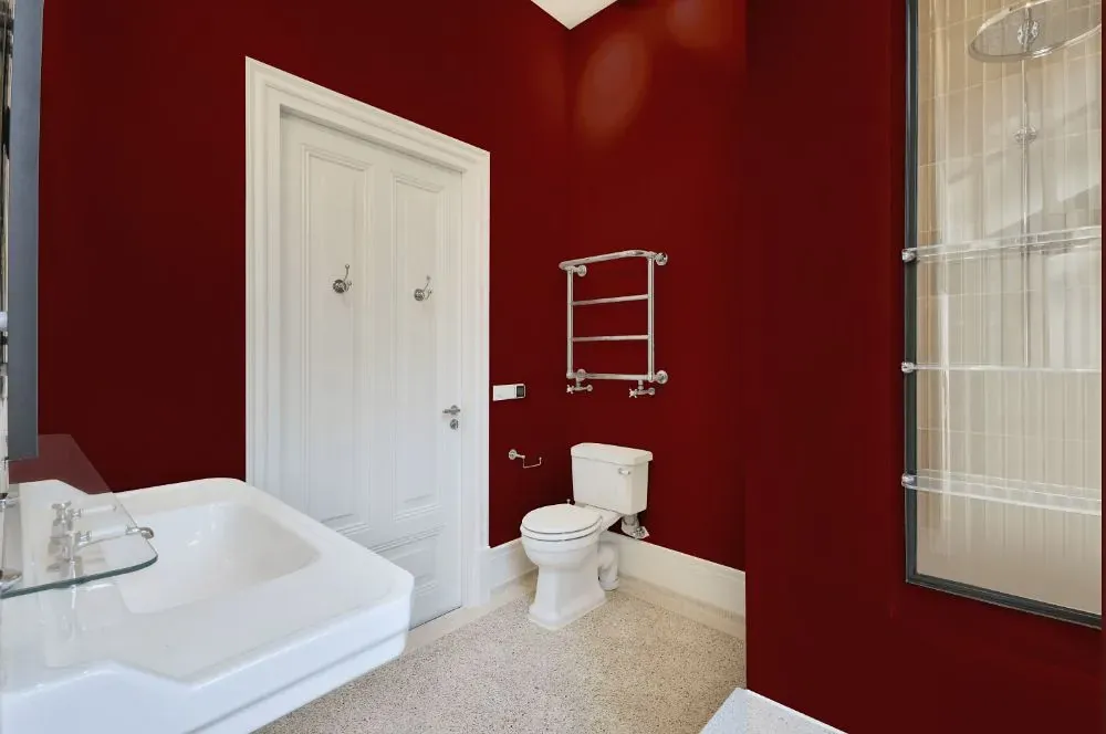
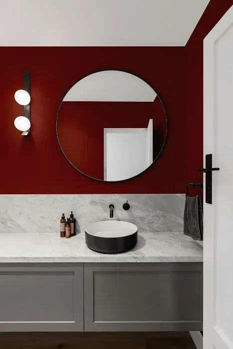
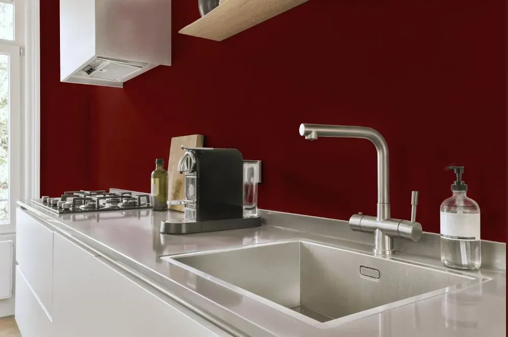
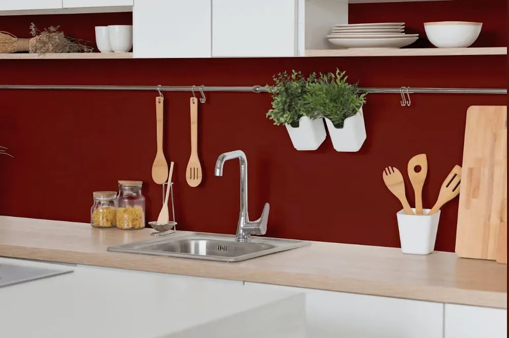
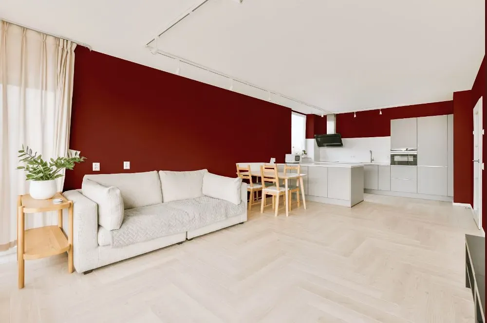
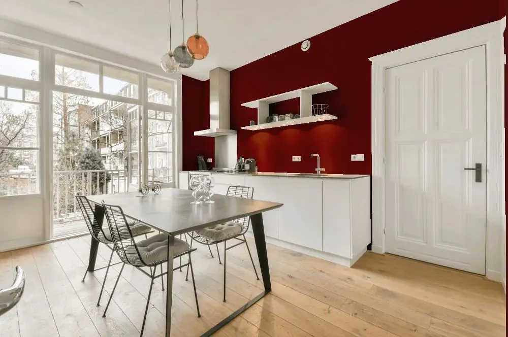
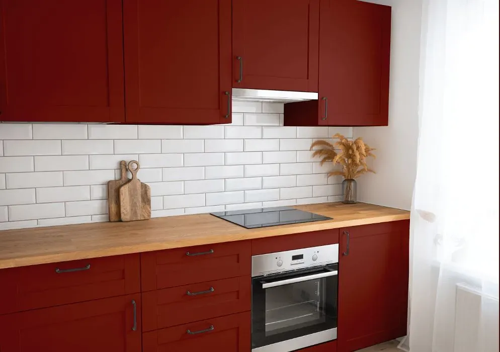
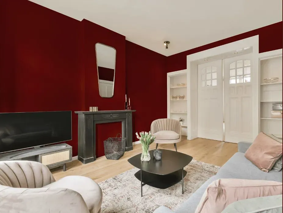
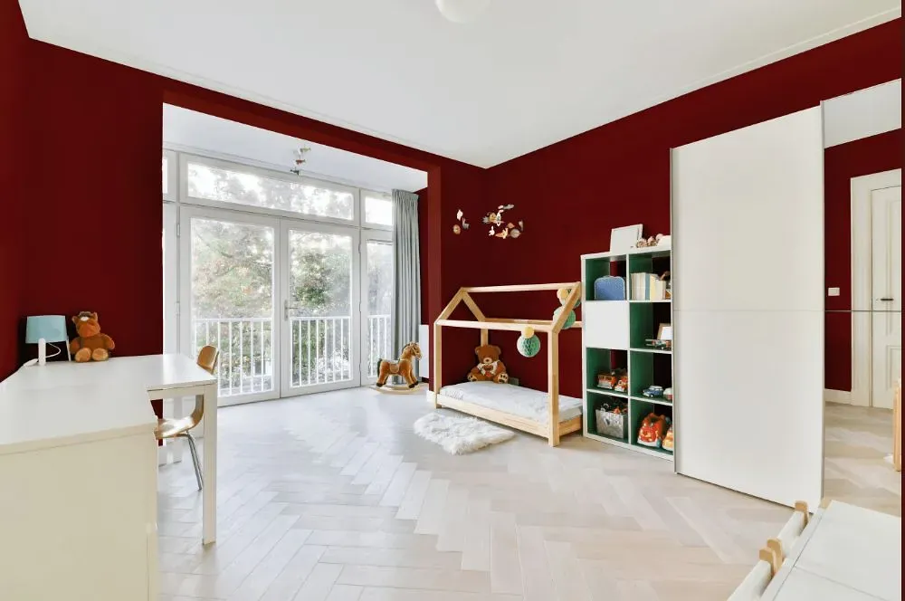
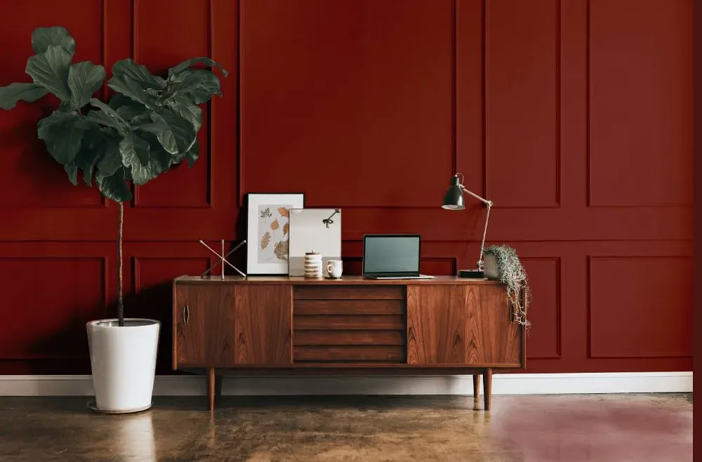
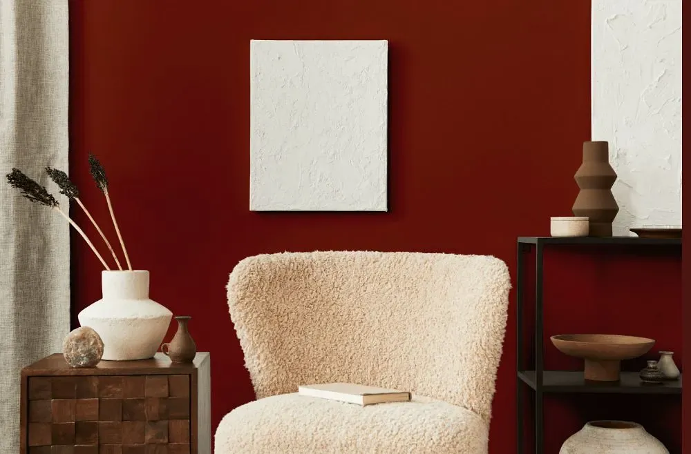
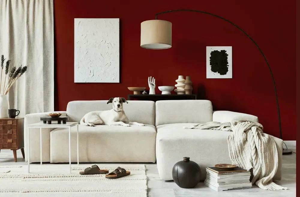
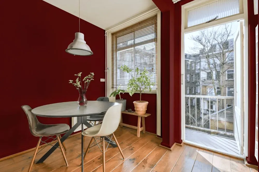
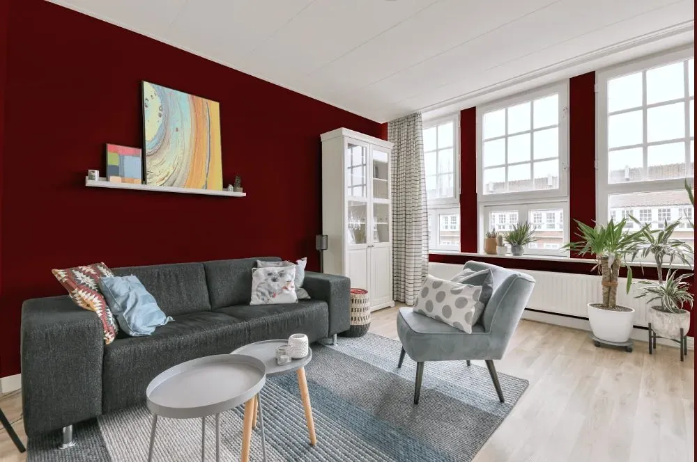
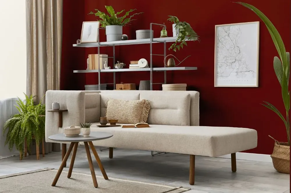
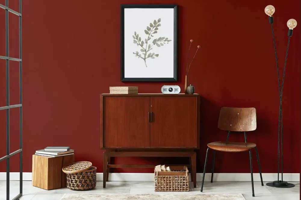
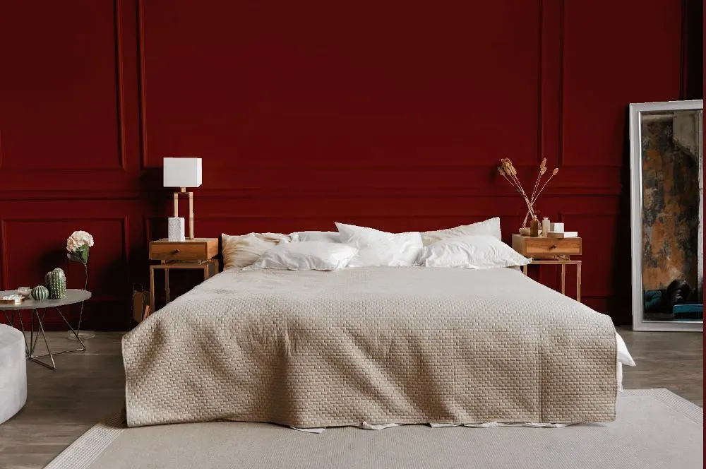
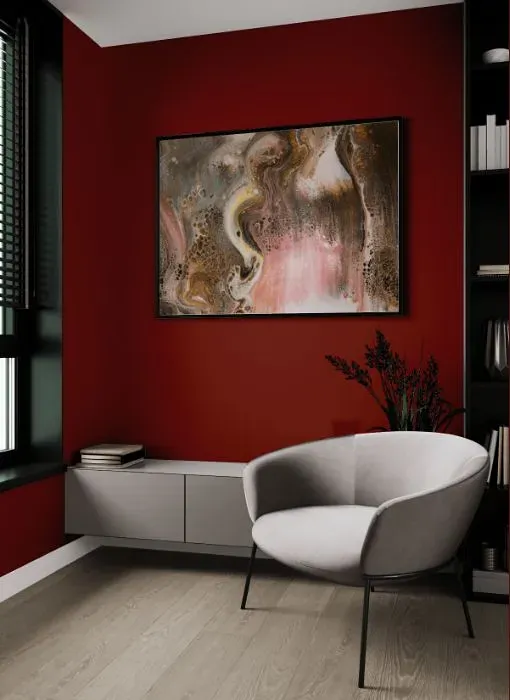
Benjamin Moore's Country Redwood (HC-183) is a rich and warm hue that exudes sophistication and coziness. This color pairs exceptionally well with soft neutrals like creamy whites or taupe to create a harmonious and inviting ambiance. For a more striking look, consider combining Country Redwood with deep blues or forest greens to add depth and contrast to your space. Whether used as an accent wall or throughout the room, the versatile nature of Country Redwood allows it to complement both traditional and contemporary design schemes effortlessly. Add a touch of elegance to your living space with Benjamin Moore's HC-183, creating a space that is both timeless and welcoming.
Loading...
LRV of Country Redwood
Country Redwood has an LRV of 8.03% and refers to Dark colors which means that this color almost does not reflect light. Why LRV is important?

Light Reflectance Value measures the amount of visible and usable light that reflects from a painted surface.
Simply put, the higher the LRV of a paint color, the brighter the room you will get.
The scale goes from 0% (absolute black, absorbing all light) to 100% (pure white, reflecting all light).
Act like a pro: When choosing paint with an LRV of 8.03%, pay attention to your bulbs' brightness. Light brightness is measured in lumens. The lower the paint's LRV, the higher lumen level you need. Every square foot of room needs at least 40 lumens. That means for a 200 ft2 living room you'll need about 8000 lumens of light – e.g., eight 1000 lm bulbs.
Color codes
We have collected almost every possible color code you could ever need.
Not sure what the difference between HEX and RGB is? We break down color models in plain language. Understanding color models
| Format | Code |
|---|---|
| HEX | #762C23 |
| RGB Decimal | 118, 44, 35 |
| RGB Percent | 46.27%, 17.25%, 13.73% |
| HSV | Hue: 7° Saturation: 70.34% Value: 46.27% |
| HSL | hsl(7, 54, 30) |
| CMYK | Cyan: 0.0 Magenta: 62.71 Yellow: 70.34 Key: 53.73 |
| YIQ | Y: 65.1 I: 46.989 Q: 12.853 |
| XYZ | X: 8.676 Y: 5.775 Z: 2.248 |
| CIE Lab | L:28.839 a:31.859 b:22.445 |
| CIE Luv | L:28.839 u:53.323 v:15.375 |
| Decimal | 7744547 |
| Hunter Lab | 24.032, 22.386, 11.277 |