Benjamin Moore Copper Clay 2172-10
Contentsshow +hide -
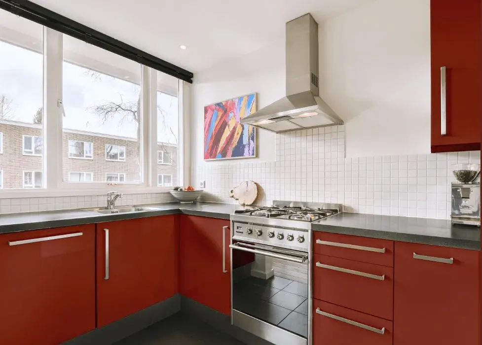
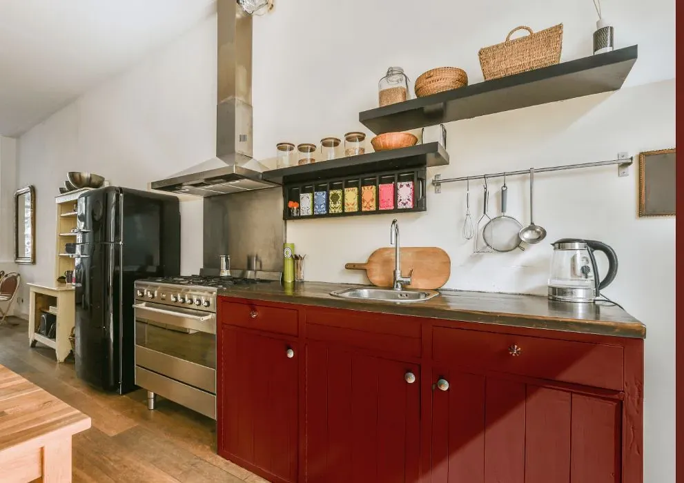
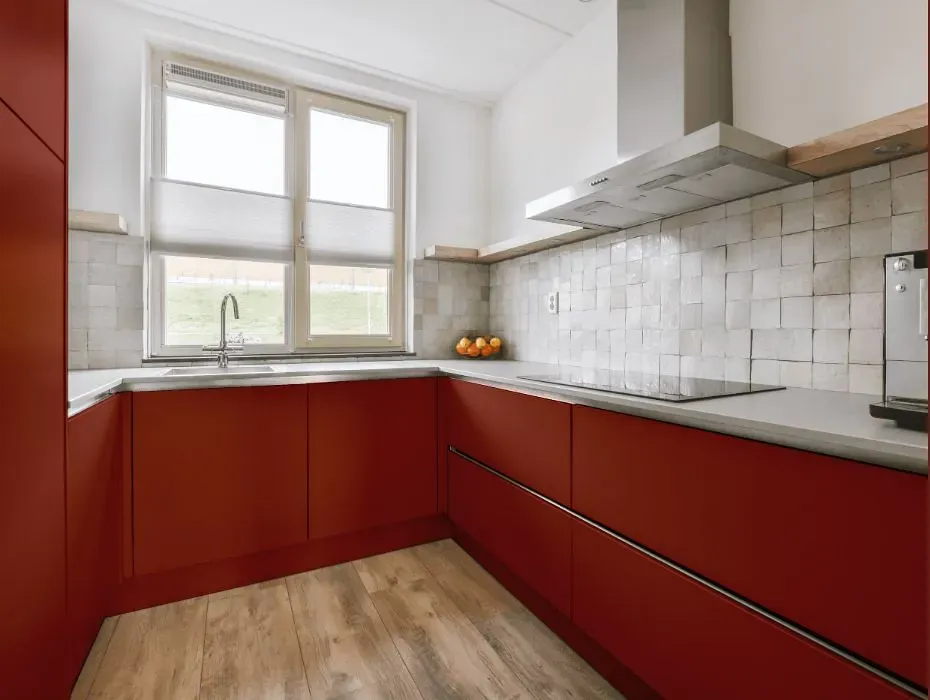
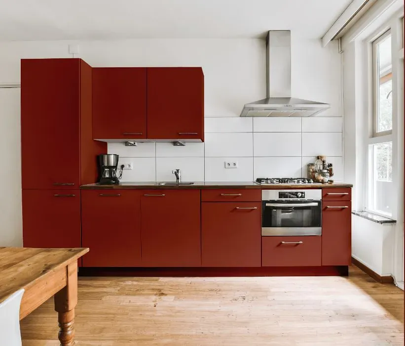
- Benjamin Moore Copper Clay reviews (23 photos)
- What are Benjamin Moore Copper Clay undertones?
- Is Copper Clay 2172-10 cool or warm?
- How light temperature affects on Copper Clay
- Monochromatic color scheme
- Complementary color scheme
- Color comparison and matching
- LRV of Copper Clay 2172-10
- Color codes
- Color equivalents
| Official page: | Copper Clay 2172-10 |
| Code: | 2172-10 |
| Name: | Copper Clay |
| Brand: | Benjamin Moore |
What color is Benjamin Moore Copper Clay?
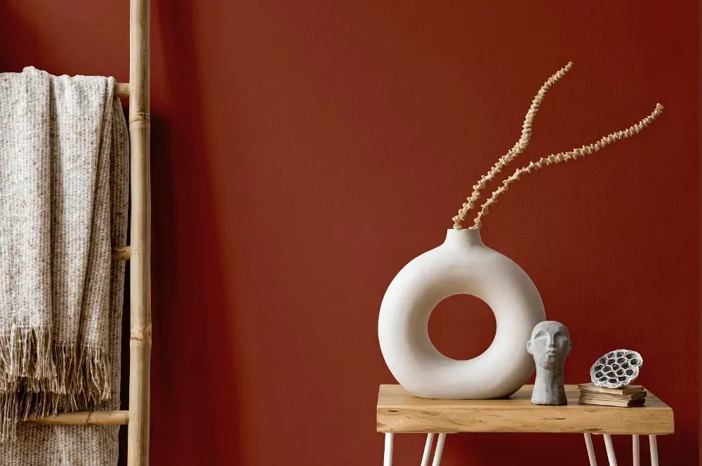
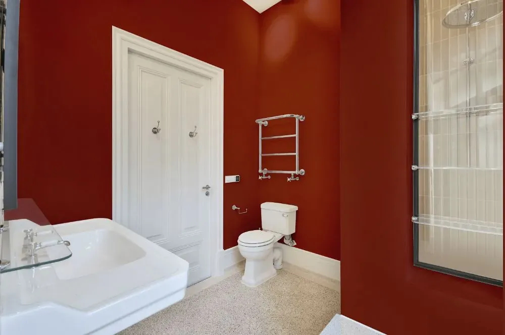
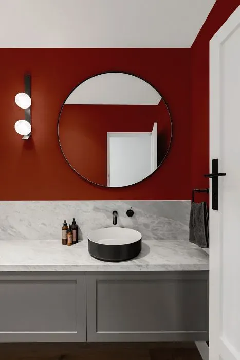
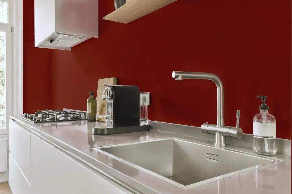
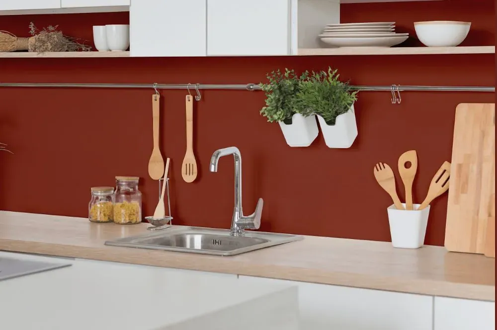
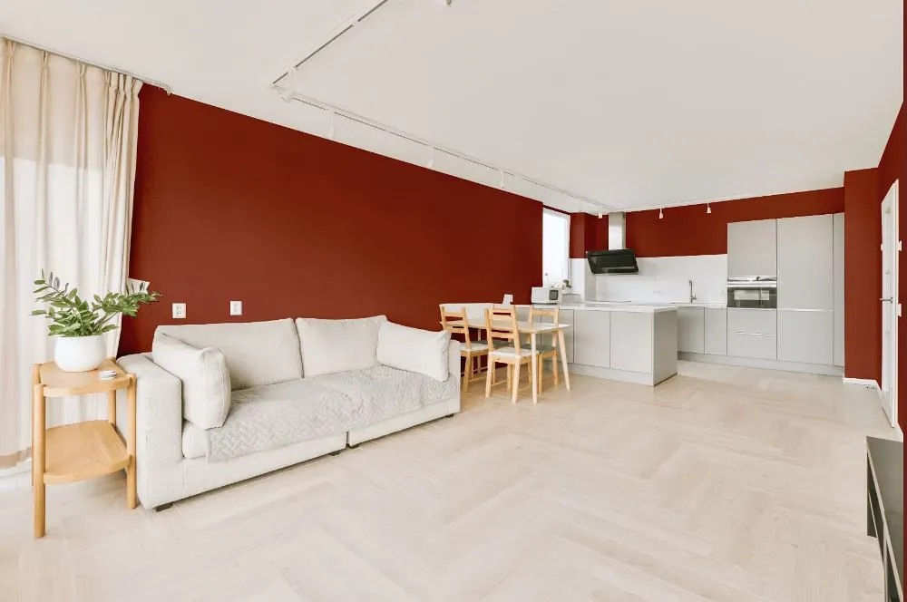
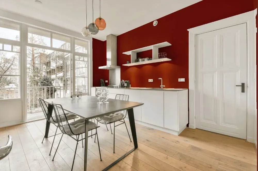
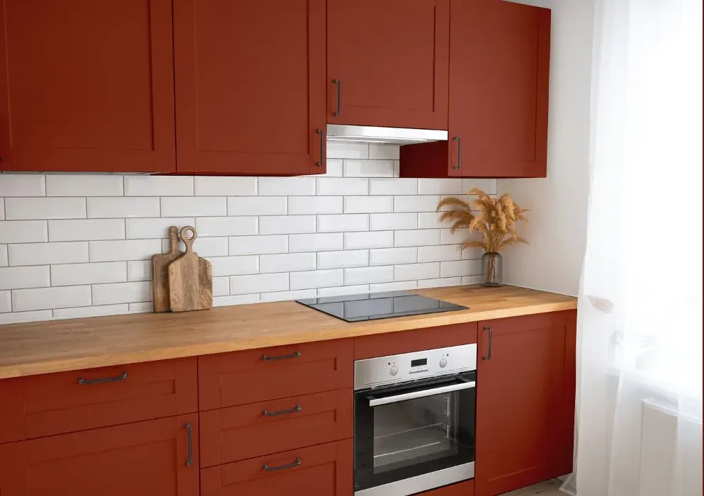
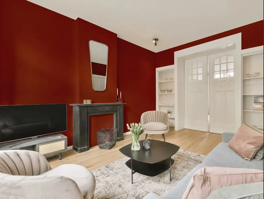
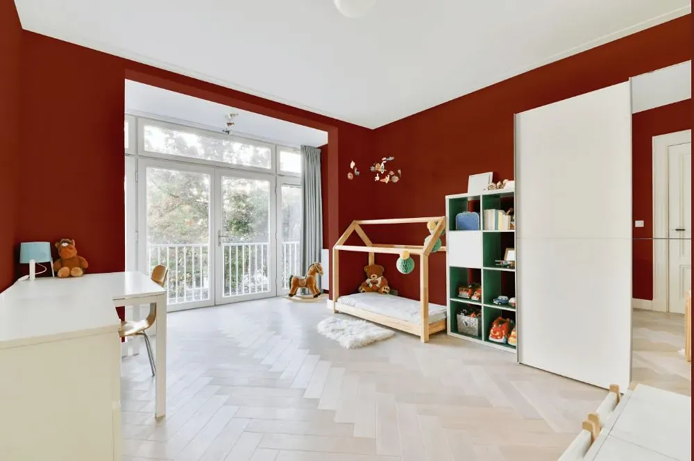
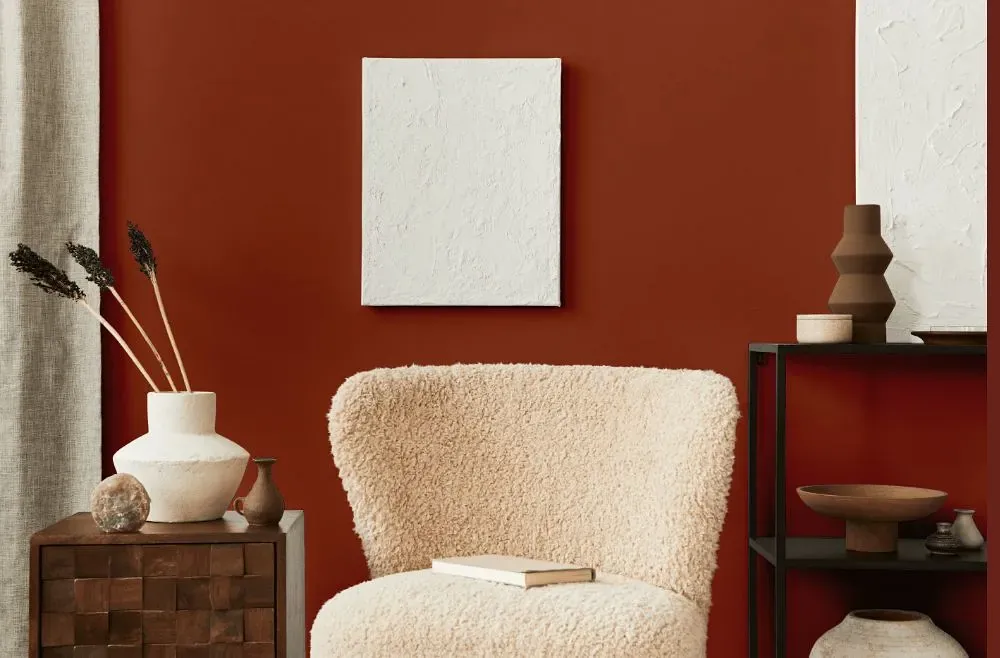
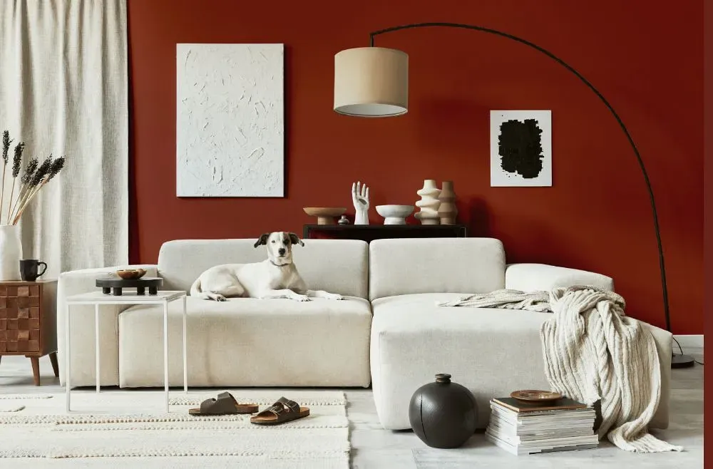
The warm and rich tones of Copper Clay are reminiscent of a sunset, adding a sense of coziness and sophistication to any space. When paired with soft creams and muted browns, Benjamin Moore 2172-10 harmoniously blends earthy elements into the decor. Incorporating pops of deep forest green or burnt orange can create a striking contrast, enhancing the overall depth and character of the room. The versatile nature of Copper Clay makes it a captivating choice for those seeking to infuse their interiors with a touch of refined elegance.
Loading...
LRV of Copper Clay
Copper Clay has an LRV of 10.6% and refers to Medium Dark which means that this color reflects very little light. Why LRV is important?

Light Reflectance Value measures the amount of visible and usable light that reflects from a painted surface.
Simply put, the higher the LRV of a paint color, the brighter the room you will get.
The scale goes from 0% (absolute black, absorbing all light) to 100% (pure white, reflecting all light).
Act like a pro: When choosing paint with an LRV of 10.6%, pay attention to your bulbs' brightness. Light brightness is measured in lumens. The lower the paint's LRV, the higher lumen level you need. Every square foot of room needs at least 40 lumens. That means for a 200 ft2 living room you'll need about 8000 lumens of light – e.g., eight 1000 lm bulbs.
Color codes
We have collected almost every possible color code you could ever need.
Not sure what the difference between HEX and RGB is? We break down color models in plain language. Understanding color models
| Format | Code |
|---|---|
| HEX | #8E4332 |
| RGB Decimal | 142, 67, 50 |
| RGB Percent | 55.69%, 26.27%, 19.61% |
| HSV | Hue: 11° Saturation: 64.79% Value: 55.69% |
| HSL | hsl(11, 48, 38) |
| CMYK | Cyan: 0.0 Magenta: 52.82 Yellow: 64.79 Key: 44.31 |
| YIQ | Y: 87.487 I: 50.155 Q: 10.575 |
| XYZ | X: 13.739 Y: 9.997 Z: 4.223 |
| CIE Lab | L:37.837 a:30.353 b:25.124 |
| CIE Luv | L:37.837 u:55.964 v:20.572 |
| Decimal | 9323314 |
| Hunter Lab | 31.618, 22.234, 14.214 |