Benjamin Moore Drop Dead Gorgeous 1329
Contentsshow +hide -
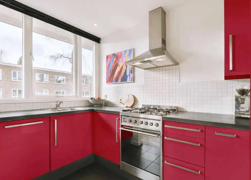
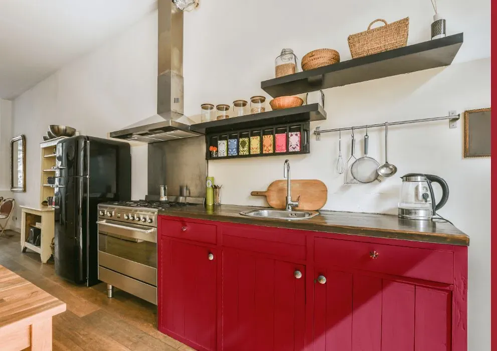
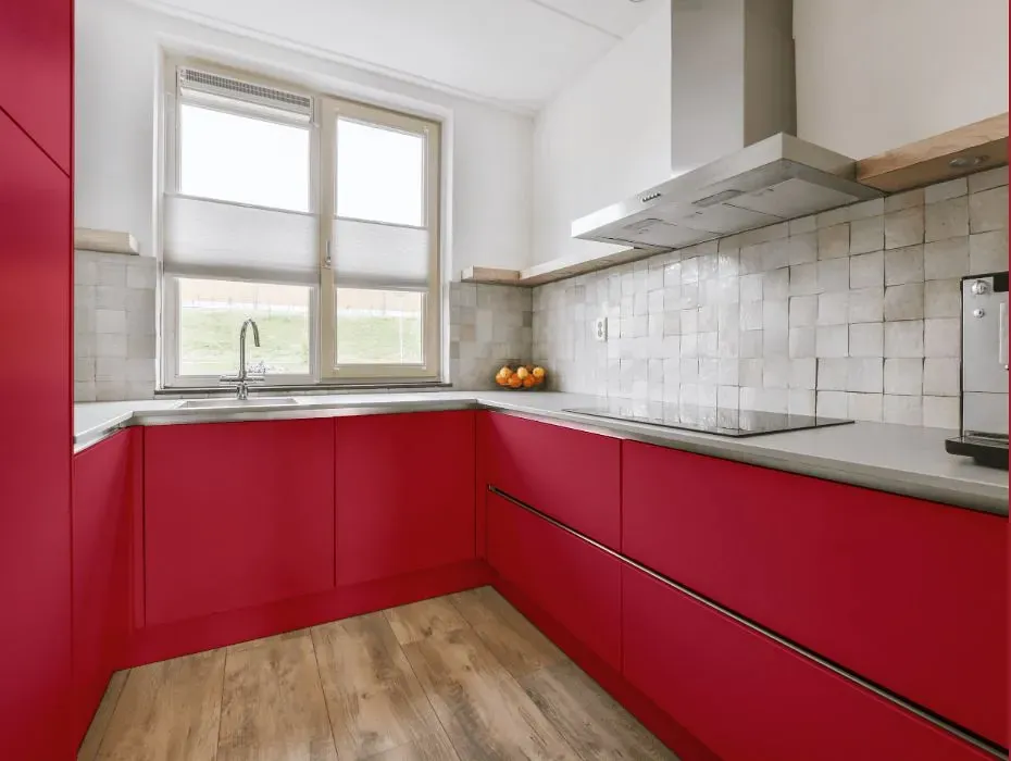
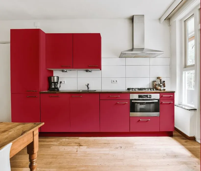
- Benjamin Moore Drop Dead Gorgeous reviews (23 photos)
- What are Benjamin Moore Drop Dead Gorgeous undertones?
- Is Drop Dead Gorgeous 1329 cool or warm?
- How light temperature affects on Drop Dead Gorgeous
- Monochromatic color scheme
- Complementary color scheme
- Color comparison and matching
- LRV of Drop Dead Gorgeous 1329
- Color codes
- Color equivalents
| Official page: | Drop Dead Gorgeous 1329 |
| Code: | 1329 |
| Name: | Drop Dead Gorgeous |
| Brand: | Benjamin Moore |
What color is Benjamin Moore Drop Dead Gorgeous?
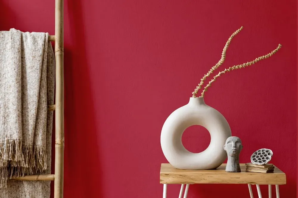
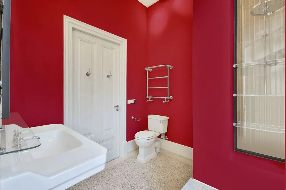
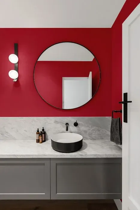
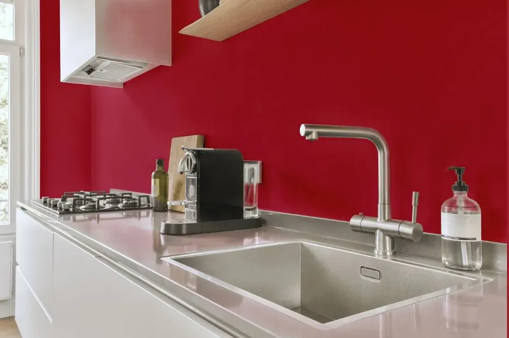
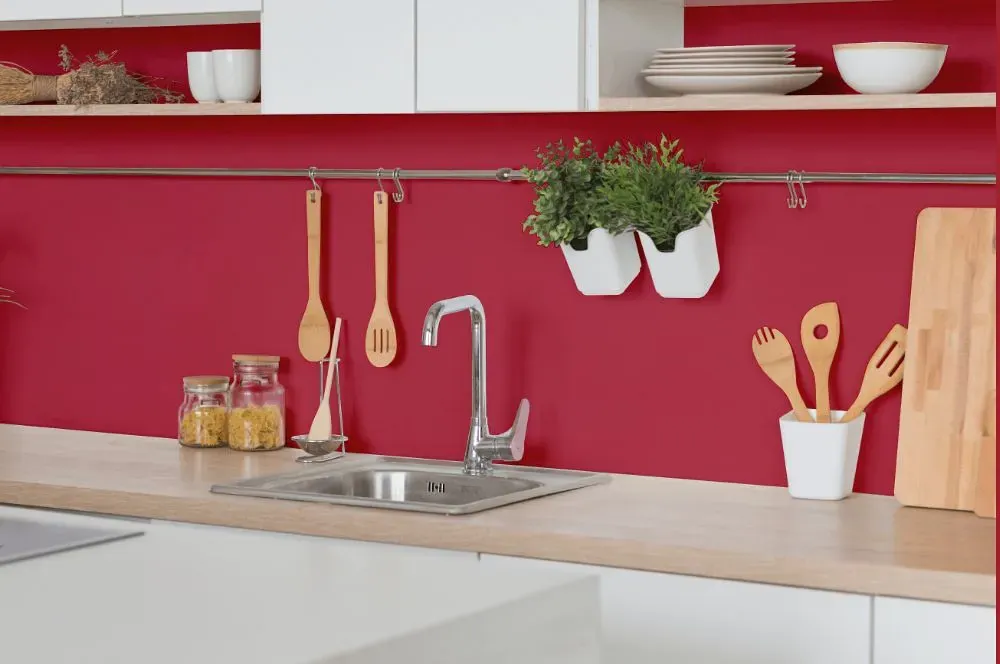
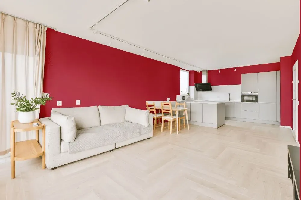
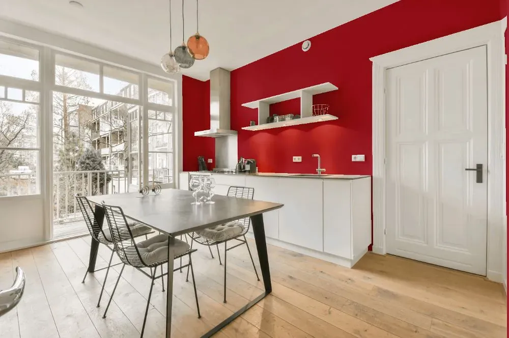
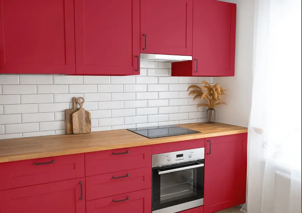
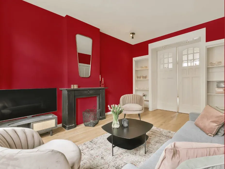
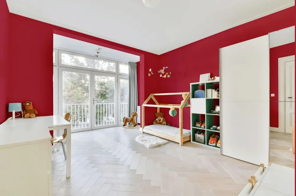
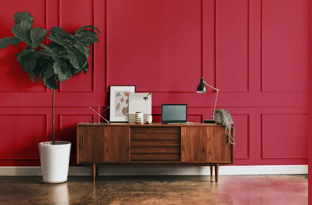
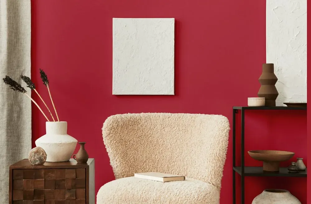
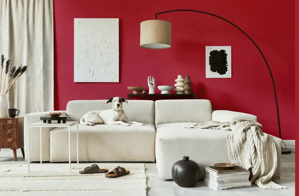
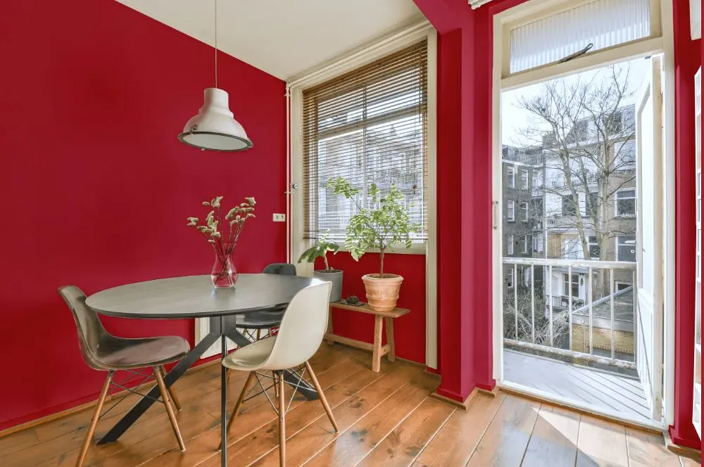
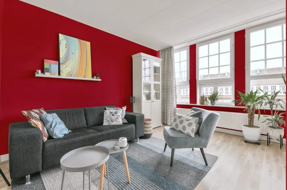
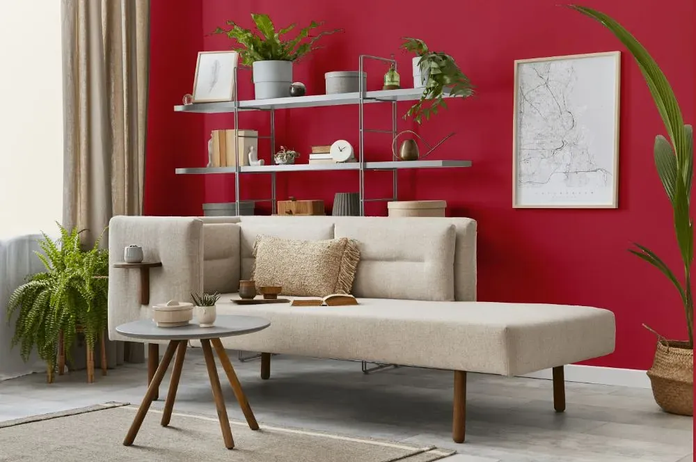
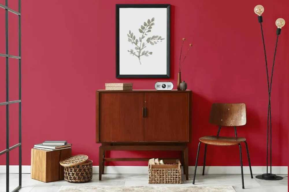
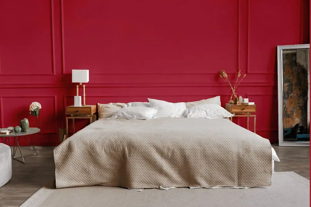
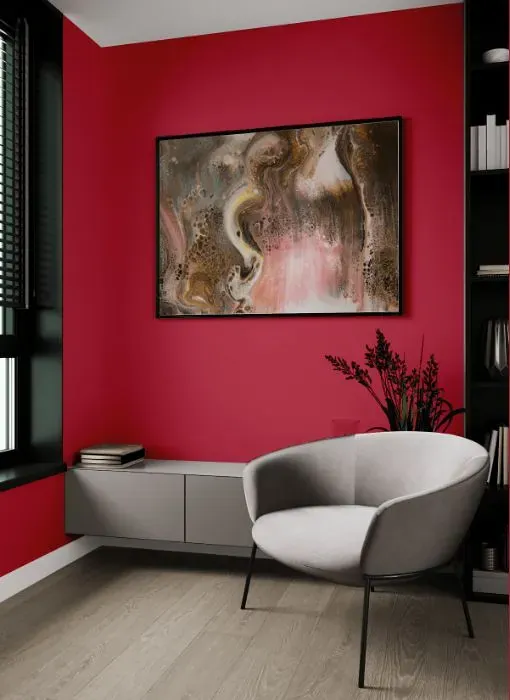
Are you ready to transform your space with Benjamin Moore 1329 Drop Dead Gorgeous? This deep and sultry shade exudes sophistication and drama, making it the perfect choice for a bold accent wall or a statement piece of furniture. Pair Drop Dead Gorgeous with soft neutrals like Benjamin Moore Simply White (OC-117) for a classy and elegant look, or add a pop of color with Benjamin Moore Gentleman’s Gray (2062-20) for a modern and chic vibe. Whether you're revamping your living room or giving your bedroom a stylish makeover, Drop Dead Gorgeous will instantly elevate your decor to a whole new level.
Loading...
LRV of Drop Dead Gorgeous
Drop Dead Gorgeous has an LRV of 15.32% and refers to Medium Dark which means that this color reflects very little light. Why LRV is important?

Light Reflectance Value measures the amount of visible and usable light that reflects from a painted surface.
Simply put, the higher the LRV of a paint color, the brighter the room you will get.
The scale goes from 0% (absolute black, absorbing all light) to 100% (pure white, reflecting all light).
Act like a pro: When choosing paint with an LRV of 15.32%, pay attention to your bulbs' brightness. Light brightness is measured in lumens. The lower the paint's LRV, the higher lumen level you need. Every square foot of room needs at least 40 lumens. That means for a 200 ft2 living room you'll need about 8000 lumens of light – e.g., eight 1000 lm bulbs.
Color codes
We have collected almost every possible color code you could ever need.
Not sure what the difference between HEX and RGB is? We break down color models in plain language. Understanding color models
| Format | Code |
|---|---|
| HEX | #BB4254 |
| RGB Decimal | 187, 66, 84 |
| RGB Percent | 73.33%, 25.88%, 32.94% |
| HSV | Hue: 351° Saturation: 64.71% Value: 73.33% |
| HSL | hsl(351, 48, 50) |
| CMYK | Cyan: 0.0 Magenta: 64.71 Yellow: 55.08 Key: 26.67 |
| YIQ | Y: 104.231 I: 66.32 Q: 31.198 |
| XYZ | X: 24.044 Y: 15.104 Z: 10.034 |
| CIE Lab | L:45.777 a:49.942 b:16.173 |
| CIE Luv | L:45.777 u:86.153 v:9.479 |
| Decimal | 12272212 |
| Hunter Lab | 38.864, 42.418, 11.897 |