Benjamin Moore Gentle Butterfly / Hint of Pink / 2173-70
Contentsshow +hide -
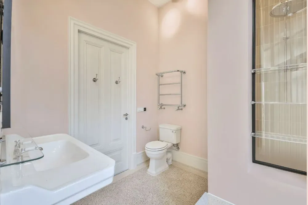
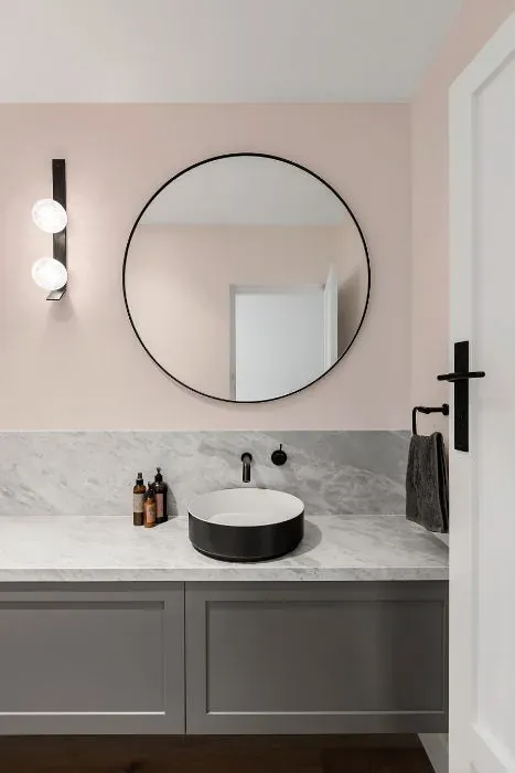
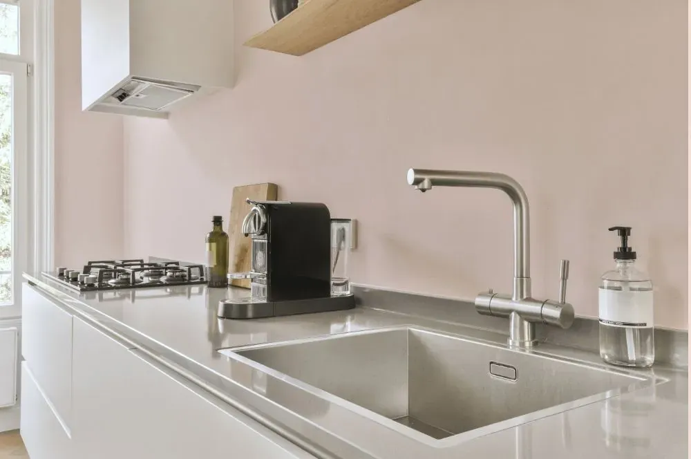
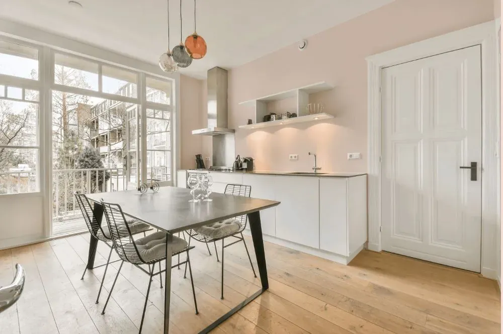
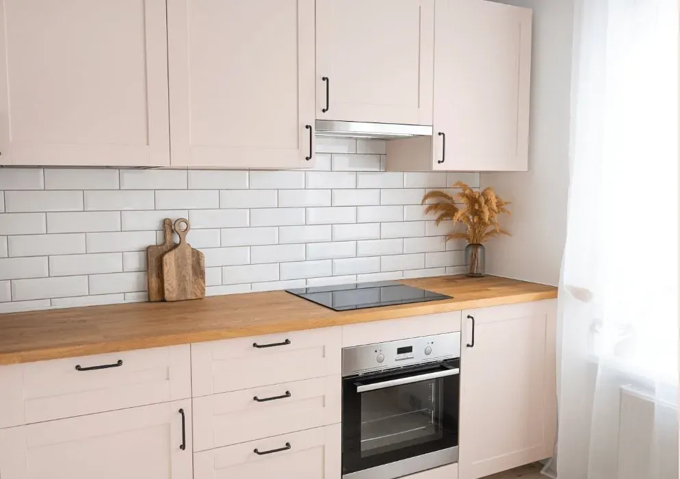
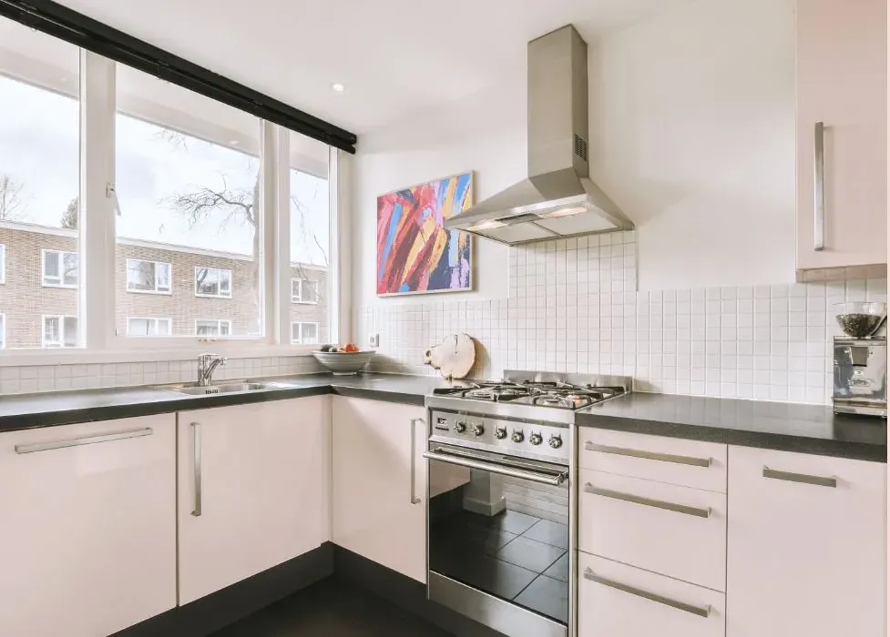
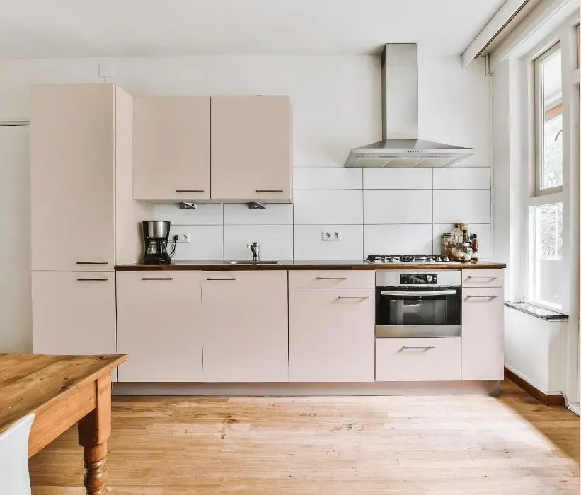
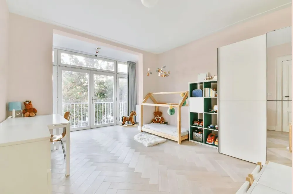
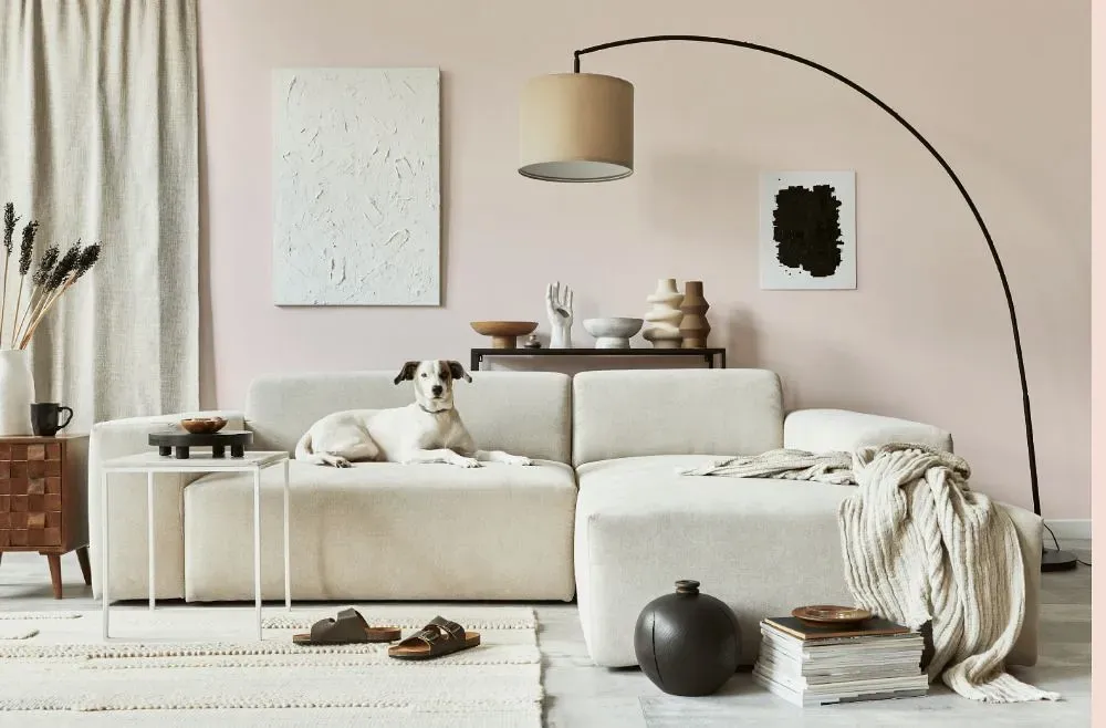
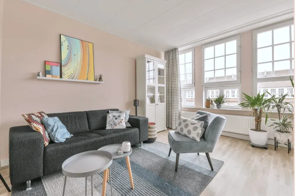
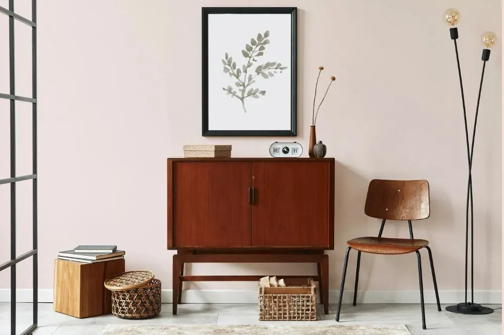
- Benjamin Moore Gentle Butterfly reviews (46 photos)
- What are Benjamin Moore Gentle Butterfly undertones?
- Is Gentle Butterfly 2173-70 cool or warm?
- How light temperature affects on Gentle Butterfly
- Monochromatic color scheme
- Complementary color scheme
- Color comparison and matching
- LRV of Gentle Butterfly 2173-70
- Color codes
- Color equivalents
| Official page: | Gentle Butterfly 2173-70 |
| Code: | 2173-70 |
| Name: | Gentle Butterfly |
| Brand: | Benjamin Moore |
What color is Benjamin Moore Gentle Butterfly?
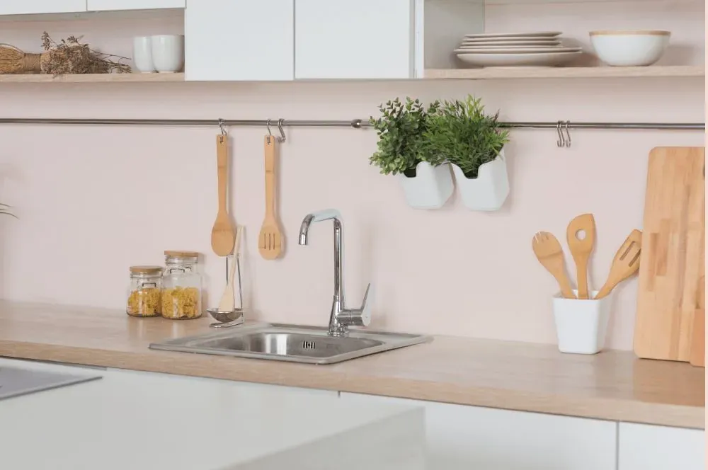
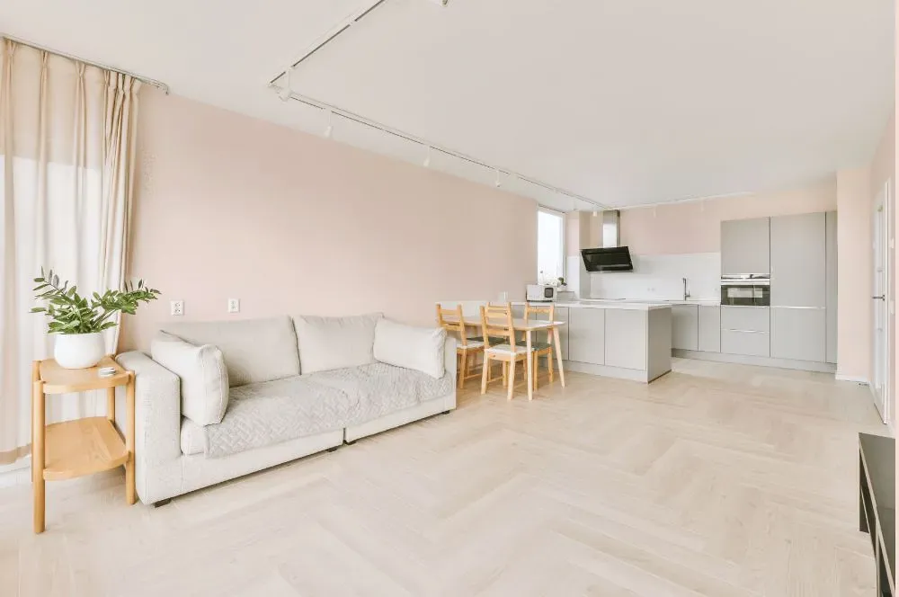
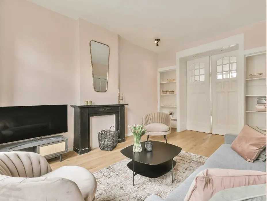
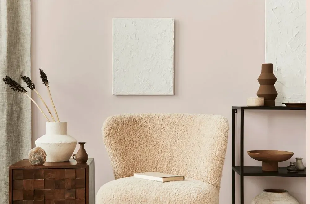
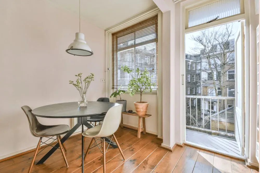
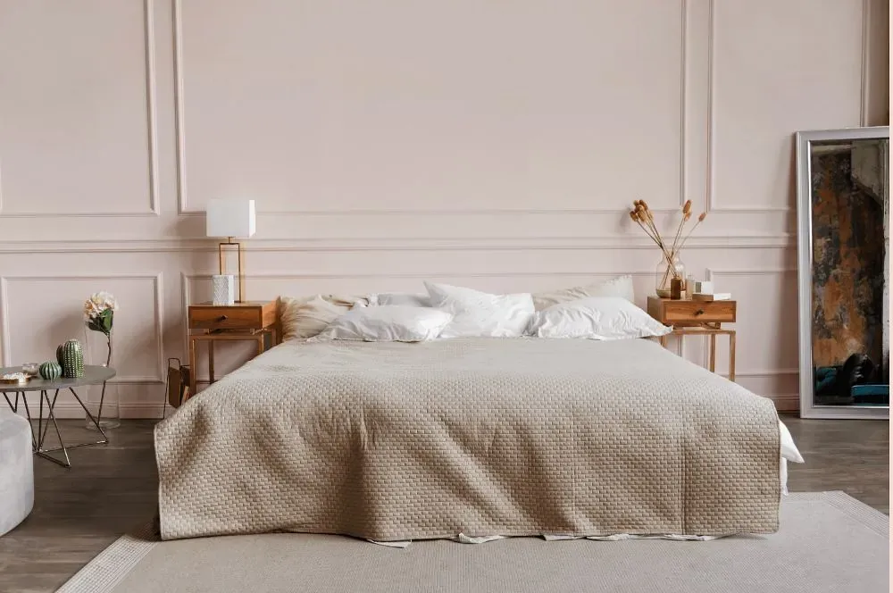
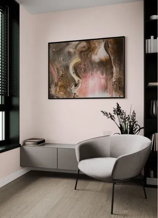
Benjamin Moore's Gentle Butterfly 2173-70 is a soft and serene shade that brings a sense of calm to any space. This delicate hue pairs beautifully with crisp whites and creamy off-whites for a classic look. For a more modern feel, consider combining Gentle Butterfly with accents of soft greys or pale blush tones. Whether used on walls, furniture, or decor accents, this versatile color adds a touch of elegance to any room. Embrace the tranquil beauty of Gentle Butterfly 2173-70 and create a harmonious space that radiates peace and sophistication.
Loading...
LRV of Gentle Butterfly
Gentle Butterfly has an LRV of 81.64% and refers to Off‑White colors that reflect a lot of light. Why LRV is important?

Light Reflectance Value measures the amount of visible and usable light that reflects from a painted surface.
Simply put, the higher the LRV of a paint color, the brighter the room you will get.
The scale goes from 0% (absolute black, absorbing all light) to 100% (pure white, reflecting all light).
Act like a pro: When choosing paint with an LRV of 81.64%, pay attention to your bulbs' brightness. Light brightness is measured in lumens. The lower the paint's LRV, the higher lumen level you need. Every square foot of room needs at least 40 lumens. That means for a 200 ft2 living room you'll need about 8000 lumens of light – e.g., eight 1000 lm bulbs.
Color codes
We have collected almost every possible color code you could ever need.
Not sure what the difference between HEX and RGB is? We break down color models in plain language. Understanding color models
| Format | Code |
|---|---|
| HEX | #F7E8E2 |
| RGB Decimal | 247, 232, 226 |
| RGB Percent | 96.86%, 90.98%, 88.63% |
| HSV | Hue: 17° Saturation: 8.5% Value: 96.86% |
| HSL | hsl(17, 57, 93) |
| CMYK | Cyan: 0.0 Magenta: 6.07 Yellow: 8.5 Key: 3.14 |
| YIQ | Y: 235.801 I: 10.867 Q: 1.306 |
| XYZ | X: 80.939 Y: 82.979 Z: 83.684 |
| CIE Lab | L:93.005 a:4.075 b:4.741 |
| CIE Luv | L:93.005 u:9.069 v:6.44 |
| Decimal | 16247010 |
| Hunter Lab | 91.093, -0.809, 9.298 |