Benjamin Moore Island Sunset 1346
Contentsshow +hide -
- Benjamin Moore Island Sunset reviews (23 photos)
- What are Benjamin Moore Island Sunset undertones?
- Is Island Sunset 1346 cool or warm?
- How light temperature affects on Island Sunset
- Monochromatic color scheme
- Complementary color scheme
- Color comparison and matching
- LRV of Island Sunset 1346
- Color codes
- Color equivalents
| Official page: | Island Sunset 1346 |
| Code: | 1346 |
| Name: | Island Sunset |
| Brand: | Benjamin Moore |
What color is Benjamin Moore Island Sunset?
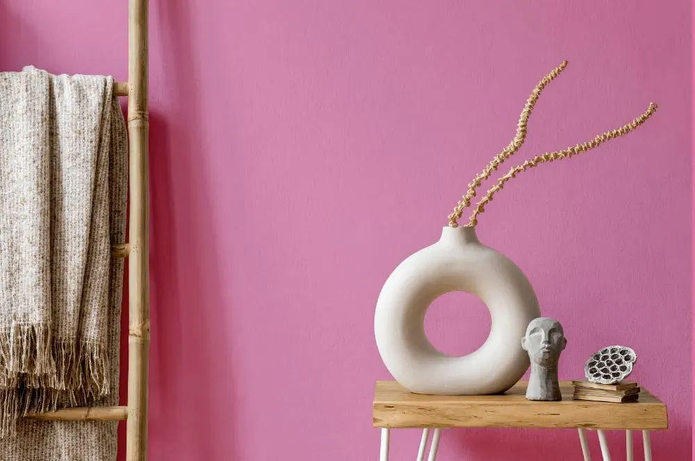
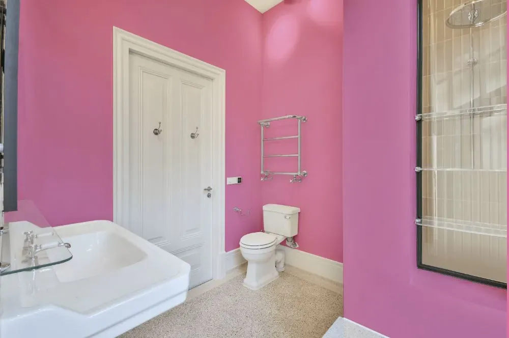
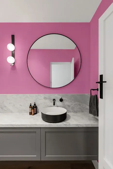
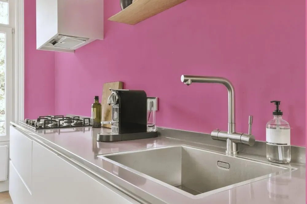
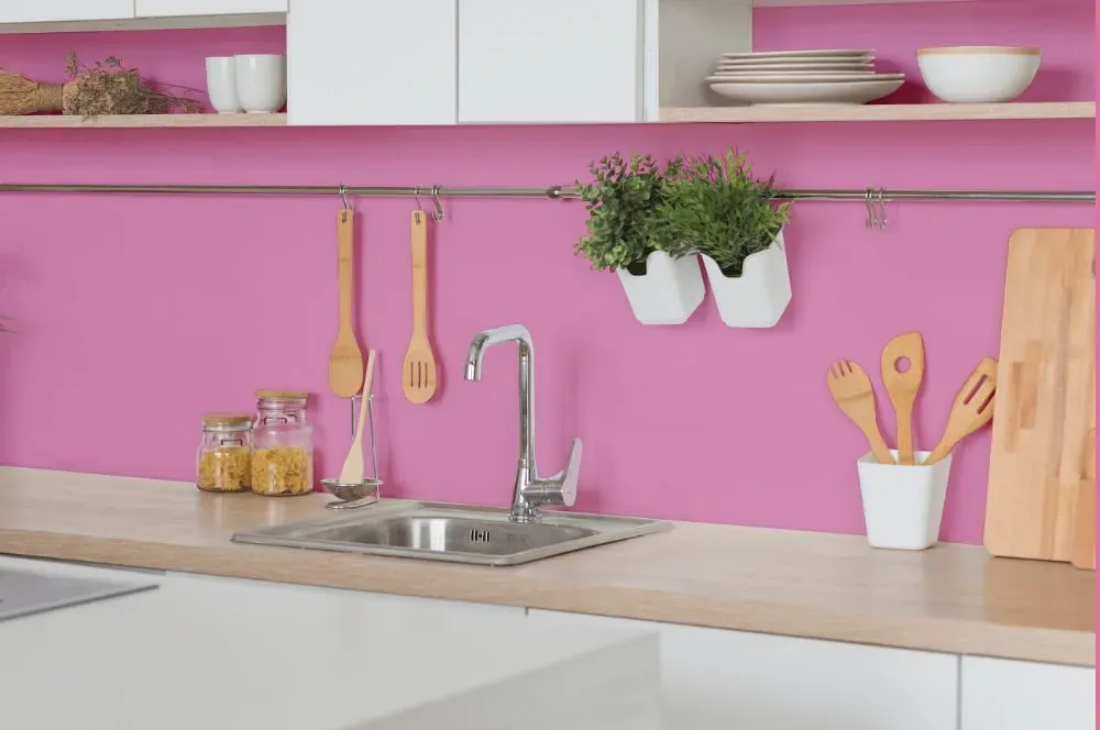
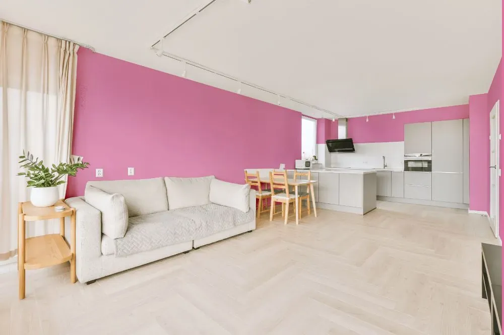
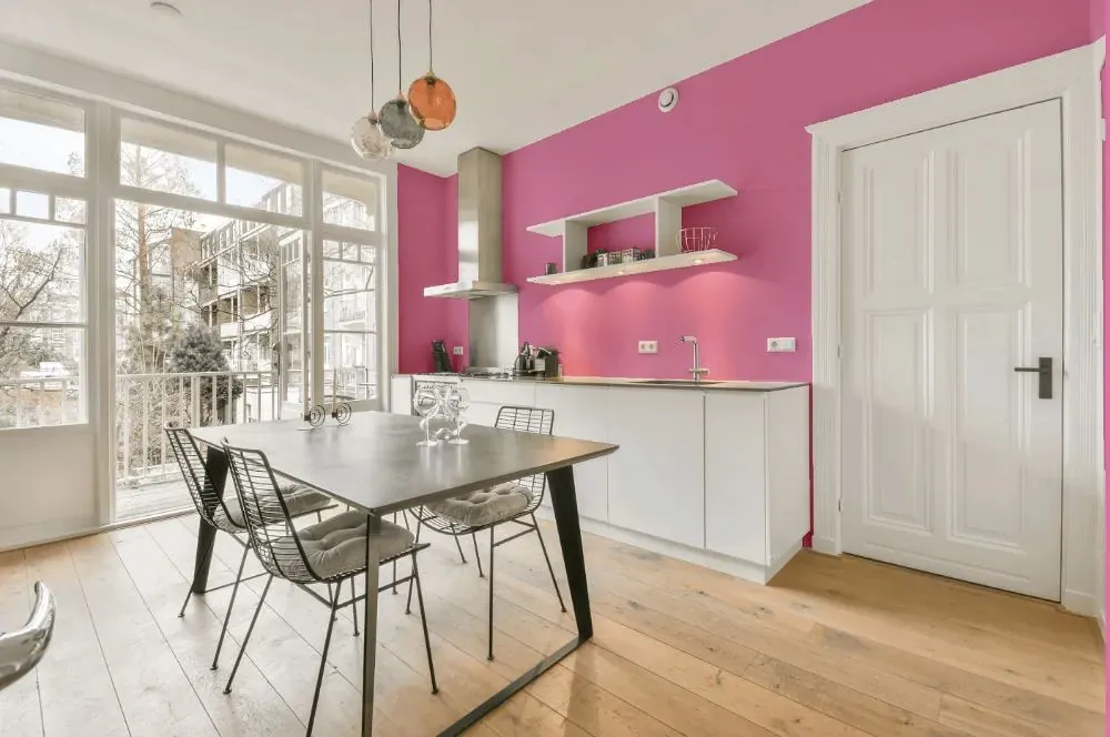
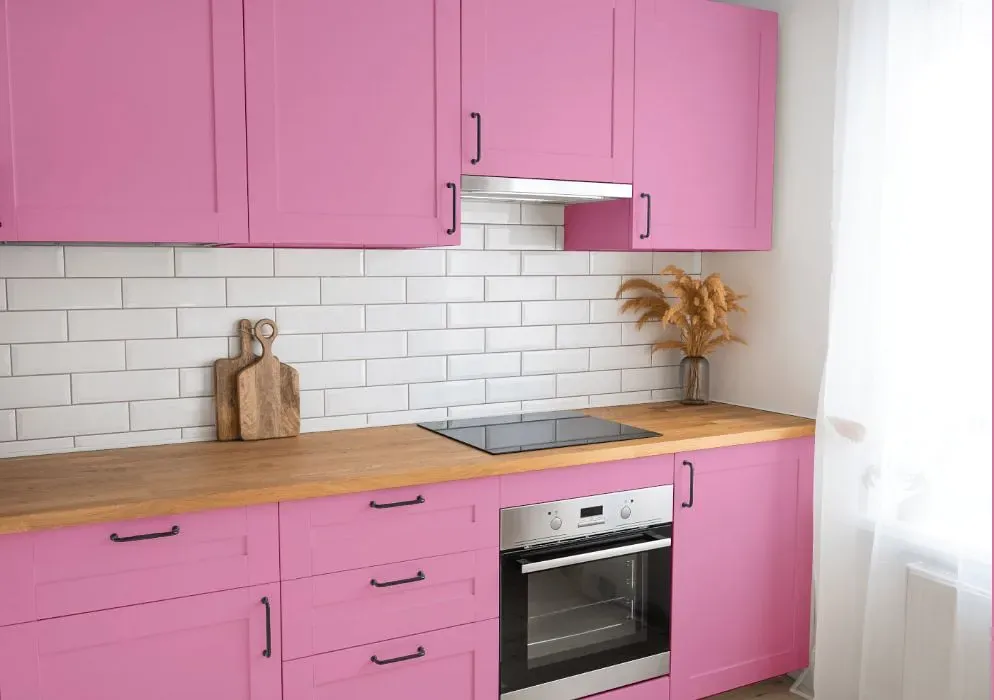
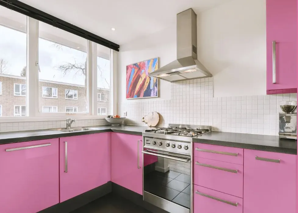
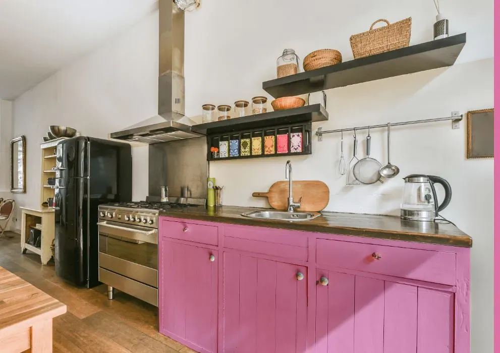
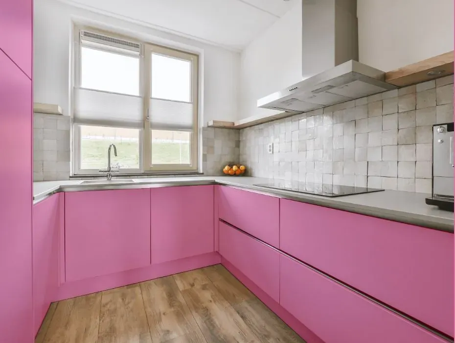
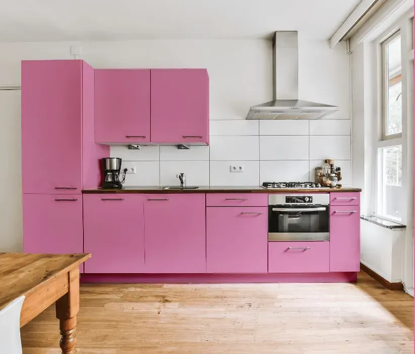
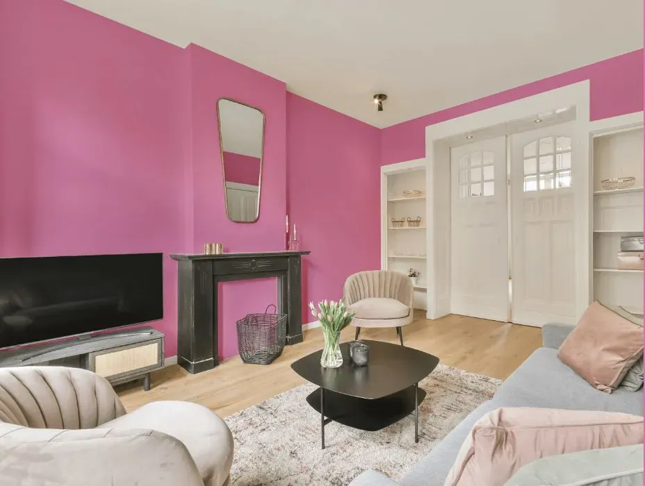
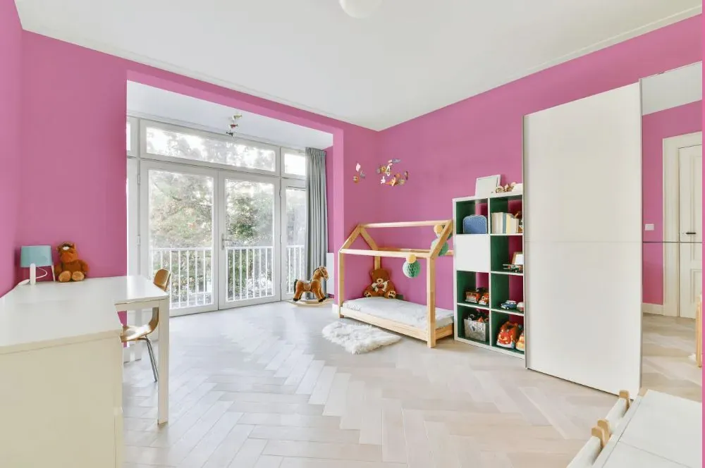
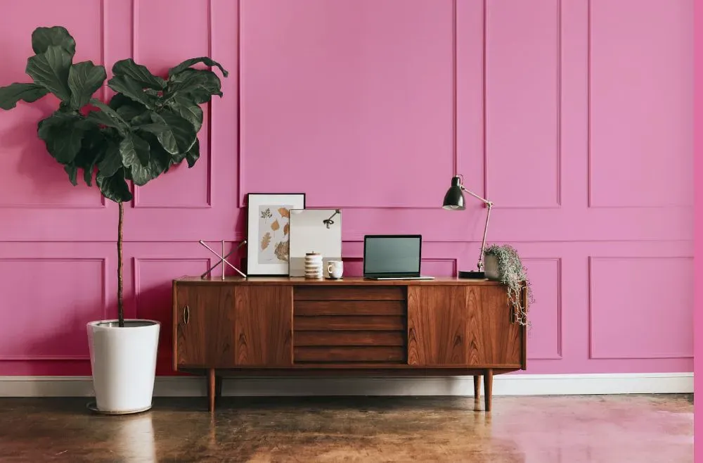
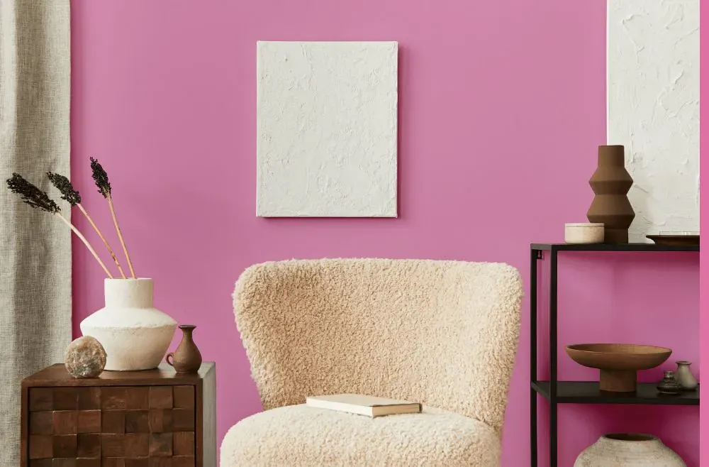
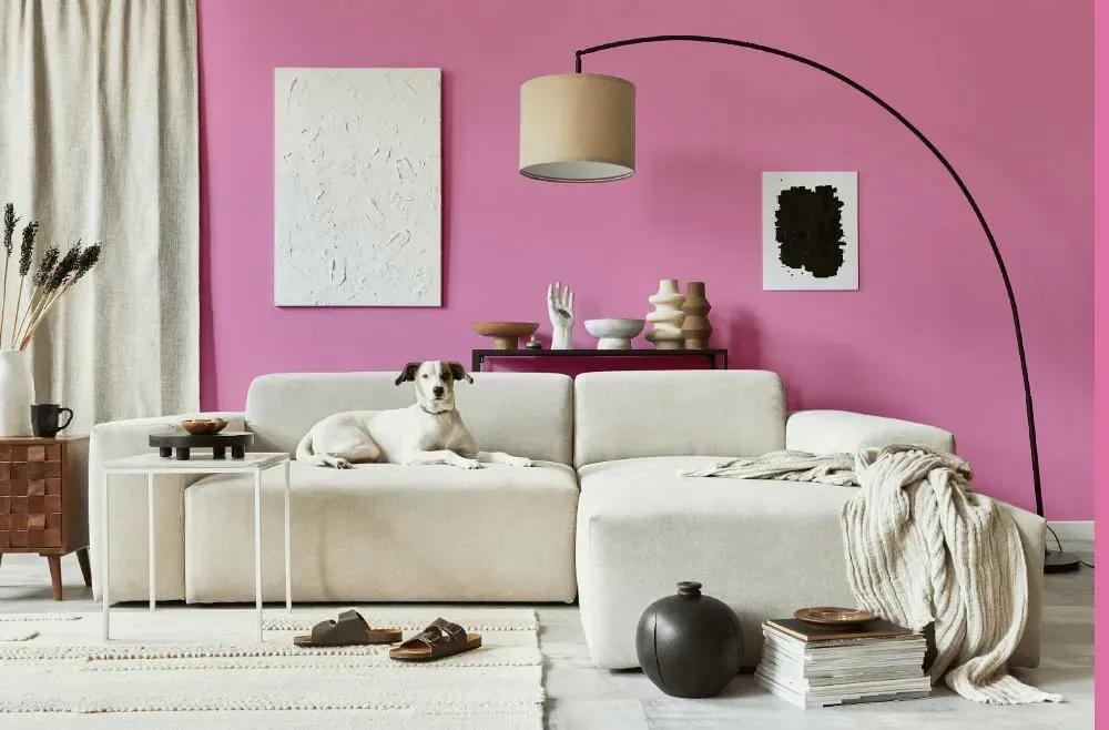
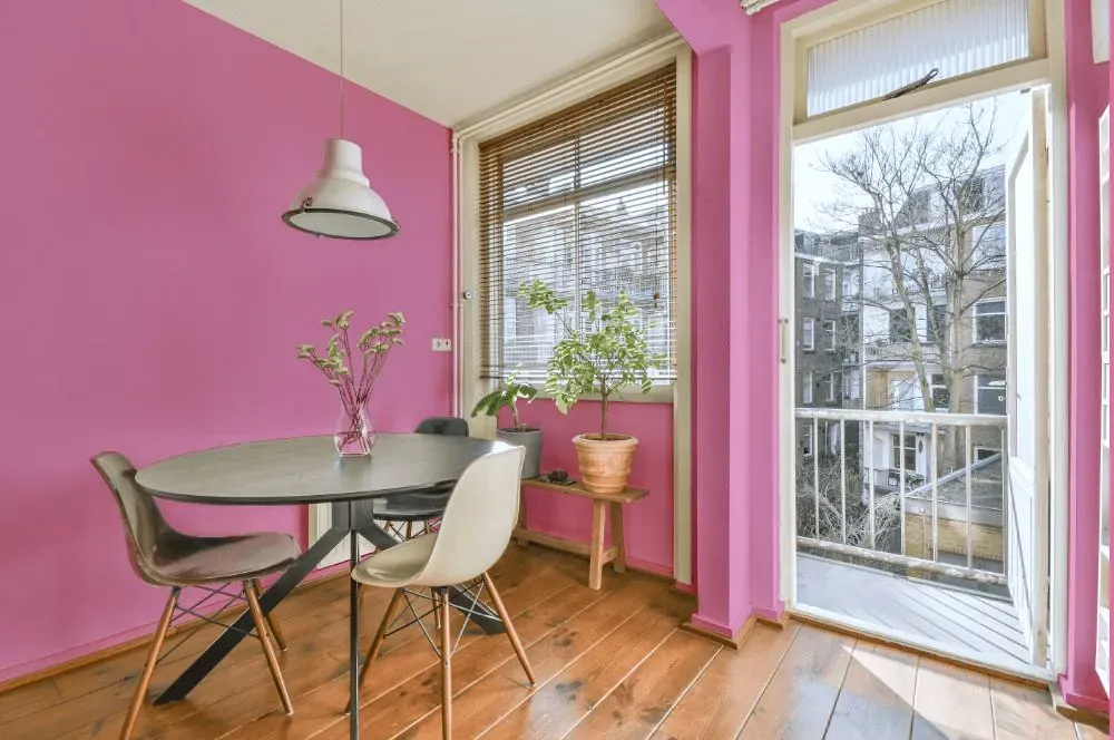
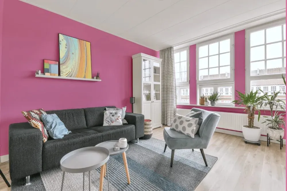
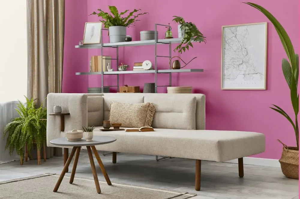
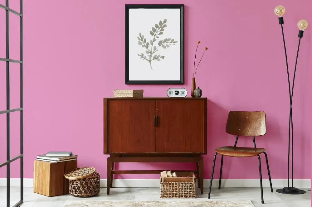
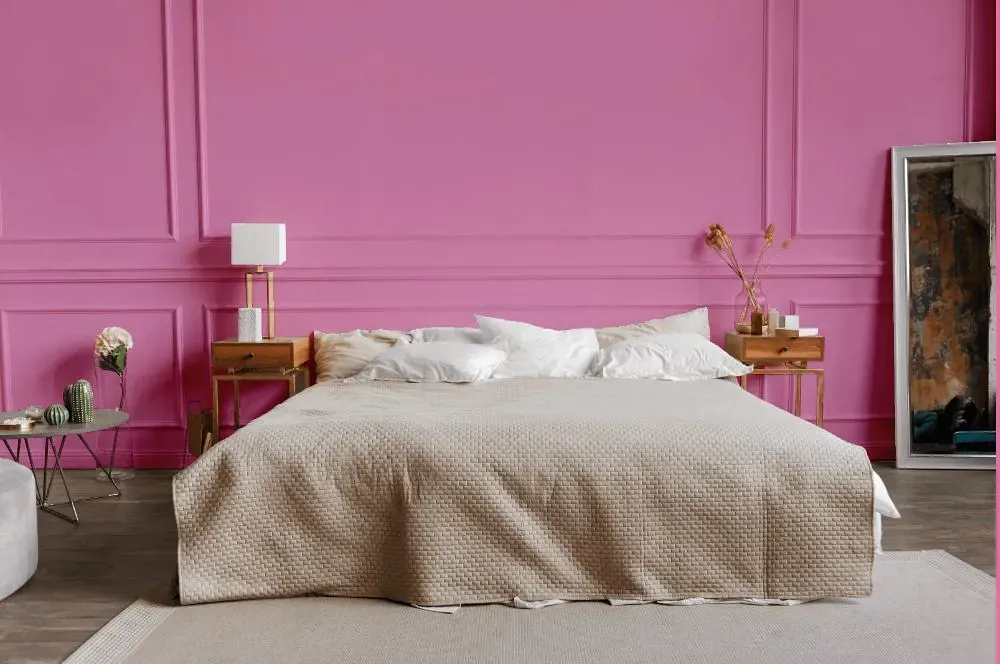
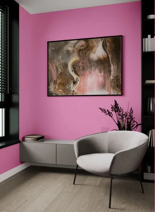
Benjamin Moore 1346 Island Sunset is a warm and inviting hue that adds a touch of tropical charm to any space. This rich orange with a hint of pink radiates energy and coziness, perfect for creating a welcoming atmosphere in your home. Pair Island Sunset with soft neutrals like Benjamin Moore White Dove (OC-17) or Benjamin Moore Revere Pewter (HC-172) for a harmonious contrast. For a more daring look, combine it with bold colors like Benjamin Moore Hale Navy (HC-154) or Benjamin Moore Golden Retriever (2165-30) to create a vibrant and cheerful space that exudes personality. Brighten up your living room, bedroom, or even kitchen with Island Sunset to infuse your home with warmth and style.
Loading...
LRV of Island Sunset
Island Sunset has an LRV of 43.81% and refers to Light Medium colors that reflect half of the incident light. Why LRV is important?

Light Reflectance Value measures the amount of visible and usable light that reflects from a painted surface.
Simply put, the higher the LRV of a paint color, the brighter the room you will get.
The scale goes from 0% (absolute black, absorbing all light) to 100% (pure white, reflecting all light).
Act like a pro: When choosing paint with an LRV of 43.81%, pay attention to your bulbs' brightness. Light brightness is measured in lumens. The lower the paint's LRV, the higher lumen level you need. Every square foot of room needs at least 40 lumens. That means for a 200 ft2 living room you'll need about 8000 lumens of light – e.g., eight 1000 lm bulbs.
Color codes
We have collected almost every possible color code you could ever need.
Not sure what the difference between HEX and RGB is? We break down color models in plain language. Understanding color models
| Format | Code |
|---|---|
| HEX | #E898BF |
| RGB Decimal | 232, 152, 191 |
| RGB Percent | 90.98%, 59.61%, 74.90% |
| HSV | Hue: 331° Saturation: 34.48% Value: 90.98% |
| HSL | hsl(331, 63, 75) |
| CMYK | Cyan: 0.0 Magenta: 34.48 Yellow: 17.67 Key: 9.02 |
| YIQ | Y: 180.366 I: 35.14 Q: 29.06 |
| XYZ | X: 53.911 Y: 43.377 Z: 54.809 |
| CIE Lab | L:71.81 a:35.396 b:-7.7 |
| CIE Luv | L:71.81 u:46.969 v:-17.82 |
| Decimal | 15243455 |
| Hunter Lab | 65.861, 30.854, -3.238 |