Benjamin Moore Springtime Bloom 2079-40
Contentsshow +hide -
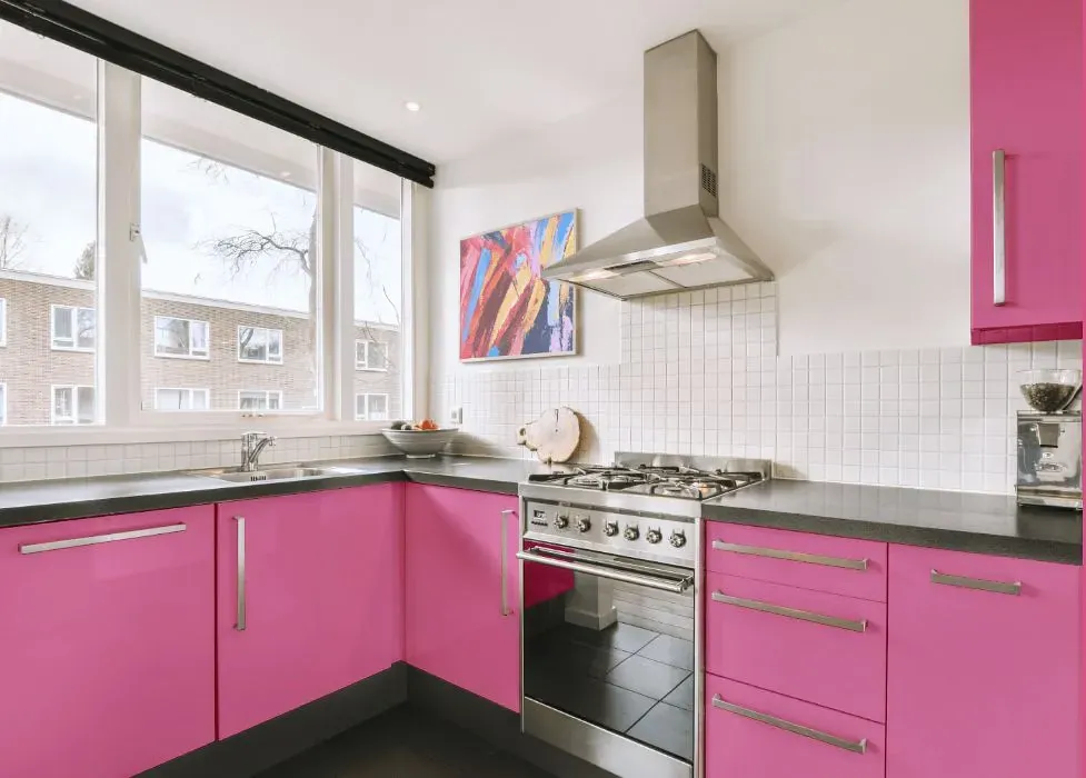
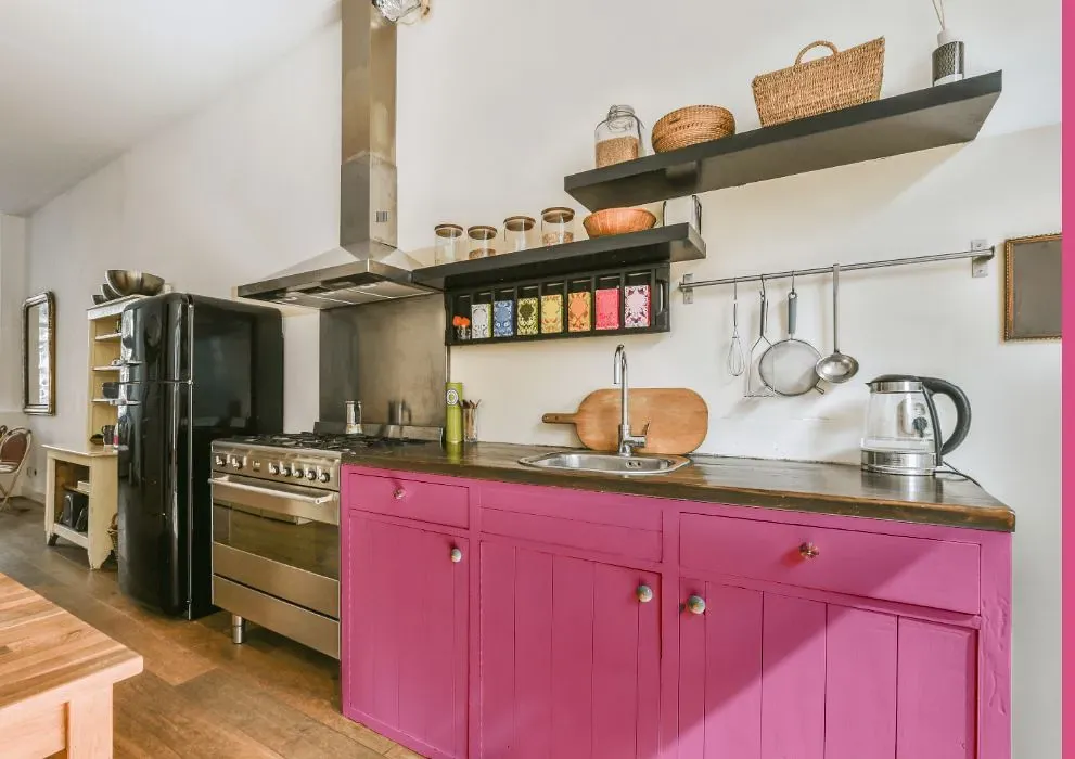
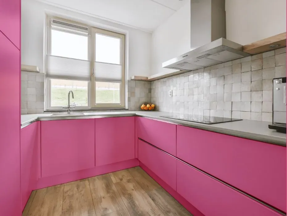
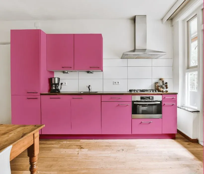
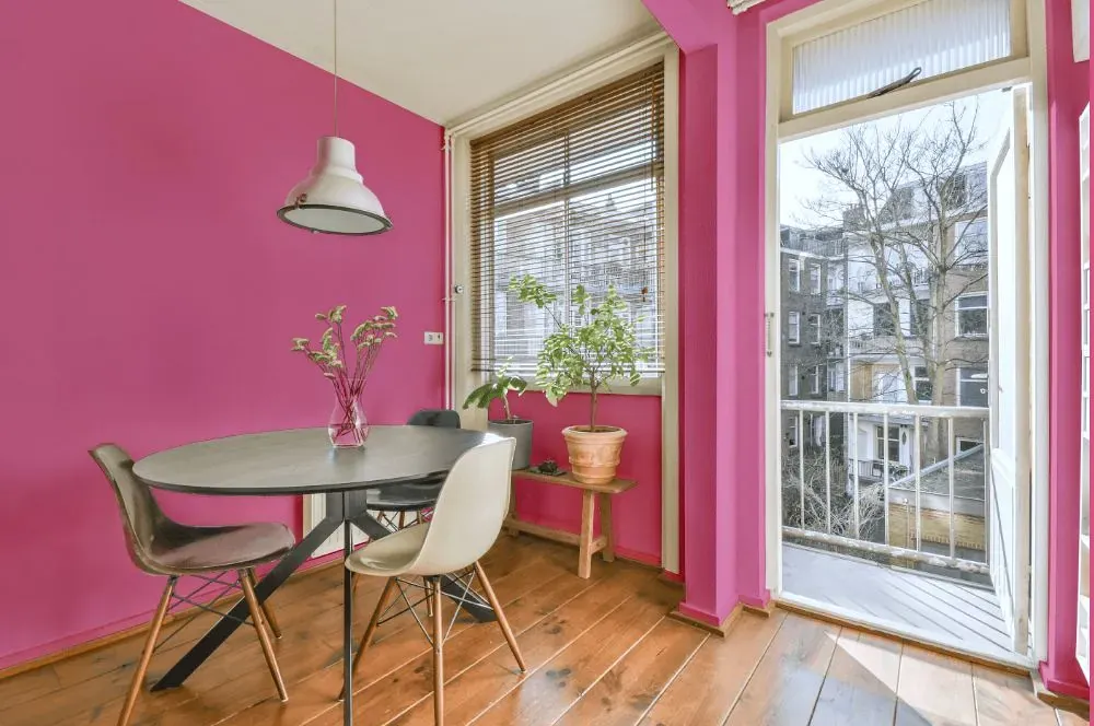
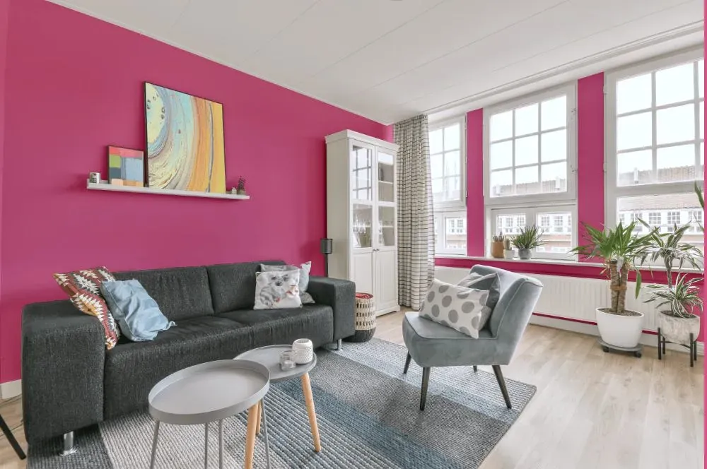
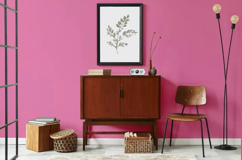
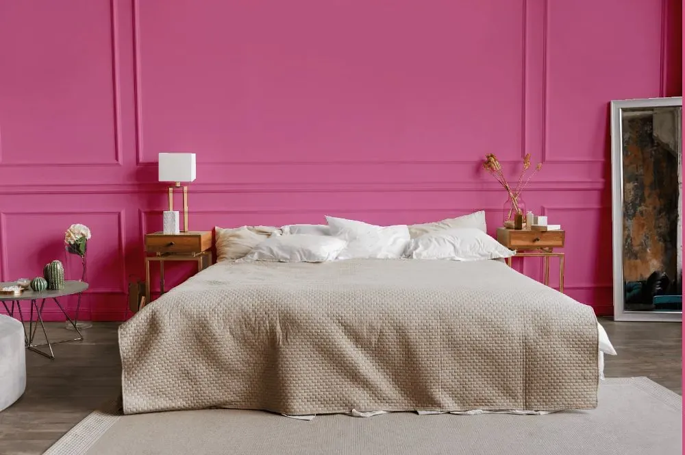
- Benjamin Moore Springtime Bloom reviews (23 photos)
- What are Benjamin Moore Springtime Bloom undertones?
- Is Springtime Bloom 2079-40 cool or warm?
- How light temperature affects on Springtime Bloom
- Monochromatic color scheme
- Complementary color scheme
- Color comparison and matching
- LRV of Springtime Bloom 2079-40
- Color codes
- Color equivalents
| Official page: | Springtime Bloom 2079-40 |
| Code: | 2079-40 |
| Name: | Springtime Bloom |
| Brand: | Benjamin Moore |
What color is Benjamin Moore Springtime Bloom?
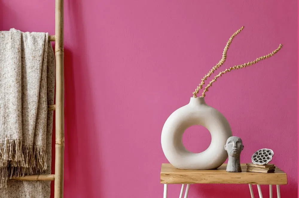
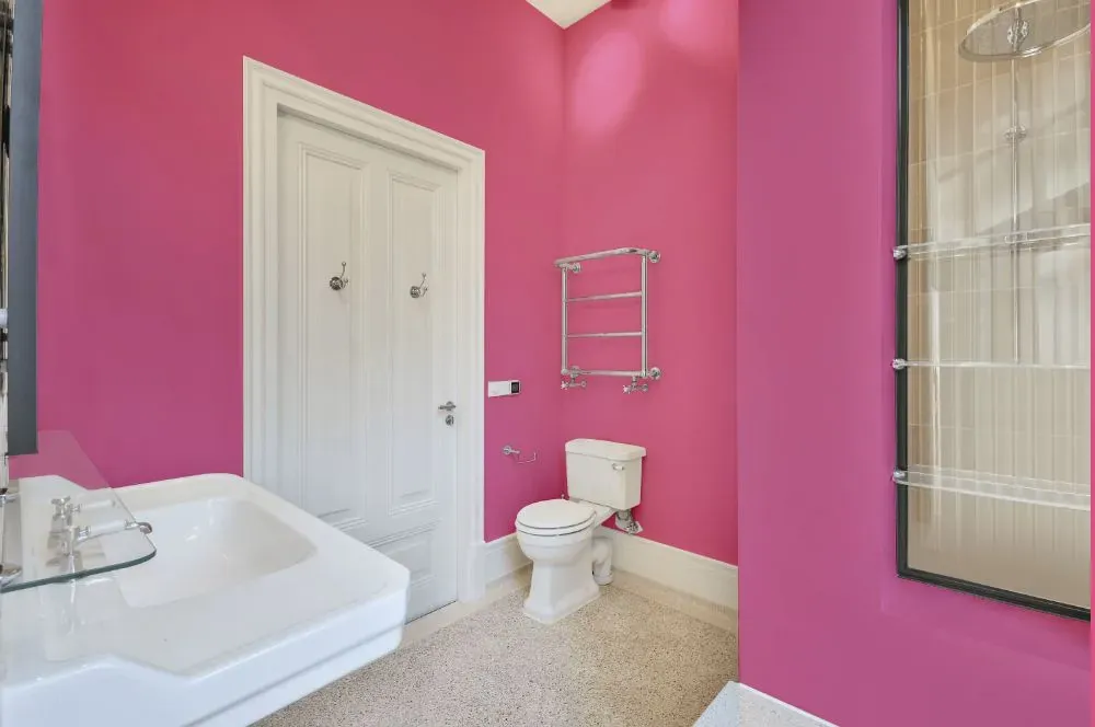
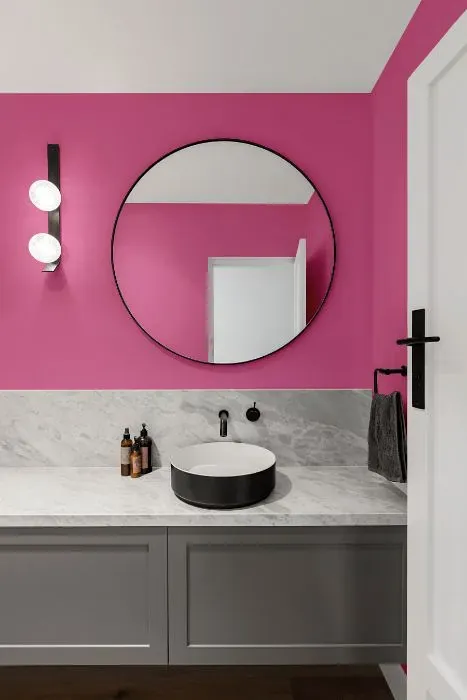
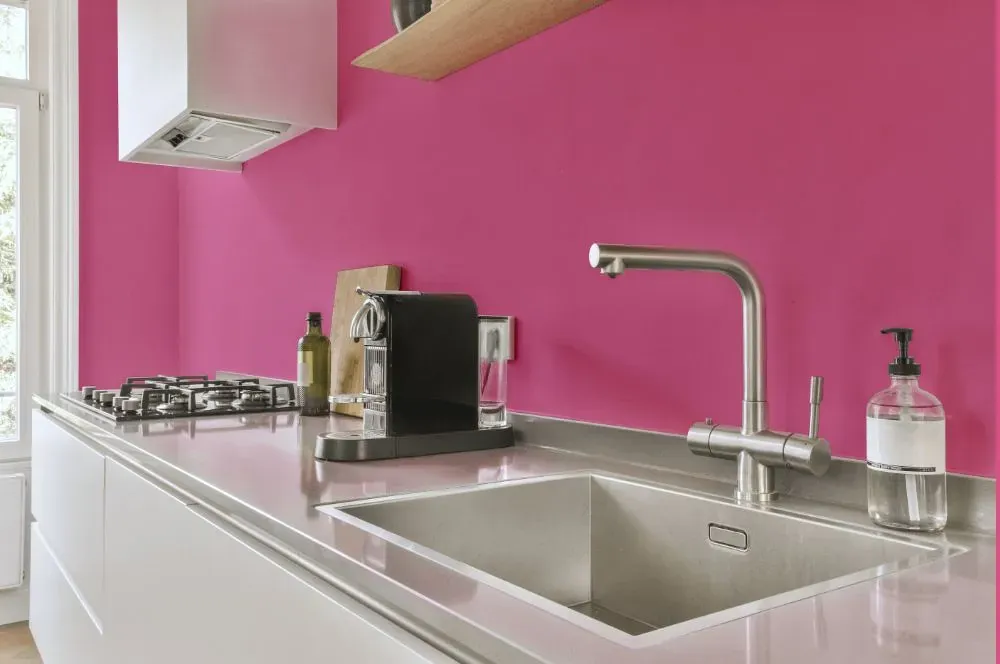
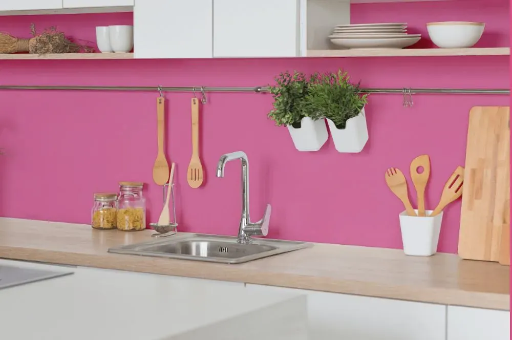
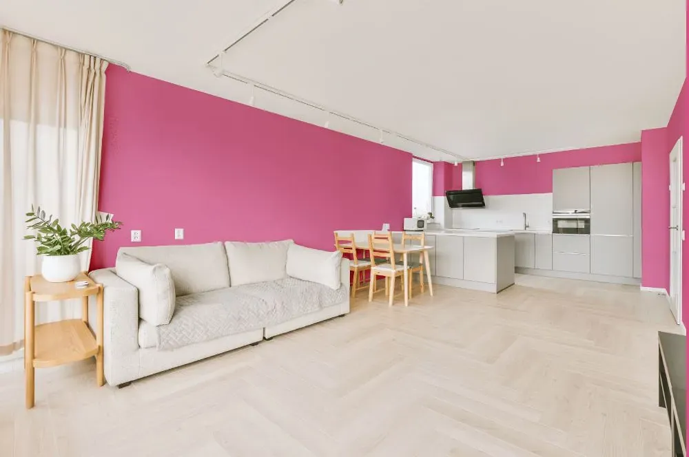
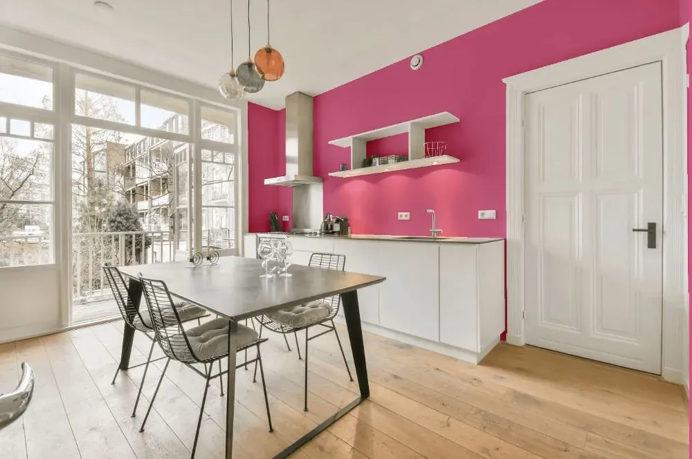
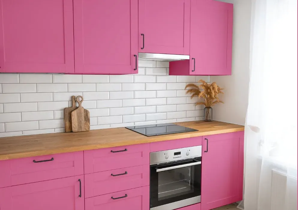
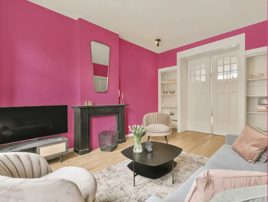
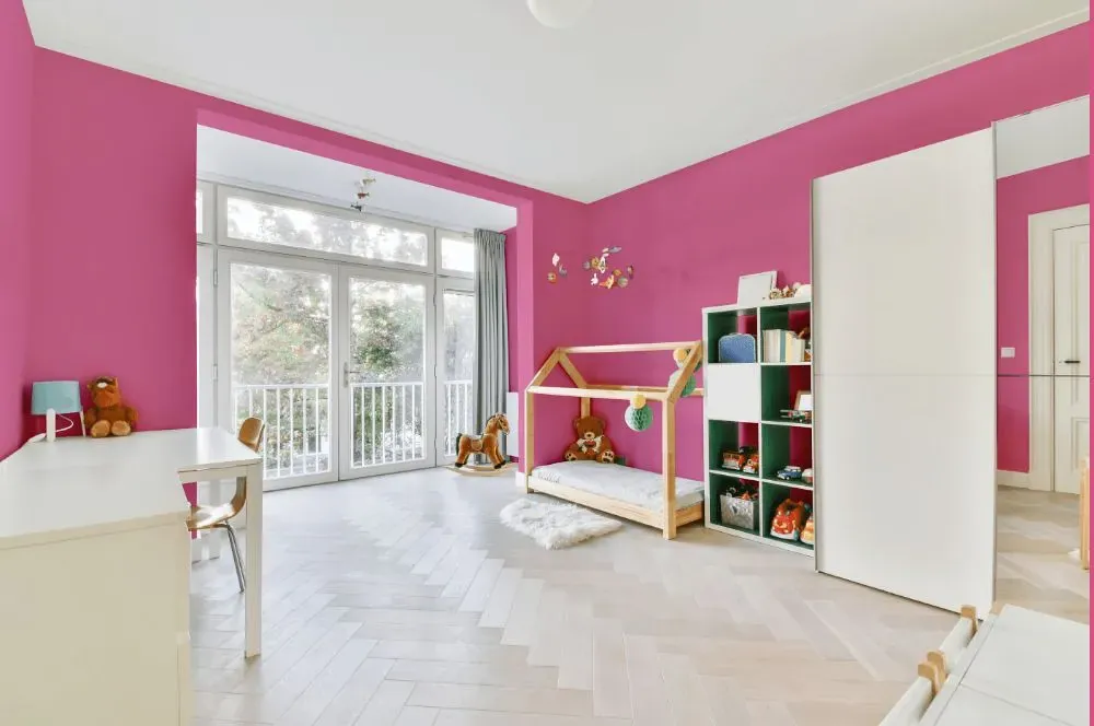
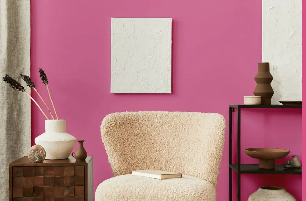
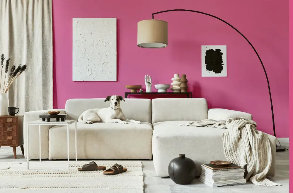
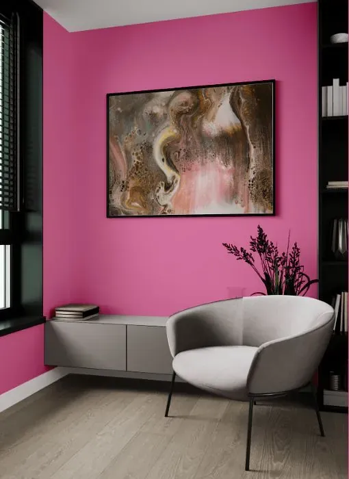
Benjamin Moore 2079-40 Springtime Bloom is a refreshing and lively color choice for any interior space. This vibrant hue brightens up the room, creating a cheerful and welcoming atmosphere. Springtime Bloom pairs beautifully with soft neutrals such as pale grays and warm whites to create a harmonious and balanced palette. Add touches of gold or brass accents to enhance the sophistication of the space while keeping the overall look fresh and vibrant. Incorporate natural wood tones and greenery to bring a sense of balance and tranquility to the room.
Loading...
LRV of Springtime Bloom
Springtime Bloom has an LRV of 33.58% and refers to Medium colors that reflect a lot of light. Why LRV is important?

Light Reflectance Value measures the amount of visible and usable light that reflects from a painted surface.
Simply put, the higher the LRV of a paint color, the brighter the room you will get.
The scale goes from 0% (absolute black, absorbing all light) to 100% (pure white, reflecting all light).
Act like a pro: When choosing paint with an LRV of 33.58%, pay attention to your bulbs' brightness. Light brightness is measured in lumens. The lower the paint's LRV, the higher lumen level you need. Every square foot of room needs at least 40 lumens. That means for a 200 ft2 living room you'll need about 8000 lumens of light – e.g., eight 1000 lm bulbs.
Color codes
We have collected almost every possible color code you could ever need.
Not sure what the difference between HEX and RGB is? We break down color models in plain language. Understanding color models
| Format | Code |
|---|---|
| HEX | #E47DA7 |
| RGB Decimal | 228, 125, 167 |
| RGB Percent | 89.41%, 49.02%, 65.49% |
| HSV | Hue: 336° Saturation: 45.18% Value: 89.41% |
| HSL | hsl(336, 66, 69) |
| CMYK | Cyan: 0.0 Magenta: 45.18 Yellow: 26.75 Key: 10.59 |
| YIQ | Y: 160.585 I: 47.881 Q: 34.859 |
| XYZ | X: 46.304 Y: 33.955 Z: 40.664 |
| CIE Lab | L:64.927 a:44.606 b:-4.499 |
| CIE Luv | L:64.927 u:63.722 v:-14.649 |
| Decimal | 14974375 |
| Hunter Lab | 58.271, 39.87, -0.586 |