Benjamin Moore Oceanfront 660
Contentsshow +hide -
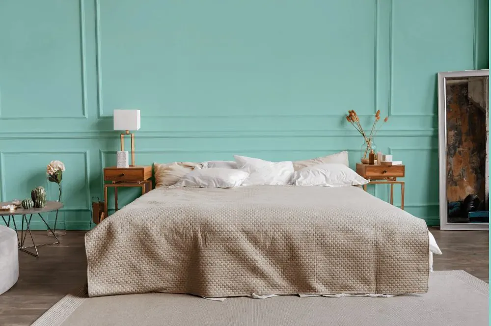
- Oceanfront for bedroom (1 photo)
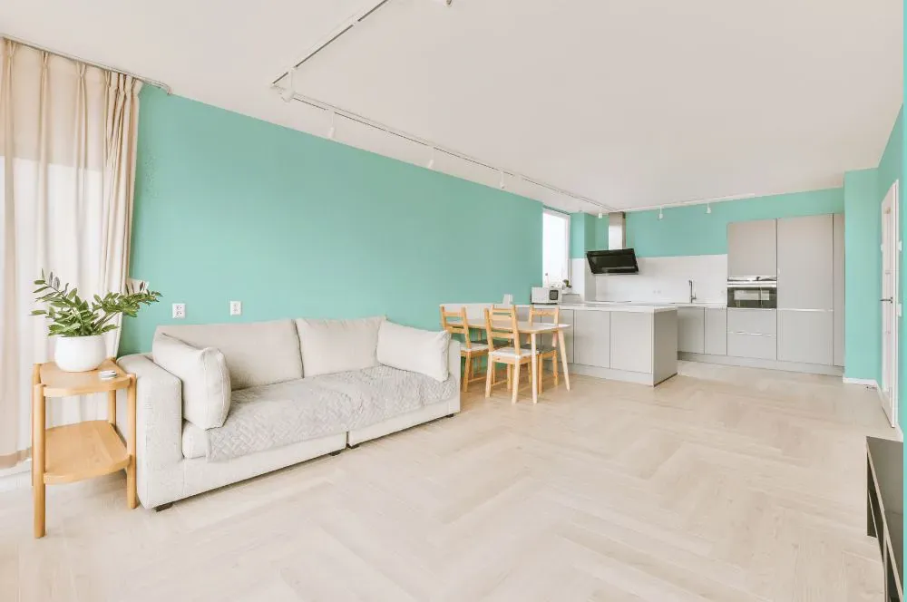
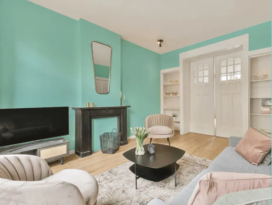
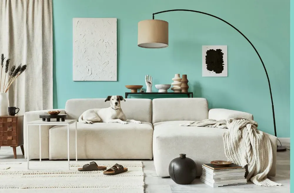
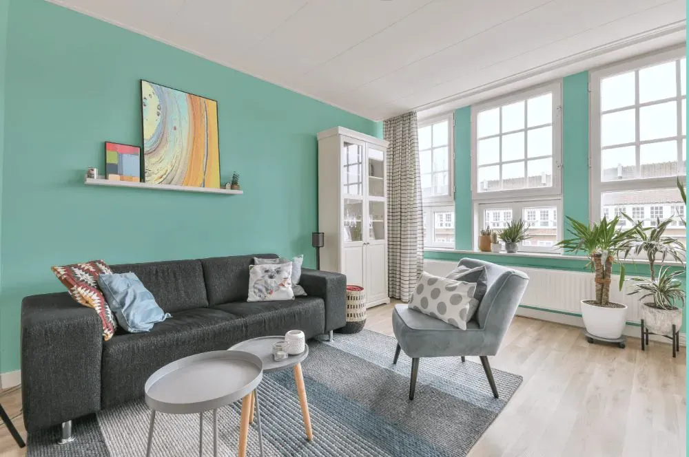
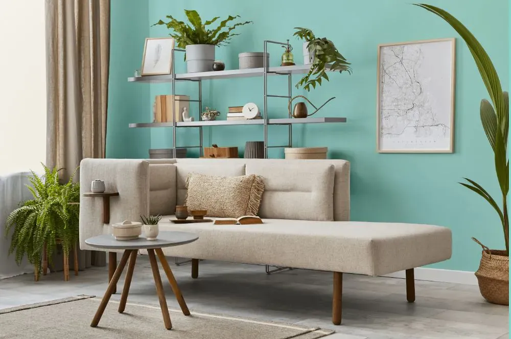
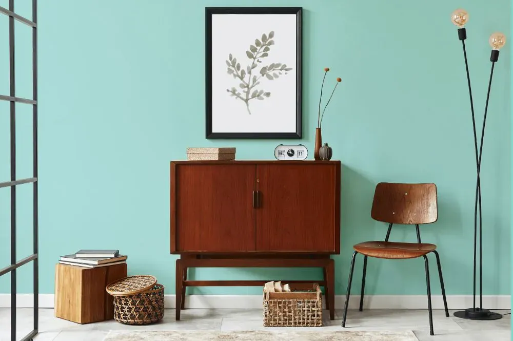
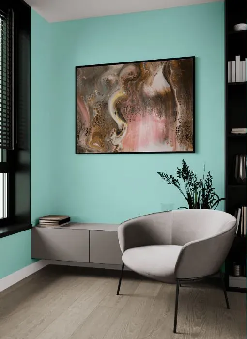
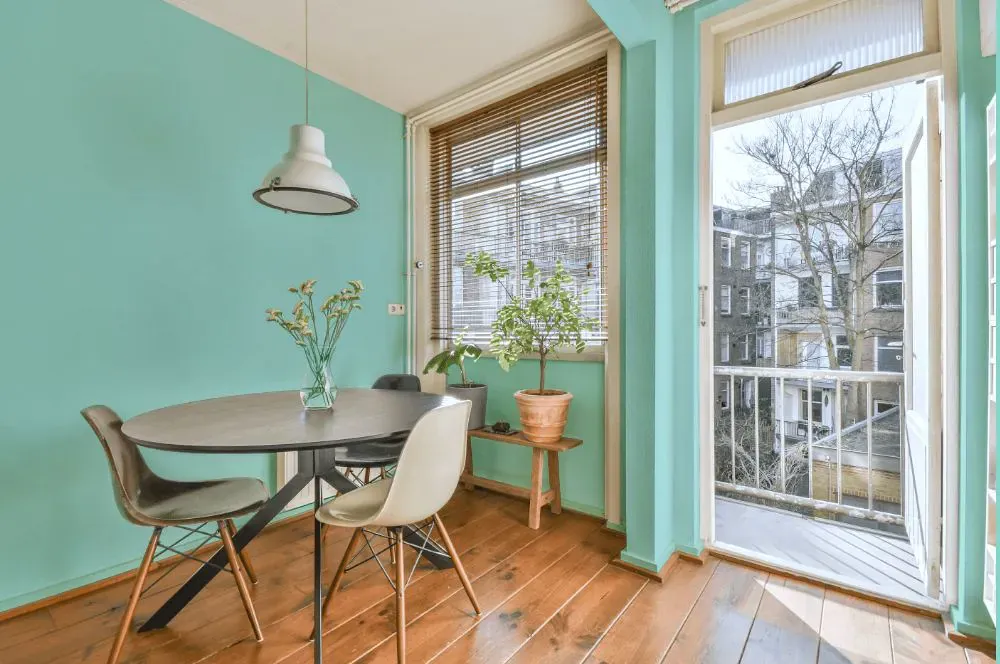
- Oceanfront for living room (7 photos)
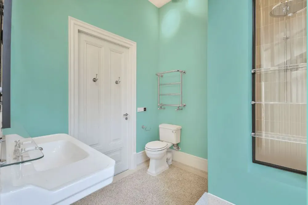
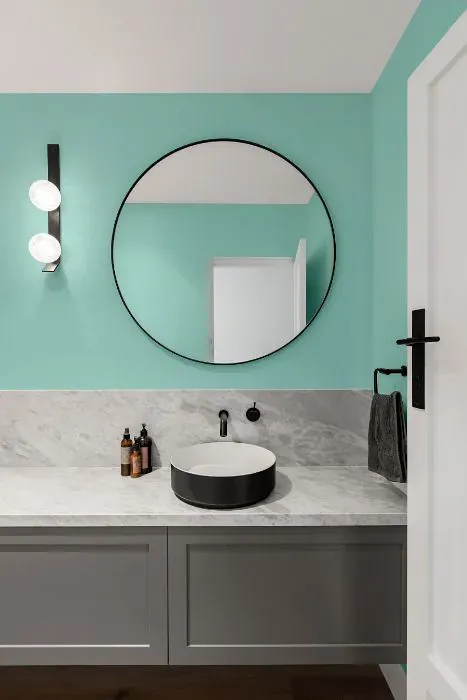
- Benjamin Moore Oceanfront for bathroom (2 photos)
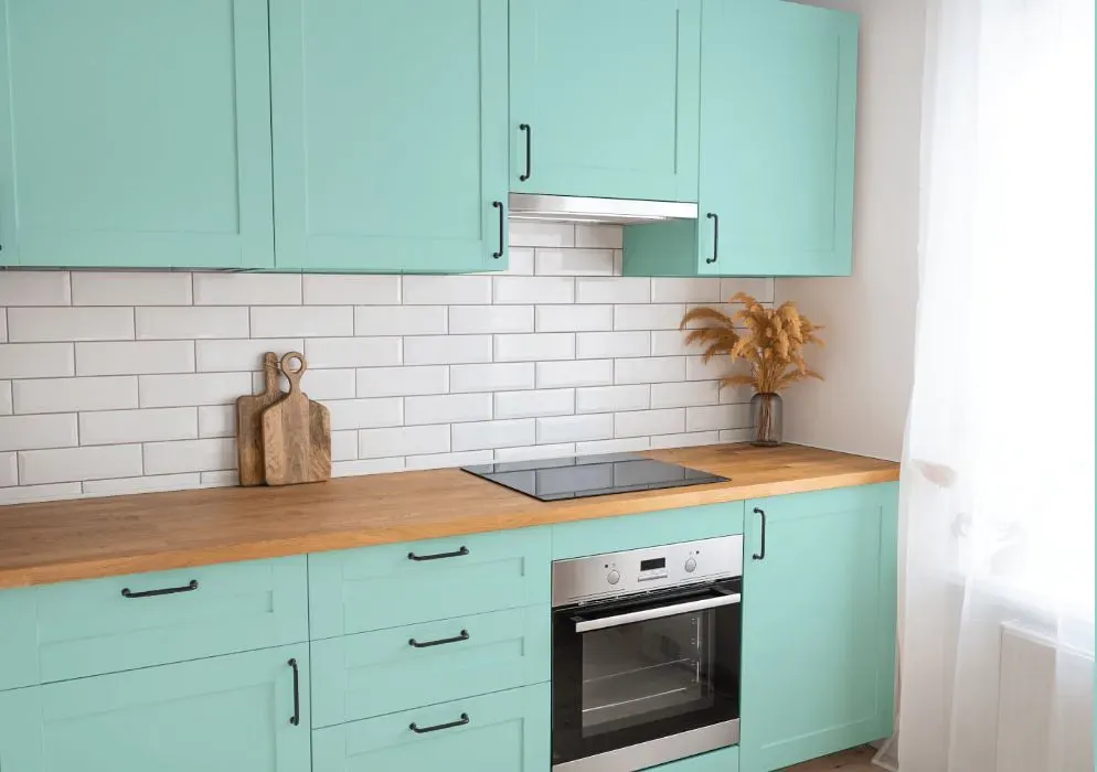
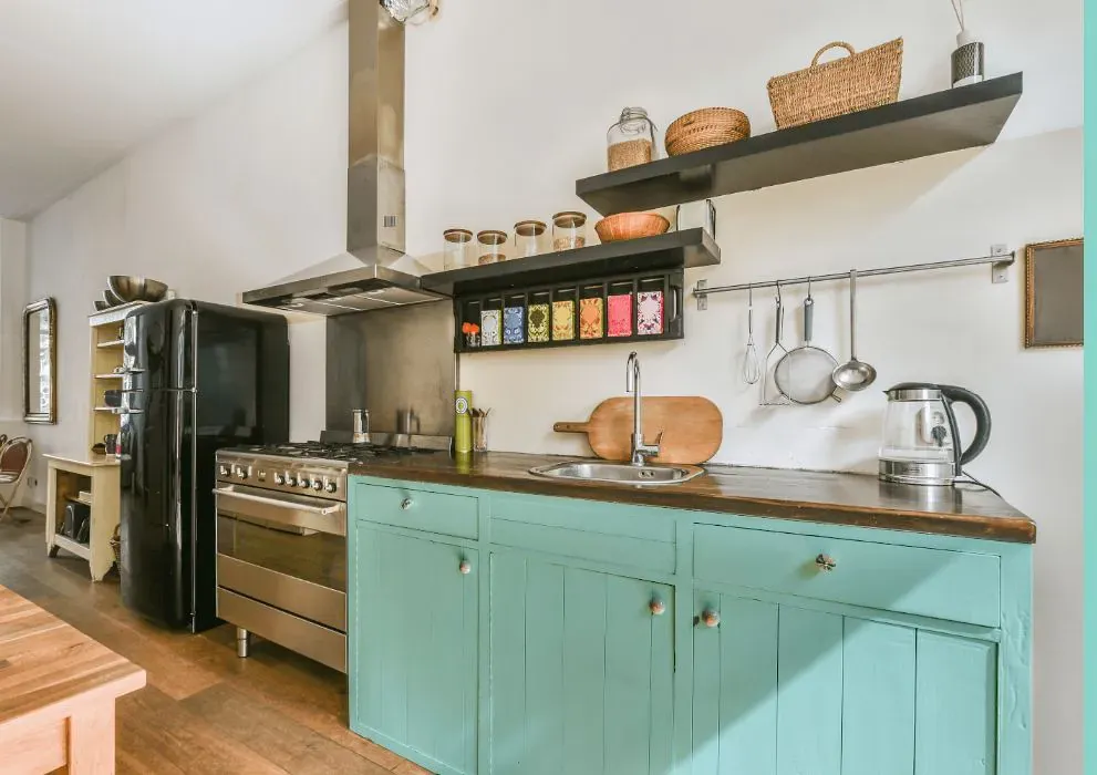
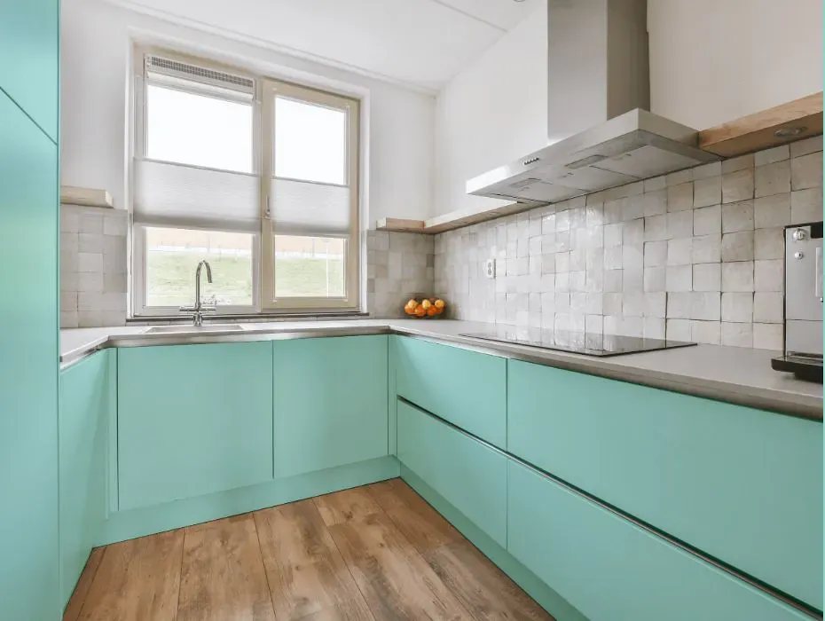
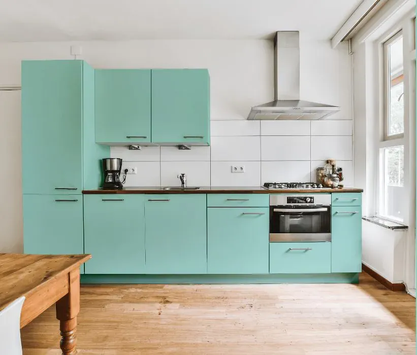
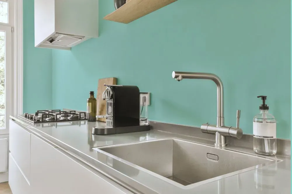
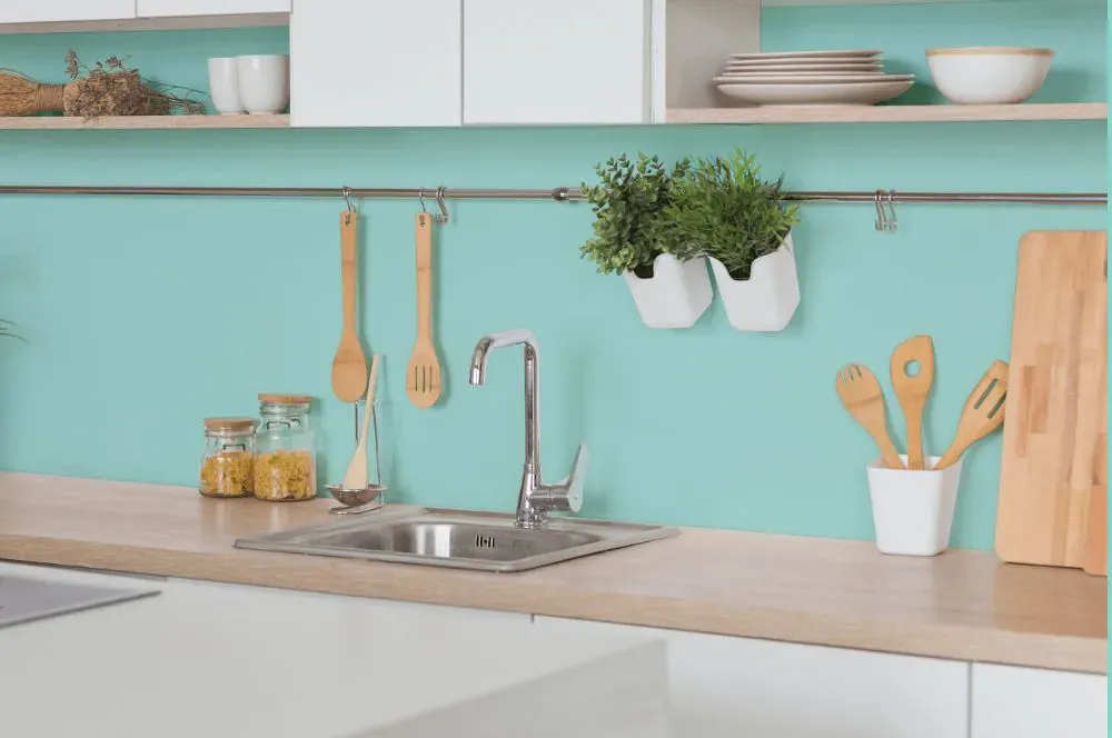
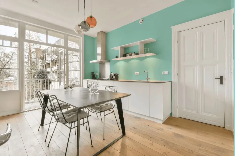
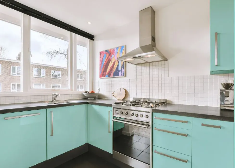
- Benjamin Moore 660 on kitchen cabinets (4 photos)
- Benjamin Moore Oceanfront reviews (9 photos)
- What are Benjamin Moore Oceanfront undertones?
- Is Oceanfront 660 cool or warm?
- How light temperature affects on Oceanfront
- Monochromatic color scheme
- Complementary color scheme
- Color comparison and matching
- LRV of Oceanfront 660
- Color codes
- Color equivalents
| Official page: | Oceanfront 660 |
| Code: | 660 |
| Name: | Oceanfront |
| Brand: | Benjamin Moore |
What color is Benjamin Moore Oceanfront?
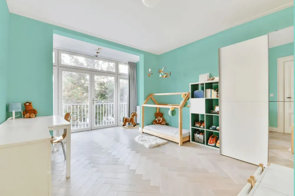
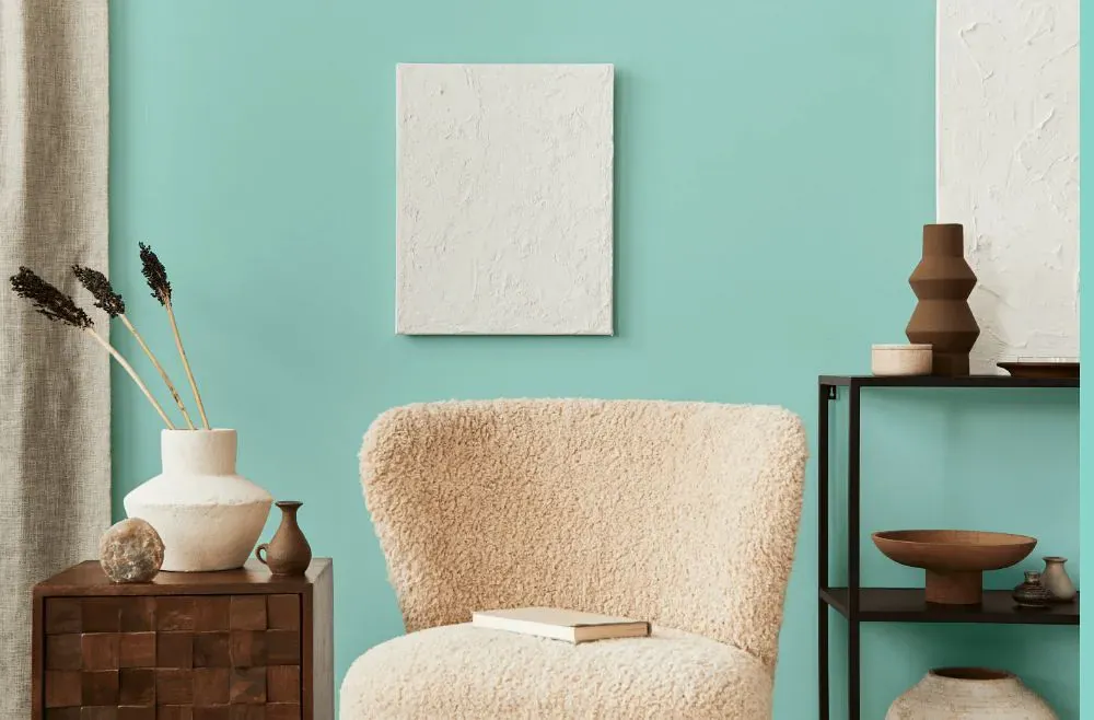
Dive into a coastal oasis with Benjamin Moore 660 Oceanfront. This soft blue hue evokes the serenity of the ocean, creating a peaceful and relaxing atmosphere in any space. Pair Oceanfront with crisp whites and sandy neutrals to enhance its seaside charm and bring a sense of light and airiness to the room. The combination of Oceanfront with these complementary colors will create a harmonious palette that invites tranquility and calm into your home. Explore the beauty of Oceanfront and transform your space into a coastal retreat.
Loading...
LRV of Oceanfront
Oceanfront has an LRV of 67.36% and refers to Light colors that reflect most of the incident light. Why LRV is important?

Light Reflectance Value measures the amount of visible and usable light that reflects from a painted surface.
Simply put, the higher the LRV of a paint color, the brighter the room you will get.
The scale goes from 0% (absolute black, absorbing all light) to 100% (pure white, reflecting all light).
Act like a pro: When choosing paint with an LRV of 67.36%, pay attention to your bulbs' brightness. Light brightness is measured in lumens. The lower the paint's LRV, the higher lumen level you need. Every square foot of room needs at least 40 lumens. That means for a 200 ft2 living room you'll need about 8000 lumens of light – e.g., eight 1000 lm bulbs.
Color codes
We have collected almost every possible color code you could ever need.
Not sure what the difference between HEX and RGB is? We break down color models in plain language. Understanding color models
| Format | Code |
|---|---|
| HEX | #ADE1DA |
| RGB Decimal | 173, 225, 218 |
| RGB Percent | 67.84%, 88.24%, 85.49% |
| HSV | Hue: 172° Saturation: 23.11% Value: 88.24% |
| HSL | hsl(172, 46, 78) |
| CMYK | Cyan: 23.11 Magenta: 0.0 Yellow: 3.11 Key: 11.76 |
| YIQ | Y: 208.654 I: -28.737 Q: -13.178 |
| XYZ | X: 56.809 Y: 67.794 Z: 76.403 |
| CIE Lab | L:85.904 a:-18.064 b:-2.029 |
| CIE Luv | L:85.904 u:-26.173 v:-0.053 |
| Decimal | 11395546 |
| Hunter Lab | 82.337, -20.934, 2.619 |