Benjamin Moore Organdy 1248
Contentsshow +hide -
| Official page: | Organdy 1248 |
| Code: | 1248 |
| Name: | Organdy |
| Brand: | Benjamin Moore |
What color is Benjamin Moore Organdy?
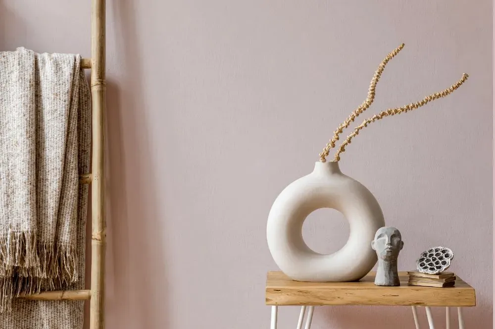
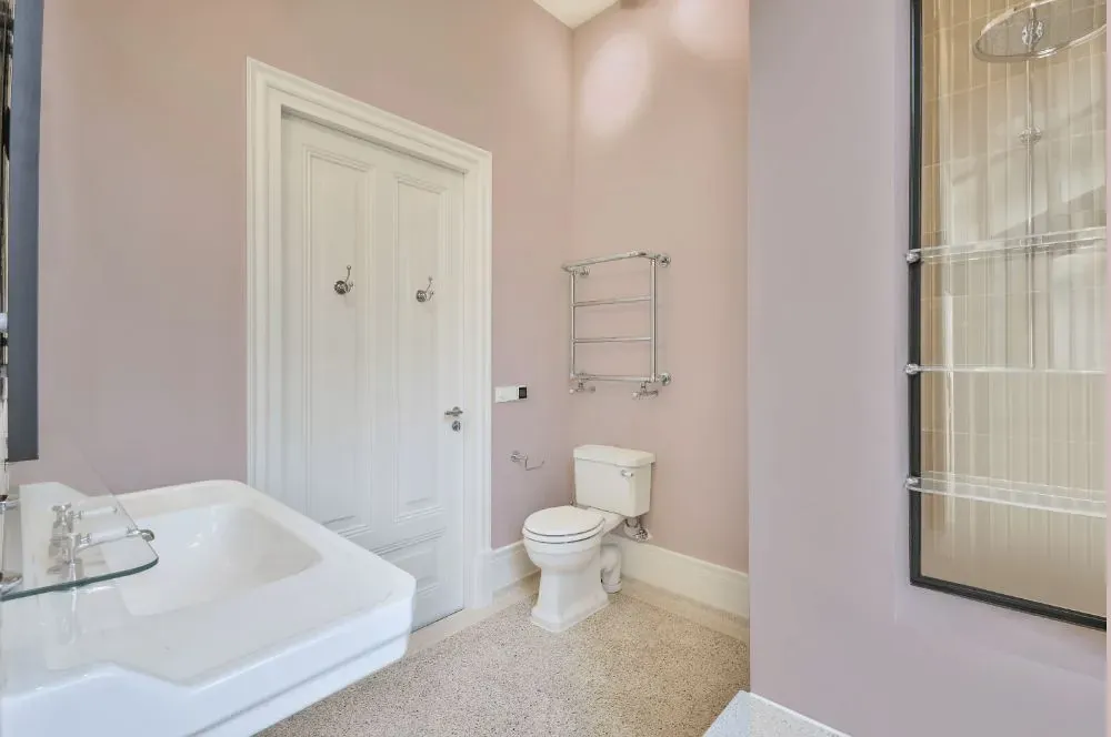
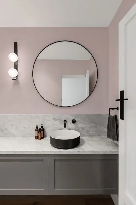
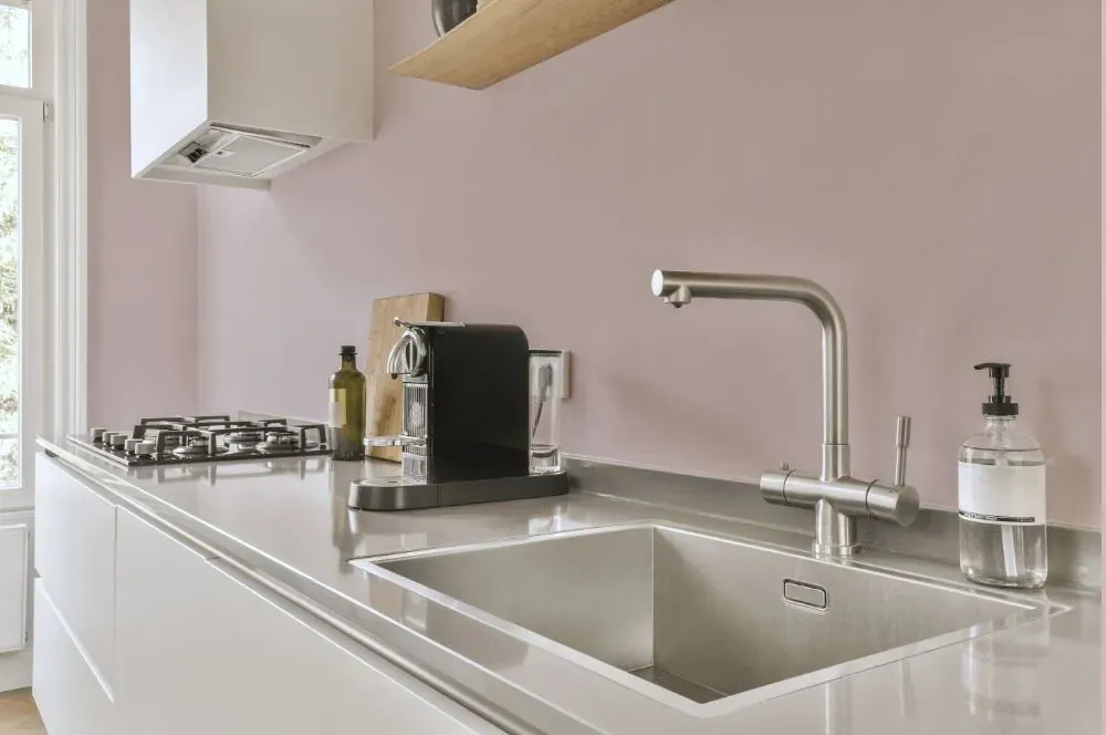
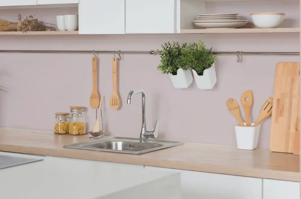
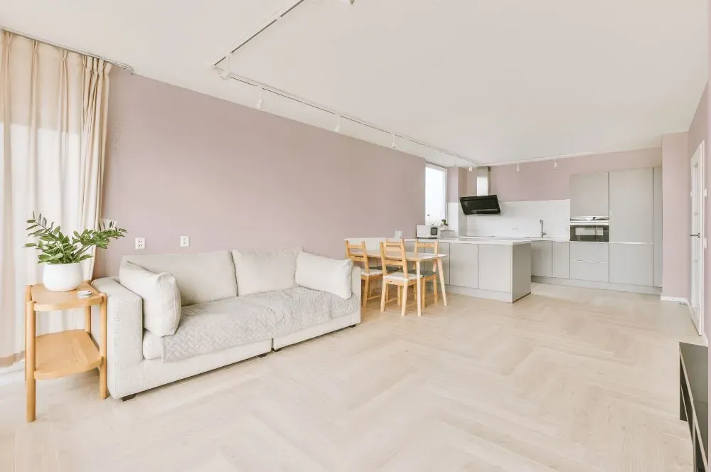
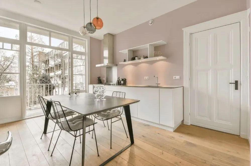
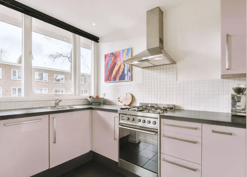
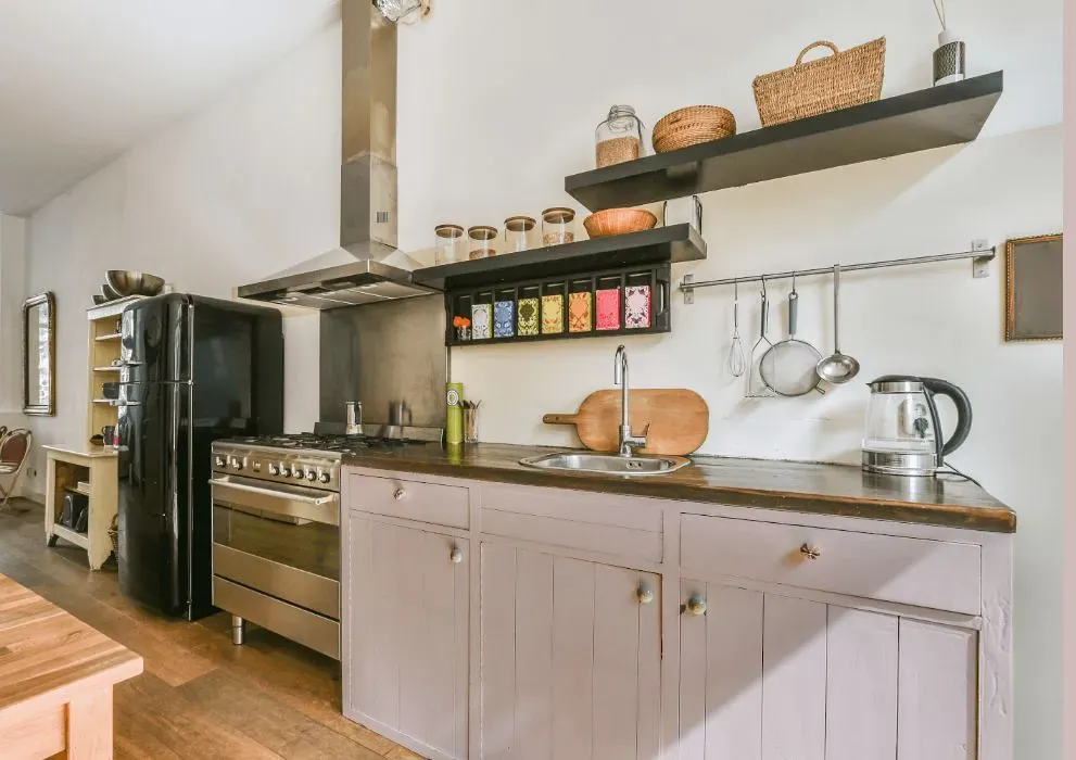
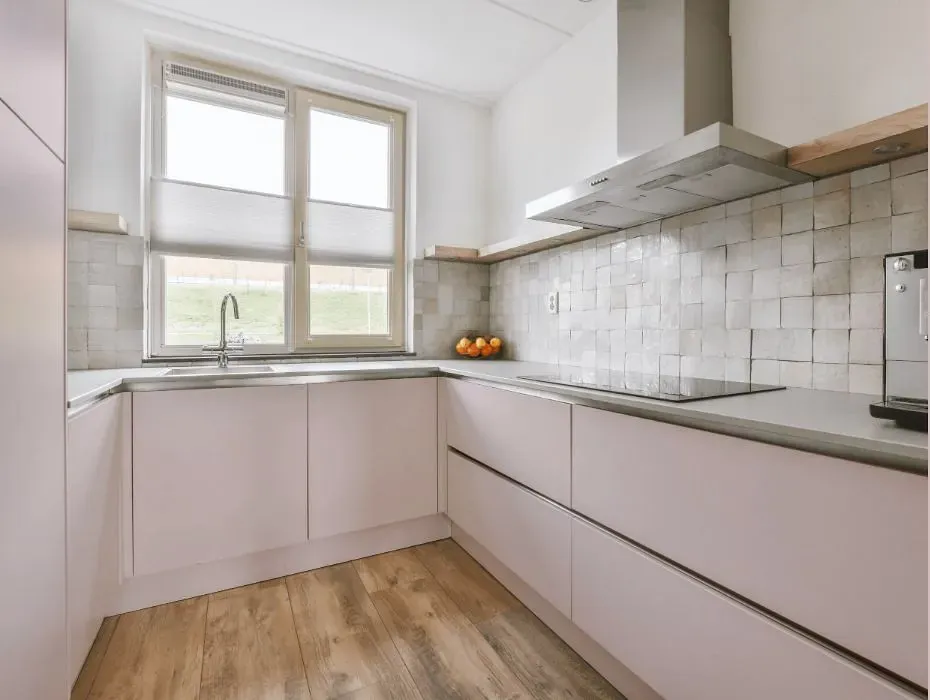
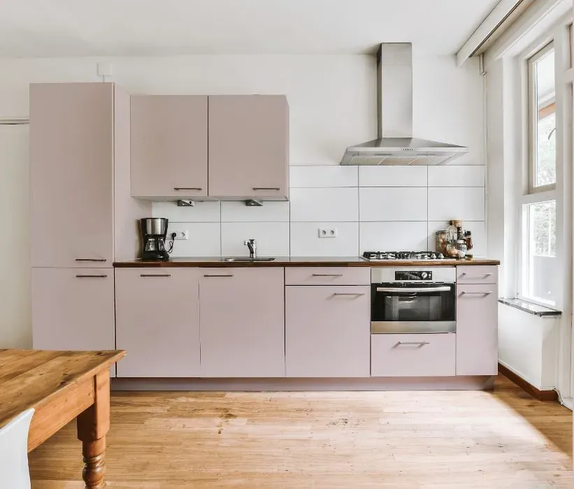
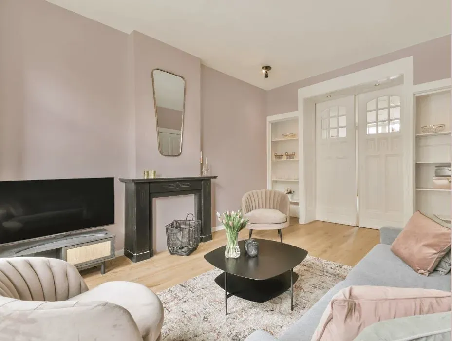
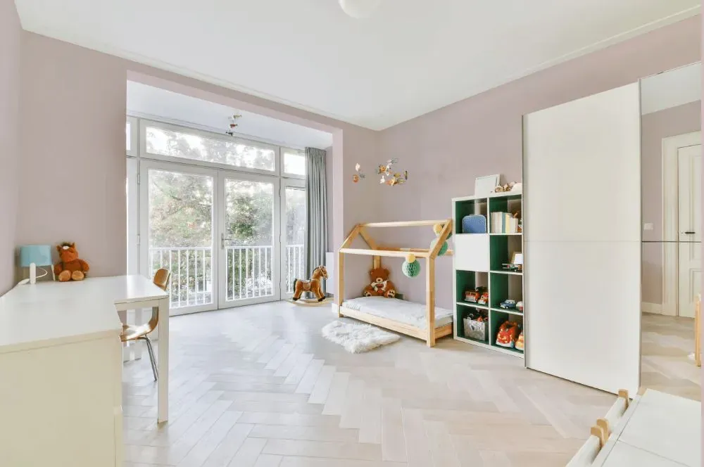
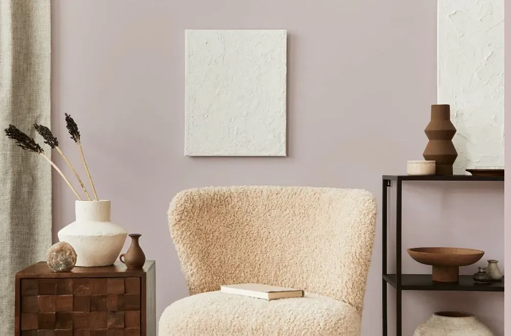
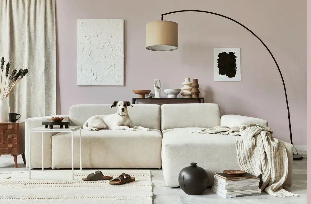
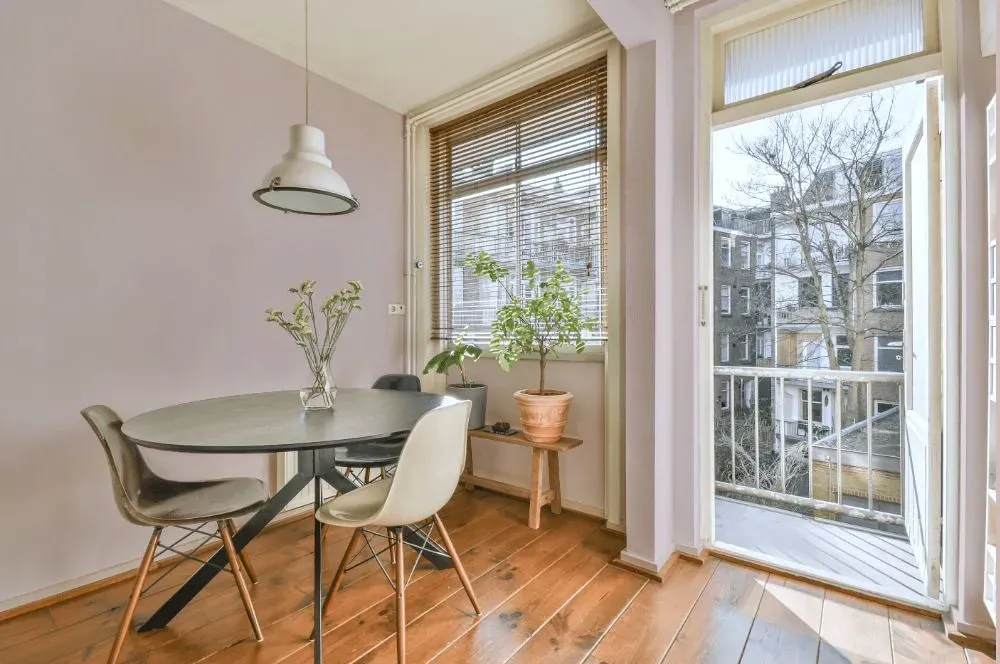
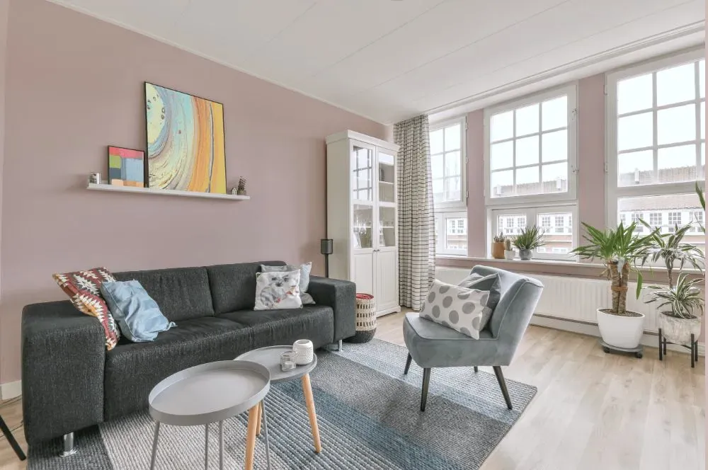
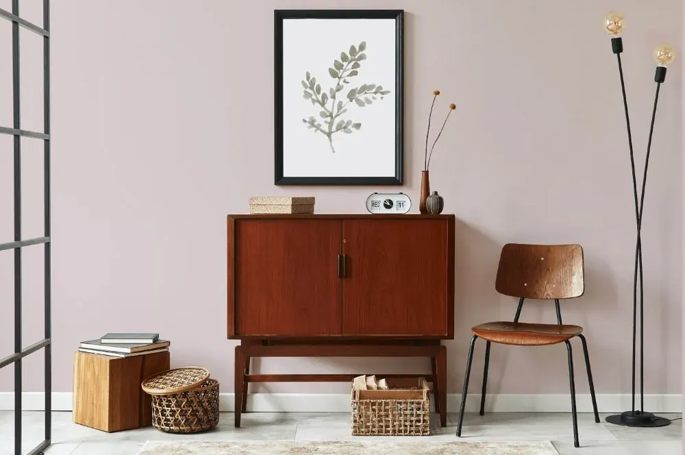
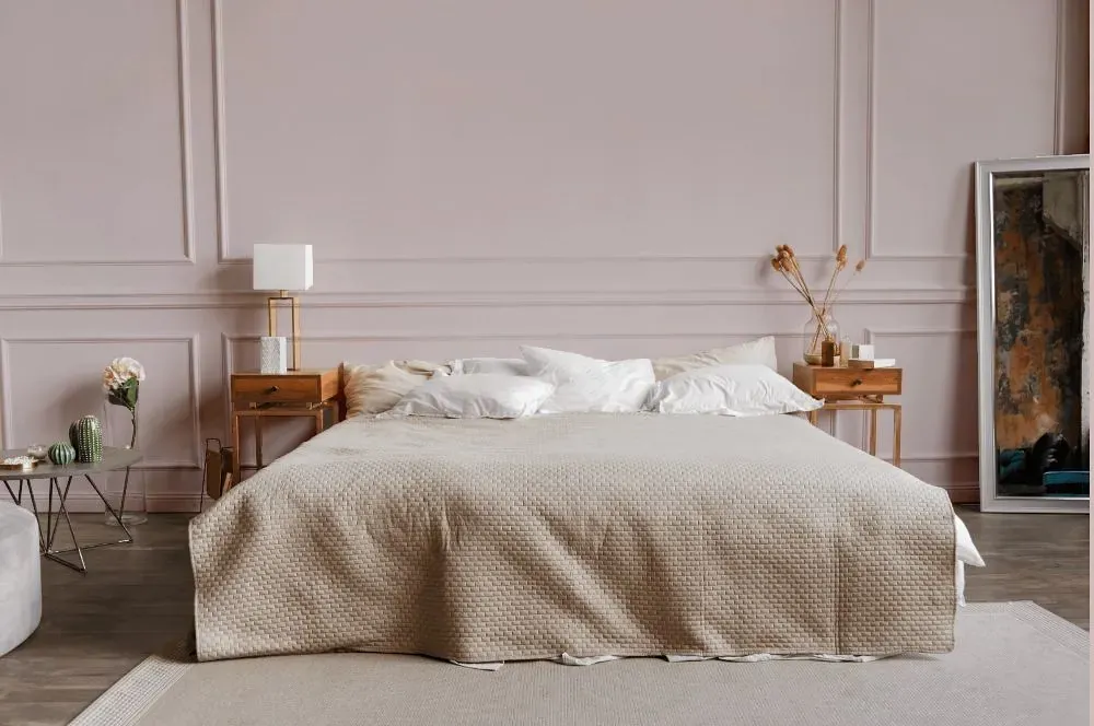
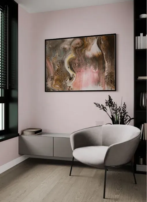
Imagine a space adorned in the ethereal tones of Benjamin Moore 1248 Organdy. The subtle beauty of this color pairs effortlessly with soft shades of ivory and warm greys, creating a tranquil and elegant atmosphere. The delicate nuances of "Organdy" evoke a sense of serenity, enhancing the overall charm of any room it graces. Its gentle hue harmonizes beautifully with accents of muted green and blush pink, adding a touch of sophistication to the space. Embrace the understated refinement of Benjamin Moore 1248 Organdy and create a space that exudes timeless grace.
Loading...
LRV of Organdy
Organdy has an LRV of 64.37% and refers to Light colors that reflect most of the incident light. Why LRV is important?

Light Reflectance Value measures the amount of visible and usable light that reflects from a painted surface.
Simply put, the higher the LRV of a paint color, the brighter the room you will get.
The scale goes from 0% (absolute black, absorbing all light) to 100% (pure white, reflecting all light).
Act like a pro: When choosing paint with an LRV of 64.37%, pay attention to your bulbs' brightness. Light brightness is measured in lumens. The lower the paint's LRV, the higher lumen level you need. Every square foot of room needs at least 40 lumens. That means for a 200 ft2 living room you'll need about 8000 lumens of light – e.g., eight 1000 lm bulbs.
Color codes
We have collected almost every possible color code you could ever need.
Not sure what the difference between HEX and RGB is? We break down color models in plain language. Understanding color models
| Format | Code |
|---|---|
| HEX | #DFD1D0 |
| RGB Decimal | 223, 209, 208 |
| RGB Percent | 87.45%, 81.96%, 81.57% |
| HSV | Hue: 4° Saturation: 6.73% Value: 87.45% |
| HSL | hsl(4, 19, 85) |
| CMYK | Cyan: 0.0 Magenta: 6.28 Yellow: 6.73 Key: 12.55 |
| YIQ | Y: 213.072 I: 8.664 Q: 2.65 |
| XYZ | X: 64.615 Y: 65.844 Z: 68.963 |
| CIE Lab | L:84.917 a:4.659 b:2.237 |
| CIE Luv | L:84.917 u:8.195 v:2.528 |
| Decimal | 14668240 |
| Hunter Lab | 81.144, 0.137, 6.412 |