Benjamin Moore Patina 1195
Contentsshow +hide -
| Official page: | Patina 1195 |
| Code: | 1195 |
| Name: | Patina |
| Brand: | Benjamin Moore |
What color is Benjamin Moore Patina?
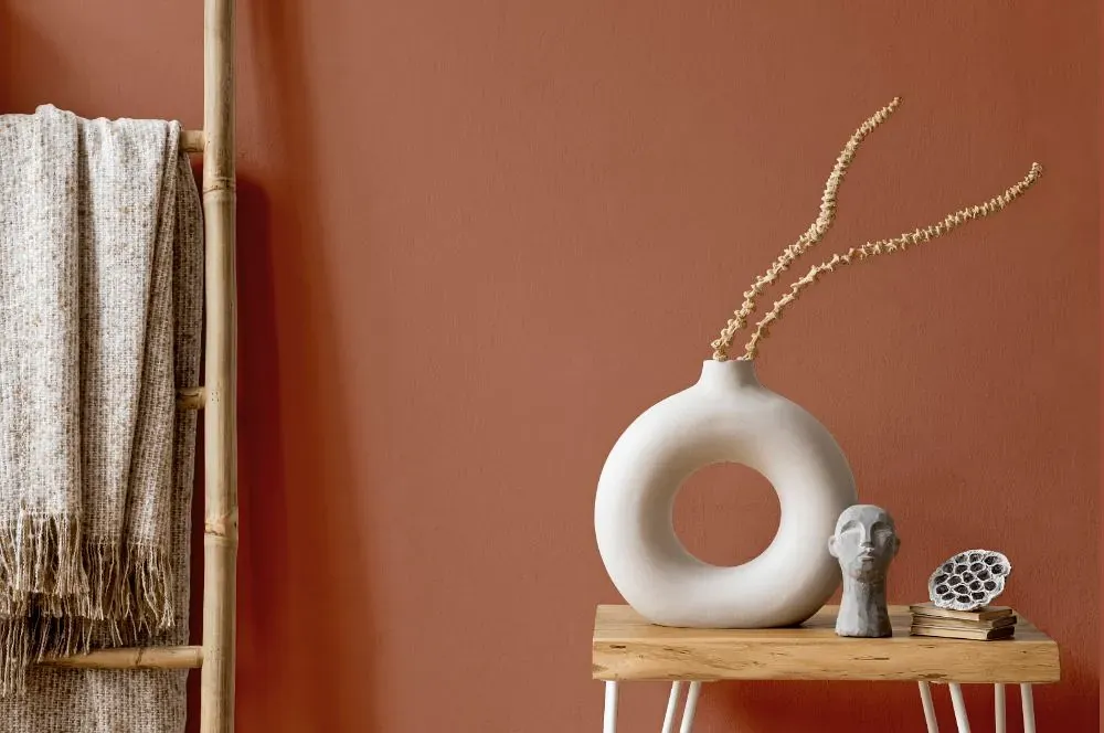
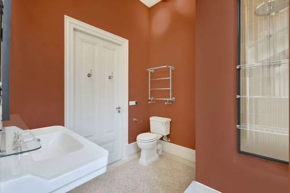
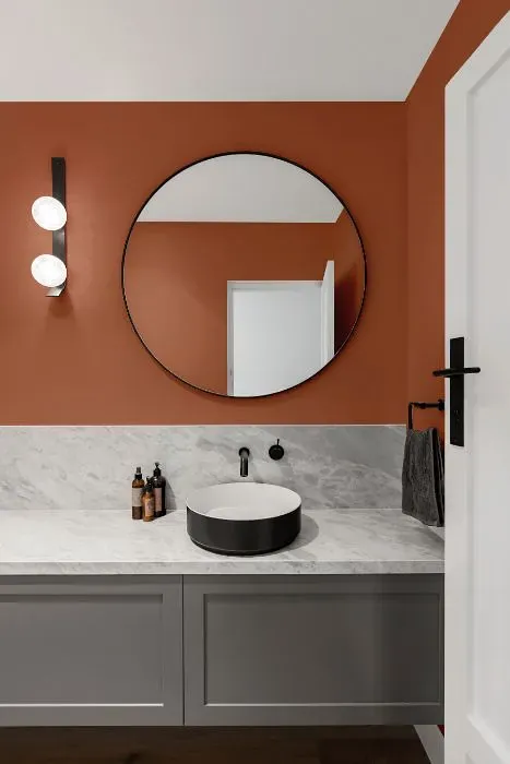
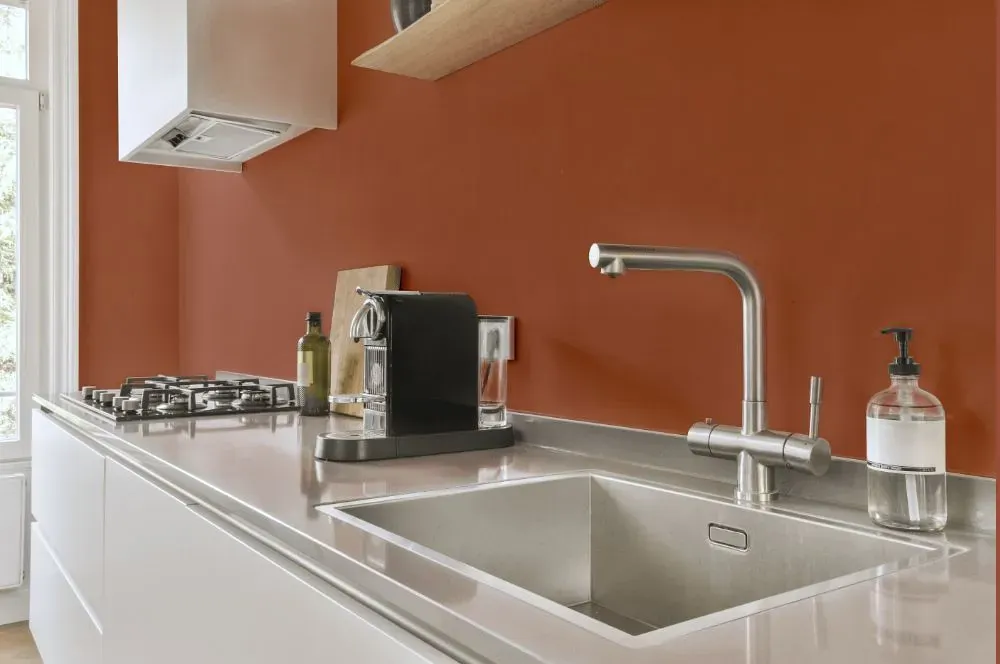
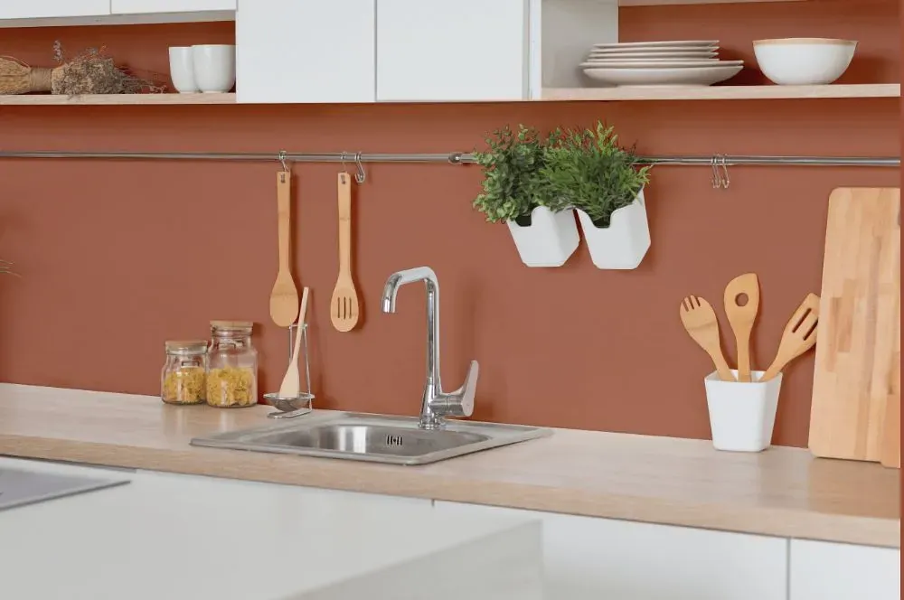
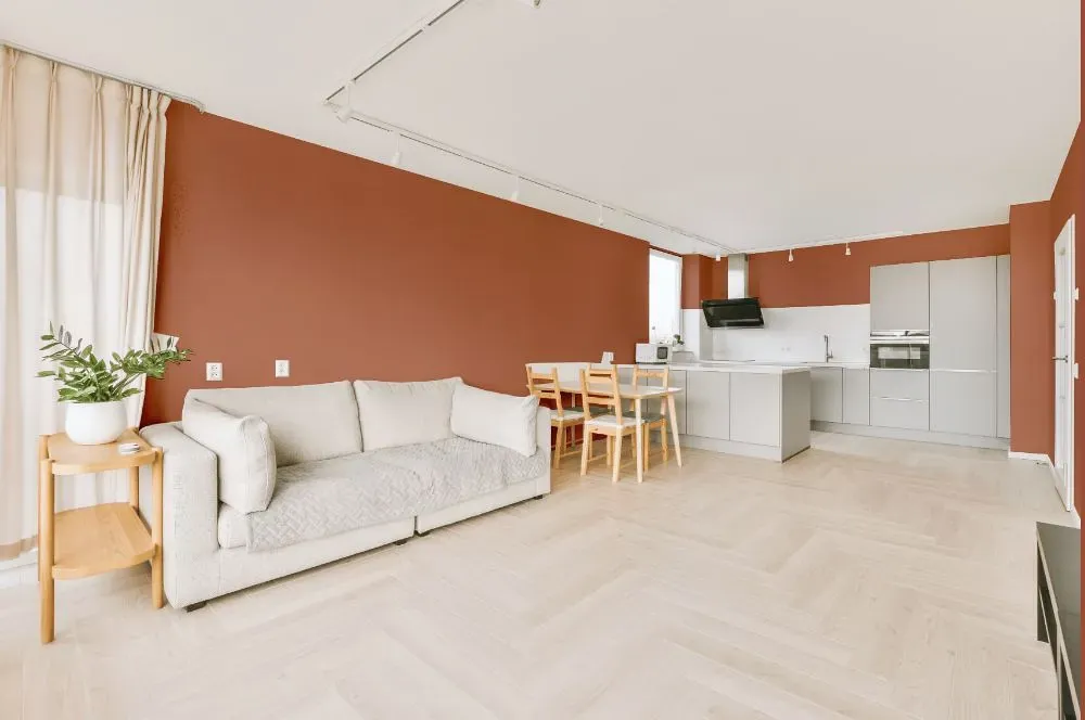
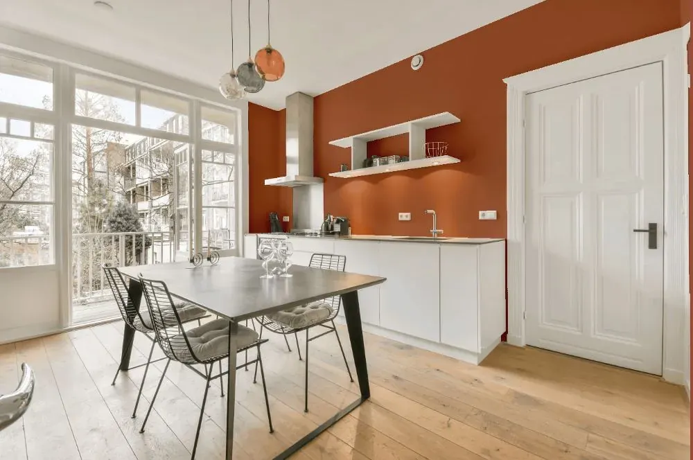
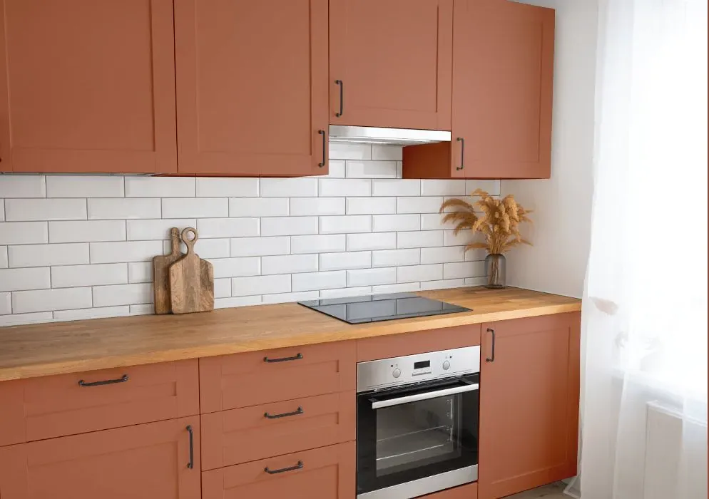
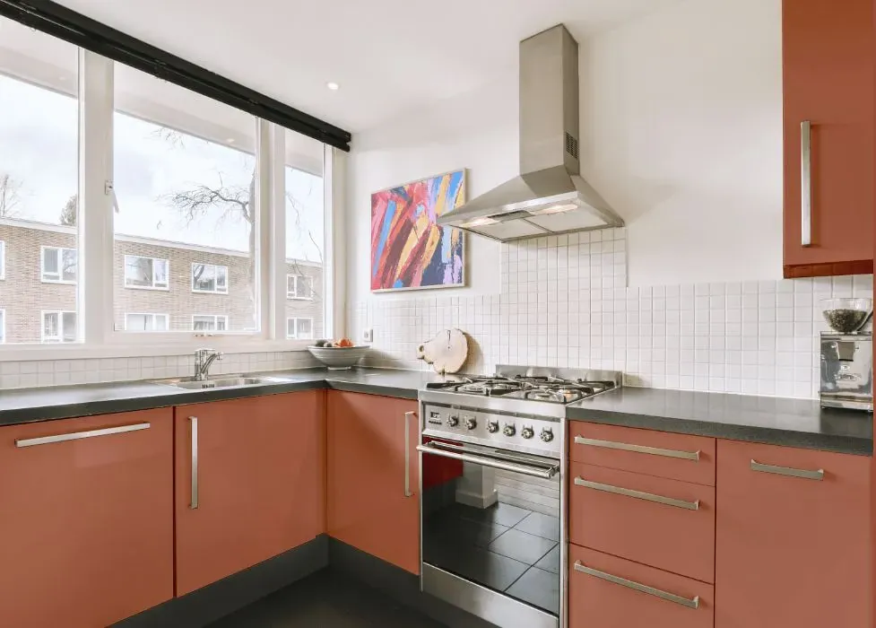
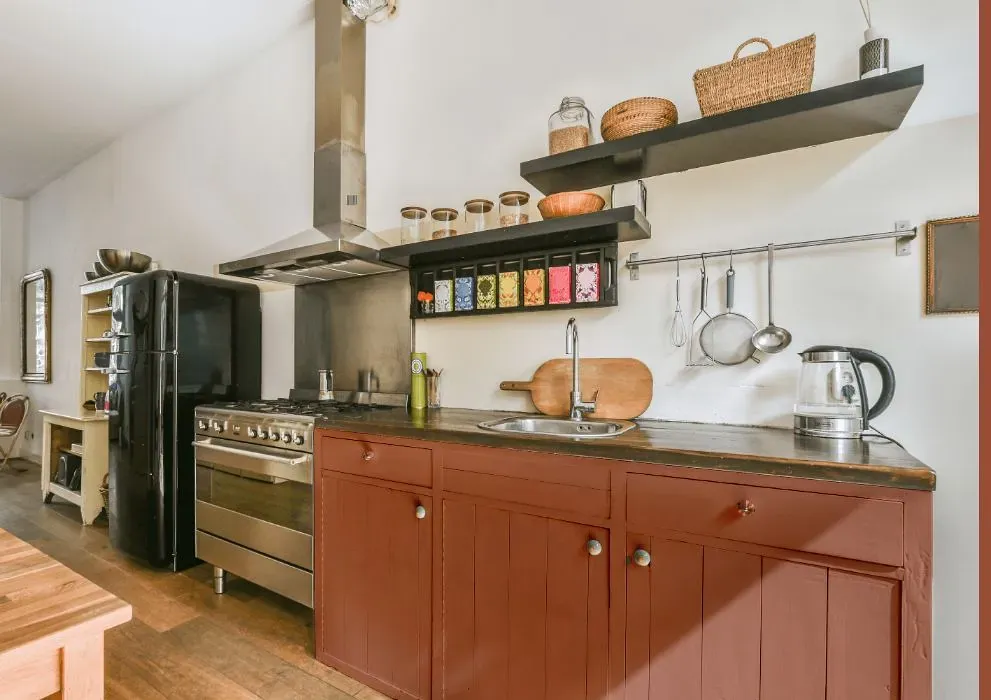
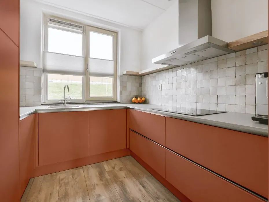
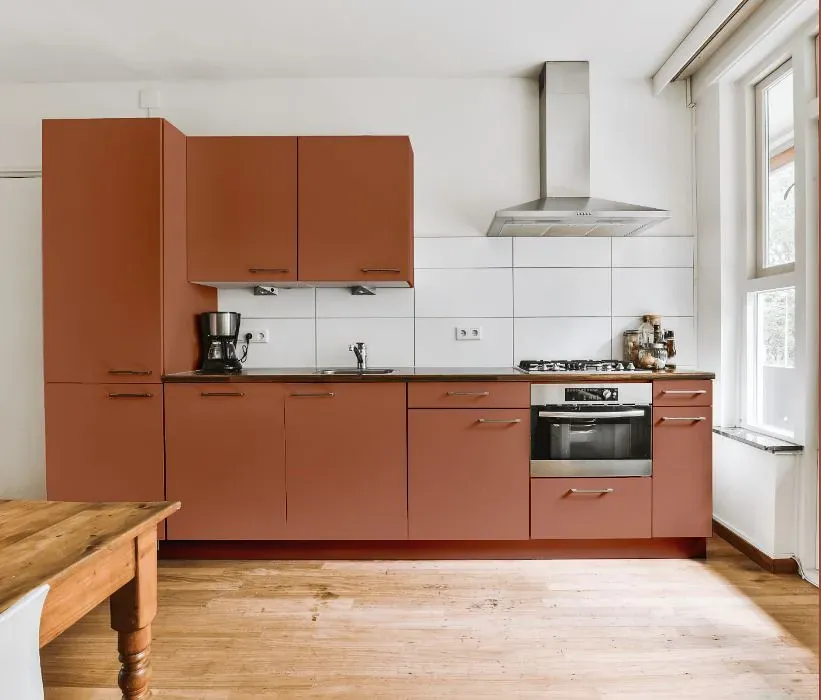
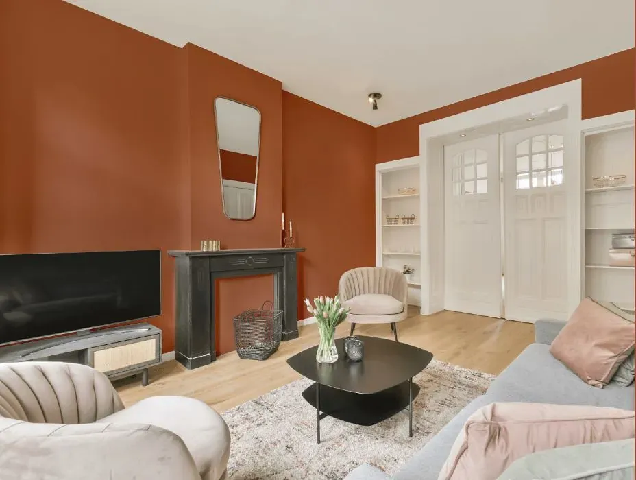
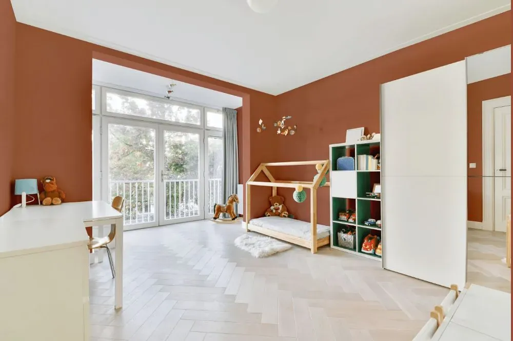
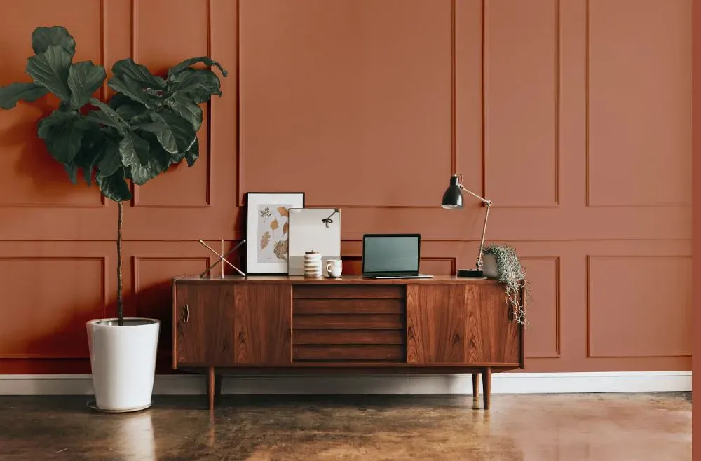
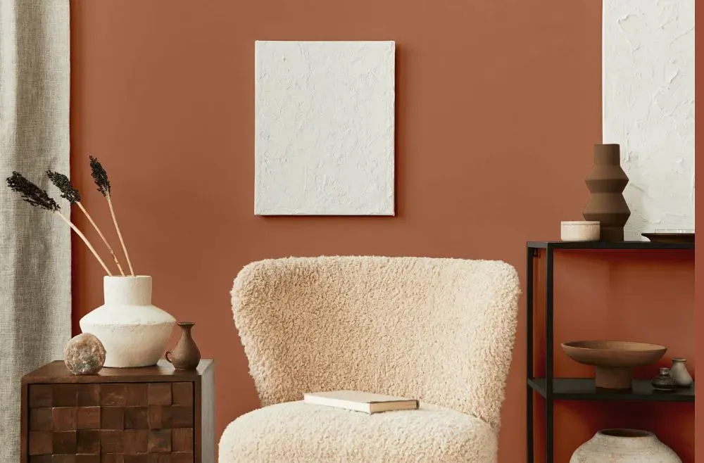
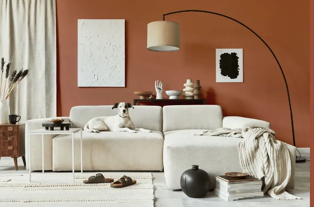
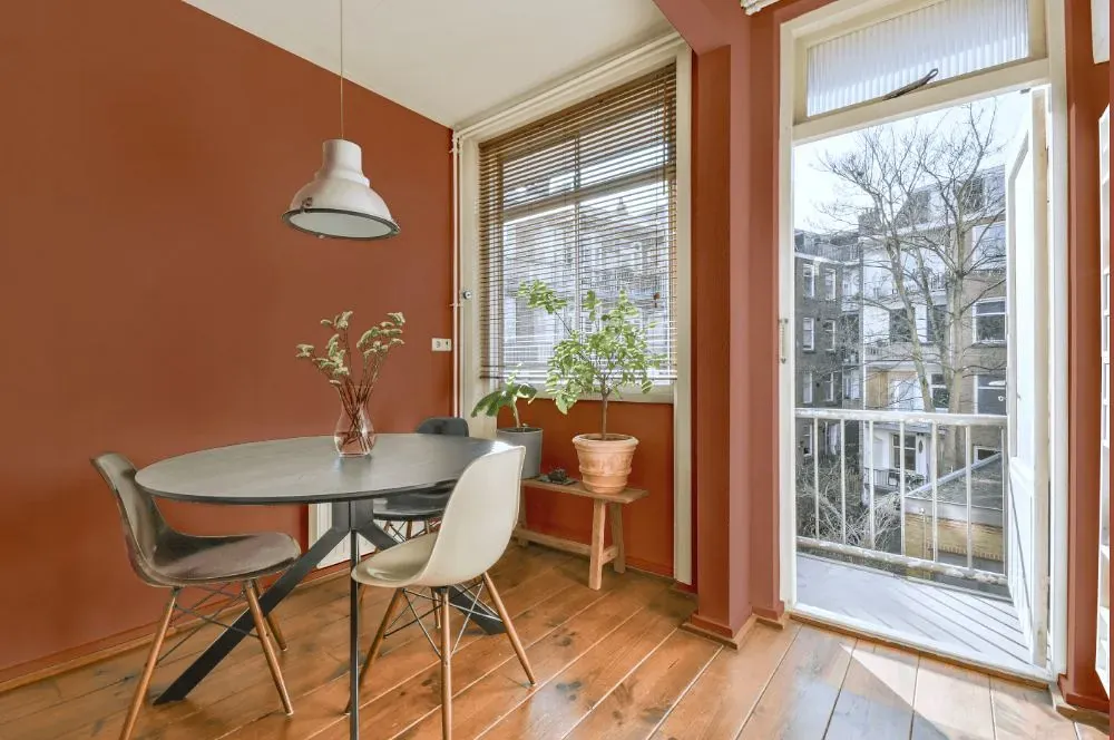
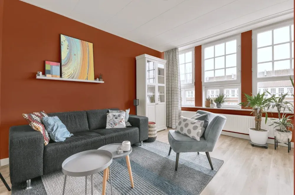
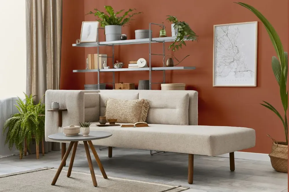
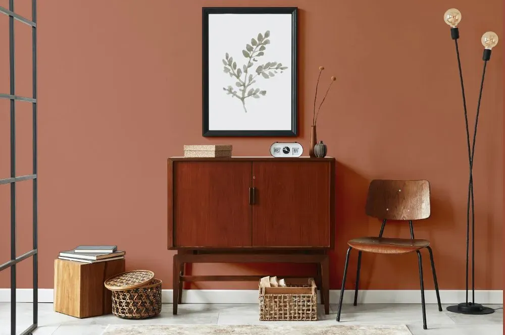
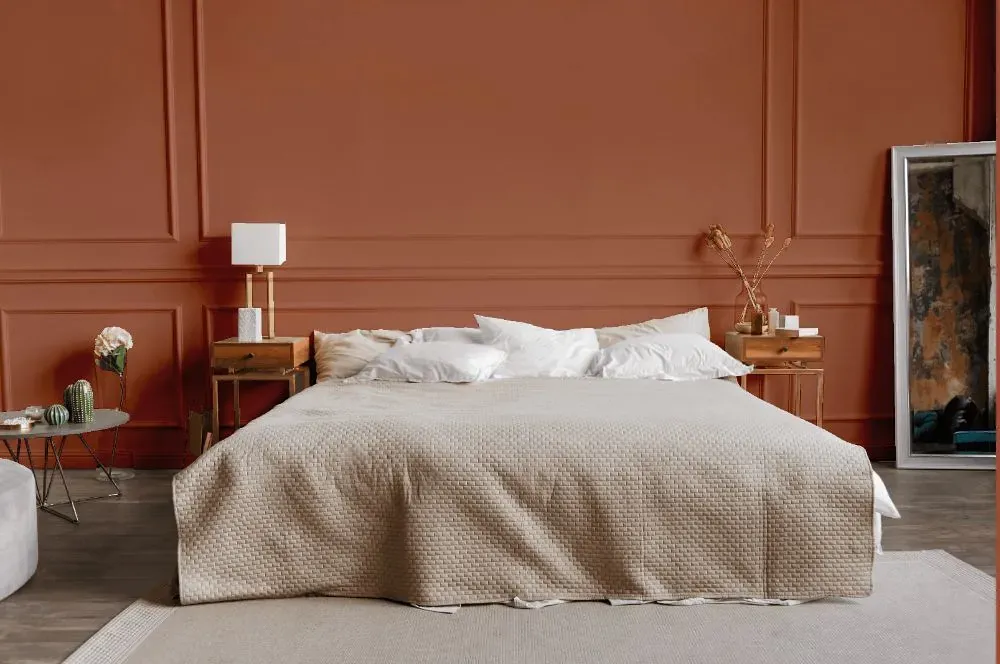
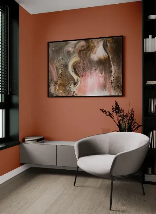
Immerse your space in the serene allure of Benjamin Moore 1195 Patina. This soothing hue, reminiscent of the verdigris on aged copper, adds a touch of elegance to any room. Pair Patina with crisp whites and soft greys to create a harmonious and sophisticated color palette. This versatile shade also complements earthy tones like olive green and sandy beige, enhancing the natural feel of your space. Embrace the timeless beauty of Patina (1195) and elevate your interior with its understated charm.
Loading...
LRV of Patina
Patina has an LRV of 24.53% and refers to Medium colors that reflect a lot of light. Why LRV is important?

Light Reflectance Value measures the amount of visible and usable light that reflects from a painted surface.
Simply put, the higher the LRV of a paint color, the brighter the room you will get.
The scale goes from 0% (absolute black, absorbing all light) to 100% (pure white, reflecting all light).
Act like a pro: When choosing paint with an LRV of 24.53%, pay attention to your bulbs' brightness. Light brightness is measured in lumens. The lower the paint's LRV, the higher lumen level you need. Every square foot of room needs at least 40 lumens. That means for a 200 ft2 living room you'll need about 8000 lumens of light – e.g., eight 1000 lm bulbs.
Color codes
We have collected almost every possible color code you could ever need.
Not sure what the difference between HEX and RGB is? We break down color models in plain language. Understanding color models
| Format | Code |
|---|---|
| HEX | #B67861 |
| RGB Decimal | 182, 120, 97 |
| RGB Percent | 71.37%, 47.06%, 38.04% |
| HSV | Hue: 16° Saturation: 46.7% Value: 71.37% |
| HSL | hsl(16, 37, 55) |
| CMYK | Cyan: 0.0 Magenta: 34.07 Yellow: 46.7 Key: 28.63 |
| YIQ | Y: 135.916 I: 44.337 Q: 5.958 |
| XYZ | X: 28.167 Y: 24.243 Z: 14.502 |
| CIE Lab | L:56.331 a:21.582 b:22.57 |
| CIE Luv | L:56.331 u:44.65 v:24.076 |
| Decimal | 11958369 |
| Hunter Lab | 49.237, 15.947, 17.003 |