

Benjamin Moore Pearl Gray 863
Contentsshow +hide -
| Official page: | Pearl Gray 863 |
| Code: | 863 |
| Name: | Pearl Gray |
| Brand: | Benjamin Moore |
What color is Benjamin Moore Pearl Gray?
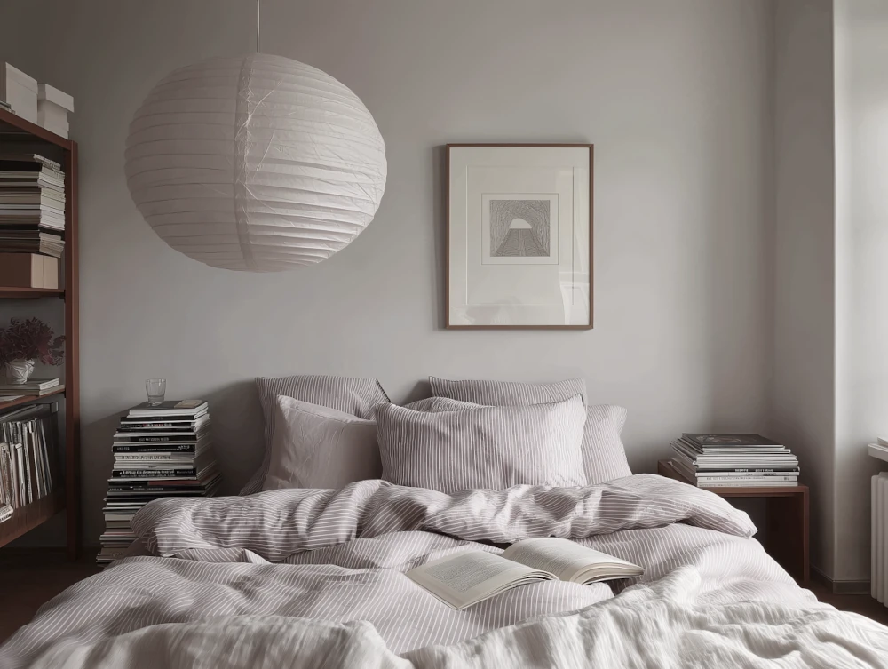
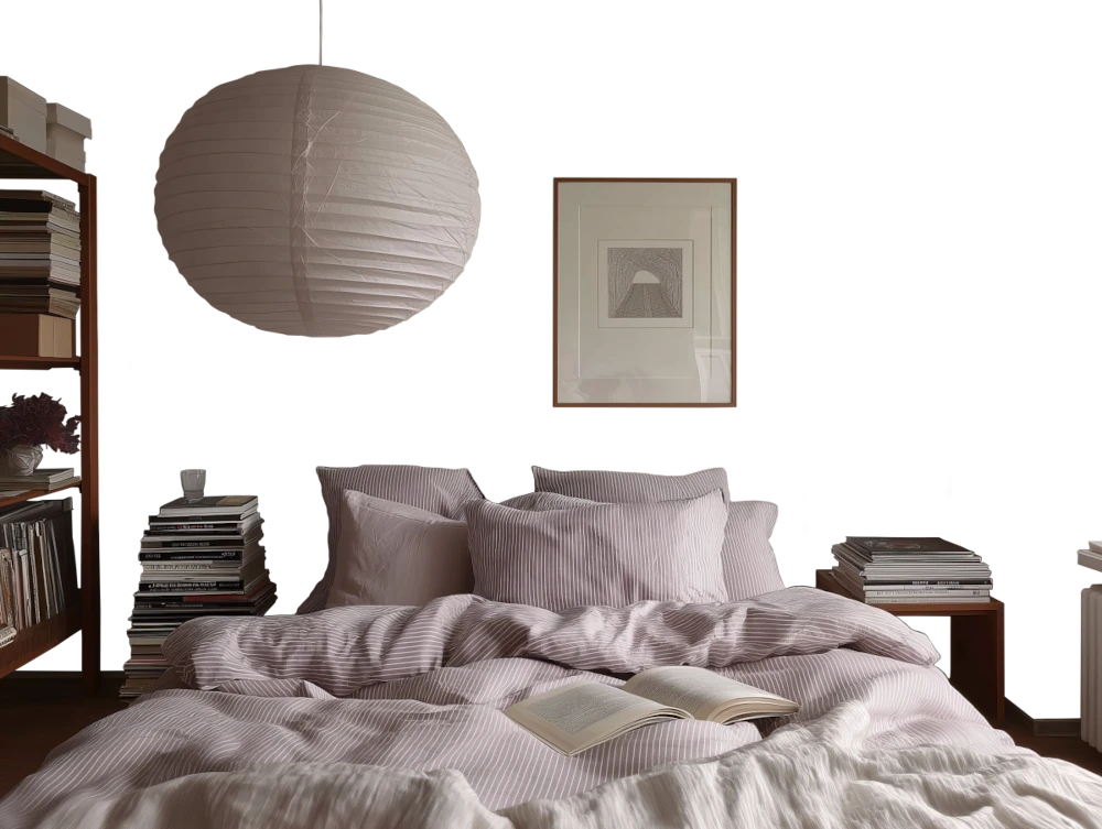
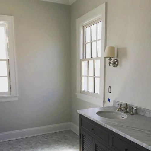
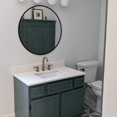
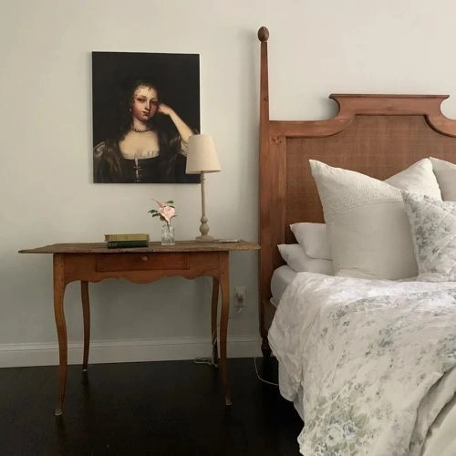
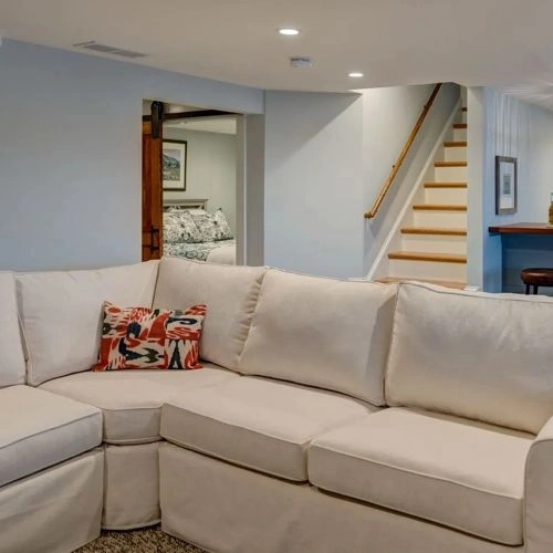
Benjamin Moore Pearl Gray 863 is a very light gray with a soft green cast that keeps it from reading stark or icy. Its pale, muted character gives walls a clean, lightly weathered look, especially in rooms with natural wood, stone, or linen textures. Daylight can bring out the gentle green influence, while warmer evening bulbs may make it appear closer to a quiet off-white gray. Use Pearl Gray in kitchens, bedrooms, or bathrooms where a low-contrast backdrop is preferred, pairing it with creamy whites, warm oak, charcoal details, or brushed nickel. It is best suited to broad wall areas and cabinetry when you want color presence without a strong gray statement.
Benjamin Moore Pearl Gray reviews
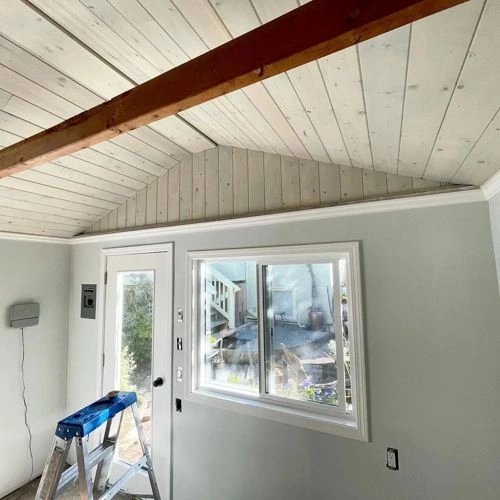
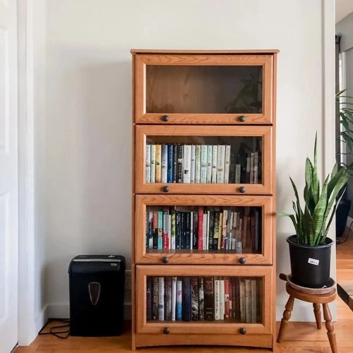
View the photos of real spaces painted with this green that were not included in specific categories. Close-ups, painted furniture, storages and dressers, hallways, stairs and ceilings.
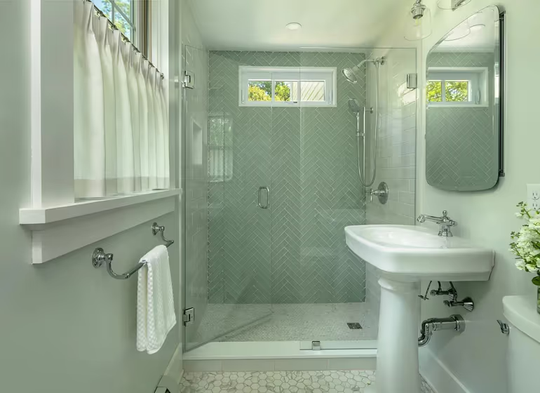
@tapper_richards_interiors
Try before you buy

100% accurate
reusable paint samples
Peel, stick,
and repeat
Twice painted
with real paint
Next day
delivery
What are Benjamin Moore Pearl Gray undertones?
Pearl Gray is a very light, muted gray with a soft green-yellow cast visible in the supplied digital sample, though that bias is subtle. Benjamin Moore describes it as a “slinky silver-gray” and places it in its Green category, which fits the way the gray can read slightly green rather than purely neutral. Its low saturation keeps the color quiet and near-white, while its overall character remains cool-leaning. Warm artificial light may soften the gray and make its yellow-green hint more noticeable, while cool daylight may emphasize its silvery gray appearance.
Manufacturer information used in this description: official color page.
HEX value:
RGB code:
221, 225, 216
Is Benjamin Moore Pearl Gray cool or warm?
warm
cool
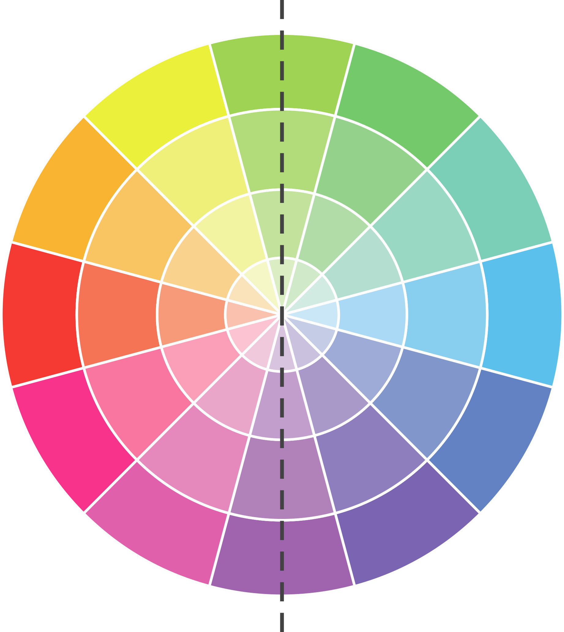
With a hue of 87°, this Green leans warm, but it is close to neutral and can read cooler in some light.
863 Pearl Gray HSL code: 87, 13%, 86%
Hue - degree on a color wheel from 0 to 360. 0 is red, 120 is green, and 240 is blue.
Saturation is expressed as a percentage. At 0%, it appears as a shade of grey, and at 100%, it is in full color.
Lightness is also a percentage value. 0% is black, and 100% is white.
How light temperature affects Pearl Gray
Natural Lighting. During the day, natural light shifts from about 2000 K at sunrise/sunset to 5500–6500 K at noon.
In addition, natural-light temperature depends on its direction:
| Direction of sunlight | Visible temp. | Hue | Duration |
|---|---|---|---|
| North | Cool | Bluish | All day |
| East | Warm | Yellow | Before noon |
| West | Warm | Orange-red | After noon |
| South | Warm | Orange-yellow | All day |
Artificial Lighting. When choosing bulbs, pay attention to their color temperature in Kelvins.
Use the slider to see how this Green shade looks under different lighting:
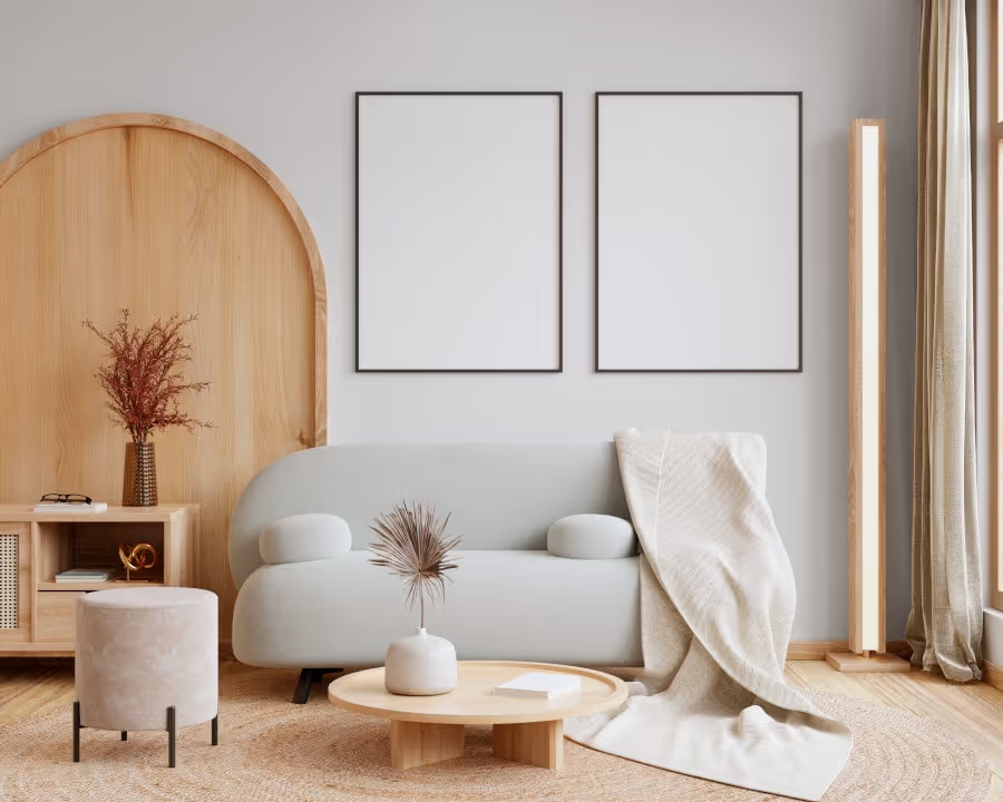
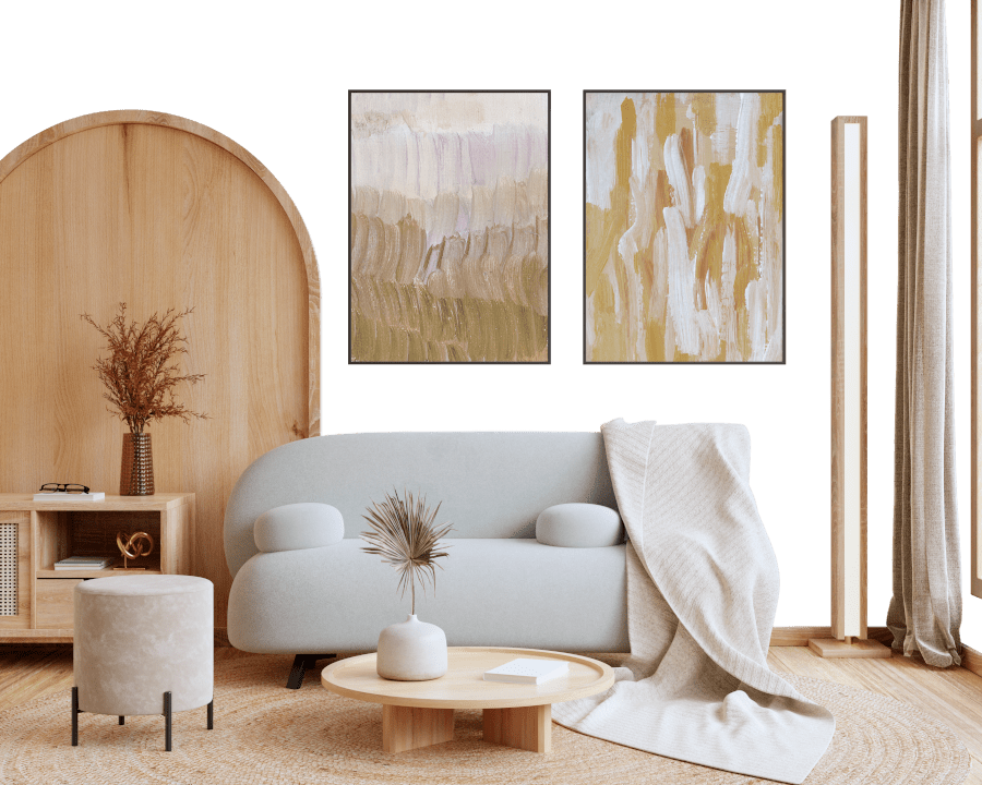
4000K
Coordinating colors.
Colors that go with Benjamin Moore Pearl Gray:
Monochromatic color scheme
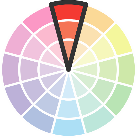
This scheme consists of various shades, tints, and tones of a single color. While it offers a perfect combination of hues, without accent décor it may become monotonous.
Lighter shades
863
Pearl Gray

Darker shades
Complementary color scheme
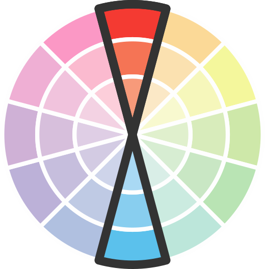
This color scheme is a combination of two shades that are opposite each other on the color wheel. The high contrast between these colors creates a vibrant and dynamic visual effect. For the color Pearl Gray with a orange hue, complementary colors are those with a blue hue close to 267, such as Benjamin Moore Cupid's Dart and Plum Royale.


LRV of Pearl Gray
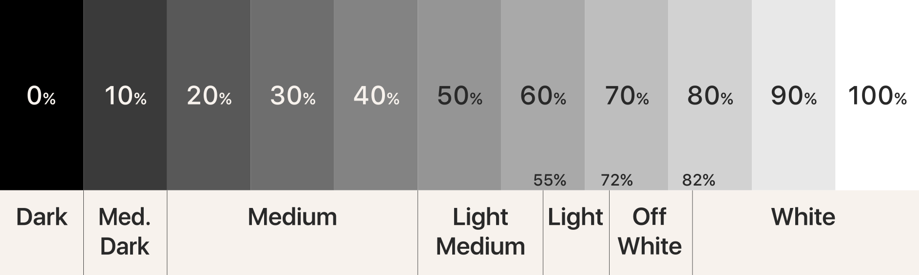
Pearl Gray has an LRV of 73.54% and refers to Off‑White colors that reflect a lot of light. Why LRV is important?
Light Reflectance Value measures the amount of visible and usable light that reflects from a painted surface.
Simply put, the higher the LRV of a paint color, the brighter the room you will get.
The scale goes from 0% (absolute black, absorbing all light) to 100% (pure white, reflecting all light).
Act like a pro: When choosing paint with an LRV of 73.54%, pay attention to your bulbs' brightness. Light brightness is measured in lumens. The lower the paint's LRV, the higher lumen level you need. Every square foot of room needs at least 40 lumens. That means for a 200 ft2 living room you'll need about 8000 lumens of light – e.g., eight 1000 lm bulbs.
Color codes
We have collected almost every possible color code you could ever need.
Not sure what the difference between HEX and RGB is? We break down color models in plain language. Understanding color models
| Format | Code |
|---|---|
| HEX | #DDE1D8 |
| RGB Decimal | 221, 225, 216 |
| RGB Percent | 86.67%, 88.24%, 84.71% |
| HSV | Hue: 87° Saturation: 4.0% Value: 88.24% |
| HSL | hsl(87, 13, 86) |
| CMYK | Cyan: 1.78 Magenta: 0.0 Yellow: 4.0 Key: 11.76 |
| YIQ | Y: 222.778 I: 0.508 Q: -3.647 |
| XYZ | X: 69.136 Y: 74.18 Z: 75.623 |
| CIE Lab | L:89.008 a:-2.952 b:3.93 |
| CIE Luv | L:89.008 u:-1.771 v:6.467 |
| Decimal | 14541272 |
| Hunter Lab | 86.128, -7.441, 8.231 |

Color equivalents
SW 6189
Opaline
Sherwin Williams


PPU25-11
Salt Cellar
Behr
MQ3-45
Looking Glass
Behr
N420-1
Juniper Breeze
Behr
N390-1
Light Mist
Behr
BL-W06
Whispering Waterfall
Behr
2139-60
Green Tint
Benjamin Moore
463
Woodland White
Benjamin Moore
1583
Silver Crest
Benjamin Moore
1562
Healing Aloe
Benjamin Moore

HDC-NT-24
Glacier Valley
Behr
OC-53
Horizon
Benjamin Moore
GR-W06
Winds Breath
Behr
862
Cascade Mountains
Benjamin Moore
OC-55
Paper White
Benjamin Moore
CSP-575
Ice Fog
Benjamin Moore
SW 6210
Window Pane
Sherwin Williams
1555
Winter Orchard
Benjamin Moore
BL-W12
Canyon Wind
Behr
2138-70
Gray Lake
Benjamin Moore
