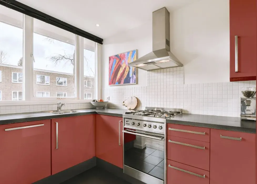
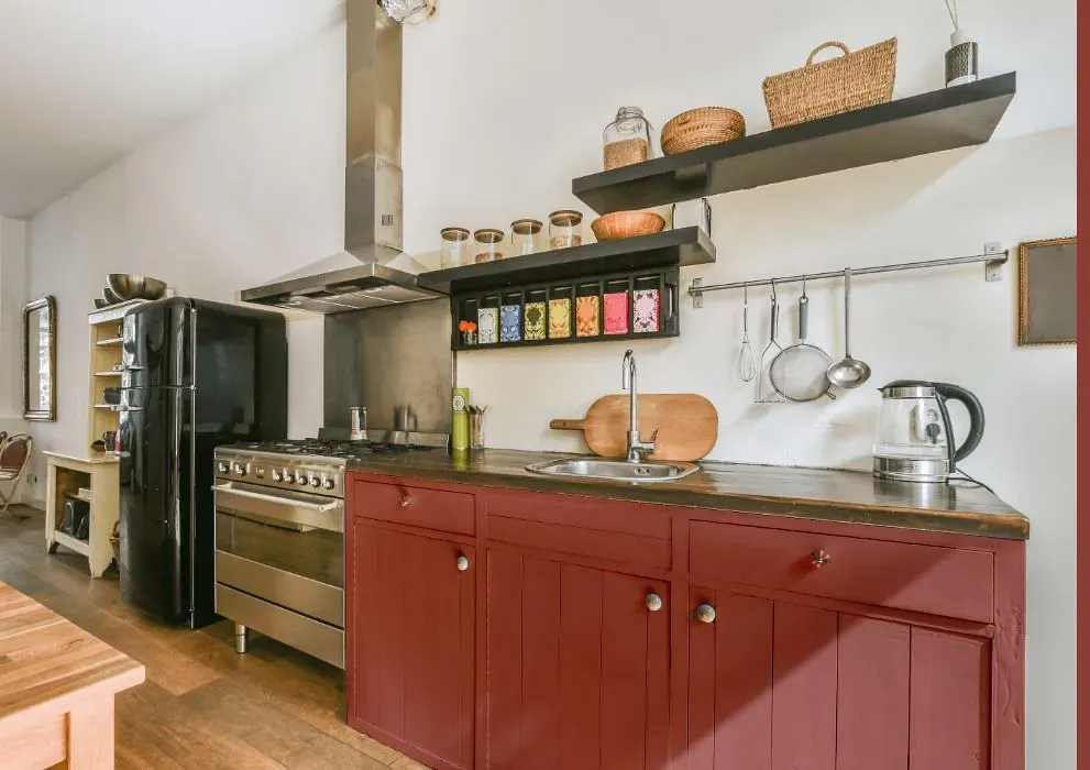
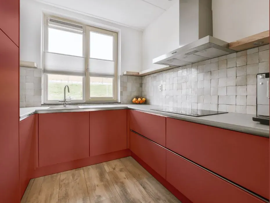
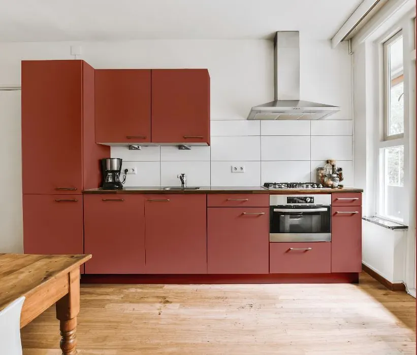
Benjamin Moore Potters Wheel 1294
Contentsshow +hide -
- Benjamin Moore Potters Wheel reviews (23 photos)
- What are Benjamin Moore Potters Wheel undertones?
- Is Potters Wheel 1294 cool or warm?
- How light temperature affects on Potters Wheel
- Monochromatic color scheme
- Complementary color scheme
- Color comparison and matching
- LRV of Potters Wheel 1294
- Color codes
- Color equivalents
| Official page: | Potters Wheel 1294 |
| Code: | 1294 |
| Name: | Potters Wheel |
| Brand: | Benjamin Moore |
What color is Benjamin Moore Potters Wheel?
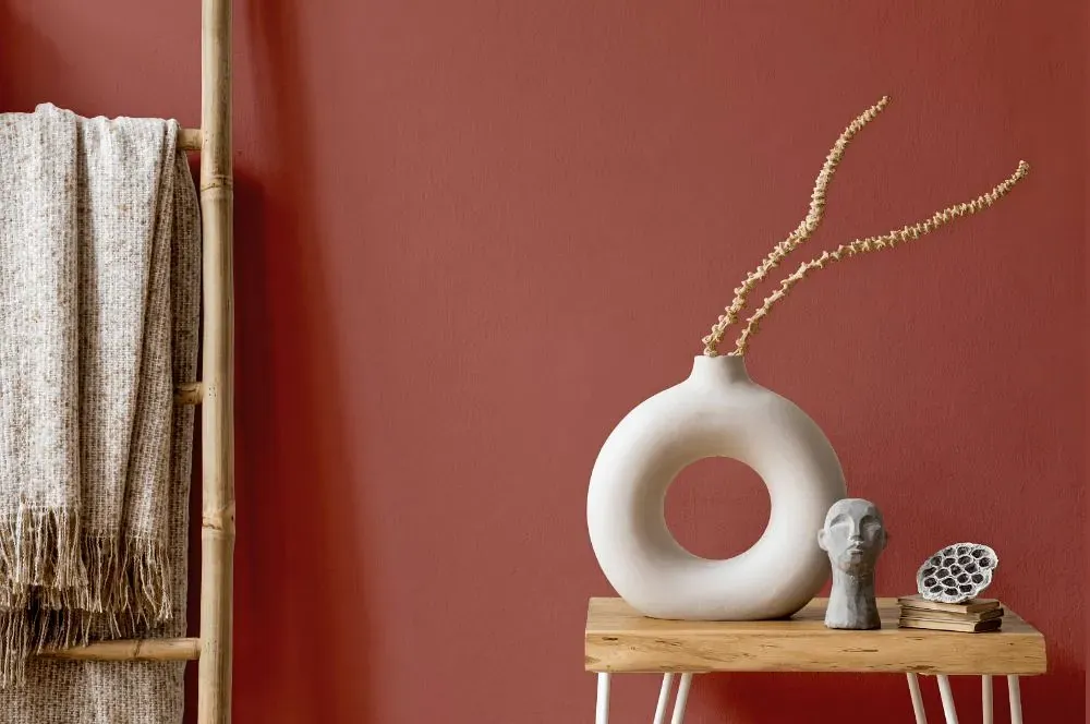
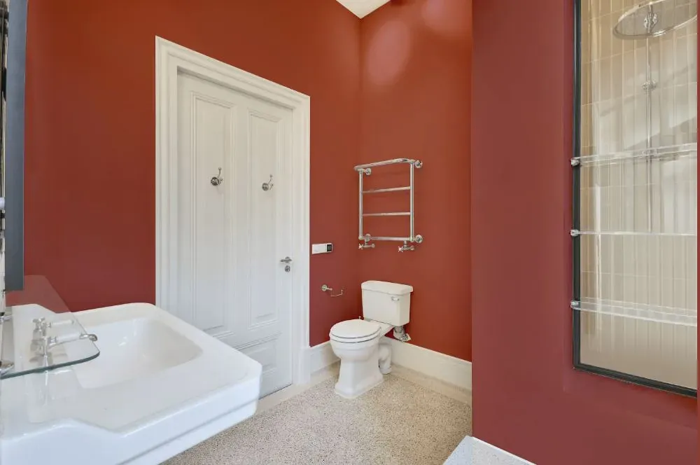
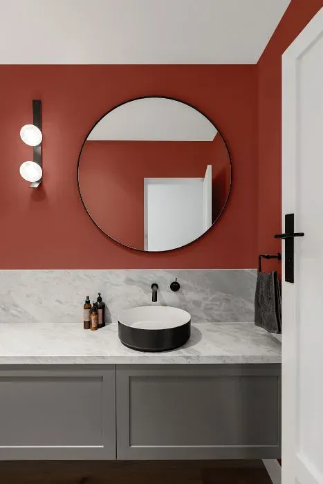
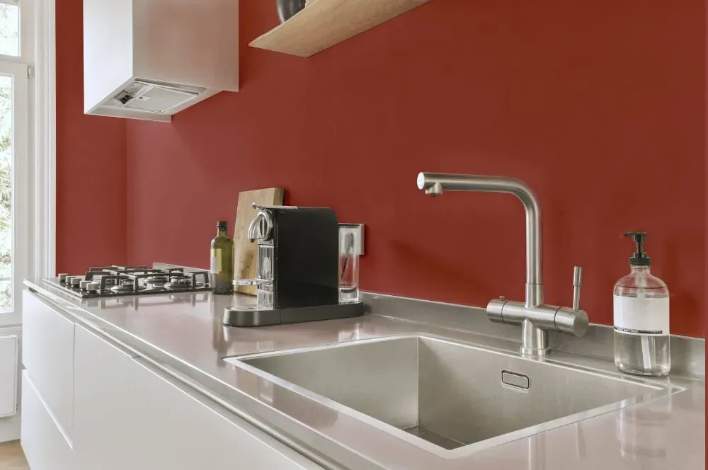
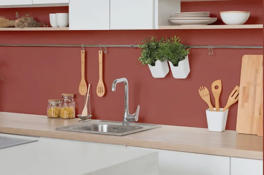
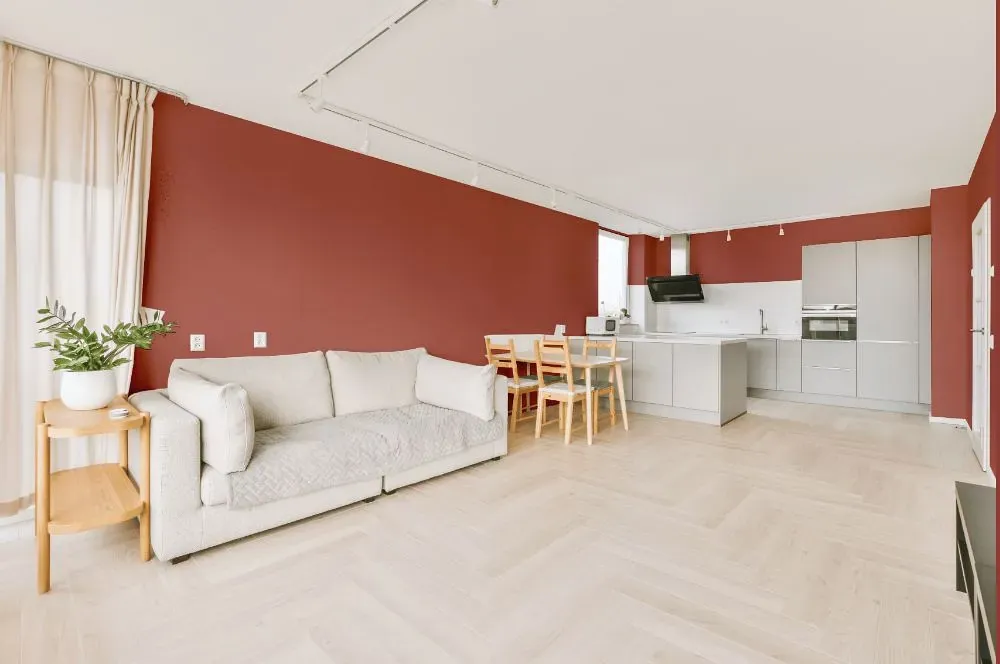
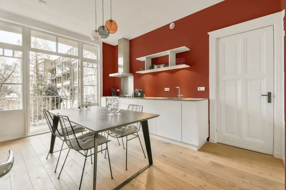
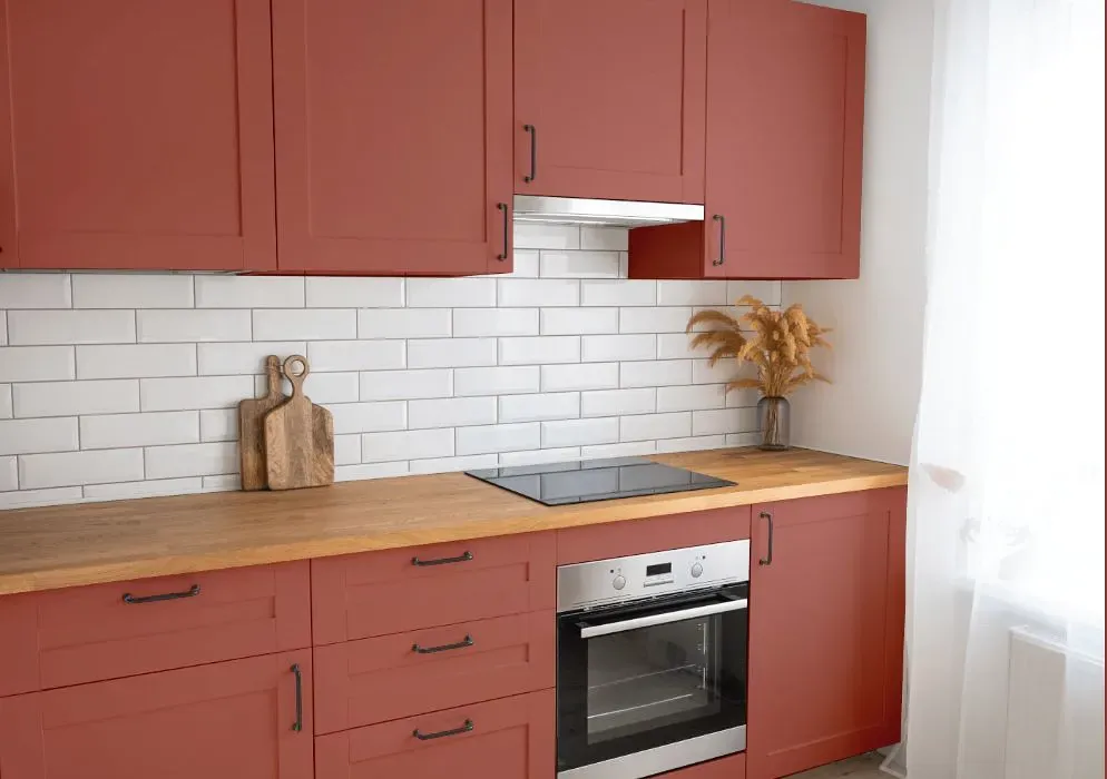
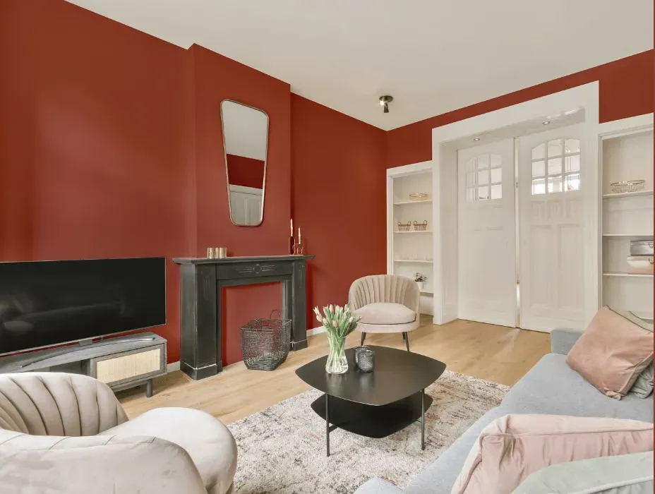
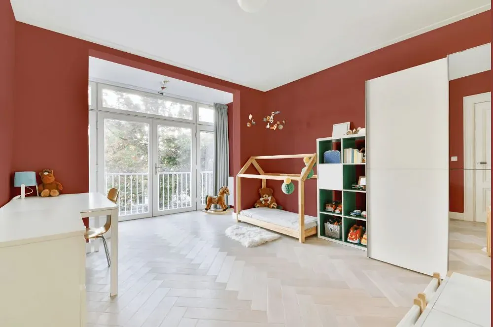
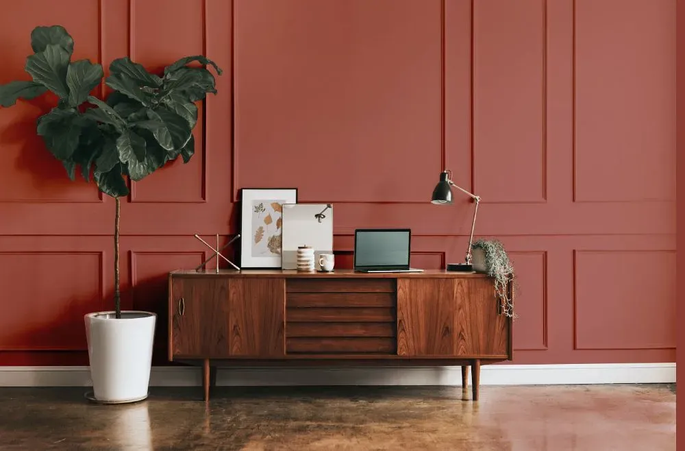
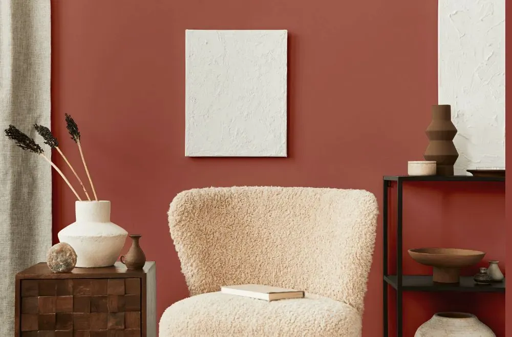
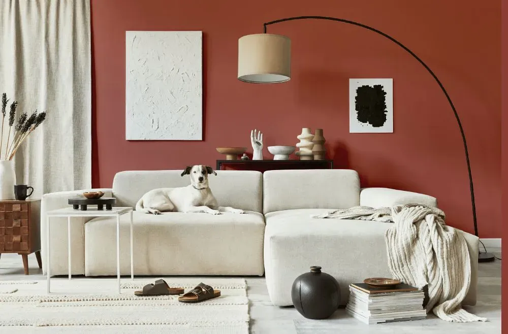
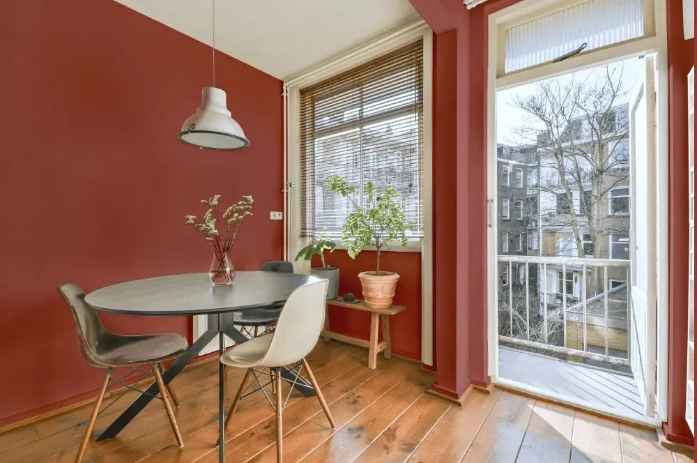
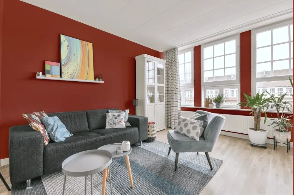
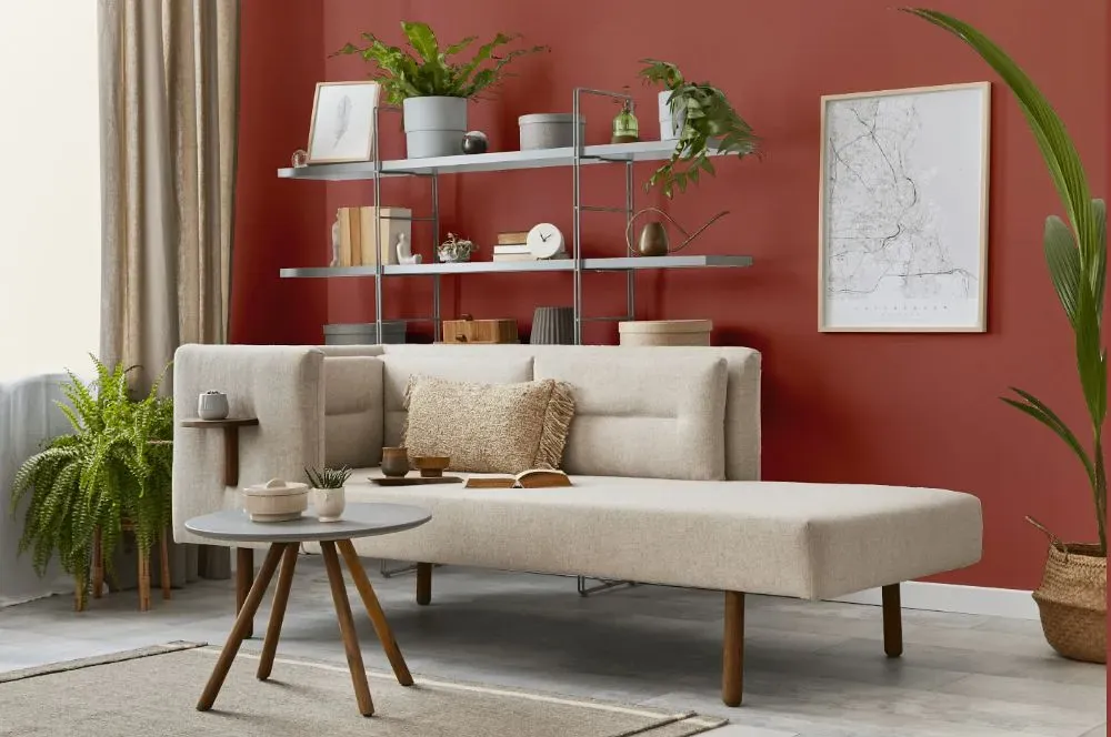
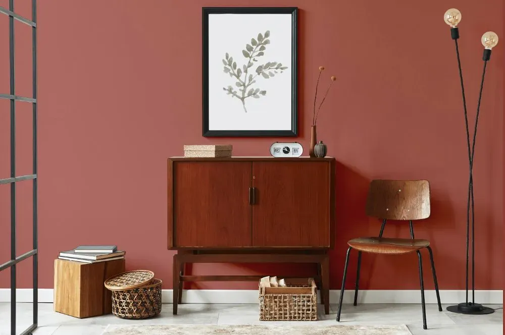
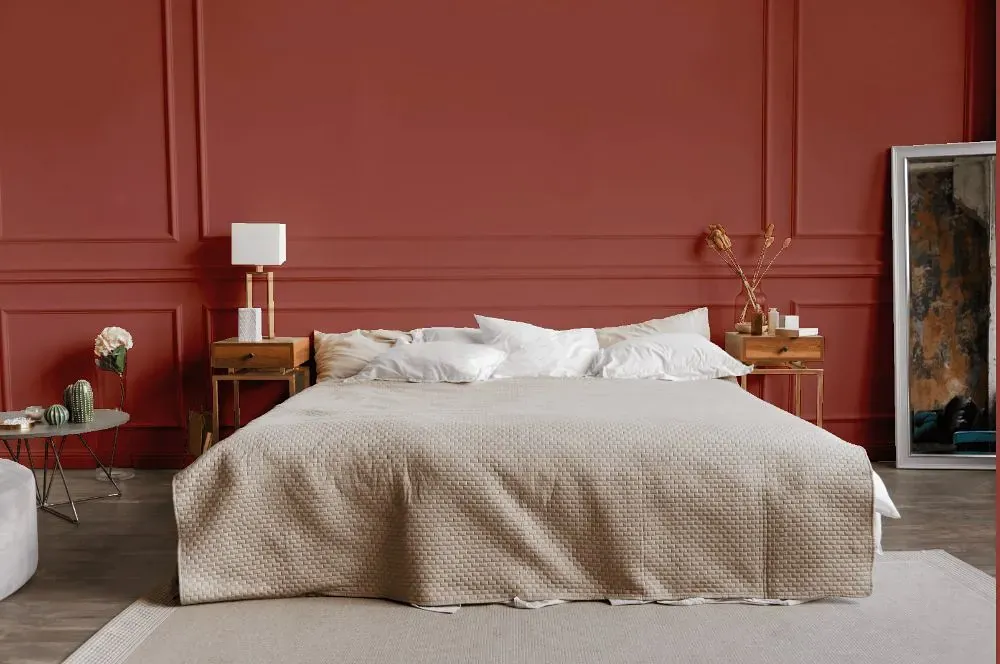
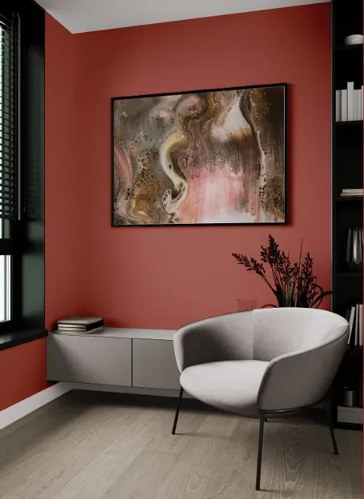
Benjamin Moore 1294 pairs exquisitely with warm, earthy tones such as burnt sienna and terracotta. This rich and deep hue can be beautifully complemented by accents in creamy ivory and soft taupe. For a sophisticated and cozy feel, consider incorporating shades of olive green or mustard yellow into your design scheme. The versatility of PottersWheel makes it an excellent choice for creating a welcoming and inviting space with a touch of elegance.
Loading...
LRV of Potters Wheel
Potters Wheel has an LRV of 19.91% and refers to Medium Dark which means that this color reflects very little light. Why LRV is important?

Light Reflectance Value measures the amount of visible and usable light that reflects from a painted surface.
Simply put, the higher the LRV of a paint color, the brighter the room you will get.
The scale goes from 0% (absolute black, absorbing all light) to 100% (pure white, reflecting all light).
Act like a pro: When choosing paint with an LRV of 19.91%, pay attention to your bulbs' brightness. Light brightness is measured in lumens. The lower the paint's LRV, the higher lumen level you need. Every square foot of room needs at least 40 lumens. That means for a 200 ft2 living room you'll need about 8000 lumens of light – e.g., eight 1000 lm bulbs.
Color codes
We have collected almost every possible color code you could ever need.
Not sure what the difference between HEX and RGB is? We break down color models in plain language. Understanding color models
| Format | Code |
|---|---|
| HEX | #AE675E |
| RGB Decimal | 174, 103, 94 |
| RGB Percent | 68.24%, 40.39%, 36.86% |
| HSV | Hue: 7° Saturation: 45.98% Value: 68.24% |
| HSL | hsl(7, 33, 53) |
| CMYK | Cyan: 0.0 Magenta: 40.8 Yellow: 45.98 Key: 31.76 |
| YIQ | Y: 123.203 I: 45.201 Q: 12.218 |
| XYZ | X: 24.327 Y: 19.509 Z: 13.071 |
| CIE Lab | L:51.278 a:27.468 b:17.335 |
| CIE Luv | L:51.278 u:50.237 v:16.417 |
| Decimal | 11429726 |
| Hunter Lab | 44.169, 21.016, 13.373 |