Benjamin Moore Pottery Red 2085-20
Contentsshow +hide -
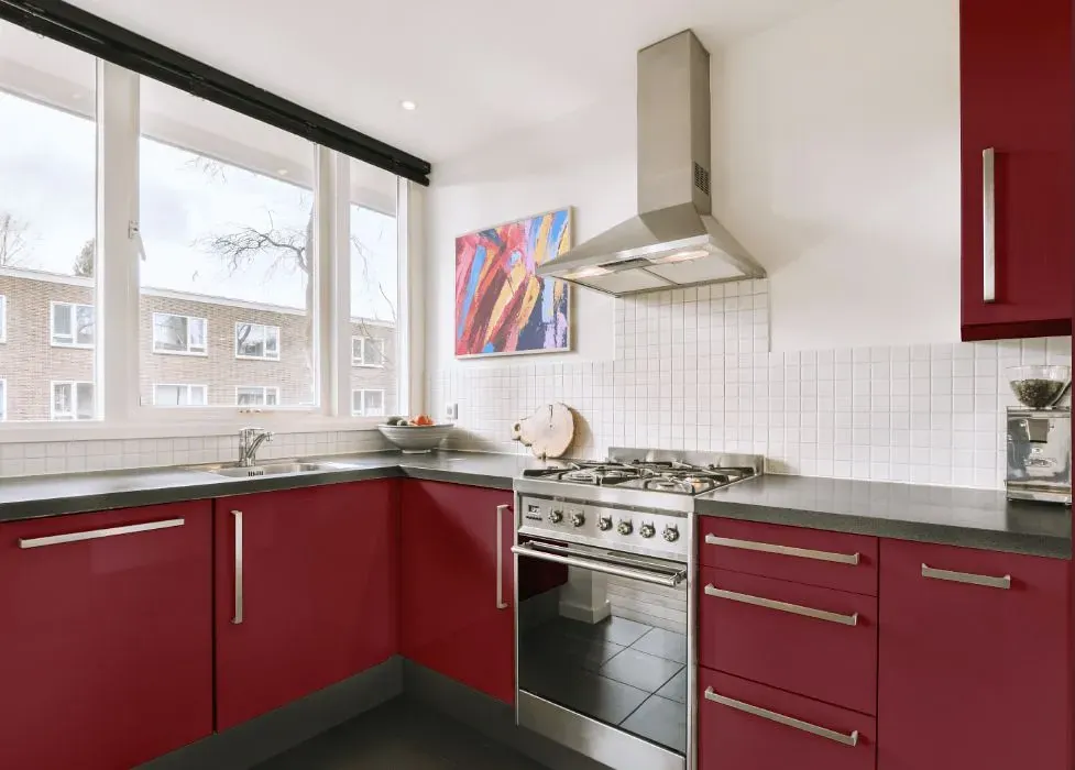
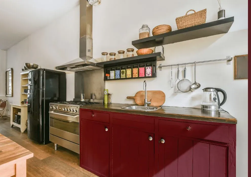
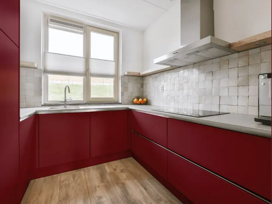
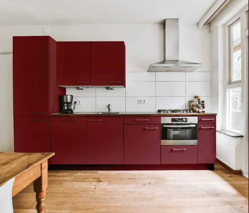
- Benjamin Moore Pottery Red reviews (23 photos)
- What are Benjamin Moore Pottery Red undertones?
- Is Pottery Red 2085-20 cool or warm?
- How light temperature affects on Pottery Red
- Monochromatic color scheme
- Complementary color scheme
- Color comparison and matching
- LRV of Pottery Red 2085-20
- Color codes
- Color equivalents
| Official page: | Pottery Red 2085-20 |
| Code: | 2085-20 |
| Name: | Pottery Red |
| Brand: | Benjamin Moore |
What color is Benjamin Moore Pottery Red?
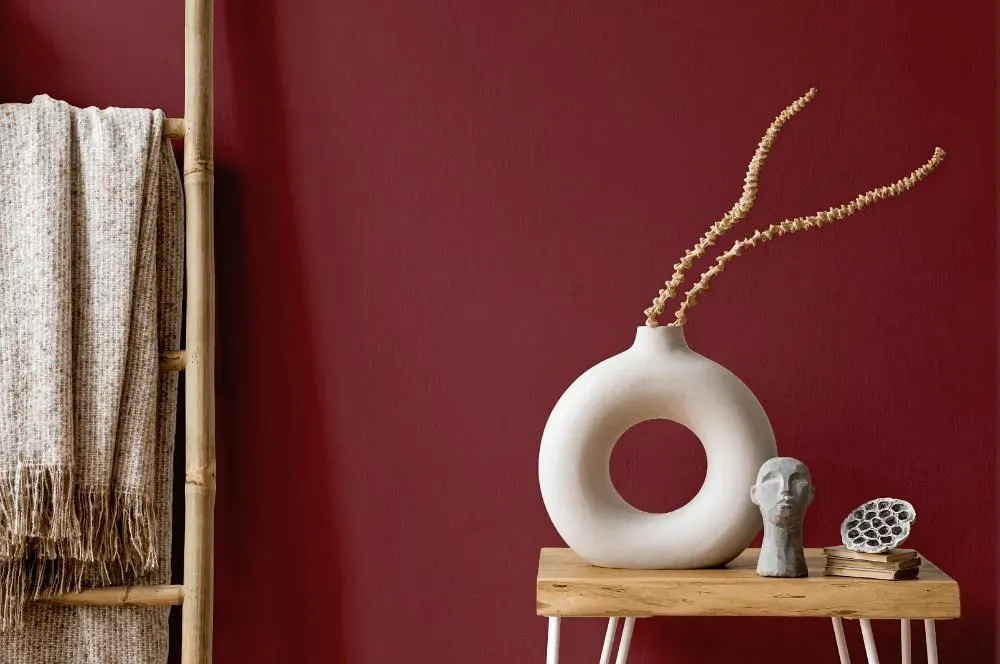
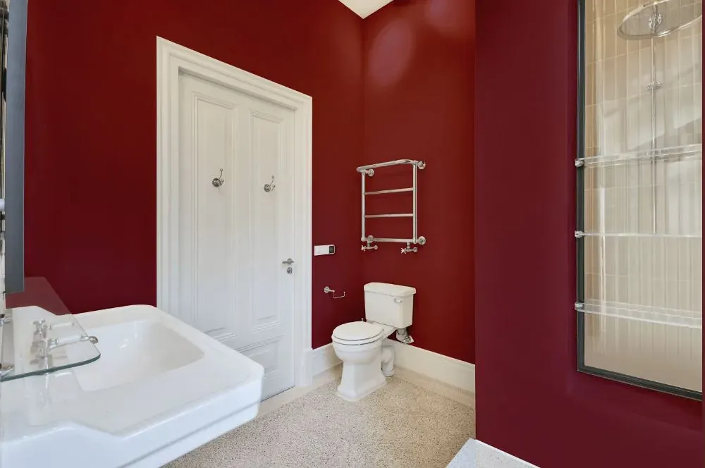
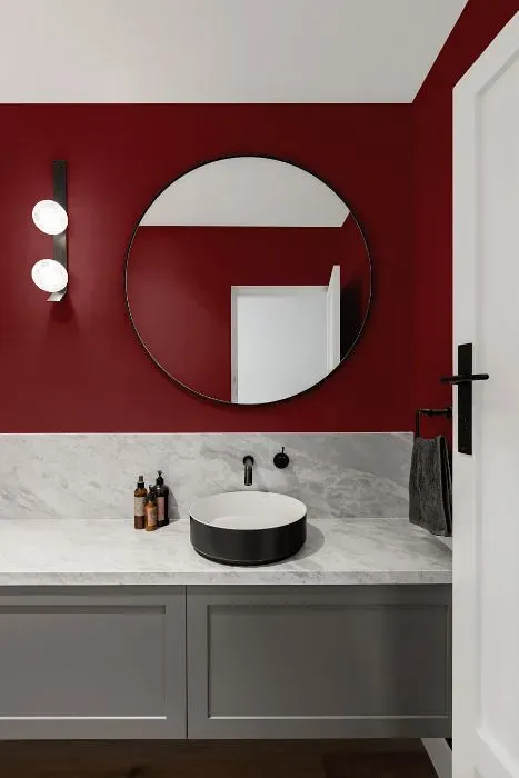
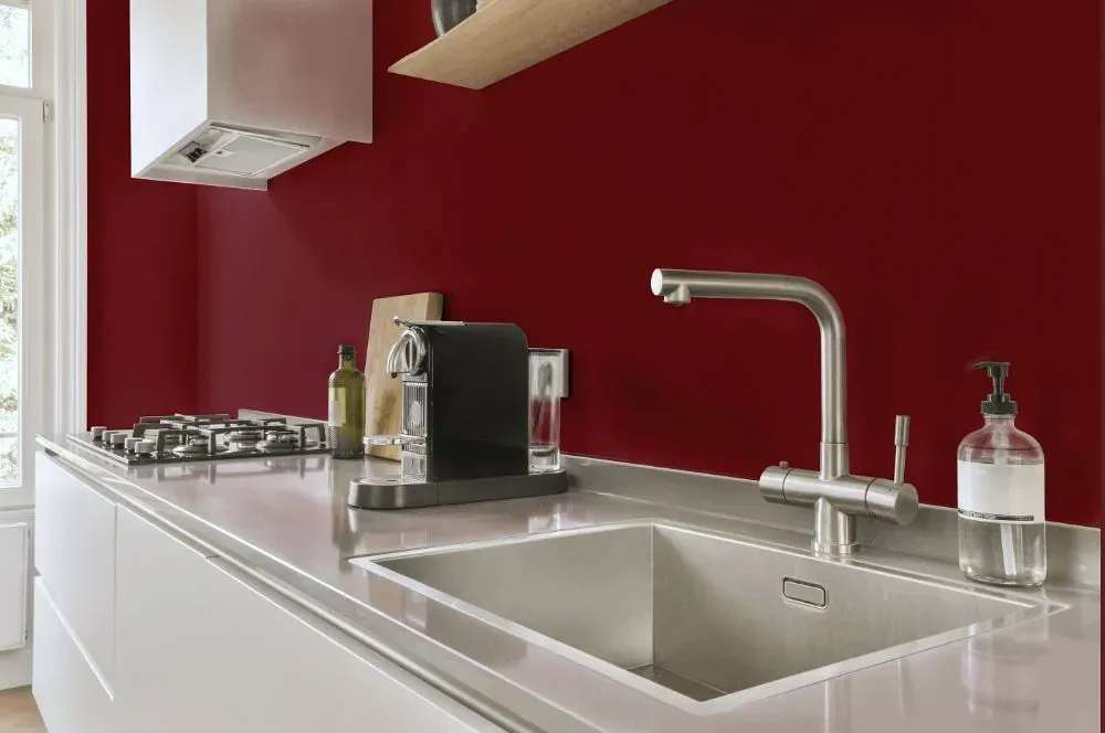
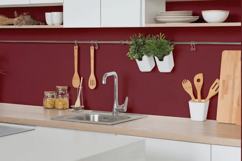
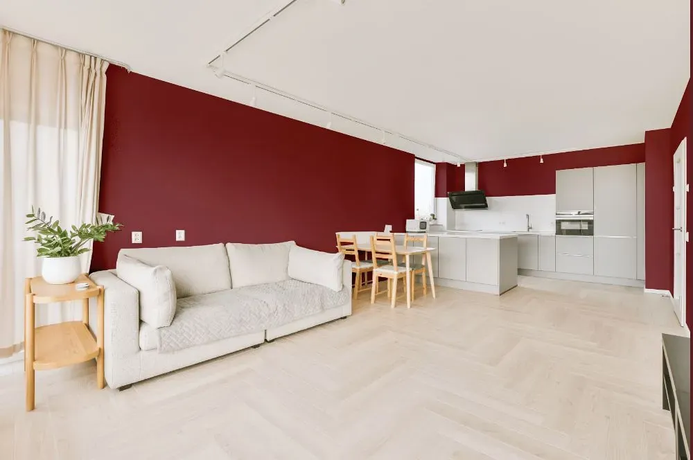
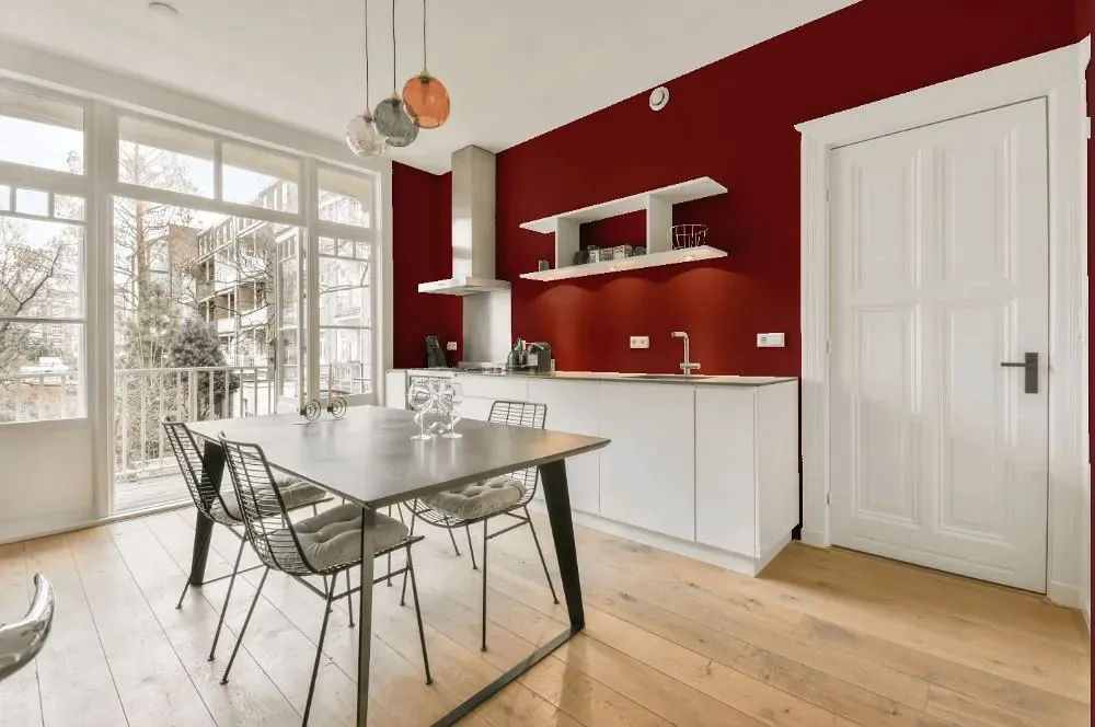
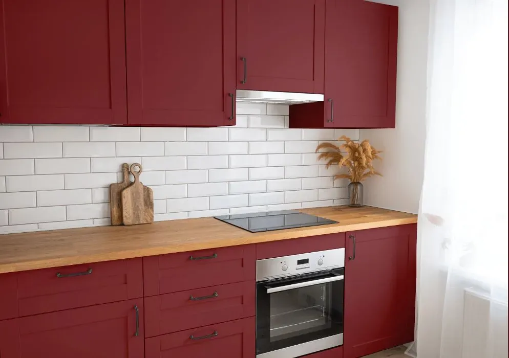
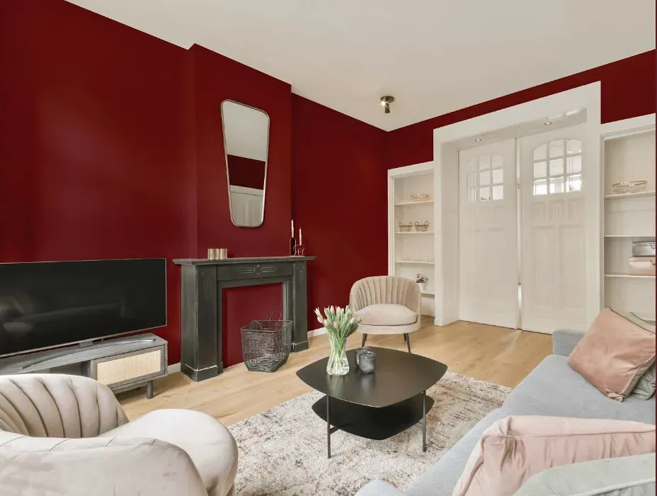
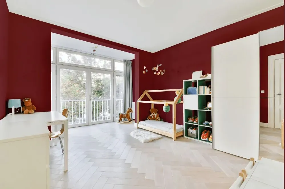
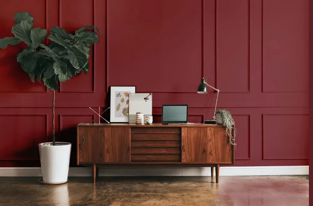
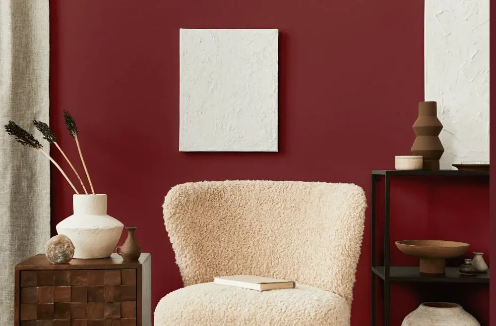
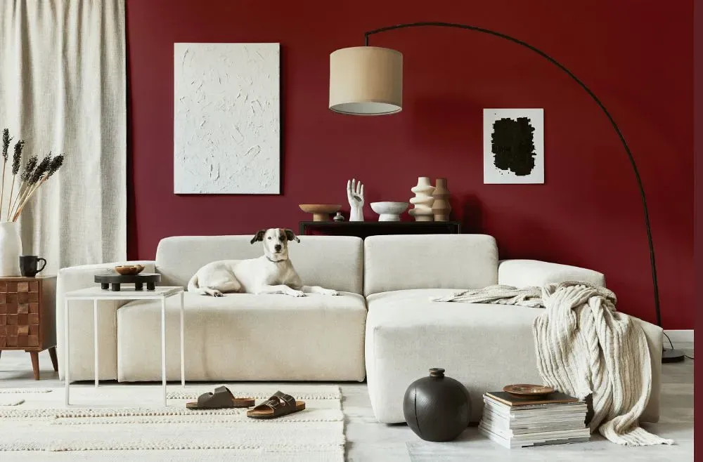
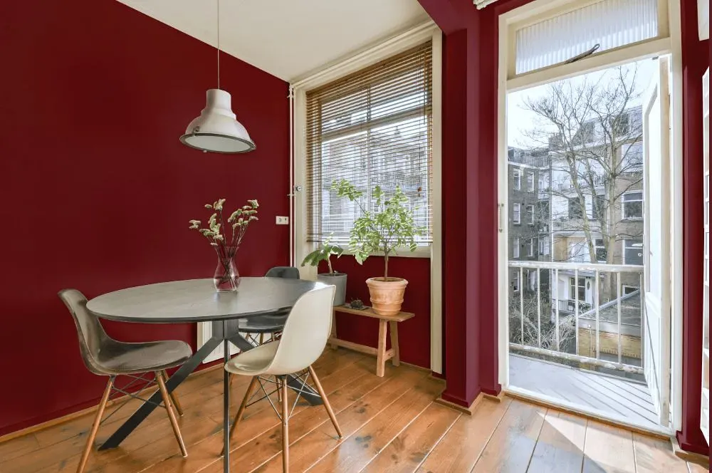
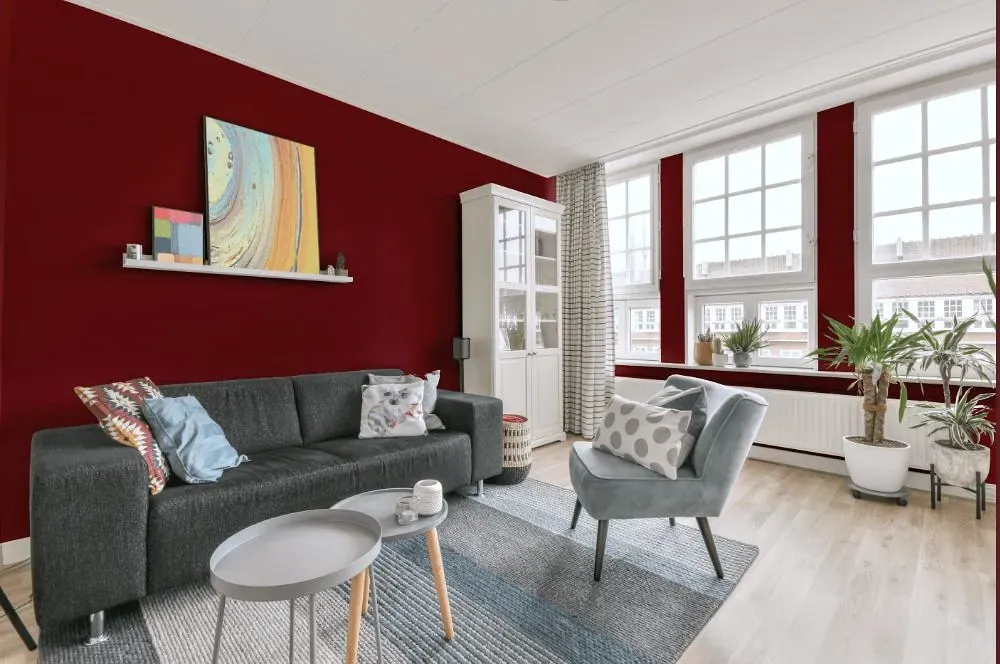
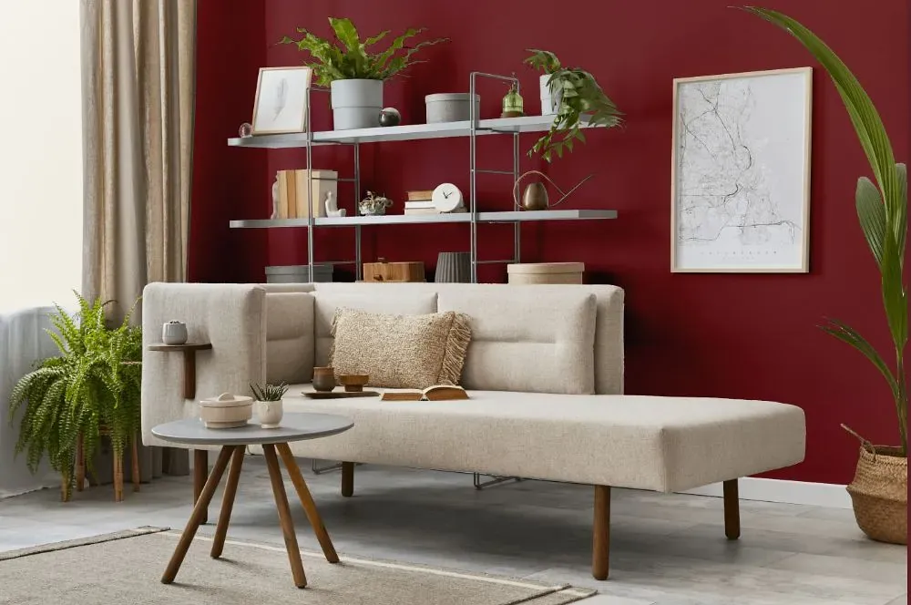
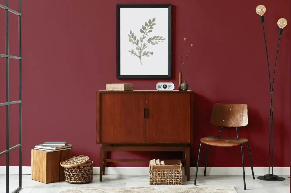
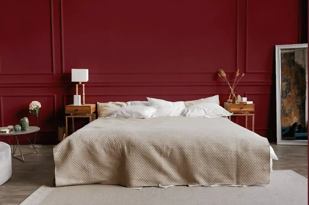
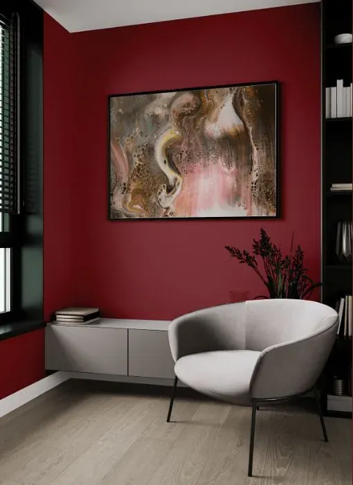
Benjamin Moore's 2085-20 Pottery Red is a warm and inviting hue that adds a rich, timeless feel to any space. This sophisticated color pairs beautifully with neutral tones like beige, ivory, and taupe, creating a harmonious and elegant color palette. For a bolder look, Pottery Red can be complemented by deep greens, navy blues, or even shades of gold for a more dramatic flair. Whether used as an accent wall or a statement piece of furniture, Pottery Red brings character and depth to your interior design scheme. Experiment with different color combinations to discover the perfect balance that suits your style preferences.
Loading...
LRV of Pottery Red
Pottery Red has an LRV of 9.82% and refers to Dark colors which means that this color almost does not reflect light. Why LRV is important?

Light Reflectance Value measures the amount of visible and usable light that reflects from a painted surface.
Simply put, the higher the LRV of a paint color, the brighter the room you will get.
The scale goes from 0% (absolute black, absorbing all light) to 100% (pure white, reflecting all light).
Act like a pro: When choosing paint with an LRV of 9.82%, pay attention to your bulbs' brightness. Light brightness is measured in lumens. The lower the paint's LRV, the higher lumen level you need. Every square foot of room needs at least 40 lumens. That means for a 200 ft2 living room you'll need about 8000 lumens of light – e.g., eight 1000 lm bulbs.
Color codes
We have collected almost every possible color code you could ever need.
Not sure what the difference between HEX and RGB is? We break down color models in plain language. Understanding color models
| Format | Code |
|---|---|
| HEX | #853F44 |
| RGB Decimal | 133, 63, 68 |
| RGB Percent | 52.16%, 24.71%, 26.67% |
| HSV | Hue: 356° Saturation: 52.63% Value: 52.16% |
| HSL | hsl(356, 36, 38) |
| CMYK | Cyan: 0.0 Magenta: 52.63 Yellow: 48.87 Key: 47.84 |
| YIQ | Y: 84.5 I: 40.106 Q: 16.364 |
| XYZ | X: 12.494 Y: 8.96 Z: 6.539 |
| CIE Lab | L:35.908 a:30.492 b:11.175 |
| CIE Luv | L:35.908 u:47.755 v:7.45 |
| Decimal | 8732484 |
| Hunter Lab | 29.934, 22.123, 8.002 |