Benjamin Moore Primrose Petals 1367
Contentsshow +hide -
- Benjamin Moore Primrose Petals reviews (23 photos)
- What are Benjamin Moore Primrose Petals undertones?
- Is Primrose Petals 1367 cool or warm?
- How light temperature affects on Primrose Petals
- Monochromatic color scheme
- Complementary color scheme
- Color comparison and matching
- LRV of Primrose Petals 1367
- Color codes
- Color equivalents
| Official page: | Primrose Petals 1367 |
| Code: | 1367 |
| Name: | Primrose Petals |
| Brand: | Benjamin Moore |
What color is Benjamin Moore Primrose Petals?
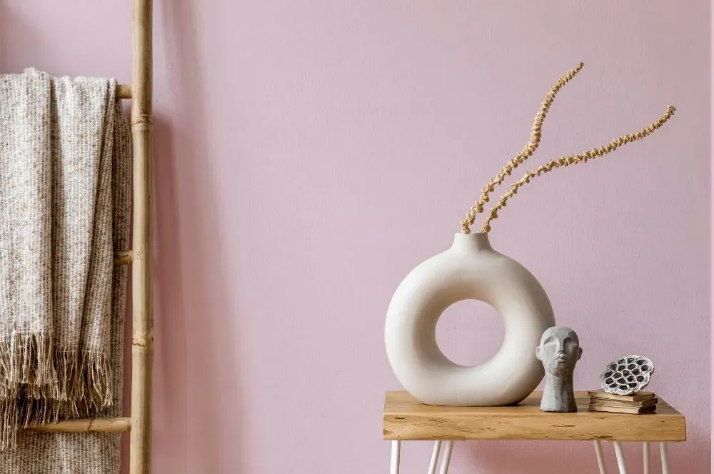
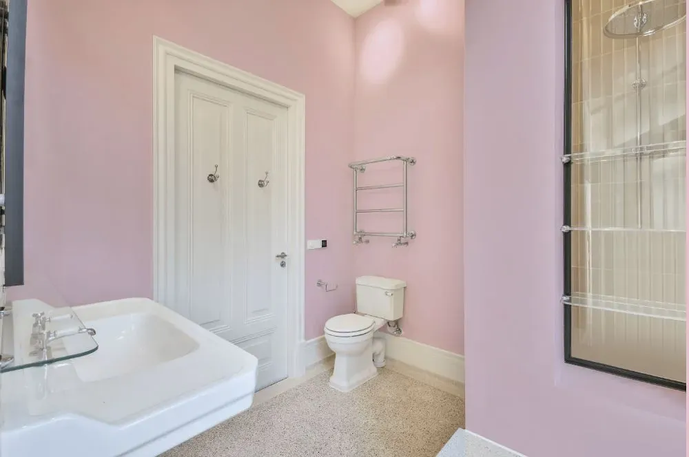
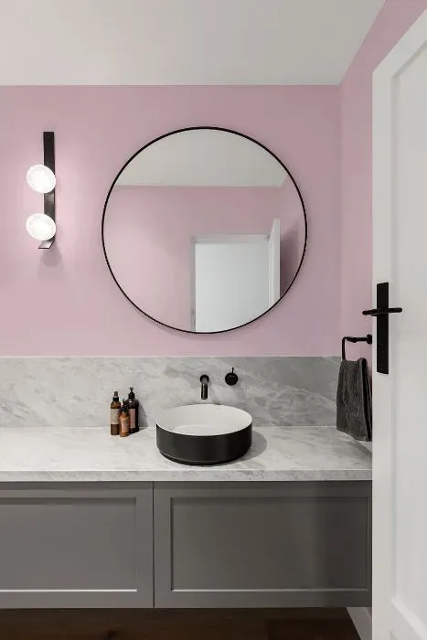
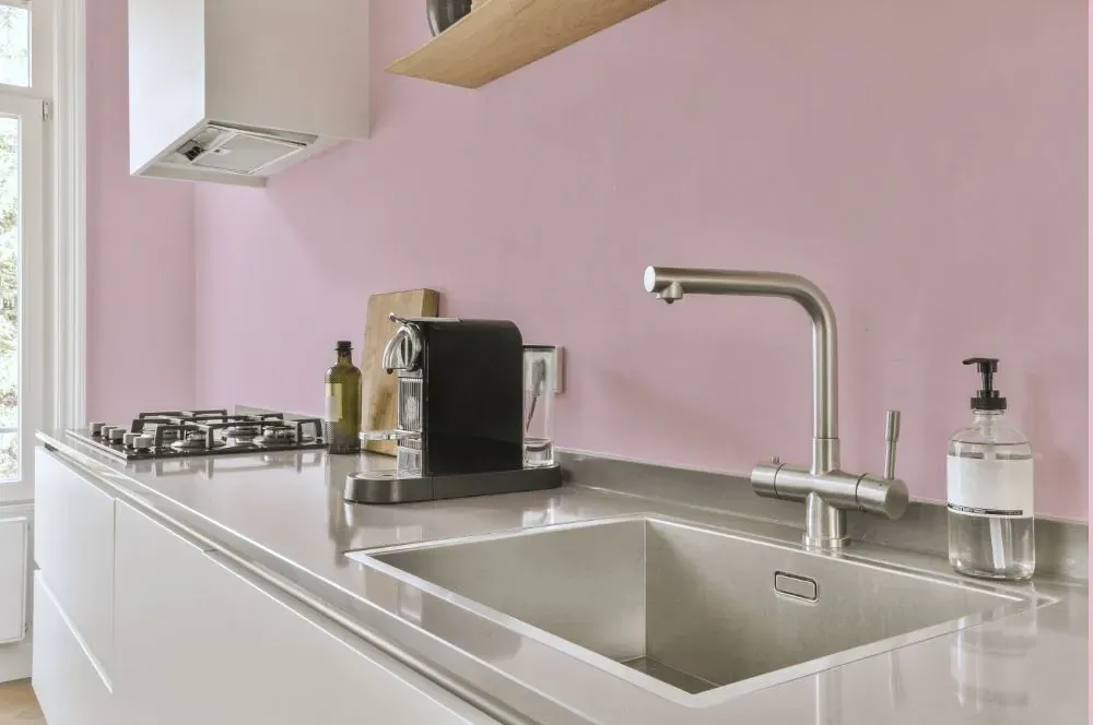
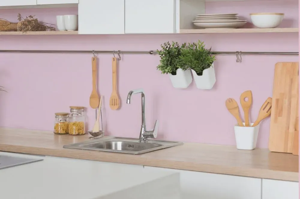
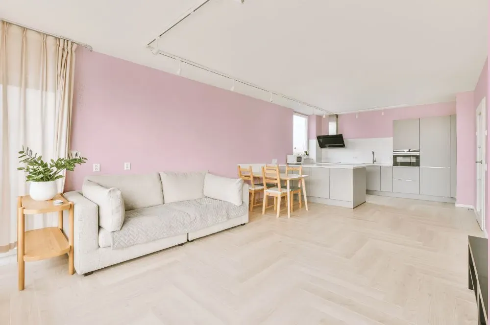
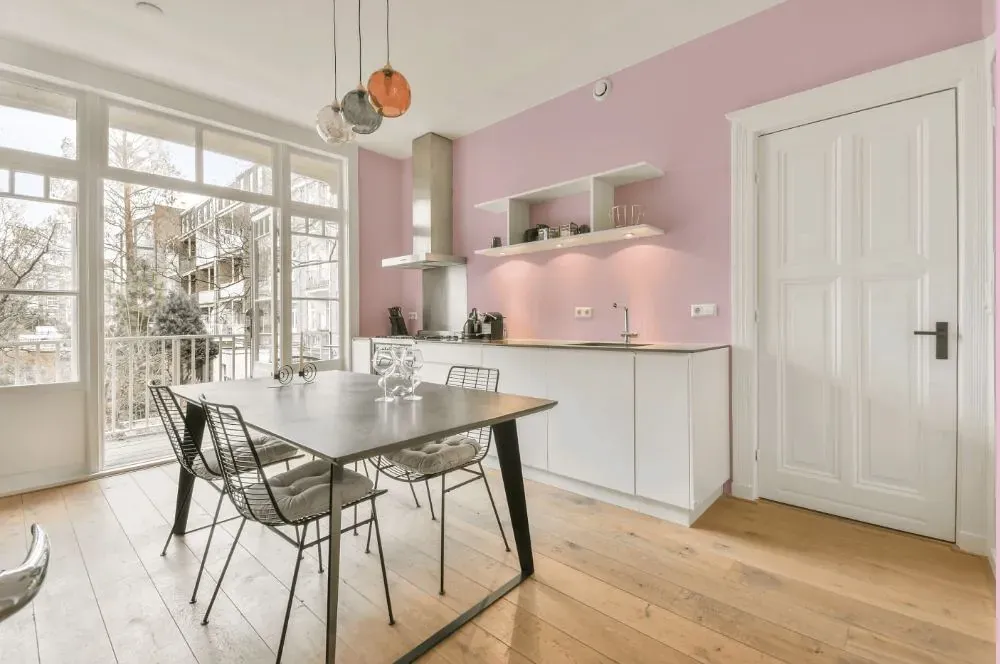
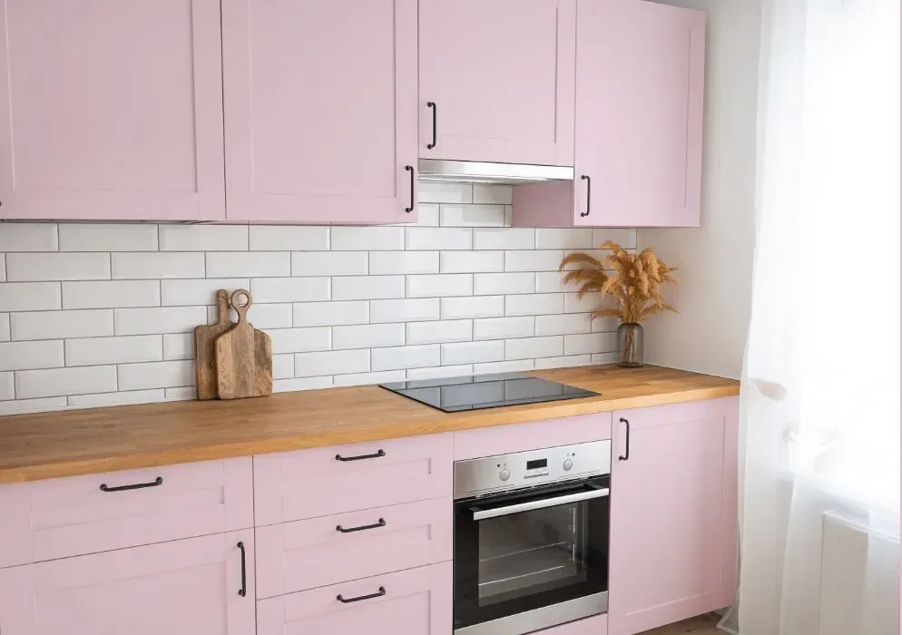
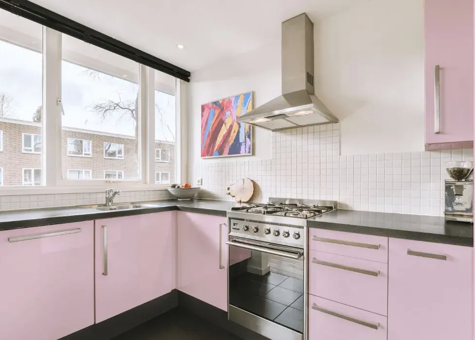
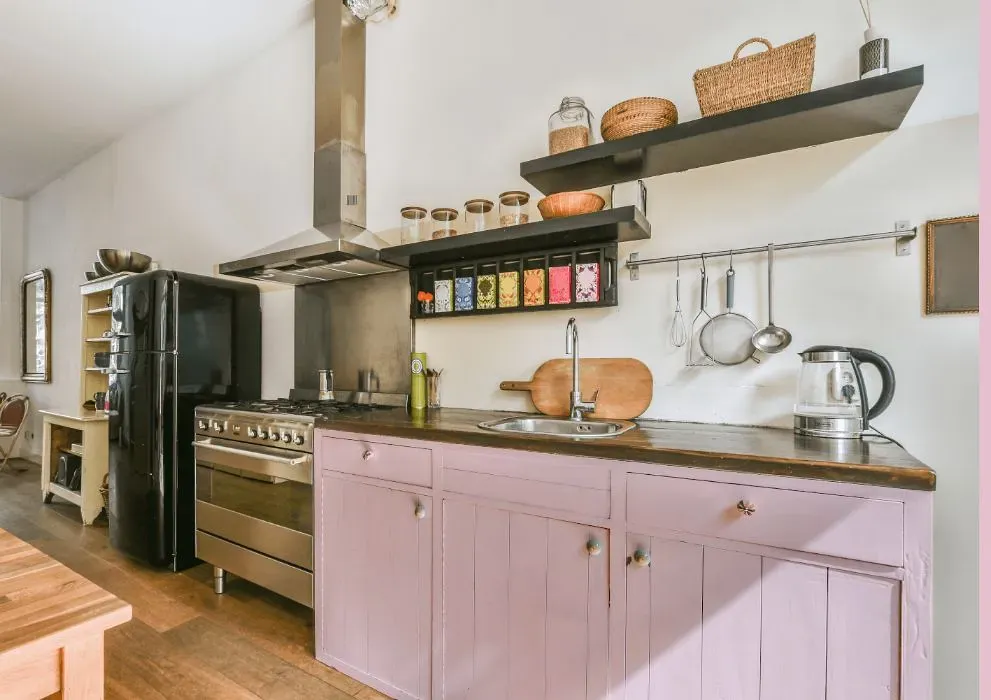
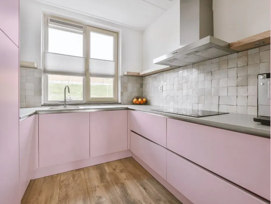
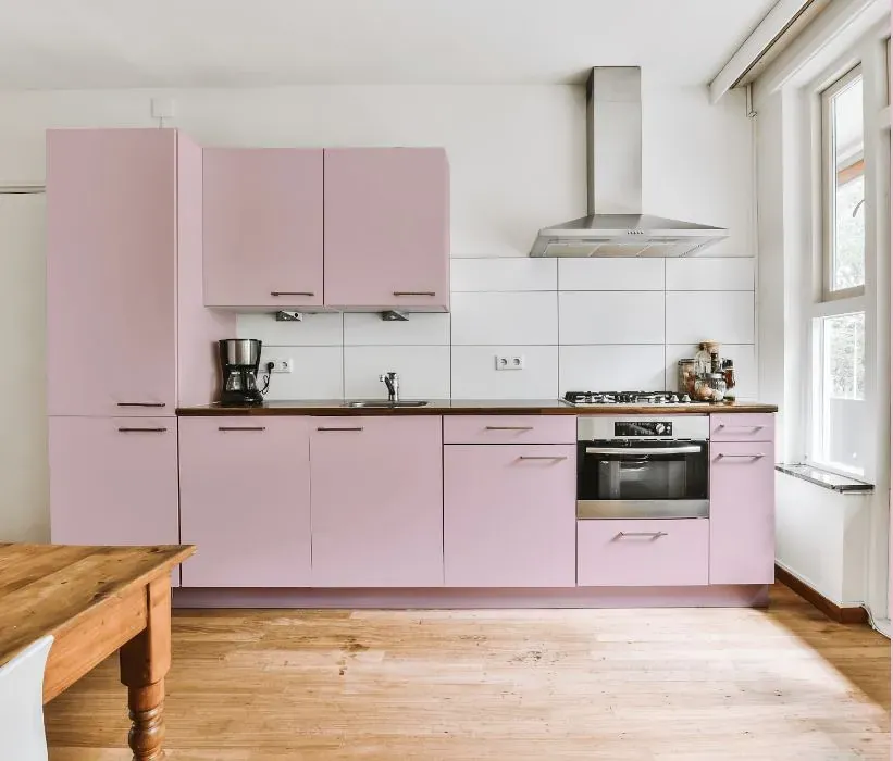
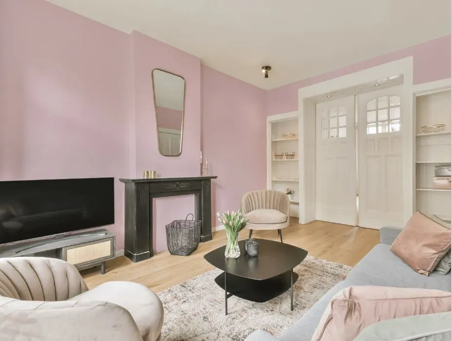
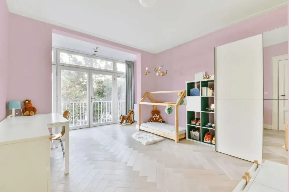
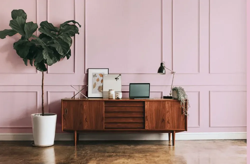
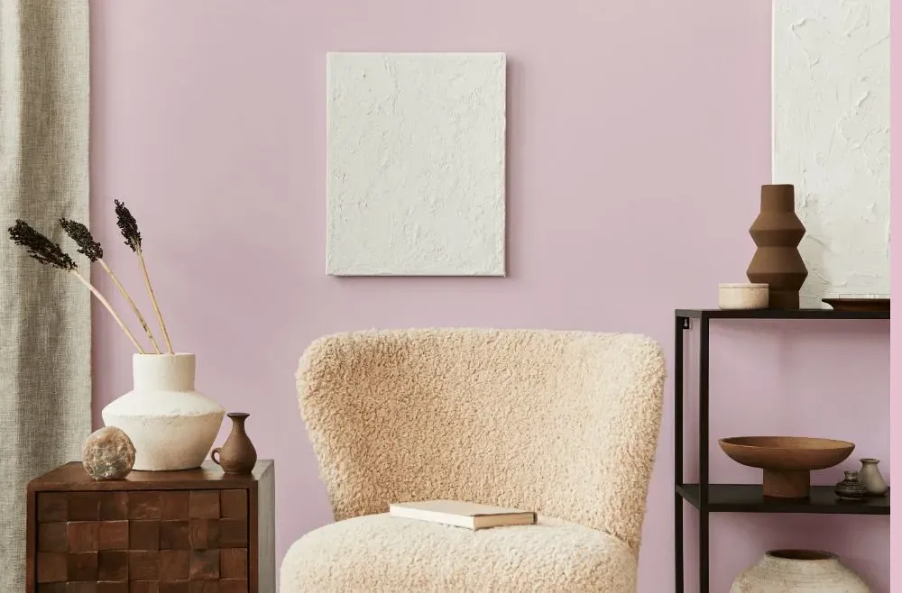
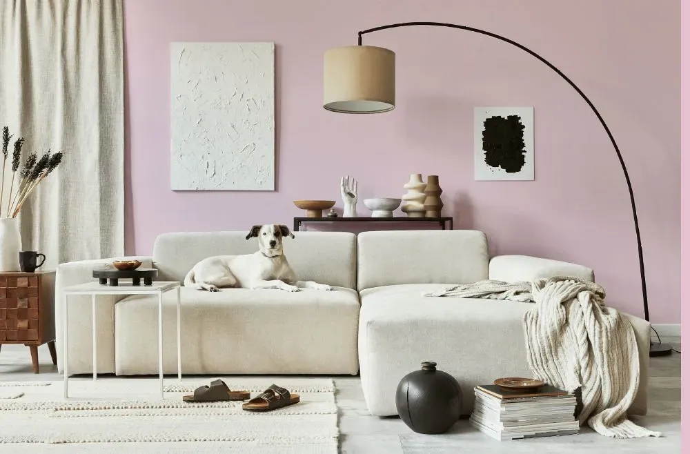
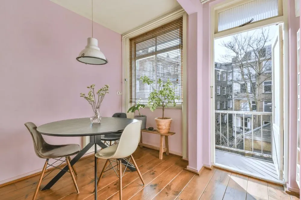
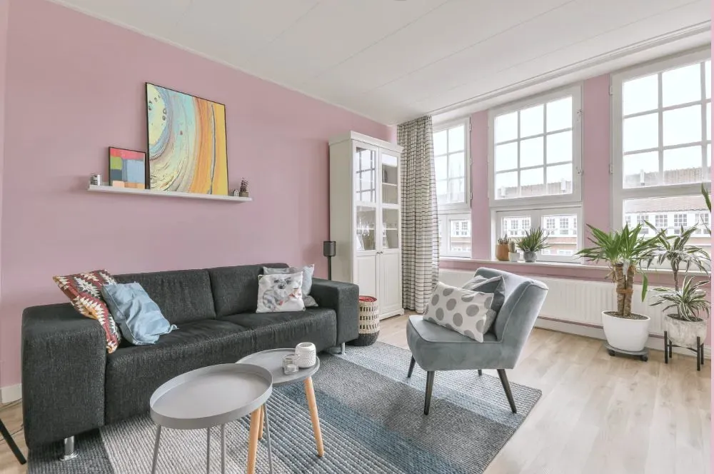
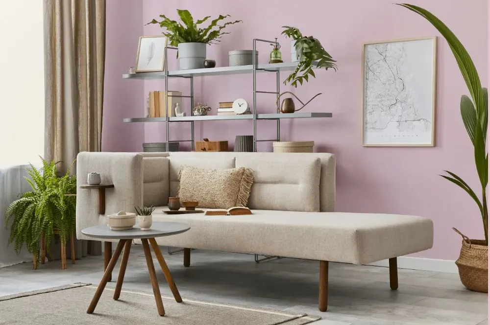
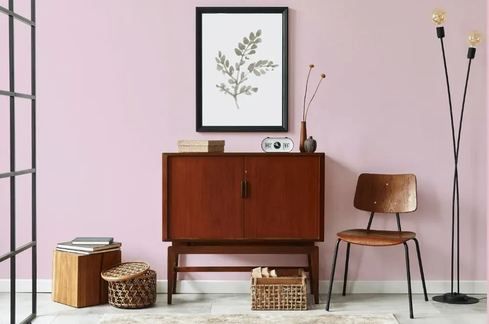
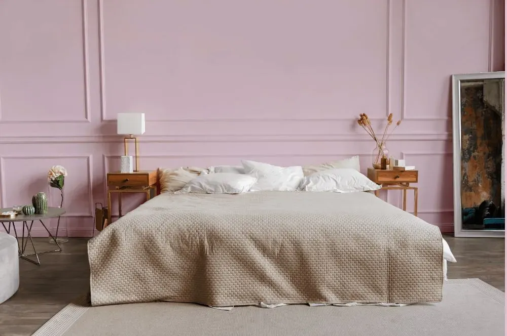
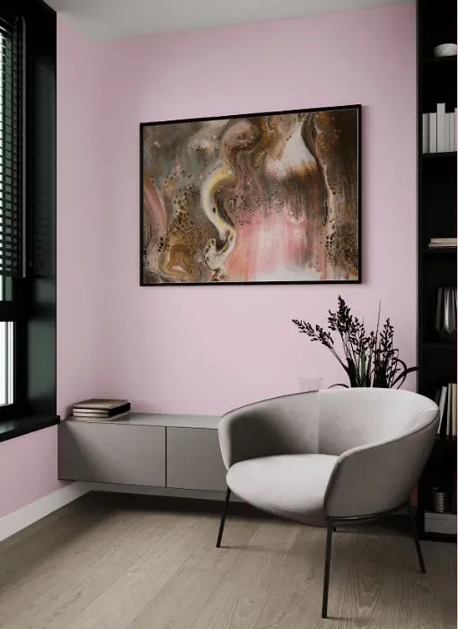
Benjamin Moore's 1367 Primrose Petals is a soft and sophisticated shade that adds a warm touch to any space. This tranquil color pairs beautifully with neutrals like 2143 Winterwood and 1430 Flowering Herb for a timeless look. For a bolder aesthetic, consider combining Primrose Petals with 2029-50 Bamboo Shoot or 2136-40 Crushed Velvet to create a statement pop of color. Whether used as an accent or a primary hue, Primrose Petals brings a sense of elegance and charm to any room.
Loading...
LRV of Primrose Petals
Primrose Petals has an LRV of 69.94% and refers to Light colors that reflect most of the incident light. Why LRV is important?

Light Reflectance Value measures the amount of visible and usable light that reflects from a painted surface.
Simply put, the higher the LRV of a paint color, the brighter the room you will get.
The scale goes from 0% (absolute black, absorbing all light) to 100% (pure white, reflecting all light).
Act like a pro: When choosing paint with an LRV of 69.94%, pay attention to your bulbs' brightness. Light brightness is measured in lumens. The lower the paint's LRV, the higher lumen level you need. Every square foot of room needs at least 40 lumens. That means for a 200 ft2 living room you'll need about 8000 lumens of light – e.g., eight 1000 lm bulbs.
Color codes
We have collected almost every possible color code you could ever need.
Not sure what the difference between HEX and RGB is? We break down color models in plain language. Understanding color models
| Format | Code |
|---|---|
| HEX | #EED5DF |
| RGB Decimal | 238, 213, 223 |
| RGB Percent | 93.33%, 83.53%, 87.45% |
| HSV | Hue: 336° Saturation: 10.5% Value: 93.33% |
| HSL | hsl(336, 42, 88) |
| CMYK | Cyan: 0.0 Magenta: 10.5 Yellow: 6.3 Key: 6.67 |
| YIQ | Y: 221.615 I: 11.684 Q: 8.4 |
| XYZ | X: 72.371 Y: 71.094 Z: 79.702 |
| CIE Lab | L:87.531 a:10.321 b:-1.745 |
| CIE Luv | L:87.531 u:13.941 v:-4.516 |
| Decimal | 15652319 |
| Hunter Lab | 84.318, 5.653, 2.978 |