Benjamin Moore Sweet Naivete 2083-60
Contentsshow +hide -
- Benjamin Moore Sweet Naivete reviews (23 photos)
- What are Benjamin Moore Sweet Naivete undertones?
- Is Sweet Naivete 2083-60 cool or warm?
- How light temperature affects on Sweet Naivete
- Monochromatic color scheme
- Complementary color scheme
- Color comparison and matching
- LRV of Sweet Naivete 2083-60
- Color codes
- Color equivalents
| Official page: | Sweet Naivete 2083-60 |
| Code: | 2083-60 |
| Name: | Sweet Naivete |
| Brand: | Benjamin Moore |
What color is Benjamin Moore Sweet Naivete?
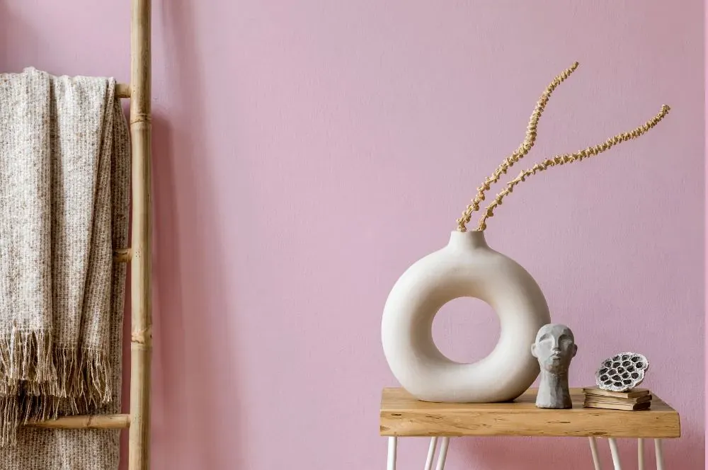
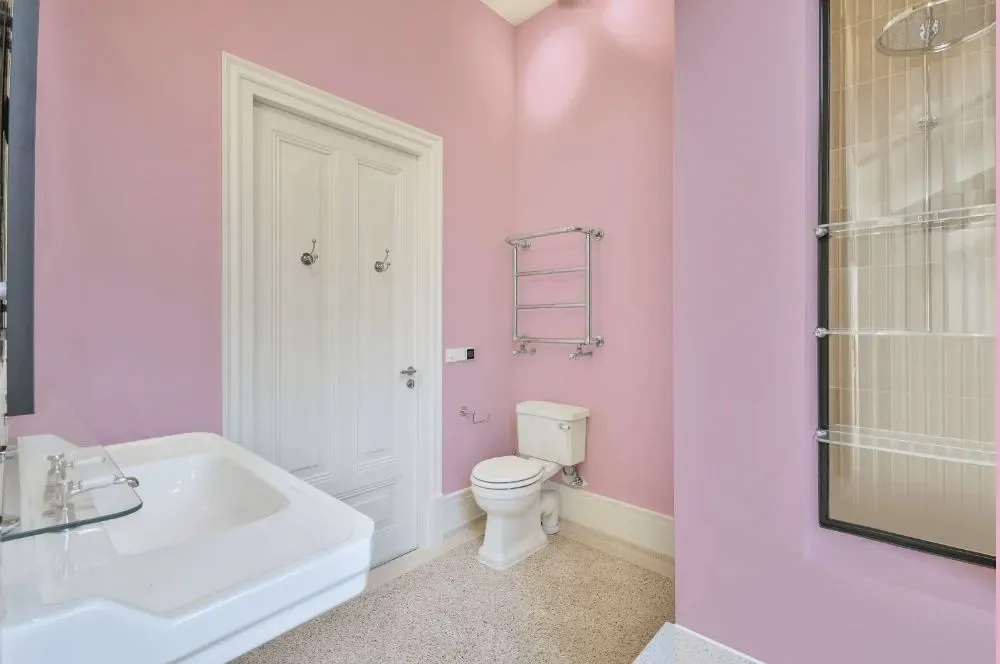
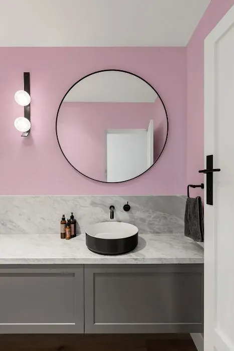
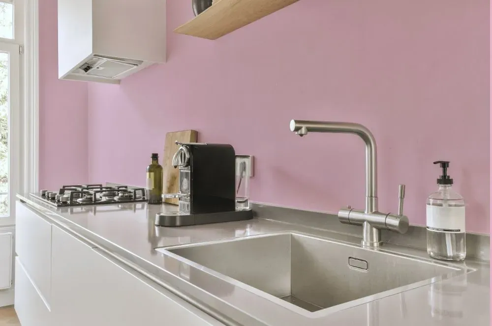
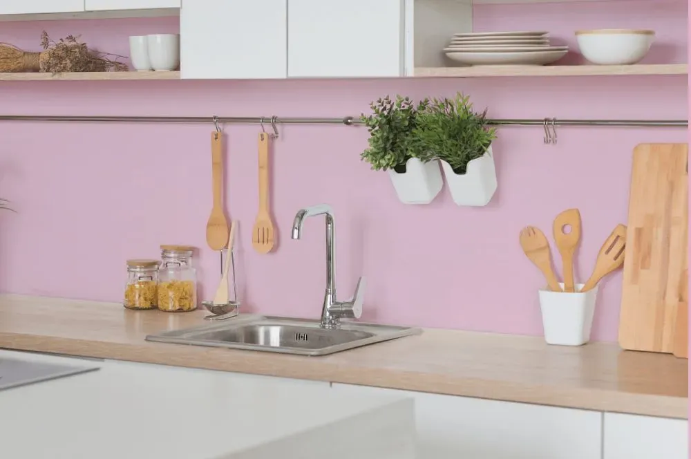
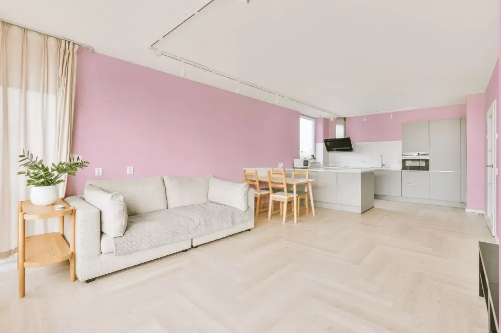
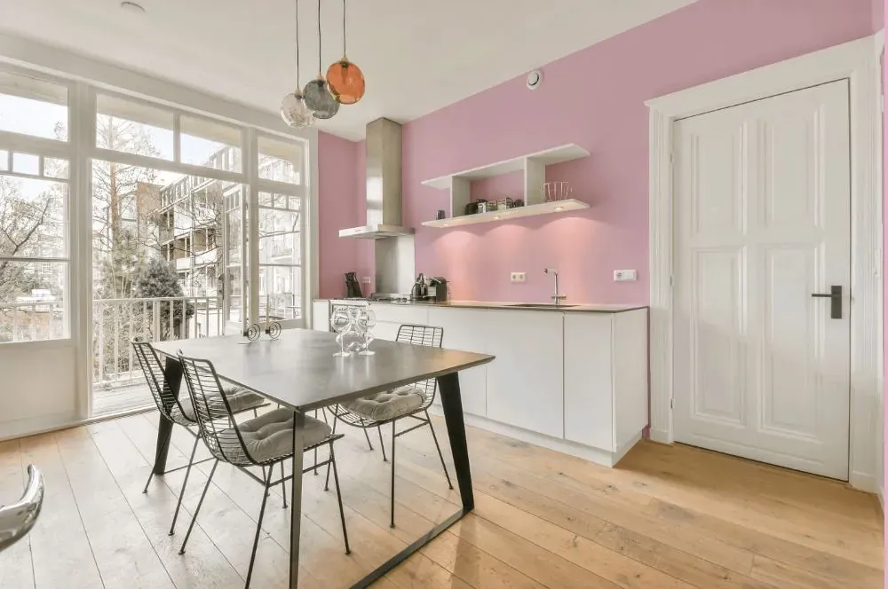
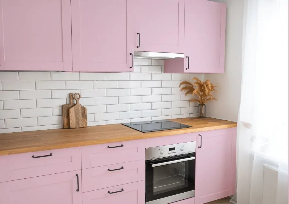
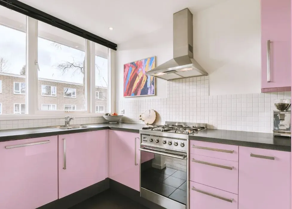
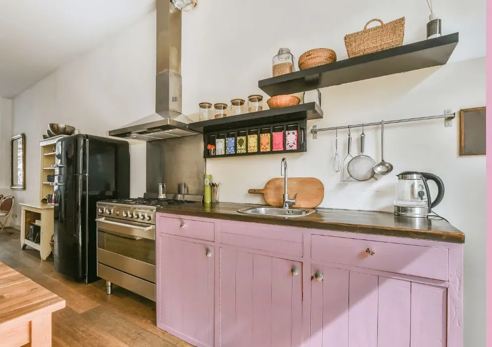
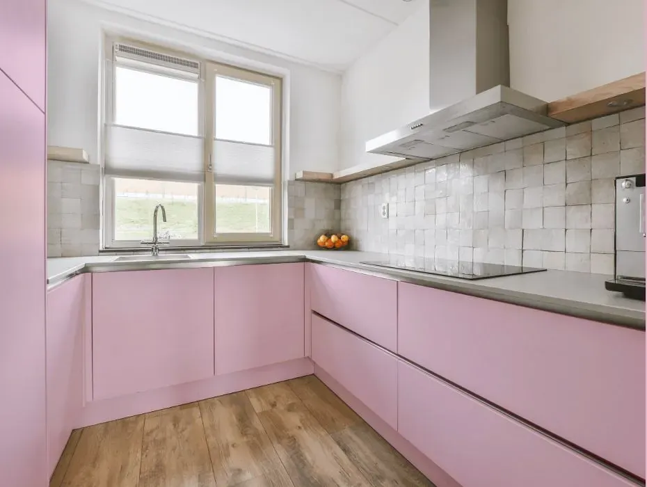
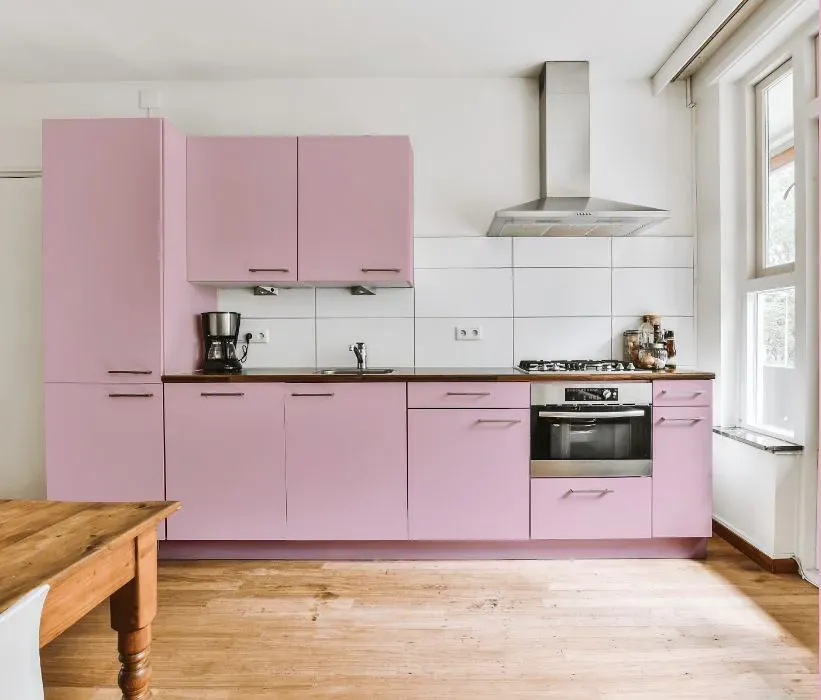
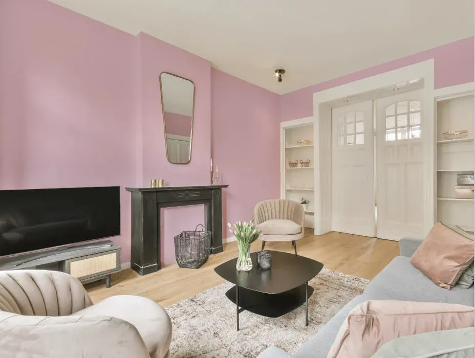
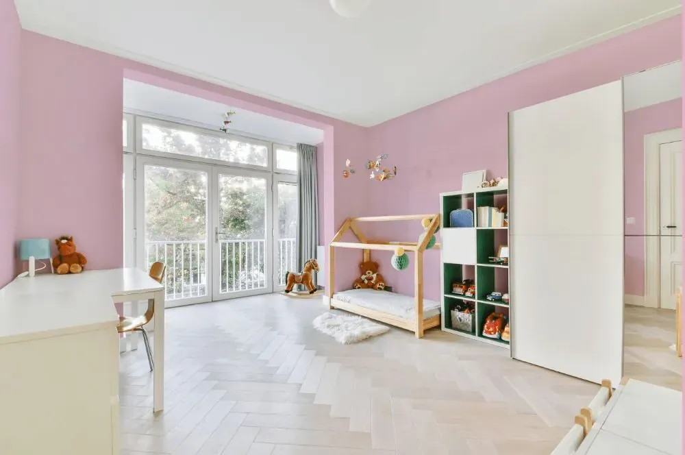
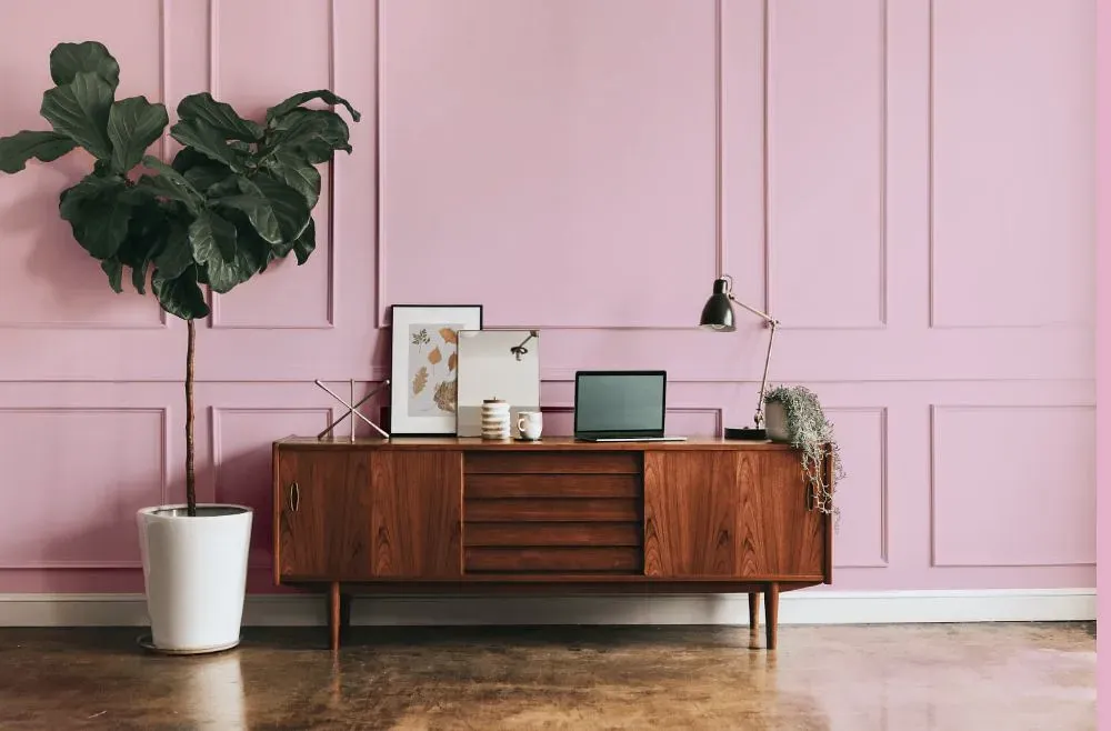
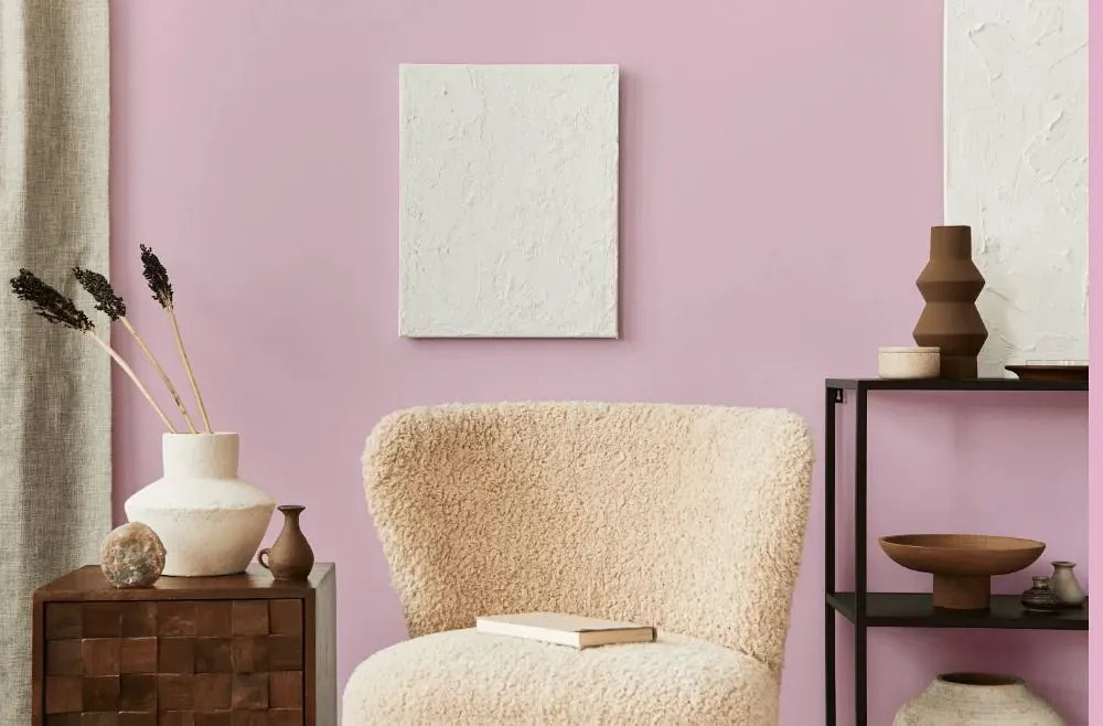
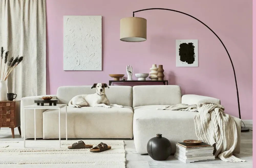
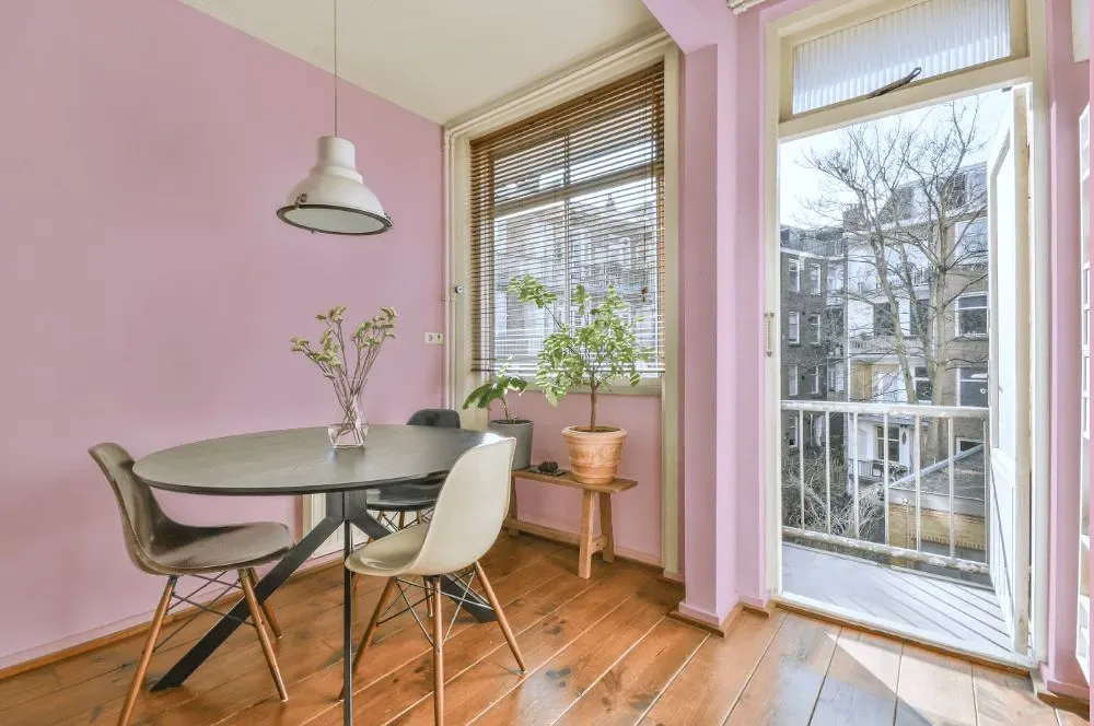
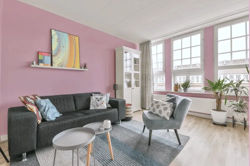
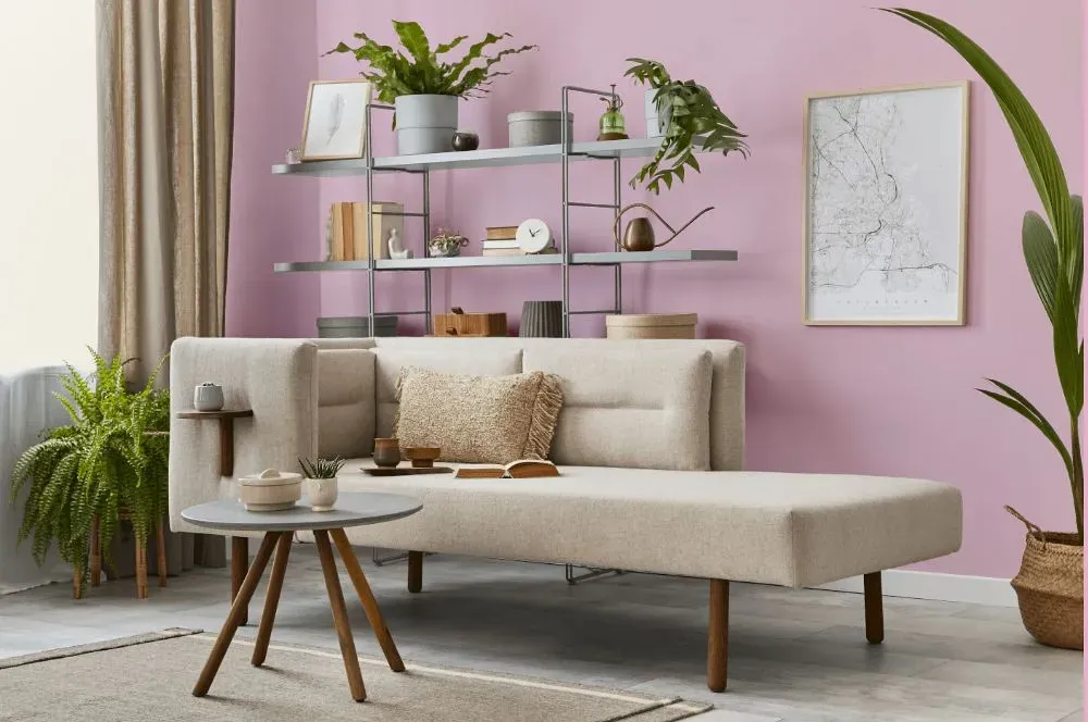
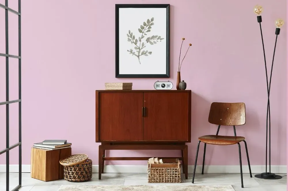
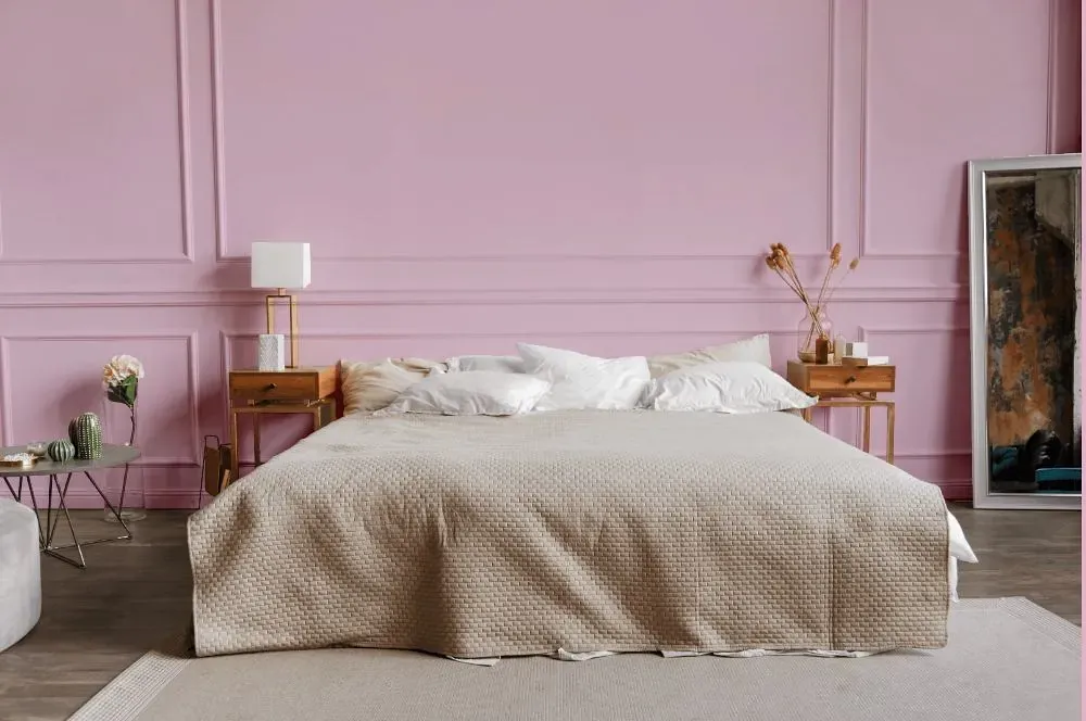
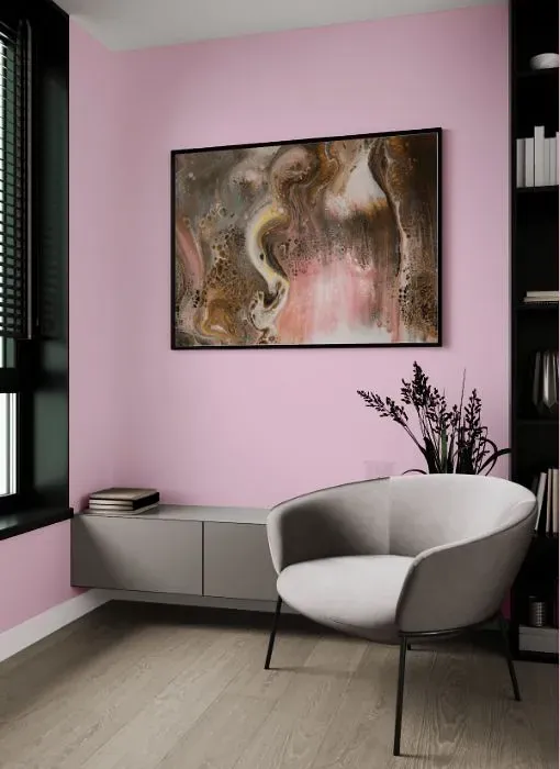
Benjamin Moore 2083-60, Sweet Naivete, embodies a delightful blend of softness and sophistication. This gentle hue creates a calming atmosphere, perfect for a nursery or a cozy reading nook. Sweet Naivete pairs beautifully with subtle shades of grey and cream to enhance its subtle charm. Accents in dusty pink or light blue can bring a touch of whimsy to a space painted in this serene color.
Loading...
LRV of Sweet Naivete
Sweet Naivete has an LRV of 64.82% and refers to Light colors that reflect most of the incident light. Why LRV is important?

Light Reflectance Value measures the amount of visible and usable light that reflects from a painted surface.
Simply put, the higher the LRV of a paint color, the brighter the room you will get.
The scale goes from 0% (absolute black, absorbing all light) to 100% (pure white, reflecting all light).
Act like a pro: When choosing paint with an LRV of 64.82%, pay attention to your bulbs' brightness. Light brightness is measured in lumens. The lower the paint's LRV, the higher lumen level you need. Every square foot of room needs at least 40 lumens. That means for a 200 ft2 living room you'll need about 8000 lumens of light – e.g., eight 1000 lm bulbs.
Color codes
We have collected almost every possible color code you could ever need.
Not sure what the difference between HEX and RGB is? We break down color models in plain language. Understanding color models
| Format | Code |
|---|---|
| HEX | #ECCBDA |
| RGB Decimal | 236, 203, 218 |
| RGB Percent | 92.55%, 79.61%, 85.49% |
| HSV | Hue: 333° Saturation: 13.98% Value: 92.55% |
| HSL | hsl(333, 46, 86) |
| CMYK | Cyan: 0.0 Magenta: 13.98 Yellow: 7.63 Key: 7.45 |
| YIQ | Y: 214.577 I: 14.845 Q: 11.649 |
| XYZ | X: 68.601 Y: 65.608 Z: 75.361 |
| CIE Lab | L:84.796 a:14.039 b:-3.126 |
| CIE Luv | L:84.796 u:18.451 v:-7.273 |
| Decimal | 15518682 |
| Hunter Lab | 80.999, 9.43, 1.536 |