Benjamin Moore Razzle Dazzle 1348
Contentsshow +hide -
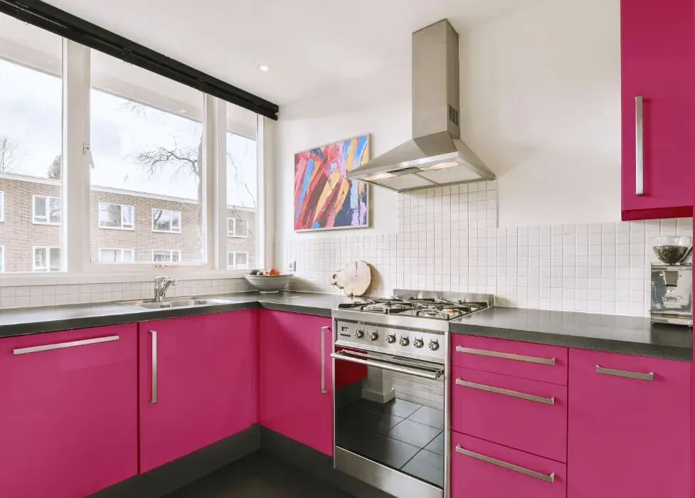
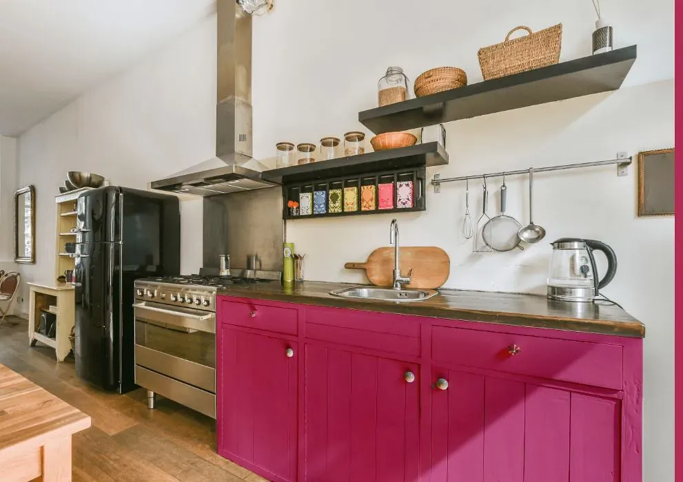
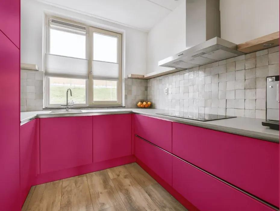
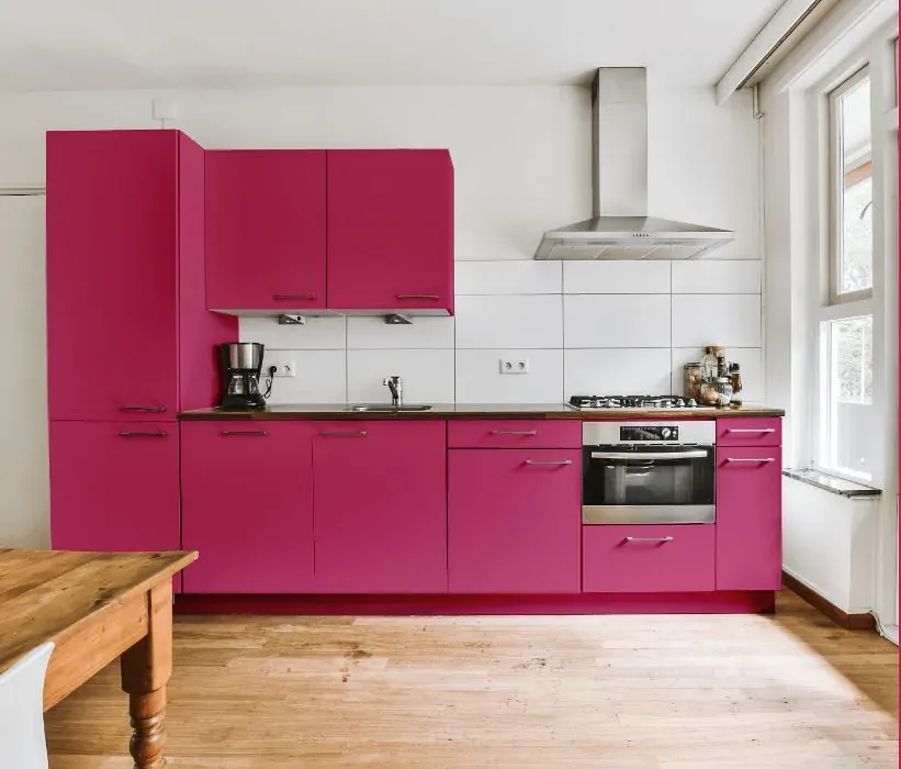
- Benjamin Moore Razzle Dazzle reviews (23 photos)
- What are Benjamin Moore Razzle Dazzle undertones?
- Is Razzle Dazzle 1348 cool or warm?
- How light temperature affects on Razzle Dazzle
- Monochromatic color scheme
- Complementary color scheme
- Color comparison and matching
- LRV of Razzle Dazzle 1348
- Color codes
- Color equivalents
| Official page: | Razzle Dazzle 1348 |
| Code: | 1348 |
| Name: | Razzle Dazzle |
| Brand: | Benjamin Moore |
What color is Benjamin Moore Razzle Dazzle?
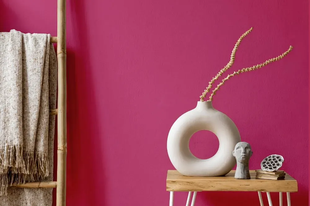
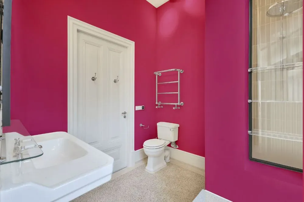
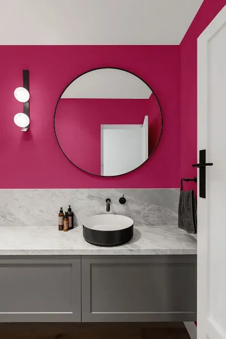
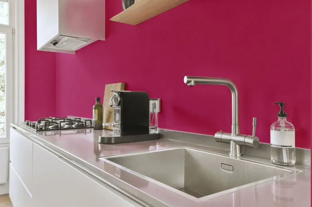
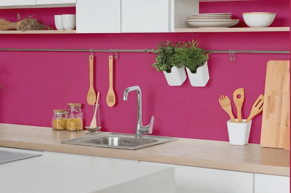
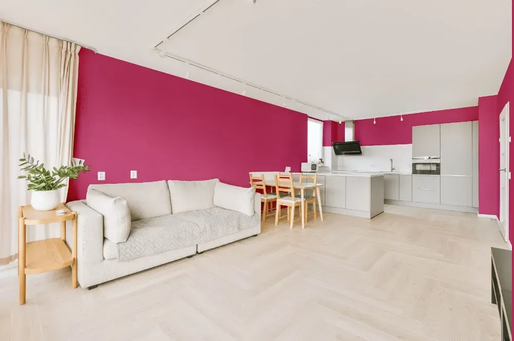
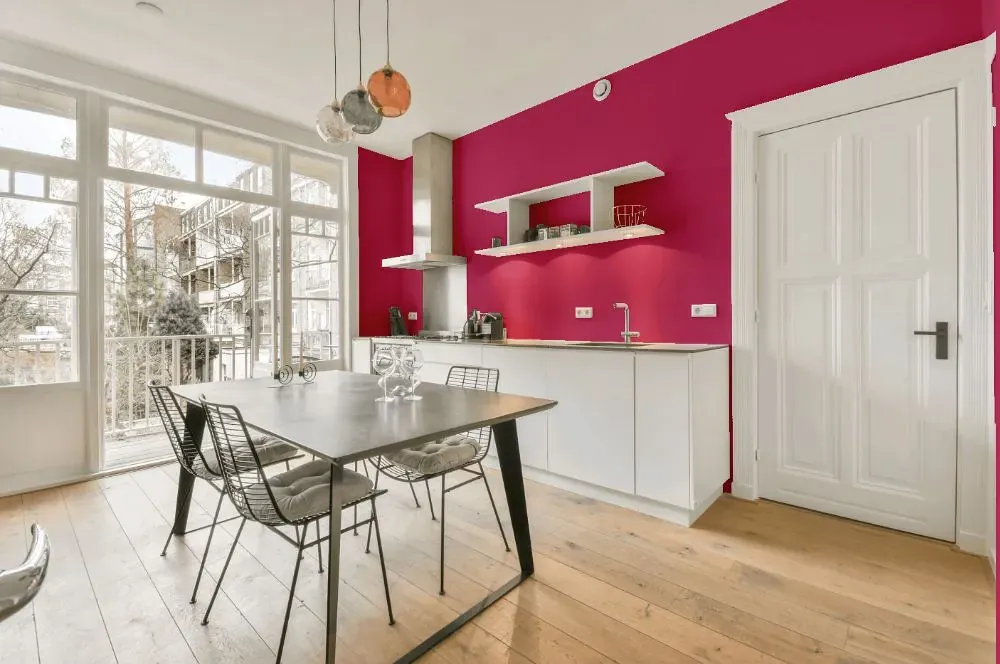
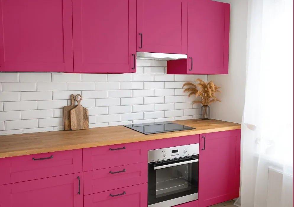
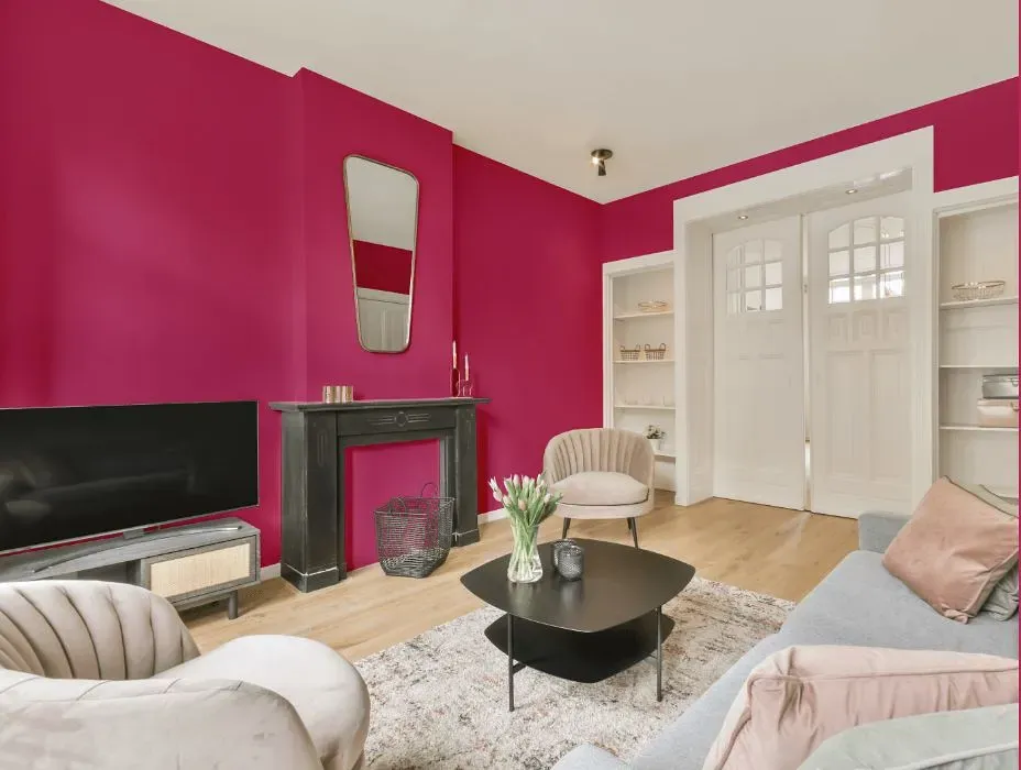
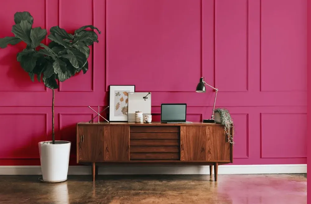
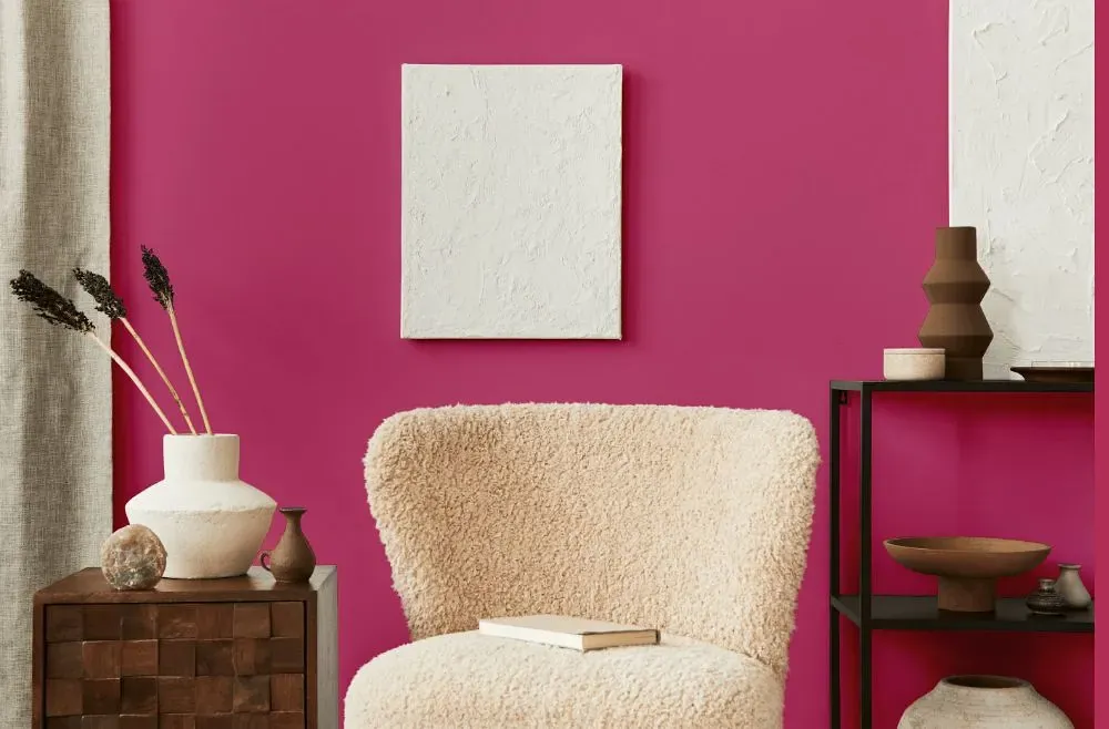
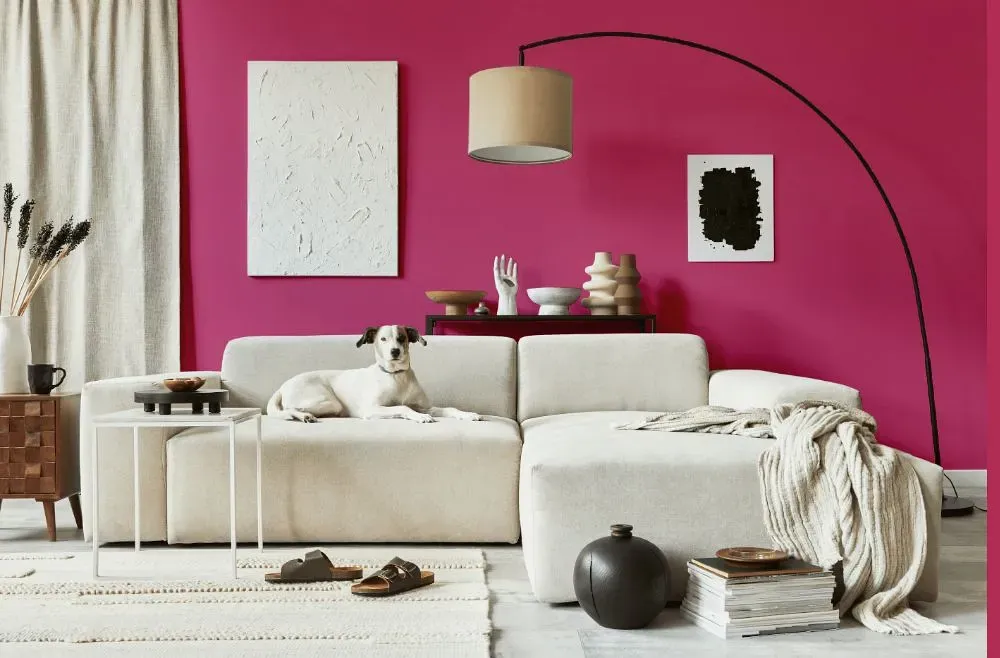
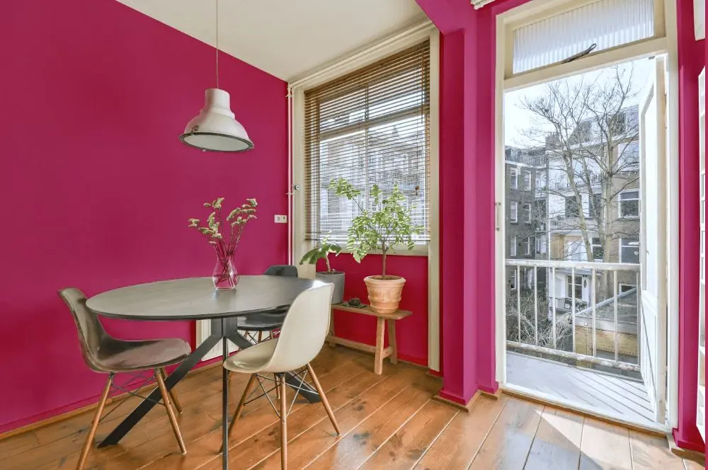
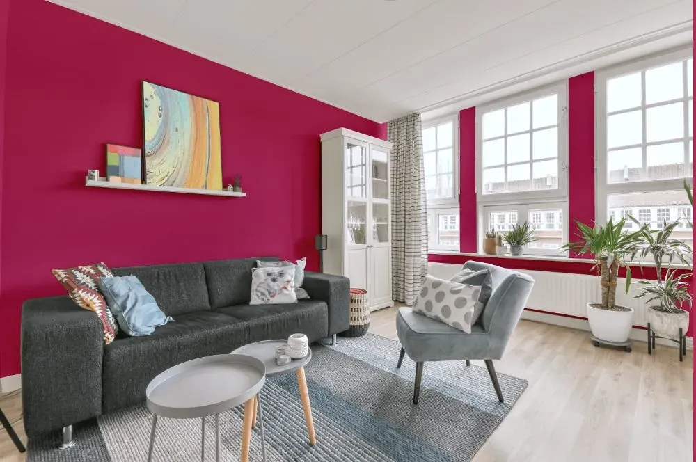
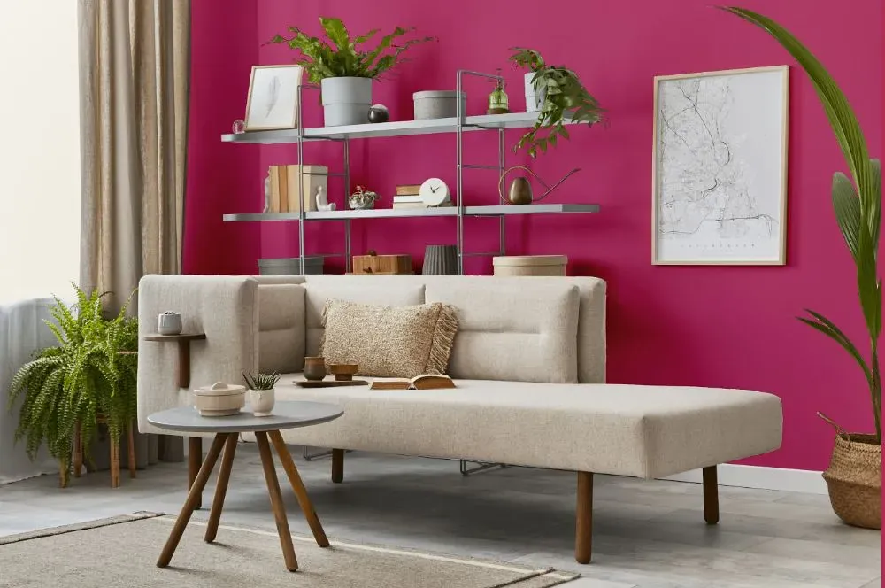
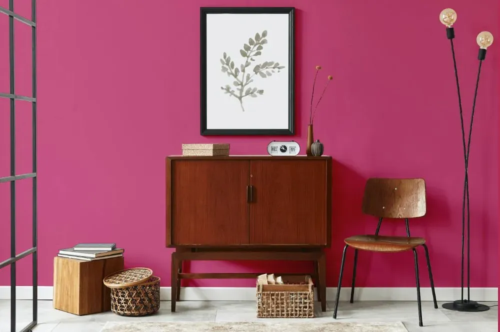
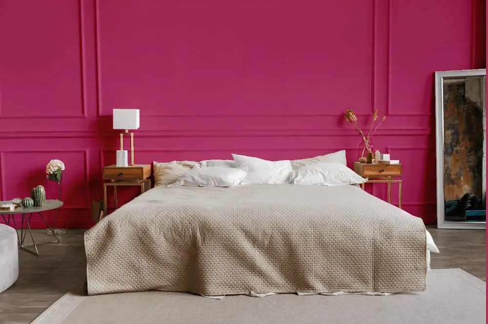
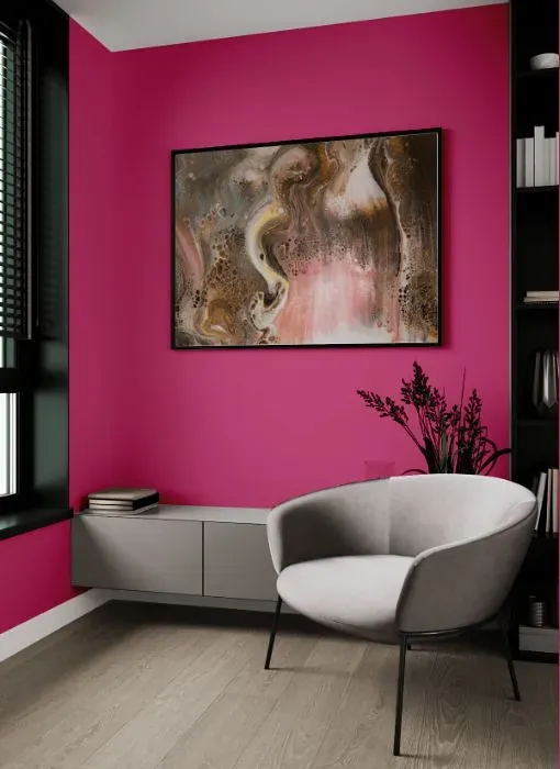
Step into a world of vibrance and playfulness with Benjamin Moore 1348, better known as Razzle Dazzle. This bold and lively hue is perfect for injecting energy and personality into spaces like a home office, creative studio, or children's playroom. Let Razzle Dazzle ignite your imagination and inspire creativity in every corner it graces. Pair it with neutral tones for a striking contrast or with complementary colors for a fun and eclectic look. Embrace the spirit of Razzle Dazzle and let your space come alive with color.
Loading...
LRV of Razzle Dazzle
Razzle Dazzle has an LRV of 20.68% and refers to Medium colors that reflect a lot of light. Why LRV is important?

Light Reflectance Value measures the amount of visible and usable light that reflects from a painted surface.
Simply put, the higher the LRV of a paint color, the brighter the room you will get.
The scale goes from 0% (absolute black, absorbing all light) to 100% (pure white, reflecting all light).
Act like a pro: When choosing paint with an LRV of 20.68%, pay attention to your bulbs' brightness. Light brightness is measured in lumens. The lower the paint's LRV, the higher lumen level you need. Every square foot of room needs at least 40 lumens. That means for a 200 ft2 living room you'll need about 8000 lumens of light – e.g., eight 1000 lm bulbs.
Color codes
We have collected almost every possible color code you could ever need.
Not sure what the difference between HEX and RGB is? We break down color models in plain language. Understanding color models
| Format | Code |
|---|---|
| HEX | #C9527F |
| RGB Decimal | 201, 82, 127 |
| RGB Percent | 78.82%, 32.16%, 49.80% |
| HSV | Hue: 337° Saturation: 59.2% Value: 78.82% |
| HSL | hsl(337, 52, 55) |
| CMYK | Cyan: 0.0 Magenta: 59.2 Yellow: 36.82 Key: 21.18 |
| YIQ | Y: 122.711 I: 56.452 Q: 39.177 |
| XYZ | X: 30.937 Y: 19.988 Z: 22.302 |
| CIE Lab | L:51.823 a:51.598 b:-0.957 |
| CIE Luv | L:51.823 u:76.365 v:-10.755 |
| Decimal | 13193855 |
| Hunter Lab | 44.707, 45.281, 1.719 |