Benjamin Moore Peony 2079-30
Contentsshow +hide -
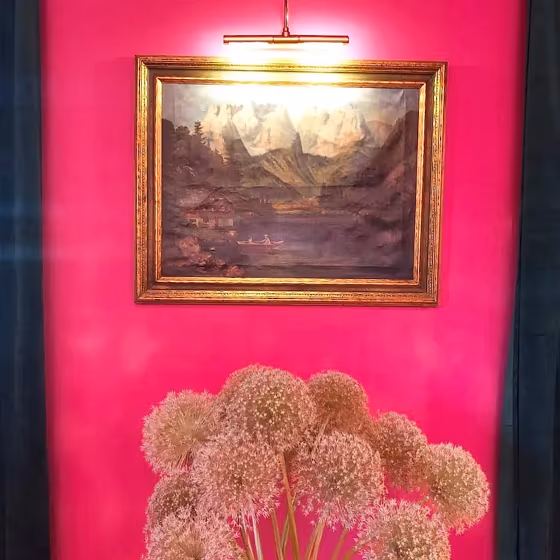
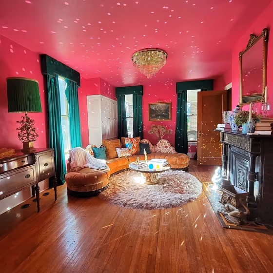
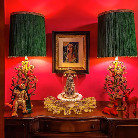
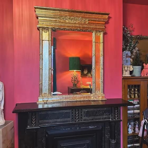
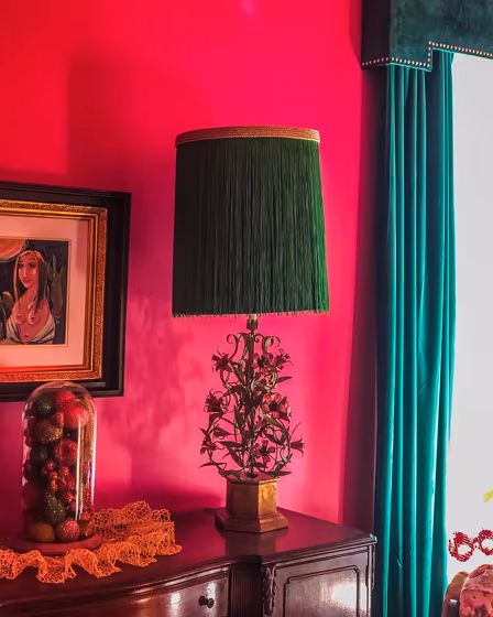
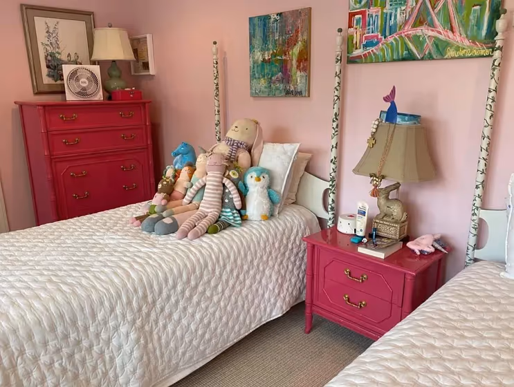
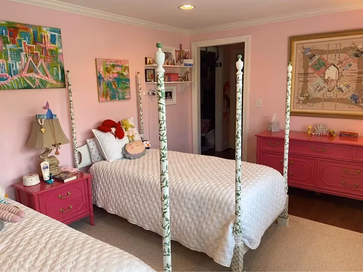
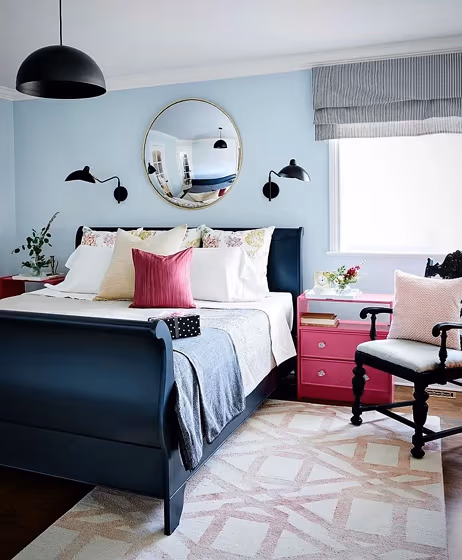
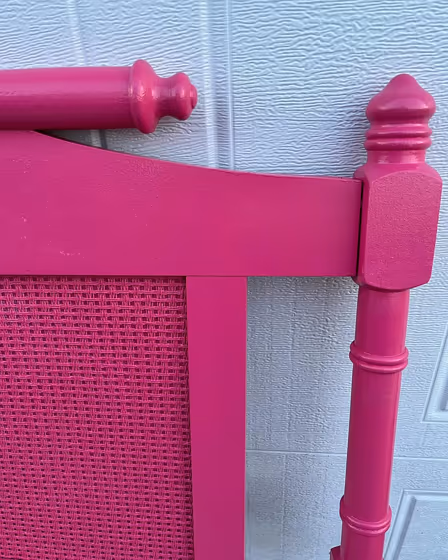
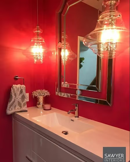
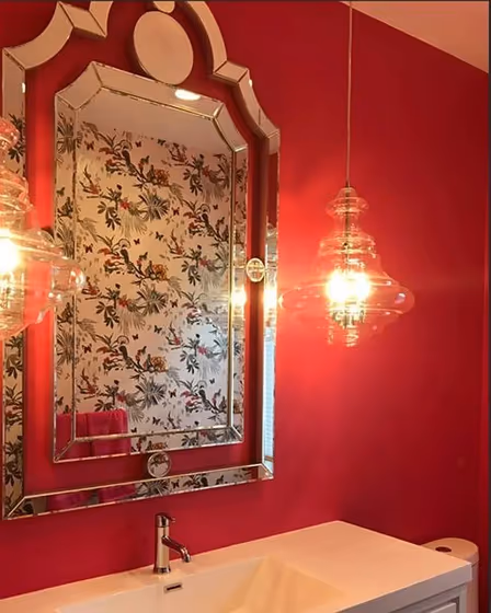
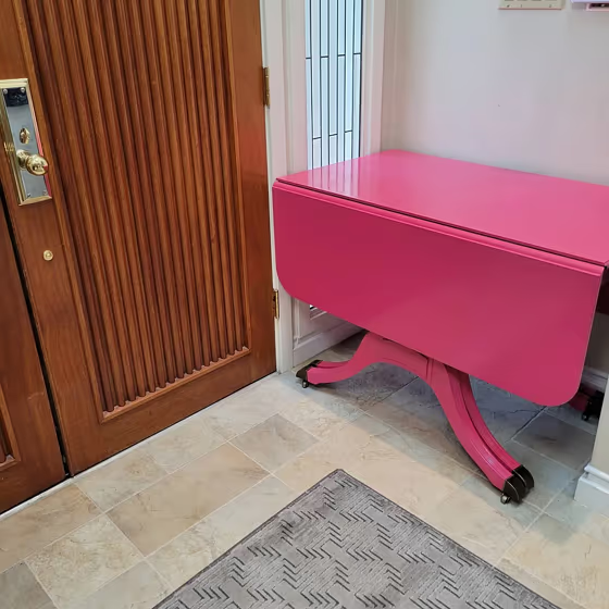
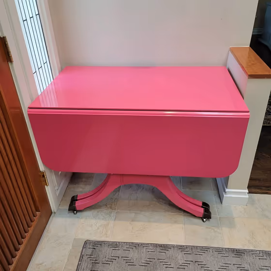
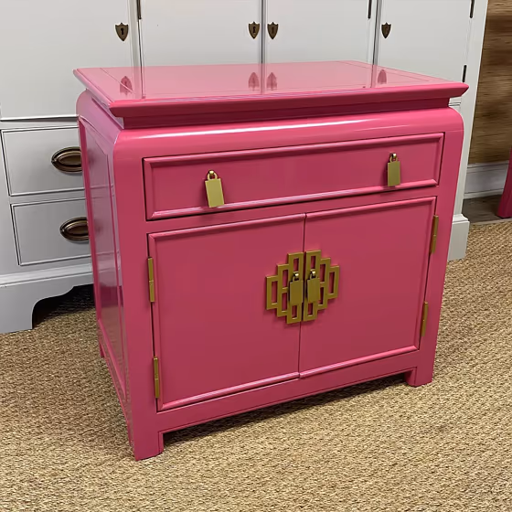
- Peony for living room (5 photos)
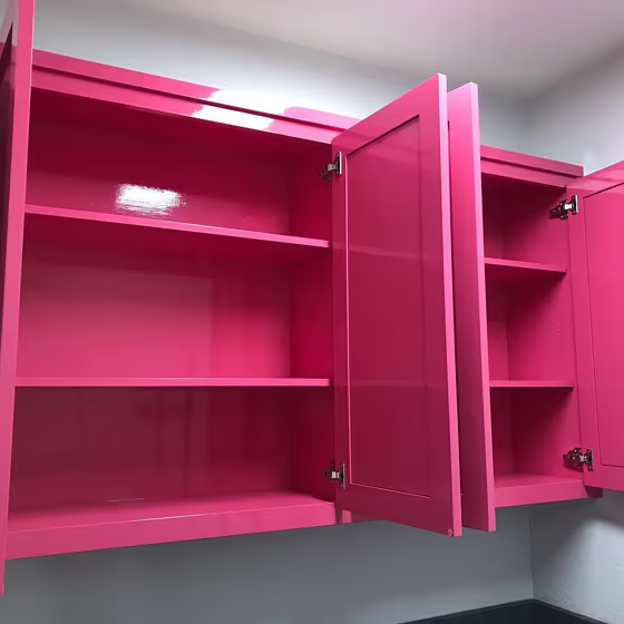
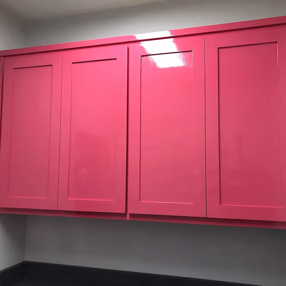
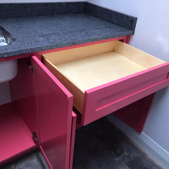
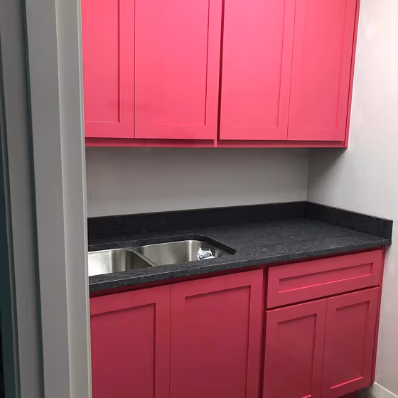
- Benjamin Moore 2079-30 on kitchen cabinets (4 photos)
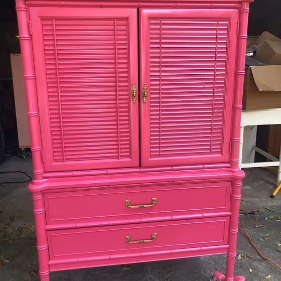
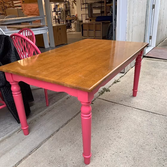
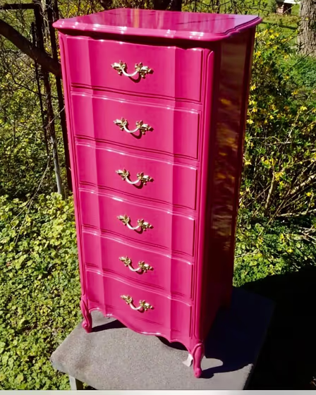
- Benjamin Moore Peony reviews (13 photos)
- What are Benjamin Moore Peony undertones?
- Is Peony 2079-30 cool or warm?
- How light temperature affects on Peony
- Monochromatic color scheme
- Complementary color scheme
- Color comparison and matching
- LRV of Peony 2079-30
- Color codes
- Color equivalents
| Official page: | Peony 2079-30 |
| Code: | 2079-30 |
| Name: | Peony |
| Brand: | Benjamin Moore |
What color is Benjamin Moore Peony?
Elevate your space with the charming hues of Benjamin Moore Peony (2079-30). This soft and elegant pink exudes a romantic and sophisticated vibe. Pair Peony with crisp whites for a fresh and modern look, or combine it with greys for a chic and timeless appeal. For a bolder statement, complement Peony with navy blues or deep greens to create a striking contrast. Infuse your interiors with this versatile shade and watch it transform your room into a stylish sanctuary.
Loading...
LRV of Peony
Peony has an LRV of 18.55% and refers to Medium Dark which means that this color reflects very little light. Why LRV is important?

Light Reflectance Value measures the amount of visible and usable light that reflects from a painted surface.
Simply put, the higher the LRV of a paint color, the brighter the room you will get.
The scale goes from 0% (absolute black, absorbing all light) to 100% (pure white, reflecting all light).
Act like a pro: When choosing paint with an LRV of 18.55%, pay attention to your bulbs' brightness. Light brightness is measured in lumens. The lower the paint's LRV, the higher lumen level you need. Every square foot of room needs at least 40 lumens. That means for a 200 ft2 living room you'll need about 8000 lumens of light – e.g., eight 1000 lm bulbs.
Color codes
We have collected almost every possible color code you could ever need.
Not sure what the difference between HEX and RGB is? We break down color models in plain language. Understanding color models
| Format | Code |
|---|---|
| HEX | #C84470 |
| RGB Decimal | 200, 68, 112 |
| RGB Percent | 78.43%, 26.67%, 43.92% |
| HSV | Hue: 340° Saturation: 66.0% Value: 78.43% |
| HSL | hsl(340, 55, 53) |
| CMYK | Cyan: 0.0 Magenta: 66.0 Yellow: 44.0 Key: 21.57 |
| YIQ | Y: 112.484 I: 64.52 Q: 41.616 |
| XYZ | X: 28.813 Y: 17.587 Z: 17.202 |
| CIE Lab | L:48.991 a:55.747 b:3.934 |
| CIE Luv | L:48.991 u:87.239 v:-5.421 |
| Decimal | 13124720 |
| Hunter Lab | 41.937, 49.251, 5.035 |