Benjamin Moore Santa Fe Pottery 1287
Contentsshow +hide -
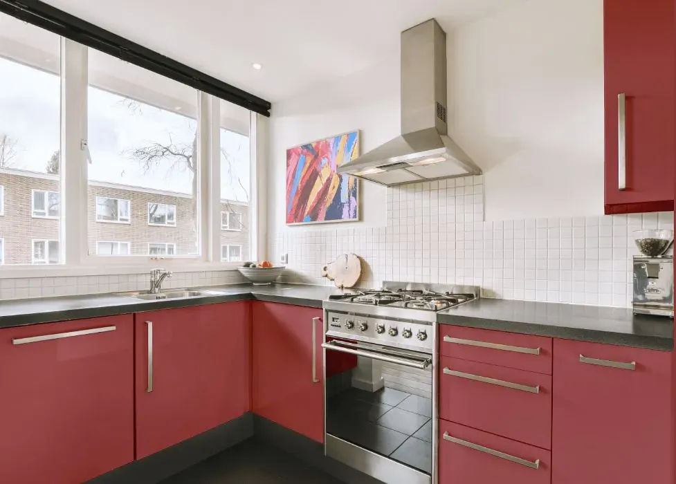
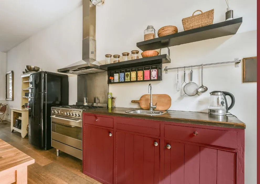
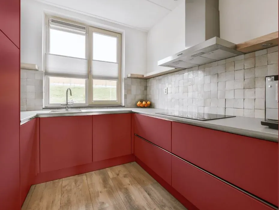
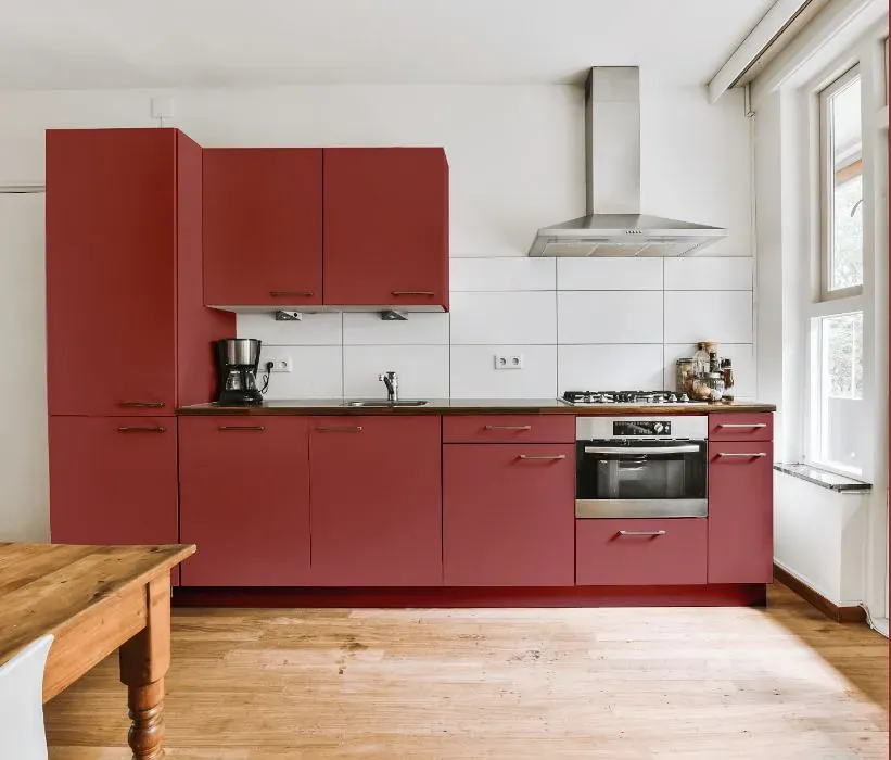
- Benjamin Moore Santa Fe Pottery reviews (23 photos)
- What are Benjamin Moore Santa Fe Pottery undertones?
- Is Santa Fe Pottery 1287 cool or warm?
- How light temperature affects on Santa Fe Pottery
- Monochromatic color scheme
- Complementary color scheme
- Color comparison and matching
- LRV of Santa Fe Pottery 1287
- Color codes
- Color equivalents
| Official page: | Santa Fe Pottery 1287 |
| Code: | 1287 |
| Name: | Santa Fe Pottery |
| Brand: | Benjamin Moore |
What color is Benjamin Moore Santa Fe Pottery?
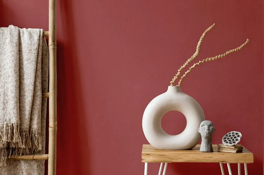
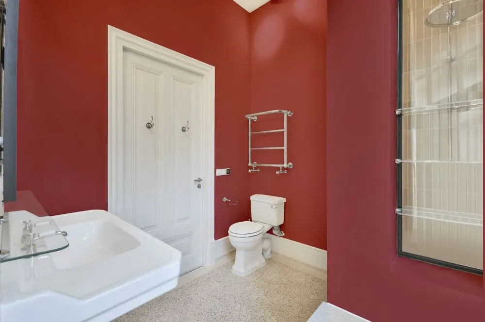
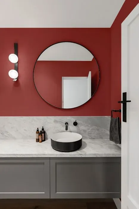
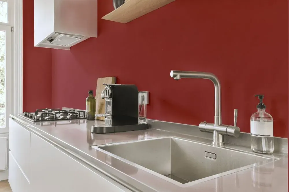
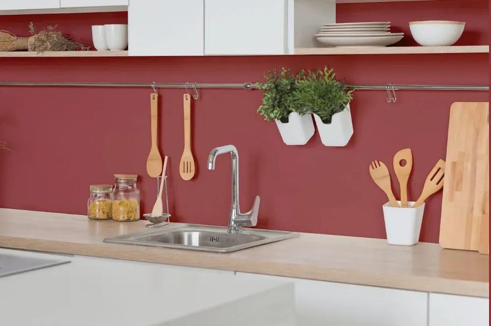
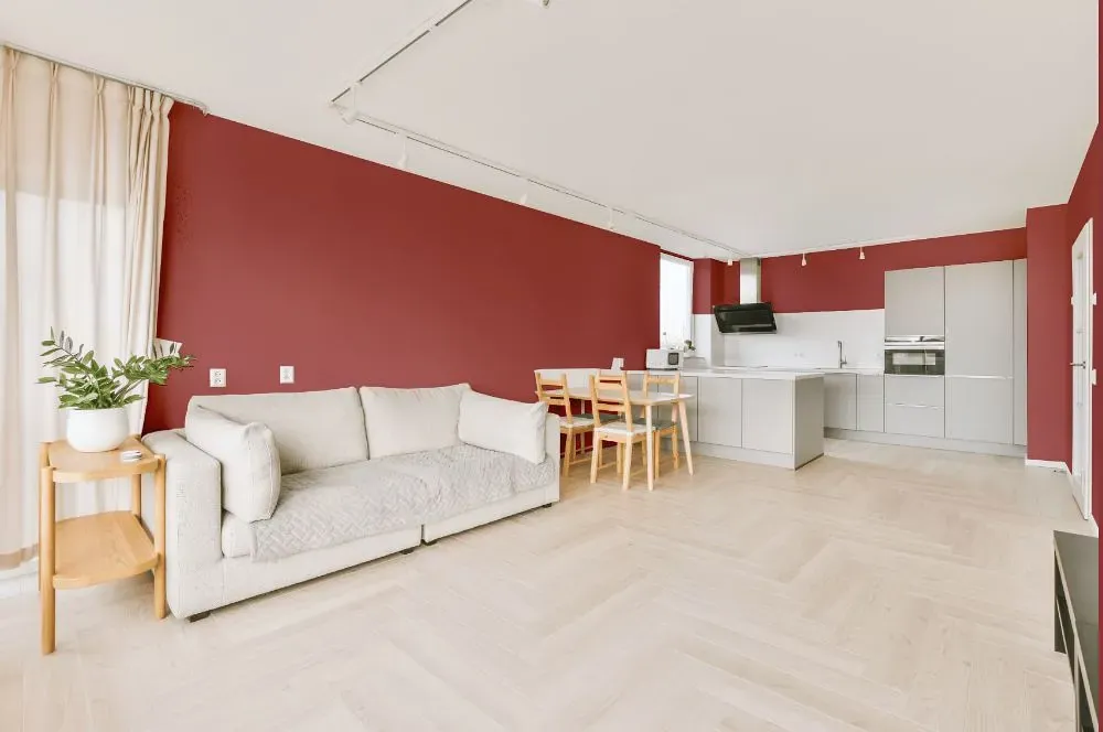
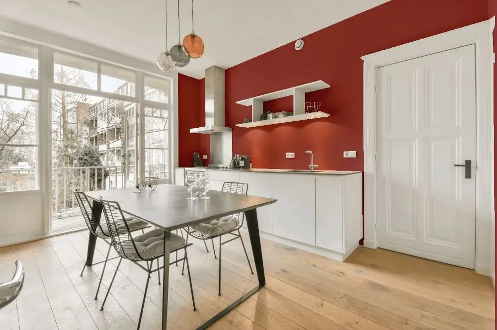
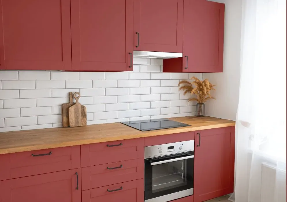
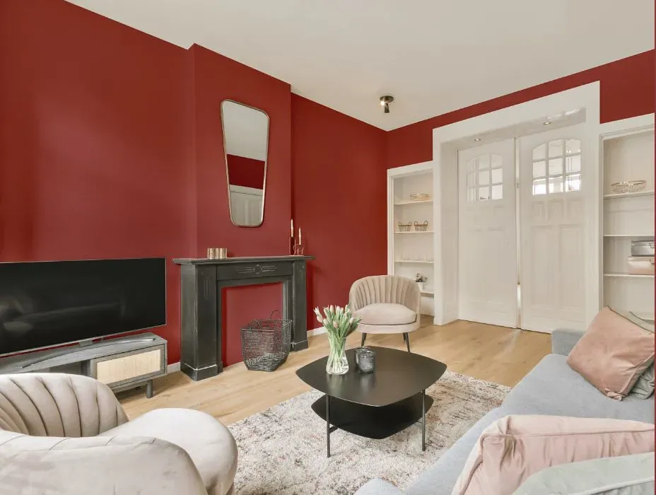
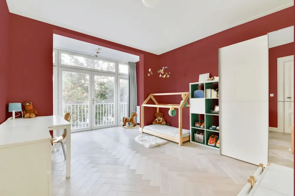
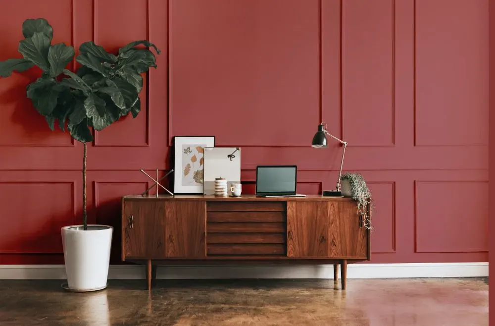
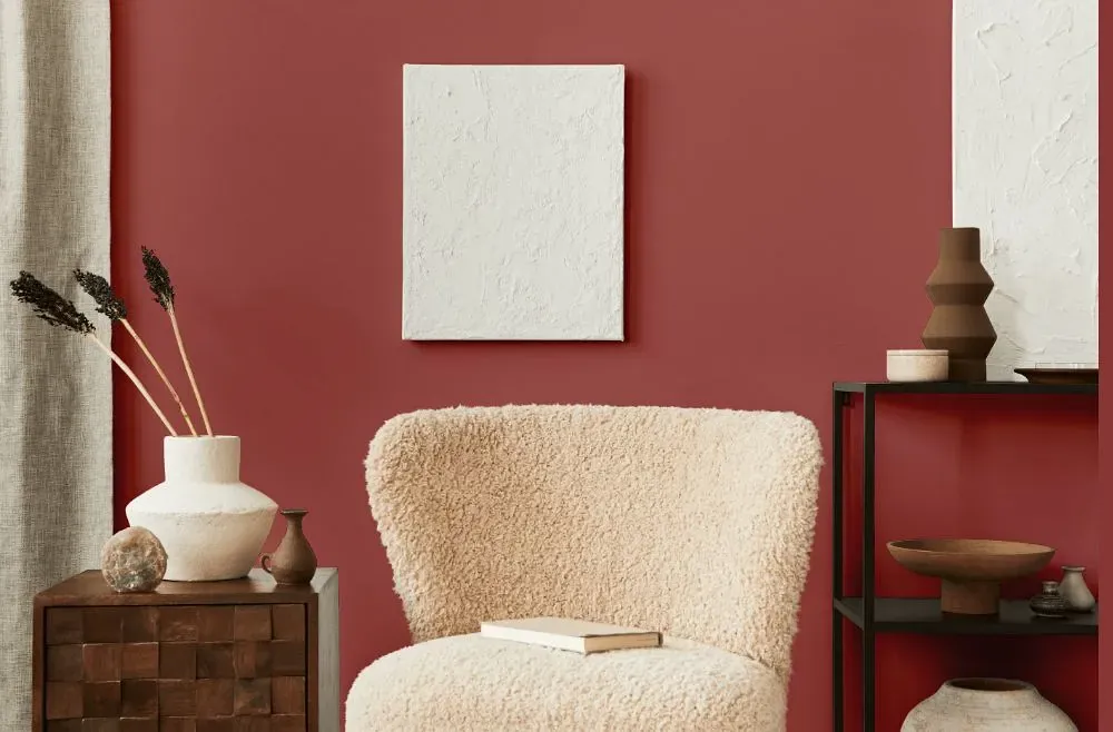
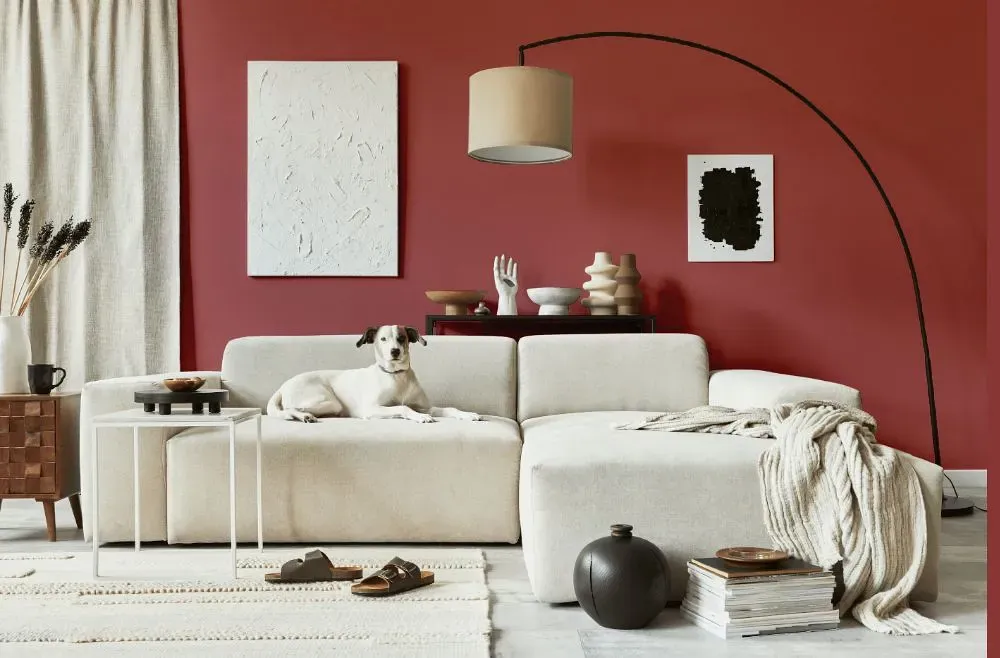
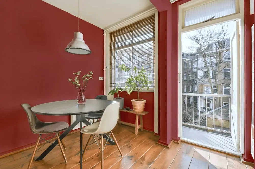
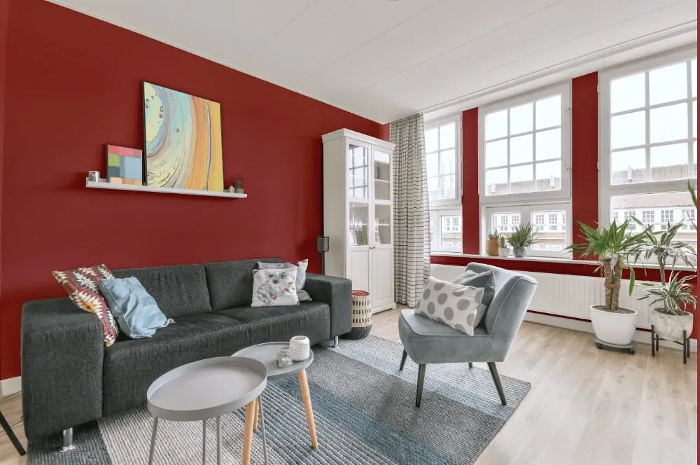
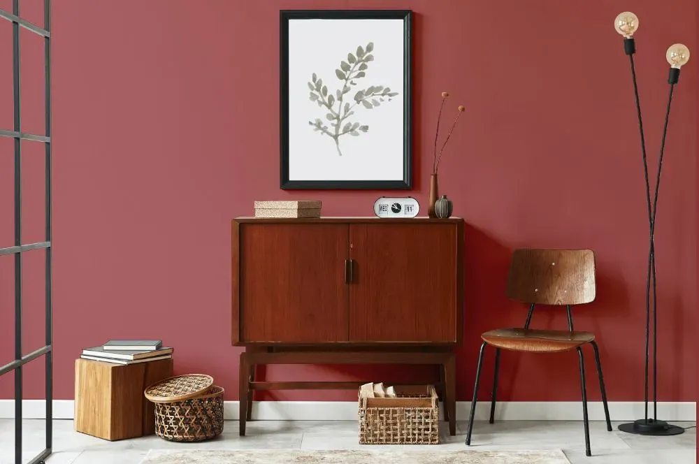
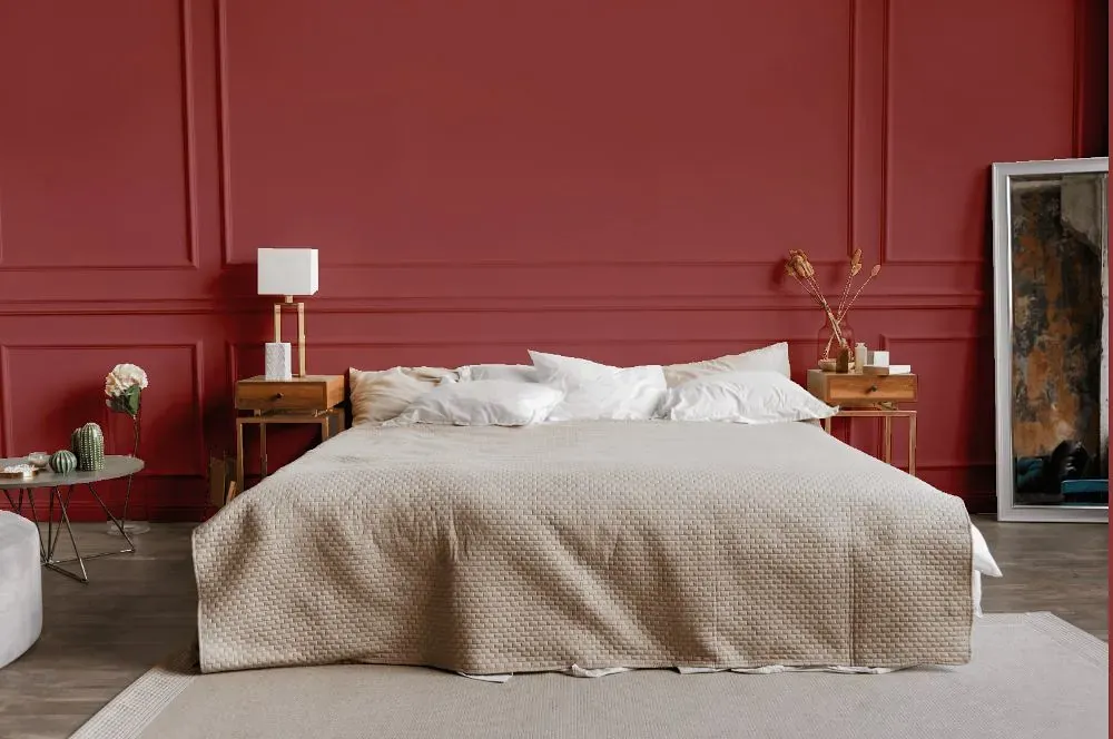
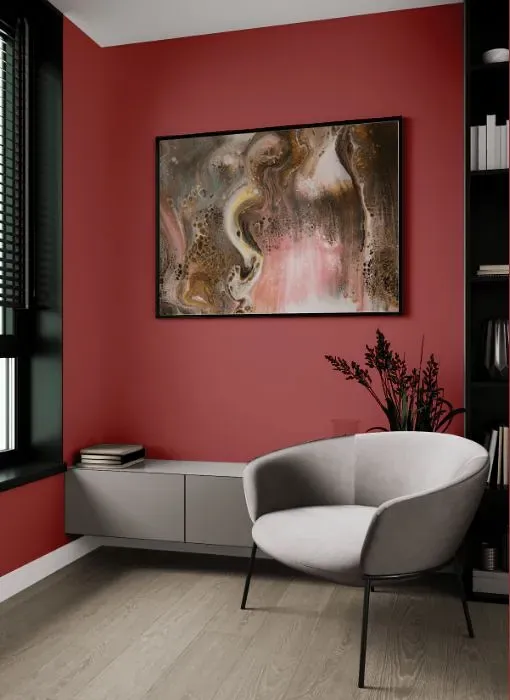
Benjamin Moore 1287, also known as Santa Fe Pottery, exudes warmth and earthiness. This rich hue pairs beautifully with neutral tones such as beige and cream to create a soothing and inviting ambiance. For a more dramatic look, consider combining Santa Fe Pottery with deep navy or forest green accents to add depth and sophistication to the space. The versatile nature of Benjamin Moore 1287 allows it to complement both traditional and modern interior designs effortlessly. Whether used as a statement wall color or as an accent throughout the room, Santa Fe Pottery adds a touch of coziness and elegance to any space.
Loading...
LRV of Santa Fe Pottery
Santa Fe Pottery has an LRV of 18.16% and refers to Medium Dark which means that this color reflects very little light. Why LRV is important?

Light Reflectance Value measures the amount of visible and usable light that reflects from a painted surface.
Simply put, the higher the LRV of a paint color, the brighter the room you will get.
The scale goes from 0% (absolute black, absorbing all light) to 100% (pure white, reflecting all light).
Act like a pro: When choosing paint with an LRV of 18.16%, pay attention to your bulbs' brightness. Light brightness is measured in lumens. The lower the paint's LRV, the higher lumen level you need. Every square foot of room needs at least 40 lumens. That means for a 200 ft2 living room you'll need about 8000 lumens of light – e.g., eight 1000 lm bulbs.
Color codes
We have collected almost every possible color code you could ever need.
Not sure what the difference between HEX and RGB is? We break down color models in plain language. Understanding color models
| Format | Code |
|---|---|
| HEX | #AB5F5E |
| RGB Decimal | 171, 95, 94 |
| RGB Percent | 67.06%, 37.25%, 36.86% |
| HSV | Hue: 1° Saturation: 45.03% Value: 67.06% |
| HSL | hsl(1, 31, 52) |
| CMYK | Cyan: 0.0 Magenta: 44.44 Yellow: 45.03 Key: 32.94 |
| YIQ | Y: 117.61 I: 45.61 Q: 15.766 |
| XYZ | X: 22.908 Y: 17.653 Z: 12.787 |
| CIE Lab | L:49.072 a:30.68 b:14.251 |
| CIE Luv | L:49.072 u:53.071 v:12.067 |
| Decimal | 11231070 |
| Hunter Lab | 42.015, 23.799, 11.365 |