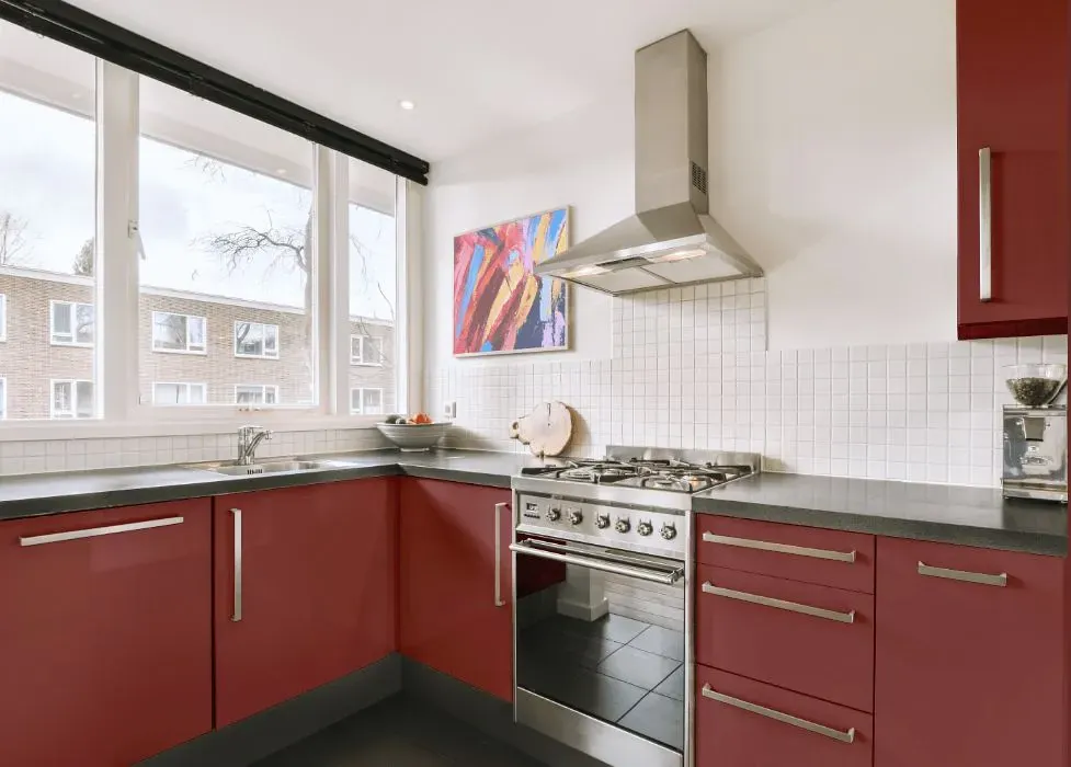
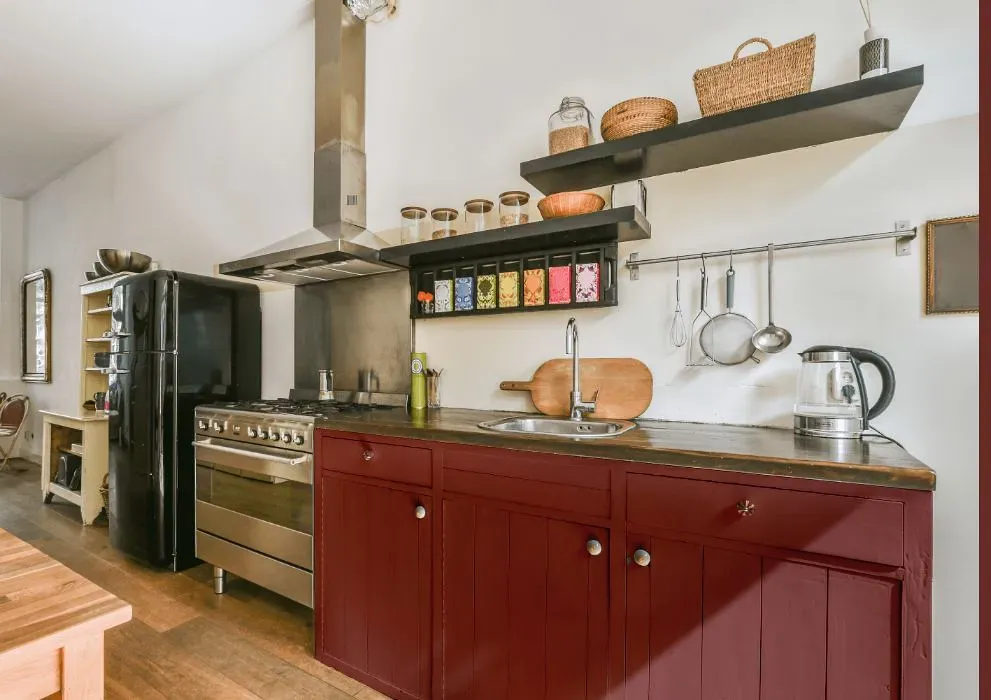
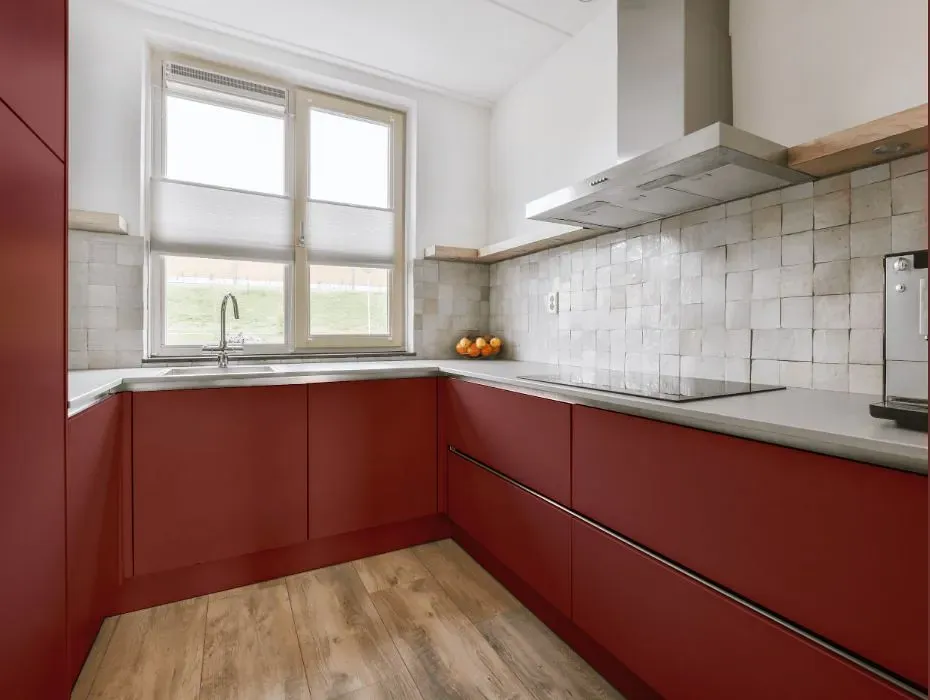
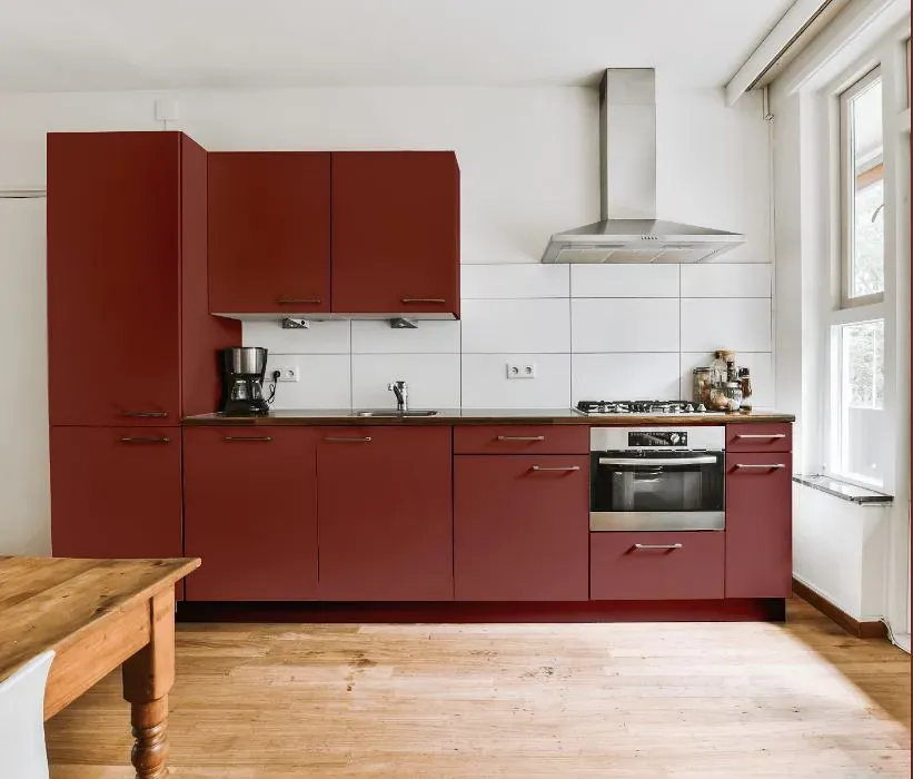
Benjamin Moore St. George Red CW-245
Contentsshow +hide -
- Benjamin Moore St. George Red reviews (23 photos)
- What are Benjamin Moore St. George Red undertones?
- Is St. George Red CW-245 cool or warm?
- How light temperature affects on St. George Red
- Monochromatic color scheme
- Complementary color scheme
- Color comparison and matching
- LRV of St. George Red CW-245
- Color codes
- Color equivalents
| Official page: | St. George Red CW-245 |
| Code: | CW-245 |
| Name: | St. George Red |
| Brand: | Benjamin Moore |
What color is Benjamin Moore St. George Red?
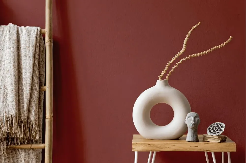
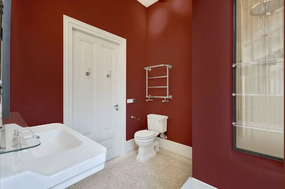
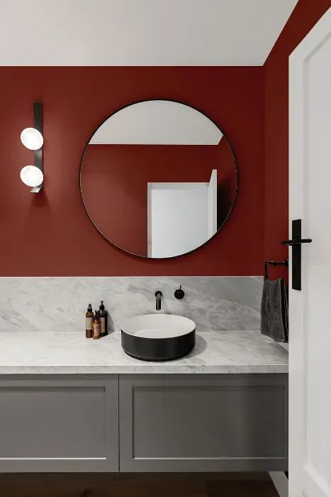
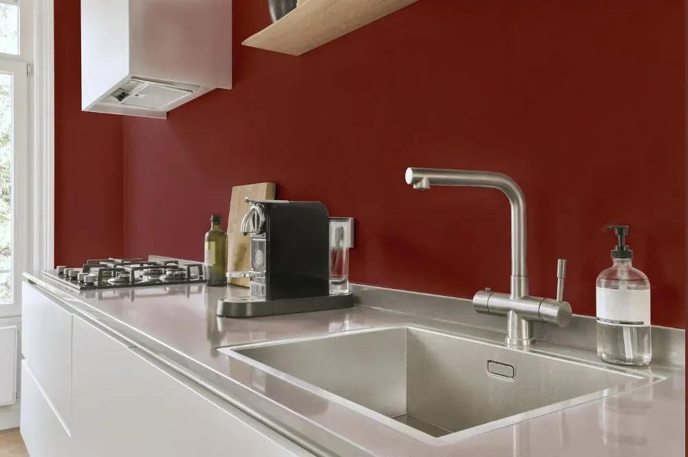
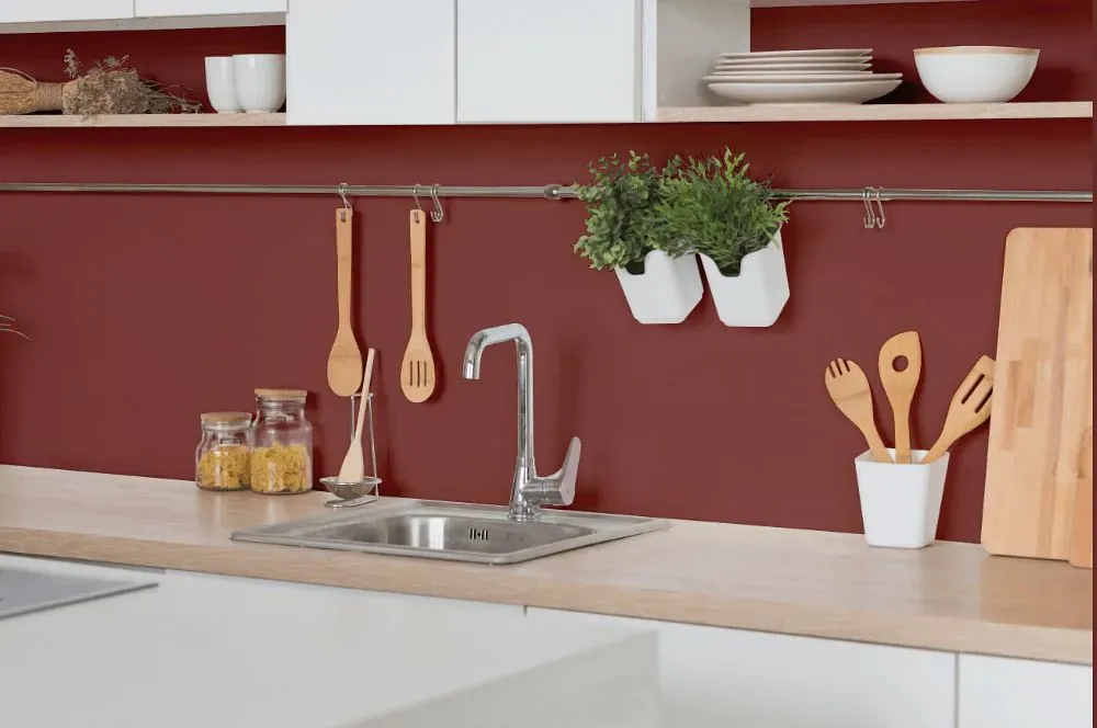
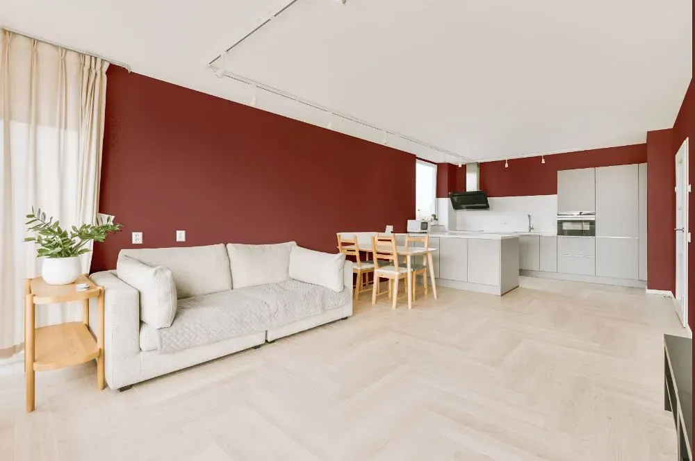
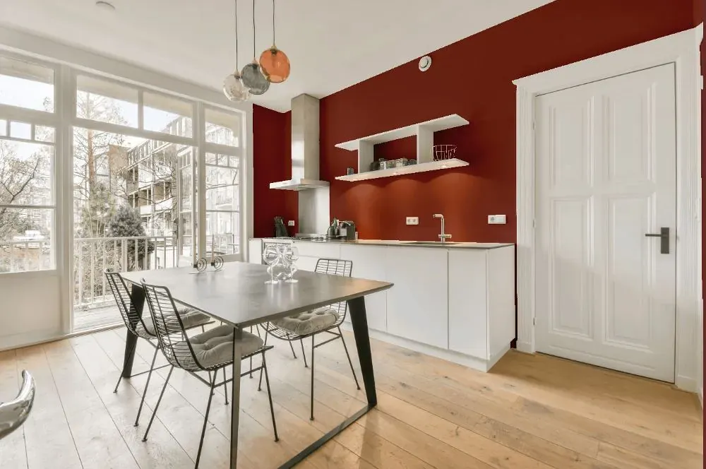
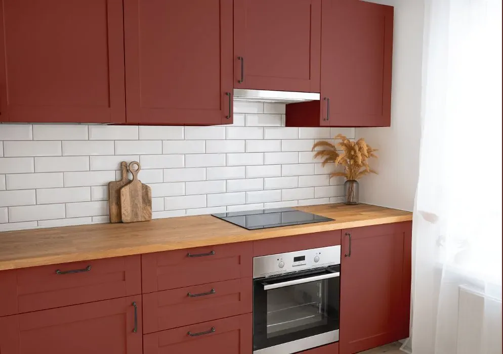
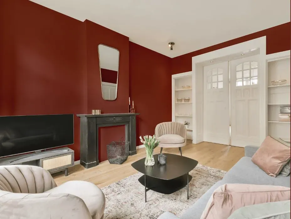
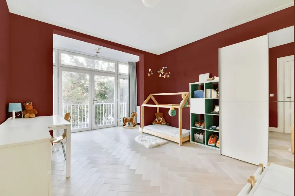
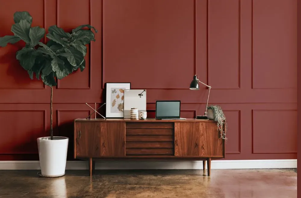
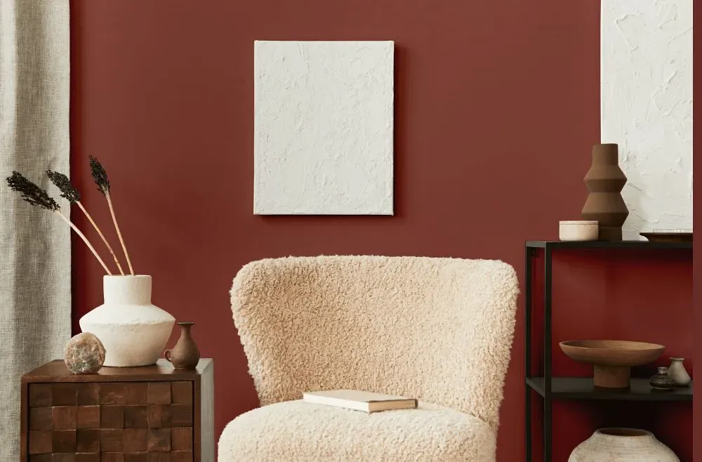
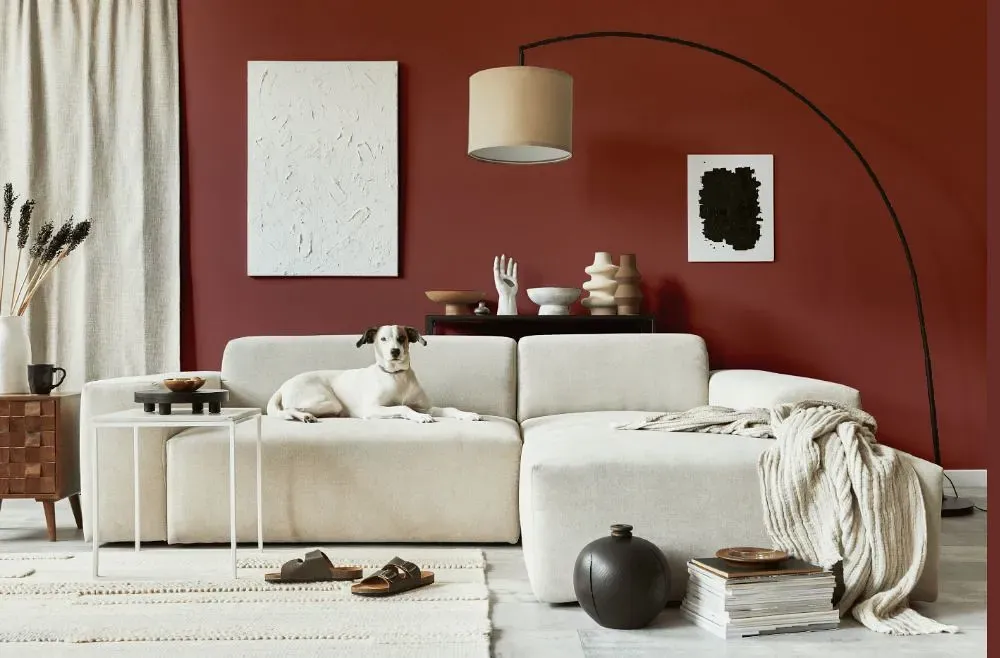
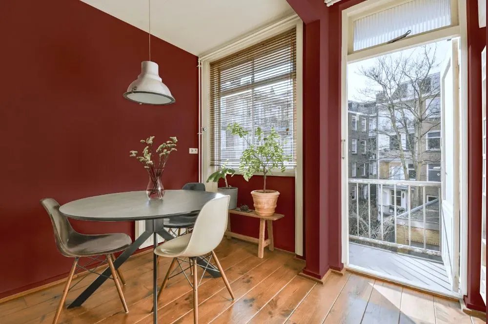
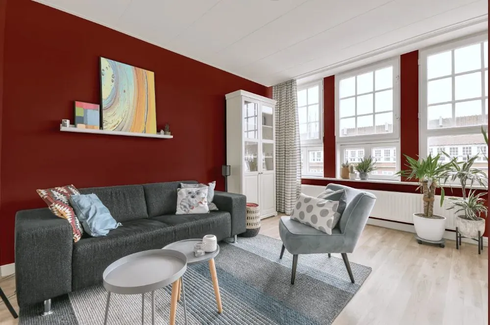
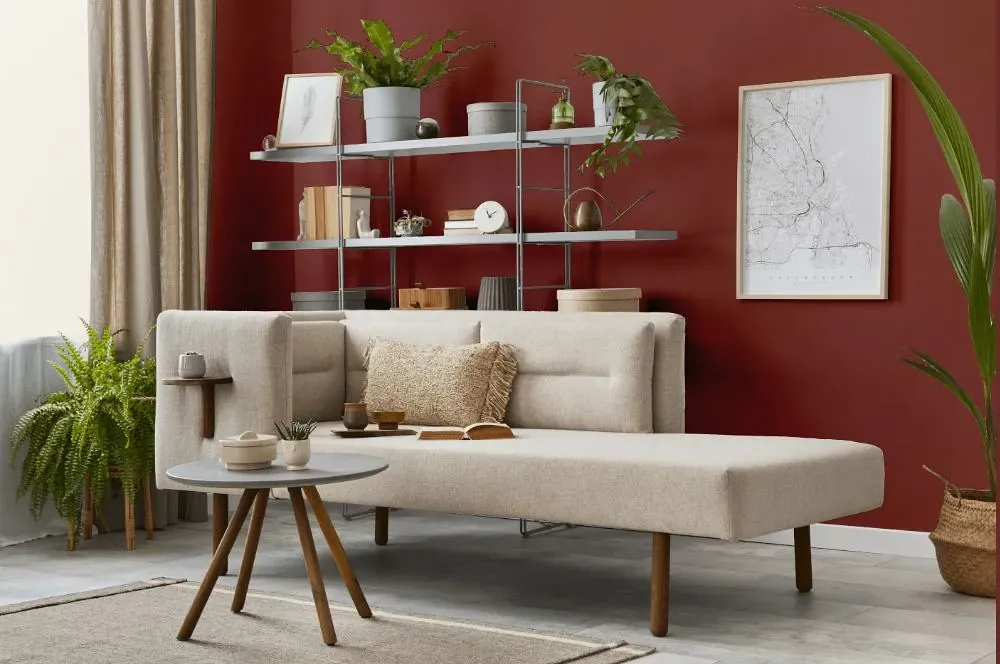
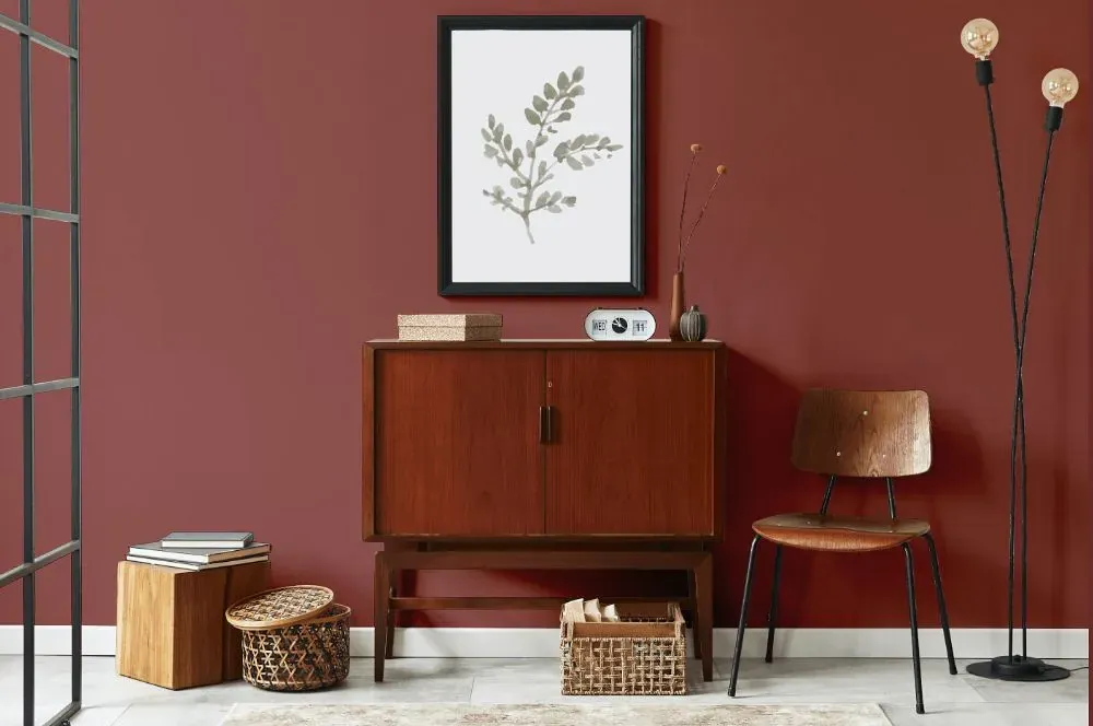
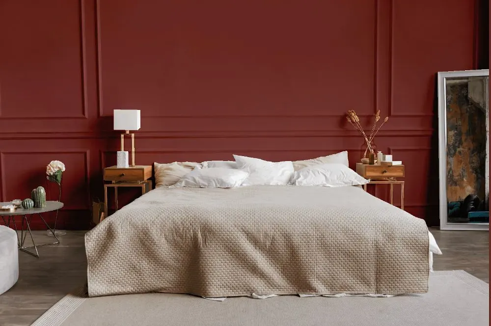
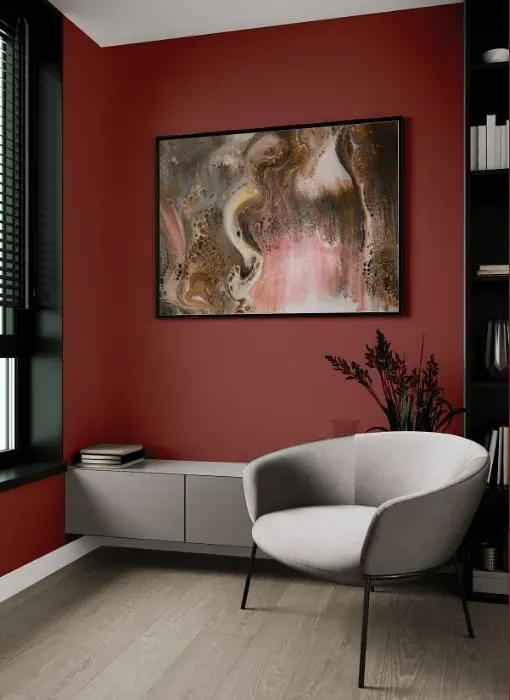
Benjamin Moore St. George Red, also known as CW-245, evokes a sense of richness and warmth in any space. This deep, inviting hue pairs beautifully with crisp white accents, adding a pop of drama to a room. Additionally, combining it with shades of soft gray or charcoal can create a sophisticated and balanced look. Consider incorporating natural textures such as wood or stone to complement the intensity of Benjamin Moore CW-245 St. George Red.
Loading...
LRV of St. George Red
St. George Red has an LRV of 14.14% and refers to Medium Dark which means that this color reflects very little light. Why LRV is important?

Light Reflectance Value measures the amount of visible and usable light that reflects from a painted surface.
Simply put, the higher the LRV of a paint color, the brighter the room you will get.
The scale goes from 0% (absolute black, absorbing all light) to 100% (pure white, reflecting all light).
Act like a pro: When choosing paint with an LRV of 14.14%, pay attention to your bulbs' brightness. Light brightness is measured in lumens. The lower the paint's LRV, the higher lumen level you need. Every square foot of room needs at least 40 lumens. That means for a 200 ft2 living room you'll need about 8000 lumens of light – e.g., eight 1000 lm bulbs.
Color codes
We have collected almost every possible color code you could ever need.
Not sure what the difference between HEX and RGB is? We break down color models in plain language. Understanding color models
| Format | Code |
|---|---|
| HEX | #8F514C |
| RGB Decimal | 143, 81, 76 |
| RGB Percent | 56.08%, 31.76%, 29.80% |
| HSV | Hue: 4° Saturation: 46.85% Value: 56.08% |
| HSL | hsl(4, 31, 43) |
| CMYK | Cyan: 0.0 Magenta: 43.36 Yellow: 46.85 Key: 43.92 |
| YIQ | Y: 98.968 I: 38.553 Q: 11.559 |
| XYZ | X: 15.575 Y: 12.248 Z: 8.379 |
| CIE Lab | L:41.607 a:25.306 b:14.252 |
| CIE Luv | L:41.607 u:43.142 v:12.343 |
| Decimal | 9392460 |
| Hunter Lab | 34.997, 18.198, 10.302 |