Benjamin Moore Shy Cherry 2007-20
Contentsshow +hide -
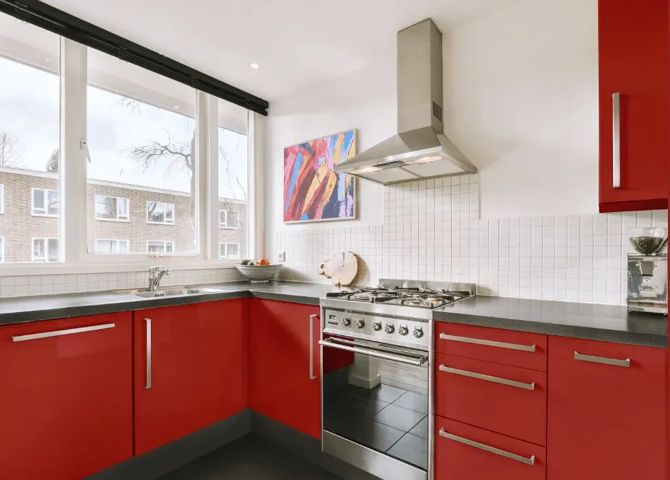
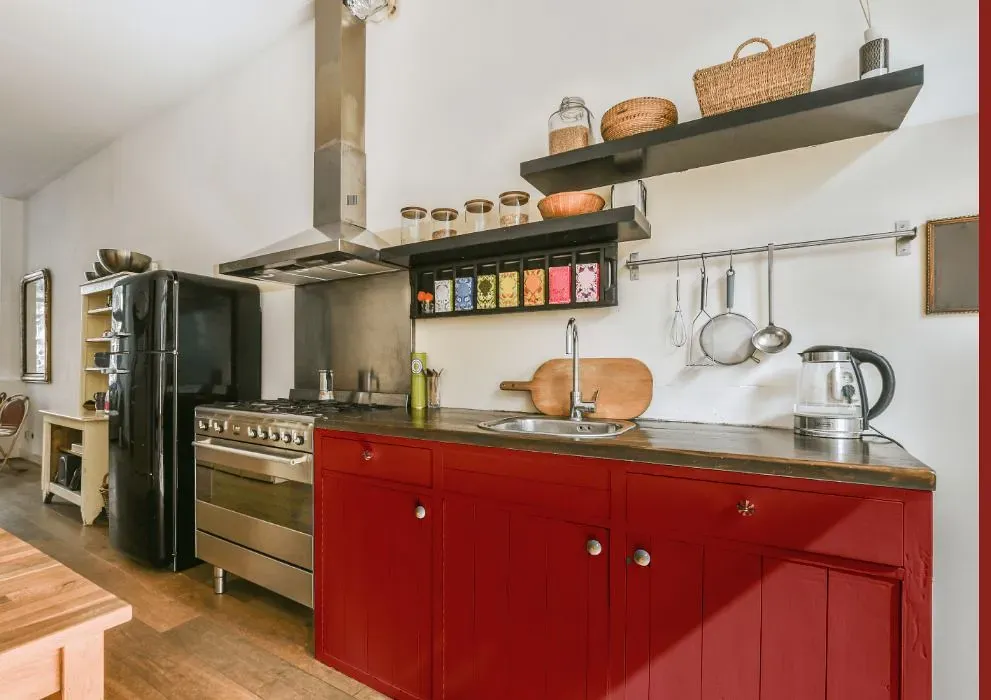
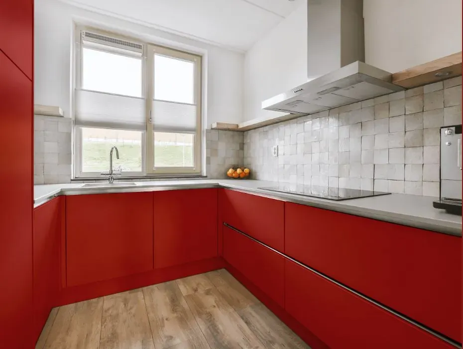
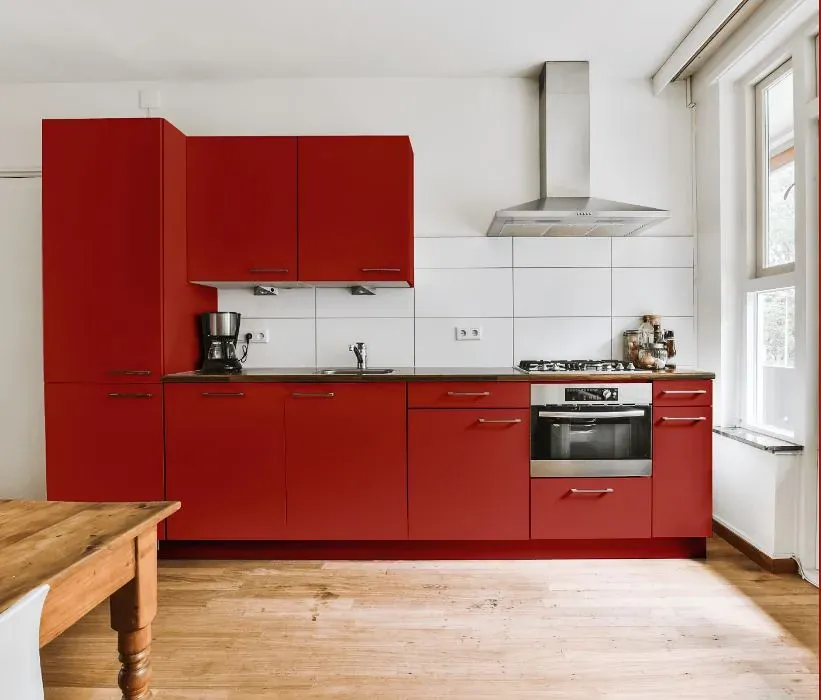
- Benjamin Moore Shy Cherry reviews (23 photos)
- What are Benjamin Moore Shy Cherry undertones?
- Is Shy Cherry 2007-20 cool or warm?
- How light temperature affects on Shy Cherry
- Monochromatic color scheme
- Complementary color scheme
- Color comparison and matching
- LRV of Shy Cherry 2007-20
- Color codes
- Color equivalents
| Official page: | Shy Cherry 2007-20 |
| Code: | 2007-20 |
| Name: | Shy Cherry |
| Brand: | Benjamin Moore |
What color is Benjamin Moore Shy Cherry?
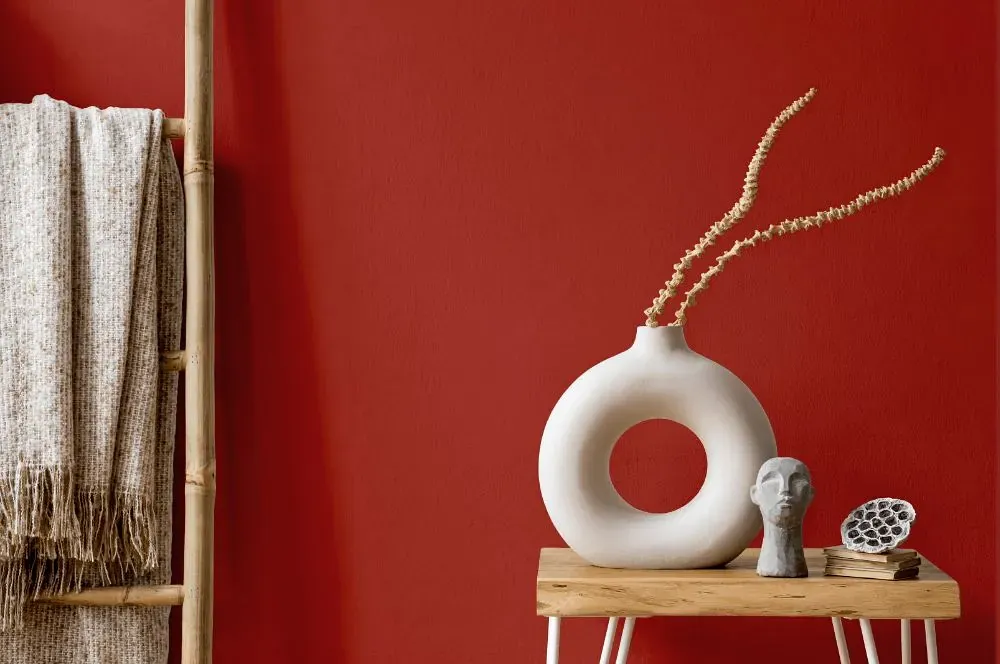
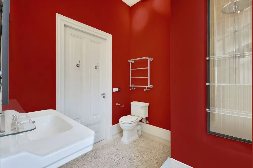
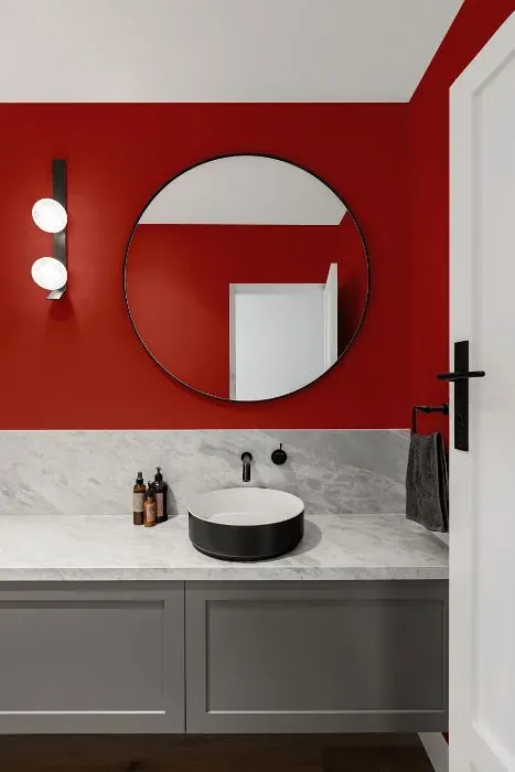
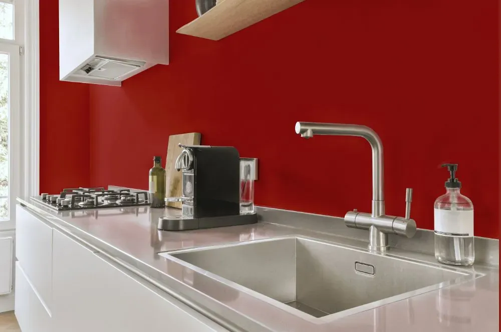
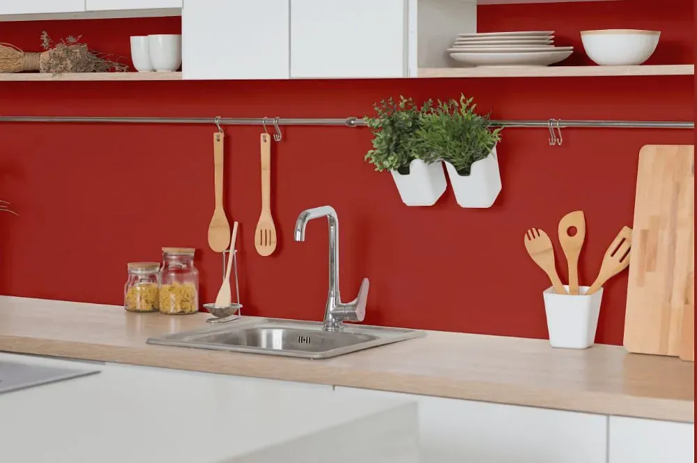
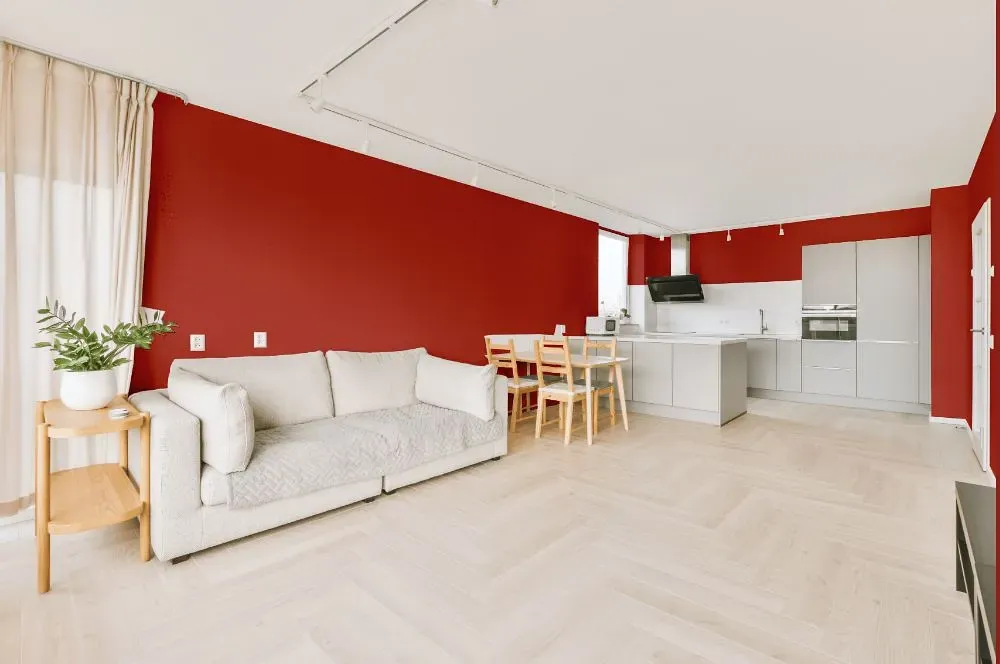
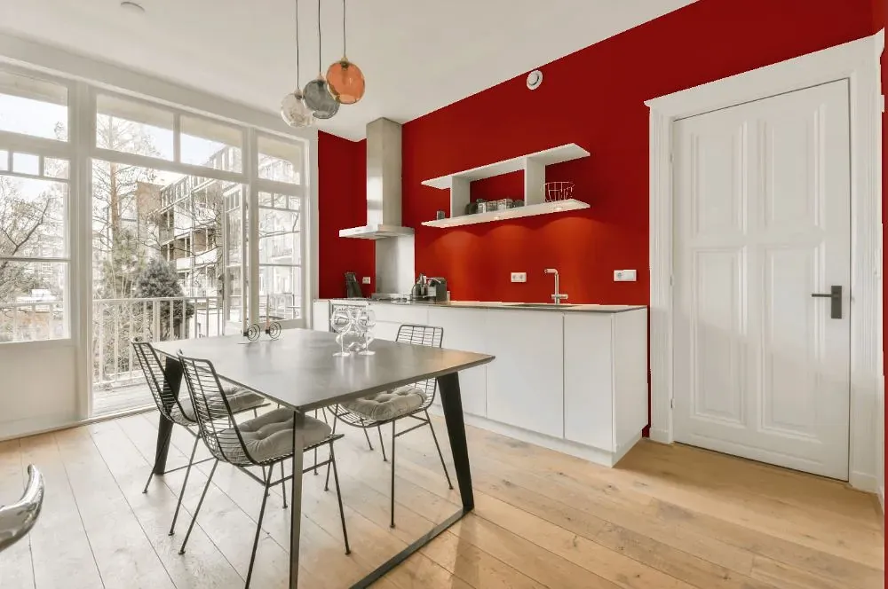
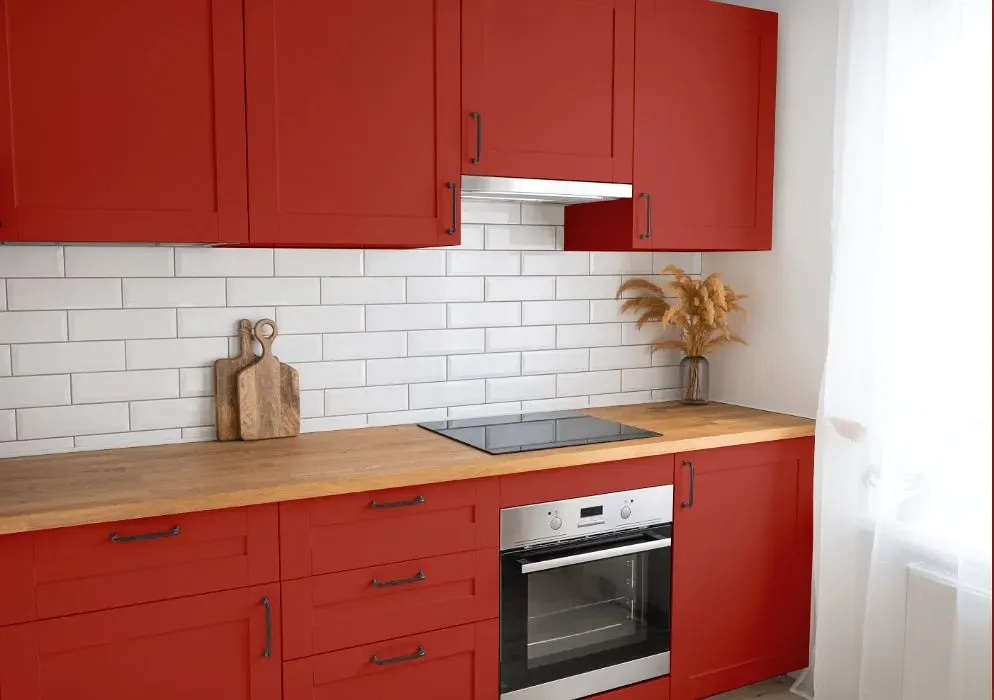
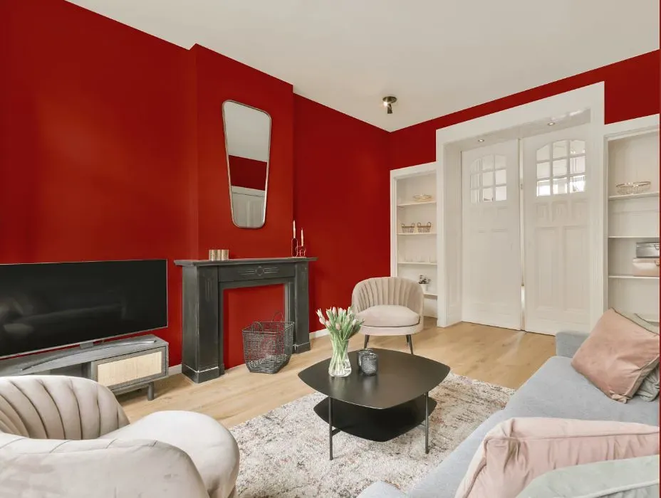
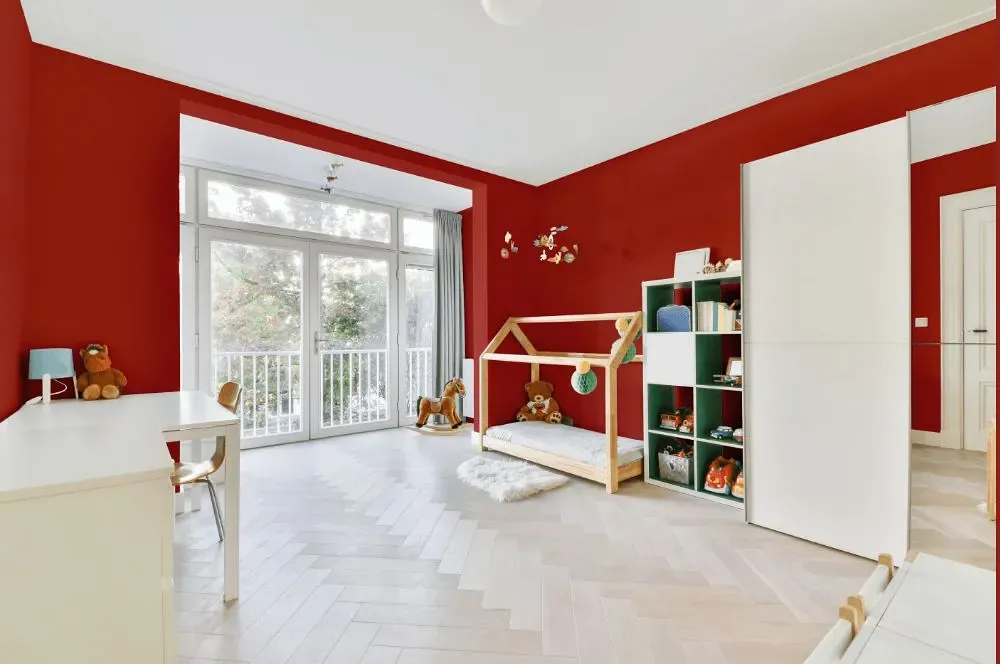
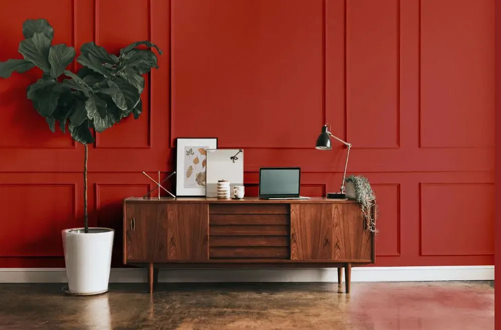
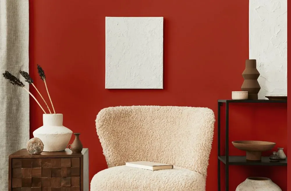
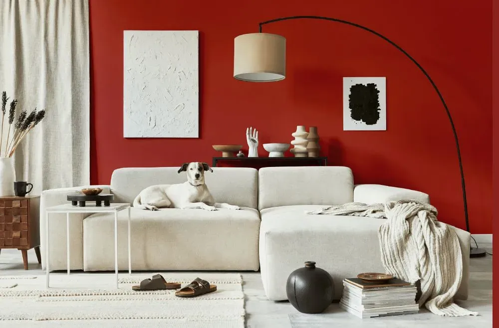
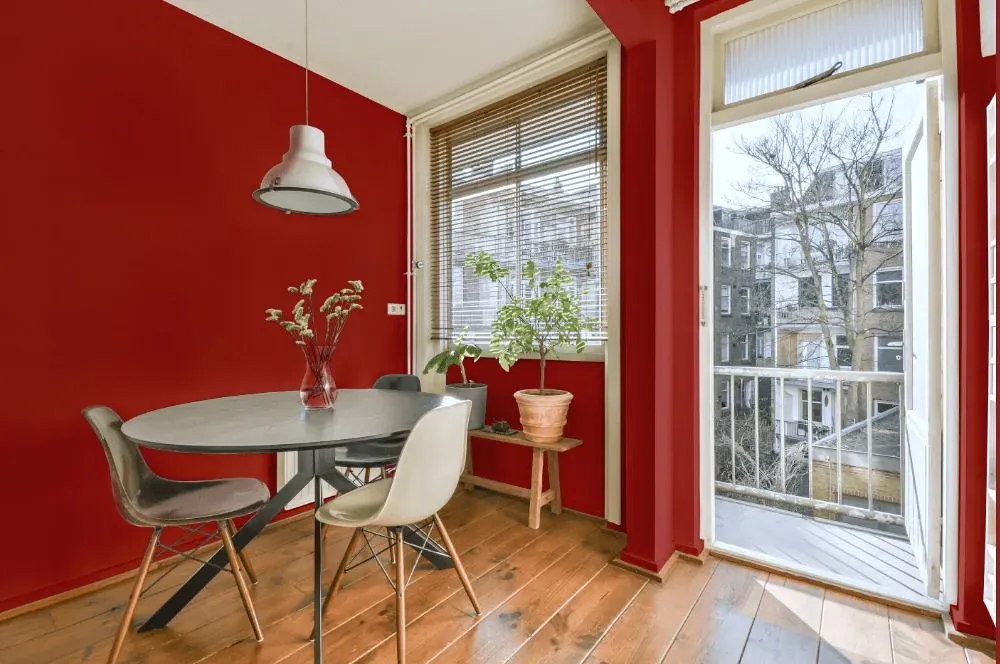
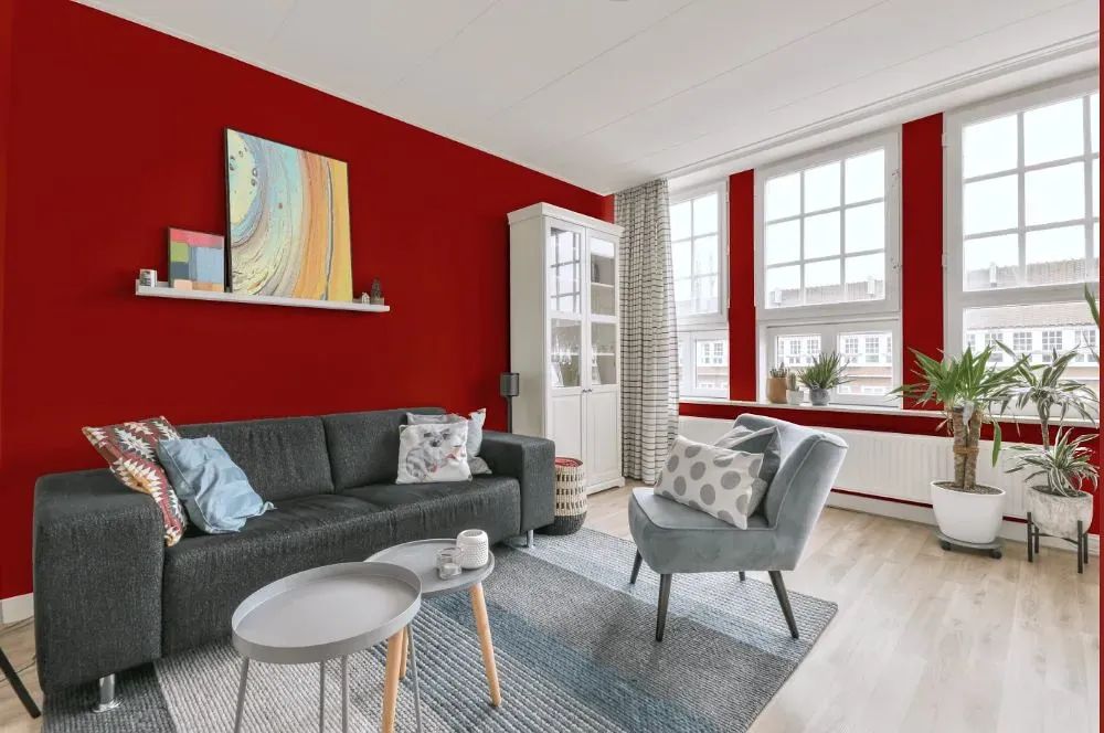
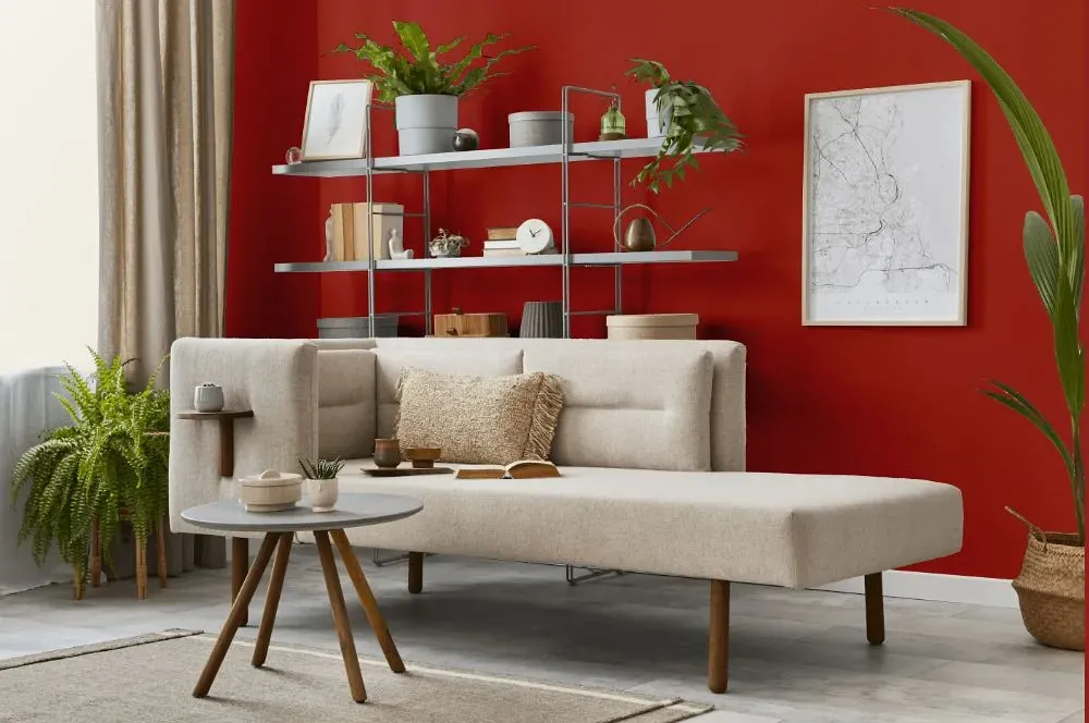
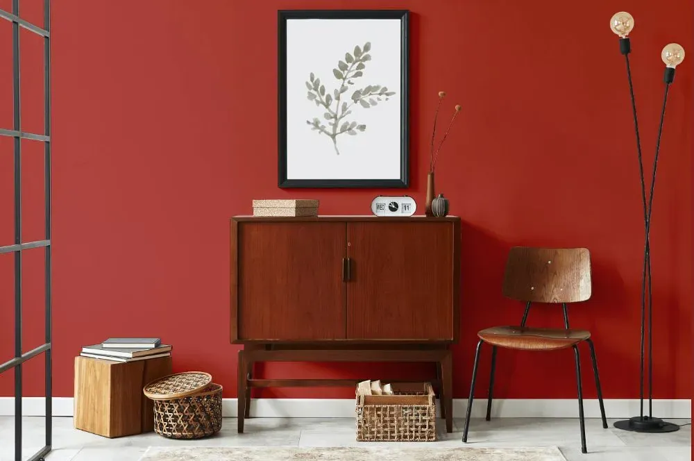
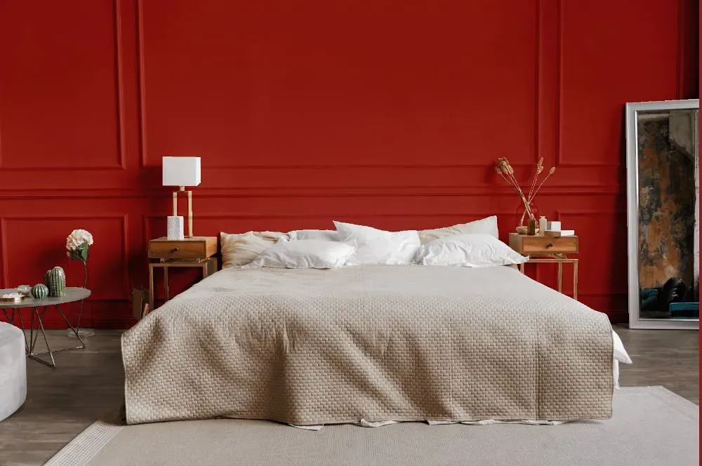
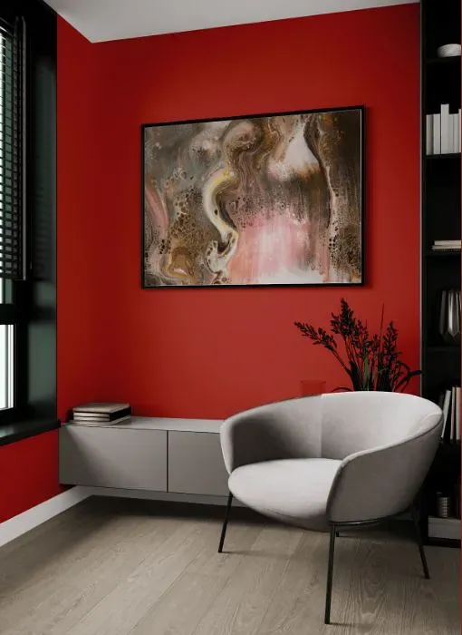
Immerse yourself in the inviting warmth of Benjamin Moore Shy Cherry (2007-20), a rich and elegant hue that exudes sophistication and charm. This vibrant shade is perfect for creating a cozy and intimate atmosphere in the dining room or living room. Infuse your space with a touch of luxury by incorporating Shy Cherry into your decor, adding depth and visual interest to any room. Embrace the bold and timeless appeal of Shy Cherry to transform your space into a sanctuary of style and comfort.
Loading...
LRV of Shy Cherry
Shy Cherry has an LRV of 13.68% and refers to Medium Dark which means that this color reflects very little light. Why LRV is important?

Light Reflectance Value measures the amount of visible and usable light that reflects from a painted surface.
Simply put, the higher the LRV of a paint color, the brighter the room you will get.
The scale goes from 0% (absolute black, absorbing all light) to 100% (pure white, reflecting all light).
Act like a pro: When choosing paint with an LRV of 13.68%, pay attention to your bulbs' brightness. Light brightness is measured in lumens. The lower the paint's LRV, the higher lumen level you need. Every square foot of room needs at least 40 lumens. That means for a 200 ft2 living room you'll need about 8000 lumens of light – e.g., eight 1000 lm bulbs.
Color codes
We have collected almost every possible color code you could ever need.
Not sure what the difference between HEX and RGB is? We break down color models in plain language. Understanding color models
| Format | Code |
|---|---|
| HEX | #AE4138 |
| RGB Decimal | 174, 65, 56 |
| RGB Percent | 68.24%, 25.49%, 21.96% |
| HSV | Hue: 5° Saturation: 67.82% Value: 68.24% |
| HSL | hsl(5, 51, 45) |
| CMYK | Cyan: 0.0 Magenta: 62.64 Yellow: 67.82 Key: 31.76 |
| YIQ | Y: 96.565 I: 67.845 Q: 20.257 |
| XYZ | X: 20.061 Y: 13.067 Z: 5.206 |
| CIE Lab | L:42.865 a:43.972 b:28.9 |
| CIE Luv | L:42.865 u:82.755 v:21.88 |
| Decimal | 11419960 |
| Hunter Lab | 36.149, 35.801, 16.765 |