Benjamin Moore Spanish Red / CC-92 / 1301
Contentsshow +hide -
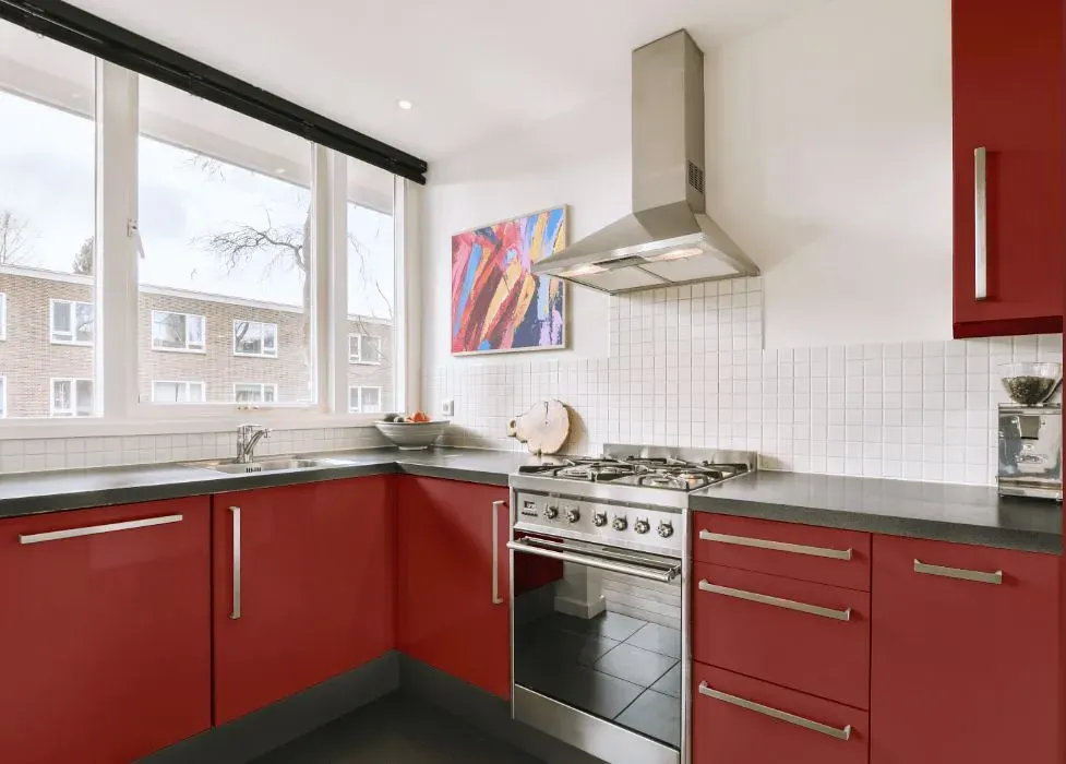
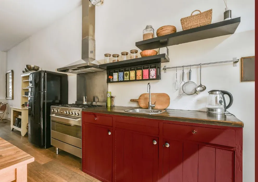
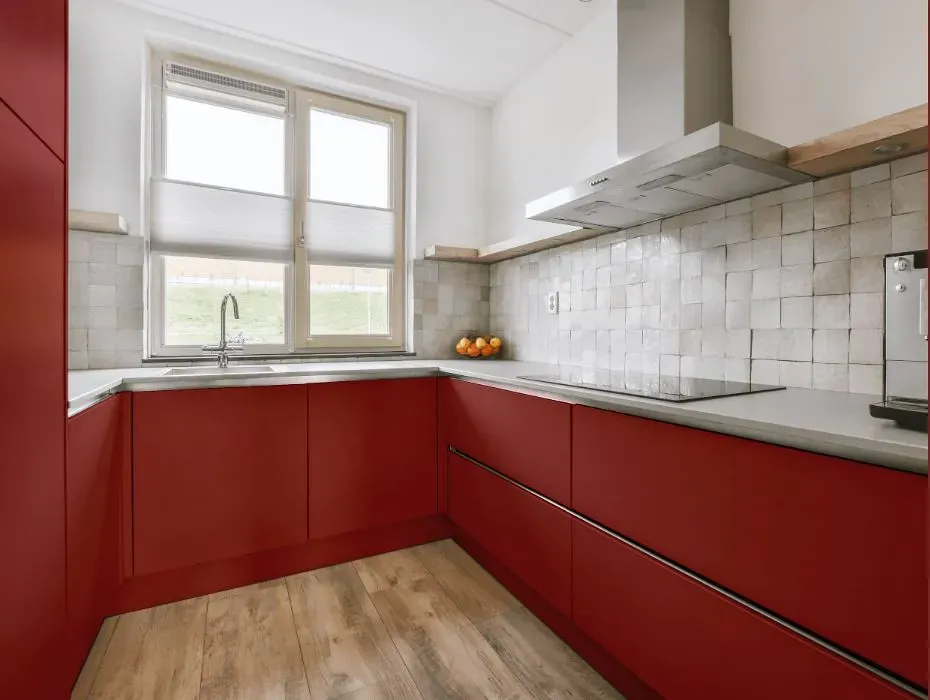
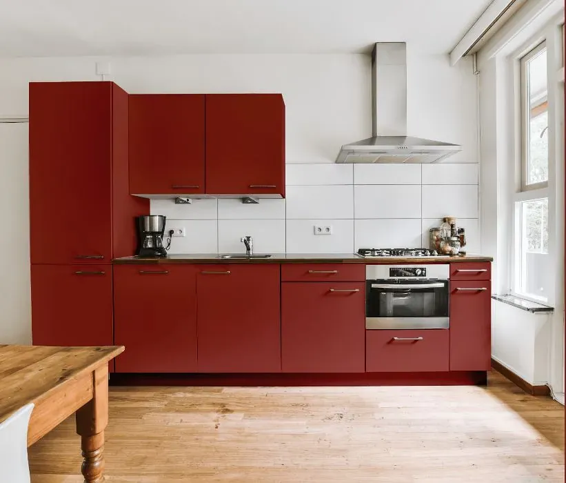
- Benjamin Moore Spanish Red reviews (23 photos)
- What are Benjamin Moore Spanish Red undertones?
- Is Spanish Red 1301 cool or warm?
- How light temperature affects on Spanish Red
- Monochromatic color scheme
- Complementary color scheme
- Color comparison and matching
- LRV of Spanish Red 1301
- Color codes
- Color equivalents
| Official page: | Spanish Red 1301 |
| Code: | 1301 |
| Name: | Spanish Red |
| Brand: | Benjamin Moore |
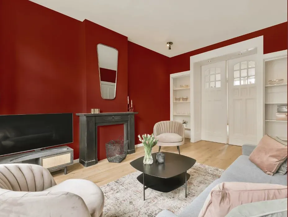
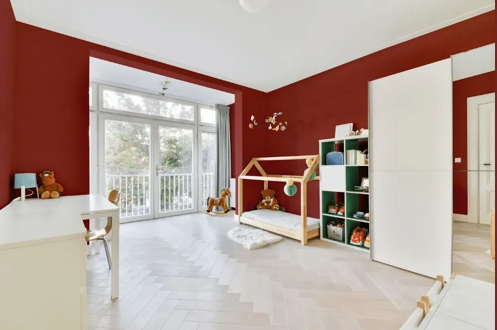
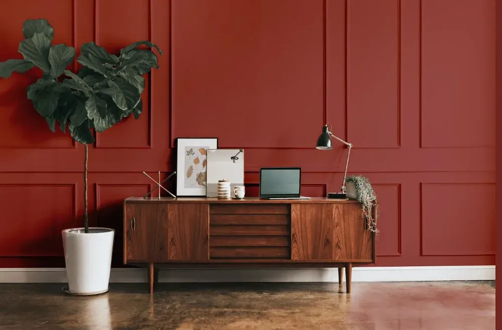
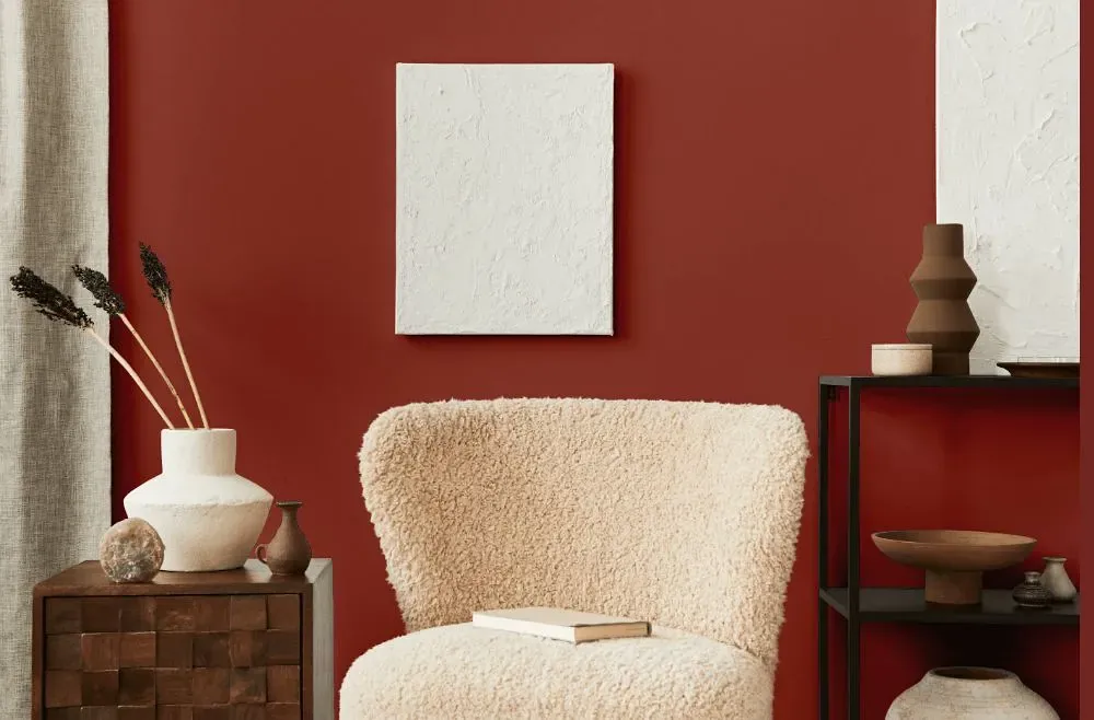
What color is Benjamin Moore Spanish Red?
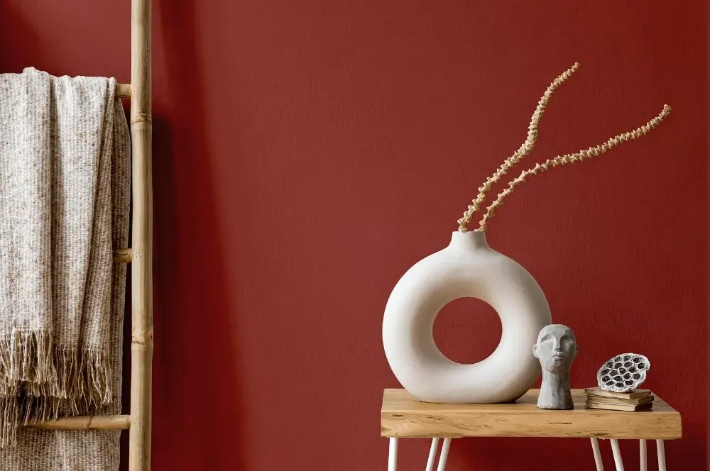
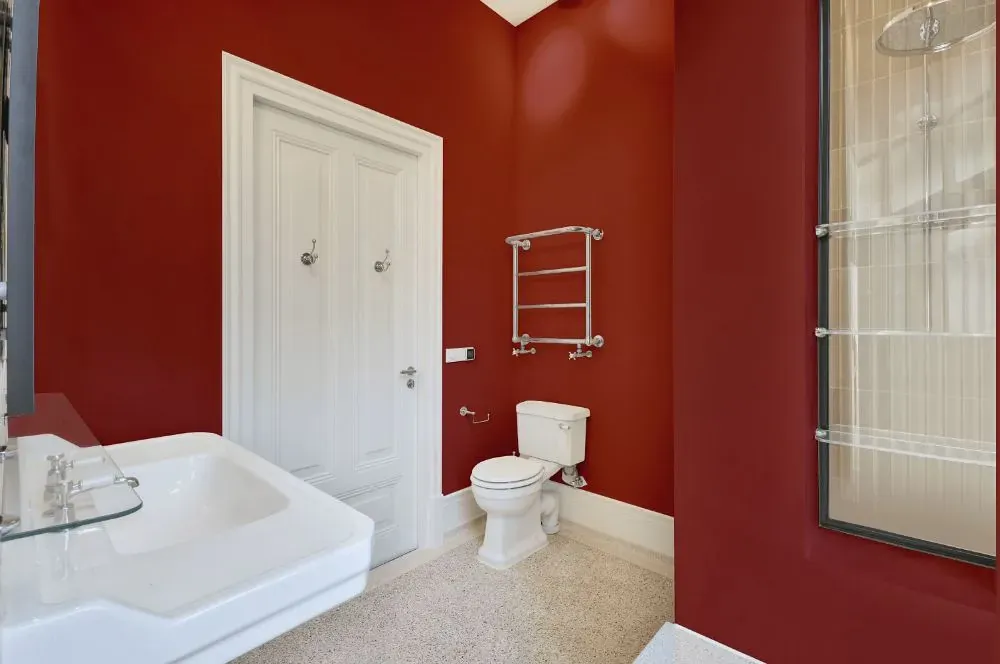
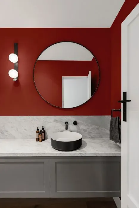
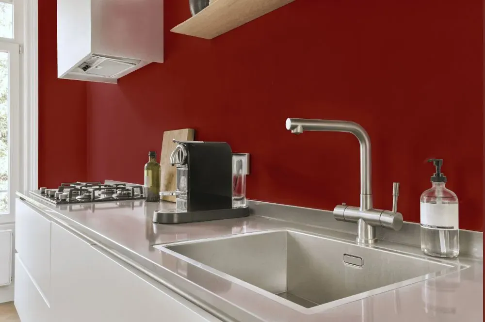
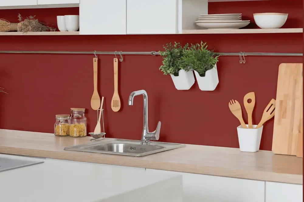
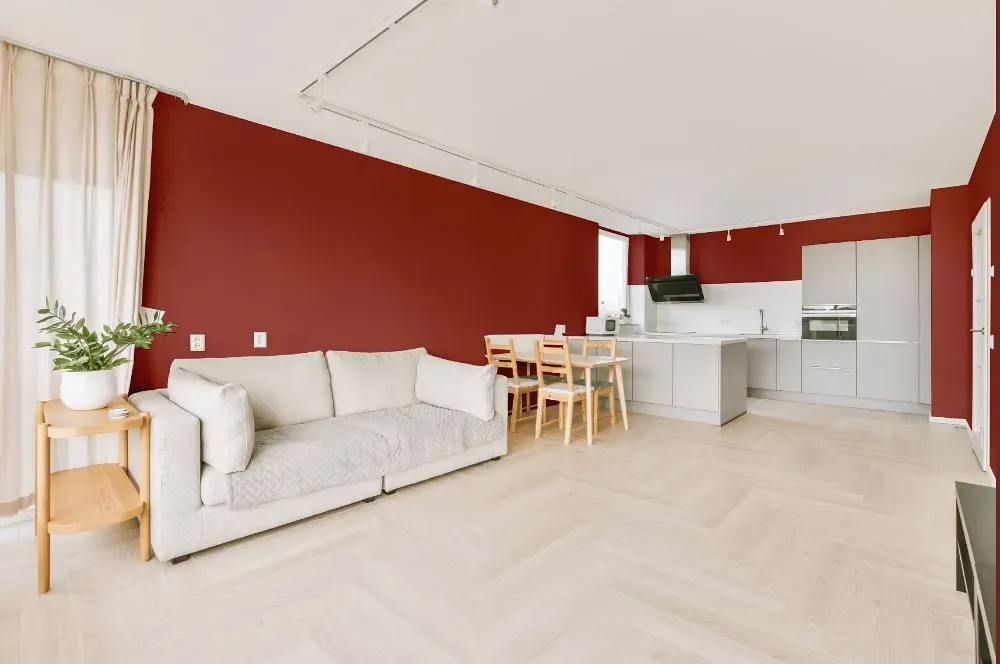
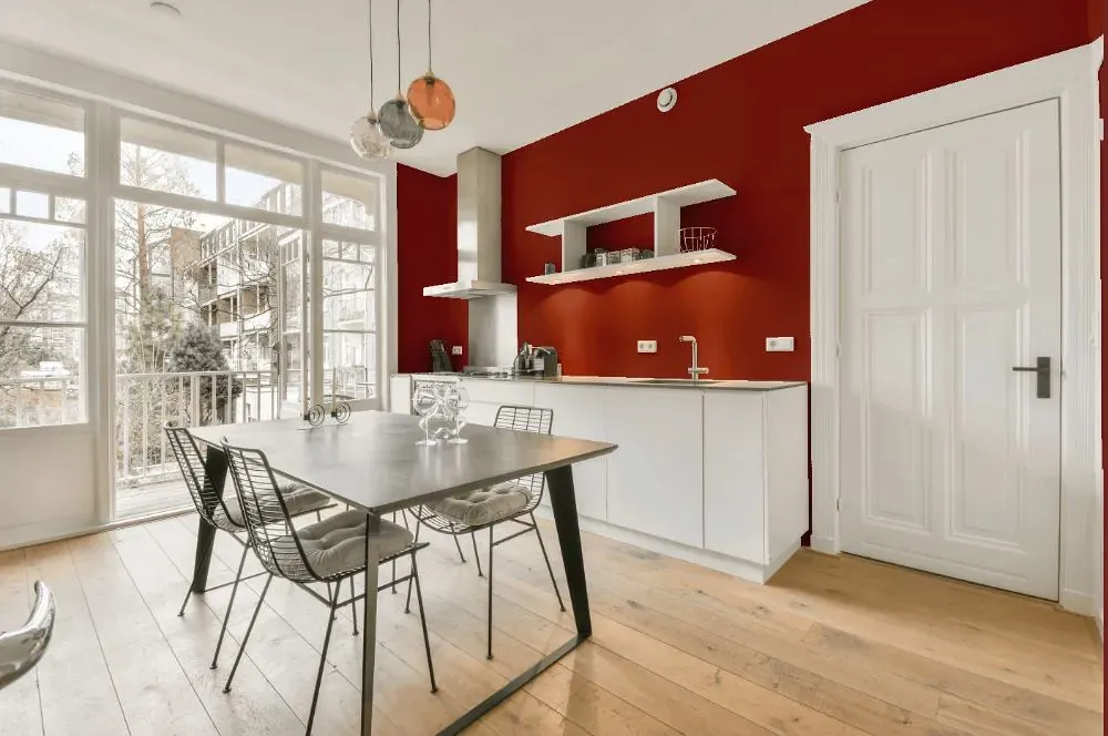
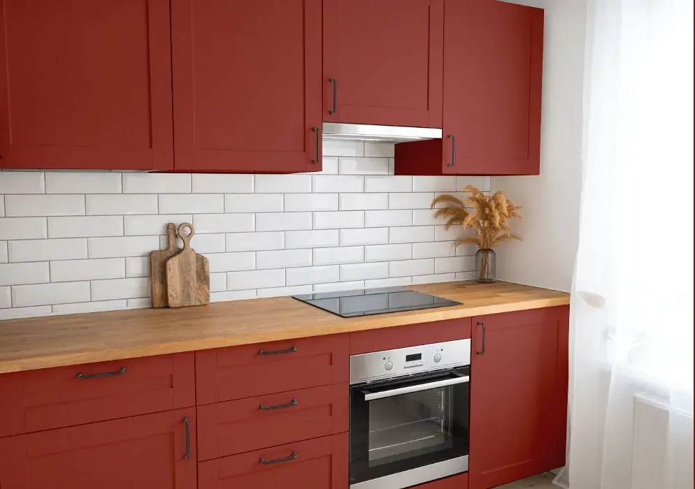
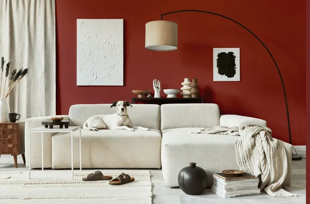
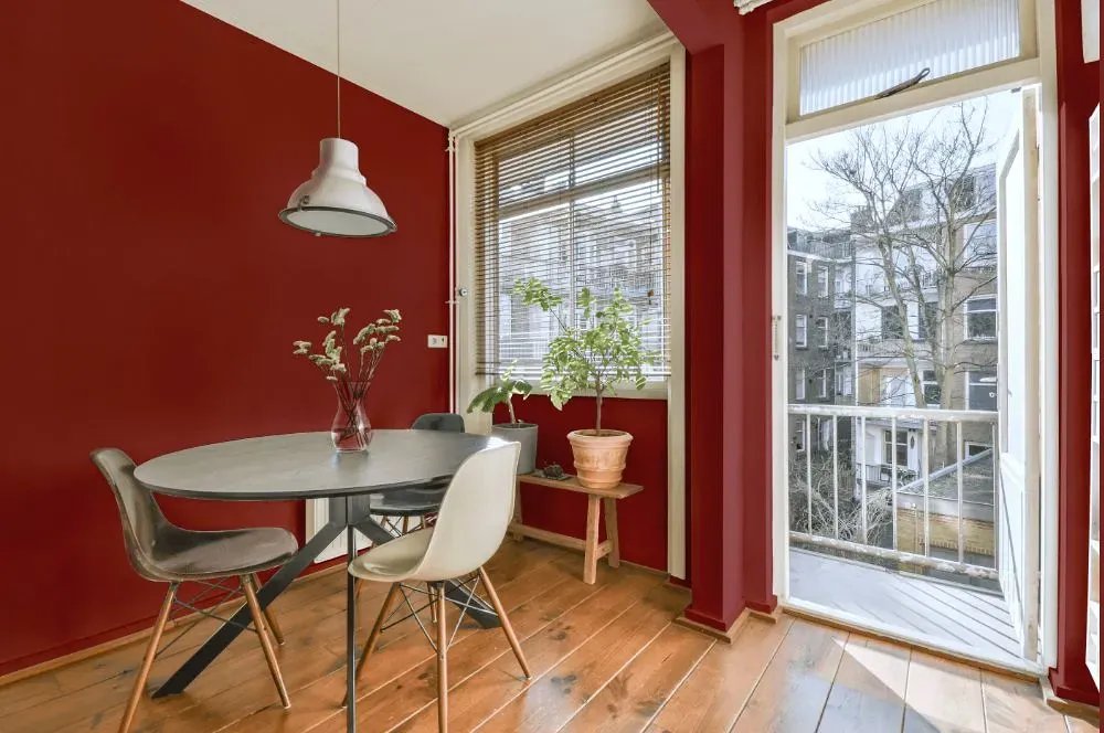
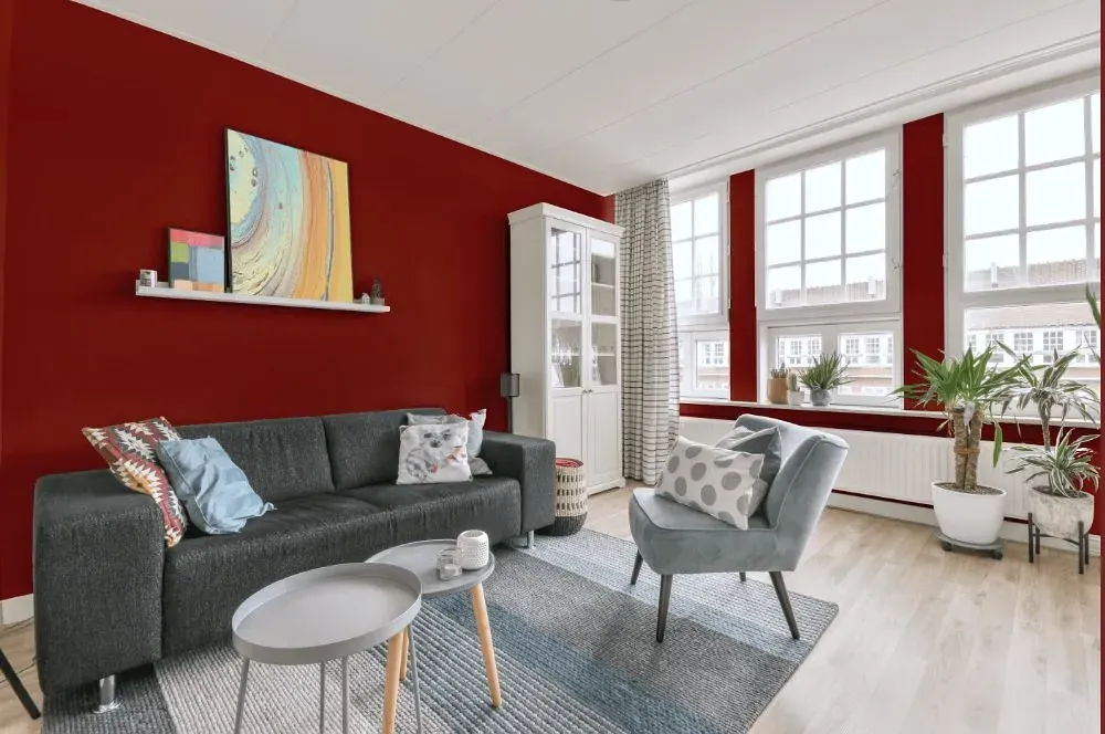
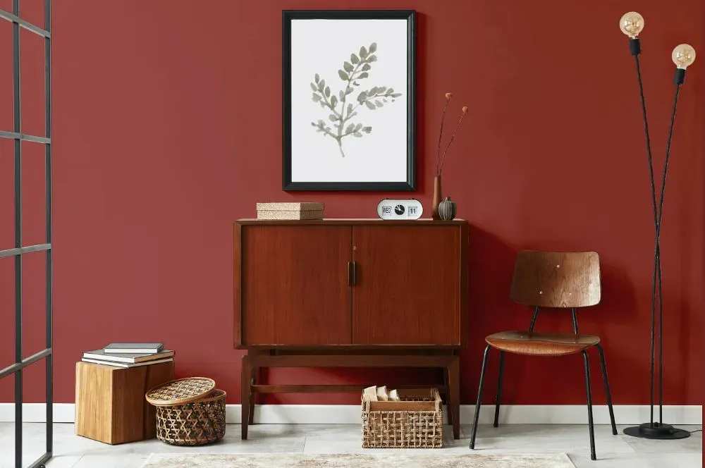
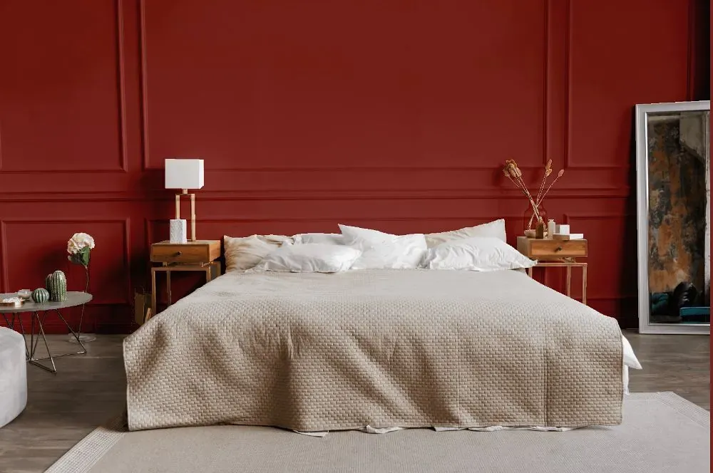
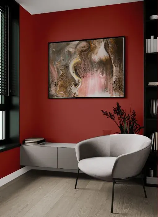
Benjamin Moore 1301 Spanish Red adds a warm and inviting touch to any space. This rich hue evokes a sense of passion and energy, making it perfect for creating a cozy atmosphere in a room. Pair it with neutral tones like soft beige or creamy white to balance out its boldness and create a harmonious color palette. Alternatively, you can contrast it with deep navy or olive green for a more dramatic and sophisticated look. Whichever way you choose to incorporate Benjamin Moore 1301 Spanish Red into your decor, it's sure to make a stylish statement.
Loading...
LRV of Spanish Red
Spanish Red has an LRV of 12.6% and refers to Medium Dark which means that this color reflects very little light. Why LRV is important?

Light Reflectance Value measures the amount of visible and usable light that reflects from a painted surface.
Simply put, the higher the LRV of a paint color, the brighter the room you will get.
The scale goes from 0% (absolute black, absorbing all light) to 100% (pure white, reflecting all light).
Act like a pro: When choosing paint with an LRV of 12.6%, pay attention to your bulbs' brightness. Light brightness is measured in lumens. The lower the paint's LRV, the higher lumen level you need. Every square foot of room needs at least 40 lumens. That means for a 200 ft2 living room you'll need about 8000 lumens of light – e.g., eight 1000 lm bulbs.
Color codes
We have collected almost every possible color code you could ever need.
Not sure what the difference between HEX and RGB is? We break down color models in plain language. Understanding color models
| Format | Code |
|---|---|
| HEX | #984841 |
| RGB Decimal | 152, 72, 65 |
| RGB Percent | 59.61%, 28.24%, 25.49% |
| HSV | Hue: 5° Saturation: 57.24% Value: 59.61% |
| HSL | hsl(5, 40, 43) |
| CMYK | Cyan: 0.0 Magenta: 52.63 Yellow: 57.24 Key: 40.39 |
| YIQ | Y: 95.122 I: 49.921 Q: 14.745 |
| XYZ | X: 16.222 Y: 11.694 Z: 6.402 |
| CIE Lab | L:40.725 a:32.841 b:20.029 |
| CIE Luv | L:40.725 u:58.195 v:16.327 |
| Decimal | 9979969 |
| Hunter Lab | 34.196, 24.832, 12.836 |