Benjamin Moore True Pink 2003-40
Contentsshow +hide -
| Official page: | True Pink 2003-40 |
| Code: | 2003-40 |
| Name: | True Pink |
| Brand: | Benjamin Moore |
What color is Benjamin Moore True Pink?
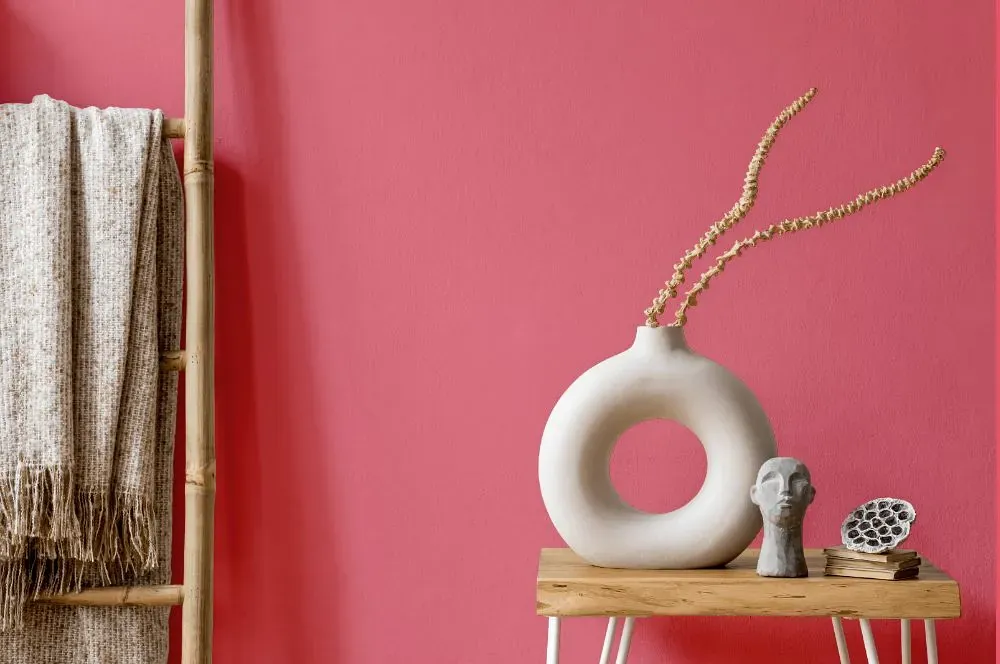
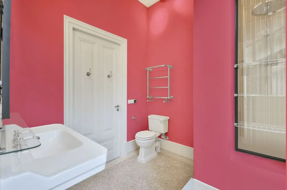
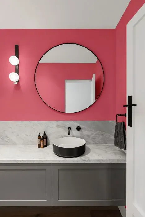
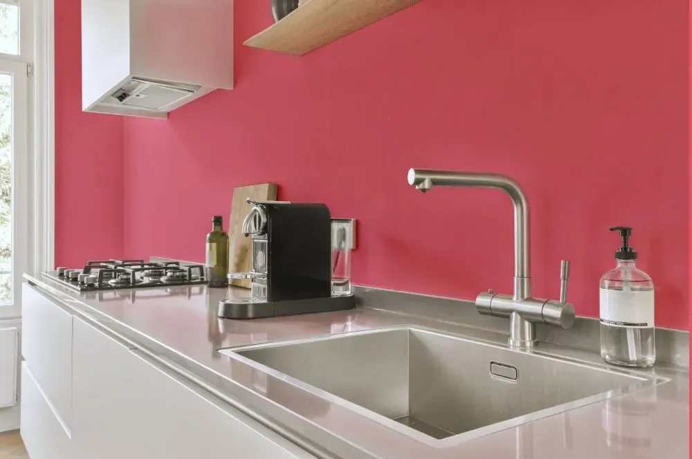
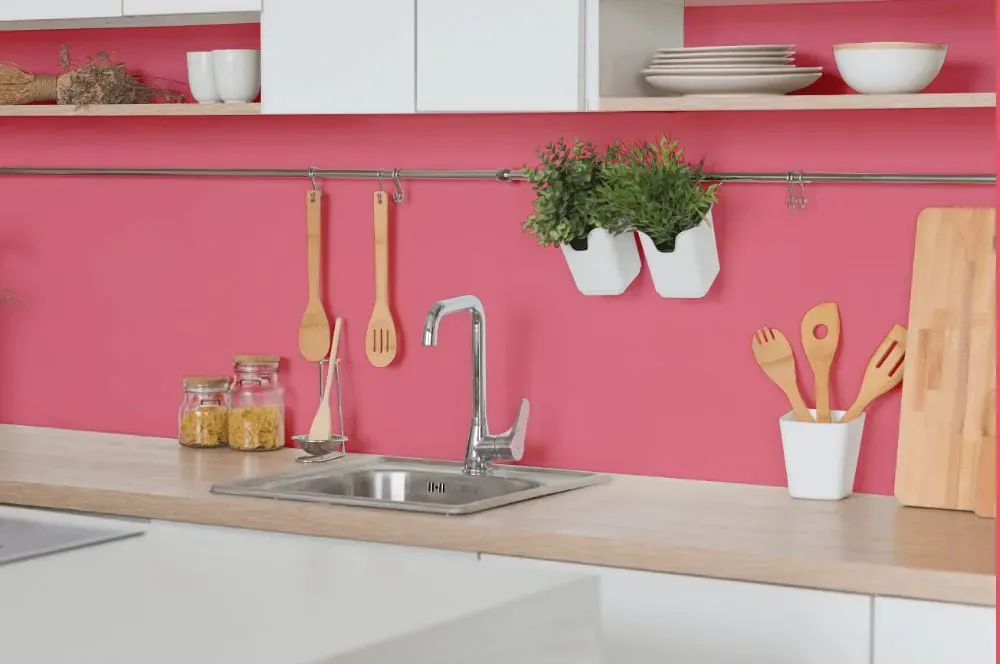
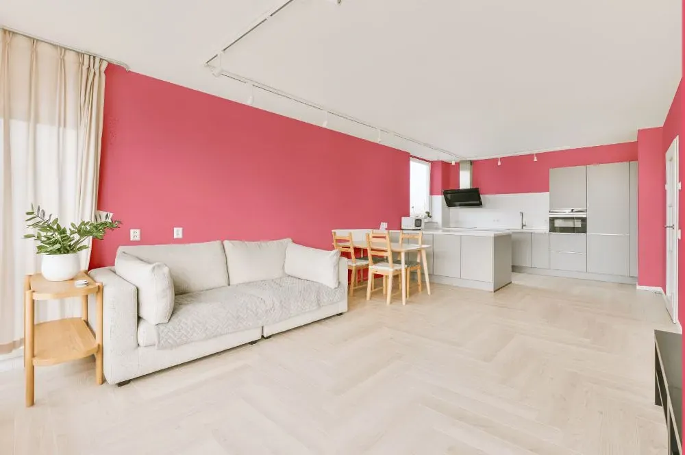
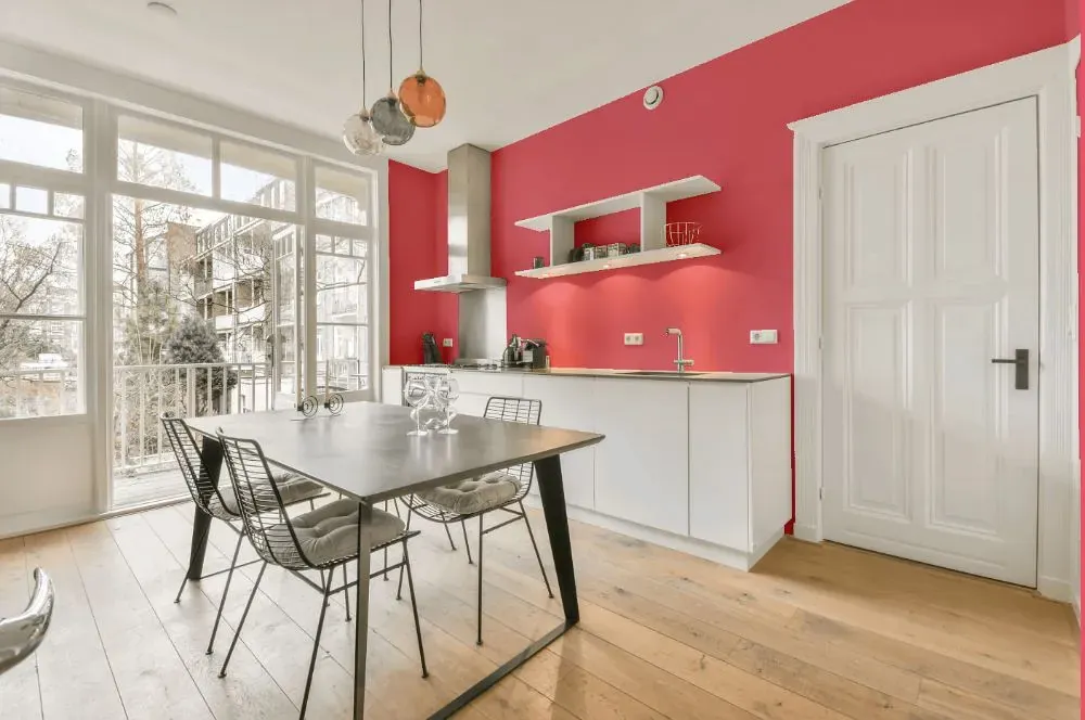
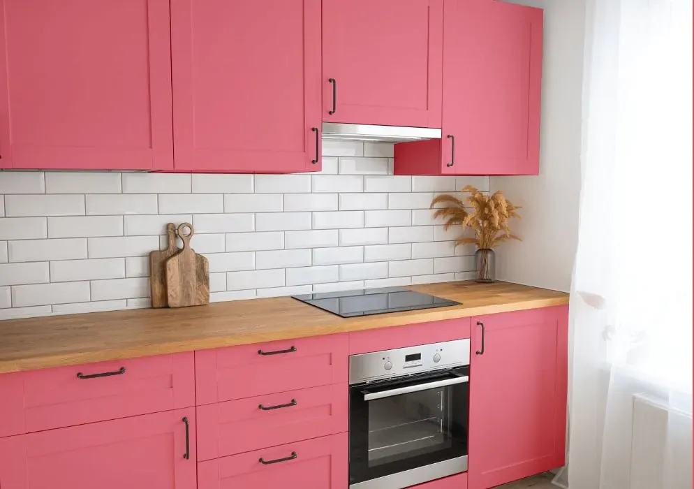
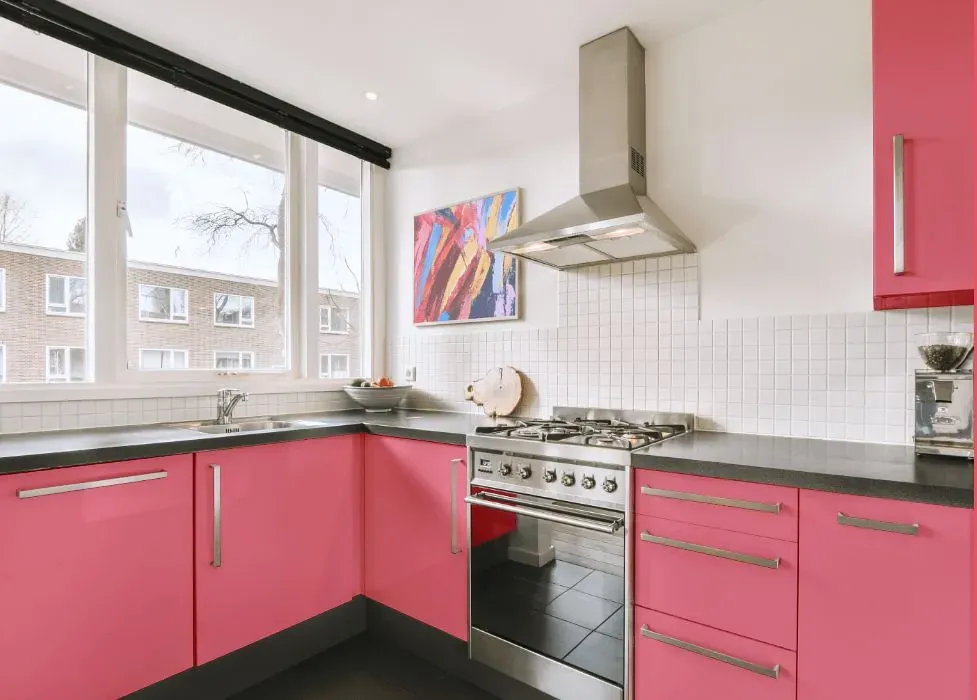
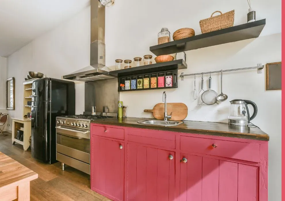
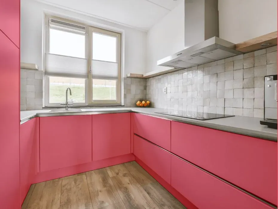
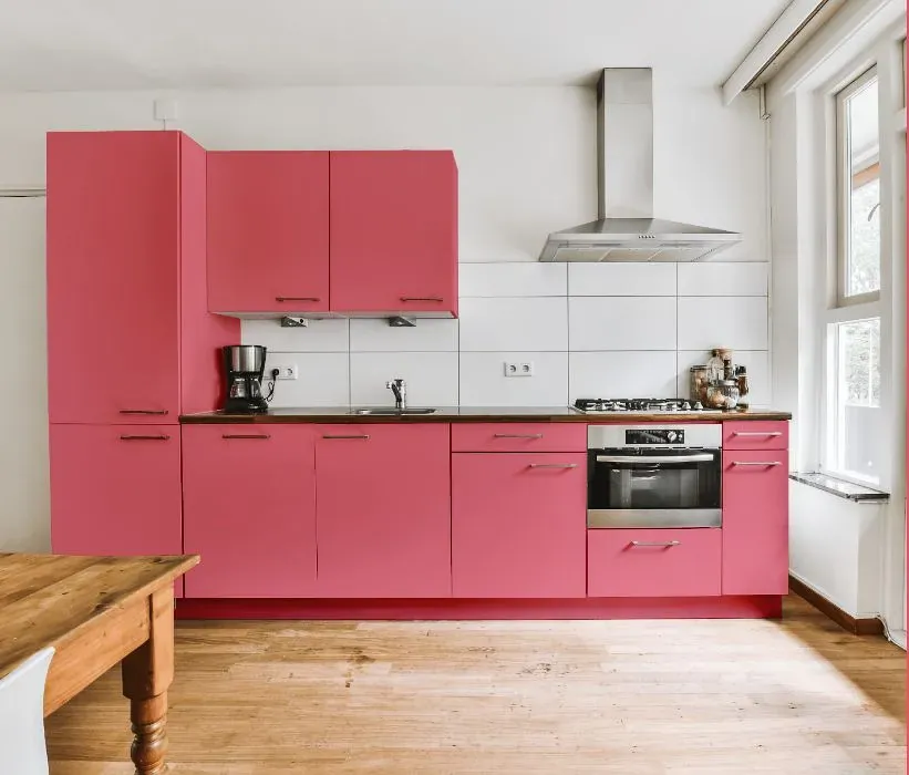
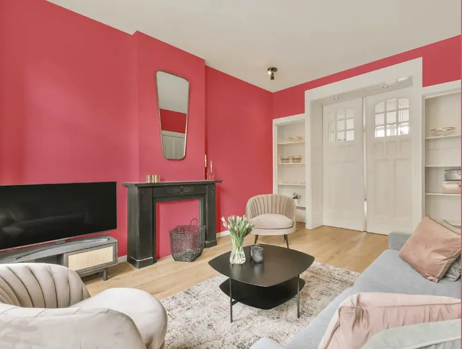
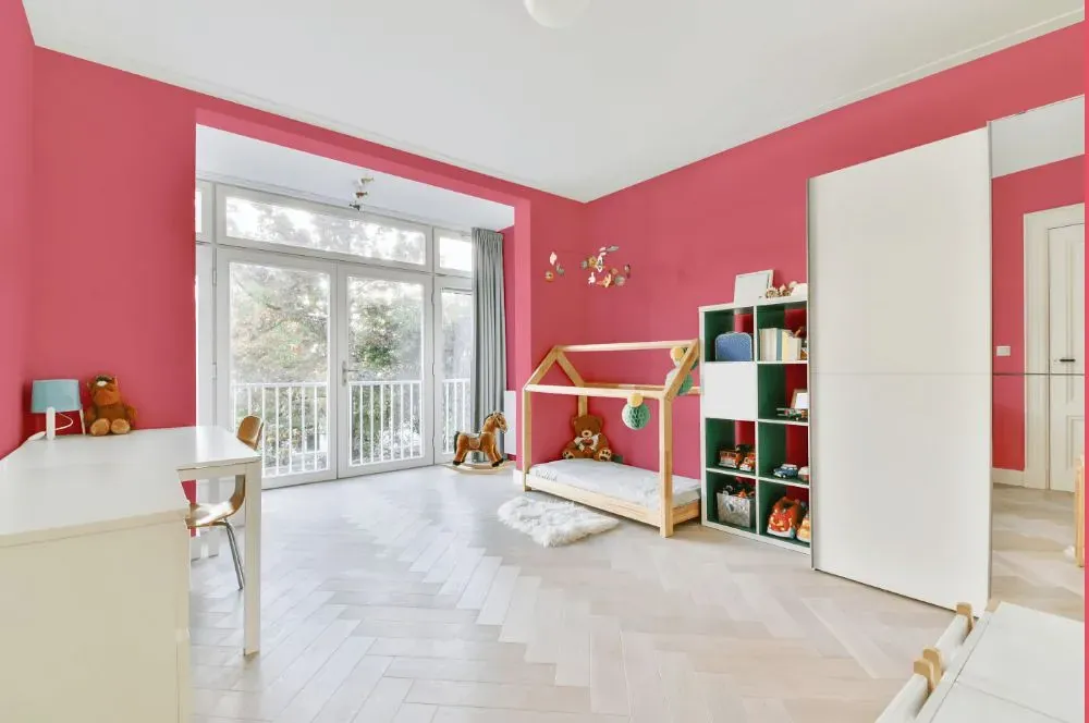
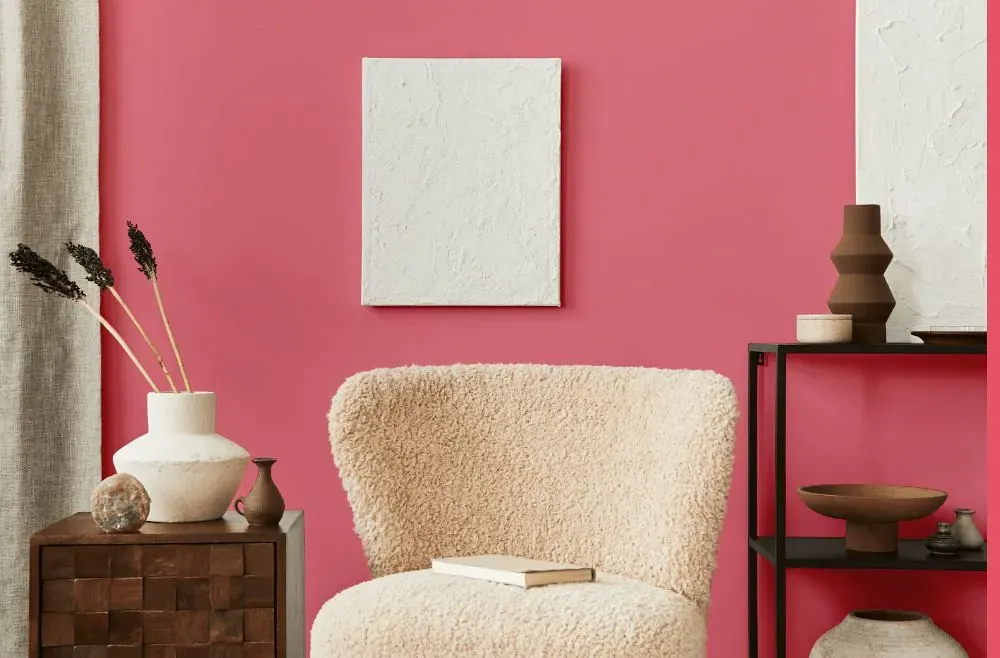
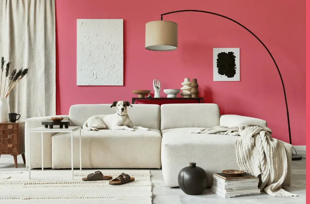
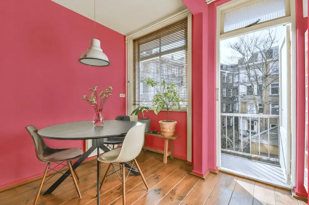
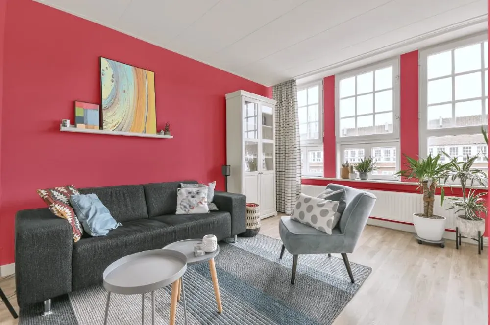
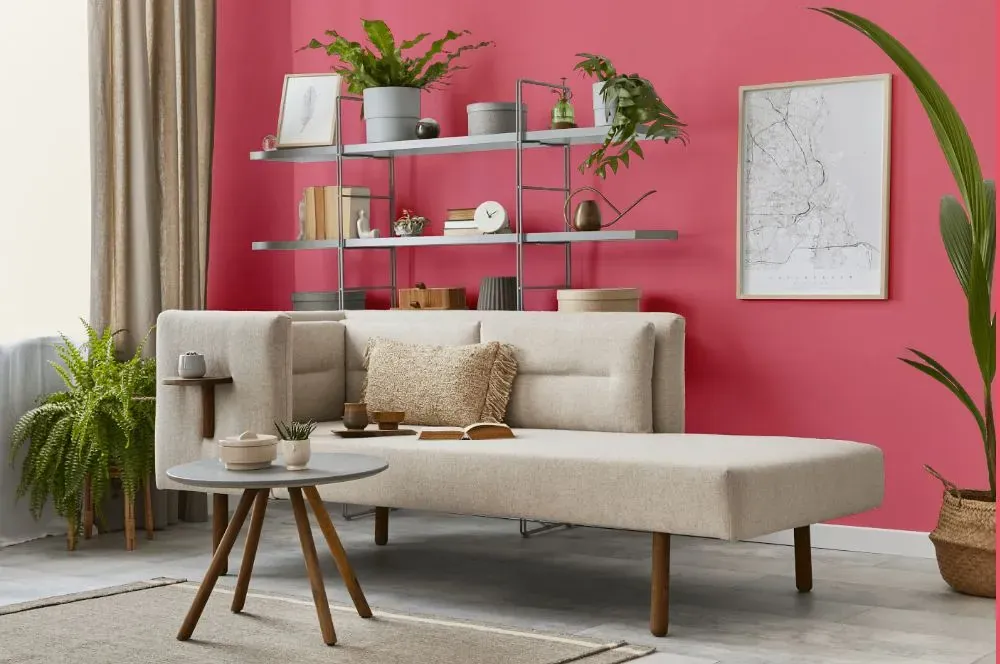
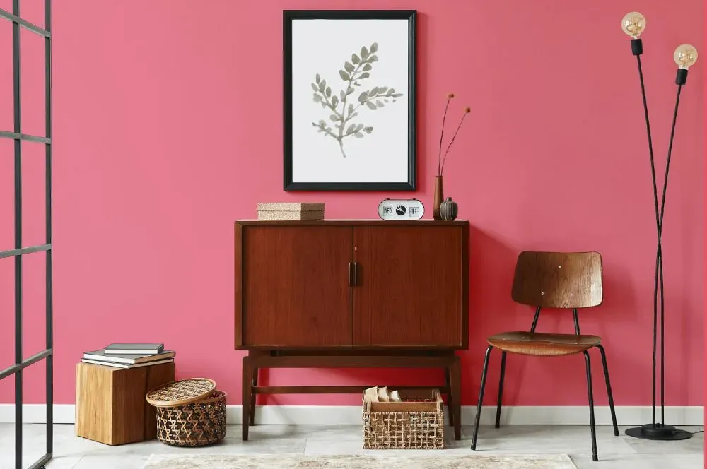
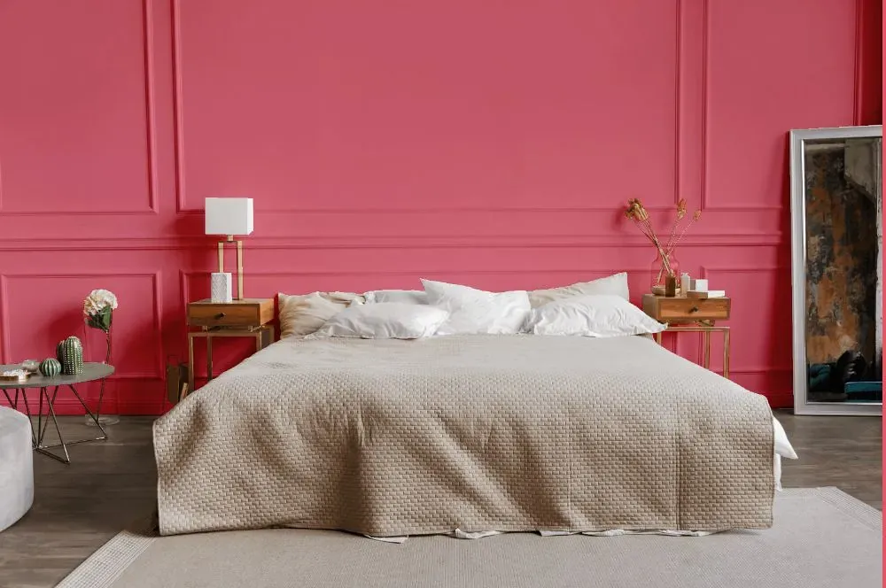
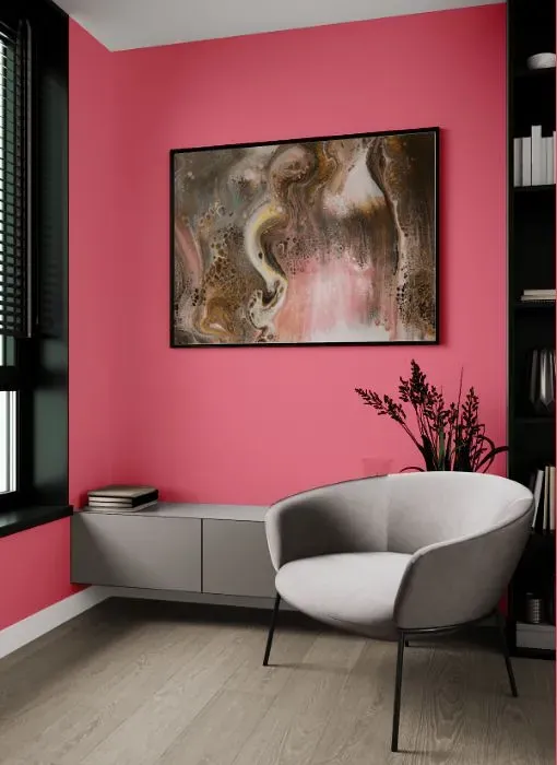
Energize your space with the playful charm of Benjamin Moore True Pink (2003-40). This vibrant hue adds a delightful touch to any room, especially in spaces where creativity flourishes, such as home offices, craft rooms, or children's play areas. True Pink infuses a sense of whimsy and joy, perfect for brightening up a dull corner or accent wall. Let your imagination soar with this lively shade that brings warmth and personality to your home décor palette. Embrace the spirit of True Pink for a space that radiates positivity and creativity.
Loading...
LRV of True Pink
True Pink has an LRV of 35.73% and refers to Medium colors that reflect a lot of light. Why LRV is important?

Light Reflectance Value measures the amount of visible and usable light that reflects from a painted surface.
Simply put, the higher the LRV of a paint color, the brighter the room you will get.
The scale goes from 0% (absolute black, absorbing all light) to 100% (pure white, reflecting all light).
Act like a pro: When choosing paint with an LRV of 35.73%, pay attention to your bulbs' brightness. Light brightness is measured in lumens. The lower the paint's LRV, the higher lumen level you need. Every square foot of room needs at least 40 lumens. That means for a 200 ft2 living room you'll need about 8000 lumens of light – e.g., eight 1000 lm bulbs.
Color codes
We have collected almost every possible color code you could ever need.
Not sure what the difference between HEX and RGB is? We break down color models in plain language. Understanding color models
| Format | Code |
|---|---|
| HEX | #ED7E8E |
| RGB Decimal | 237, 126, 142 |
| RGB Percent | 92.94%, 49.41%, 55.69% |
| HSV | Hue: 351° Saturation: 46.84% Value: 92.94% |
| HSL | hsl(351, 76, 71) |
| CMYK | Cyan: 0.0 Magenta: 46.84 Yellow: 40.08 Key: 7.06 |
| YIQ | Y: 161.013 I: 61.003 Q: 28.46 |
| XYZ | X: 47.27 Y: 34.884 Z: 29.828 |
| CIE Lab | L:65.658 a:44.171 b:10.897 |
| CIE Luv | L:65.658 u:75.663 v:6.268 |
| Decimal | 15564430 |
| Hunter Lab | 59.062, 39.503, 11.401 |