Benjamin Moore Venetian Rose 1292
Contentsshow +hide -
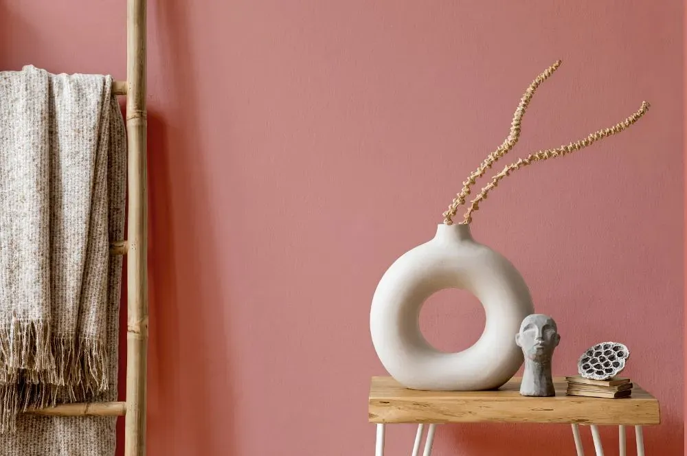
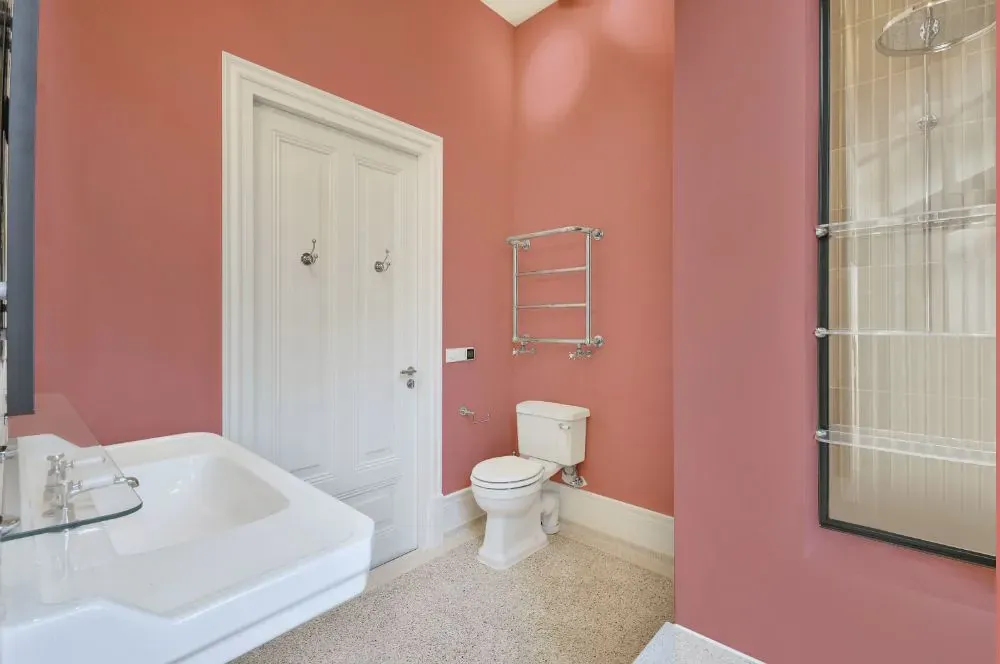
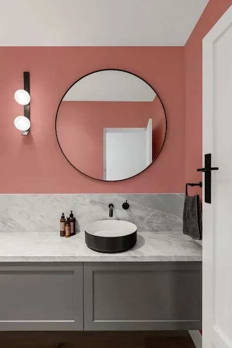
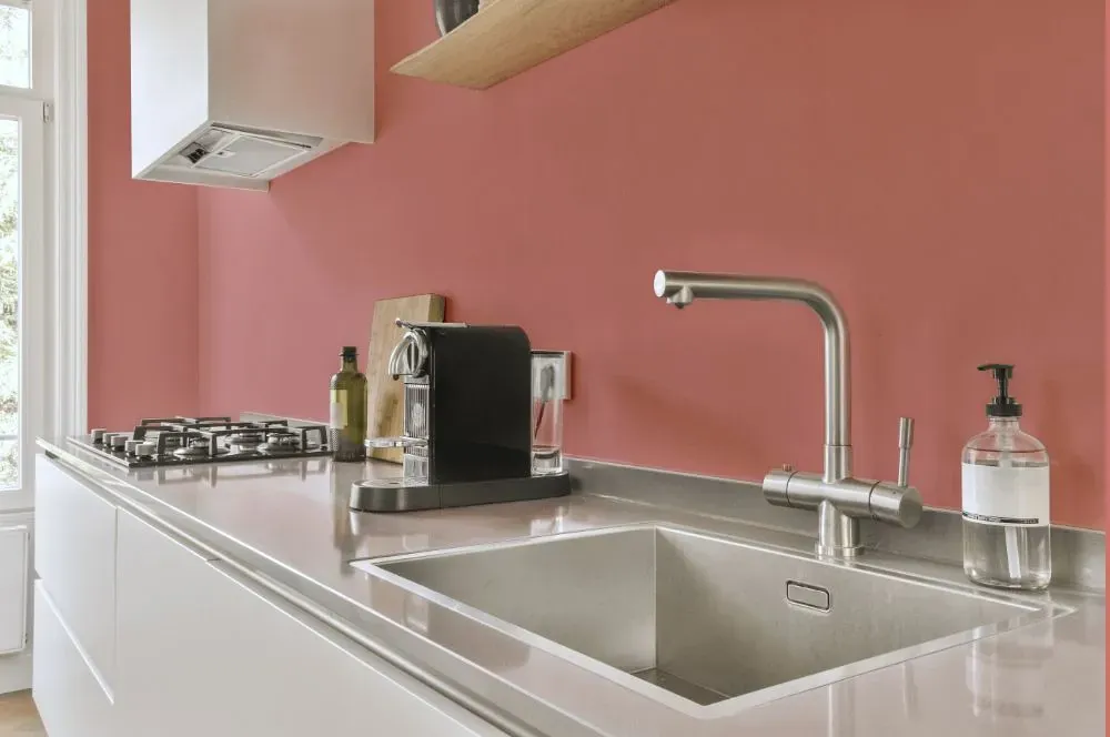
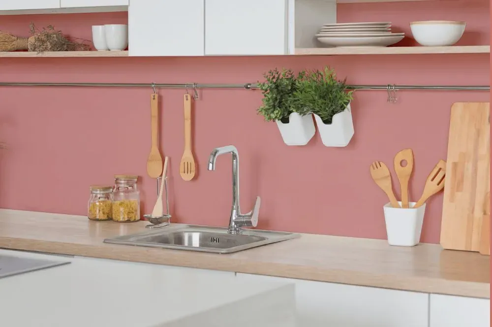
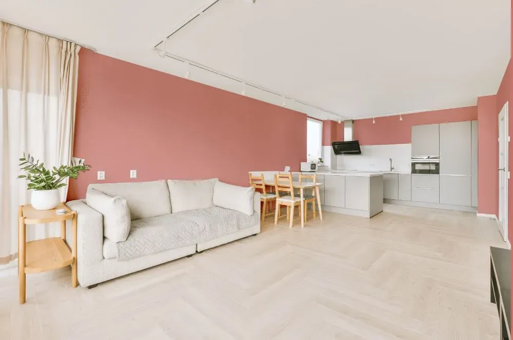
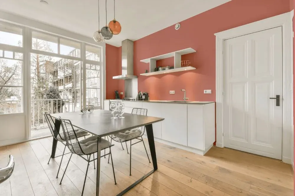
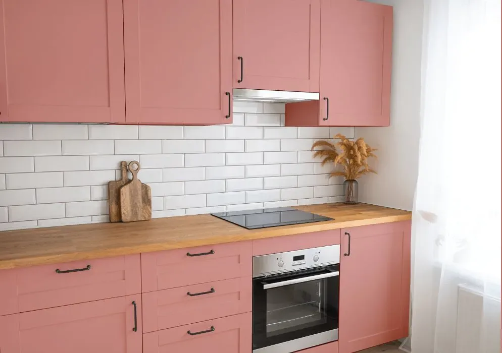
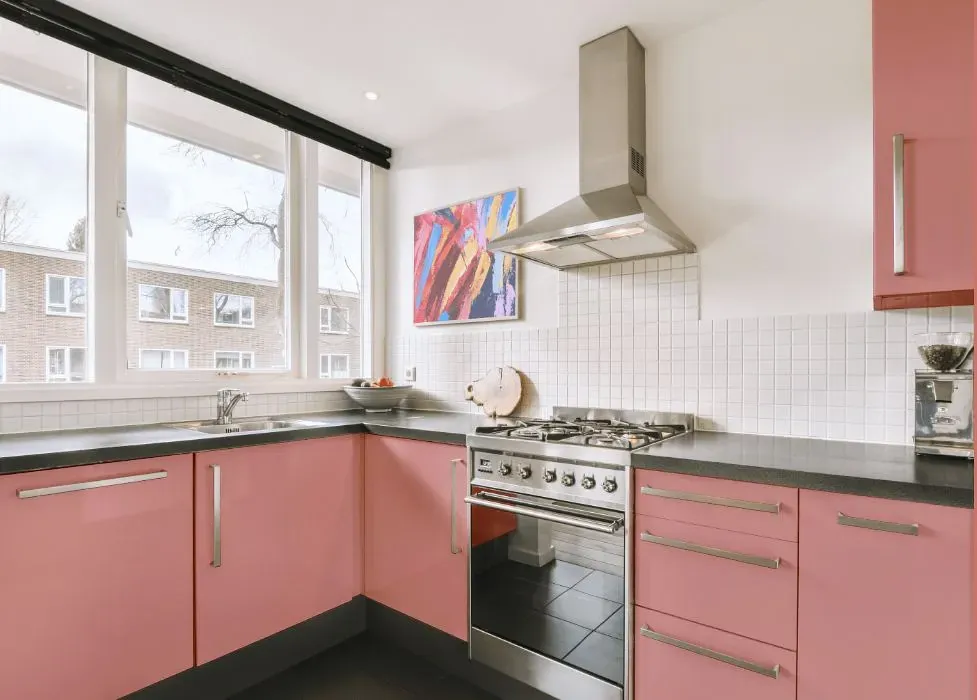
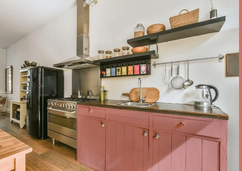
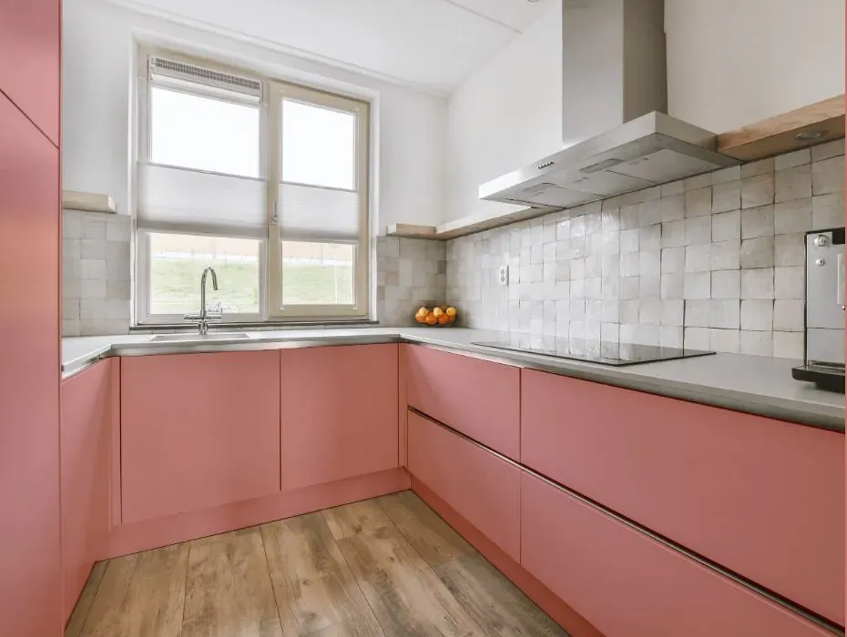
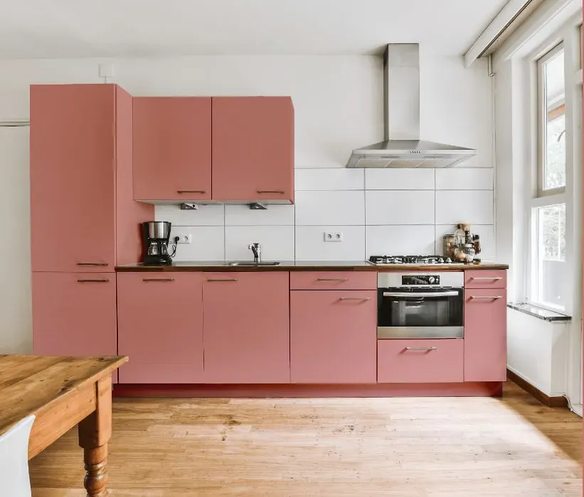
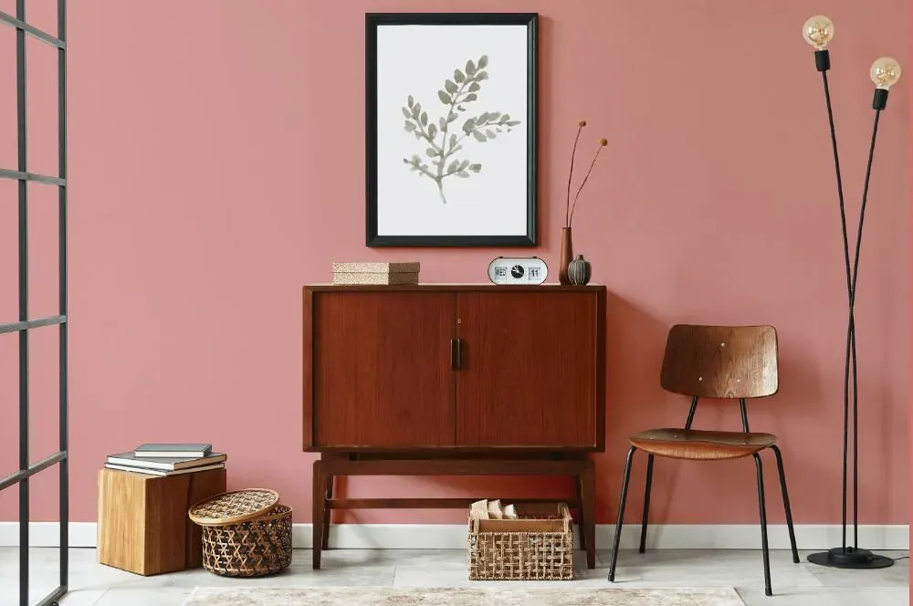
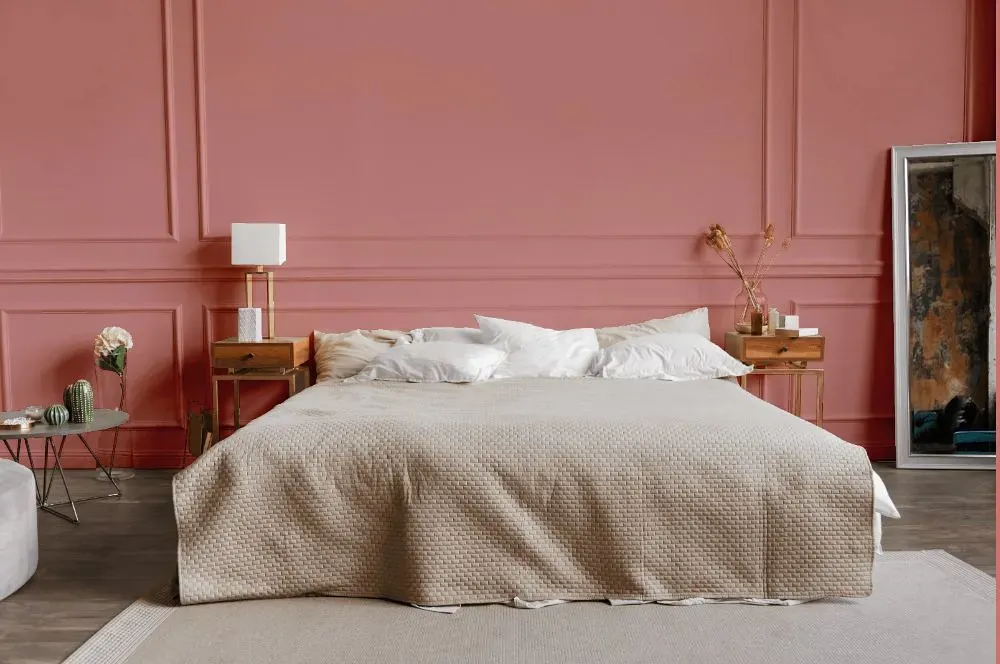
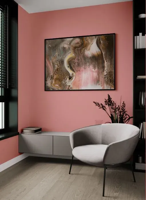
- Benjamin Moore Venetian Rose reviews (23 photos)
- What are Benjamin Moore Venetian Rose undertones?
- Is Venetian Rose 1292 cool or warm?
- How light temperature affects on Venetian Rose
- Monochromatic color scheme
- Complementary color scheme
- Color comparison and matching
- LRV of Venetian Rose 1292
- Color codes
- Color equivalents
| Official page: | Venetian Rose 1292 |
| Code: | 1292 |
| Name: | Venetian Rose |
| Brand: | Benjamin Moore |
What color is Benjamin Moore Venetian Rose?
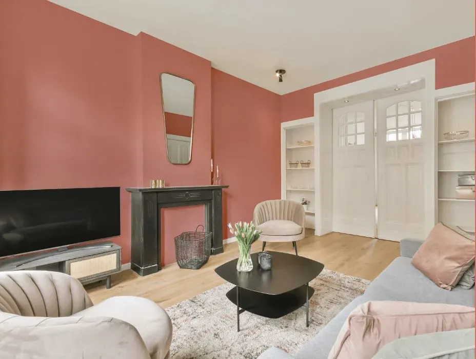
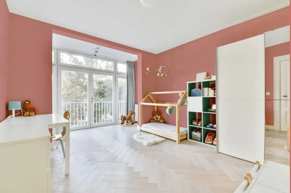
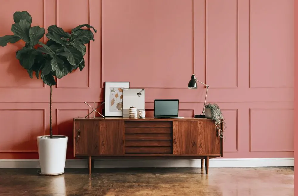
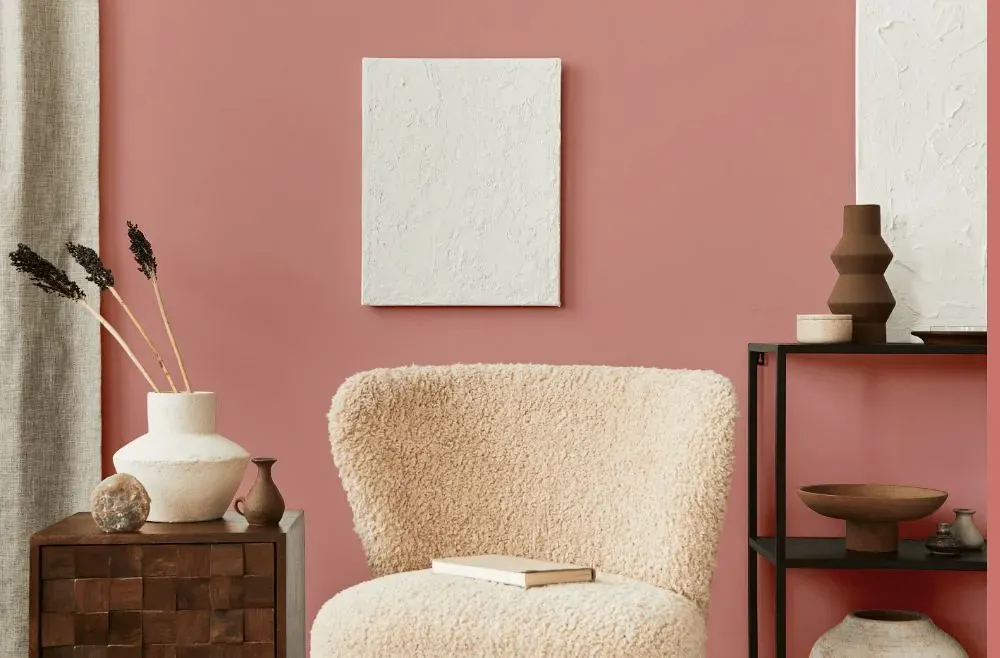
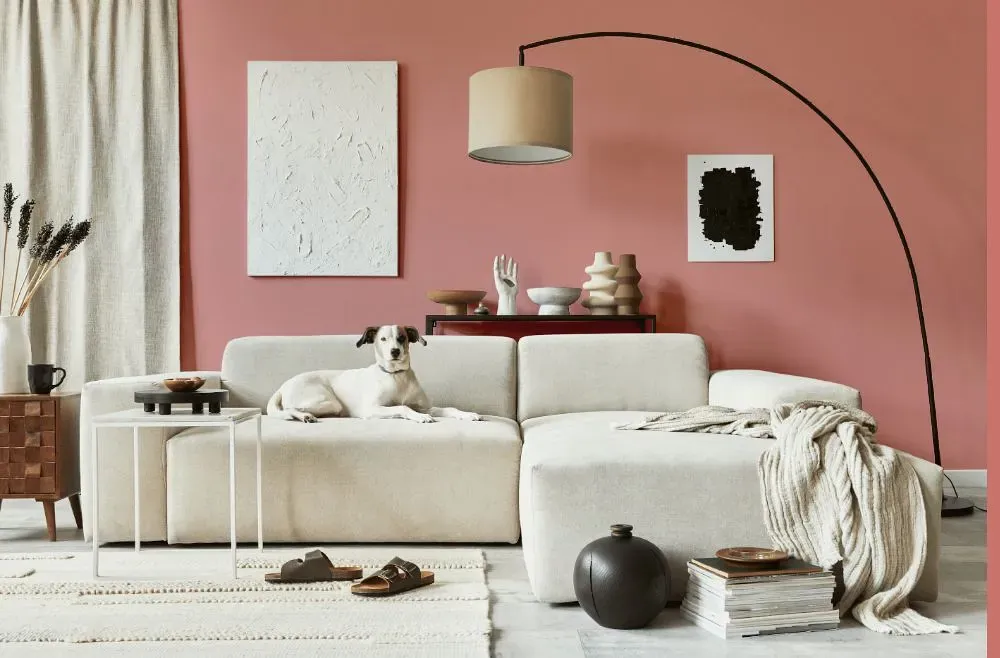
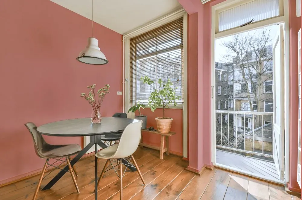
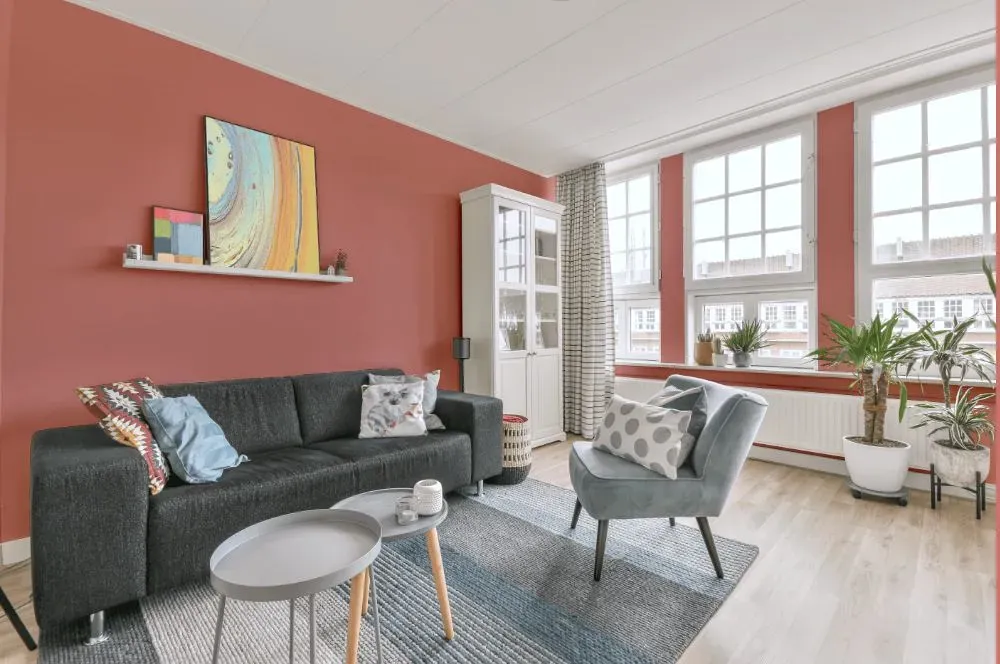
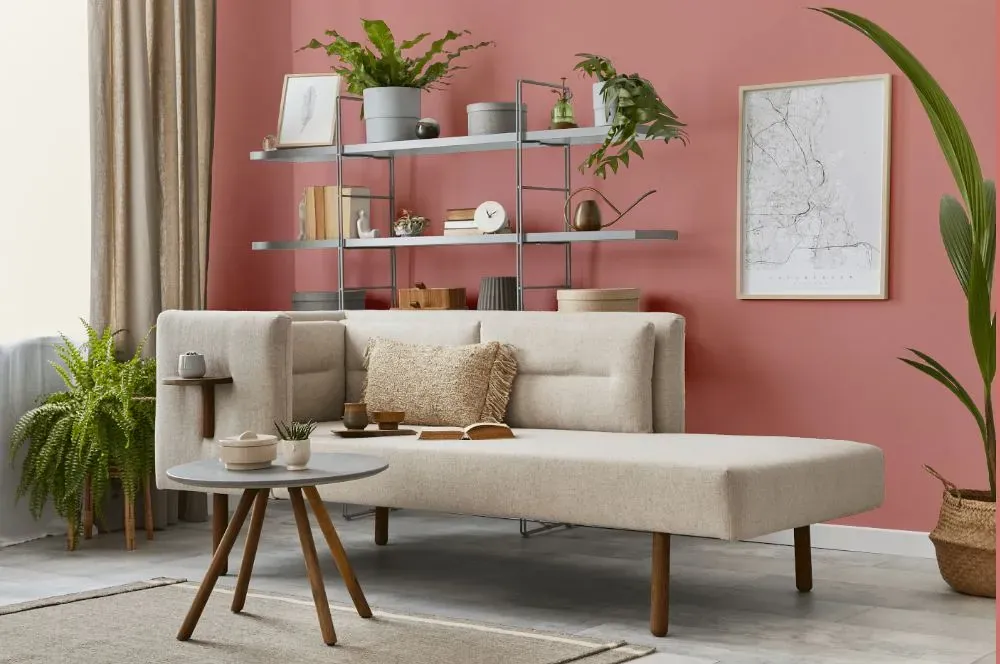
Benjamin Moore 1292 Venetian Rose exudes elegance and warmth, creating a sophisticated atmosphere within any space. This luscious color pairs beautifully with soft neutrals like Benjamin Moore OC-17 White Dove, creating a harmonious balance. For a more daring look, consider blending Venetian Rose with Benjamin Moore 2129-30 Nokia Blue for a striking contrast that adds depth and personality to the room. The rich tones of Venetian Rose can be complemented with metallic accents in gold or brass to elevate the overall luxurious feel of the space. With the versatility of this color, you can easily incorporate various textures and patterns to customize the ambiance to your desired aesthetic.
Loading...
LRV of Venetian Rose
Venetian Rose has an LRV of 39.98% and refers to Medium colors that reflect a lot of light. Why LRV is important?

Light Reflectance Value measures the amount of visible and usable light that reflects from a painted surface.
Simply put, the higher the LRV of a paint color, the brighter the room you will get.
The scale goes from 0% (absolute black, absorbing all light) to 100% (pure white, reflecting all light).
Act like a pro: When choosing paint with an LRV of 39.98%, pay attention to your bulbs' brightness. Light brightness is measured in lumens. The lower the paint's LRV, the higher lumen level you need. Every square foot of room needs at least 40 lumens. That means for a 200 ft2 living room you'll need about 8000 lumens of light – e.g., eight 1000 lm bulbs.
Color codes
We have collected almost every possible color code you could ever need.
Not sure what the difference between HEX and RGB is? We break down color models in plain language. Understanding color models
| Format | Code |
|---|---|
| HEX | #D99A94 |
| RGB Decimal | 217, 154, 148 |
| RGB Percent | 85.10%, 60.39%, 58.04% |
| HSV | Hue: 5° Saturation: 31.8% Value: 85.1% |
| HSL | hsl(5, 48, 72) |
| CMYK | Cyan: 0.0 Magenta: 29.03 Yellow: 31.8 Key: 14.9 |
| YIQ | Y: 172.153 I: 39.47 Q: 11.46 |
| XYZ | X: 45.517 Y: 40.004 Z: 33.333 |
| CIE Lab | L:69.472 a:22.77 b:12.573 |
| CIE Luv | L:69.472 u:41.868 v:13.149 |
| Decimal | 14260884 |
| Hunter Lab | 63.249, 17.773, 13.027 |