Benjamin Moore Walnut CW-240
Contentsshow +hide -
| Official page: | Walnut CW-240 |
| Code: | CW-240 |
| Name: | Walnut |
| Brand: | Benjamin Moore |
What color is Benjamin Moore Walnut?
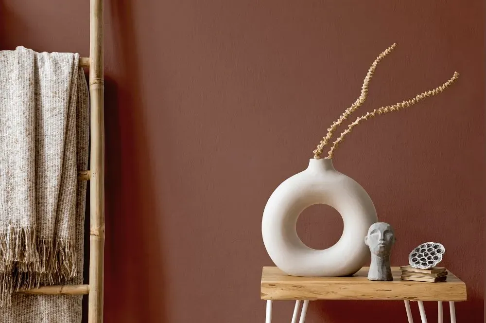
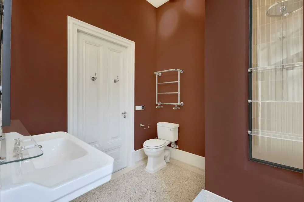
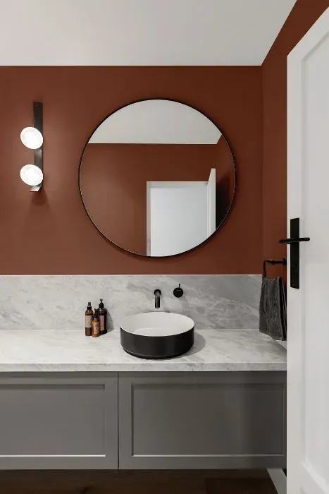
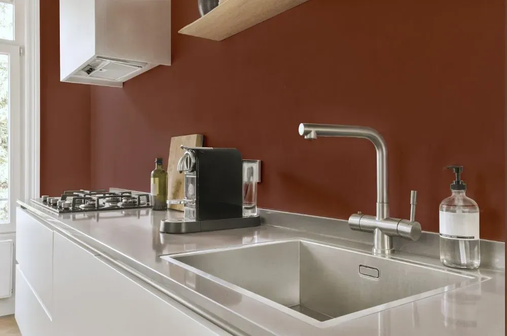
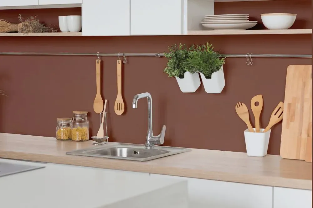
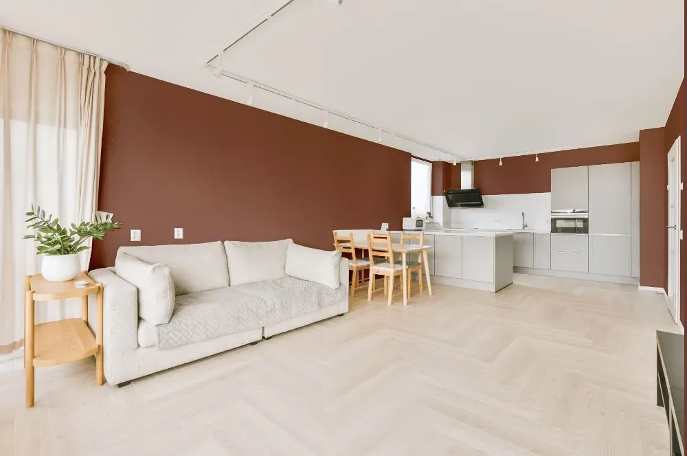
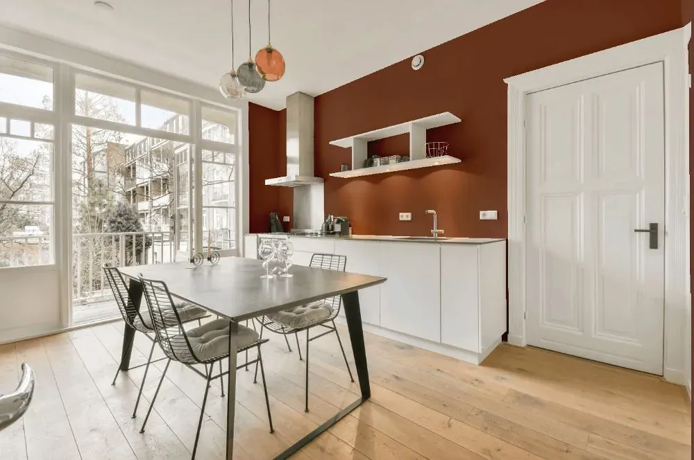
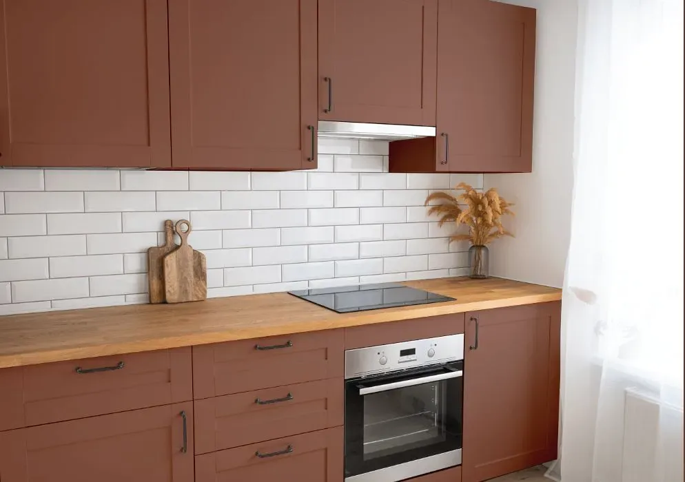
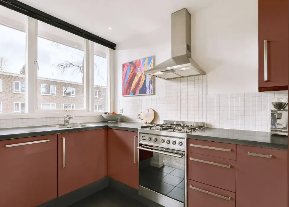
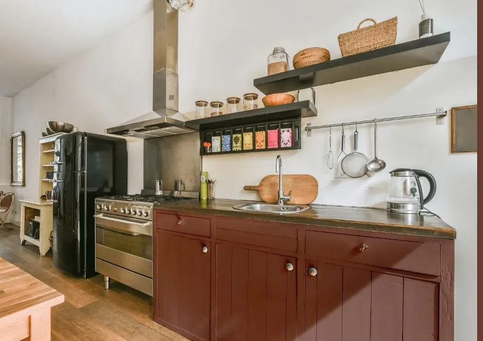
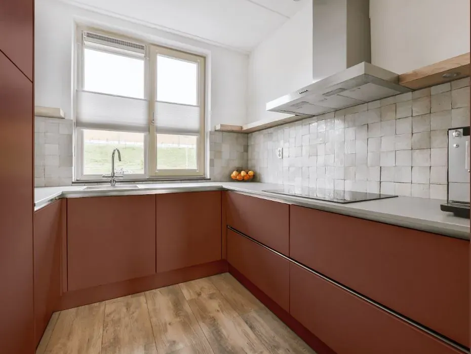
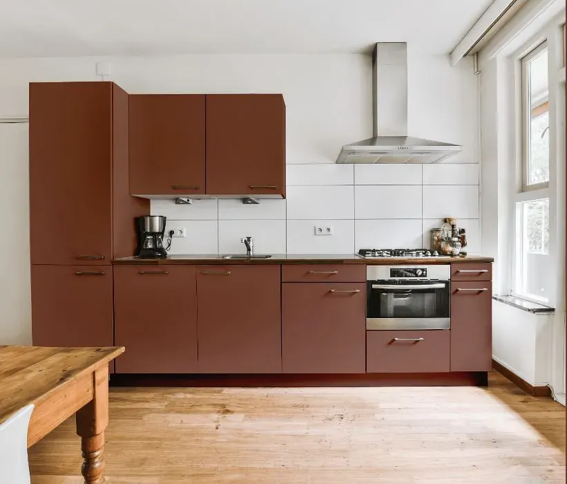
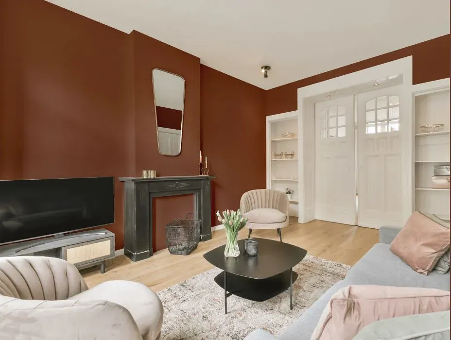
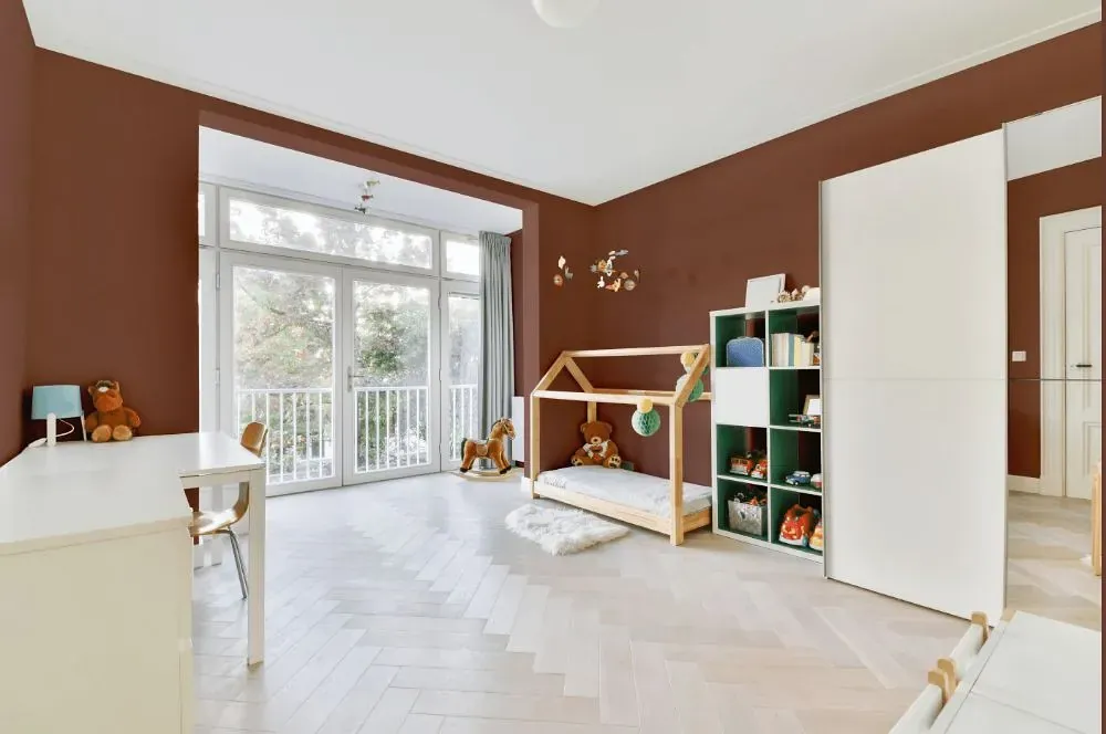
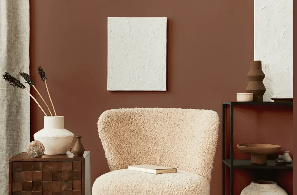
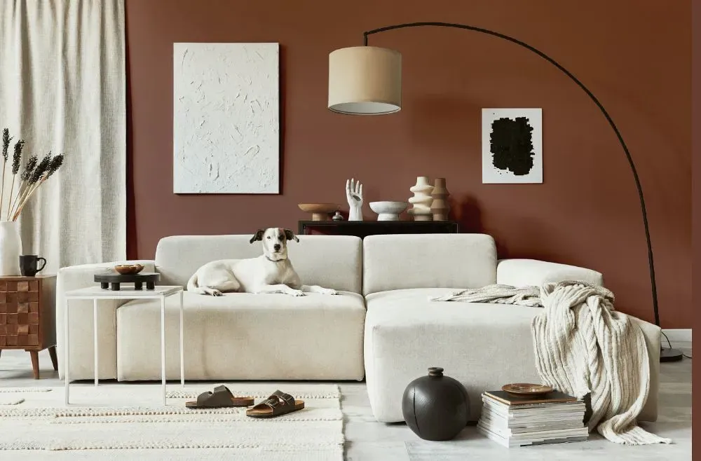
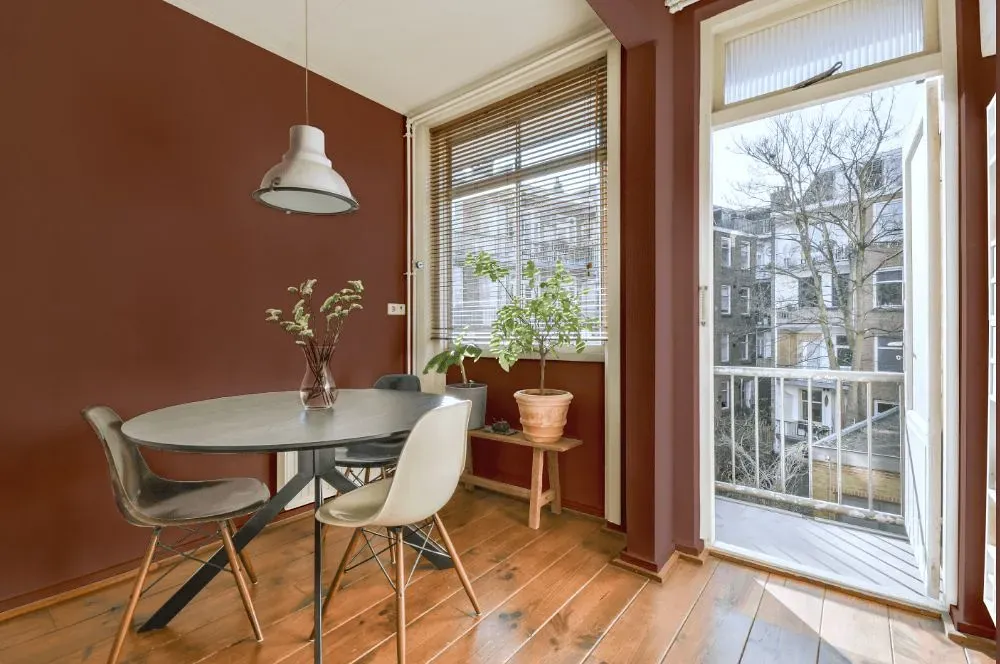
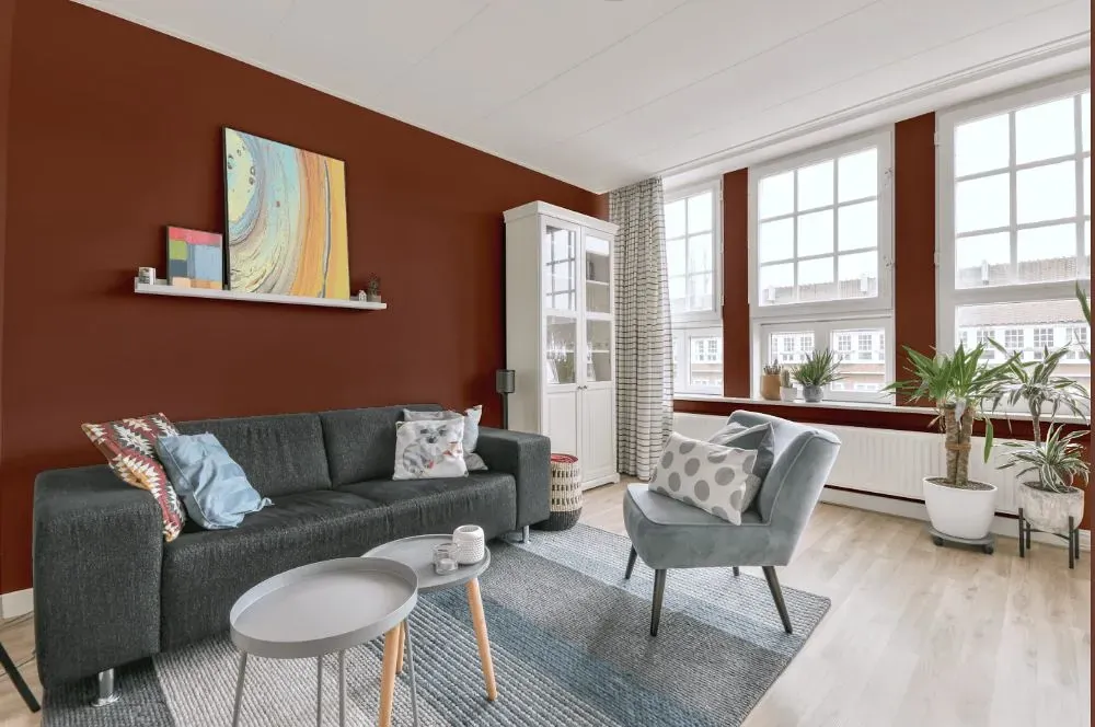
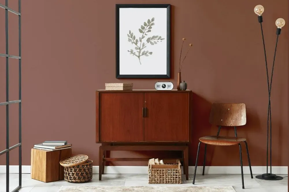
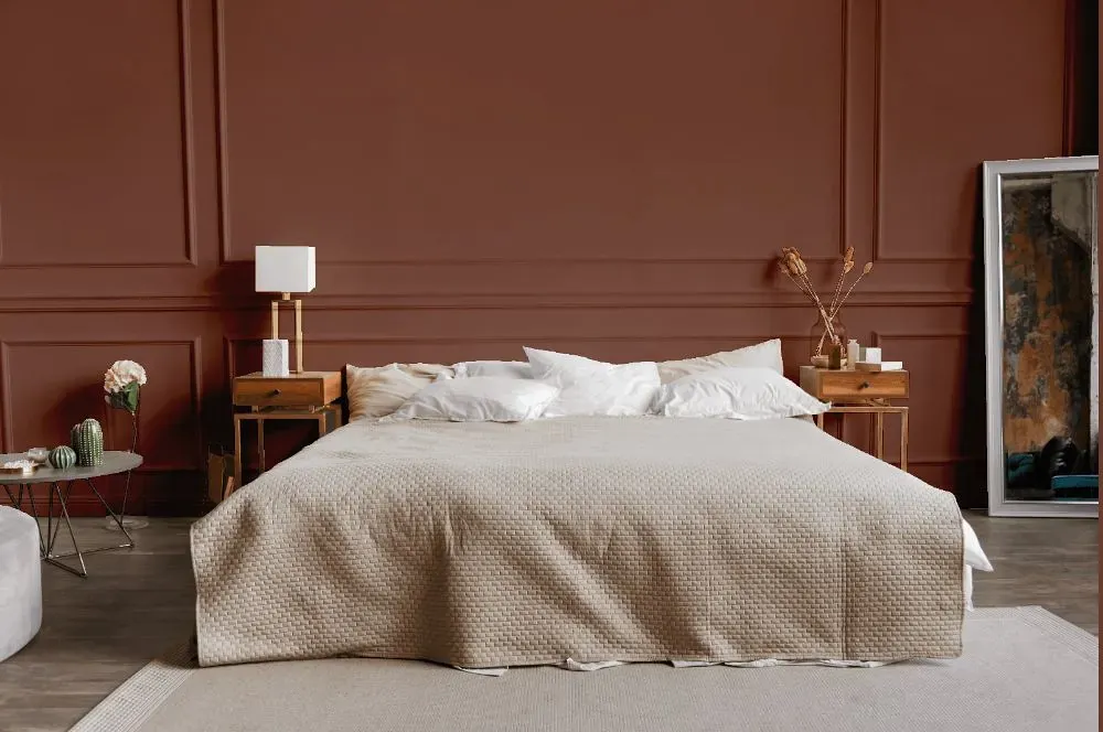
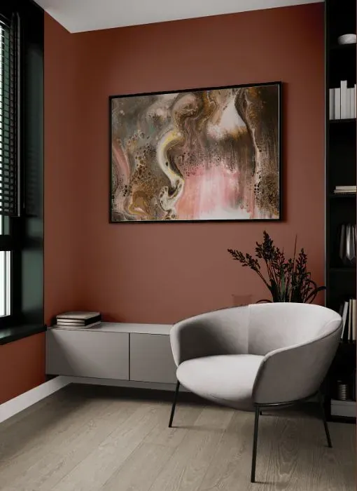
With Benjamin Moore's rich and luxurious Walnut (CW-240), your space is instantly elevated to new heights of sophistication. This deep and earthy tone exudes warmth and invites a sense of calm and serenity. Perfect for living rooms, bedrooms, or home offices, Walnut adds a touch of elegance and coziness to any room. Pair it with soft neutrals or metallic accents for a modern and timeless look that is sure to impress. Let the timeless beauty of Walnut transform your space into a sanctuary of style and comfort.
Loading...
LRV of Walnut
Walnut has an LRV of 17.55% and refers to Medium Dark which means that this color reflects very little light. Why LRV is important?

Light Reflectance Value measures the amount of visible and usable light that reflects from a painted surface.
Simply put, the higher the LRV of a paint color, the brighter the room you will get.
The scale goes from 0% (absolute black, absorbing all light) to 100% (pure white, reflecting all light).
Act like a pro: When choosing paint with an LRV of 17.55%, pay attention to your bulbs' brightness. Light brightness is measured in lumens. The lower the paint's LRV, the higher lumen level you need. Every square foot of room needs at least 40 lumens. That means for a 200 ft2 living room you'll need about 8000 lumens of light – e.g., eight 1000 lm bulbs.
Color codes
We have collected almost every possible color code you could ever need.
Not sure what the difference between HEX and RGB is? We break down color models in plain language. Understanding color models
| Format | Code |
|---|---|
| HEX | #906558 |
| RGB Decimal | 144, 101, 88 |
| RGB Percent | 56.47%, 39.61%, 34.51% |
| HSV | Hue: 14° Saturation: 38.89% Value: 56.47% |
| HSL | hsl(14, 24, 45) |
| CMYK | Cyan: 0.0 Magenta: 29.86 Yellow: 38.89 Key: 43.53 |
| YIQ | Y: 112.375 I: 29.801 Q: 5.05 |
| XYZ | X: 17.917 Y: 15.942 Z: 11.363 |
| CIE Lab | L:46.899 a:15.575 b:14.284 |
| CIE Luv | L:46.899 u:29.462 v:14.928 |
| Decimal | 9463128 |
| Hunter Lab | 39.928, 10.226, 11.076 |