Benjamin Moore Yours Truly 1317
Contentsshow +hide -
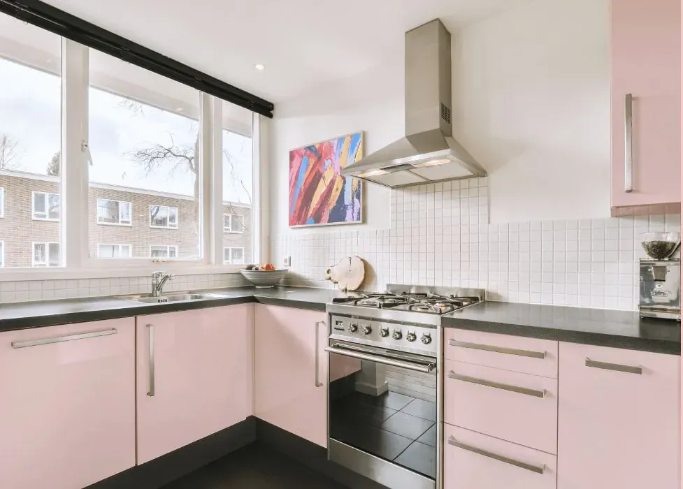
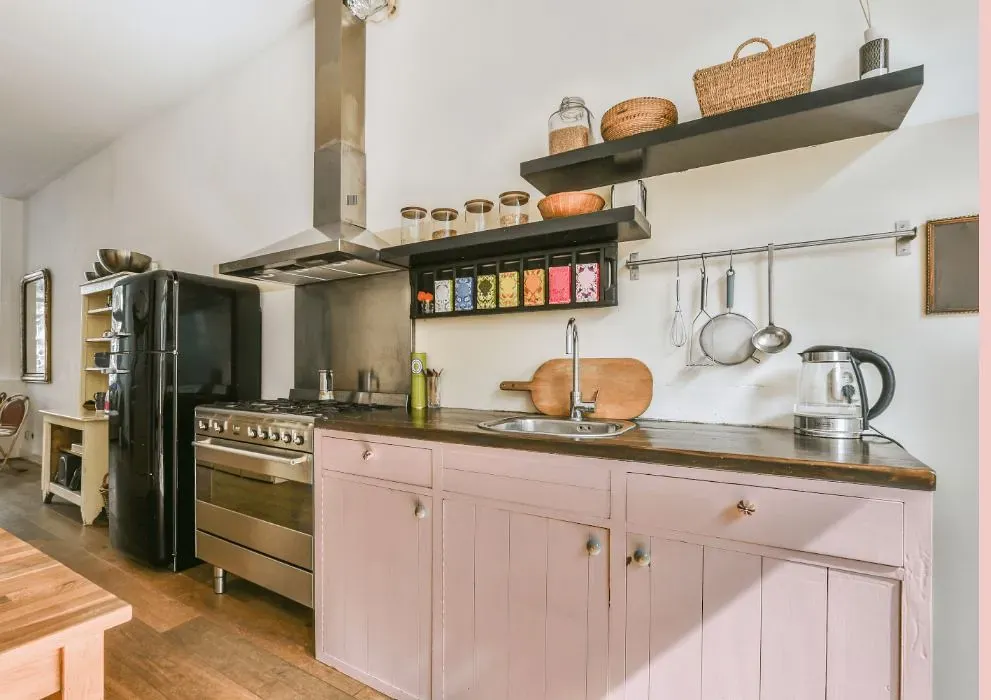
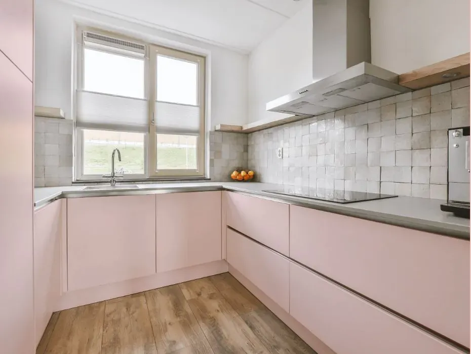
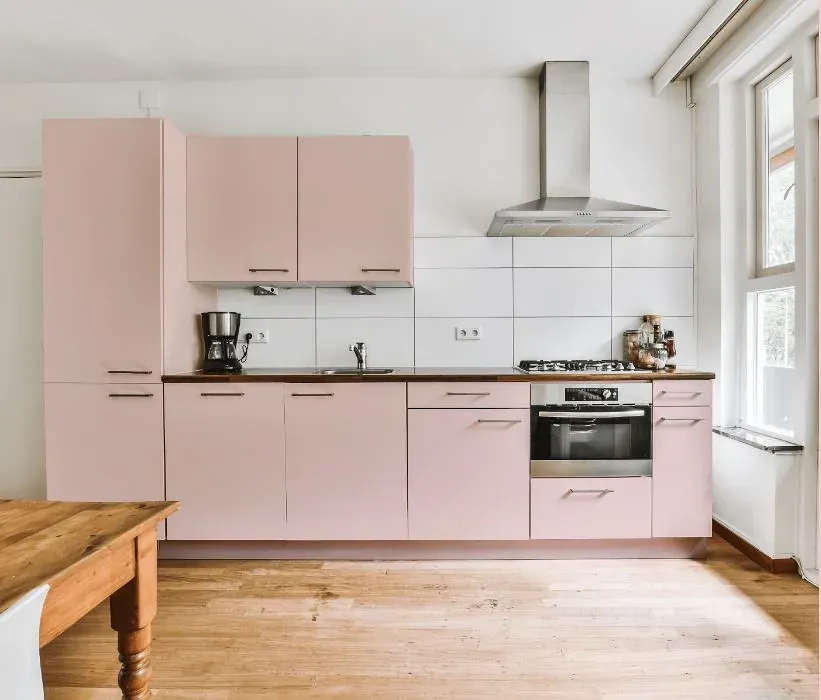
- Benjamin Moore Yours Truly reviews (23 photos)
- What are Benjamin Moore Yours Truly undertones?
- Is Yours Truly 1317 cool or warm?
- How light temperature affects on Yours Truly
- Monochromatic color scheme
- Complementary color scheme
- Color comparison and matching
- LRV of Yours Truly 1317
- Color codes
- Color equivalents
| Official page: | Yours Truly 1317 |
| Code: | 1317 |
| Name: | Yours Truly |
| Brand: | Benjamin Moore |
What color is Benjamin Moore Yours Truly?
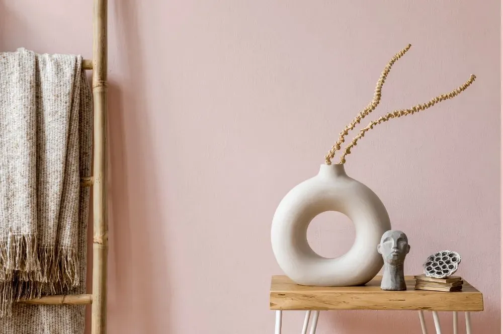
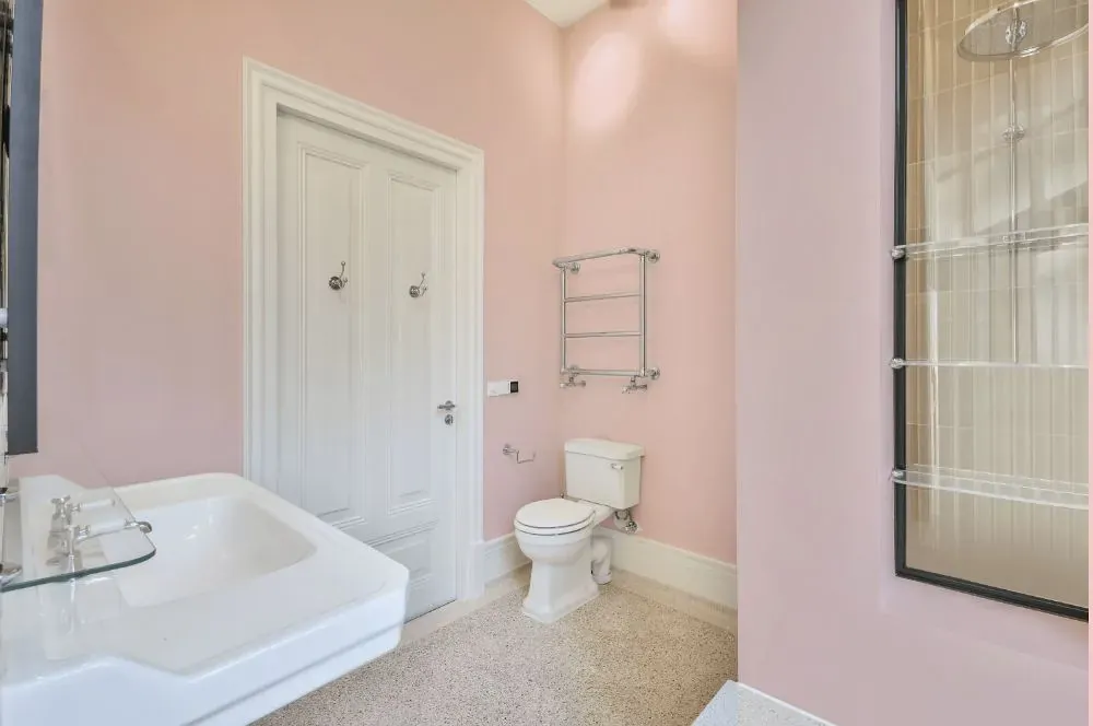
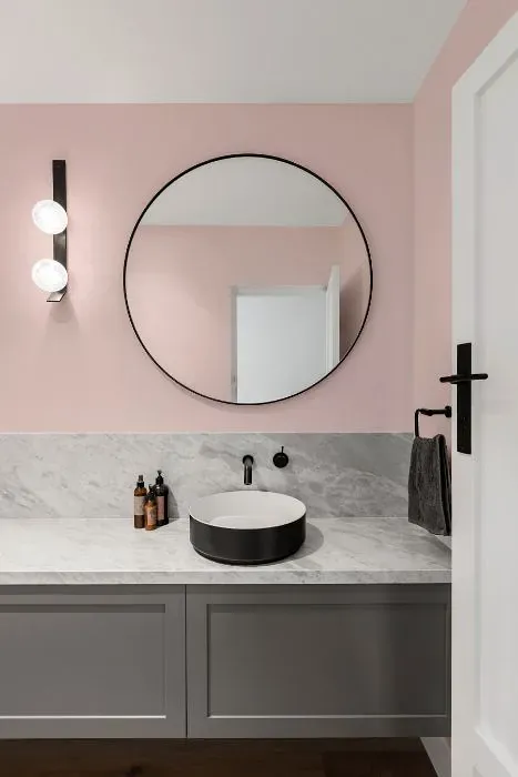
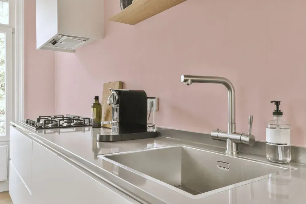
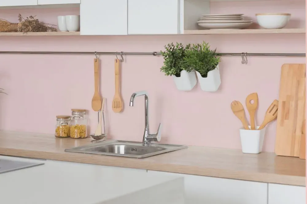
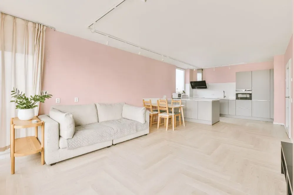
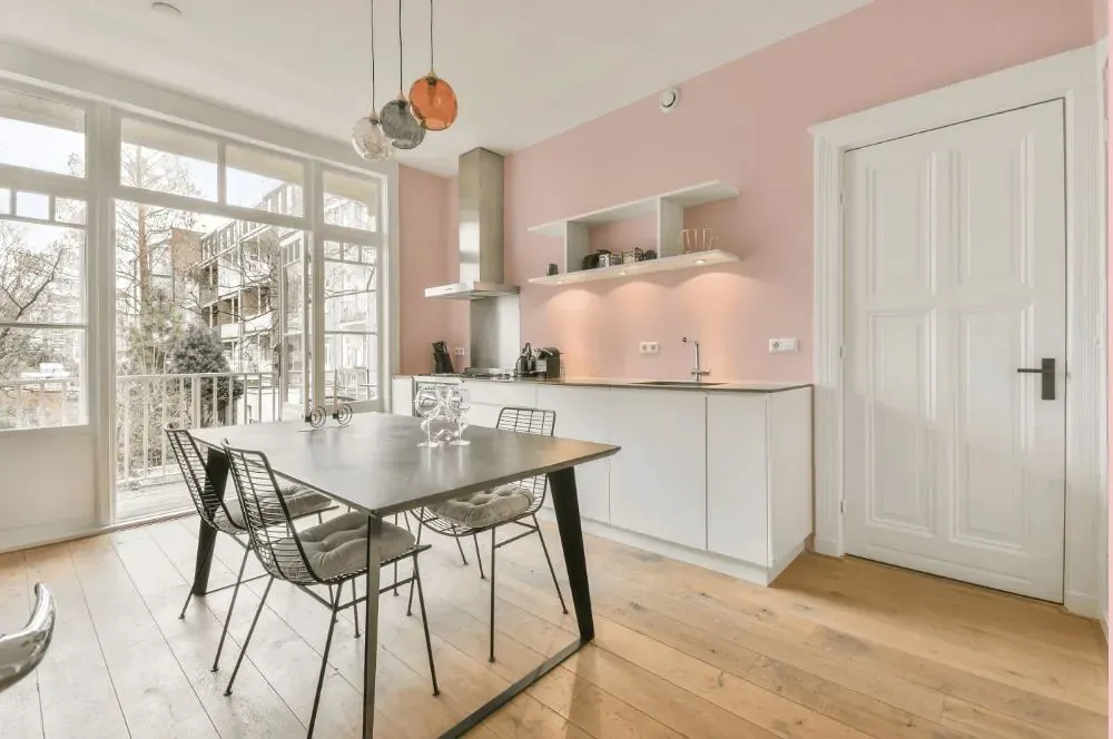
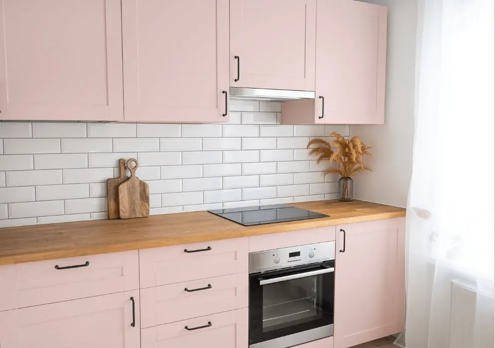
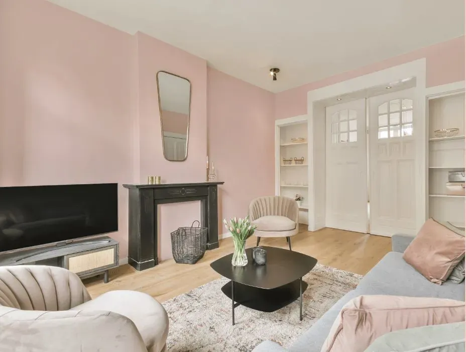
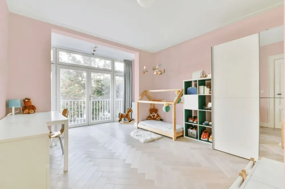
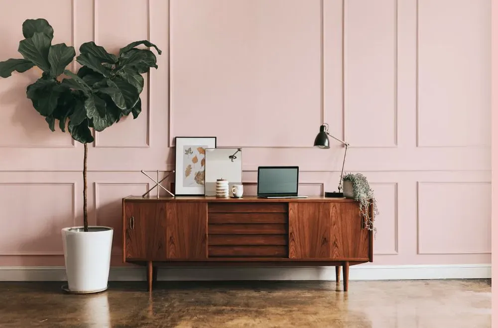
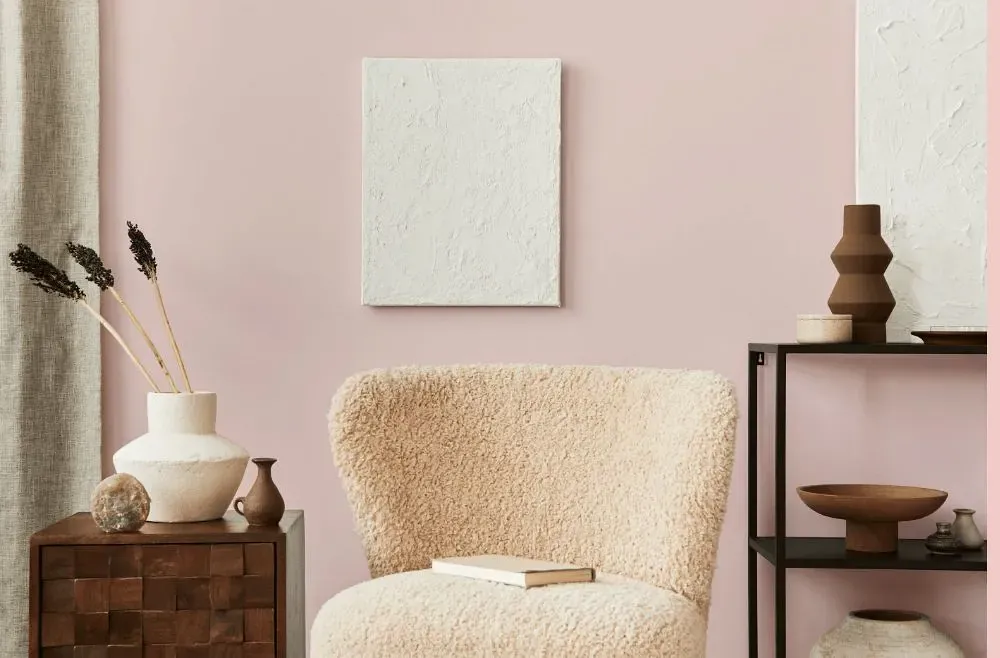
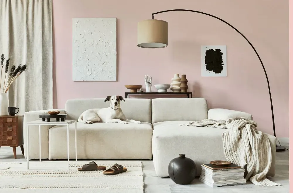
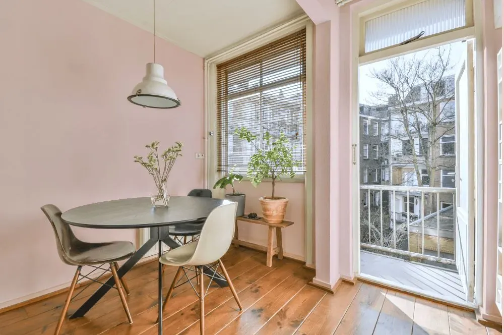
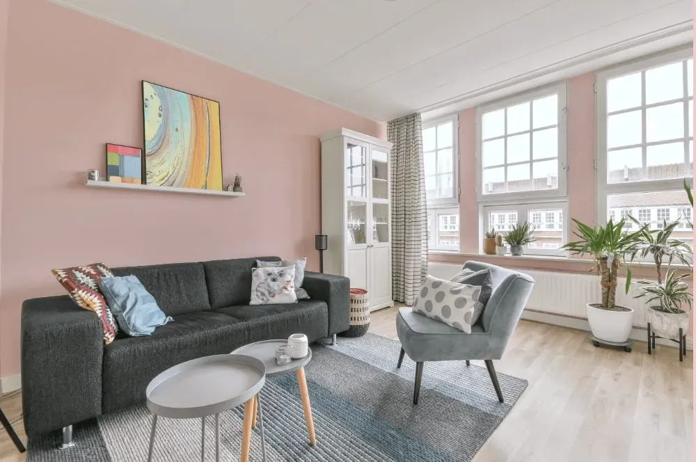
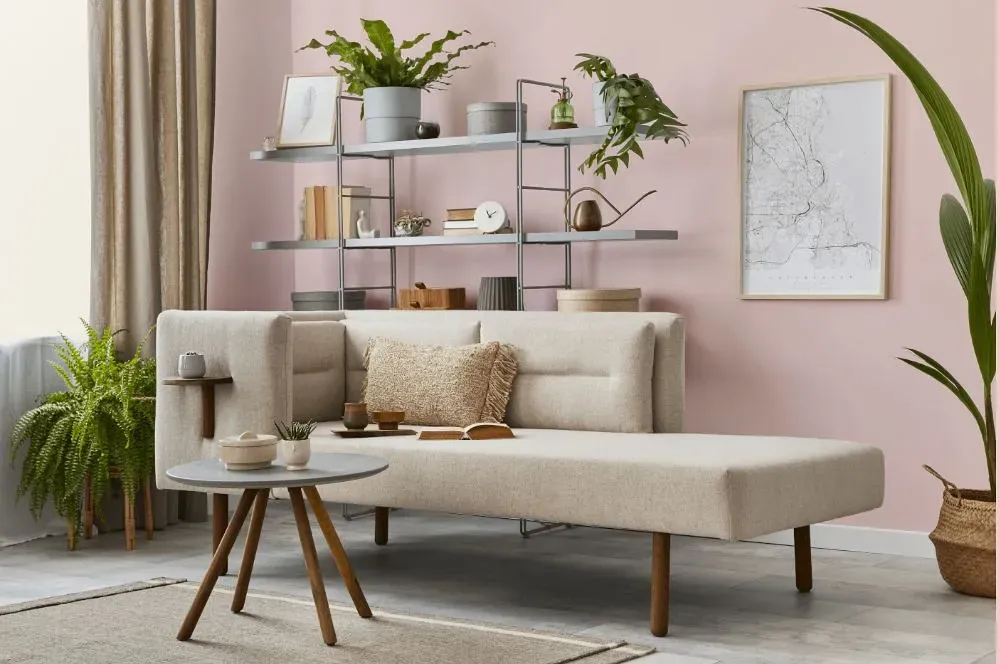
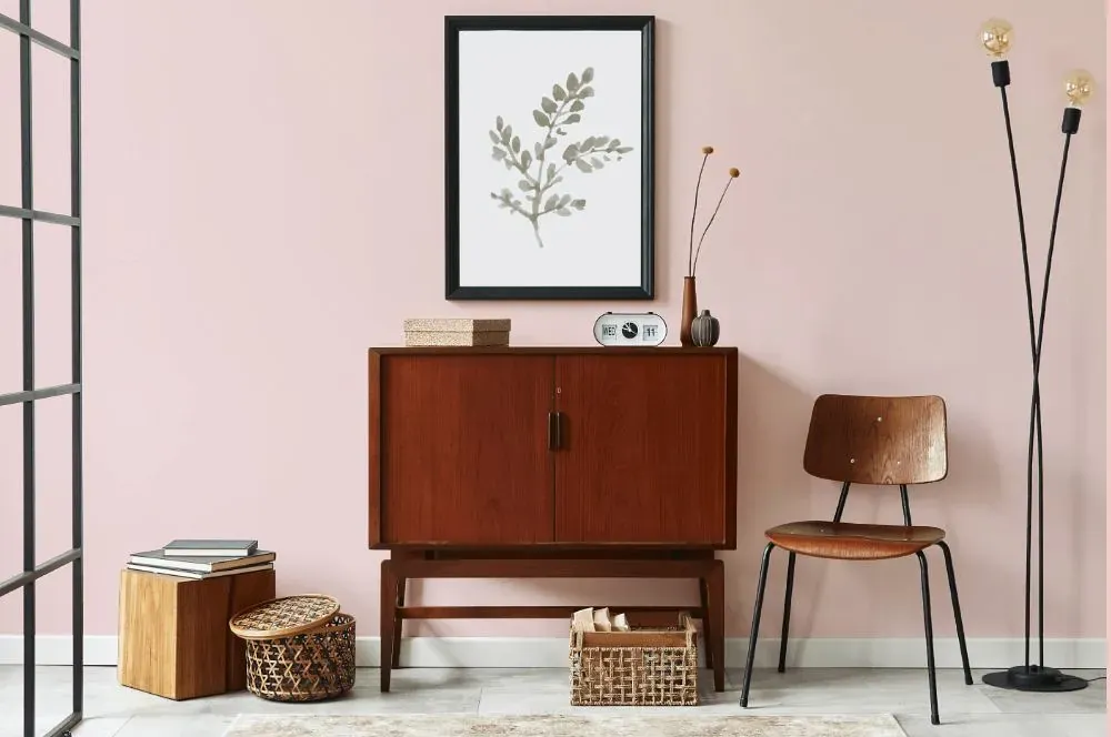
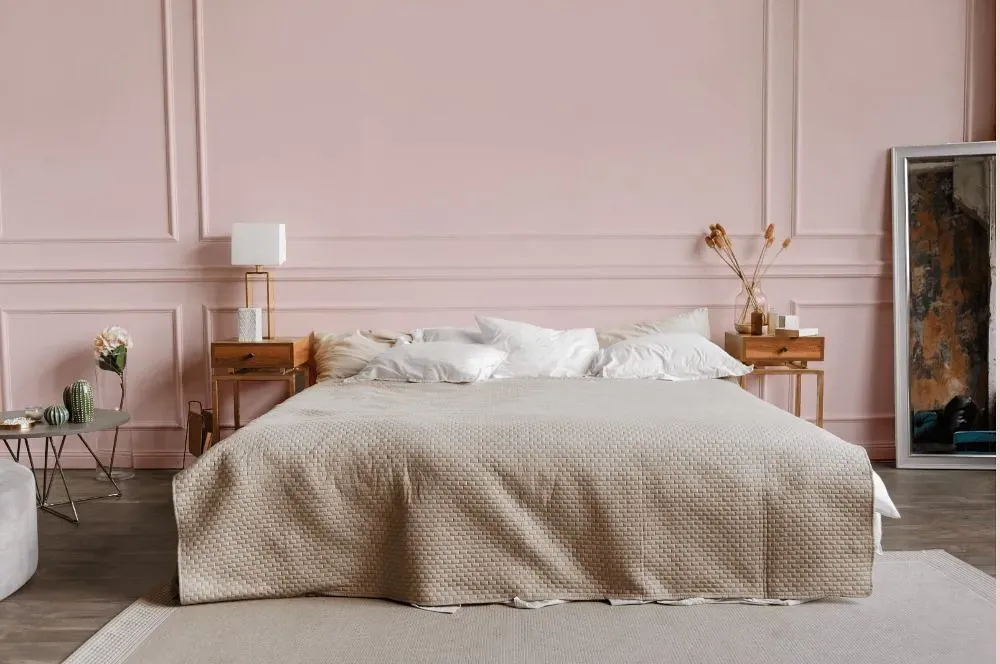
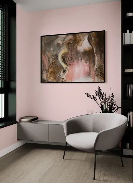
Benjamin Moore 1317 Yours Truly offers a soft and inviting hue that adds warmth to any space. This color pairs beautifully with neutral tones such as cream and taupe, creating a soothing and harmonious atmosphere. When combined with deep greens or rich blues, Benjamin Moore 1317 enhances a sense of depth and sophistication in the room. Its versatile nature makes it easy to blend with both modern and traditional decor styles, making it a timeless choice for any interior.
Loading...
LRV of Yours Truly
Yours Truly has an LRV of 74.35% and refers to Off‑White colors that reflect a lot of light. Why LRV is important?

Light Reflectance Value measures the amount of visible and usable light that reflects from a painted surface.
Simply put, the higher the LRV of a paint color, the brighter the room you will get.
The scale goes from 0% (absolute black, absorbing all light) to 100% (pure white, reflecting all light).
Act like a pro: When choosing paint with an LRV of 74.35%, pay attention to your bulbs' brightness. Light brightness is measured in lumens. The lower the paint's LRV, the higher lumen level you need. Every square foot of room needs at least 40 lumens. That means for a 200 ft2 living room you'll need about 8000 lumens of light – e.g., eight 1000 lm bulbs.
Color codes
We have collected almost every possible color code you could ever need.
Not sure what the difference between HEX and RGB is? We break down color models in plain language. Understanding color models
| Format | Code |
|---|---|
| HEX | #F5DCD9 |
| RGB Decimal | 245, 220, 217 |
| RGB Percent | 96.08%, 86.27%, 85.10% |
| HSV | Hue: 6° Saturation: 11.43% Value: 96.08% |
| HSL | hsl(6, 58, 91) |
| CMYK | Cyan: 0.0 Magenta: 10.2 Yellow: 11.43 Key: 3.92 |
| YIQ | Y: 227.133 I: 15.862 Q: 4.355 |
| XYZ | X: 75.772 Y: 75.61 Z: 76.23 |
| CIE Lab | L:89.678 a:8.109 b:4.614 |
| CIE Luv | L:89.678 u:14.97 v:5.459 |
| Decimal | 16112857 |
| Hunter Lab | 86.954, 3.375, 8.89 |