Sherwin Williams Briny SW 6775
Contentsshow +hide -
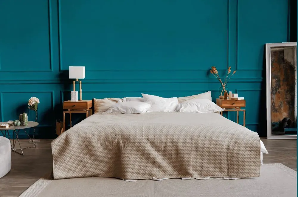
- Briny for bedroom (1 photo)
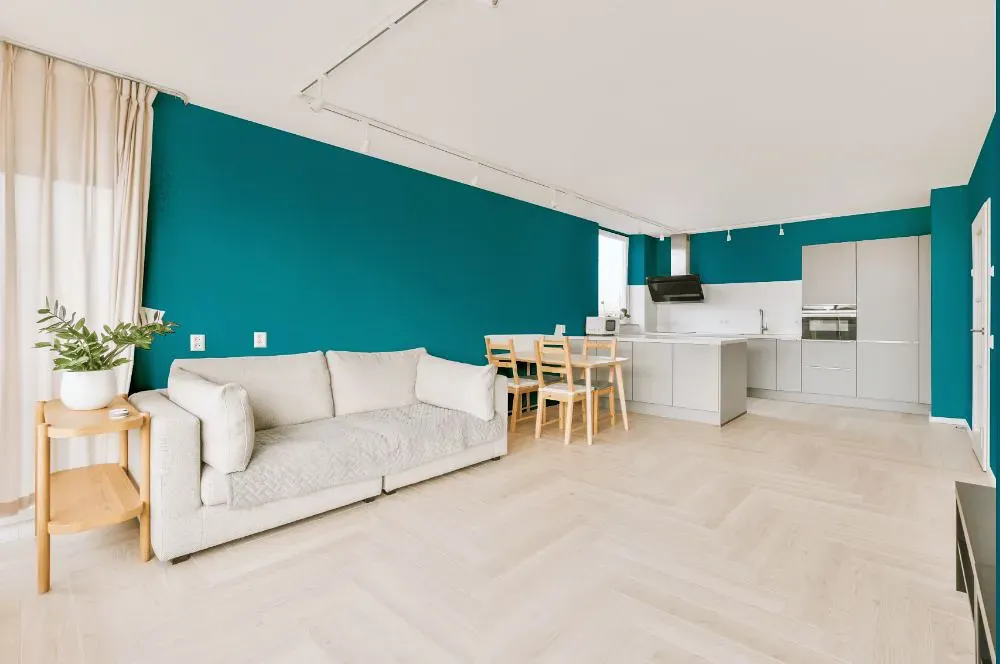
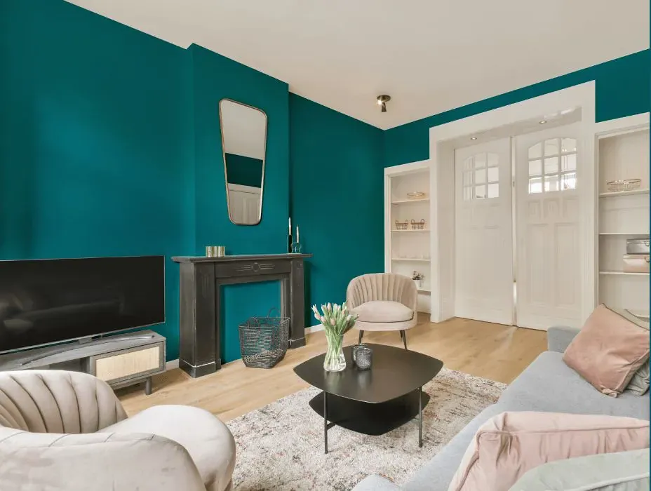
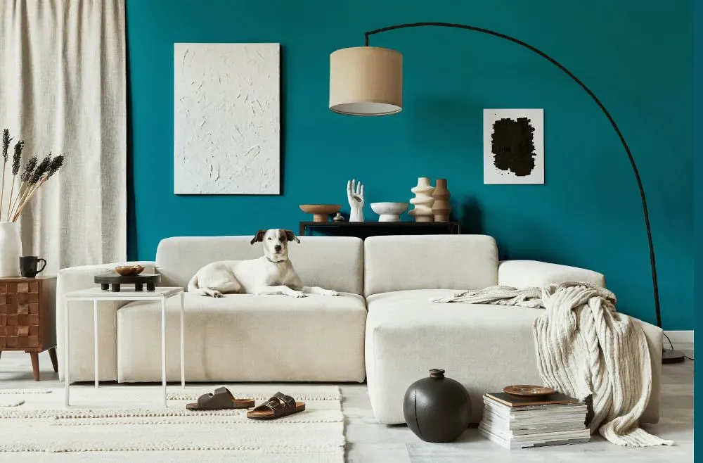
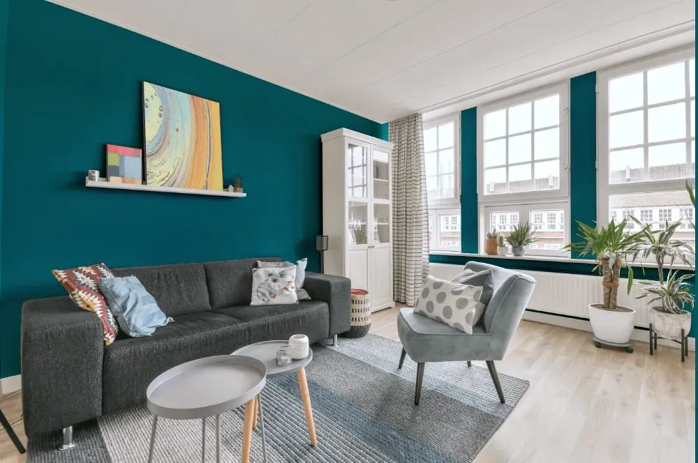
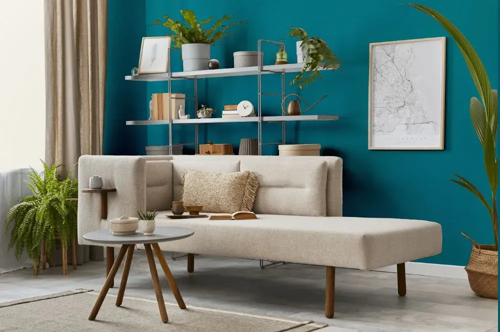
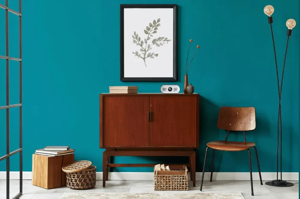
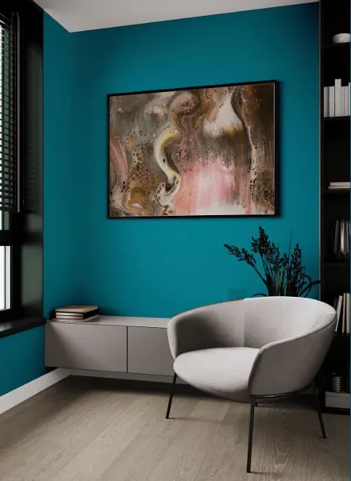
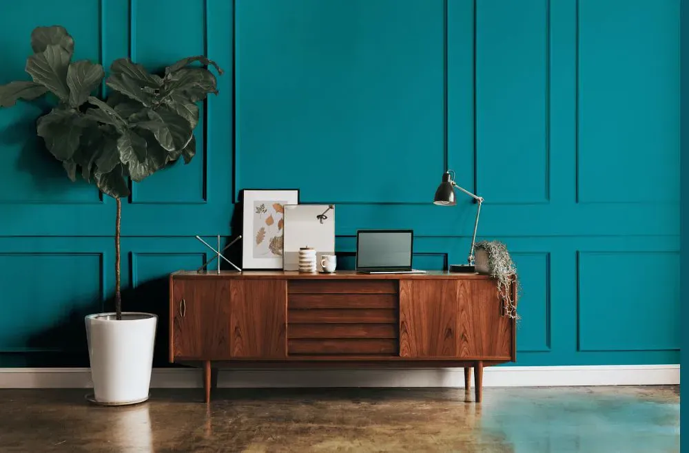
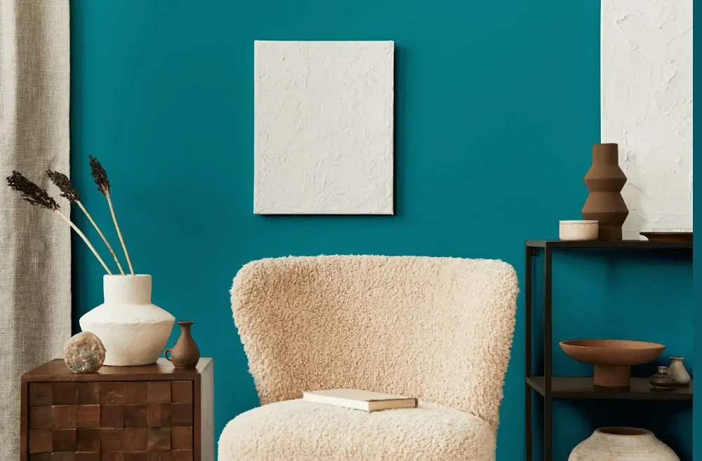
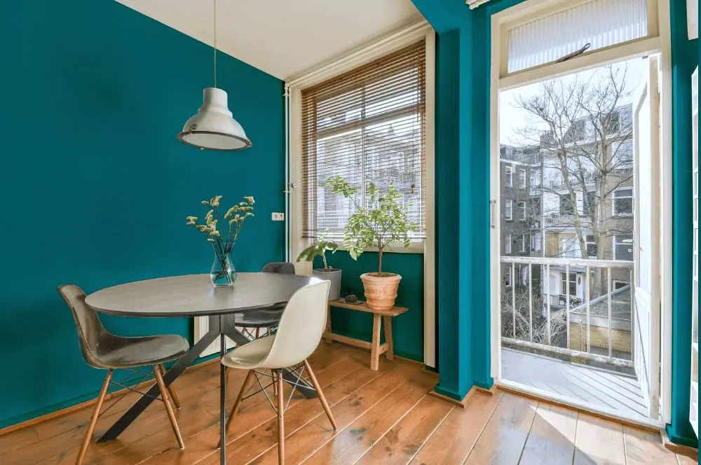
- Briny for living room (7 photos)
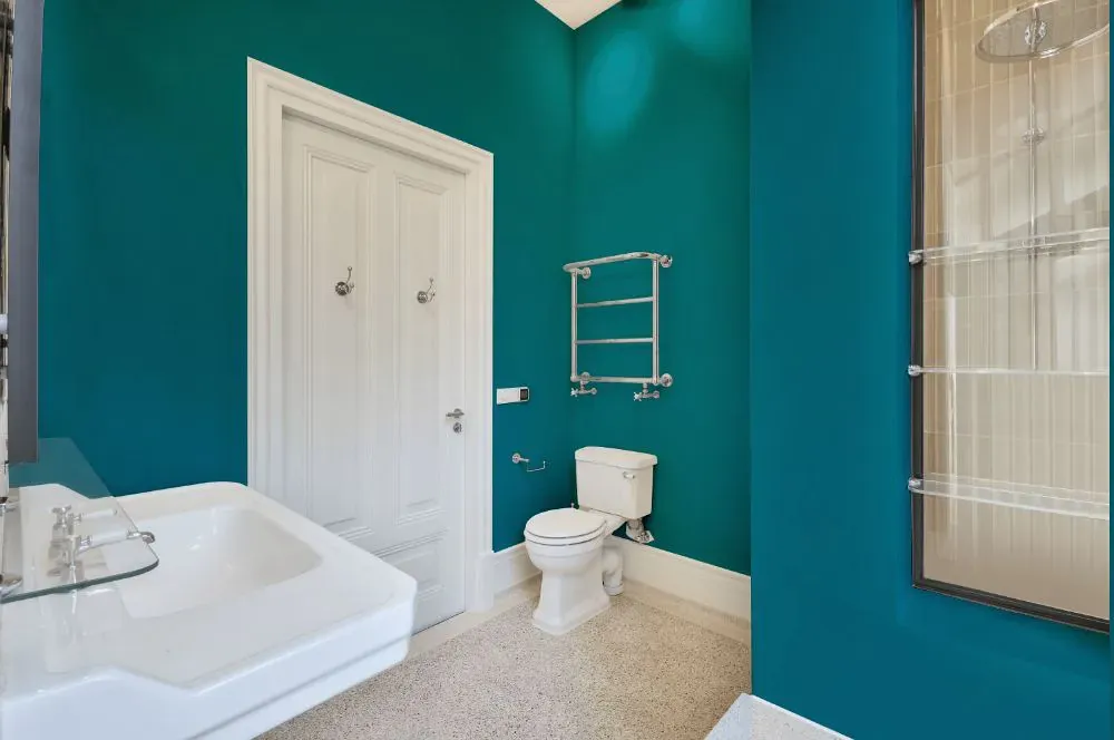
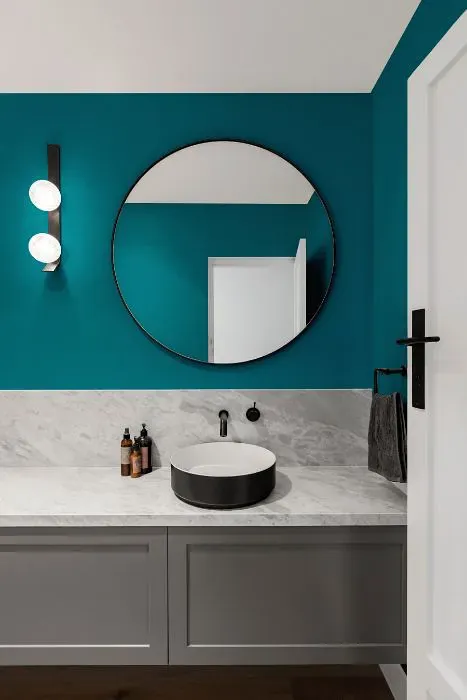
- Sherwin Williams Briny for bathroom (2 photos)
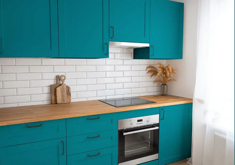
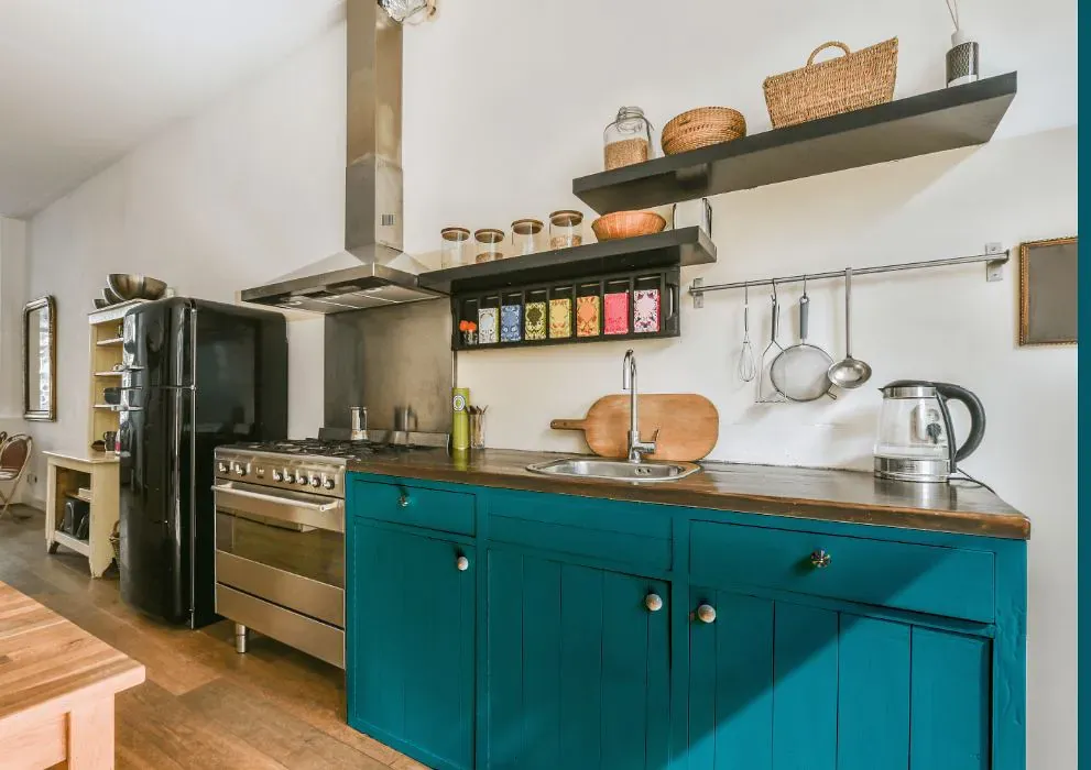
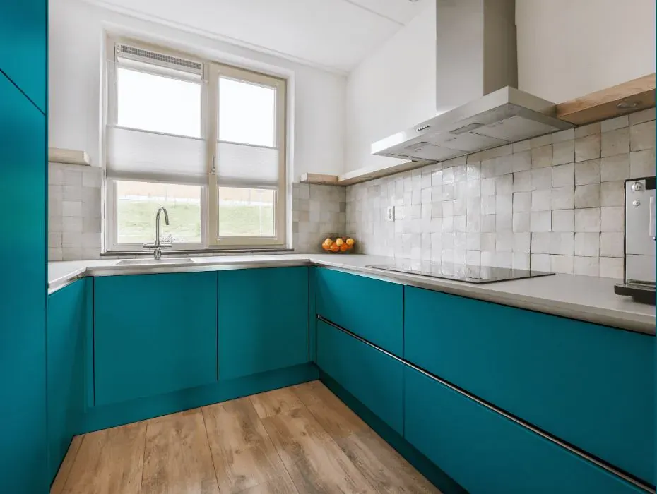
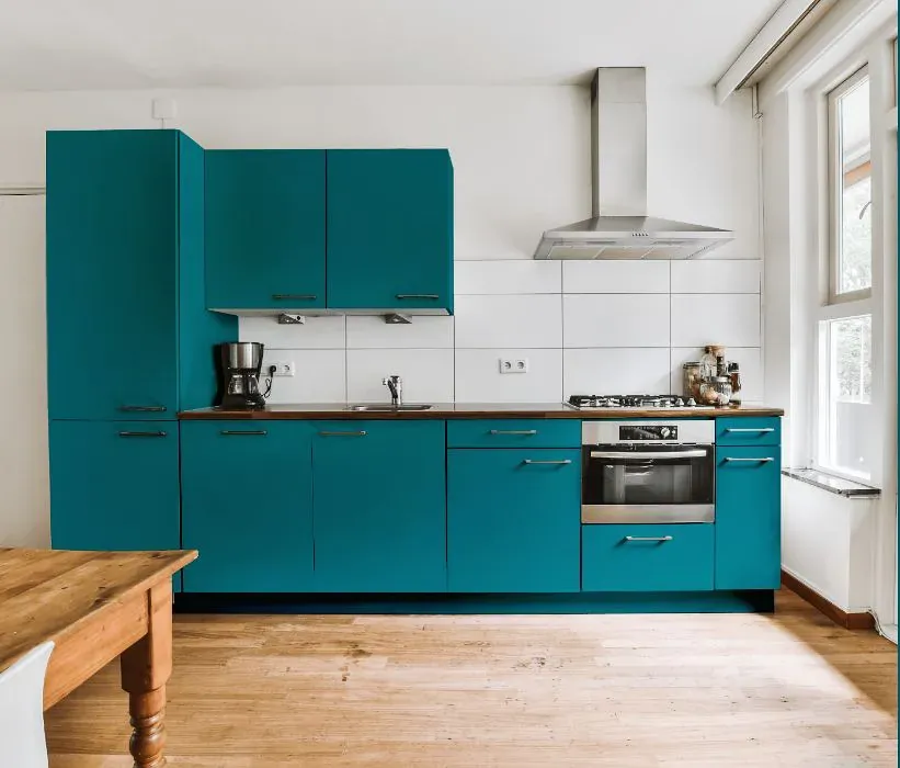
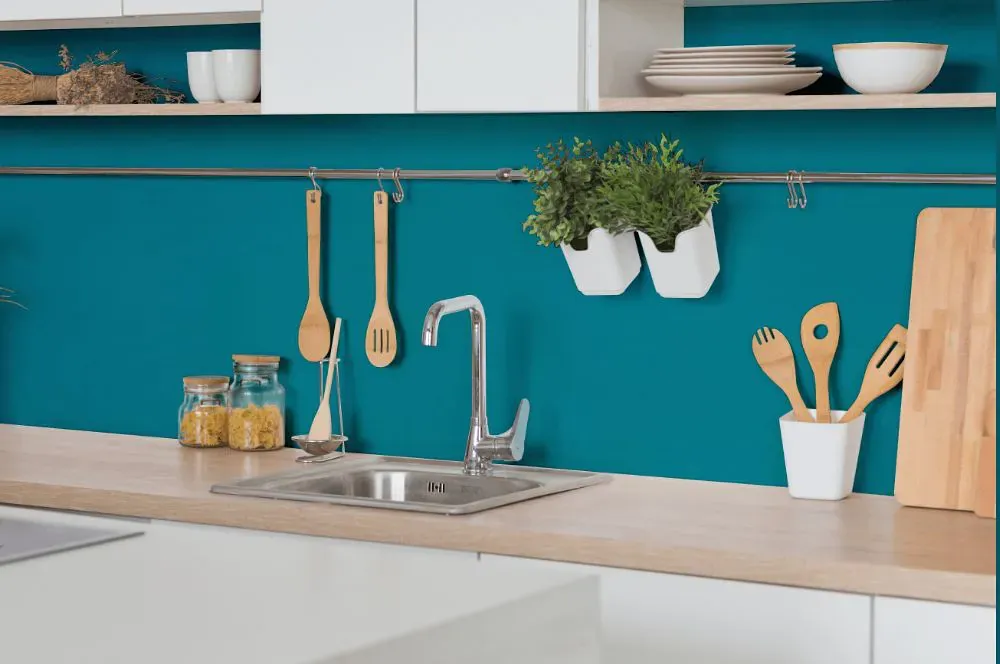
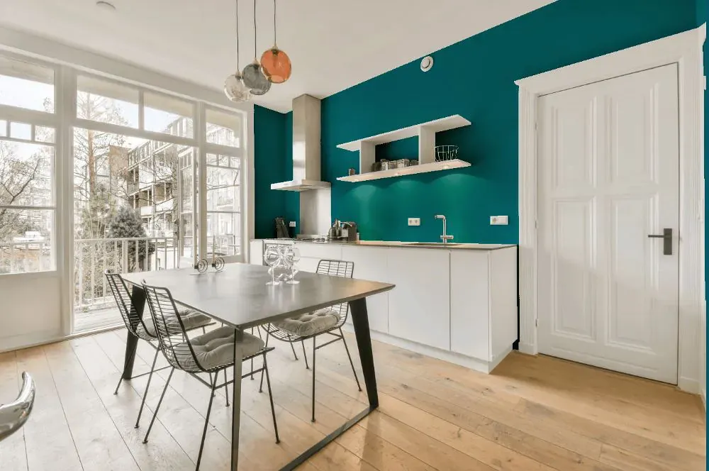
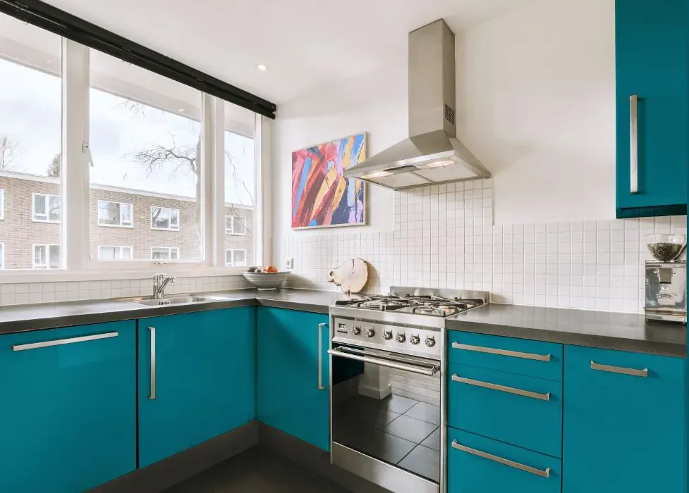
- Sherwin Williams SW 6775 on kitchen cabinets (4 photos)
- Sherwin Williams Briny reviews (9 photos)
- What are Sherwin Williams Briny undertones?
- Is Briny SW 6775 cool or warm?
- How light temperature affects on Briny
- Complementary color scheme
- Color comparison and matching
- LRV of Briny SW 6775
- Color codes
- Color equivalents
| Official page: | Briny SW 6775 |
| Code: | SW 6775 |
| Name: | Briny |
| Brand: | Sherwin Williams |
What color is Sherwin Williams Briny?
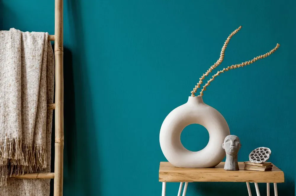
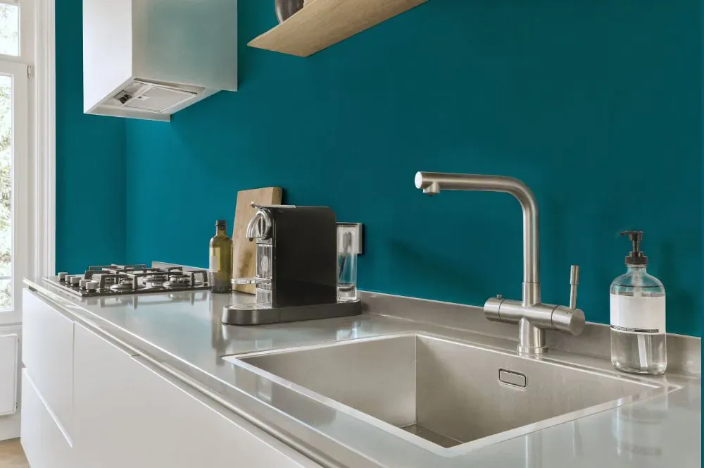
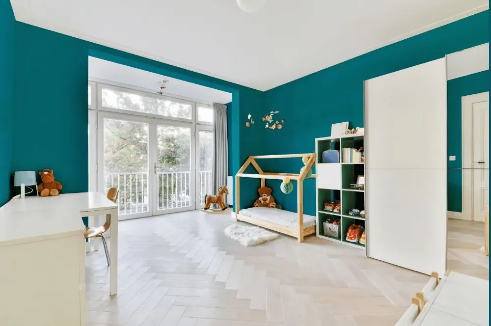
Sherwin Williams SW 6775 Briny is a refreshing and vibrant blue-green hue that brings a sense of calmness and tranquility to any space. This color pairs beautifully with crisp whites, sandy beiges, and earthy neutrals to create a beach-inspired palette that is both soothing and inviting. The combination of Briny with accents in SW 7008 Alabaster and SW 7507 Stone Lion adds depth and sophistication, while touches of SW 6141 Softer Tan bring warmth and balance to the overall look. Embrace the coastal vibes of Briny by incorporating natural textures like wood and rattan, along with sea-inspired decor elements such as shells and driftwood.
Loading...
LRV of Briny
Briny has an LRV of 17.49% and refers to Medium Dark which means that this color reflects very little light. Why LRV is important?

Light Reflectance Value measures the amount of visible and usable light that reflects from a painted surface.
Simply put, the higher the LRV of a paint color, the brighter the room you will get.
The scale goes from 0% (absolute black, absorbing all light) to 100% (pure white, reflecting all light).
Act like a pro: When choosing paint with an LRV of 17.49%, pay attention to your bulbs' brightness. Light brightness is measured in lumens. The lower the paint's LRV, the higher lumen level you need. Every square foot of room needs at least 40 lumens. That means for a 200 ft2 living room you'll need about 8000 lumens of light – e.g., eight 1000 lm bulbs.
Color codes
We have collected almost every possible color code you could ever need.
Not sure what the difference between HEX and RGB is? We break down color models in plain language. Understanding color models
| Format | Code |
|---|---|
| HEX | #08808e |
| RGB Decimal | 8, 128, 142 |
| RGB Percent | 3.14%, 50.20%, 55.69% |
| HSV | Hue: 186° Saturation: 94.37% Value: 55.69% |
| HSL | hsl(186, 89, 29) |
| CMYK | Cyan: 94.37 Magenta: 9.86 Yellow: 0.0 Key: 44.31 |
| YIQ | Y: 93.716 I: -76.007 Q: -21.028 |
| XYZ | X: 12.699 Y: 17.441 Z: 28.281 |
| CIE Lab | L:48.811 a:-23.746 b:-15.864 |
| CIE Luv | L:48.811 u:-35.793 v:-19.853 |
| Decimal | 557198 |
| Hunter Lab | 41.763, -18.806, -10.916 |