Sherwin Williams Clay Pot SW 2917
Contentsshow +hide -
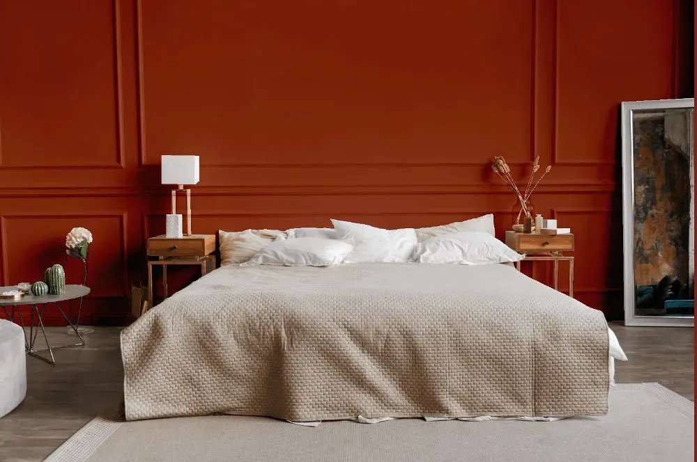
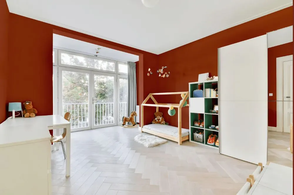
- Clay Pot for bedroom (1 photo)
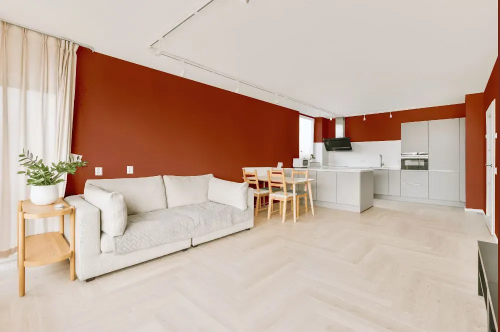
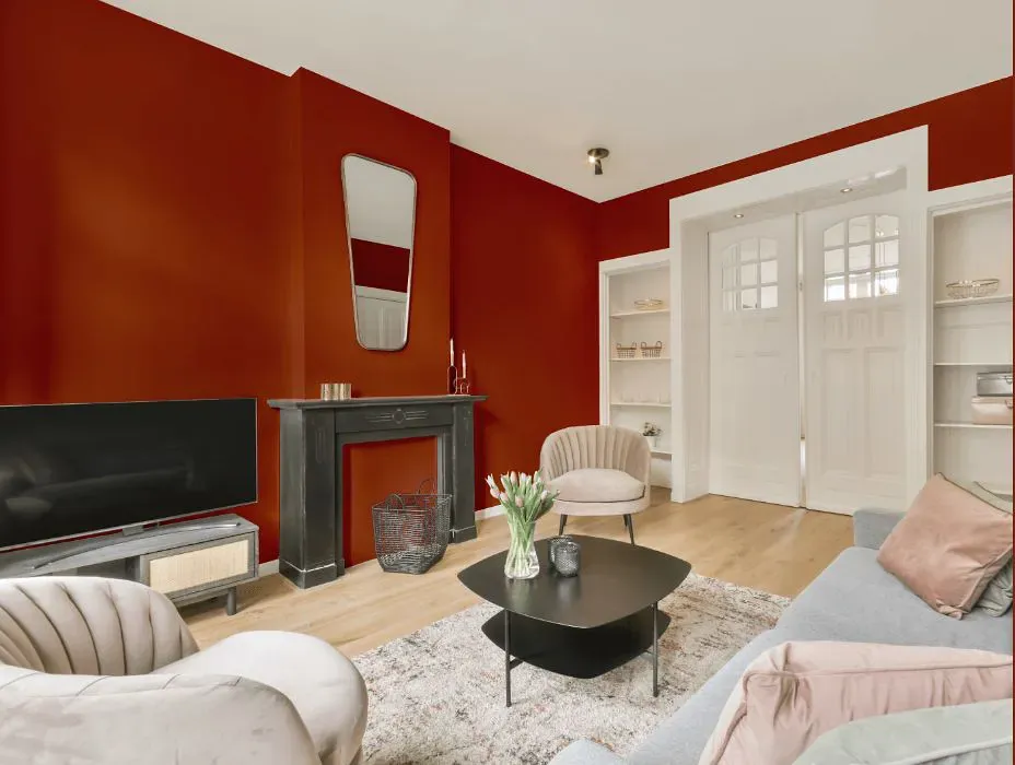
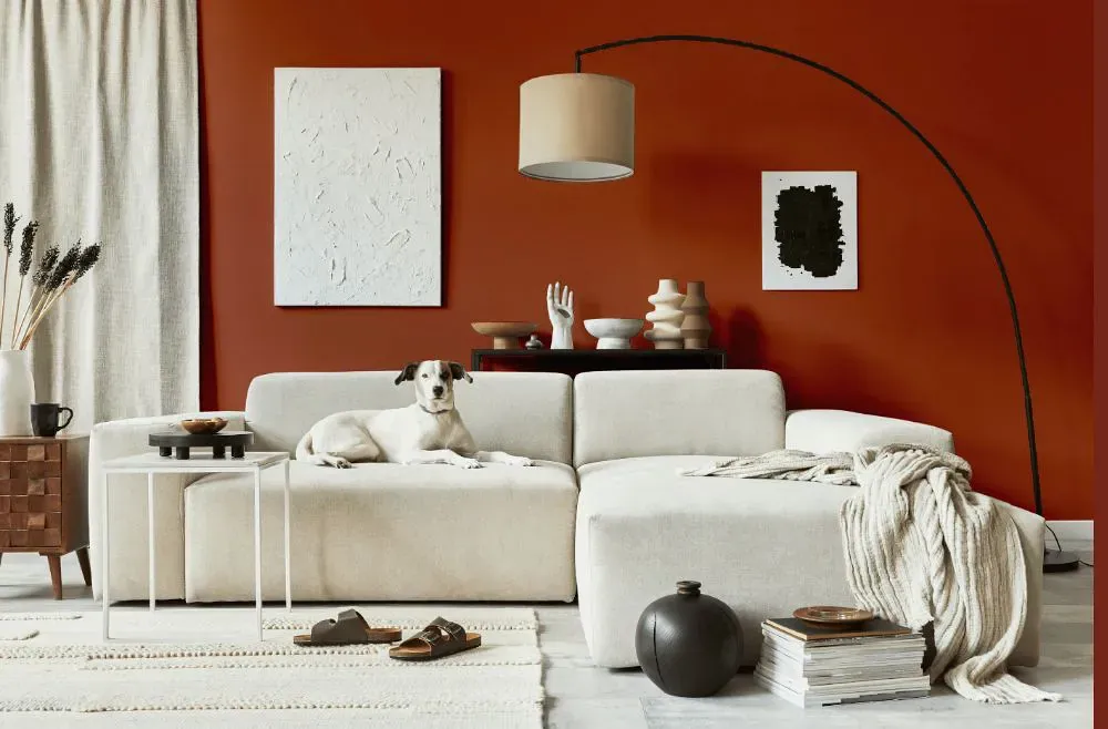
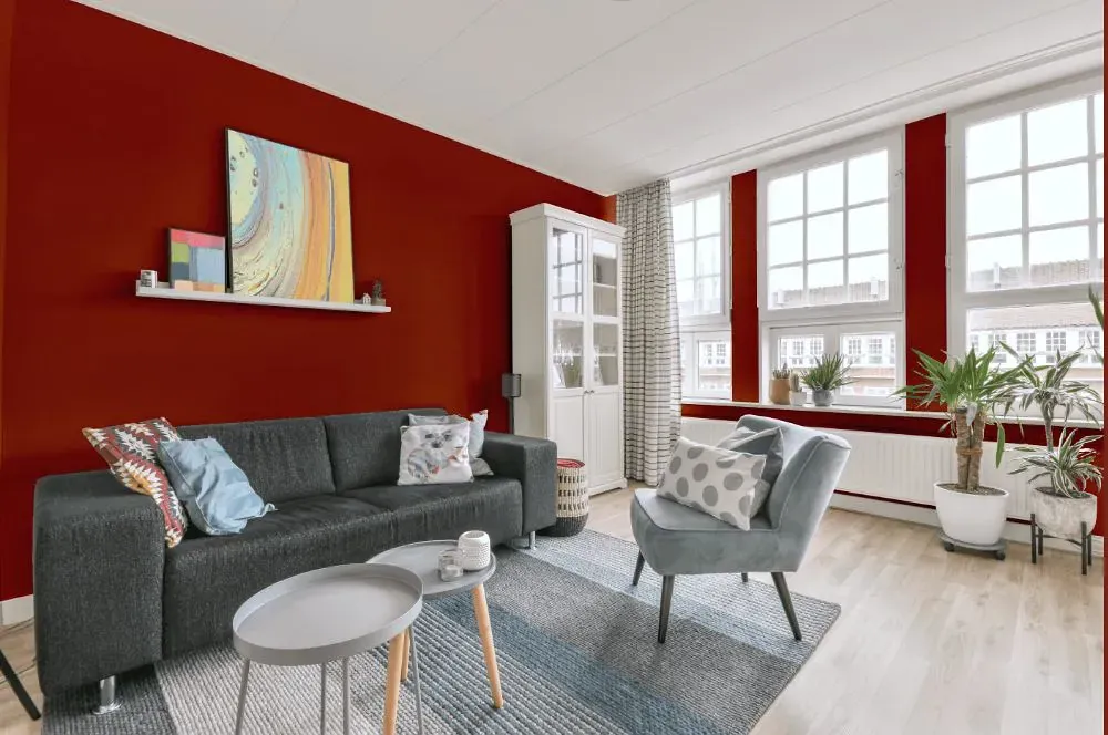
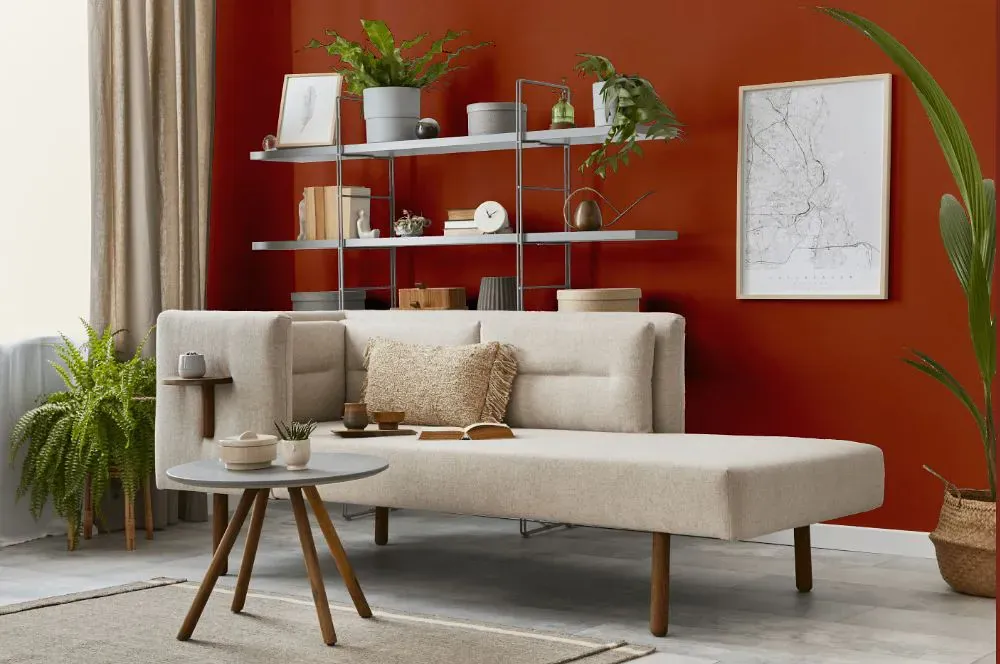
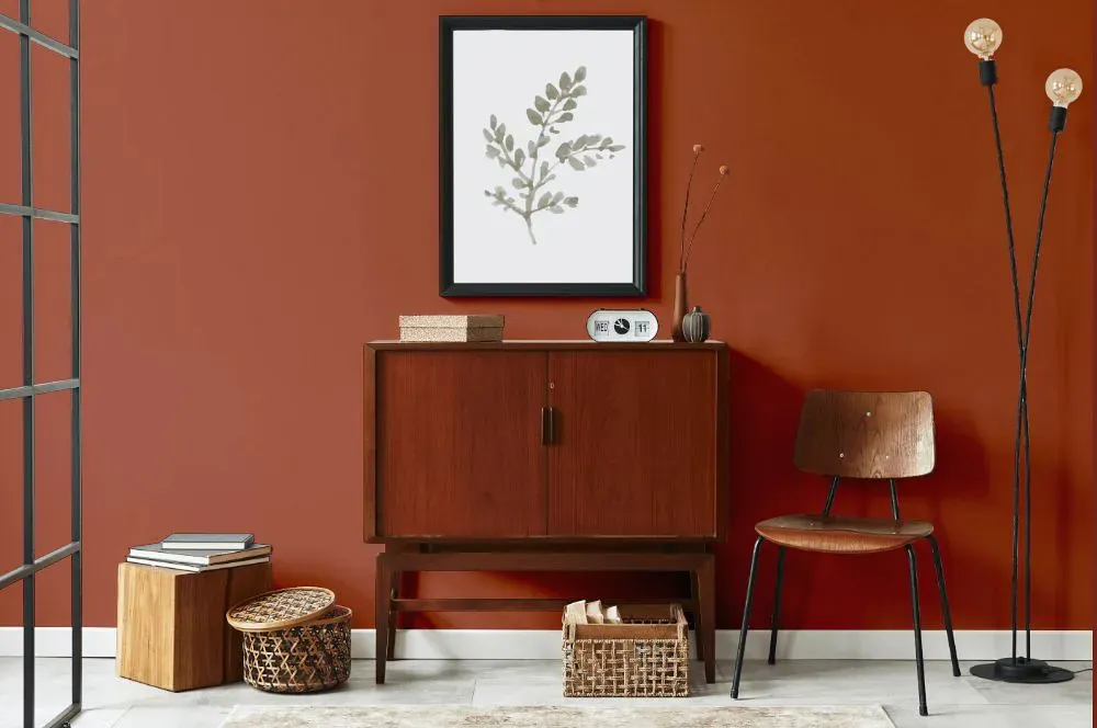
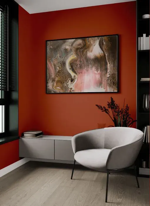
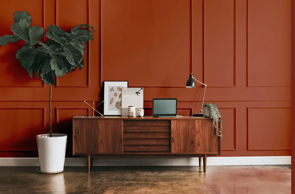
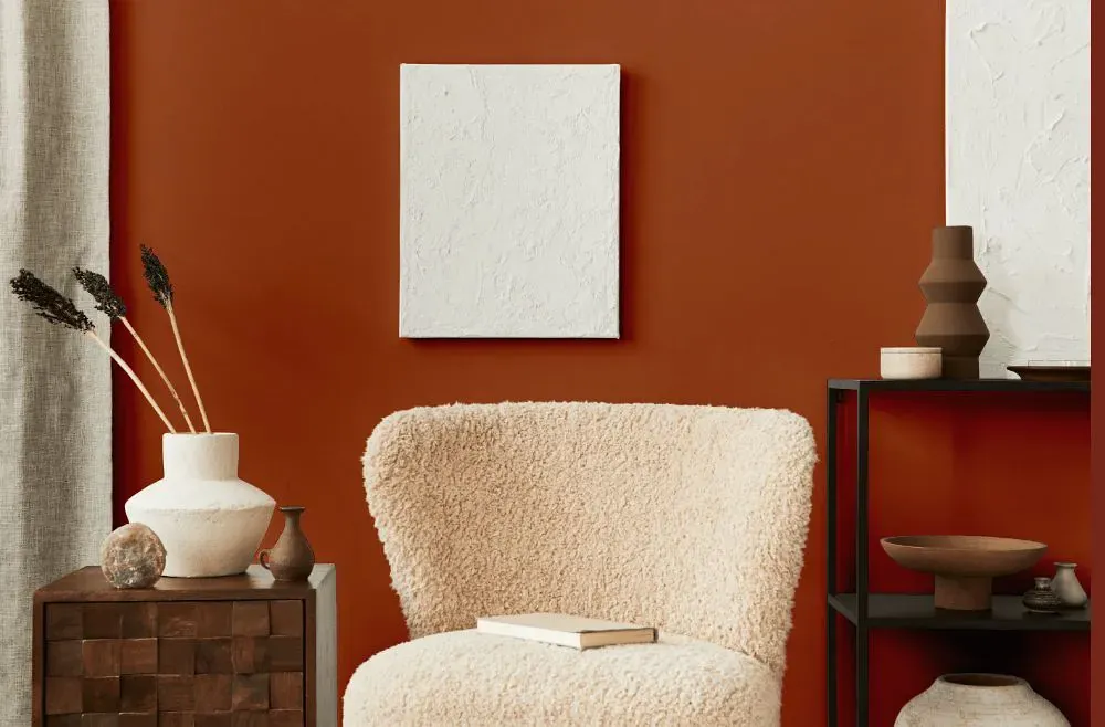
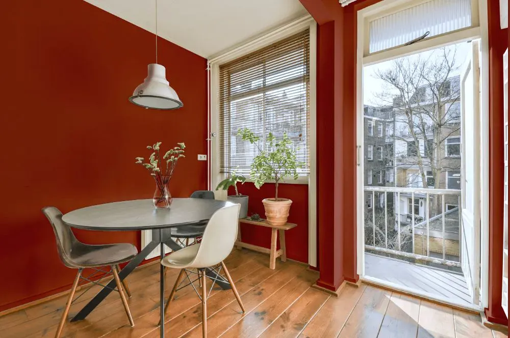
- Clay Pot for living room (7 photos)
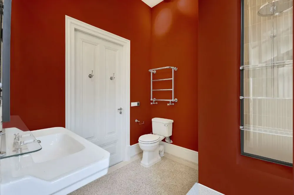
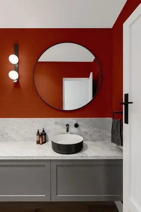
- Sherwin Williams Clay Pot for bathroom (2 photos)
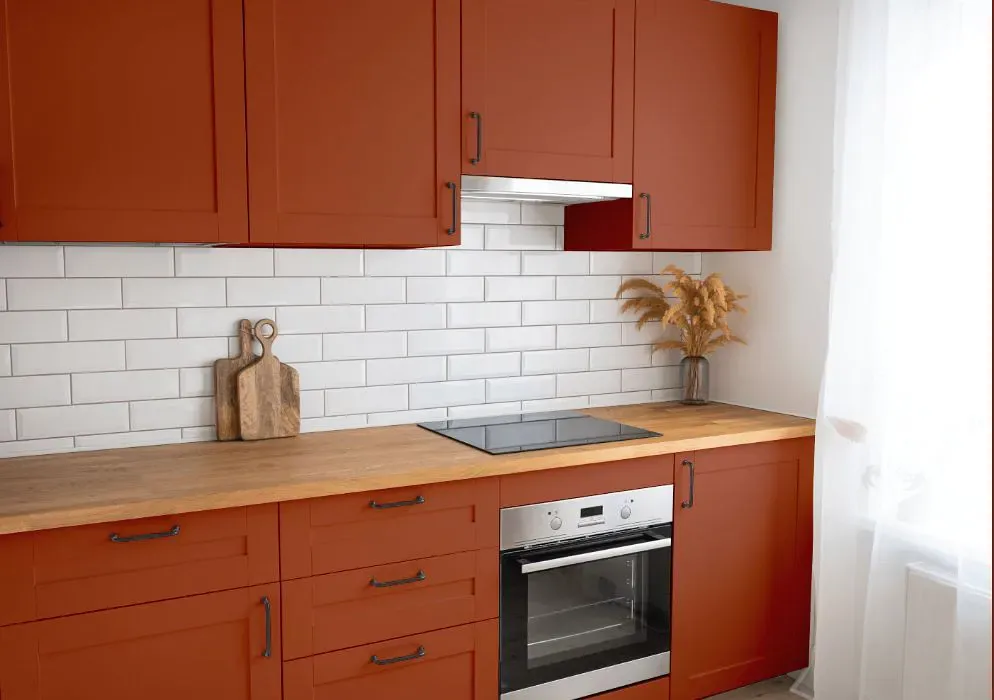
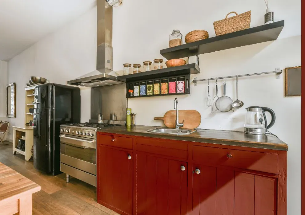
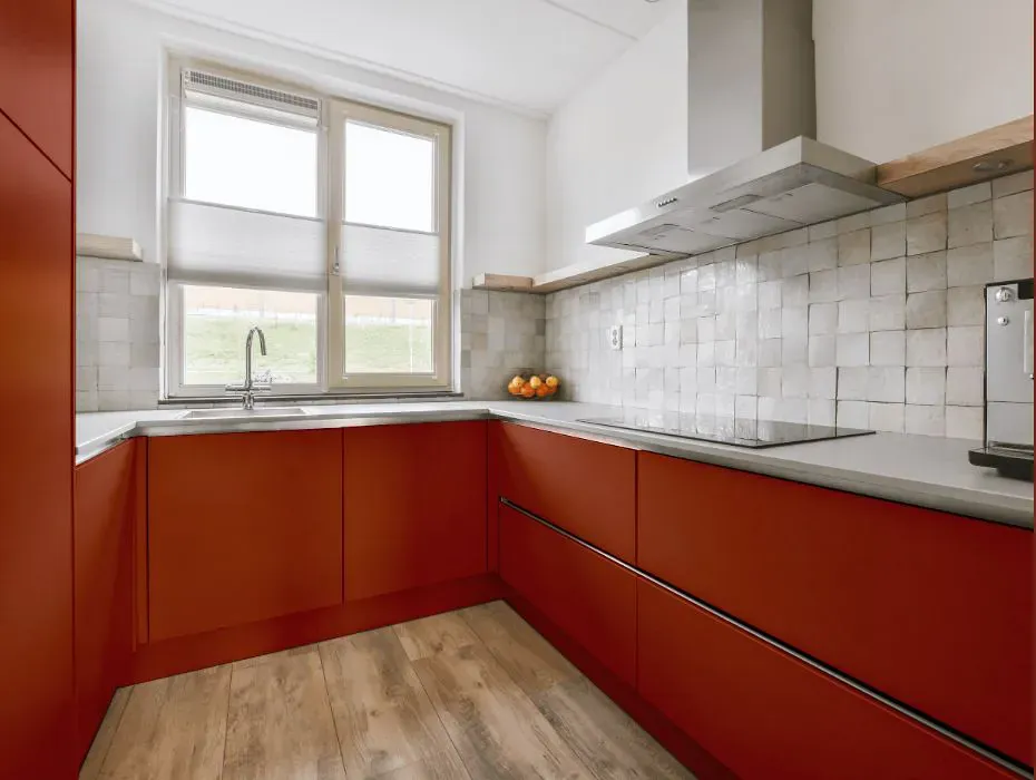
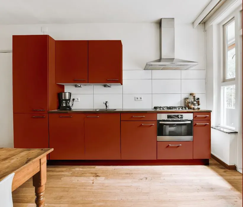
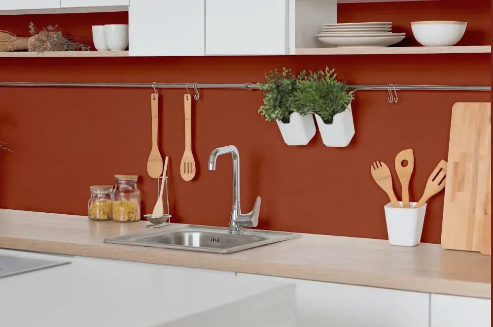
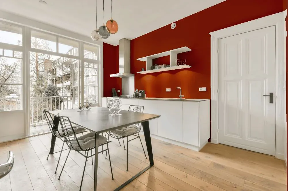
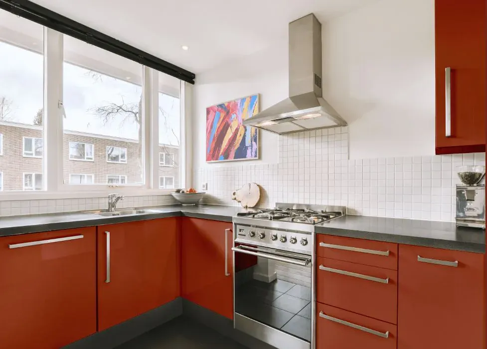
- Sherwin Williams SW 2917 on kitchen cabinets (4 photos)
- Sherwin Williams Clay Pot reviews (9 photos)
- What are Sherwin Williams Clay Pot undertones?
- Is Clay Pot SW 2917 cool or warm?
- How light temperature affects on Clay Pot
- Monochromatic color scheme
- Complementary color scheme
- Color comparison and matching
- LRV of Clay Pot SW 2917
- Color codes
- Color equivalents
| Official page: | Clay Pot SW 2917 |
| Code: | SW 2917 |
| Name: | Clay Pot |
| Brand: | Sherwin Williams |
What color is Sherwin Williams Clay Pot?
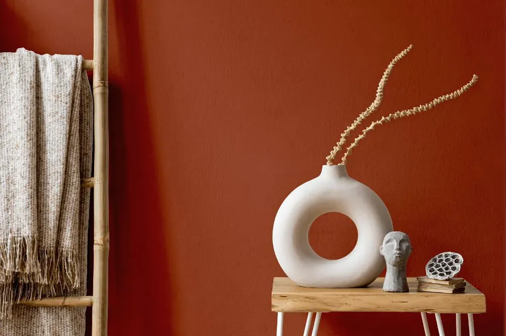
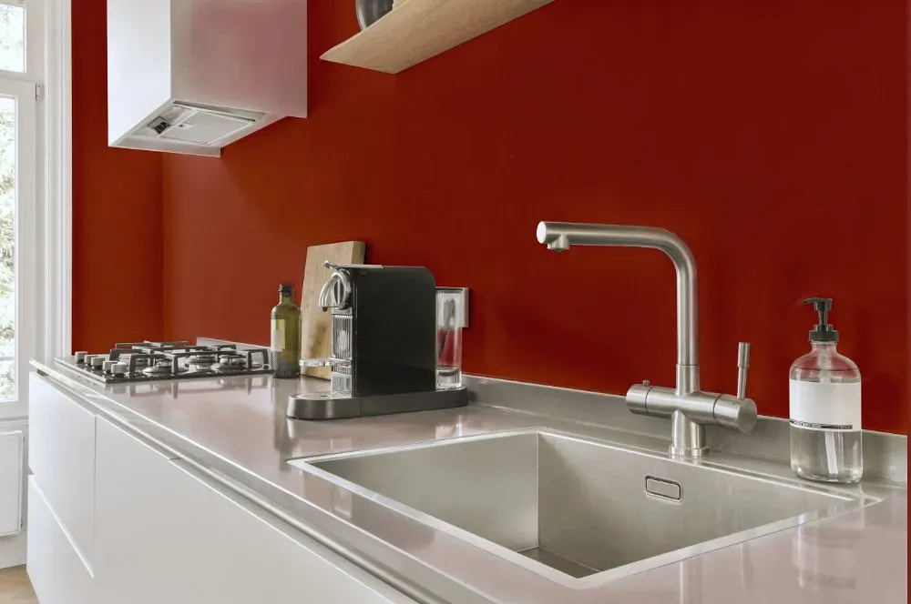
Sherwin Williams SW 2917 Clay Pot is a warm terracotta hue that adds depth and character to any space. This rich color evokes a sense of earthiness and coziness, making it perfect for creating a welcoming ambiance in a room. Pair Clay Pot with crisp whites, soft creams, or deep greens to create a harmonious color palette. Whether used as an accent wall or throughout the room, SW 2917 blends beautifully with natural textures like wood and rattan. Elevate your interior design with the warmth and sophistication of Sherwin Williams Clay Pot.
Loading...
LRV of Clay Pot
Clay Pot has an LRV of 11.69% and refers to Medium Dark which means that this color reflects very little light. Why LRV is important?

Light Reflectance Value measures the amount of visible and usable light that reflects from a painted surface.
Simply put, the higher the LRV of a paint color, the brighter the room you will get.
The scale goes from 0% (absolute black, absorbing all light) to 100% (pure white, reflecting all light).
Act like a pro: When choosing paint with an LRV of 11.69%, pay attention to your bulbs' brightness. Light brightness is measured in lumens. The lower the paint's LRV, the higher lumen level you need. Every square foot of room needs at least 40 lumens. That means for a 200 ft2 living room you'll need about 8000 lumens of light – e.g., eight 1000 lm bulbs.
Color codes
We have collected almost every possible color code you could ever need.
Not sure what the difference between HEX and RGB is? We break down color models in plain language. Understanding color models
| Format | Code |
|---|---|
| HEX | #9a4a33 |
| RGB Decimal | 154, 74, 51 |
| RGB Percent | 60.39%, 29.02%, 20.00% |
| HSV | Hue: 13° Saturation: 66.88% Value: 60.39% |
| HSL | hsl(13, 50, 40) |
| CMYK | Cyan: 0.0 Magenta: 51.95 Yellow: 66.88 Key: 39.61 |
| YIQ | Y: 95.298 I: 55.063 Q: 9.765 |
| XYZ | X: 16.374 Y: 12.009 Z: 4.587 |
| CIE Lab | L:41.23 a:31.533 b:29.082 |
| CIE Luv | L:41.23 u:60.919 v:24.48 |
| Decimal | 10111539 |
| Hunter Lab | 34.653, 23.7, 16.41 |