Tikkurila Chalet N485
Contentsshow +hide -
| Code: | N485 |
| Name: | Chalet |
| Brand: | Tikkurila |
What color is Tikkurila Chalet?
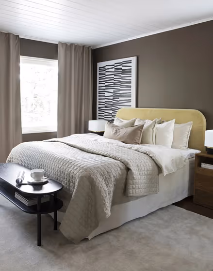
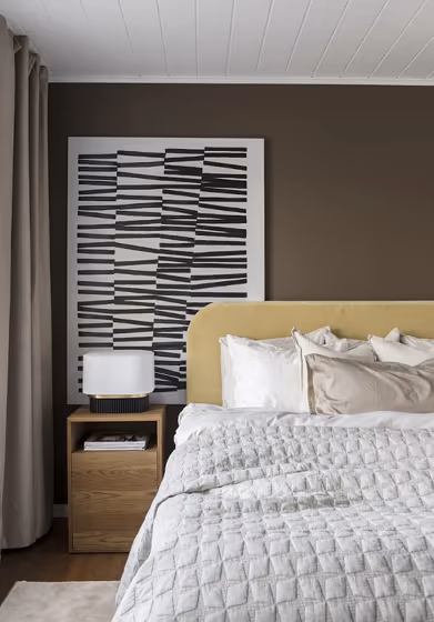
Introducing the stunning Tikkurila N485 Chalet, a warm and inviting hue that exudes coziness and sophistication. This rich shade pairs harmoniously with accents in "Cinnamon Sand" (N438) and "Dusty Lavender" (N484) for a rustic-chic aesthetic. Complement Chalet with furniture in natural wood tones or textiles in "Earthy Moss" (N900) for a serene and earthy vibe. Elevate the ambiance by adding pops of "Golden Oak" (N400) or "Evening Sky" (N488) for a touch of contrast. Embrace the timeless elegance of Tikkurila N485 Chalet and transform your space into a sanctuary of style and comfort.
Loading...
LRV of Chalet
Chalet has an LRV of 13.15% and refers to Medium Dark which means that this color reflects very little light. Why LRV is important?

Light Reflectance Value measures the amount of visible and usable light that reflects from a painted surface.
Simply put, the higher the LRV of a paint color, the brighter the room you will get.
The scale goes from 0% (absolute black, absorbing all light) to 100% (pure white, reflecting all light).
Act like a pro: When choosing paint with an LRV of 13.15%, pay attention to your bulbs' brightness. Light brightness is measured in lumens. The lower the paint's LRV, the higher lumen level you need. Every square foot of room needs at least 40 lumens. That means for a 200 ft2 living room you'll need about 8000 lumens of light – e.g., eight 1000 lm bulbs.
Color codes
We have collected almost every possible color code you could ever need.
Not sure what the difference between HEX and RGB is? We break down color models in plain language. Understanding color models
| Format | Code |
|---|---|
| HEX | #6E6357 |
| RGB Decimal | 110, 99, 87 |
| RGB Percent | 43.14%, 38.82%, 34.12% |
| HSV | Hue: 31° Saturation: 20.91% Value: 43.14% |
| HSL | hsl(31, 12, 39) |
| CMYK | Cyan: 0.0 Magenta: 10.0 Yellow: 20.91 Key: 56.86 |
| YIQ | Y: 100.921 I: 10.411 Q: -1.407 |
| XYZ | X: 12.612 Y: 12.927 Z: 10.845 |
| CIE Lab | L:42.653 a:2.213 b:8.418 |
| CIE Luv | L:42.653 u:7.318 v:10.174 |
| Decimal | 7234391 |
| Hunter Lab | 35.954, -0.304, 7.284 |