Tikkurila Mole L487
Contentsshow +hide -
| Code: | L487 |
| Name: | Mole |
| Brand: | Tikkurila |
What color is Tikkurila Mole?
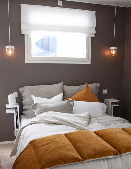
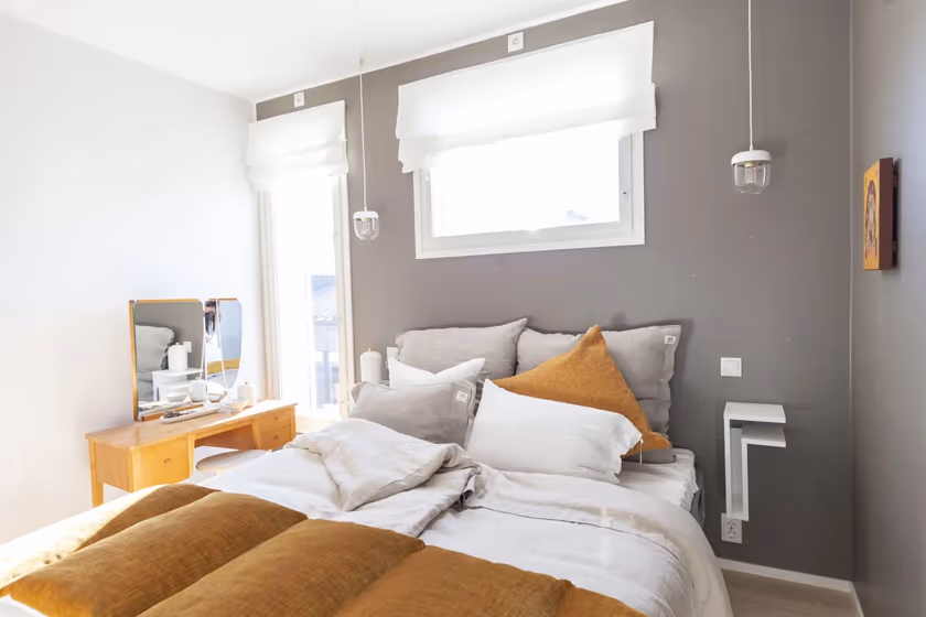
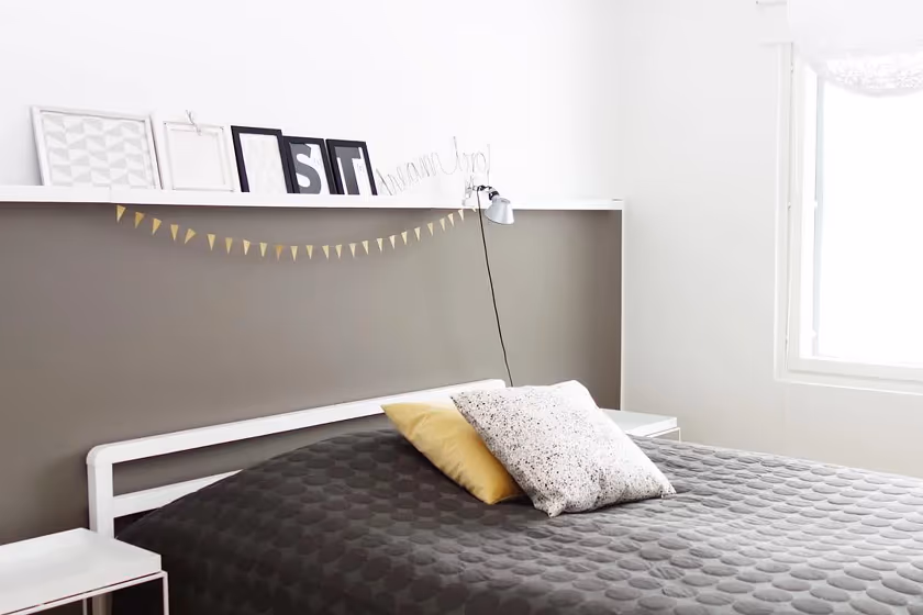
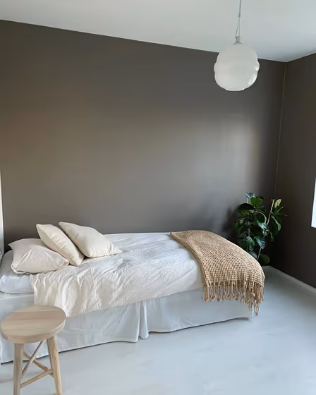
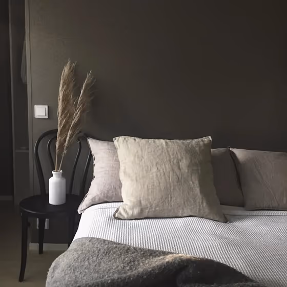
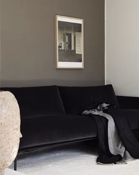
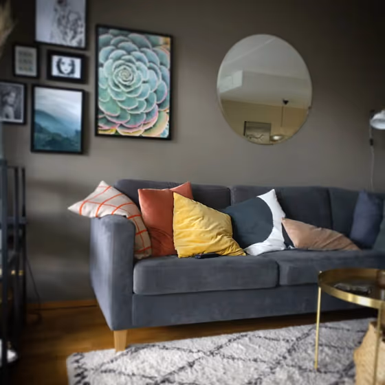
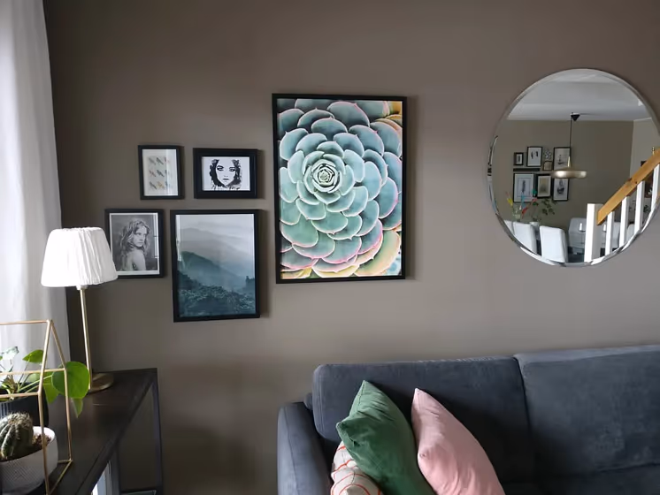
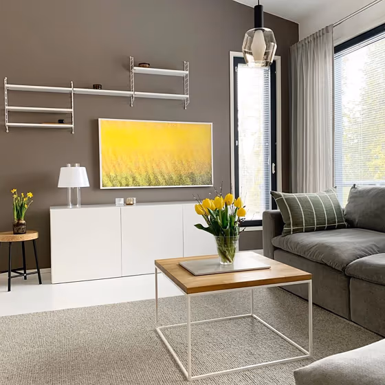
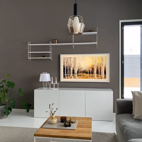
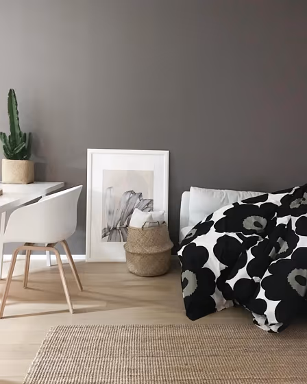
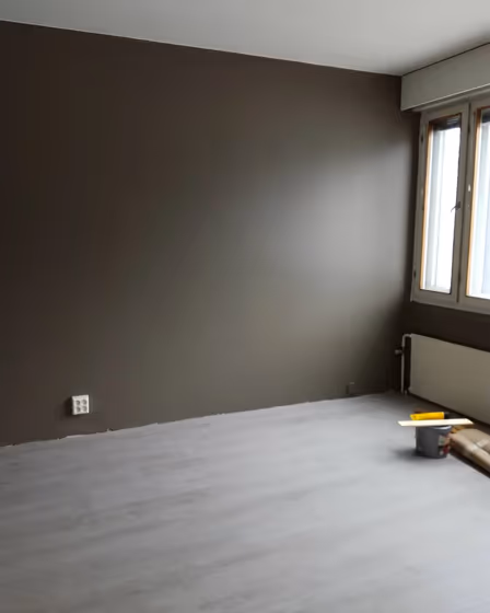
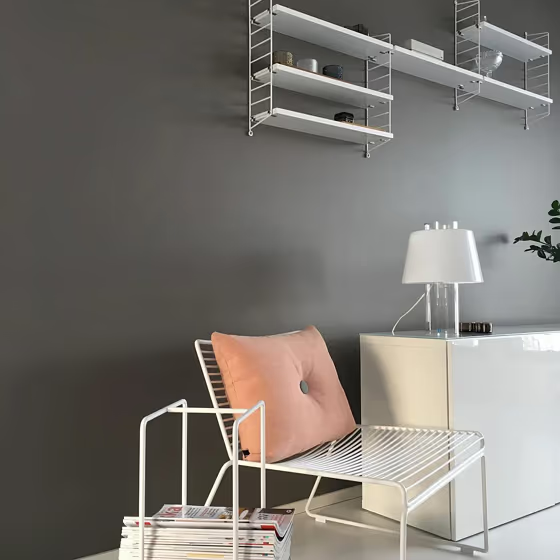
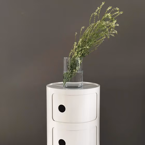
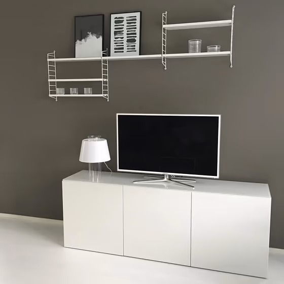
The Tikkurila L487 Mole color is a classic blend of warm earth tones that exude sophistication and elegance. This rich hue pairs beautifully with neutrals such as White E9 and Gray E3, creating a timeless and harmonious color scheme. For a bolder look, consider pairing L487 Mole with a deep blue like Azure 6642 or a muted green like Moss G435. The versatility of Tikkurila's L487 Mole allows for endless possibilities in creating a welcoming and stylish interior design scheme.
Loading...
LRV of Mole
Mole has an LRV of 19.8% and refers to Medium Dark which means that this color reflects very little light. Why LRV is important?

Light Reflectance Value measures the amount of visible and usable light that reflects from a painted surface.
Simply put, the higher the LRV of a paint color, the brighter the room you will get.
The scale goes from 0% (absolute black, absorbing all light) to 100% (pure white, reflecting all light).
Act like a pro: When choosing paint with an LRV of 19.8%, pay attention to your bulbs' brightness. Light brightness is measured in lumens. The lower the paint's LRV, the higher lumen level you need. Every square foot of room needs at least 40 lumens. That means for a 200 ft2 living room you'll need about 8000 lumens of light – e.g., eight 1000 lm bulbs.
Color codes
We have collected almost every possible color code you could ever need.
Not sure what the difference between HEX and RGB is? We break down color models in plain language. Understanding color models
| Format | Code |
|---|---|
| HEX | #817971 |
| RGB Decimal | 129, 121, 113 |
| RGB Percent | 50.59%, 47.45%, 44.31% |
| HSV | Hue: 30° Saturation: 12.4% Value: 50.59% |
| HSL | hsl(30, 7, 47) |
| CMYK | Cyan: 0.0 Magenta: 6.2 Yellow: 12.4 Key: 49.41 |
| YIQ | Y: 122.48 I: 7.338 Q: -0.797 |
| XYZ | X: 18.871 Y: 19.534 Z: 18.395 |
| CIE Lab | L:51.307 a:1.574 b:5.483 |
| CIE Luv | L:51.307 u:5.2 v:7.081 |
| Decimal | 8485233 |
| Hunter Lab | 44.198, -1.133, 6.262 |