Sherwin Williams Pennywise SW 6349
Contentsshow +hide -
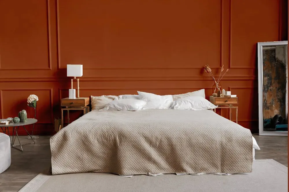
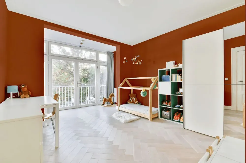
- Pennywise for bedroom (1 photo)
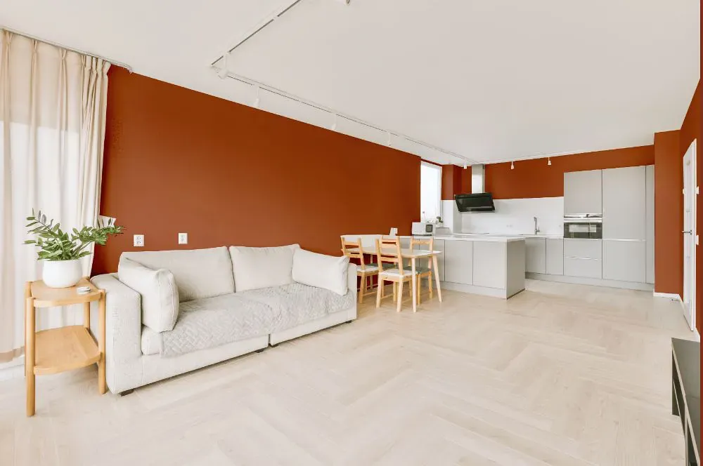
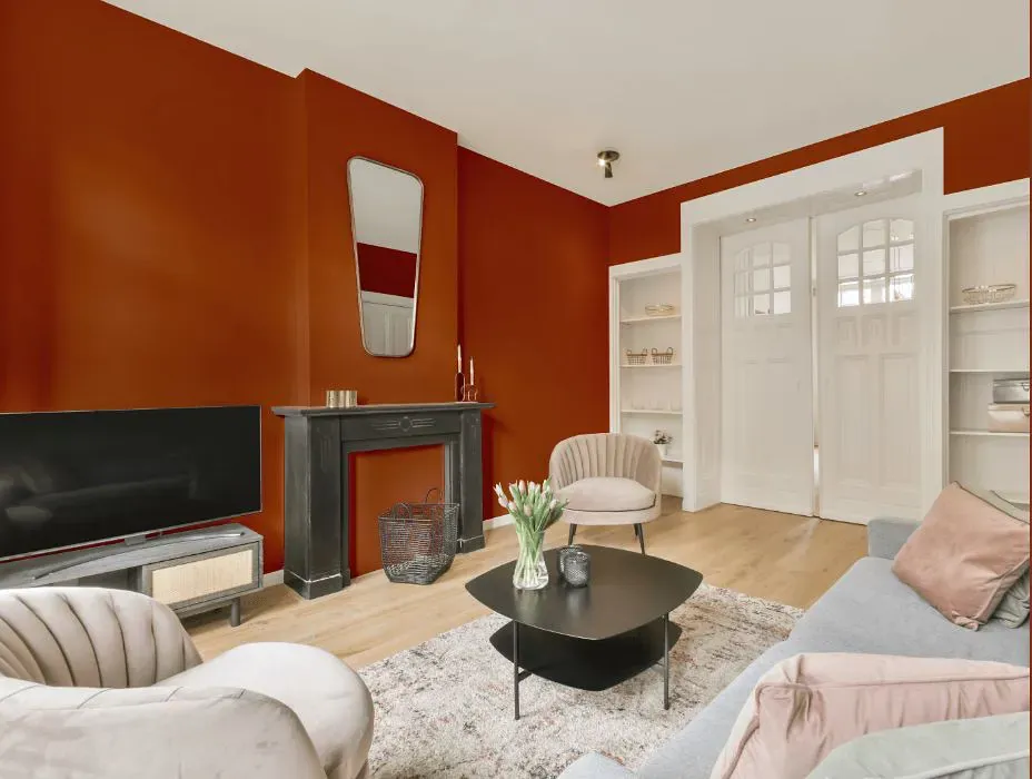
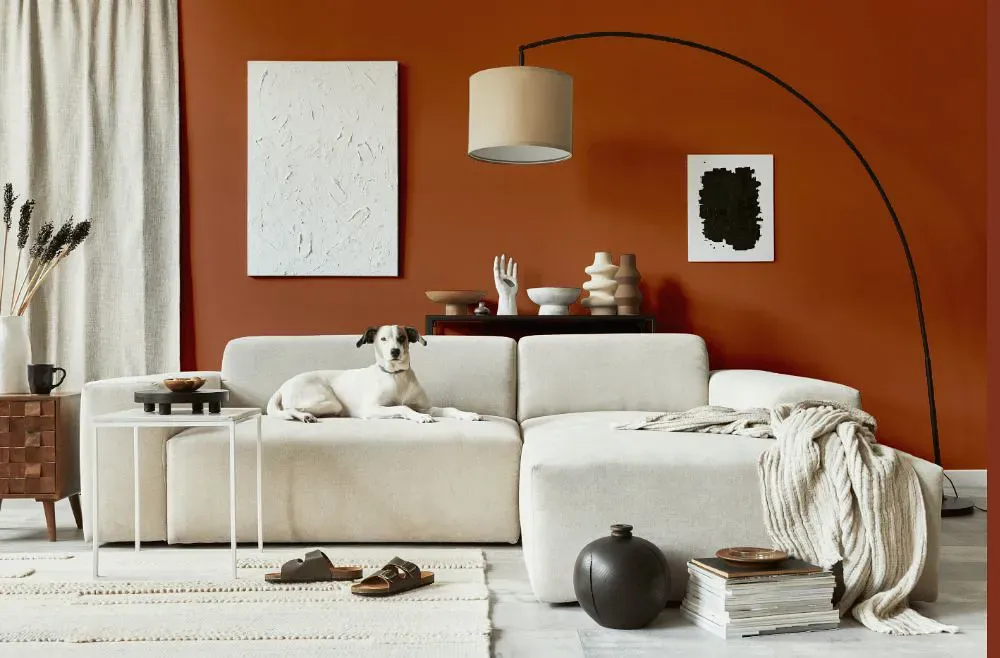
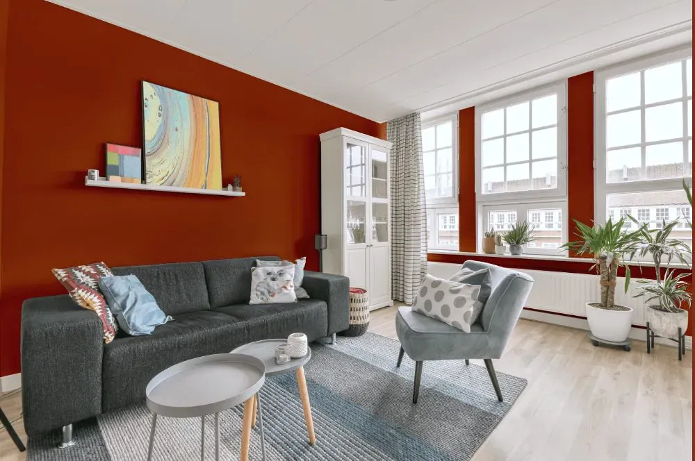
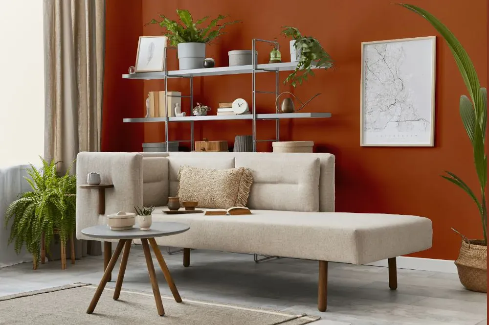
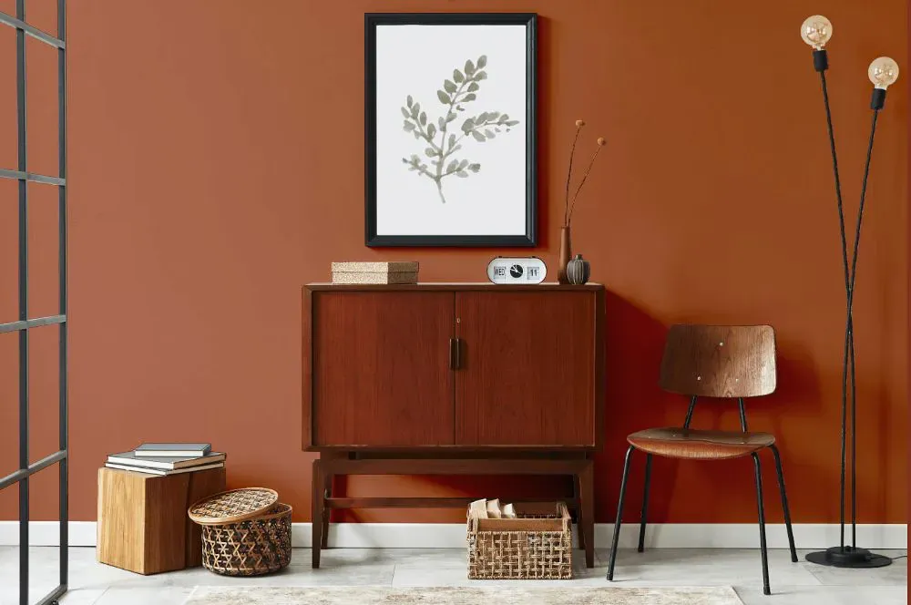
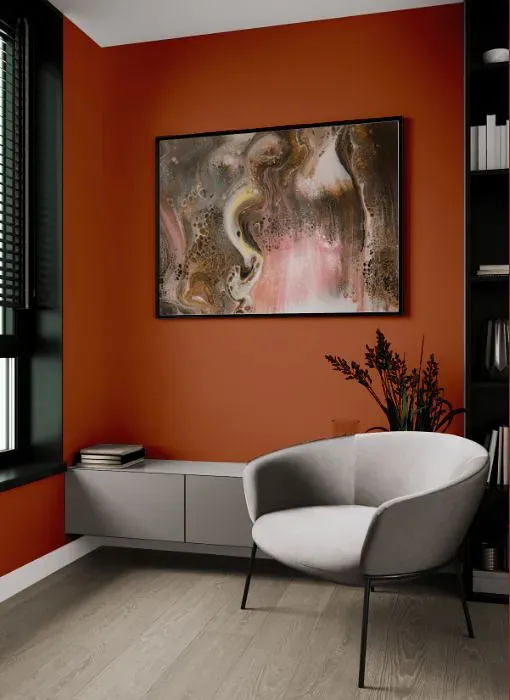
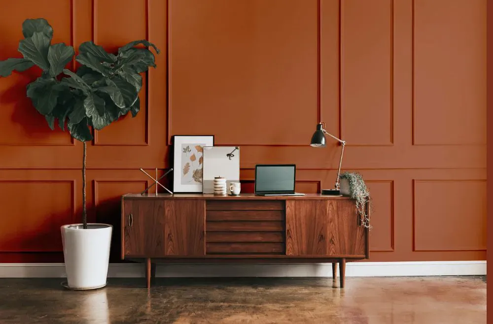
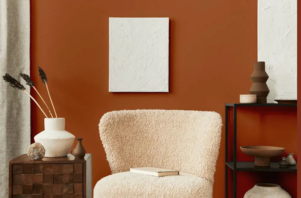
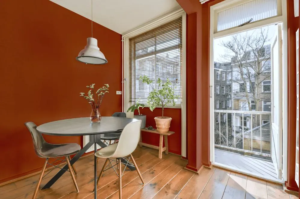
- Pennywise for living room (7 photos)
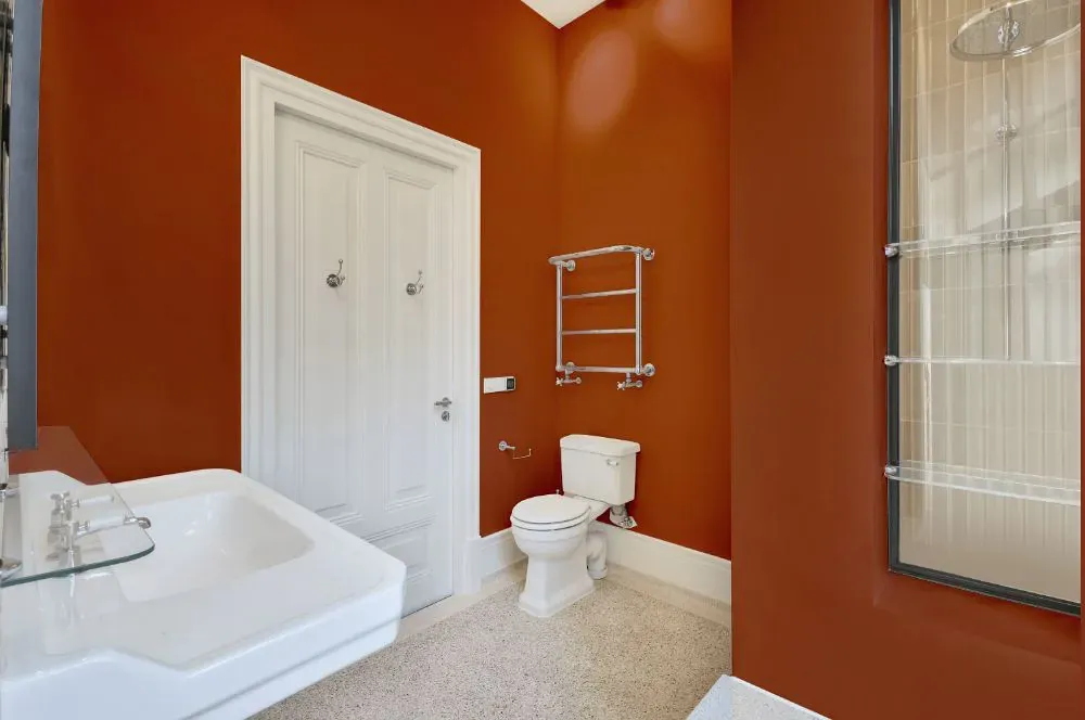
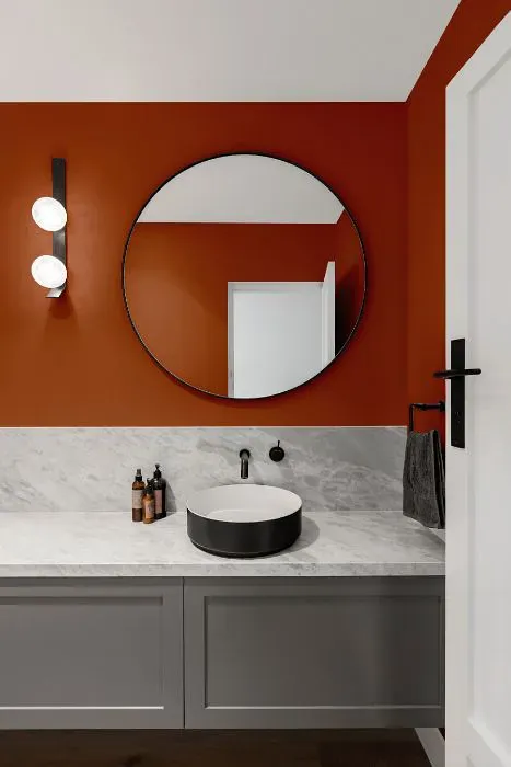
- Sherwin Williams Pennywise for bathroom (2 photos)
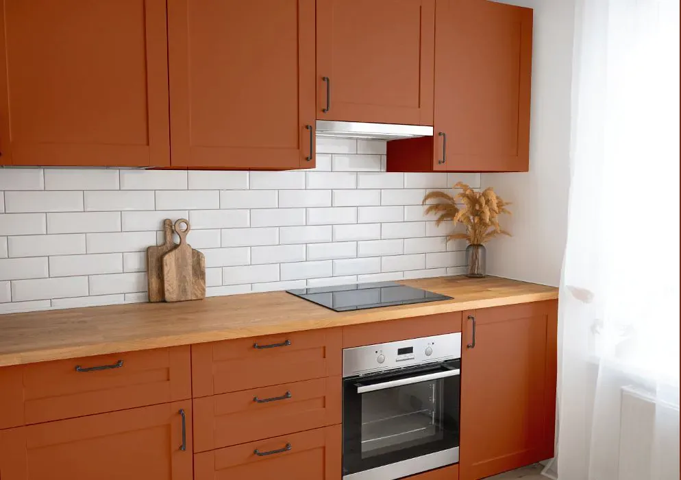
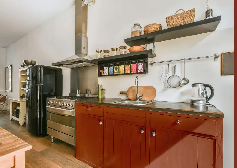
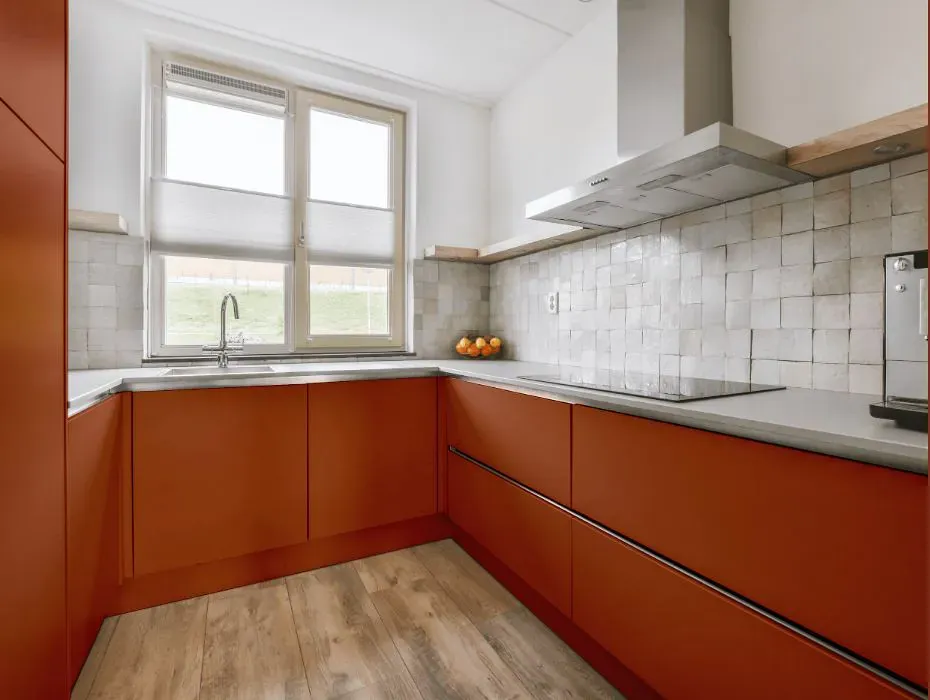
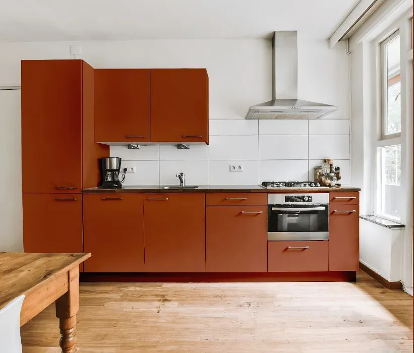
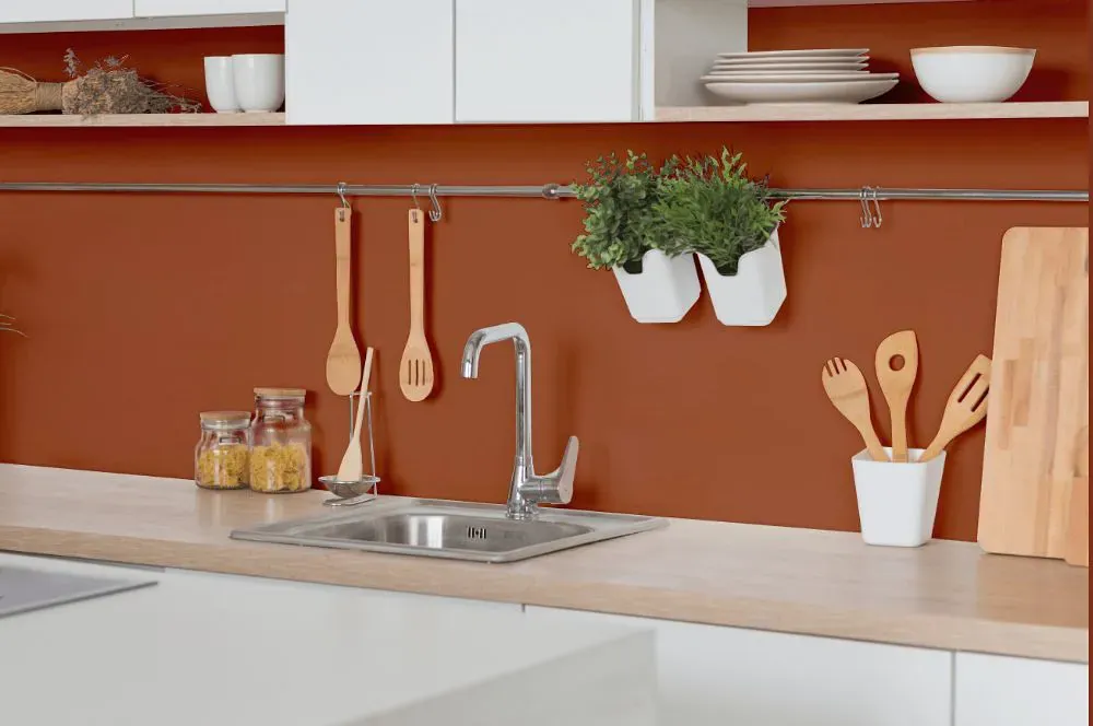
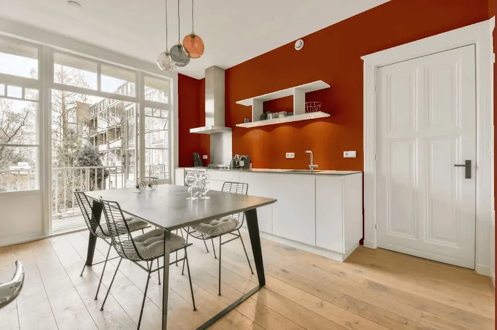
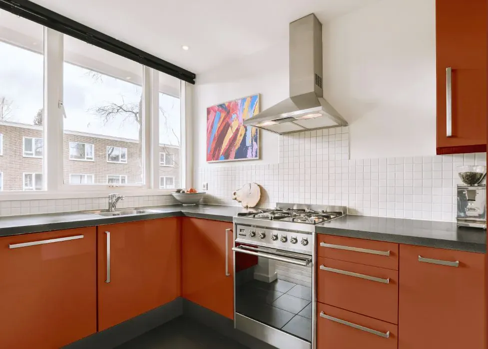
- Sherwin Williams SW 6349 on kitchen cabinets (4 photos)
- Sherwin Williams Pennywise reviews (9 photos)
- What are Sherwin Williams Pennywise undertones?
- Is Pennywise SW 6349 cool or warm?
- How light temperature affects on Pennywise
- Monochromatic color scheme
- Complementary color scheme
- Color comparison and matching
- LRV of Pennywise SW 6349
- Color codes
- Color equivalents
| Official page: | Pennywise SW 6349 |
| Code: | SW 6349 |
| Name: | Pennywise |
| Brand: | Sherwin Williams |
| Collections: | Enriched Earth |
What color is Sherwin Williams Pennywise?
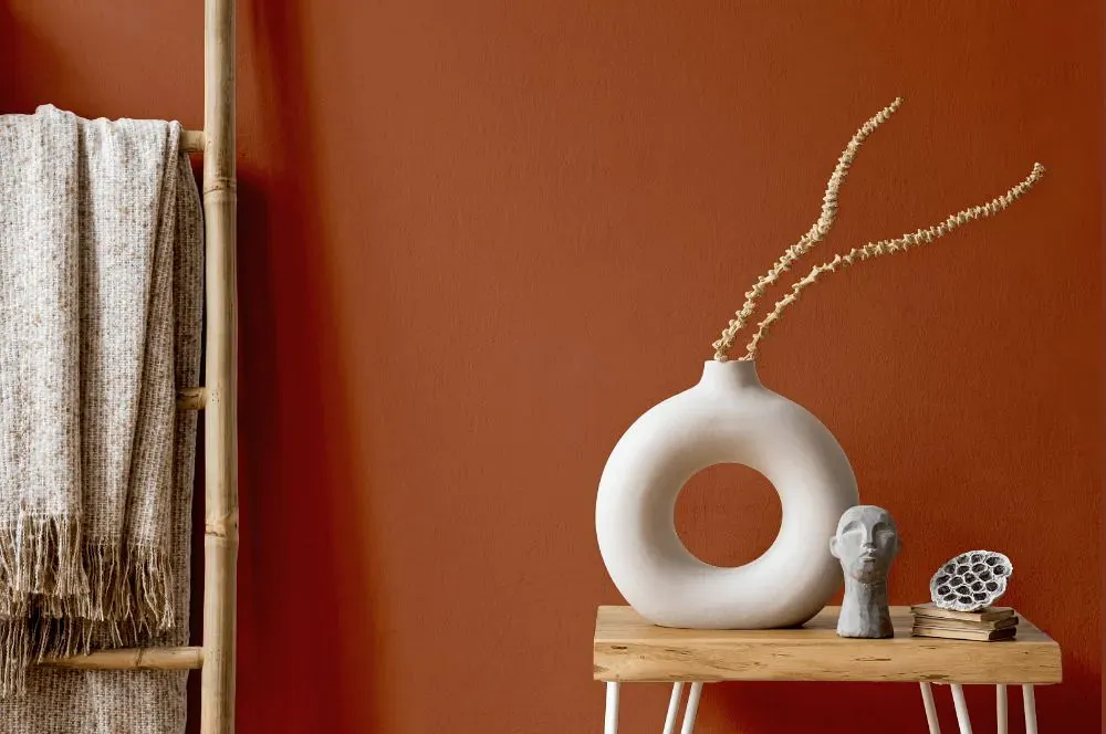
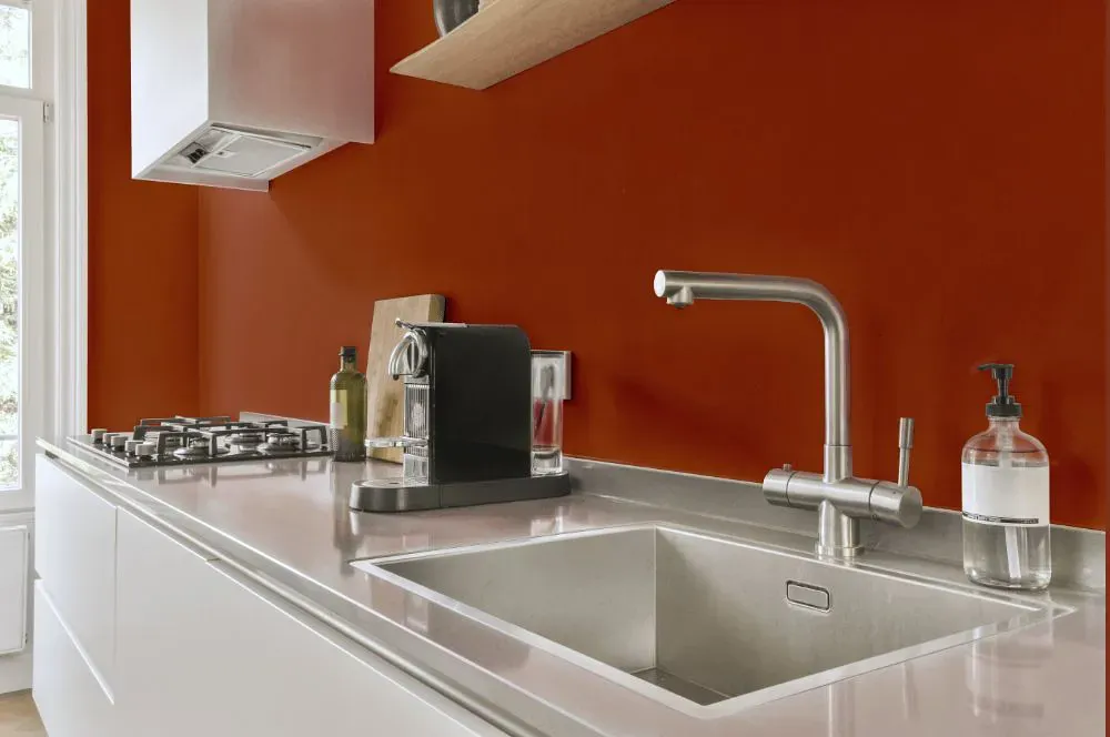
Sherwin Williams Pennywise SW 6349 is a medium-deep terracotta brown with a clear orange-red cast. Its earthy warmth gives it enough richness for a dining room, den, or front door, while the brown base keeps it from reading as a bright clay orange. In direct sunlight, Pennywise can show more of its baked-orange character; lower or cooler light draws out its deeper russet-brown side. Pair it with creamy off-whites, sand-colored textiles, dark walnut, aged brass, or muted olive accents for a grounded palette. It has the presence to cover all four walls in a room with good natural light, but it is especially effective on cabinetry, built-ins, and exterior trim.
Loading...
LRV of Pennywise
Pennywise has an LRV of 14.92% and refers to Medium Dark which means that this color reflects very little light. Why LRV is important?

Light Reflectance Value measures the amount of visible and usable light that reflects from a painted surface.
Simply put, the higher the LRV of a paint color, the brighter the room you will get.
The scale goes from 0% (absolute black, absorbing all light) to 100% (pure white, reflecting all light).
Act like a pro: When choosing paint with an LRV of 14.92%, pay attention to your bulbs' brightness. Light brightness is measured in lumens. The lower the paint's LRV, the higher lumen level you need. Every square foot of room needs at least 40 lumens. That means for a 200 ft2 living room you'll need about 8000 lumens of light – e.g., eight 1000 lm bulbs.
Color codes
We have collected almost every possible color code you could ever need.
Not sure what the difference between HEX and RGB is? We break down color models in plain language. Understanding color models
| Format | Code |
|---|---|
| HEX | #a2583a |
| RGB Decimal | 162, 88, 58 |
| RGB Percent | 63.53%, 34.51%, 22.75% |
| HSV | Hue: 17° Saturation: 64.2% Value: 63.53% |
| HSL | hsl(17, 47, 43) |
| CMYK | Cyan: 0.0 Magenta: 45.68 Yellow: 64.2 Key: 36.47 |
| YIQ | Y: 106.706 I: 53.737 Q: 6.318 |
| XYZ | X: 19.155 Y: 14.968 Z: 5.882 |
| CIE Lab | L:45.591 a:27.669 b:30.585 |
| CIE Luv | L:45.591 u:56.517 v:27.955 |
| Decimal | 10639418 |
| Hunter Lab | 38.689, 20.671, 18.068 |