
Tikkurila F362
| Code: | F362 |
| Name: | |
| Brand: | Tikkurila |
What color is Tikkurila F362?
The Tikkurila F362 color adds a touch of sophistication and warmth to any space with its rich and inviting tones. It pairs well with neutrals such as off-white and light gray, creating a harmonious and timeless look. The combination of Tikkurila F362 with deep charcoal or navy blue accents brings a sense of depth and modernity to the scheme. For a more vibrant and eclectic feel, try pairing this color with mustard yellow or terracotta for a bold and stylish statement. Whether used as a main color or as an accent, Tikkurila F362 injects personality and elegance into any room.
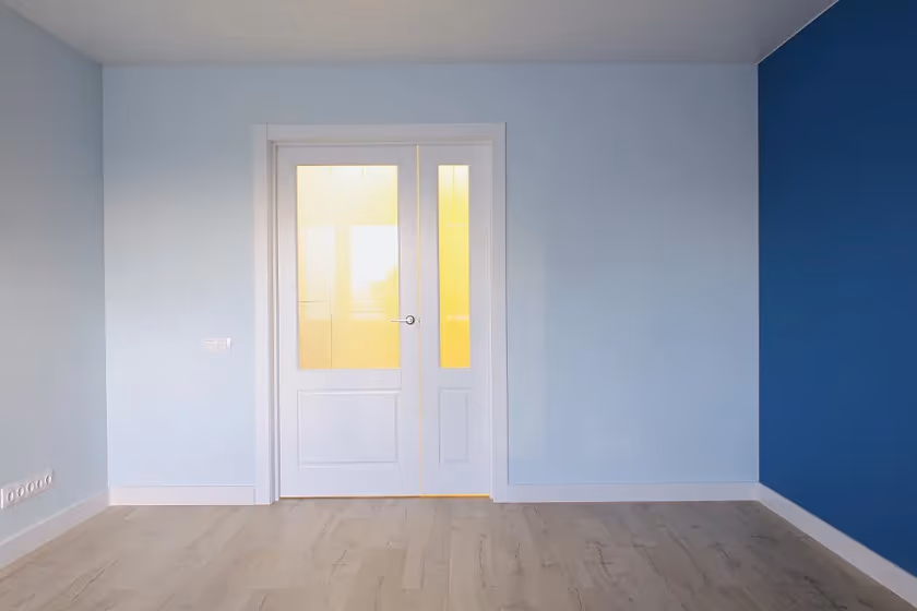
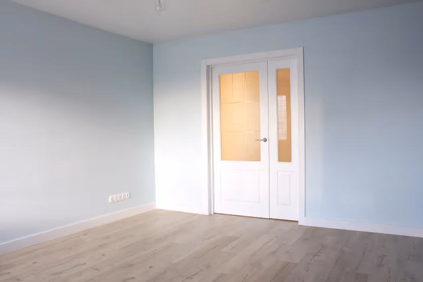
Tikkurila F362 reviews (2 photos)
View the photos of real spaces painted with this blue that were not included in specific categories.Close-ups, painted furniture, storages and dressers, hallways, stairs and ceilings.
Try before you buy
100% accurate
reusable paint samples

Peel, stick,
and repeat

Twice painted
with real paint

Next day
delivery
What are Tikkurila F362 undertones?
F362 has a clear blue undertone based on its position in the color space. We identify undertones by isolating the pure hue (separating it from lightness and saturation), which avoids distortions caused by tints, tones, and shades.
This method is generally more reliable than judging undertones on a white background.
HEX value:
#DAE7E8
RGB code:
218, 231, 232
Is Tikkurila F362 cool or warm?
warm
cool

With a hue of 184°, this Blue reads cool based on its HSL hue position.
F362 HSL code: 184, 23%, 88%
Hue - degree on a color wheel from 0 to 360. 0 is red, 120 is green, and 240 is blue.
Saturation is expressed as a percentage. At 0%, it appears as a shade of grey, and at 100%, it is in full color.
Lightness is also a percentage value. 0% is black, and 100% is white.
How light temperature affects F362
Natural Lighting. During the day, natural light shifts from about 2000 K at sunrise/sunset to 5500–6500 K at noon.
In addition, natural‑light temperature depends on its direction:
| Direction of sunlight | Visible temp. | Hue | Duration |
|---|---|---|---|
| North | Cool | Bluish | All day |
| East | Warm | Yellow | Before noon |
| West | Warm | Orange‑red | After noon |
| South | Warm | Orange‑yellow | All day |
Artificial Lighting. When choosing bulbs, pay attention to their color‑temperature (Kelvins).
Use the slider to see how this Blue shade looks under different lighting:
4000K
Coordinating colors.
Colors that go with Tikkurila F362:
Complementary color scheme

This color scheme is a combination of two shades that are opposite each other on the color wheel. The high contrast between these colors creates a vibrant and dynamic visual effect. For the color F362 with a green hue, complementary colors are those with a red hue close to 4, such as Tikkurila and Mirage.
LRV of F362
F362 has an LRV of 76.89% and refers to Off‑White colors that reflect a lot of light. Why LRV is important?

Light Reflectance Value measures the amount of visible and usable light that reflects from a painted surface.
Simply put, the higher the LRV of a paint color, the brighter the room you will get.
The scale goes from 0% (absolute black, absorbing all light) to 100% (pure white, reflecting all light).
Act like a pro: When choosing paint with an LRV of 76.89%, pay attention to your bulbs' brightness. Light brightness is measured in lumens. The lower the paint's LRV, the higher lumen level you need. Every square foot of room needs at least 40 lumens. That means for a 200 ft2 living room you’ll need about 8000 lumens of light – e.g., eight 1000 lm bulbs.
Color codes
We have collected almost every possible color code you could ever need. To copy the code, just click the icon to the right of it.
| Format | Code | |
|---|---|---|
| HEX | #DAE7E8 | |
| RGB Decimal | 218, 231, 232 | |
| RGB Percent | 85.49%, 90.59%, 90.98% | |
| HSV | Hue: 184° Saturation: 6.03% Value: 90.98% | |
| HSL | hsl(184, 23, 88) | |
| CMYK | Cyan: 6.03 Magenta: 0.43 Yellow: 0.0 Key: 9.02 | |
| YIQ | Y: 227.227 I: -8.068 Q: -2.439 | |
| XYZ | X: 72.051 Y: 77.883 Z: 87.559 | |
| CIE Lab | L:90.726 a:-4.127 b:-1.974 | |
| CIE Luv | L:90.726 u:-7.176 v:-2.315 | |
| Decimal | 14346216 | |
| Hunter Lab | 88.251, -8.707, 2.951 |
Tikkurila F362
Copy color code
Color equivalents
30BG 72/051
Jewelled Creek 6
Dulux
69BG 77/076
Holiday Blues 6
Dulux
248
Delicate Blue
Little Greene

90GG 83/034
Sea Urchin 6
Dulux
10BG 83/061
Javan Dawn 6
Dulux
70BG 72/057
Winter Teal 6
Dulux
5262
Svalbard Sea
Jotun

Pistachio Whip
Dulux
First Frost
Dulux
70BG 72/043
Celestial Cloud 6
Dulux
G358
Tikkurila

50BG 76/023
Quartz Flint 3
Dulux
55GG 82/041
Jade White
Dulux

70BG 72/071
Blue Opal
Dulux
10BG 72/057
Peppermint Candy
Dulux

Calm Sea
Dulux
10BG 83/018
Clouded Pearl 2
Dulux

Polar Storm
Dulux
10BB 83/006
Atmosphere
Dulux
