Tikkurila N473
Contentsshow +hide -
| Code: | N473 |
| Name: | |
| Brand: | Tikkurila |
What color is Tikkurila N473?
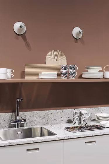
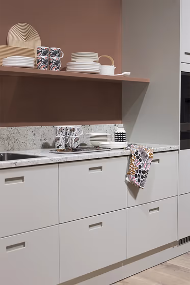
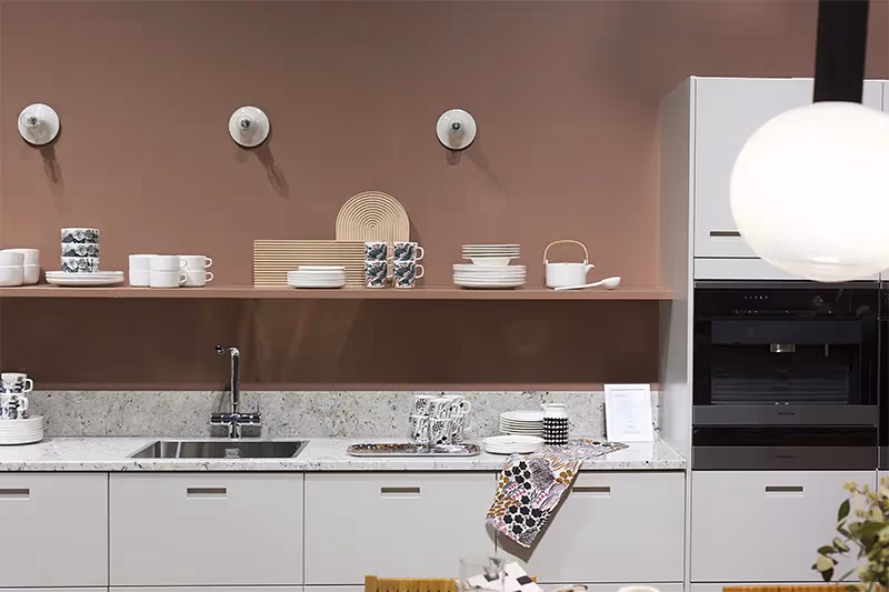
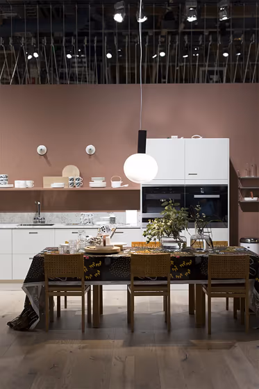
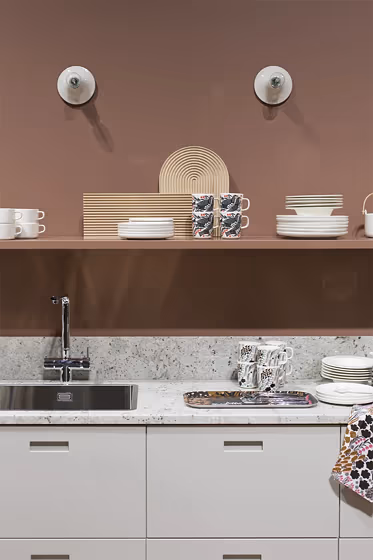
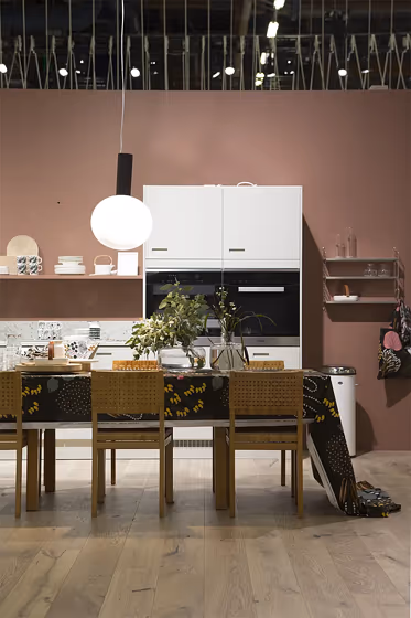
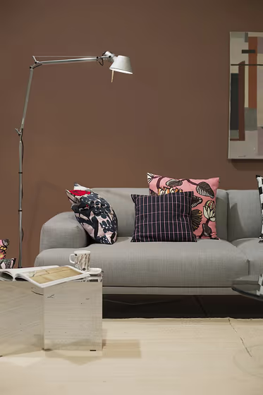
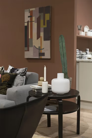
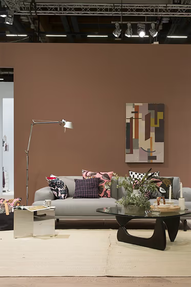
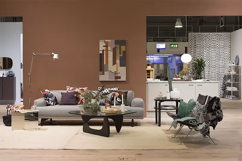
Tikkurila N473 exudes a sophisticated charm perfect for modern interiors. This deep, rich hue adds a sense of depth and warmth to any space. Pair it with soft neutrals like creamy whites and warm grays to create a balanced and elegant color palette. For a touch of contrast, consider incorporating accents in dusty blues or muted greens to complement the richness of N473. This versatile color enhances the ambiance of a room, making it a timeless choice for those seeking a luxurious yet inviting atmosphere.
Loading...
LRV of N473
N473 has an LRV of 18.33% and refers to Medium Dark which means that this color reflects very little light. Why LRV is important?

Light Reflectance Value measures the amount of visible and usable light that reflects from a painted surface.
Simply put, the higher the LRV of a paint color, the brighter the room you will get.
The scale goes from 0% (absolute black, absorbing all light) to 100% (pure white, reflecting all light).
Act like a pro: When choosing paint with an LRV of 18.33%, pay attention to your bulbs' brightness. Light brightness is measured in lumens. The lower the paint's LRV, the higher lumen level you need. Every square foot of room needs at least 40 lumens. That means for a 200 ft2 living room you'll need about 8000 lumens of light – e.g., eight 1000 lm bulbs.
Color codes
We have collected almost every possible color code you could ever need.
Not sure what the difference between HEX and RGB is? We break down color models in plain language. Understanding color models
| Format | Code |
|---|---|
| HEX | #8F6D64 |
| RGB Decimal | 143, 109, 100 |
| RGB Percent | 56.08%, 42.75%, 39.22% |
| HSV | Hue: 13° Saturation: 30.07% Value: 56.08% |
| HSL | hsl(13, 18, 48) |
| CMYK | Cyan: 0.0 Magenta: 23.78 Yellow: 30.07 Key: 43.92 |
| YIQ | Y: 118.14 I: 23.153 Q: 4.391 |
| XYZ | X: 19.097 Y: 17.698 Z: 14.463 |
| CIE Lab | L:49.128 a:12.126 b:10.242 |
| CIE Luv | L:49.128 u:22.403 v:11.077 |
| Decimal | 9399652 |
| Hunter Lab | 42.069, 7.408, 9.064 |