Sherwin Williams Faint Coral SW 6329
Contentsshow +hide -
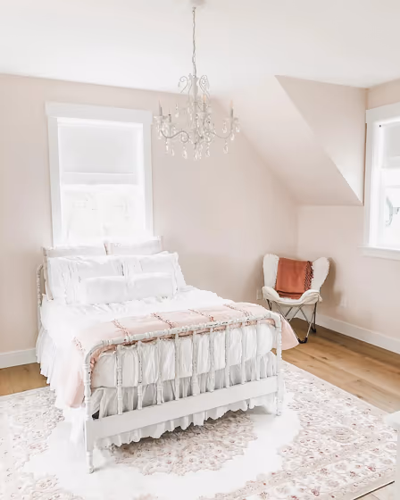
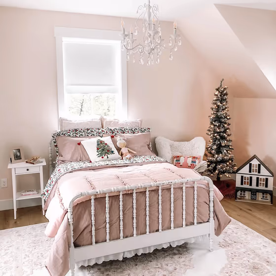
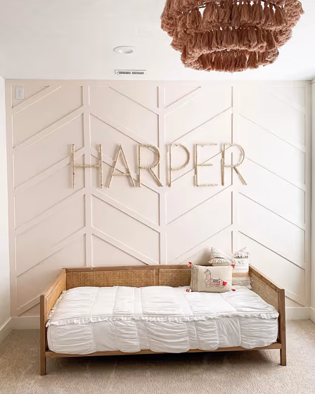
- Faint Coral for bedroom (2 photos)
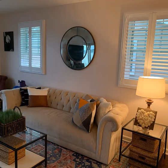
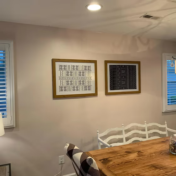
- Faint Coral for living room (1 photo)
- Sherwin Williams Faint Coral reviews (4 photos)
- What are Sherwin Williams Faint Coral undertones?
- Is Faint Coral SW 6329 cool or warm?
- How light temperature affects on Faint Coral
- Monochromatic color scheme
- Complementary color scheme
- Color comparison and matching
- LRV of Faint Coral SW 6329
- Color codes
- Color equivalents
| Code: | SW 6329 |
| Name: | Faint Coral |
| Brand: | Sherwin Williams |
| Collections: | Living Well, Pottery Barn Kids |
What color is Sherwin Williams Faint Coral?
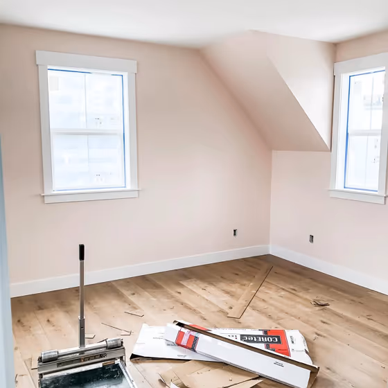
Sherwin Williams Faint Coral SW 6329 is a pale, muted blush with a gentle peach-beige cast. Its high lightness keeps it airy on broad walls, while the soft coral tint adds more warmth than a typical off-white. In bright daylight, Faint Coral can read as a barely-there rosy neutral; under warm lamps, its peach undertone becomes more noticeable. It suits bedrooms, powder rooms, nurseries, and living spaces where a light wall color should still have visible color. Pair it with creamy whites, warm oak, natural linen, brushed brass, or deeper clay and terracotta accents for a grounded contrast.
Loading...
LRV of Faint Coral
Faint Coral has an LRV of 75.31% and refers to Off‑White colors that reflect a lot of light. Why LRV is important?

Light Reflectance Value measures the amount of visible and usable light that reflects from a painted surface.
Simply put, the higher the LRV of a paint color, the brighter the room you will get.
The scale goes from 0% (absolute black, absorbing all light) to 100% (pure white, reflecting all light).
Act like a pro: When choosing paint with an LRV of 75.31%, pay attention to your bulbs' brightness. Light brightness is measured in lumens. The lower the paint's LRV, the higher lumen level you need. Every square foot of room needs at least 40 lumens. That means for a 200 ft2 living room you'll need about 8000 lumens of light – e.g., eight 1000 lm bulbs.
Color codes
We have collected almost every possible color code you could ever need.
Not sure what the difference between HEX and RGB is? We break down color models in plain language. Understanding color models
| Format | Code |
|---|---|
| HEX | #eeded5 |
| RGB Decimal | 238, 222, 213 |
| RGB Percent | 93.33%, 87.06%, 83.53% |
| HSV | Hue: 22° Saturation: 10.5% Value: 93.33% |
| HSL | hsl(22, 42, 88) |
| CMYK | Cyan: 0.0 Magenta: 6.72 Yellow: 10.5 Key: 6.67 |
| YIQ | Y: 225.758 I: 12.427 Q: 0.584 |
| XYZ | X: 73.389 Y: 75.225 Z: 73.587 |
| CIE Lab | L:89.498 a:3.973 b:6.38 |
| CIE Luv | L:89.498 u:9.918 v:8.838 |
| Decimal | 15654613 |
| Hunter Lab | 86.732, -0.742, 10.409 |